Fundamentals of Mathematics (indefinite integral)
1. Indefinite integral
1.1 definition of indefinite integral
Indefinite integral is the inverse operation of derivation, but indefinite integral f(x) is a representative element, and its derivative is f(x), but it is not unique.

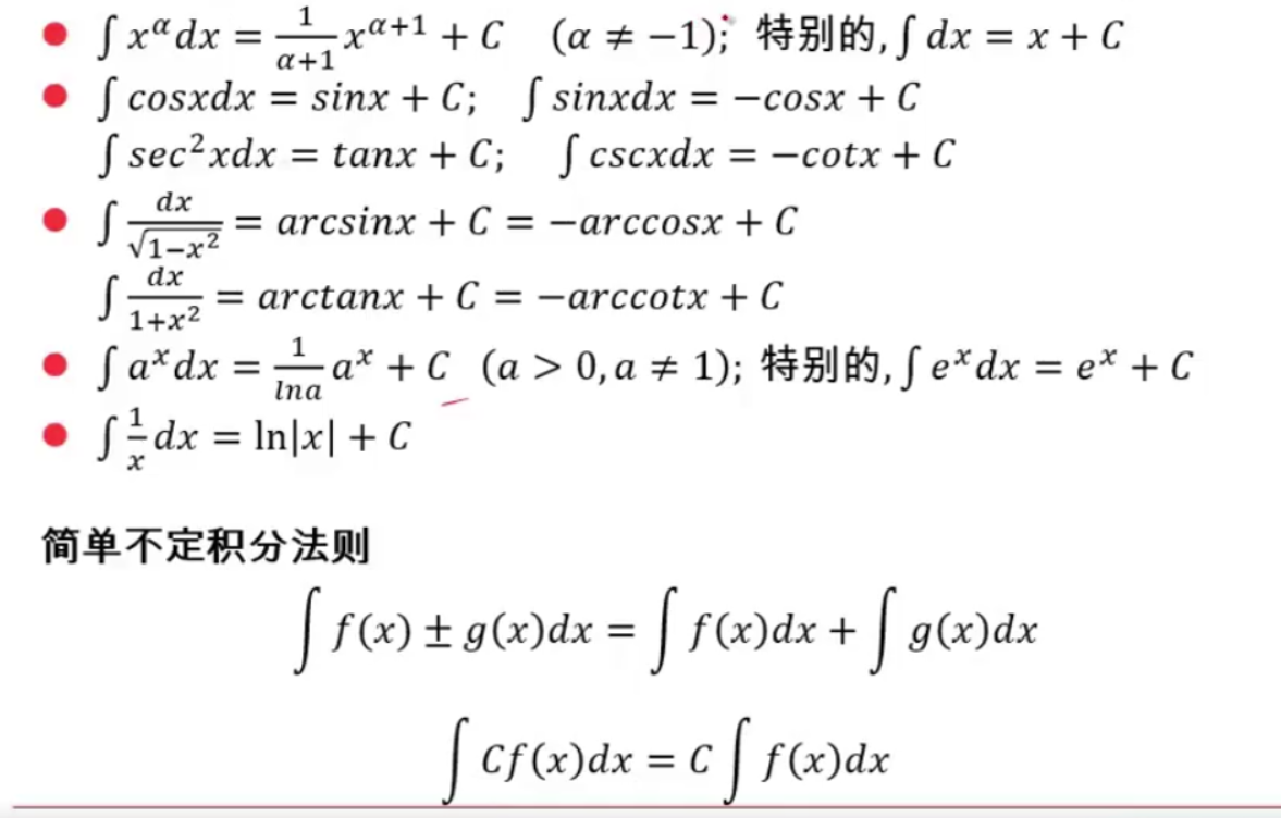
1.2 basic formula of indefinite integral of elementary function
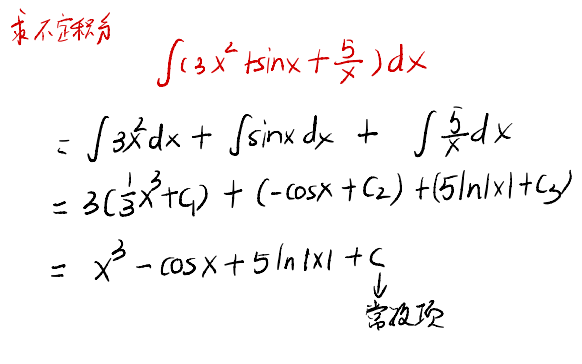
 example:

1.3 first substitution method

example:


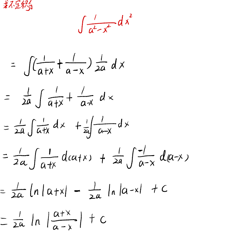


1.4 the second substitution method:
 example:


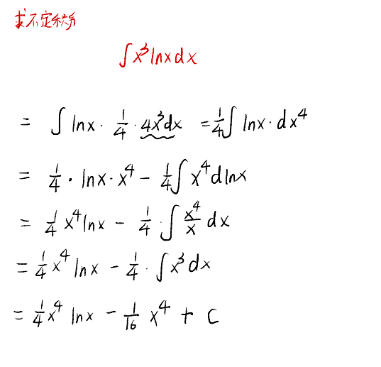
1.5 partial integral method
 example:

1.6 rational integral
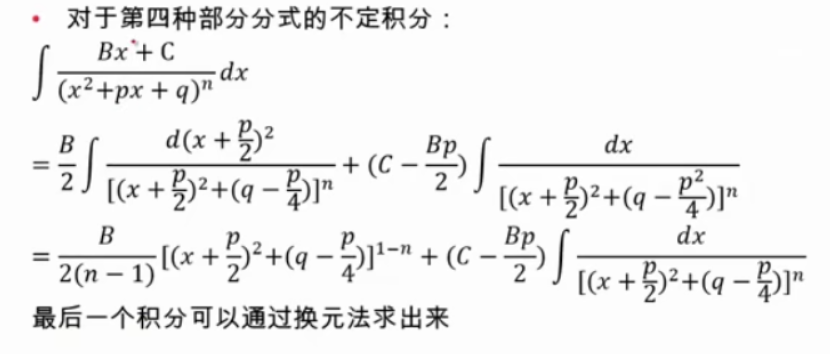
 Split a true fraction into several partial fractions. The following formula is the structure of some partial fractions
 Then the indefinite integrals of several partial fractions are as follows:


example:


1.7 rational formula of trigonometric function
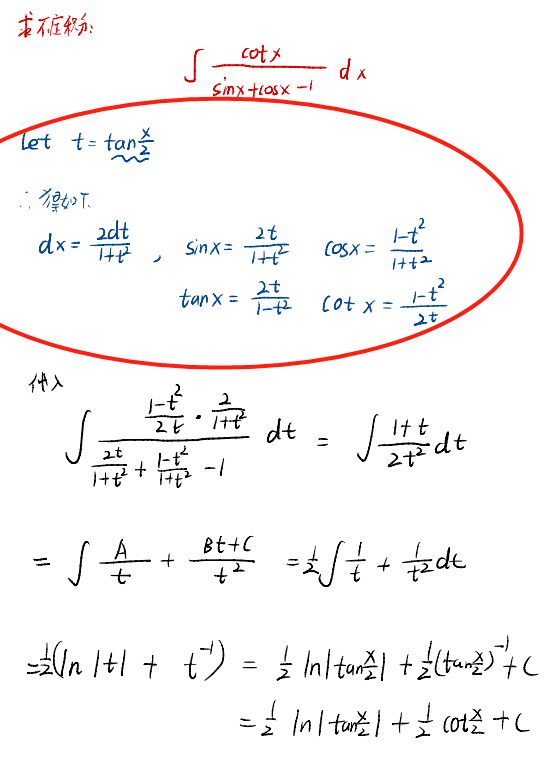
Solve with universal substitution:

example:
1.8 common indefinite integral
Note: not all indefinite integrals must be the combination of elementary functions, that is, some indefinite integrals can find F(x)+C, but this F(x) cannot be expressed by elementary functions

Data analysis (matplotlib)
1.1 draw scatter diagram
example:
import matplotlib.pyplot as plt
from matplotlib import font_manager

# Set a font
my_font = font_manager.FontProperties(fname="\\Windows\\Fonts\\simfang.ttf")

# Set image size
plt.figure(figsize=(20, 8), dpi=80)

#

a = [11, 17, 16, 11, 12, 11, 12, 6, 6, 7, 8, 9, 12, 15, 14, 17, 18, 21, 16, 17, 20, 14, 15, 15, 15, 19, 21, 22, 22,
     22, 23]
b = [26, 26, 28, 19, 21, 17, 16, 19, 18, 20, 20, 19, 22, 23, 17, 20, 21, 20, 22, 15, 11, 15, 5, 13, 17, 10, 11, 13,
     12, 13, 6]

x1 = range(1, 32)
x2 = range(51, 82)

plt.scatter(x1, a, label="3 Monthly temperature")
plt.scatter(x2, b, label="10 Monthly temperature")

# Adjust the scale of the X-axis
_x = list(x1) + list(x2)
_xtick_labels = ["3 month{}day".format(i) for i in x1]
_xtick_labels += ["10 month{}day".format(i) for i in x2]
plt.xticks(_x[::2], _xtick_labels[::2], fontproperties=my_font, rotation=90)

# Add legend
plt.legend(loc="upper left", prop=my_font)

# Add description information
plt.xlabel("time", fontproperties=my_font)
plt.ylabel("temperature", fontproperties=my_font)
plt.title("3 Monthly and October temperature scatter", fontproperties=my_font)

plt.show()

1.2 draw bar chart
(1) Vertical histogram plt.bar
example:
import matplotlib.pyplot as plt
from matplotlib import font_manager

# Set a font
my_font = font_manager.FontProperties(fname="\\Windows\\Fonts\\simfang.ttf")

# Set image size
plt.figure(figsize=(20, 15), dpi=100)

a = ["Warwolf 2", "Speed and passion 8", "Kung Fu Yoga", "Journey to the West subdues demons chapter", "Transformers 5: The Last Knight", "Wrestle! dad", "Pirates of the Caribbean 5: dead without proof", "King Kong: Skeleton Island", "Extreme agent: ultimate return", "Biochemical crisis 6: final chapter",
     "ride the wind and waves", "Stealing daddy 3", "Outwit Weihu mountain", "Make trouble in Tianzhu", "Wolverine 3: battle to death", "Spider Man: Hero returns", "Wukong biography", "Galaxy guard 2", "Love saint", "The Mummy ", ]

b = [56.01, 26.94, 17.53, 16.49, 15.45, 12.96, 11.8, 11.61, 11.28, 11.12, 10.49, 10.3, 8.75, 7.55, 7.32, 6.99, 6.88,
     6.86, 6.58, 6.23]

# Width controls the bar width
plt.bar(range(len(a)), b, width=0.5)
# plt.barh(range(len(a)), b, height=0.5)

# Set string to x axis
plt.xticks(range(len(a)), a, fontproperties=my_font, rotation=90)
# plt.yticks(range(len(a)), a, fontproperties=my_font, rotation=0)

# Save picture
plt.savefig("./movie.svg")

plt.show()

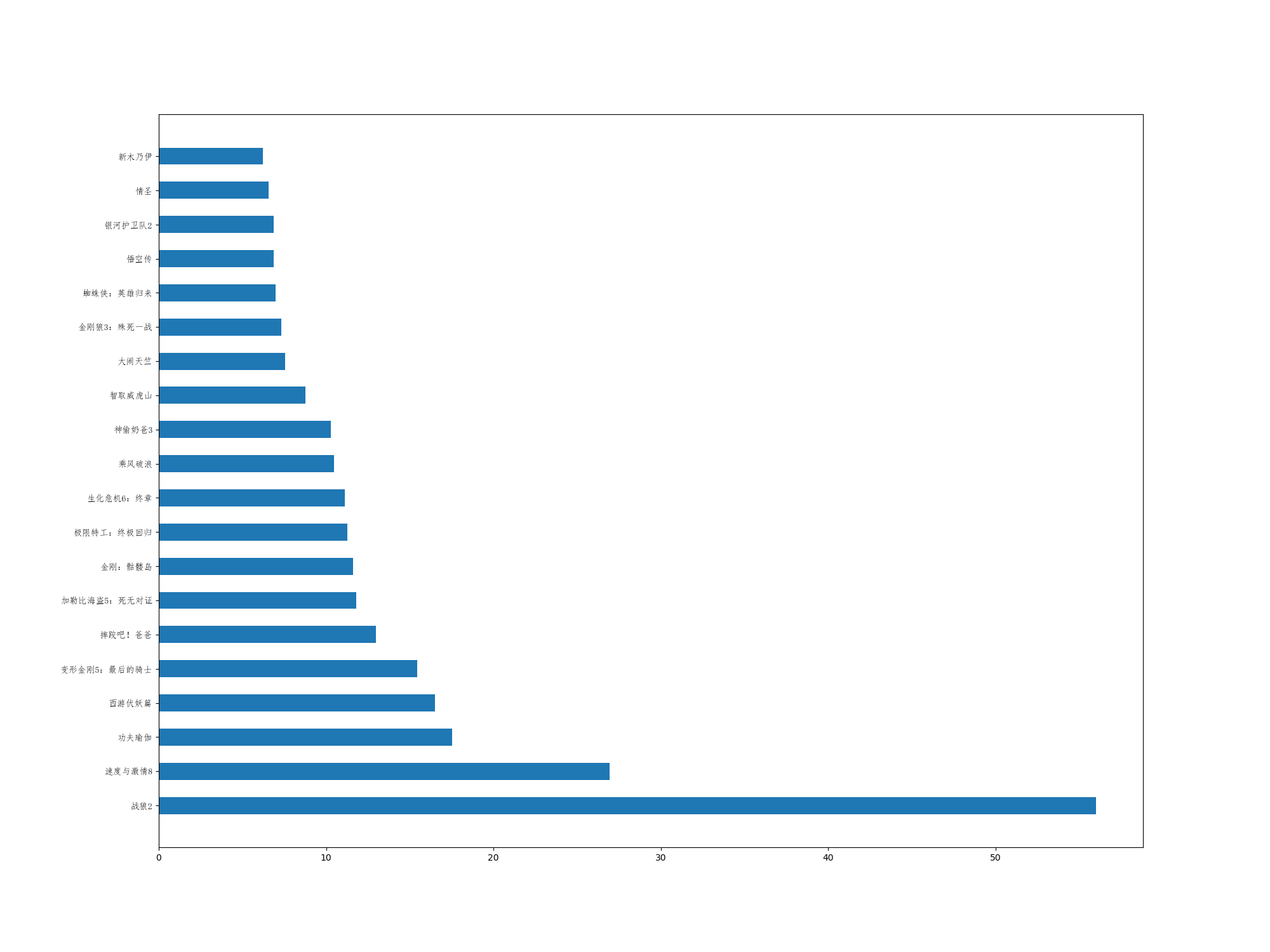
(2) Horizontal histogram PLT barh
example:
# height controls the bar width, which is different from the above
plt.barh(range(len(a)), b, height=0.5)

# Set string to y axis
plt.yticks(range(len(a)), a, fontproperties=my_font, rotation=0)
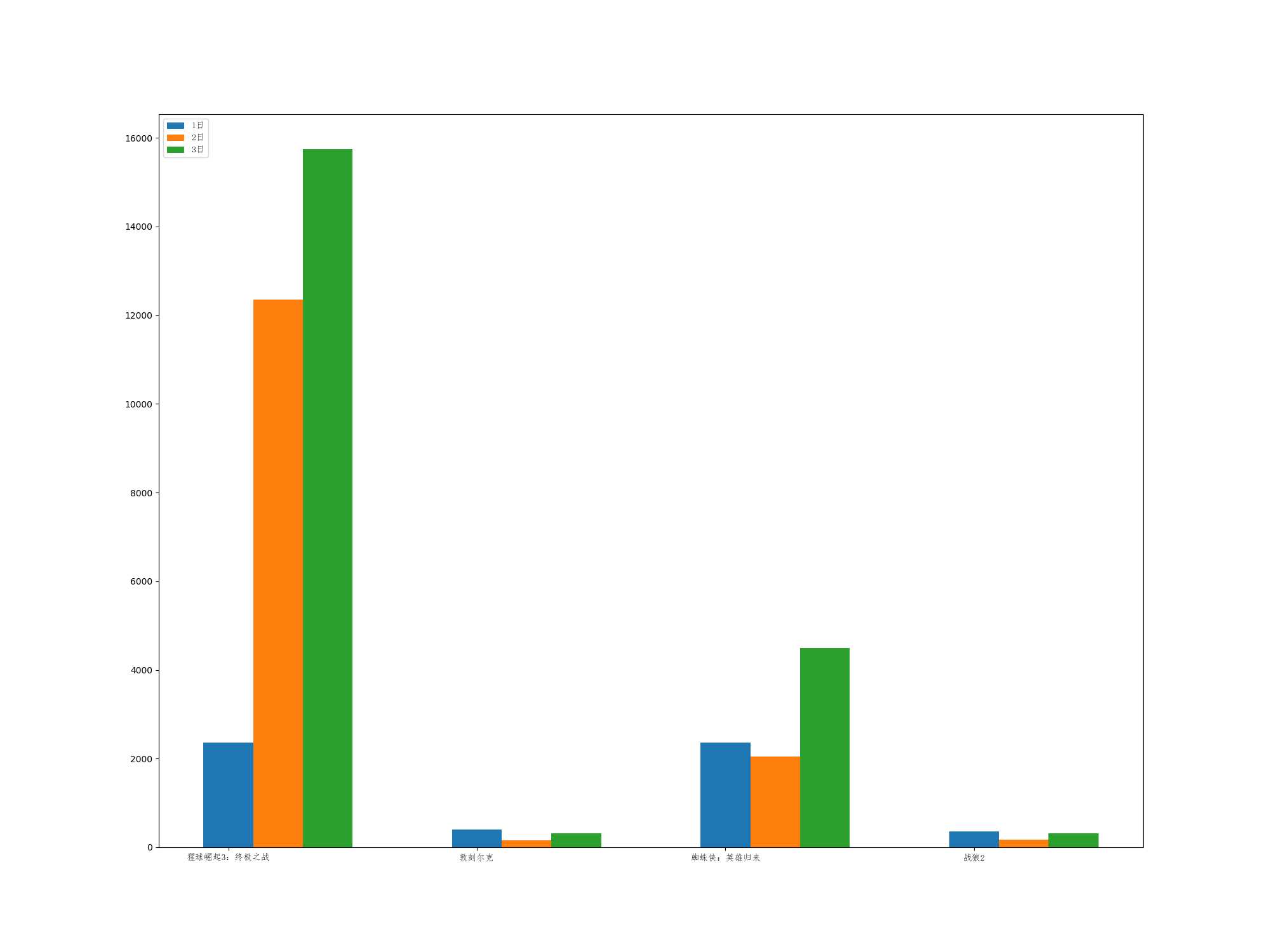
(3) Draw a multiline bar chart
import matplotlib.pyplot as plt
from matplotlib import font_manager

# Set a font
my_font = font_manager.FontProperties(fname="\\Windows\\Fonts\\simfang.ttf")

# Set image size
plt.figure(figsize=(20, 15), dpi=100)

a = ["The rise of the scarlet ball 3: the ultimate battle", "Dunkirk", "Spider Man: Hero returns", "Warwolf 2"]
b_16 = [15746, 312, 4497, 319]
b_15 = [12357, 156, 2045, 168]
b_14 = [2358, 399, 2358, 362]

# The horizontal axis needs to be offset
bar_offset = 0.2

x_14 = range(len(a))
x_15 = [i + bar_offset for i in range(len(a))]
x_16 = [i + 2 * bar_offset for i in range(len(a))]

# Draw a three-layer image
plt.bar(x_14, b_14, width=bar_offset, label="1 day")
plt.bar(x_15, b_15, width=bar_offset, label="2 day")
plt.bar(x_16, b_16, width=bar_offset, label="3 day")

# Set legend
plt.legend(loc="upper left", prop=my_font)

# Add abscissa label
plt.xticks(range(len(a)), a, fontproperties=my_font)

plt.show()
1.3 drawing histogram
First, several concepts are identified:
(1) Number of groups: how many groups will a group of data be divided into
(2) Group spacing: the range of each group of data
Note: the number of groups should be appropriate. Too few groups will have large statistical errors, and most of the rules are not obvious
(1) Given no statistical data, the statistical histogram is drawn, and Hist is used directly
import matplotlib.pyplot as plt
from matplotlib import font_manager

# Set a font
my_font = font_manager.FontProperties(fname="\\Windows\\Fonts\\simfang.ttf")

# Set image size
plt.figure(figsize=(20, 8), dpi=80)

a = [131, 98, 125, 131, 124, 139, 131, 117, 128, 108, 135, 138, 131, 102, 107, 114, 119, 128, 121, 142, 127, 130, 124,
     101, 110, 116, 117, 110, 128, 128, 115, 99, 136, 126, 134, 95, 138, 117, 111, 78, 132, 124, 113, 150, 110, 117, 86,
     95, 144, 105, 126, 130, 126, 130, 126, 116, 123, 106, 112, 138, 123, 86, 101, 99, 136, 123, 117, 119, 105, 137,
     123, 128, 125, 104, 109, 134, 125, 127, 105, 120, 107, 129, 116, 108, 132, 103, 136, 118, 102, 120, 114, 105, 115,
     132, 145, 119, 121, 112, 139, 125, 138, 109, 132, 134, 156, 106, 117, 127, 144, 139, 139, 119, 140, 83, 110, 102,
     123, 107, 143, 115, 136, 118, 139, 123, 112, 118, 125, 109, 119, 133, 112, 114, 122, 109, 106, 123, 116, 131, 127,
     115, 118, 112, 135, 115, 146, 137, 116, 103, 144, 83, 123, 111, 110, 111, 100, 154, 136, 100, 118, 119, 133, 134,
     106, 129, 126, 110, 111, 109, 141, 120, 117, 106, 149, 122, 122, 110, 118, 127, 121, 114, 125, 126, 114, 140, 103,
     130, 141, 117, 106, 114, 121, 114, 133, 137, 92, 121, 112, 146, 97, 137, 105, 98, 117, 112, 81, 97, 139, 113, 134,
     106, 144, 110, 137, 137, 111, 104, 117, 100, 111, 101, 110, 105, 129, 137, 112, 120, 113, 133, 112, 83, 94, 146,
     133, 101, 131, 116, 111, 84, 137, 115, 122, 106, 144, 109, 123, 116, 111, 111, 133, 150]

bin_width = 5  # Set group spacing = 3
num_bins = (max(a) - min(a)) // bin_width # set the group distance according to the number of groups. Note that it is best to select the bin that can be divided_ width

plt.hist(a, num_bins)
plt.grid(alpha=0.4)
plt.xticks(range(min(a), max(a) + bin_width, bin_width))
plt.show()
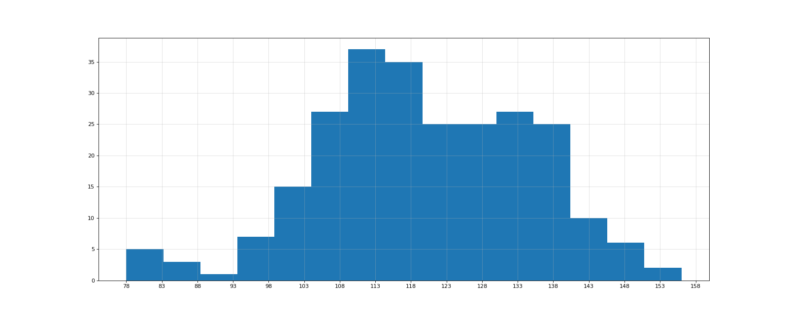
(2) The most difficult thing is to align the labels. Note that the X-axis input object of the bar graph is the middle value of the bar, for example, (1,10, width=1) represents a bar graph with a width of 1 between (0.5-1.5). Therefore, it is necessary to change the offset of the horizontal axis to achieve histogram drawing
The following is an example of an isometric histogram:
# Set image size
plt.figure(figsize=(20, 8), dpi=80)

# First, we should interpret the statistics
interval = [0, 5, 10, 15, 20, 25, 30, 35, 40, 45, 60, 90]  # Data interval. The number of intervals is the number of groups
width = [5, 5, 5, 5, 5, 5, 5, 5, 5, 15, 30, 60]  # Note that some width bands are different, so X_ The label s of ticks should be changed appropriately
quantity = [836, 2737, 3723, 3926, 3596, 1438, 3273, 642, 824, 613, 215, 47]

# First, make sure that the drawing method is bar, because no gap is required, so the width is set to 1
plt.bar(range(len(quantity)), quantity, width=1)

# To change the interval, you can directly change it on the basis of intercal or generate it with the width list. I choose 2 and start with 0
x_labels = [0]
for i in range(1, len(width) + 1):
    x_labels.append(x_labels[i - 1] + width[i - 1])

# Because it is a bar chart, the first point of the bar chart needs to be corresponding to the label, and the bar chart needs to be moved forward by 0.5 as a whole
plt.xticks([i - 0.5 for i in range(len(quantity) + 1)], x_labels)

plt.grid(alpha=0.4)
plt.show()

(3) For non equidistant histogram, pay attention to setting the offset of horizontal axis!!!!!!
import matplotlib.pyplot as plt
from matplotlib import font_manager

# Set a font
my_font = font_manager.FontProperties(fname="\\Windows\\Fonts\\simfang.ttf")

# Set image size
plt.figure(figsize=(20, 8), dpi=80)

# First, we should interpret the statistics
interval = [0, 5, 10, 15, 20, 25, 30, 35, 40, 45, 60, 90]  # Data interval. The number of intervals is the number of groups
width = [5, 5, 5, 5, 5, 5, 5, 5, 5, 15, 30, 60]  # Note that some width bands are different, so X_ The label s of ticks should be changed appropriately
quantity = [836, 2737, 3723, 3926, 3596, 1438, 3273, 642, 824, 613, 215, 47]

new_interval = []
for i in range(0, 12):
    new_interval.append(interval[i] + width[i] / 2)

# First, make sure that the drawing method is bar, because no gap is required, so the width is set to 1
plt.bar(new_interval, quantity, width=width)

# To change the interval, you can change it directly on the basis of interval or generate it with the width list. I choose 2 and start with 0
x_labels = [0]
for i in range(1, len(width) + 1):
    x_labels.append(x_labels[i - 1] + width[i - 1])

plt.xticks(x_labels)

plt.grid(alpha=0.4)
plt.show()

leetcode (21, 26)
leetcode21: merge ordered linked list
Build a new linked list, compare the number of two linked lists, and add them continuously
class Solution:
    def mergeTwoLists(self, list1: Optional[ListNode], list2: Optional[ListNode]) -> Optional[ListNode]:
        head=newlist=ListNode(0)
        while list1 and list2:
            if list1.val<list2.val:
                newlist.next=list1
                list1=list1.next
            else:
                newlist.next=list2
                list2=list2.next
            newlist=newlist.next

        newlist.next=list1 if list1 else list2

        return head.next
leetcode26: remove duplicates from ordered arrays
The first important requirement is: please delete the repeated elements in place, make each element appear only once, and return the new length of the deleted array
Use the double pointer in the double pointer to solve the problem:
The main ideas are as follows:
(1) There are only two cases where slow refers to the same number as fast, slow=fast or the value is repeated
(2) But anyway, as long as the two are equal, fast must move back until they are not equal
(3) In case of inequality, as long as there is one principle, because the list is orderly, the next bit of slow must be consistent with the number pointed to by the current fast, so that there will be no repetition
So the logic is as follows:
compare fast and slow Whether the elements of the position are equal.

Loop execution:
    If equal, fast Shift back 1 bit
    If not, the slow The value of the previous digit is changed to fast,slow Move back 1 bit, fast Shift back 1 bit
 End of cycle:
    fast Cross the border

At the end of the loop, the length of the new array is returned slow + 1
class Solution:
    def removeDuplicates(self, nums: List[int]) -> int:
        if not nums:
            return 0
        len_nums = len(nums)
        fast = 1
        slow = 0
        while fast < len_nums:
            if nums[fast] != nums[slow]:
                nums[slow + 1] = nums[fast]
                slow += 1
            fast += 1
        return slow + 1
(2) Method 2: use the set method to solve it directly
class Solution:
    def removeDuplicates(self, nums: List[int]) -> int:
        newnums=list(set(nums))
        newnums.sort()
        #print(newnums)
        for i in range(len(newnums)):
            nums[i]=newnums[i]

        return len(newnums)