Generally speaking, when it comes to data visualization, Python readers may think of matplotlib module or seaborn module for the first time, while when it comes to drawing dynamic charts, they think more of Plotly or pyechards.
Today, I'd like to introduce another module for drawing dynamic charts, which is very convenient to use, and the charts drawn are very exquisite and beautiful. It's called pygal. Compared with seaborn and other commonly used modules, the advantages of this module are:
-
Highly customizable and easy to use
-
Charts are highly interactive
-
Images can be exported in SVG format (vector graphics)
-
Highly integrated with Django, Flask and other Web frameworks
Therefore, the pygal module editor thinks it's worth talking about. We'll talk about these contents:
- pygal module installation
- Drawing of histogram
- Drawing of line chart
- Pie chart drawing
- Radar mapping
- Box diagram
- Dashboard
- Tree diagram
- Map
Module installation
The module installation is very simple, which can be realized through pip install,
pip install pygal
Of course, if domestic small partners feel that the download speed is slow, they can also speed up by adding a third-party image
pip install -i http://pypi.douban.com/simple/ pygal
Histogram
Let's look at the drawing of histogram. First, let's look at the example of single column histogram
view = pygal.Bar()
#Chart name
view.title = 'Histogram'
#Add data
view.add('data', [1,3,5,7,9,11])
#View in browser
#view.render_in_browser()
view.render_to_file('bar.svg')
output
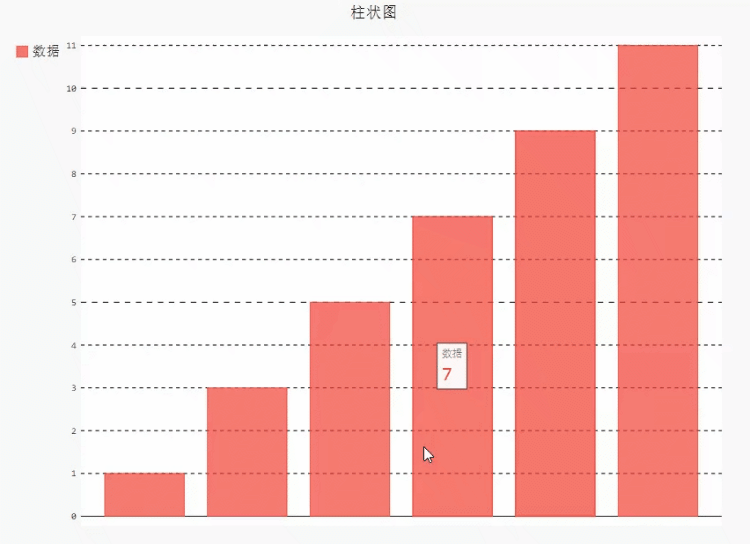
We can use render_to_file() method, or render_ in_ The browser () method is used to view in the browser
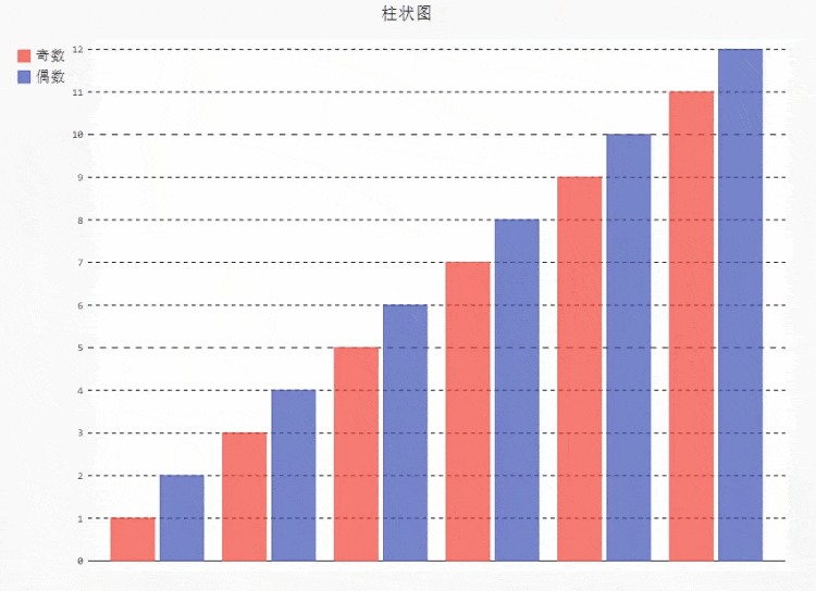
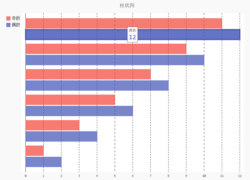
Let's look at the drawing of multi column columnar graph. The code is as follows
view.add('Odd number', [1,3,5,7,9,11])
view.add('even numbers', [2,4,6,8,10,12])
output
If we want to look at the bar chart horizontally, replace a small part of the above code with
view = pygal.HorizontalBar()
output
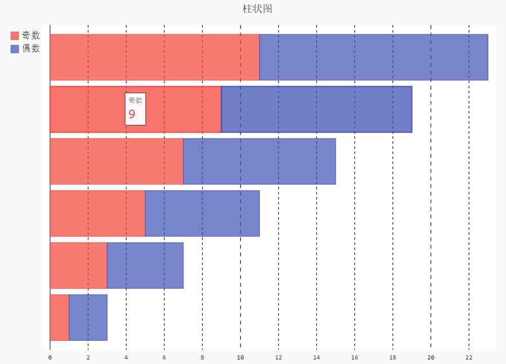
If we want a stacked histogram, we need to replace a small part of the above code with
view = pygal.HorizontalStackedBar()
output
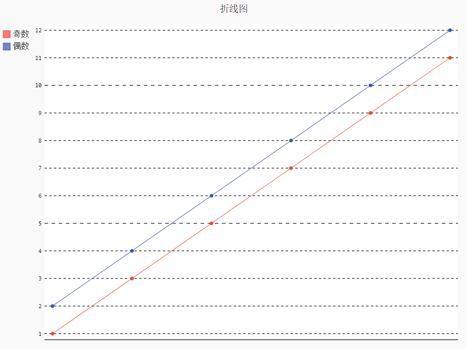
Line chart
The drawing of line chart is basically consistent with the drawing of histogram above. Let's look at the code directly
view = pygal.HorizontalStackedBar()
output
picture
It is also consistent with the code logic of the bar chart above. There are also stacked line charts in the line chart. Only a part of the above code needs to be replaced with
view = pygal.StackedLine(fill=True)
Pie chart
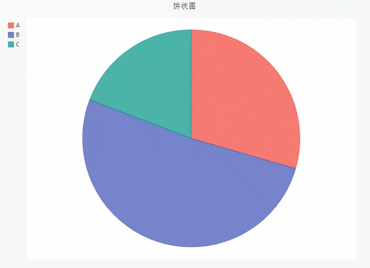
Similarly, the drawing of pie chart is also similar to the code logic
view = pygal.Pie()
#Chart name
view.title = 'Pie chart'
#Add data
view.add('A', 23)
view.add('B', 40)
view.add('C', 15)

view.render_to_file('pie.svg')
output
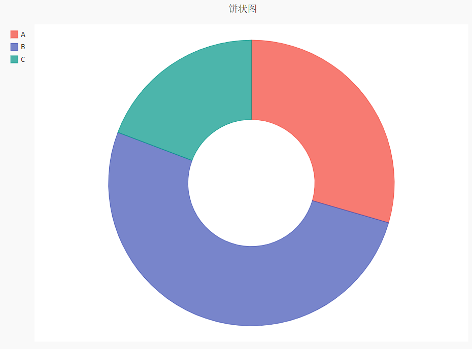
At the same time, we can also draw a doughnut and empty out a piece in the center of the pie chart. The code is roughly the same, but we need to replace a small part of the above with
#Sets the radius of the hollow circle
view = pygal.Pie(inner_radius=0.4)
output
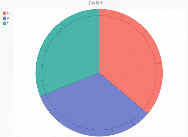
When we have more than one number in each class, we can draw a multi-level pie chart. The code is as follows
view = pygal.Pie()
#Chart name
view.title = 'Multilevel pie chart'
#Add data
view.add('A', [20, 25, 30, 45])
view.add('B', [15, 19, 25, 50])
view.add('C', [18, 22, 28, 35])

view.render_to_file('pie_multi.svg')
output
Radar chart
Radar chart can help us analyze data from multiple dimensions. For example, when we analyze athletes' sports ability, we will look at it from multiple dimensions. At this time, radar chart becomes very useful. The code is as follows
radar_chart = pygal.Radar()
radar_chart.title = 'NBA Competition among players'
radar_chart.x_labels = ['score', 'defense', 'Assists', 'an error', 'backboard']
radar_chart.add('Curry', [70, 98, 96, 85, 97])
radar_chart.add('James', [60, 95, 50, 75, 99])
radar_chart.add('Durant', [94, 45, 88, 91, 98])
radar_chart.render_to_file('radar_nba.svg')
output
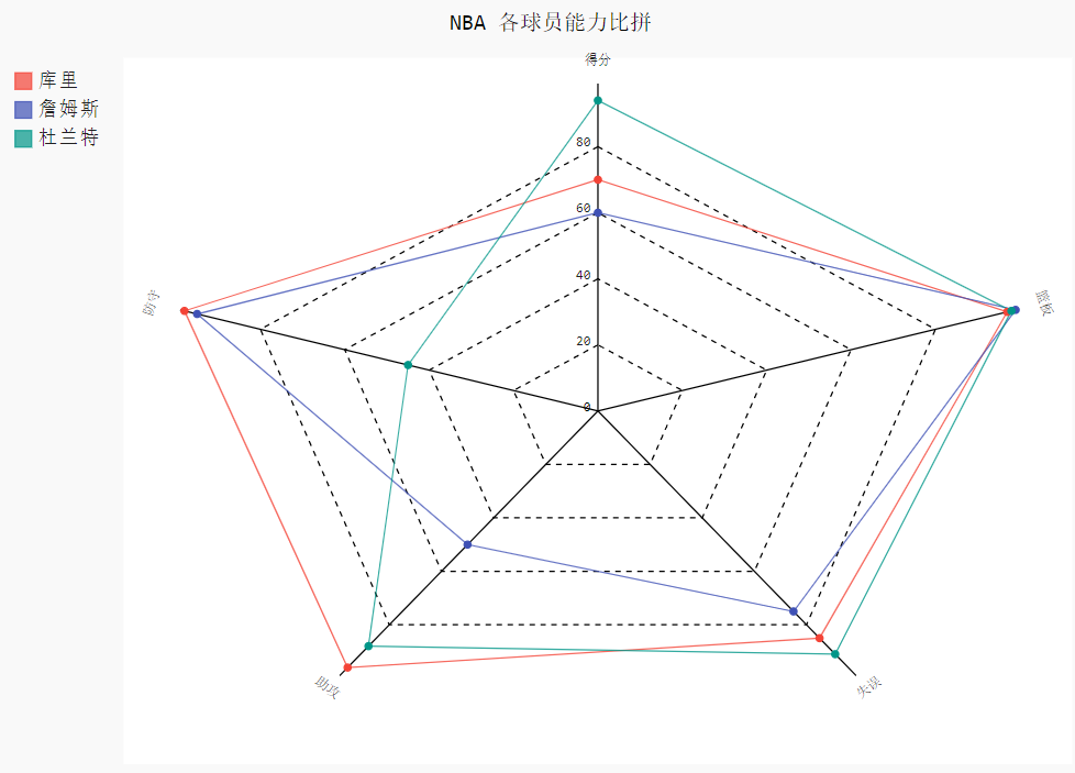
Of course, the above data are all made up. Don't spray me if you like NBA readers or readers who like the balls above
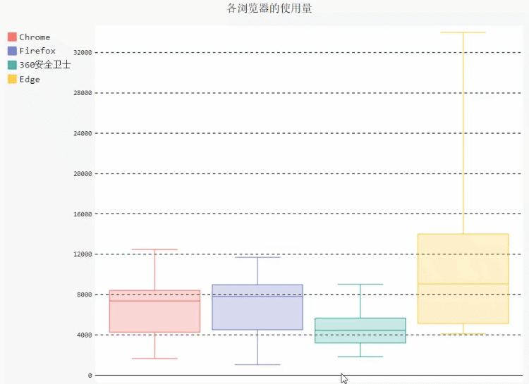
Box diagram
Box chart can quickly help us understand the distribution of data and check whether there are extreme values. The pygal module also provides the method of drawing box diagram. The code is as follows
box_plot = pygal.Box()
box_plot.title = 'Usage by browser'
box_plot.add('Chrome', [6395, 8212, 7520, 7218, 12464, 1660, 2123, 8607])
box_plot.add('Firefox', [7512, 8099, 11700, 2651, 6361, 1044, 8502, 9450])
box_plot.add('360 Security guard', [3472, 2933, 4203, 5510, 5810, 1828, 9013, 4669])
box_plot.add('Edge', [4310, 4109, 5935, 7902, 14404, 13608, 34004, 10210])
box_plot.render_to_file("box.svg")
output
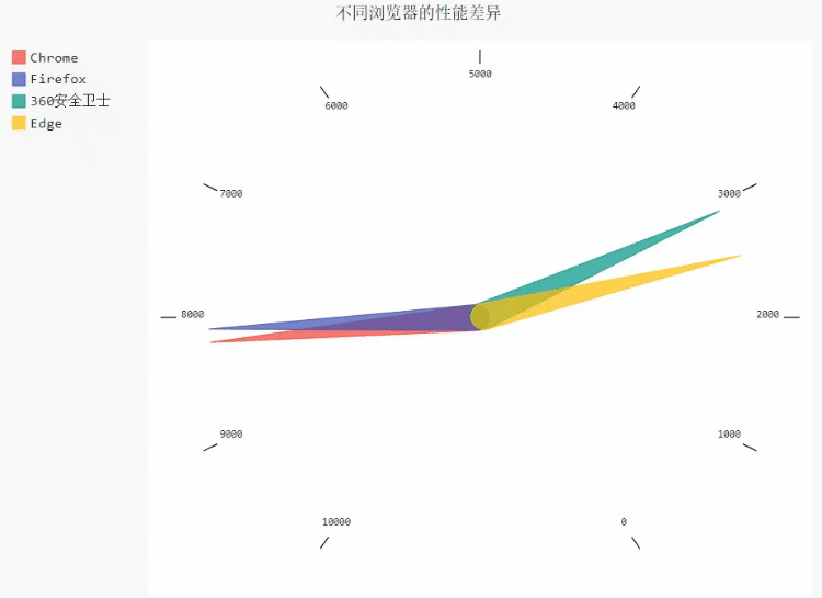
Dashboard
The dashboard can help us quantify the quality of indicators. The code is as follows
gauge_chart = pygal.Gauge(human_readable=True)
gauge_chart.title = 'Performance differences between different browsers'
gauge_chart.range = [0, 10000]
gauge_chart.add('Chrome', 8212)
gauge_chart.add('Firefox', 8099)
gauge_chart.add('360 Security guard', 2933)
gauge_chart.add('Edge', 2530)
gauge_chart.render_to_file('gauge_1.svg')
output
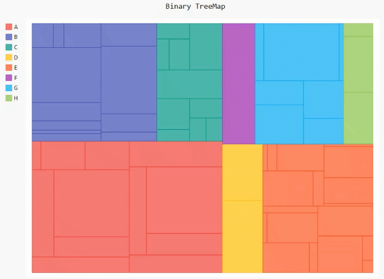
Thermodynamic diagram
The thermal map can more intuitively observe the data distribution in each area. The code is as follows
treemap = pygal.Treemap()
treemap.title = 'Binary TreeMap'
treemap.add('A', [12, 15, 12, 40, 2, 10, 10, 13, 12, 13, 40, None, 19])
treemap.add('B', [4, 2, 5, 10, 30, 4, 2, 7, 4, -10, None, 8, 30, 10])
treemap.add('C', [3, 8, 3, 3, 5, 15, 3, 5, 4, 12])
treemap.add('D', [23, 18])
treemap.add('E', [11, 2, 1, 12, 3, 13, 1, 2, 13,
      14, 3, 1, 2, 10, 1, 10, 12, 1])
treemap.add('F', [31])
treemap.add('G', [15, 9.3, 8.1, 12, 4, 34, 2])
treemap.add('H', [12, 13, 3])
treemap.render_in_browser()
output
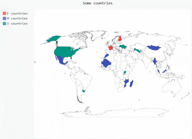
Map
First, let's look at the drawing of the world map. Before that, we have to download the plug-ins needed to draw the whole world map
pip install pygal_maps_world
The code is as follows
worldmap_chart = pygal.maps.world.World()
worldmap_chart.title = 'Some countries'
worldmap_chart.add('A countries', ['Abbreviation of country name'])
worldmap_chart.add('B countries', ['Abbreviation of country name'])
worldmap_chart.add('C countries', ['Abbreviation of country name'])
worldmap_chart.render_in_browser()
output
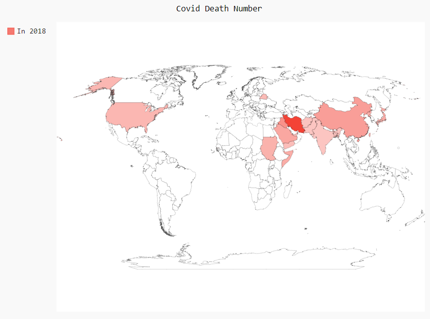
We can also draw maps according to the counts of different countries, such as the number of deaths from major diseases in different countries. The codes are as follows
worldmap_chart = pygal.maps.world.World()
worldmap_chart.title = 'Minimum deaths by capital punishement (source: Amnesty International)'
worldmap_chart.add('In 2012', {
  'Abbreviation of country name': quantity,
  'Abbreviation of country name': quantity,
  .....
})
worldmap_chart.render_in_browser()
output
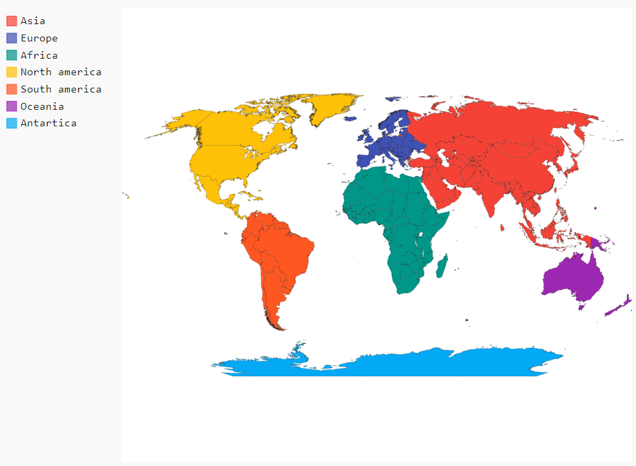
We can also draw a world map based on five continents. The code is as follows
worldmap_continent = pygal.maps.world.SupranationalWorld()
worldmap_continent.add('Asia', [('asia', 1)])
worldmap_continent.add('Europe', [('europe', 1)])
worldmap_continent.add('Africa', [('africa', 1)])
worldmap_continent.add('North america', [('north_america', 1)])
worldmap_continent.add('South america', [('south_america', 1)])
worldmap_continent.add('Oceania', [('oceania', 1)])
worldmap_continent.add('Antartica', [('antartica', 1)])
worldmap_continent.render_in_browser()
output
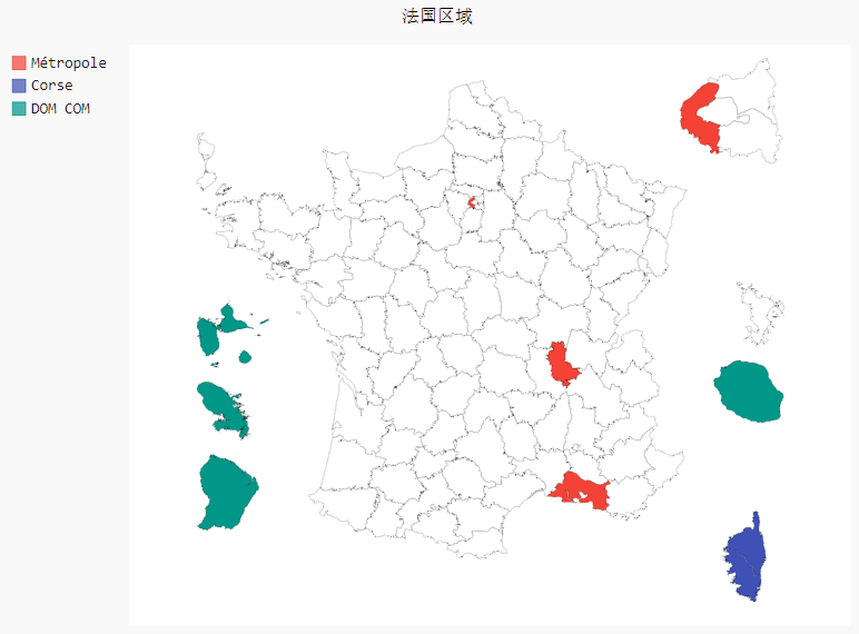
Of course, we can also draw a country as a map. For example, we take France as an example. First, we need to download the plug-in that we rely on to draw a map of a single country
pip install pygal_maps_fr
The code is as follows
fr_chart = pygal.maps.fr.Regions()
fr_chart.title = 'Regional map of France'
fr_chart.add('Area name', ['quantity'])
fr_chart.render_in_browser()
output
However, when it comes to drawing a map of a country, the number of countries supported is not large. Only France and Switzerland are listed on the official website. The plug-ins of other countries can be downloaded. Xiaobian tried to download them, but they can't be downloaded. Later, we'll wait for the official update and optimization.