float
The visual formatting model generally divides the arrangement of boxes in the page into three ways:
1. Conventional flow
2. Float
3. Positioning
Application scenario
- text wrapping
- Horizontal arrangement
For example, the menu bar of Baidu home page can be arranged horizontally by using row block box or floating.
However, there may be blank folding and other problems in the use of row block boxes, so floating is often used to realize horizontal arrangement. And floating has good compatibility. Many low version browsers can use floating.

Basic characteristics of floating
Modify the float attribute value to:
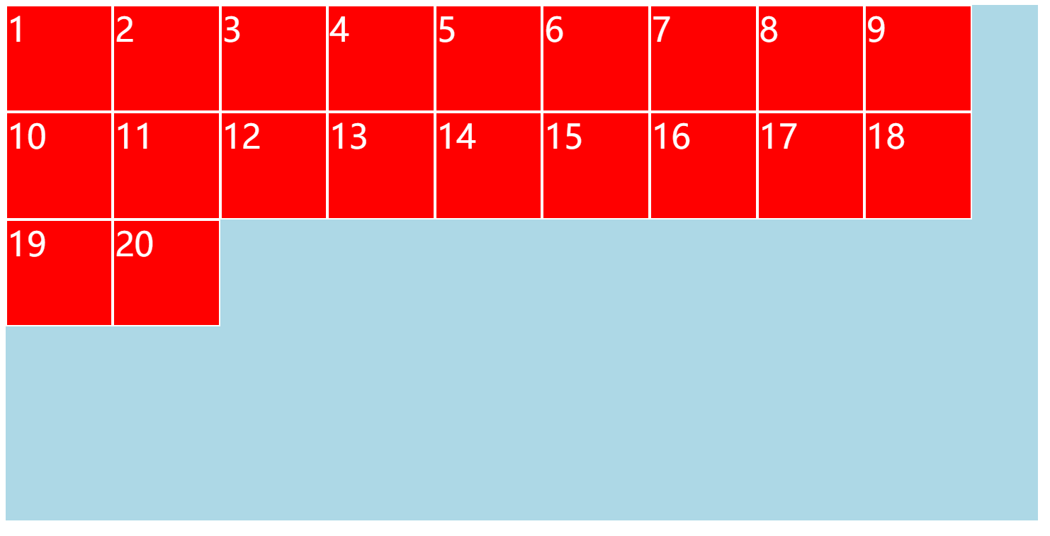
Left: float to the left, the element moves up to the left, float: left;
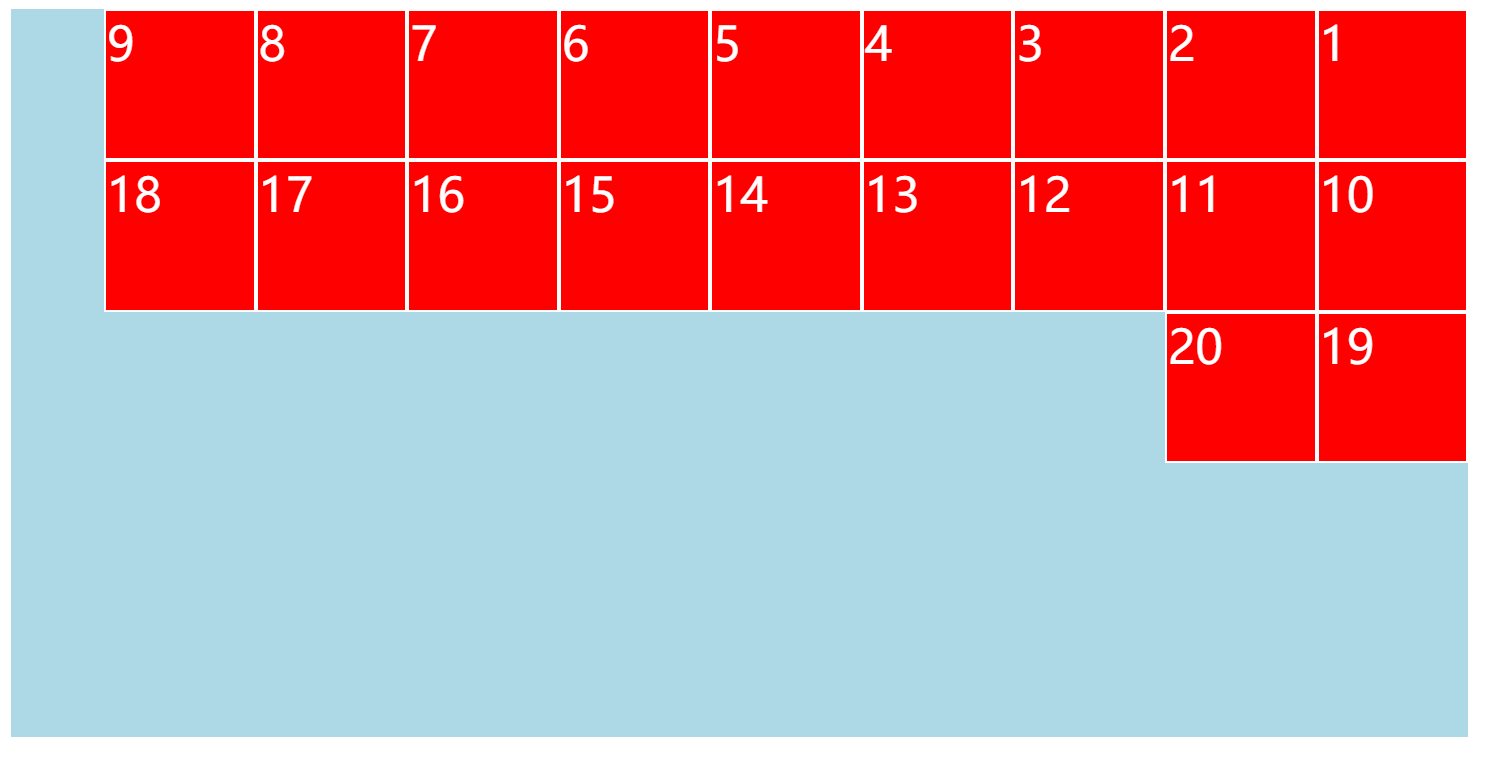
Right: right floating, element up and right, float: right;
The default value is none, that is, by default, the visual formatting model is a regular stream.
characteristic:
- When an element floats, it must be a block box (change the display attribute to block)
It should be noted here that the block box is an exclusive line in the regular stream, which is not the case in the floating, but the width adapts to the content.
- The containing block of a floating element, like a regular stream, is the content box of the parent element
Box size
1. When the width is auto, adapt to the content width
Therefore, the floating block box does not occupy a single line, but adjusts the width according to the amount of content.
The function of width auto in conventional flow is to absorb the remaining space.
2. When the height is auto, it is consistent with the conventional flow and adapt to the height of the content
3. When margin is auto, it is 0
Pay attention to distinguish the effect when margin is auto in the conventional flow. In the conventional flow, margin absorbs the remaining space in the horizontal direction of auto and 0 in the vertical direction.
4. The border, inner margin and percentage settings are consistent with the normal flow
Box arrangement
-
Left floating boxes are arranged on the top and left;

-
Right floating boxes are arranged on the top and right;

-
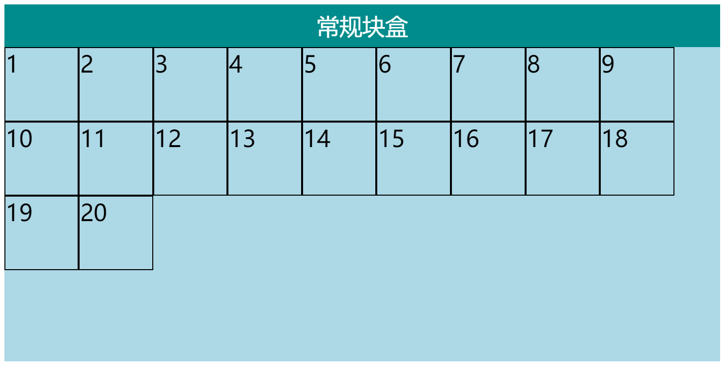
When the floating box is arranged in the containing block, it will avoid the conventional flow block box;

-
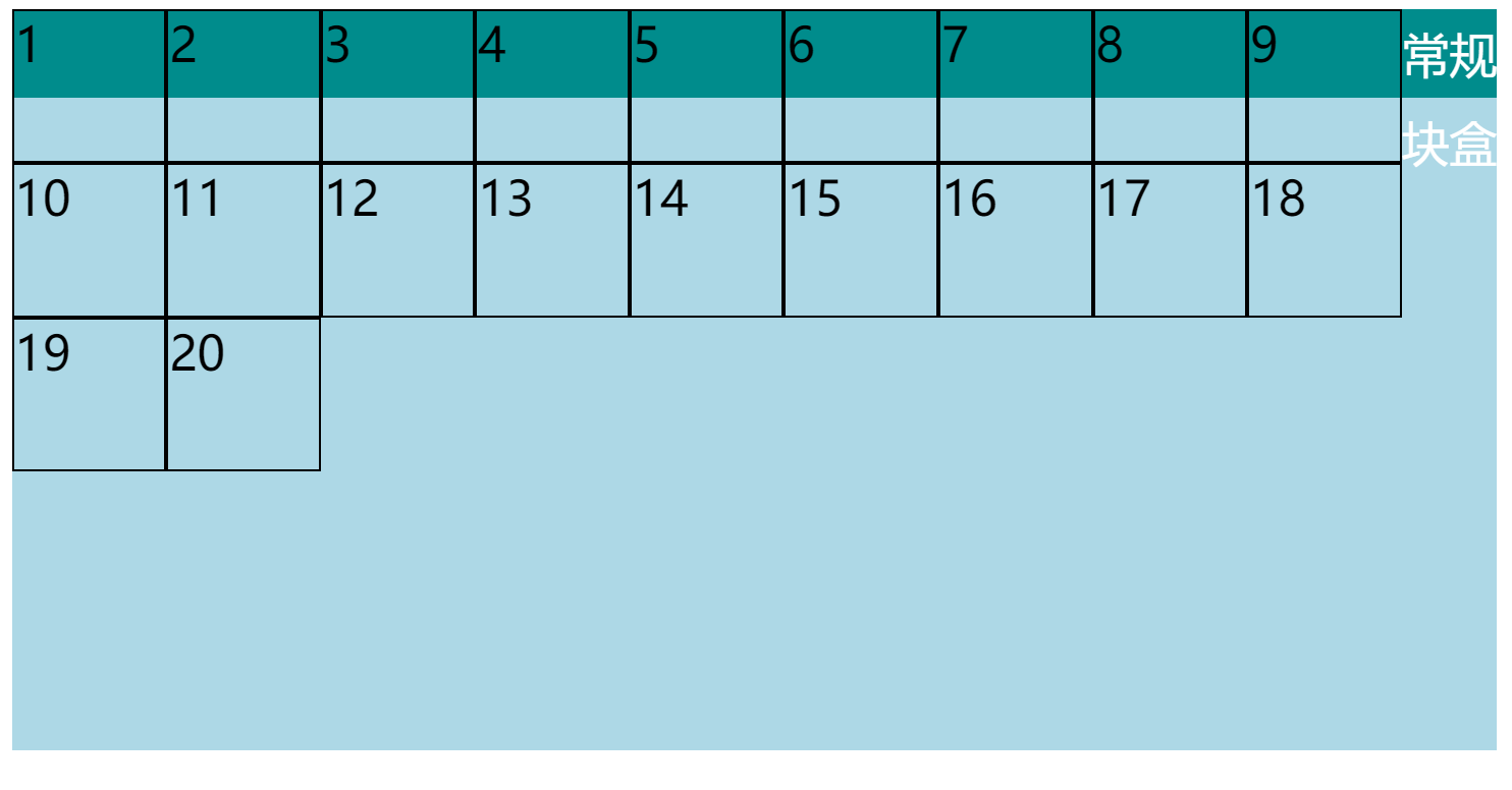
When the conventional flow block boxes are arranged, the floating box is ignored;

Although the position of the conventional flow block box here ignores the floating box, the text content is extruded. -
When the row boxes are arranged, they will avoid the floating box;
If the text is not in the line box, the browser will automatically generate a line box to wrap the text, which is called anonymous line box. This is also the reason why the characters in the figure in point 4 are squeezed out.
Use this point to make text wrapping effect:
<!DOCTYPE html>
<html lang="en">
<head>
    <meta charset="UTF-8">
    <meta http-equiv="X-UA-Compatible" content="IE=edge">
    <meta name="viewport" content="width=device-width, initial-scale=1.0">
    <title>Document</title>
</head>
<body>
    <div class="container">
        <img src="../../Picture material/HTML&CSS.jpg" alt="" style="width: 200px; float: left;">
        <p>
            Lorem ipsum, dolor sit amet consectetur adipisicing elit. Voluptates, autem. Mollitia vitae consectetur assumenda sequi excepturi, magnam doloribus hic officia aut rerum quibusdam enim est ut accusamus recusandae, laboriosam sit reprehenderit fugit velit ratione quam, possimus laudantium ducimus. Voluptatibus minima inventore at sit. Odit magni accusantium, accusamus quaerat earum expedita omnis eaque a modi autem neque explicabo. Corporis ratione tenetur deserunt. Dolor ratione beatae, atque molestias ea autem accusantium at, rerum ducimus velit maxime est aperiam nulla alias nobis architecto doloremque neque adipisci nam incidunt veritatis. Quam, quibusdam consequatur vero natus repudiandae tenetur voluptatem obcaecati pariatur similique, aperiam quod autem sunt corrupti velit repellat odit iste fugit quaerat ipsam! Ea est vitae qui vero nulla eos, modi sit corrupti expedita perferendis, aut blanditiis fugiat. Perferendis nisi fugit ducimus saepe mollitia unde officiis similique magnam dolorem perspiciatis. Natus laboriosam, praesentium beatae vel tenetur repellat dicta cupiditate eligendi in similique est odio culpa iusto hic provident assumenda molestias, perspiciatis placeat! Voluptates eaque ea, iusto commodi, dolorum esse et pariatur repellat fugit dolor architecto eveniet, reprehenderit quam quae. Quae incidunt dolore dignissimos nisi odio debitis sed, placeat neque labore mollitia at beatae adipisci, pariatur culpa aliquid itaque id inventore! Perferendis suscipit voluptas quo sapiente omnis repellendus quam, pariatur similique. Impedit laboriosam neque assumenda? Quibusdam, quis iste dolor quisquam vero ratione beatae cupiditate consequuntur maxime perspiciatis ex molestias aperiam tenetur veritatis possimus necessitatibus aut reprehenderit optio sint eius ipsam aspernatur illum odit unde. Cupiditate atque illo sed, dolorem fuga doloremque nostrum, fugiat commodi corrupti possimus nesciunt quam architecto, animi suscipit velit recusandae reprehenderit maiores! Non ab repudiandae quidem labore tempore debitis illo, aliquid corporis blanditiis possimus accusamus molestias facere laudantium iure sed dolorem tenetur neque doloribus quas temporibus nobis animi ut fuga! Excepturi eum natus praesentium esse eius est accusamus error. Voluptates, magni laborum?
        </p>
    </div>
</body>
</html>

Although the p element is a block box and its position ignores the img element as a floating box, its text content wraps the anonymous line box, so it will avoid the floating box.
High collapse
The root cause of height collapse: the automatic height of the conventional flow box will not be considered when calculating the floating box
Solution to high collapse: clear floating (involving css attribute: clear)
About the clear attribute:
- Default: none
- Left: to clear the left float, the element must appear below all previous left float boxes
- Right: to clear the right float, the element must appear below all previous right float boxes
- both: to clear the float, the element must appear below all previous float boxes