26. Polar map (Nightingale Rose)
27. Venn diagram
28. Area chart
29. Tree map
26. Polar map (Nightingale Rose)
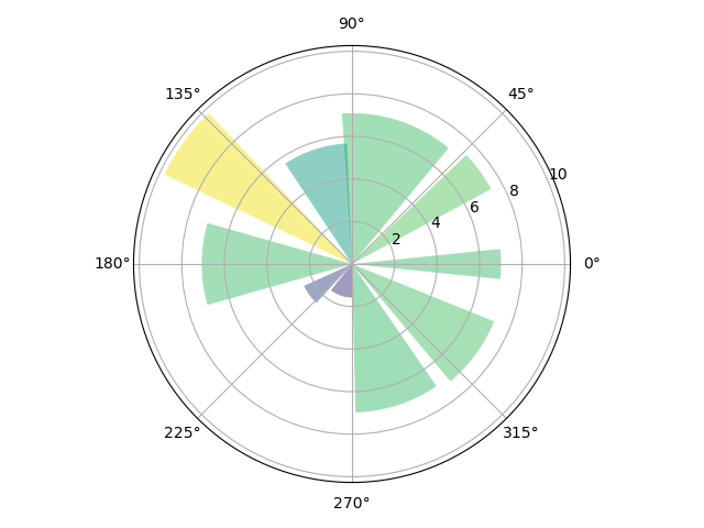
The polar map (also known as Nightingale Rose) is radially extended, and each piece will occupy a certain angle. Its radius represents the size of a certain type of data it represents. Its angle size indicates its proportion in the total category.
Nightingale rose, invented by Nightingale, is a British nurse and statistician. When working in the British barracks, he collected the mortality and cause distribution of soldiers during the Crimean War in different months, and effectively moved the senior managers at that time through the rose chart. Therefore, the proposal for medical improvement received strong support, reducing the mortality of soldiers from 42% to 2%. Therefore, this graph was later called Nightingale rose chart.
What scene is the Nightingale rose generally used in? In fact, Nightingale rose chart is similar to pie chart. It is a deformation of pie chart, and its usage is the same. It is mainly used in scenes that need to check the proportion. The only difference between the two is that the pie chart judges the proportion by angle, while the rose chart can judge by radius or sector area.
import numpy as np
import matplotlib.pyplot as plt

# Fixing random state for reproducibility
np.random.seed(19680801)

# Compute pie slices
N = 10
theta = np.linspace(0.0, 2 * np.pi, N, endpoint=False)
radii = 10 * np.random.rand(N)
width = np.pi / 4 * np.random.rand(N)
colors = plt.cm.viridis(radii / 10.)

ax = plt.subplot(111, projection='polar')
ax.bar(theta, radii, width=width, bottom=0.0, color=colors, alpha=0.5)

plt.show()
import matplotlib.pyplot as plt
import numpy as np

N = 7
'''Generate angle value'''
theta = np.arange(0.,2*np.pi,2*np.pi/N)
'''Generate radius value'''
radii = np.array([7,4,5,3,2,4,6])
'''Define shaft type'''
plt.axes([0.025,0.025,0.95,0.95],polar=True)
'''Define the color set, which is used here RGB Value, of course, you can also use color names'''
colors = np.array(['#4bb2c5','#c5b47f','#EAA228','#579575','#839557','#958c12','#953579'])
'''bar()The function requires an angle and radius to be passed in as parameters'''
bars = plt.bar(theta,radii,width=(2*np.pi/N),bottom=0.0,color=colors)
plt.show()

27. Venn diagram
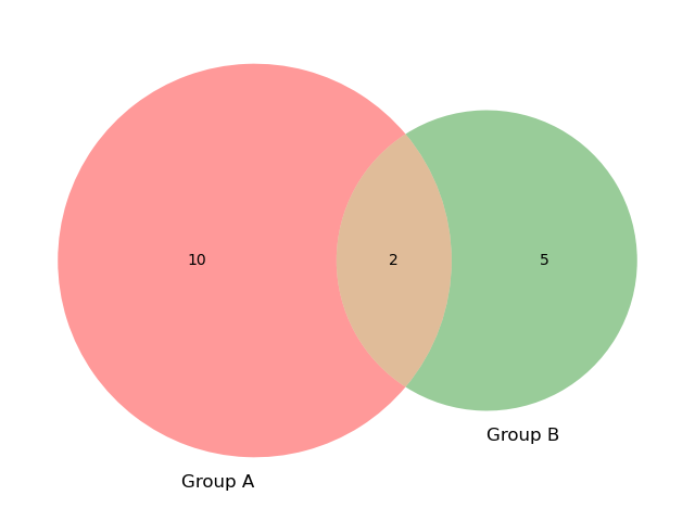
Venn diagram is a diagram showing the logical relationship (intersection, difference, Union) between sets.
Install Matplotlib Venn when using: PIP install Matplotlib Venn
import matplotlib.pyplot as plt
from matplotlib_venn import venn2

# First way to call the 2 group Venn diagram
venn2(subsets=(10, 5, 2), set_labels=('Group A', 'Group B'))
plt.show()
import matplotlib.pyplot as plt
from matplotlib_venn import venn2

# Second way
venn2([set(['A', 'B', 'C', 'D']), set(['D', 'E', 'F'])])
plt.show()

import pandas as pd
import numpy as np
import matplotlib.pyplot as plt
from matplotlib_venn import venn2

df = pd.DataFrame({'Product': ['Only cheese', 'Only red wine', 'Both'],
                   'NbClient': [900, 1200, 400]},
                  columns = ['Product', 'NbClient'])
print(df)
'''
Output result:
         Product  NbClient
0    Only cheese       900
1  Only red wine      1200
2           Both       400
'''

# First way
plt.figure(figsize=(8, 11))

v2 = venn2(subsets = {'10': df.loc[0, 'NbClient'],
                      '01': df.loc[1, 'NbClient'],
                      '11': df.loc[2, 'NbClient']},
           set_labels=('', ''))
v2.get_patch_by_id('10').set_color('yellow')
v2.get_patch_by_id('01').set_color('red')
v2.get_patch_by_id('11').set_color('orange')

v2.get_patch_by_id('10').set_edgecolor('none')
v2.get_patch_by_id('01').set_edgecolor('none')
v2.get_patch_by_id('11').set_edgecolor('none')

v2.get_label_by_id('10').set_text('%s\n%d\n(%.0f%%)' % (df.loc[0, 'Product'],
                                                        df.loc[0, 'NbClient'],
                                                        np.divide(df.loc[0, 'NbClient'],
                                                                  df.NbClient.sum())*100))

v2.get_label_by_id('01').set_text('%s\n%d\n(%.0f%%)' % (df.loc[1, 'Product'],
                                                        df.loc[1, 'NbClient'],
                                                        np.divide(df.loc[1, 'NbClient'],
                                                                  df.NbClient.sum())*100))

v2.get_label_by_id('11').set_text('%s\n%d\n(%.0f%%)' % (df.loc[2, 'Product'],
                                                        df.loc[2, 'NbClient'],
                                                        np.divide(df.loc[2, 'NbClient'],
                                                                  df.NbClient.sum())*100))
for text in v2.subset_labels:
    text.set_fontsize(12)

plt.show()
import pandas as pd
import numpy as np
import matplotlib.pyplot as plt
from matplotlib_venn import venn2

# Second way
grp1 = set(['cheese-a', 'cheese-b', 'cheese-c', 'cheese-d',
            'cheese-e', 'cheese-f', 'cheese-g', 'cheese-h',
            'cheese-i', 'cheese', 'red wine'])
grp2 = set(['red wine-a', 'red wine-b', 'red wine-c', 'red wine-d',
            'red wine-e', 'red wine-f', 'red wine-g', 'red wine-h',
            'red wine-i', 'red wine-j', 'red wine-k', 'red wine-l',
            'red wine', 'cheese'])

v2 = venn2([grp1, grp2], set_labels = ('', ''))

v2.get_patch_by_id('10').set_color('yellow')
v2.get_patch_by_id('01').set_color('red')
v2.get_patch_by_id('11').set_color('orange')

v2.get_patch_by_id('10').set_edgecolor('none')
v2.get_patch_by_id('01').set_edgecolor('none')
v2.get_patch_by_id('11').set_edgecolor('none')

v2.get_label_by_id('10').set_text('Only cheese\n(36%)')
v2.get_label_by_id('01').set_text('Only red wine\n(48%)')
v2.get_label_by_id('11').set_text('Both\n(16%)')

plt.show()

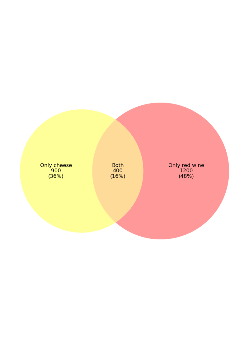
This Venn diagram can usually be used for the analysis of retail transactions. Suppose we need to study the popularity of cheese and red wine, and 2500 customers answered the questionnaire. According to the above figure, we found that among 2500 customers, 900 customers (36%) like cheese, 1200 customers (48%) like red wine, and 400 customers (16%) like both products.
import matplotlib.pyplot as plt
from matplotlib_venn import venn3
plt.figure(figsize=(12,12))
v3 = venn3(subsets = {'100':30, '010':30, '110':17,
'001':30, '101':17, '011':17, '111':5},
set_labels = ('', '', ''))
v3.get_patch_by_id('100').set_color('red')
v3.get_patch_by_id('010').set_color('yellow')
v3.get_patch_by_id('001').set_color('blue')
v3.get_patch_by_id('110').set_color('orange')
v3.get_patch_by_id('101').set_color('purple')
v3.get_patch_by_id('011').set_color('green')
v3.get_patch_by_id('111').set_color('grey')
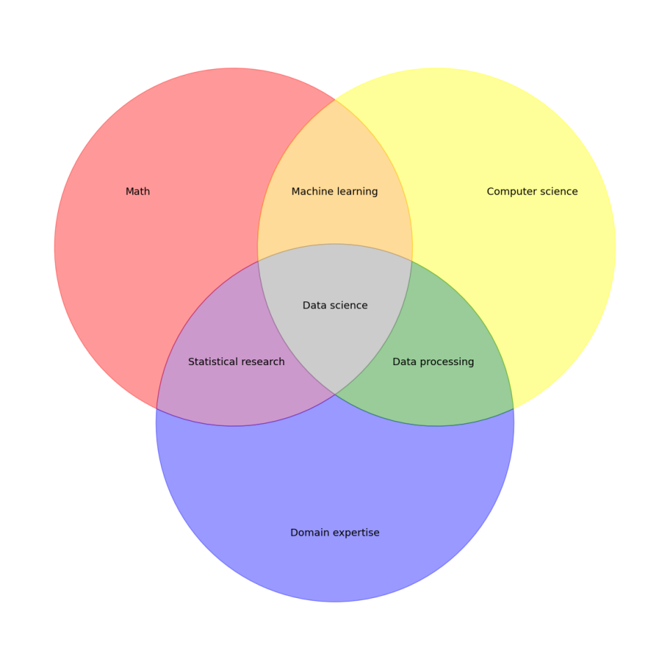
v3.get_label_by_id('100').set_text('Math')
v3.get_label_by_id('010').set_text('Computer science')
v3.get_label_by_id('001').set_text('Domain expertise')
v3.get_label_by_id('110').set_text('Machine learning')
v3.get_label_by_id('101').set_text('Statistical research')
v3.get_label_by_id('011').set_text('Data processing')
v3.get_label_by_id('111').set_text('Data science')
for text in v3.subset_labels:
text.set_fontsize(13)
plt.show()
28. Area chart
The area chart or area chart displays quantitative data graphically. It is based on a line graph. Areas between axes and lines are usually highlighted with colors, textures, and hatches.
It can be used to display or compare quantitative progress over time.
import numpy as np
import matplotlib.pyplot as plt

plt.figure(figsize=(6, 4))

turnover = [2, 7, 14, 17, 20, 27, 30, 38, 25, 18, 6, 1]
plt.fill_between(np.arange(12), turnover, color="skyblue", alpha=0.4)
plt.plot(np.arange(12), turnover, color="Slateblue", alpha=0.6, linewidth=2)

plt.tick_params(labelsize=12)
plt.xticks(np.arange(12), np.arange(1,13))
plt.xlabel('Month', size=12)
plt.ylabel('Turnover (K dollars) of ice-cream', size=12)
plt.ylim(bottom=0)

plt.show()

Suppose the figure above describes the turnover of ice cream sales in one year. According to the figure, it is clear that sales peak in summer and then decline from autumn to winter.
Example 2:
import numpy as np
import matplotlib.pyplot as plt

plt.figure(figsize=(9, 6))

year_n_1 = [1.5, 3, 10, 13, 22, 36, 30, 33, 24.5, 15, 6.5, 1.2]
year_n = [2, 7, 14, 17, 20, 27, 30, 38, 25, 18, 6, 1]

plt.fill_between(np.arange(12), year_n_1, color="lightpink", alpha=0.5, label='year N-1')
plt.fill_between(np.arange(12), year_n, color="skyblue", alpha=0.5, label='year N')

plt.tick_params(labelsize=12)
plt.xticks(np.arange(12), np.arange(1,13))
plt.xlabel('Month', size=12)
plt.ylabel('Turnover (K dollars) of ice-cream', size=12)
plt.ylim(bottom=0)
plt.legend()

plt.show()

29. Tree map
A tree map displays hierarchical (tree structured) data as a set of nested rectangles. Each branch of the tree has a rectangle, which is then tiled with smaller rectangles representing sub branches. The area of the rectangle of the leaf node is proportional to the specified size of the data. Typically, leaf nodes are shaded to show individual dimensions of the data.
The idea of tree map is represented by the area of the box. The larger the area, the larger the value it represents, and vice versa.
Install square when using: PIP install square
(base) C:\Users\toto>pip install squarify
Collecting squarify
  Downloading squarify-0.4.3-py3-none-any.whl (4.3 kB)
Installing collected packages: squarify
Successfully installed squarify-0.4.3

(base) C:\Users\toto>
Function syntax and parameters:
squarify.plot(sizes,
            norm_x=100,
            norm_y=100,
            color=None,
            label=None,
            value=None,
            alpha,
            **kwargs)
sizes: specify the value corresponding to each level of discrete variable, that is, reflect the area size of tree map sub block;
norm_x: By default, the range of x-axis is limited to 0-100;
norm_y: By default, the range of y-axis is limited to 0-100;
color: customize the filling color of tree map sub blocks;
label: assign a label to each sub block;
value: add a label of value size for each sub block;
• alpha: sets the transparency of the fill color;
kwargs: keyword parameter, which is similar to the keyword parameter of bar chart, such as setting border color, border thickness, etc.
import matplotlib.pyplot as plt
import squarify

# Chinese and minus sign processing method
plt.rcParams['font.sans-serif'] = 'Microsoft YaHei'
# plt.rcParams['axes.unicode_minus'] = False

# Data creation
name = ['Shanghai GDP', 'Beijing GDP', 'Shenzhen GDP', 'Guangzhou GDP',
        'Chongqing GDP', 'Suzhou GDP', 'Chengdu GDP', 'Wuhan GDP',
        'Hangzhou GDP', 'Tianjin GDP', 'Nanjing GDP', 'Changsha GDP',
        'Ningbo GDP', 'Wuxi GDP', 'Qingdao GDP', 'Zhengzhou GDP',
        'Foshan GDP', 'Quanzhou GDP', 'Dongguan GDP', 'Jinan GDP']
income = [38155, 35371, 26927, 23628, 23605, 19235, 17012, 16900, 15373, 14104,
          14030, 12580, 11985, 11852, 11741, 11380, 10751, 9946, 9482, 9443]

# Drawing details
colors = ['steelblue', '#9999ff', 'red', 'indianred', 'deepskyblue', 'lime', 'magenta', 'violet', 'peru', 'green',
          'yellow', 'orange', 'tomato', 'lawngreen', 'cyan', 'darkcyan', 'dodgerblue', 'teal', 'tan', 'royalblue']
plot = squarify.plot(sizes=income,  # Specify drawing data
                     label=name,  # Specify label
                     color=colors,  # Specify custom colors
                     alpha=0.6,  # Specify transparency
                     value=income,  # Add value label
                     edgecolor='white',  # Set the bounding box to white
                     linewidth=3  # Set the border width to 3
                     )
# Set the label size to 10
plt.rc('font', size=10)
# Set title and font size
plot.set_title('2019 Year city GDP Top 20(RMB100mn)', fontdict={'fontsize': 15})
# Remove axis
plt.axis('off')
# Scale except top and right borders
plt.tick_params(top='off', right='off')
# Graphic display
plt.show()
