
HMTL + CSS
1. Advantages of div + CSS layout
- The code is simplified, the structure is separated from the style, and it is easy to maintain
- The amount of code is reduced, a large amount of bandwidth is reduced, the page loads faster, and the user experience is improved
- It is more friendly to SEO search engine, and H5 has added many semantic tags
- Allow more cool page effects and enrich the page
- Comply with W3C standards to ensure that the website will not be eliminated due to the upgrading of network applications
Disadvantages: different browsers have different default values for web standards, so it is easier to have compatibility problems with browsers.
2. Semantic HTML tags
2.1 introduction to the semantic background of HTML
Semantic HTML structure was proposed only in recent years. The previous HTML structure was a pile of div+css as soon as it was opened. In order to change this situation, developers and officials put forward the concept of semantic HTML structure, and officials also gave several new semantic tags in HTML5.
2.2 what is semantic and what effect will the document have after semantic
-
Semantic means that the HTML structure you write is represented by corresponding tags with certain semantics, because HTML itself is a markup language. Not only for myself, it is easy to read and write. It's easy for others to understand your code and structure, even for people who don't do web development. In the process of development, try to use official semantic tags instead of a pile of meaningless tags to stack structures.
-
How to know whether your page structure is semantic depends on your HTML structure. After removing the CSS style sheet, whether you can still present the content structure and code structure well. In other words, when you take off the CSS coat, the head is still the head and the feet are the feet. A naked and complete document. This is the effect of semantic documents.
-
In fact, Semantization is nothing more than using English semantic tags when using tags, such as h tag, which is used to define titles in HTML, p tag represents paragraphs, table tag and so on.
2.3 why semantic
-
In order to present a good content structure and code structure without CSS
-
User experience: for example, title and alt are used to explain nouns or explain picture information. Try to fill in meaningful words and flexible use of label labels
-
Conducive to SEO: establish good communication with search engines and help crawlers capture more effective information: crawlers rely on tags to determine the context and the weight of each keyword
-
Facilitate other devices such as screen readers, blind readers and mobile devices to render web pages in a meaningful way
-
It is convenient for team development and maintenance, and the semantics is more readable. Teams that follow the W3C standard follow this standard, which can reduce differentiation
2.4 what should I pay attention to when writing HTML code
-
Use as few non semantic tags div and span as possible
-
When the semantics is not obvious, when div or P can be used, try to use p, because P has up-down spacing by default, which is beneficial to compatibility with special terminals
-
Do not use pure style labels, such as b, font, u, etc. use css settings instead
-
Text that needs to be emphasized can be included in strong or em tags. The default style of strong is bold (don't use b) and EM is italic (don't use i)< b> It is bold for the sake of bold, < strong > is enhanced, which indicates that the text is important and prompts the terminal. In order to achieve this purpose, browsers and other terminals will bold it.
-
When using a table, the title should be caption, the header should be thead, the main part should be surrounded by tbody, and the tail should be surrounded by tfoot. The header and general cells should be distinguished. The header uses th and the cell uses td
-
The form fields should be wrapped with a fieldset tag, and the purpose of the form should be described with a legend tag
-
The description text corresponding to each input tag needs to use the label tag, and the description text is associated with the corresponding input by setting the id attribute for input and setting for = some in the label tag
-
Not only when writing html structures, we should use semantic tags, but also when writing css class names for elements, we should also follow the semantic principle. Don't use a name casually. In that way, it will be very difficult to read when refactoring later. The most taboo is that you can't speak English and use Chinese Pinyin instead.
2.5 what semantic tags are added to HTML5
header,footer,nav,aside,article,video,audio,canvas
3. What are the inline / block level elements
In line elements: adjacent in line elements will be arranged in the same line and will not monopolize one line. Setting width and height is invalid: a br I em img input select span sub sup u textarea
Block level element: it can monopolize a row and set width and height attributes: div h1-h6 hr p ul ol table address blockquote dir from menu
Variable element: determines whether the element is a block element or an inline element according to the context alert. Block level element: button del iframe ins
4. CSS selector and priority
- !important
- Inline style (1000)
- ID selector (0100)
- Class selector / property selector / pseudo class selector (0010)
- Label selector / pseudo element selector (0001)
- Relationship selector / wildcard selector (0000)
5. How does the browser parse CSS selectors
CSS selectors are read from right to left.
.mod-nav h3 span {font-size: 16px;}
The reading order is as follows: find all spans first, find h3 along the parent element of the span, and add the nodes that meet the matching rules to the result set in the middle; If there is no match until the root element html, the path will not be traversed, and the process will be repeated from the next span (if multiple rightmost nodes are span).
6. The difference between link and @ import
-
Subordination
- Link: link is a tag provided by HTML. It can not only load CSS, but also define properties such as rel
- @Import: @ import is the syntax provided by css. It is only used to import style sheets
-
Loading order
- Link: link when the page is loaded, the CSS is loaded at the same time
- @import: the imported CSS should be loaded after the page is loaded
-
Compatibility issues
- link is the syntax provided by HTML, and there is no compatibility problem
- @import is the syntax provided by css2.1, which is compatible with ie5 and above
-
DOM controllability
- When js controls the DOM, you can change the style by inserting the link tag, not @ import
link is recommended. Use @ import with caution
The excess of CSS text ends with an ellipsis
When there is only one line of text
overflow: hidden;
text-overflow: ellipsis;
white-space: nowrap;
Specify multiline text
overflow: hidden;
/* Display the object as an elastic box model; */
display: -webkit-box;
/* The overflow part is replaced by an ellipsis *//* autoprefixer: off */
text-overflow: ellipsis;
/* Set the text to display two lines */
-webkit-line-clamp: 2;
/* List the sub elements from top to bottom; */
-webkit-box-orient: vertical;
7. BFC
7.1 what is BFC
The full name of BFC is Block Formatting Context. BFC is a concept in W3C CSS 2.1 specification. It determines how elements locate their content and their relationship and interaction with other elements. When it comes to visual layout, Block Formatting Context provides an environment in which HTML elements are laid out according to certain rules. Elements in one environment do not affect the layout in other environments. For example, a floating element will form a BFC. The internal sub elements of a floating element are mainly affected by the floating element, and the two floating elements do not affect each other. A bit like a BFC means an independent administrative unit. It can be said that BFC is a scope of action. It is understood as an independent container, and the layout of boxes in this container has nothing to do with boxes outside this container.
7.2 what are the conditions for BFC triggering
- The root element or other element that contains it
- Floating element (element's float is not none)
- Absolute positioning element (element with position of absolute or fixed)
- Elastic box (flex or inline Flex)
- Inline block (element with display: inline block)
- Table cell (element with display: table cell)
- Table title (element with display: table caption)
- Block element with overflow and value not visible
7.3 layout rules of BFC
-
The inner boxes will be arranged one by one in the vertical direction (which can be regarded as a conventional flow with one in the BFC)
-
The elements in the same BFC interact with each other, and the outer margin overlap may occur
-
The left side of the margin box of each element contacts the left side of the container block border box (for formatting from left to right, otherwise the opposite), even if there is a float
-
BFC is an isolated independent container on the page. The child elements in the container will not affect the external elements, and vice versa
-
When calculating the height of BFC, all elements contained in BFC shall be considered, including floating elements
-
The floating box area is not superimposed on the BFC
7.4 problems that can be solved by BFC
- Prevent margin overlap
- Clear internal float
- Self applicable two column layout (float + overflow)
- Prevent font wrapping
7.5 code example demonstration
<style>
  div {
    width: 100px;
    height: 100px;
    background-color: aqua;
    margin: 100px;
  }
</style>

<body>
  <div></div>
  <div></div>
</body>
<!--
	Because two div All elements are in the same BFC Under container (Here refers to body element) So the first one div Bottom margin and second div The top edge of the box overlaps, so the distance between the two boxes is only 100 px,Not 200 px.
-->
<style>
  .container {
    overflow: hidden;
  }
  p {
    width: 100px;
    height: 100px;
    background: aqua;
    margin: 100px;
  }
</style>

<div class="container">
  <p></p>
</div>
<div class="container">
  <p></p>
</div>
<!--
	If you want to avoid overlapping outer margins, you can put them in different places BFC In the container.
-->
[the external chain image transfer fails. The source station may have an anti-theft chain mechanism. It is recommended to save the image and upload it directly (img-svr6uml0-163348219973) (C: \ users \ Dell \ appdata \ roaming \ typora user images \ image-20210410200423783. PNG)]
<div style="border: 1px solid #000;">
  <div style="width: 100px;height: 100px;background: #eee;float: left;"></div>
</div>
<!--
Because the elements in the container float away from the document flow, there are only 2 left in the container px The margin height of the.
-->
<div style="border: 1px solid #000;overflow: hidden;">
    <div style="width: 100px;height: 100px;background: #eee;float: left;"></div>
</div>
<!--
If the trigger container BFC,Then the container will be wrapped with floating elements.
-->
[the external chain image transfer fails. The source station may have an anti-theft chain mechanism. It is recommended to save the image and upload it directly (img-ssio5fmc-163348219976) (C: \ users \ Dell \ appdata \ roaming \ typora \ typora user images \ image-20210410200626846. PNG)]
[the external chain image transfer fails. The source station may have an anti-theft chain mechanism. It is recommended to save the image and upload it directly (img-4ru6nqhq-163348219978) (C: \ users \ Dell \ appdata \ roaming \ typora user images \ image-20210410200718428. PNG)]
<div style="height: 100px;width: 100px;float: left;background: lightblue">I am a left floating element</div>
  <div style="width: 200px; height: 200px;background: #EEE "> I am a floating without setting,
    No trigger BFC element, width: 200px; height:200px; background: #eee;</div>
<!--
	The second element is partially covered by floating elements,(However, text information is not overwritten by floating elements) If you want to avoid an element being overwritten, touch the of the second element BFC Property, add in the second element overflow: hidden,
-->
<div style="height: 100px;width: 100px;float: left;background: lightblue">I am a left floating element</div>
  <div style="width: 200px; height: 200px;background: #EEE; overflow: hidden;; "> I don't set floating,
    No trigger BFC element, width: 200px; height:200px; background: #eee;</div>
[the external chain image transfer fails. The source station may have an anti-theft chain mechanism. It is recommended to save the image and upload it directly (img-erfrwgjf-163348219980) (C: \ users \ Dell \ appdata \ roaming \ typora user images \ image-20210410200847925. PNG)]
8. Box model
It includes content area, inner margin area, border area and outer margin area.
Box sizing: content box (W3C box model): the width and height of an element is expressed as the size of the content.
Box sizing: border box (IE box model): the width and height of an element is expressed as the size of content + inner margin + border. The background extends to the outer edge of the border.
IE5.x and IE6 use non-standard box models in weird mode. The width attribute of these browsers is not the width of the content, but the sum of the width of the content, inner margin and border.
9. How to realize left column fixed width and right column adaptive
DOM structure
<div class="box">
  <div class="box-left"></div>
  <div class="box-right"></div>
</div>
9.1 using float + margin
.box {
 height: 200px;
}

.box > div {
  height: 100%;
}

.box-left {
  width: 200px;
  background-color: blue;
  float: left;
}

.box-right {
  margin-left: 200px;
  background-color: red;
}
9.2 calculate width by calc
.box {
 height: 200px;
}

.box > div {
  height: 100%;
}

.box-left {
  width: 200px;
  background-color: blue;
  float: left;
}

.box-right {
  background-color: red;
  width: calc(100% - 200px);
  float: right;
}
9.3 using float + overflow
.box {
 height: 200px;
}

.box > div {
  height: 100%;
}

.box-left {
  width: 200px;
  float: left;
  background-color: blue;
}

.box-right {
  overflow: hidden;
  background-color: red;
}
9.4 implementation with flex
.box {
  height: 200px;
  display: flex;
}

.box > div {
  height: 100%;
}

.box-left {
  width: 200px;
  background-color: blue;
}

.box-right {
  flex-grow: 1;
  overflow: hidden;
  background-color: red;
}
10. Centering
10.1 horizontal centering
The parent element is a block level element and the child element is an inline element. Set text align: Center for its parent element
.father {
  width: 200px;
  height: 200px;
  background-color: antiquewhite;
  text-align: center;
}
.son {
  width: 50%;
  height: 50%;
  background-color: aqua;
}

<div class="father">
  <span class="son">son</span>
</div>
The child element is a block level element that sets margin:0 auto. Or the parent element is flex layout, and the child element is set to margin:0 auto
.son {
  margin: 0 auto;
}

<div class="son">son</div>
Use the flex layout to set the justify content: Center of the parent element
.father {
  display: flex;
  justify-content: center;
}
Use absolute positioning and CSS3 new attribute transform
.father {
  position: relative;
}
.son {
  position: absolute;
  left: 50%;
  transform: translate(-50%, 0);
}
Use absolute positioning and margin left (element width)
.father {
  position: relative;
}
.son {
  width: 100px;
  position: absolute;
  left: 50%;
  margin-left: -50px;
}
**When the child element has an indefinite width, set display to inline block, and the parent element to text align: Center**
.father {
  width: 200px;
  height: 200px;
  background-color: antiquewhite;
  text-align: center;
}
.son {
  background-color: aqua;
  display: inline-block;
}

<div class="father">
  <span class="son">son</span>
</div>
10.2 vertical centering
If the element is a single line of text, you can set line height equal to the height of the parent element
.son {
  line-height: 200px;
}

<span class="son">box-center</span>
For block level elements, set the parent element as flex layout and the child element as margin: auto 0 (the child element does not need fixed width)
.box {
  display: flex;
}
.box-center {
  margin: auto 0;
}

<div class="box-center">box-center</div>
Multiline inline elements
.father {
  width: 200px;
  height: 200px;
  line-height: 200px;
  background-color: aquamarine;
}

.son {
  display: inline-block;
  line-height: 1em;
  vertical-align: middle;
}

<div class="father">
  <span class="son">
    Here is the multiline text in the label with a height of 150 pixels. The text size is
  </span>
</div>
Flex layout
.father {
  display: flex;
  align-items: center;
}
You can use transform to set the relative positioning of parent elements
.box {
  position: relative;
}
.box-center {
  position: absolute;
  top: 50%;
  transform: translate(0, -50%);
}
Center element height fixed: position: absolute + margin
.box {
  position: relative;
}
.box-center {
  height: 100px;
  position: absolute;
  top: 50%;
  margin-top: -50px;
}
.box {
  position: relative;
}
.box-center {
  height: 100px;
  position: absolute;
  top: 0;
  bottom: 0;
  margin: auto 0;
}
10.3 horizontal and vertical centering
Premise: fixed width and height
.box {
  width: 200px;
  height: 200px;
  border: 1px solid red;
  position: relative;
}

.children-box {
  width: 100px;
  height: 100px;
  background: yellow;
}
1. Absolute positioning and negative magin value
position: absolute;
left: 50%;
top: 50%;
margin-left: -50px;
margin-top: -50px;
2. Absolute positioning + transform
position: absolute;
left: 50%;
top: 50%;
transform: translate(-50%, -50%);
3. Absolute positioning + left/right/bottom/top + margin
position: absolute;
top: 0;
left: 0;
right: 0;
bottom: 0;
margin: auto;
4. Set flex layout for parent element
display: flex;
justify-content: center;
align-items: center;
5. grid layout
display: grid;
//
margin: auto;
6. table-cell + vertical-align + inline-block/margin: auto
display: table-cell;
text-align: center;
vertical-align: middle;
//
margin: auto;
Premise: variable width and height
1. Absolute positioning + transform
position: absolute;
left: 50%;
top: 50%;
transform: translate(-50%, -50%);
2. table-cell
display: table-cell;
text-align: center;
vertical-align: middle;
//
display: inline-block;
3. flex layout
display: flex;
justify-content: center;
align-items: center;
4. flex layout
display: flex;
//
margin: auto;
5. grid + flex layout
display: grid;
//
align-self: center;
justify-self: center;
6. gird + margin layout
display: grid;
//
margin: auto;
11. Difference between pseudo class and pseudo element
Pseudo class is used to add corresponding styles to existing elements when they are in a certain state. This state changes dynamically according to user behavior. For example, when a user hovers over a specified element, we can use: hover to describe the state of the element. Although it is similar to ordinary css classes and can add styles to existing elements, it can only add styles to elements when it is in a state that the dom tree cannot describe, so it is called pseudo class.
Pseudo elements are used to create elements that are not in the document tree and add styles to them. For example, we can use: before to add some text in front of an element and add styles to these text. Although the user can see the text, it is not actually in the document tree.
11.1 differences
The operation object of the pseudo class is an existing element in the document tree, and the pseudo element creates an element outside the document tree. Therefore, the difference between pseudo class and pseudo element is whether an element outside the document tree is created.
The CSS3 specification requires that pseudo elements be represented by double colons (::) to distinguish between pseudo elements and pseudo classes. For example, pseudo elements such as:: before and:: after use double colons (: 😃,: Pseudo classes such as hover and: active use a single colon( 😃. Except for some browsers lower than IE8, most browsers support the double colon (::) representation of pseudo elements.
12. position
static
The default. An element whose location is set to static will always be in the location given by the document flow
inherit
Specifies that the value of the position attribute should be inherited from the parent element, which is not supported by IE.
fixed
Generate fixed positioning. By default, it can be positioned at the specified coordinates relative to the browser window. The position of the element is specified by the left, top, right and bottom attributes. The element will remain at that position whether the window scrolls or not. However, when the ancestor element has the transform attribute and is not none, the coordinates relative to the ancestor element will be specified instead of the browser window.
absolute
Generate absolute positioning. Positioning is performed relative to the positioned parent element closest to the element. The position of this element can be specified through the left, top, right and bottom attributes. Once absolute or float is added to the element, it is equivalent to adding display:block to the element. Absolute element overwrites the elements in the normal document flow (z-index is not set, which is naturally overwritten) . you can reduce the overhead of redrawing and reflow (such as absolute + top:-9999em, or absolute + visibility:hidden, and put the animation effect into the absolute element)
relative
Generate relative positioning. Position the element relative to its initial position in the document. Set the offset of this element relative to its position through the left, top, right and bottom properties.
sticky
Sticky positioning can be considered as a mixture of relative positioning and fixed positioning. Elements are relative positioning before crossing a specific threshold and then fixed positioning. One of the four thresholds top, right, bottom and left must be specified to make sticky positioning effective. Otherwise, its behavior is the same as relative positioning.
#one {
    position: sticky;
    top: 10px;
}
The element is positioned relative until the viewport scrolls to an element whose top distance is less than 10px. Then, the element is fixed at a distance of 10px from the top until the viewport rolls back below the threshold.
Floating, absolute positioning and fixed positioning will be separated from the document flow, and relative positioning will not be separated from the document flow. Absolute positioning is relative to the nearest positioned ancestor element of the element. If there is no ancestor element to set positioning, the reference is the body layer.
-
Absolute positioning relative to the starting position of the containing block:
- If the ancestor element is a block level element, the containing block is set as the inner margin boundary of the element.
- If the ancestor element is an inline element and contains a block, it is set as the content boundary of the ancestor element.
-
The starting position of the positioning element is the inner margin of the parent containing block (not in the border, but in the padding unless a negative value is used)
-
The margin of the positioning element still works
-
The background attribute will be displayed in the border
-
z-index has a cascading hierarchy, and the cascading priority of the same cascading context needs to be considered
-
If z-index is negative, the background color of the containing block will not be overwritten (but if there is content, it will be overwritten by the content of the containing block)
-
The elements affected by the value of z-index are positioning elements and flex boxes
-
The upper positioning element and the lower normal flow element will overwrite the normal flow element unless the z-index is given a negative value
-
Page root element html naturally has a cascading context, which is called "root cascading context"
13. Front end SEO optimization
13.1 what is SEO
SEO, that is, search engine optimization. SEO comes with the emergence of search engines, and the two are mutually beneficial and symbiotic. The existence of SEO is the optimization behavior to improve the number and ranking position of web pages in the natural search results of search engines. The purpose of optimization is to improve the weight of websites in search engines and increase their influence on search engines Friendliness, so that users can rank first when visiting the website.
Classification: white hat SEO and black hat SEO. White hat SEO plays a role in improving and standardizing website design, making the website more friendly to search engines and users, and the website can also obtain reasonable traffic from search engines, which is encouraged and supported by search engines. Black hat SEO makes use of and amplifies the defects of search engine policies to obtain more user visits. Most of these behaviors are Cheating search engines is generally not supported and encouraged by search engine companies.
13.2 front end SEO specification
- Website structure layout optimization: try to be simple and straightforward, and advocate flat structure. Generally, the directory structure of small and medium-sized websites exceeds three levels, and "spiders" are unwilling to climb down
- Control the number of home page links
- Flat directory hierarchy
- Navigation optimization
- Pay attention to the structure and layout of the website
- Use the layout to put the important content HTML code first, and the search engine grabs the HTML content from top to bottom
- Control the page size, reduce http requests and improve the loading speed of the website
- Web page code optimization
- Highlight the important content - reasonable design of title, description and keywords
- Semantic writing of HTML code, in line with W3C standards
- Label: the "title" attribute should be added to describe the links in the page, so that visitors and "spiders" can know. For external links that link to other websites, el = "nofollow" attribute should be added to tell "spiders" not to climb, because once "spiders" climb the external links, they will not come back.
- For the use of h tag, h1 tag can only appear once. It is the main title of the current page and has the strongest attraction to spiders.
- The use of strongtags. The emphasis of strong tags on keywords is second only to h tags. They are used to bold paragraph titles or key keywords.
- < title > website SEO Title < / Title >, < meta name = "description" content = "website description" / > and < meta name = "Keywords" content = "website keywords /" >, which are the focus of SEO.
- < a href = "link address" title = "link description" > link keyword < / a >, the rich hyperlinks in the station will facilitate spiders to crawl and reflect the depth and breadth of the website, which is very important in SEO.
- < img SRC = "picture link address" alt = "picture description" / >, which is for the pictures in the web page. Of course, it can also be written as < img SRC = "picture link address" title = "picture description" / >.
- < div id = "copyright" > copyright section plus website name and link < / div >.
- Don't use js to output important content, because "spider" can't read the content in JS, so important content must be put in HTML.
- Use the iframe framework as little as possible, because "spiders" generally don't read the contents.
- Use display:none with caution. For text content that you do not want to display, you should set z-index or indent to a negative number large enough to deviate from the browser. Because the search engine will filter out the contents of display:none.
14. How to calculate the first screen and white screen time?
15. Flex layout
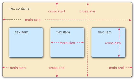
Flex layout can easily, completely and responsively realize various page layouts. Flex means "elastic layout" and is used to provide maximum flexibility for box models. Any container can be specified as a flex layout. After the parent element is set to flex layout, the float, clear and vertical align attributes of the child element will become invalid.
15.1 Flex compatibility
IE6~9 does not support it. IE10~11 supports the 2012 version of flex, but requires the - ms prefix. Other mainstream browsers, including Android and IOS, basically support it.
15.2 basic concepts
Elements with Flex layout are called Flex containers, or "containers" for short. All its child elements automatically become container members, called Flex items, or "projects".
By default, the container has two axes: the horizontal main axis and the vertical cross axis.
15.3 container properties
Flex direction: determines the direction of the spindle (i.e. the arrangement direction of items)
- row (default): the main axis is horizontal and the starting point is at the left end
- Row reverse: the spindle is horizontal and the starting point is at the right end
- column: the main axis is vertical and the starting point is at the top edge
- Column reverse: the main axis is vertical, and the starting point is at the lower edge
Flex Wrap: determines whether to wrap a line
- nowrap (default): no line breaks
- Wrap: wrap, first line above
- Wrap reverse: wrap line, first line below
Flex flow: short form of flex direction attribute and flex wrap attribute
- The default value is row nowrap
Justify content: defines the alignment of items on the main axis
- Flex start (default): align left
- Flex end: right justified
- center: center
- Space between: both ends are aligned, and the spacing between items is equal
- Space around: the space on both sides of each item is equal. Therefore, the spacing between items is twice as large as that between items and borders
Align items: defines how items are aligned on the cross axis
- Flex start: align the start point of the cross axis
- Flex end: end point alignment of the cross axis
- center: align the midpoint of the cross axis
- Baseline: the baseline alignment of the first line of text of the project
- stretch (default): if the project is not set to height or set to auto, it will occupy the height of the entire container
Align content: defines the alignment of multiple axes. This property has no effect if the project has only one axis
- Flex start: align with the start point of the cross axis
- Flex end: align with the end of the cross axis
- center: align with the midpoint of the cross axis
- Space between: align with both ends of the cross axis, and the spacing between the axes is evenly distributed
- Space around: the spacing on both sides of each axis is equal. Therefore, the spacing between the axes is twice as large as that between the axis and the frame
- stretch (default): the axis occupies the entire cross axis
15.4 project attributes
Order: defines the order of items. The smaller the value, the higher the arrangement. The default value is 0
Flex growth: defines the magnification of the project. The default value is 0. That is, if there is any remaining space, it will not be enlarged
Flex shrink: defines the reduction scale of the item, which is 1 by default, that is, if the space is insufficient, the item will be reduced
Flex basis: defines the main size occupied by the project before allocating excess space. Based on this attribute, the browser calculates whether the spindle has excess space. Its default value is auto, which is the original size of the project.
Flex: short for flex grow, flex shrink and flex basis. The default value is 0 1 auto. The last two properties are optional.
Align self: allows a single item to have a different alignment from other items
16. Realize three column layout
16.1 add floating to the left and right, and do not move in the middle
<style>
  .layout.float .left {
    float: left;
    width: 300px;
    background: red;
  }
  .layout.float .right {
    float: right;
    width: 300px;
    background: blue;
  }
  .layout.float .center {
    background: yellow;
  }
</style>
<section class="layout float">
  <article class="left-center-right">
    <div class="left"></div>
    <div class="right"></div>
    <div class="center">
      <h1>Floating solution</h1>
      <p>1.This is the middle part of the layout</p>
      <p>2.This is the middle part of the layout</p>
    </div>
  </article>
</section>
16.2 absolute positioning, all div float, the left distance is set to 0, the middle is set to 300, and the rightmost one is set to 0
<style>
  .layout.absolute .left-center-right>div {
    position: absolute;
  }
  .layout.absolute .left {
    left: 0;
    width: 300px;
    background: red;
  }
  .layout.absolute .center {
    left: 300px;
    right: 300px;
    background: yellow;
  }
  .layout.absolute .right {
    right: 0;
    width: 300px;
    background: blue;
  }
</style>
<section class="layout absolute">
  <article class="left-center-right">
    <div class="left"></div>
    <div class="center">
      <h1>Absolute positioning solution</h1>
      <p>1.This is the middle part of the layout</p>
      <p>2.This is the middle part of the layout</p>
    </div>
    <div class="right"></div>
  </article>
</section>
16.3 flex is set for the parent element of flexbox layout, width and height are set for the left and right elements, and flex is set in the middle: 1
<style>
  .layout.flexbox .left-center-right {
    display: flex;
  }
  .layout.flexbox .left {
    width: 300px;
    background: red;
  }
  .layout.flexbox .center {
    flex: 1;
    background: yellow;
  }
  .layout.flexbox .right {
    width: 300px;
    background: blue;
  }
</style>
<section class="layout flexbox">
  <article class="left-center-right">
    <div class="left"></div>
    <div class="center">
      <h1>flexbox Solutions for</h1>
      <p>1.This is the middle part of the layout</p>
      <p>2.This is the middle part of the layout</p>
    </div>
    <div class="right"></div>
  </article>
</section>
16.4 the parent element can set table attributes, div can set table cell, and the child element can set width and height on the left and right
<style>
  .layout.table .left-center-right {
    width: 100%;
    display: table;
    height: 100px;
  }
  .layout.table .left-center-right>div {
    display: table-cell;
  }
  .layout.table .left {
    width: 300px;
    background: red;
  }
  .layout.table .center {
    background: yellow;
  }
  .layout.table .right {
    width: 300px;
    background: blue;
  }
</style>
<section class="layout table">
  <article class="left-center-right">
    <div class="left"></div>
    <div class="center">
      <h1>Table layout solution</h1>
      <p>1.This is the middle part of the layout</p>
      <p>2.This is the middle part of the layout</p>
    </div>
    <div class="right"></div>
  </article>
</section>
16.5 grid layout, setting grid for parent element
<style>
  .layout.grid .left-center-right {
    display: grid;
    width: 100%;
    grid-template-rows: 100px;
    grid-template-columns: 300px auto 300px;
  }
  .layout.grid .left {
    background: red;
  }
  .layout.grid .center {
    background: yellow;
  }
  .layout.grid .right {
    background: blue;
  }
</style>
<section class="layout grid">
  <article class="left-center-right">
    <div class="left"></div>
    <div class="center">
      <h1>Grid layout solution</h1>
      <p>1.This is the middle part of the layout</p>
      <p>2.This is the middle part of the layout</p>
    </div>
    <div class="right"></div>
  </article>
</section>
17. Mobile terminal layout
17.1 CSS units
- Em: EM is a relative unit of measurement. For browsers, 1em=16px, and 16px is the default font size of the browser. The font size of the parent is font size: 2em, i.e. 32px. At this time, the font size of the child element is: 2em, that is: 64px. The EM unit is a relative measurement unit. It finds the font size of the parent label and calculates its own font size.
- REM: the font size of the root node html determines the size of REM, that is, it is a relative unit, relative to html. The default font size of the browser is 16px, and 1rem is equal to 16px by default.
- %: Based on the width of the parent. If the parent width: 200px, the child width:50% is width:100px
- VW and VH: the "viewport" in the viewport unit. The desktop refers to the visual area of the browser, excluding the size of the browser area of the taskbar title bar and the bottom toolbar. 1vw is equal to 1% of the viewport width. 1vh is equal to 1% of the viewport height.
- Vmin and Vmax: Vmin is the smaller value of the current vw and vh; Vmax is a larger value. For example, if the viewport width is 375px and the viewport height is 812px, then 100vmin = 375px and 100vmax = 812px
17.2 how to initialize the font size of the root element
Dynamically calculate font size at the beginning of the page (1rem = 16px)
(function() {
  // document.documentElement: get the root element of document
  var html = document.documentElement
  function onWindowResize() {
    // html.getBoundingClientRect().width: get the width of html (the width of the window)
    html.style.fontSize = html.getBoundingClientRect().width / 16 + 'px'
  }
  // Listen for the resize event of window
  window.addEventListener('resize', onWindowResize)
  onWindowResize()
})()
Generally, meta information is also configured
<meta name="viewport" content="width=device-width, initial-scale=1.0, minimum-sacle=1.0, maximum-scale=1.0, user-scalable=no">
17.3 mobile terminal layout
- The mobile terminal layout mainly uses rem and flex, which can combine their respective advantages. For example, flex layout is very flexible, but the font size is difficult to control. We can use rem and media query to control the font size and viewport size, and then set the font size of html according to different viewport sizes.
- The mobile terminal page can be made separately, or the responsive pc terminal and the mobile terminal can share one page. There is no good or bad, depending on the situation
17.4 adaptation 1px of mobile terminal
Retina display has a higher resolution than ordinary screens, so the 1px frame at the mobile end will look thick. In order to be beautiful, this line usually needs to be refined.
.box {
    position: relative;
    border:none;
}
.box::after {
    content: '';
    position: absolute;
    left: 0;
    bottom: 0;
    background: #000;
    width: 100%;
    height: 1px;
    transform: scaleY(0.5);
    transform-origin: 0 0;
}
Set 4 borders at the same time:
.box {
    position: relative;
    margin-bottom: 20px;
    border:none;
}
.box::after {
    content: '';
    position: absolute;
    top: 0;
    left: 0;
    border: 1px solid #000;
    -webkit-box-sizing: border-box;
    box-sizing: border-box;
    width: 200%;
    height: 200%;
    -webkit-transform: scale(0.5);
    transform: scale(0.5);
    -webkit-transform-origin: left top;
    transform-origin: left top;
}
18. Mobile terminal adaptation scheme
- Adapt to different screen widths and different DPRS, and achieve appropriate display by dynamically setting viewport(scale=1/dpr) + root element fontSize + rem, auxiliary use of vw/vh, etc
- If you do not need to adapt, you can display 1px lines, or you can not set scale dynamically, and only use the dynamic setting root element fontSize + rem + ideal viewport
- When the viewport is scaled, the calculated root element fontSize will also be scaled, that is, if the ideal viewport (scale = 1), the iPhone 6 root element fontSize=16px; If scale=0.5, iPhone6 root element fontSize=32px; Therefore, there is no need to worry about the calculation of rem
- css unit: all in rem, including font size, without px
- Elements with PX as the unit shall have different sizes according to dpr. For example, if the size is 12px and dpr = 2, 24px shall be adopted, and sass mixin simplified writing method shall be used
- Combined with scss function, px2rem conversion is simplified and easy to maintain (if you need to modify $base font size, you don't need to recalculate all REM units manually)
- The base font size of px2rem function is only related to the benchmark of the root element fontSize (fontSize=16px when 375 in this paper) and the size of the design drawing. According to this benchmark, if the design drawing is twice as large as the iPhone 6, the base − font − size is only related to the benchmark of the root element fontSize (fontSize=16px when 375 in this paper) and the size of the design drawing. According to this benchmark, If the design drawing is twice as large as iPhone6, then base font size = 32px, the parameter value is directly the size of the design icon
- Use twice the design drawing of iPhone6(375pt): width 750px
- The cut image uses a triple precision image to adapt to the triple screen
19. Floating
19.1 what is floating
A floating box can move left or right until its outer edge touches the border containing the box or another floating box. Because the floating box is not in the normal flow of the document, the block box in the normal flow of the document behaves as if the floating box does not exist.
19.2 why clear float
Floating is essentially used to do some text mixing effect, but if it is used for layout, there will be many problems.
Floating elements will break away from the normal document flow and will not occupy the position of the document flow. Therefore, if there are floating elements under a parent element, the parent element cannot be supported by the floating element. In this way, the parent element will lose its height, which is the so-called height collapse of the parent element caused by floating. Once the parent element height collapses, it will affect the subsequent element layout.
19.3 how to clear floating
19.3.1 use empty elements with clear attribute
With clear, you can set an element to prevent floating elements from appearing on its left, right, or even both sides
.news {
  background-color: gray;
  border: solid 1px black;
}
.news img {
  float: left;
}
.news p {
  float: right;
}
.clear {
  clear: both;
}
<div class="news">
  <img src="news-pic.jpg" />
  <p>some text</p>
  <div class="clear"></div>
</div>
Advantages: simple, less code, good browser compatibility
Disadvantages: a large number of non semantic html elements need to be added, the code is not elegant enough, and it is not easy to maintain in the later stage
19.3.2 using the overflow attribute of CSS
.news {
  background-color: gray;
  border: solid 1px black;
  overflow: hidden;
}
.news img {
  float: left;
}
.news p {
  float: right;
}
<div class="news">
  <img src="news-pic.jpg" />
  <p>some text</p>
</div>
19.3.3 after pseudo elements using CSS
.news {
  background-color: gray;
  border: solid 1px black;
}
.news img {
  float: left;
}
.news p {
  float: right;
}
.clear::after {
  content: "020";
  display: block;
  height: 0;
  clear: both;
  visibility: hidden;
}
<div class="news">
  <img src="news-pic.jpg" />
  <p>some text</p>
  <div class="clear"></div>
</div>
20. transform
Transform literally means deformation and change. In CSS3, transform mainly includes the following: rotate, twist, scale, move translate, and matrix deformation matrix.
transform: rotate | scale | skew | translate |matrix;
21. CSS animation
21.1 transition
The style should be set at the class name that needs to be changed.
img{
    /* Specify the time required for the state change */
    transition: 1s;
}

img{
    /* It only applies to height, and the width remains unchanged */
    transition: 1s height;
}

img{
    /* You can specify multiple attributes individually */
    transition: 1s height, 1s width;
}

img{
    /* width After 1 second, the change starts again, that is, the delay is 1 second */
    transition: 1s height, 1s 1s width;
}

img{
    /*
    	linear: Uniform velocity
    	ease-in: accelerate
    	ease-out: Slow down
    	cubic-bezier Functions: Custom speed mode
    */
    transition: 1s ease;
}
transition has the advantage of being easy to use, but it has several major limitations
- transition requires event triggering, so it cannot occur automatically when the web page is loaded
- transition is one-time and cannot be repeated unless it is triggered again and again
- transition can only define start and end states, not intermediate states, that is, there are only two states
- A transition rule can only define the change of one attribute and cannot involve multiple attributes
21.2 Animation
/* Duration, animation name  */
div:hover {
  animation: 1s rainbow;
}
@keyframes rainbow {
  0% { background: #c00; }
  50% { background: orange; }
  100% { background: yellowgreen; }
}

/* By adding the infinite keyword, you can play the animation unlimited times  */
div:hover {
  animation: 1s rainbow infinite;
}

/* Specify the specific number of times the animation is played, such as 3 times  */
div:hover {
  animation: 1s rainbow 3;
}

/* forwards Indicates to leave the animation in the end state  */
div:hover {
  animation: 1s rainbow forwards;
}
22. What is GPU acceleration, how to use GPU acceleration, and the disadvantages of GPU acceleration
GPU, also known as display core, visual processor and display chip, is a microprocessor specialized in image computing on personal computers, workstations, game consoles and some mobile devices (such as tablet computers, smart phones, etc.). GPU is designed to perform complex mathematical and geometric calculations necessary for graphics rendering. GPU has a large-scale parallel computing architecture composed of thousands of smaller and more efficient cores designed for simultaneous multitasking.
- Advantages: when using transform, opacity, filters and other attributes, the processing will be completed directly in the GPU, and the change of these attributes will not cause reflow redrawing
- Disadvantages: GPU rendering font will cause font blur, and too much GPU processing will cause memory problems
23. Difference between CSS animation and JS animation
23.1 JS animation (frame by frame animation)
js animation is a frame by frame animation, which draws the frame content frame by frame on the time frame. Because it is frame by frame, it has high operability and can complete almost any animation form. However, because the frame sequence content of frame by frame animation is different, it will increase the production burden and occupy a large amount of resources. But its advantages are also obvious: because it is similar to the film playing mode, it is very suitable for performing very delicate animation, such as 3D effects, sharp turns of characters or animals, and so on. However, if the frame rate is too low, the transition between frames may be unnatural and incoherent.
js is a single threaded scripting language. When js is running in the browser main thread, the main thread also has a series of tasks such as js script, style, calculation, layout and interaction that need to be run. The interfering threads may be blocked, resulting in frame loss.
Secondly, the complexity of js animation is higher than that of css3, and some problems such as calculation and operation need to be considered.
However, it is precisely because js has a high complexity of animation operation, and can have a better control over animation, such as start, tentative, playback, termination, frame taking, etc., which can be done very accurately. Therefore, js can do some cool dynamic effects and special effects by operating DOM and BOM, with good compatibility.
23.2 CSS3 (gap animation)
The manufacturing method is simple and convenient. Only the key positions of the first frame and the last frame need to be determined. The frame content between the two key frames is automatically generated by the synthesis thread without manual processing. Of course, you can also add the position of keys multiple times.
Because only a few key frame positions are set, the animation control is relatively weak. You can't pause the animation on the way, or you can't do some operations on it during the animation.
css3 is very convenient to realize some simple sliding, flipping and other special effects, but when you want to achieve some cool effects, its operation may have more redundancy than js operation.
The browser can optimize the animation of css3, which will consume less cpu resources than js.
23.3 conclusion
If the animation is just some simple state switching, sliding and other effects without intermediate control process, css3 is a better choice. It can be implemented directly in css files without introducing too many js libraries. Complex texture animation requires accurate control and calculation of the page. js is a good choice.
24. Picture format
In most web pages, images account for 60% - 70% of the page size. Therefore, in web development, it is very important for the performance and experience of web pages to use appropriate picture formats in different scenarios.
24.1 image format classification
-
No compression: the uncompressed picture format does not compress the picture data, and can accurately present the original picture. BMP format is one of them.
-
Lossless compression: the compression algorithm encodes and compresses all the data of the picture, which can reduce the size of the picture while ensuring the quality of the picture. png is one of the representatives.
-
Lossy compression: the compression algorithm does not encode and compress all the data of the picture, but removes the picture details that cannot be recognized by the human eye. Therefore, lossy compression can greatly reduce the size of the picture with the same picture quality. The representative is jpg.
| format | advantage | shortcoming | Applicable scenario |
|---|---|---|---|
| gif | The file is small, supports animation, is transparent, and has no compatibility problems | Only 256 colors are supported | Simple color logo, icon and moving picture |
| jpg | Rich colors and small files | Lossy compression, repeated preservation, and obvious degradation of image quality | Colorful pictures / gradient images |
| png | Lossless compression, support transparency, simple, small picture size | Does not support animation, color rich picture size is large | logo/icon / transparent diagram |
| webp | Small file, support lossy and lossless compression, support animation and transparency | Poor browser compatibility | Support webp format app and webview |
25. CSS drawing circle semicircle sector triangular trapezoid
div{
    margin: 50px;
    width: 100px;
    height: 100px;
    background: red;
}
/* Semicircle */
.half-circle{
    height: 50px;
    border-radius: 50px 50px 0 0;
}
/* sector */
.sector{
    border-radius: 100px 0 0;
}
/* triangle */
.triangle{
    width: 0px;
    height: 0px;
    background: none;
    border: 50px solid red;
    border-color: red transparent transparent transparent;
}
/* trapezoid */
.ladder{
    width: 50px;
    height: 0px;
    background: none;
    border: 50px solid red;
    border-color: red transparent transparent transparent;
}
26. Holy Grail layout and double wing layout
Generally speaking, it is a three column layout with fixed width of the left and right columns and adaptive middle part.
26.1 grail layout
<!DOCTYPE html>
<html lang="en">

<head>
  <meta charset="UTF-8">
  <meta http-equiv="X-UA-Compatible" content="IE=edge">
  <meta name="viewport" content="width=device-width, initial-scale=1.0">
  <title>Document</title>
  <style>
    * {
      margin: 0;
      right:0;
    }

    .header, .footer {
      height: 100px;
      line-height: 100px;
      background-color: aquamarine;
      text-align: center;
      font-size: 30px;
      font-weight: bolder;
    }

    .footer {
      background-color: blueviolet;
    }


    .container {
      /*
        7. container Setting padding: 0, rightWidth, 0, leftWidth
       */
      padding: 0 220px 0 200px;
      /*
        2. Set overflow: hidden on the container to form a BFC open document
      */
      overflow: hidden;
    }

    .left, .middle, .right {
      /*
        5. position: relative is set for left, middle and right, which will not obscure the contents of the middle
       */
      position: relative;
      /*
        1. First, release left, middle and right, and set float: left to separate them from the document flow
        */
      float: left;
      min-height: 130px;
      word-break: break-all;
      /*
        8. When solving the expansion of individual parts, the bottom will be uneven.
       */
      padding-bottom: 9999px;
      margin-bottom: -9999px;
    }

    .left {
      margin-left: -100%;
      /*
        6. left Set left: -leftWidth
       */
      left: -200px;
      /*
        3. left,right Set the respective widths on the
       */
      width: 200px;
      background-color: cadetblue;
    }

    .right {
      margin-left: -220px;
      /*
        6. right Set right: -rightWidth
       */
      right: -220px;
      /*
        3. left,right Set the respective widths on the
       */
      width: 220px;
      background-color: coral;
    }

    .middle {
      /*
        4. middle Set width: 100%
       */
      width: 100%;
      background-color: darkkhaki;
    }
  </style>
</head>

<body>
  <div class="header">header</div>
  <div class="container">
    <div class="middle">
      <h4>middle</h4>
      <p>
        middlemiddlemiddlemiddlemiddlemiddlemiddlemiddle
        middlemiddlemiddlemiddlemiddlemiddlemiddlemiddle
        middlemiddlemiddlemiddlemiddlemiddlemiddlemiddle
        middlemiddlemiddlemiddlemiddlemiddlemiddlemiddle
        middlemiddlemiddlemiddlemiddlemiddlemiddlemiddle
        middlemiddlemiddlemiddlemiddle
      </p>
    </div>
    <div class="left">
      <h4>left</h4>
      <p>
        leftleftleftleftleftleftleftleftleftleftleftleft
        leftleftleftleftleftleftleftleftleftleftleftleft
        leftleftleftleftleftleftleftleftleftleftleftleft
      </p>
    </div>
    <div class="right">
      <h4>right</h4>
      <p>
        rightrightrightrightrightrightrightrightrightright
        rightrightrightrightrightrightrightrightrightright
        rightrightrightrightrightrightright
      </p>
    </div>
  </div>
  <div class="footer">footer</div>
</body>

</html>
26.2 dual wing layout
<!DOCTYPE html>
<html lang="en">

<head>
  <meta charset="UTF-8">
  <meta http-equiv="X-UA-Compatible" content="IE=edge">
  <meta name="viewport" content="width=device-width, initial-scale=1.0">
  <title>Document</title>
  <style>
    * {
      margin: 0;
      padding: 0;
    }

    .header, .footer {
      height: 100px;
      line-height: 100px;
      background-color: aquamarine;
      text-align: center;
      font-size: 30px;
      font-weight: bolder;
    }

    .footer {
      background-color: blueviolet;
    }

    .container {
      /*
        2. Set overflow: hidden on the container; BFC open document can be formed
       */
      overflow: hidden;
    }

    .left, .middle, .right {
      /*
        1. First, put out the left, middle and right, add inner in the middle, and set float: left for the three to separate from the document flow
       */
      float: left;
      min-height: 130px;
      word-break: break-all;
      /*
        7. When solving the expansion of individual parts, the bottom will be uneven.
       */
      padding-bottom: 9999px;
      margin-bottom: -9999px;
    }

    .left {
      /*
        5. left Set margin left: - 100%
       */
      margin-left: -100%;
      /*
        3. left,right Set the respective widths on the
       */
      width: 200px;
      background-color: cadetblue;
    }

    .right {
      /*
        6. right Set right: -rightWidth
       */
      margin-left: -220px;
      /*
        3. left,right Set the respective widths on the
       */
      width: 220px;
      background-color: crimson;
    }

    .middle {
      /*
        4. middle Set width: 100%
       */
      width: 100%;
      height: 100%;
      background-color: cornflowerblue;
    }

    .inner {
      margin: 0 220px 0 200px;
      min-height: 130px;
      background-color: darkkhaki;
      word-break: break-all;
    }
  </style>
</head>

<body>
  <div class="header">header</div>
  <div class="container">
    <div class="middle">
      <div class="inner">
        <h4>middle</h4>
        <p>
          middlemiddlemiddlemiddlemiddlemiddlemiddlemiddle
          middlemiddlemiddlemiddlemiddlemiddlemiddlemiddle
          middlemiddlemiddlemiddlemiddlemiddlemiddlemiddle
          middlemiddlemiddlemiddlemiddlemiddlemiddlemiddle
          middlemiddlemiddlemiddlemiddlemiddlemiddlemiddle
          middlemiddlemiddlemiddlemiddle
        </p>
      </div>
    </div>
    <div class="left">
      <h4>left</h4>
      <p>
        leftleftleftleftleftleftleftleftleftleftleftleft
        leftleftleftleftleftleftleftleftleftleftleftleft
        leftleftleftleftleftleftleftleftleftleftleftleft
      </p>
    </div>
    <div class="right">
      <h4>right</h4>
      <p>
        rightrightrightrightrightrightrightrightrightright
        rightrightrightrightrightrightrightrightrightright
        rightrightrightrightrightrightright
      </p>
    </div>
  </div>
  <div class="footer">footer</div>
</body>

</html>
27. CSS performance optimization
- Merging css files, if the page loads 10 css files with 1k each, it is also slower than loading only one 100k css file.
- Reduce css nesting. It's best not to nest more than three layers.
- Do not nest in front of the ID selector. The ID is unique and the permission value is large. Nesting is a waste of performance.
- Create a public style class and extract the same style for use as a public class.
- Reduce the use of wildcard * or selectors like [hidden = "true"] and find all one by one... Can this performance be good?
- Clever use of css inheritance mechanism, if the parent node is defined, the child node does not need to be defined.
- Split the public css file. For large projects, you can extract the public structure styles of most pages and put them in a separate css file. In this way, they will be put in the cache after one download. Of course, this method will increase requests. The specific method should be determined according to the actual situation.
- Without css expressions, expressions just make your code look more cool, but the waste of performance may be more than you think.
- If you don't use css rest, you may think that resetting the style is standard, but in fact, many operations are unnecessary and unfriendly. If you are interested in requirements, you can choose normalize.css.
- cssSprite synthesizes all icon images and displays icon images in the way of width and height plus background position. This is very practical and reduces http requests.
- Aftercare work, css compression (online compression tool YUI Compressor)
- GZIP compression is a popular file compression algorithm.
Avoid using @ import. Using @ import in an external css file will add extra delay to the page loading. First, using @ import to introduce css will affect the parallel download of browsers. For the css file referenced by @ import, only after the css file referenced by @ import is downloaded and parsed, the browser will know that another css needs to be downloaded. At this time, it will download it, then start parsing after downloading, build render tree and other operations, which makes the browser unable to download the required style files in parallel. Secondly, multiple @ imports will cause the download order to be disordered. In IE, @ import will cause the download order of resource files to be disrupted, that is, the js files arranged behind @ import take precedence over @ import download, and disrupt or even destroy the parallel download of @ import itself. So don't use this method, just use the link tag.
Avoid excessive rearrangement
- In order to re render part or the whole page, the browser recalculates the position and geometry of page elements, which is called reflow
- The browser calculates according to the defined style and puts the element where it should appear. This process is called reflow
- Any node on the page triggers reflow, which will cause its child nodes and ancestor nodes to re render
- What causes reflow to occur
- Change the size of the window
- Change text size
- Add or remove style sheets
- The content of the change input box will also change
- Activation of pseudo classes
- Action class attribute
- Script operation dom js changes css class
- Calculate offsetWidth and offsetHeight
- Set style properties
10. Change the inner and outer margins of elements
- Common rearrangement elements
- Width, height, padding, margin, border width, border, min height related to size
- display,top,position,float,left,right,bottom
- Font size, text align, font weight, font family, line height, white space, vertical align
- Hide related overflow,overflow-x,overflow-y
- Suggestions for reducing reflow's impact on Performance
- Do not modify the style of dom one by one. Define the class in advance, and then modify the dom classname
- Do not modify a dom that has a large scope of influence
- Use absolute positioning for animated elements
- Do not the table layout, because a small change will cause the whole table to be rearranged
- Avoid setting a large number of style attributes. If you change the node style by setting the style attribute, each setting will trigger reflow, so it is best to use the class attribute
- If there is a calculation expression in css, it will be recalculated every time to trigger reflow
repaint
- When the appearance of an element is changed, but the layout is not changed
- When the element changes, it does not affect the position of the element in the page. The browser will only redraw the element with a new style
- Common redraw elements
-
color,background
-
Border style, border style, outline color, outline, outline style, border radius, box shadow, outline width
-
Background, background image, background position, background repeat, background size
CSS animation
- CSS animation enables GPU acceleration, and the graphics performance of GPU is applied to hand over some graphics operations in the browser to GPU. Canvas 2D, layout synthesis, css3 conversion, css3d conversion, webGL, video
- 2d acceleration
- 3d acceleration
File compression
The easiest and most common method for performance optimization is file compression, which is often effective. The size of the file will directly affect the loading speed of the browser, especially when the network is poor. The construction tools webpack, gulp/grunt and rollup can be significantly reduced after compression, which can greatly reduce the loading time of the browser.
Remove useless CSS
Although file compression can reduce the file size, css file compression usually only removes useless spaces, which limits the compression ratio of css files. If the compressed file still exceeds the expected size, you can try to find and delete useless css in the code.
In general, there are two kinds of useless CSS code:
- Duplicate codes for different elements or other situations,
- There is no effective CSS code in the whole page
Use selectors selectively
css selectors are matched from right to left. This strategy leads to performance differences between different kinds of selectors. Compared with #markdown-content-h3, it is obvious that when using #markdown.content h3, the browser takes more time to generate the rendering tree. Because the latter needs to find all H3 elements in the DOM first, then filter out the ancestor elements that are not. Content, and finally filter out the elements that are not #markdown. Imagine that if there are more elements in the page, the time cost of matching is naturally higher.
It seems that browsers have made a lot of optimizations in this regard. The performance difference of different selectors is not obvious, or even very small. In addition, the performance of different selectors in different browsers is not uniform. When writing css, it is impossible to take into account each browser. In view of these two points, try to remember the following points when using selectors:
- Keep it simple and don't use too many nested and complex selectors
- Wildcards and attribute selectors are the least efficient and need to match the most elements. Try to avoid them.
- Do not use class selectors and ID selectors to decorate element labels, such as: h3#markdown content. This will reduce efficiency
- Don't give up readability and maintainability in pursuit of speed
TIPS: why do css selectors match from right to left?
More selectors in css will not match, so when considering performance issues, we need to consider how to improve efficiency when selectors do not match. Matching from right to left is to achieve this purpose. This strategy can make css selectors more efficient when selectors do not match.
Reduce the use of expensive attributes
When the browser draws the screen, all the attributes that need to be operated or calculated by the browser need to cost more. When the page is redrawn, they will reduce the rendering performance of the browser. Therefore, when writing css, you should minimize the use of expensive attributes, such as:
Box shadow, border radius, filter, transparency,: nth child, etc
Of course, it's not that you don't use these attributes. These attributes are often used, but they can be used as an understanding here. When there are other schemes to choose, you can give priority to the scheme with no or less expensive attributes, and the performance of this website will be improved unconsciously.
Hardware acceleration is good or bad
- It's not enough to rely on GPU alone. Many animations still need the intervention of CPU. The total bandwidth connecting CPU and GPU is not unlimited, so we need to pay attention to the transmission of data between CPU and GPU, try to avoid channel congestion, and always pay attention to the transmission of pixels.
- One key point is to understand the number of composite layers created. Each layer corresponds to a GPU texture. Too many layers will consume a lot of memory.
- ** chrome://flags/#composited -Layer borders * * address of observation.
- The composite layer of each dom element is marked with an additional border, which can verify whether there are many layers
- Another key point is to keep the transmission volume between GPU and CPU to a minimum, that is, the number of layer updates should be an ideal constant. Each time the layer is updated, a pile of new pixels may need to be transmitted to GPU.
- For high performance, it is also very important to avoid layer updating after the animation starts, so as to avoid congestion caused by constant updating of other layers during the animation.
- That is to use these css attributes to realize Animation: transformation, opacity, filter
- Use performance tools to check the rationality of optimization, and timeline to check whether optimization is reasonable. It also needs to realize automatic operation to do performance regression test.
- It is very useful to detect the number of layers and the number of layer updates.
28. Properties that CSS can inherit
1. Font family properties
Font: combined font
Font family: Specifies the font family of the element
Font weight: sets the font weight
Font size: sets the font size
Font style: defines the style of the font
Font variant: set the font of small uppercase letters to display text, which means that all lowercase letters will be converted to uppercase, but all letters using small uppercase fonts have smaller font size than other text.
Font stretch: stretch and deform the current font family. All mainstream browsers do not support.
Font size adjust: specify an aspect value for an element to maintain the x-height of the preferred font.
2. Text Series Properties
Text indent: text indent
Text align: align text horizontally
Line height: line height
Word spacing: increase or decrease the space between words (i.e. word spacing)
Letter spacing: increase or decrease the space between characters (character spacing)
Text transform: controls the case of text
Direction: Specifies the writing direction of the text
Color: text color
3. Element visibility: visibility
4. Table layout attributes: caption side, border collapse, border spacing, empty cells, table layout
5. List layout attributes: list style type, list style image, list style position, list style
6. Generate content attribute: quotes
7. Cursor attribute: cursor
8. Page style attributes: page, page break inside, windows, orphans
9. Sound style attributes: speak, speak pulse, speak numeric, speak header, speech rate, volume, voice family, pitch, pitch range, stress, wealth,, azimuth, elevation
3, Attributes that all elements can inherit
1. Element visibility: visibility
2. Cursor attribute: cursor
4, Attributes that inline elements can inherit
1. Font family properties
2. Text Series attributes other than text indent and text align
5, Attributes that block level elements can inherit
1,text-indent,text-align
DOM events
1. Browser event flow
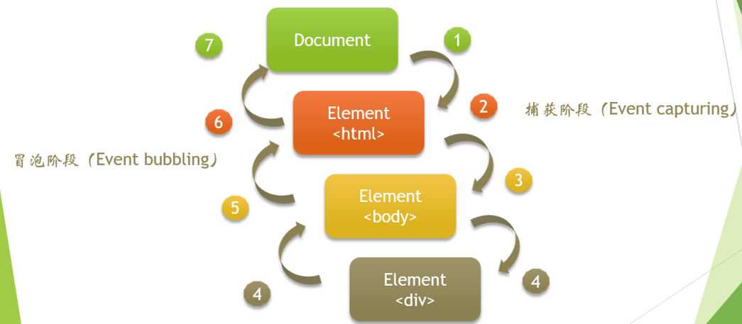
Event flow is the sequence in which web page elements receive events. The event flow specified in "DOM2 event" includes three stages: event capture stage, target stage and event bubble stage. The first event capture provides an opportunity to intercept the event. Then there is the actual target acceptance event. The last stage is the event bubbling stage, where you can respond to events. Although the capture phase specifies in the specification that it is not allowed to respond to events, it will actually be executed, so there are two opportunities to obtain events.
1.1 event capture phase
The purpose of event capture is to capture an event before it reaches a predetermined target. Therefore, the process of event capture is to let the less specific node receive the event earlier, and the most specific node should receive the event last.
1.2 at target stage
The event is happening
1.3 event bubbling stage
At the beginning of the event, it is received by the most specific element (the node with the deepest nesting level in the document), and then propagated up level by level to the less specific node, that is, the document object.
Exercises
<div onclick="console.log('div')">
 <p onclick="console.log('p')">
   Click here!
 </p>
</div>
// p div
If we click p, we will see two logs: p and div. During event propagation, there are three stages: capture, target and bubble. By default, the event handler executes in the bubbling phase (unless you set useCapture to true). It extends outward from the deepest nested element.
1.4 monitoring function
- addEventListener()
- removeEventListener()
All DOM nodes contain these two methods and accept three parameters:
- The name of the event to process
- Functions as event handlers
- A boolean value. If the value is true, it means that the event handler is called in the capture phase; If false, this event handler is called during the bubbling phase. Usually, if the third parameter is not written by default, the event is executed in the bubbling phase.
1.5 how did the event happen
Based on the publish subscribe mode, the event related code will be read when the browser is loaded, but it will be executed only when a specific event is triggered.
For example, clicking a button is an Event, and the code segment responsible for handling the Event is usually called an Event Handler, that is, the action of "starting the display of the dialog box".
2. Event entrustment (Agency)
2.1 principle
Event bubbling mechanism
Event delegation means that the listening function is not set on the place where the event occurs (direct DOM), but on its parent element. Through event bubbling, the parent element can listen to the triggering of events on the child element, and make different responses by judging the type of Dom of the event occurrence element.
2.2 advantages
- It can save a lot of memory and reduce event registration. For example, all li click events are represented on the ul
- It can be realized that when a new sub object is added, there is no need to bind its events, which is particularly suitable for the dynamic content part
2.3 disadvantages
The common application of event agent should be limited to the above requirements. If all events are used as event agent, event misjudgment may occur. That is, events that should not have been triggered are bound to events.
2.4 prevent event bubbling and default events
event.preventDefault()   // Block default events
event.stopPropagation() //Stop bubbling
3. Class array and array
3.1 what is a class array
Class array means that it is written like an array, such as arguments. The first parameter of the function is argument[0]. It is written like an array, but it is not an array. The prototype is Object. Class array objects cannot directly use array methods (e.g. forEach, map, etc.) and can only use array methods after they are converted to arrays.
Exercises
function getAge(...args) {
  console.log(typeof args)
}

getAge(21)
// "object"
The extension operator (... Args) returns an array of arguments. The array is an object, so typeof args returns "object".
3.2 converting class array to array
- Array.from(arr)
// Convert the hdList into an array with the Array.from () method and receive it with the list variable
let list = Array.from(hdList);
- Array.prototype.slice.call(elems)
// hdList is converted to an array and received with a list variable
let list = Array.prototype.slice.call(hdList);
- [ ...elems ]
// Convert it into an array with [... elems] method and receive it with list
let list = [...hdList];
- Array.prototype.forEach.call(elem,callback)
// Loop or map the hdList set directly
Array.prototype.forEach.call(hdList,function(){
 //...
})
Array.prototype.map.call(hdList,function(){
 //...
})
- Array.prototype.forEach.apply(elem,[callback])
Array.prototype.forEach.apply(hdList,[(current,index) => {
    current.addEventListener('click',() => {
        animationFn(index);
    },false);
}]);
- bind
Array.prototype.forEach.bind(hdList)((current,index) => {
    current.addEventListener('click',() => {
        animationFn(index);
    },false);
});
4. Why does adding a native event cause a memory leak without removing it
var button = document.getElementById('button');
function onClick(event) {
    button.innerHTML = 'text';
}
button.addEventListener('click', onClick);
An event handler onClick is added to the element button, and the reference of button is used in the handler. The old version of IE cannot detect the circular reference between DOM nodes and JavaScript code, which will lead to memory leakage.
Nowadays, modern browsers (including IE and Microsoft Edge) use more advanced garbage collection algorithms and can correctly detect and process circular references. In other words, when reclaiming node memory, you don't have to call removeEventListener.
4.1 common points prone to memory leakage
4.1.1 unexpected global variables
If you must use a global variable to store a large amount of data, make sure to set it to null or redefine it after use. A major cause of increased memory consumption associated with global variables is caching. Cache data is for reuse, and the cache must have an upper size limit to be useful.
4.1.2 forgotten timer
Although the timer is no longer needed and the callback inside is no longer needed, the timer callback function is not recycled, so if someResource stores a large amount of data, it cannot be recycled. Therefore, the timer needs to be cleared.
var someResource = getData();
setInterval(function() {
    var node = document.getElementById('Node');
    if(node) {
        // Handle node and someResource
        node.innerHTML = JSON.stringify(someResource));
    }
}, 1000);
4.1.3 reference out of DOM
When you save a DOM reference and delete it from the html, you should assign the reference to null, otherwise the GC will not recycle and the DOM is still in memory. Be careful when saving DOM element references.
var elements = {
    button: document.getElementById('button'),
    image: document.getElementById('image'),
    text: document.getElementById('text')
};
function doStuff() {
    image.src = 'http://some.url/image';
    button.click();
    console.log(text.innerHTML);
    // More logic
}
function removeButton() {
    // The button is a descendant element of the body
    document.body.removeChild(document.getElementById('button'));
    // At this point, there is still a global reference to #button
    // elements dictionary. The button element is still in memory and cannot be recycled by GC.
}
4.1.4 closure
Closures contain active objects of external functions and cannot be recycled by GC.
5. How to reduce the number of dom? How to optimize a large number of dom operations?
5.1 reduce the number of dom
- Use pseudo elements
- Load on demand to reduce unnecessary rendering
- Reasonable structure and semantic label
5.2 optimization of a large number of dom operations
- Cache dom objects
- Use document.createDocumentFragment to create a document fragment and create a virtual node object. Adding or modifying a dom node to this node will not affect the real dom node.
- Use innerHTML instead of high frequency appendChild
- Use requestAnimationFrame() to read in batches and write at one time
- Using virtual dom
6. setInterval() and setTimeout()
6.1 setInterval()
The setInterval() method calls a function or evaluates an expression for a specified period (in milliseconds).
The setinterval () method keeps calling the function until clearinterval () is called or the window is closed. The ID value returned by setInterval() can be used as an argument to the clearInterval() method.
6.2 precautions
- In dynamically loaded pages, be sure to clean up the cycle timer. Sometimes the timer is set repeatedly. In serious cases, it will lead to memory leakage and eventually page crash.
- The callback function will contain some variables or DOM elements. You need to be more careful and consider the release of these elements.
6.3 why is settimeout() time inaccurate
- Because JavaScript is an interpreter of a single line program, it can only execute one piece of code in a certain time
- In order to control the code to be executed, there is a JavaScript task queue
- These tasks are executed in the order they are added to the queue
- The second parameter of setTimeout() tells JavaScript how long it will take to add the current task to the queue. If the queue is empty, the added code will be executed immediately; If the queue is not empty, it will be executed after the previous code is executed
7. Difference between window.onload and DOMContentLoaded
- When the load event is triggered, all DOM, style sheets, scripts and pictures on the page have been loaded
- When the DOMContentLoaded event is triggered, only when the DOM is loaded, excluding style sheets and pictures (for example, if there is a script loaded by async, it may not be completed)