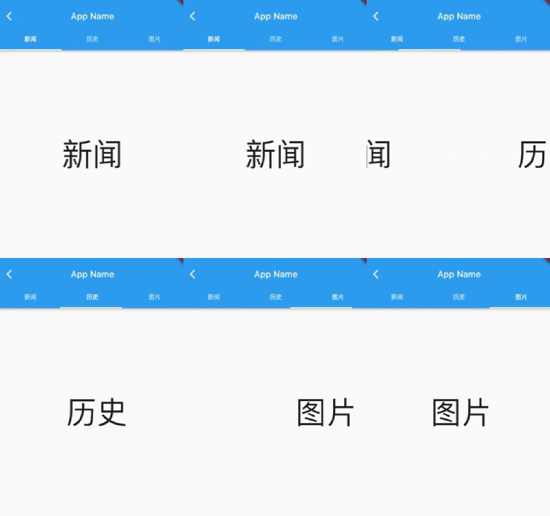
TabBarView is a Tab layout component provided in the Material component library. It is usually used with TabBar.
TabBarView
TabBarView encapsulates PageView, and its construction method is very simple
 TabBarView({
  Key? key,
  required this.children, // tab page
  this.controller, // TabController
  this.physics,
  this.dragStartBehavior = DragStartBehavior.start,
})
TabController is used to monitor and control the page switching of TabBarView, which is usually linked with TabBar. If not specified, the nearest DefaultTabController is found up in the component tree and used.
TabBar
TabBar is the navigation title of TabBarView, as shown in the following figure:
TabBar has many configuration parameters. Through these parameters, we can define the style of TabBar. Many attributes are used to configure indicator and label. Take the above figure as an example. Label is the text of each Tab, and indicator refers to the white underline under "history".
const TabBar({
  Key? key,
  required this.tabs, // We need to create specific Tabs
  this.controller,
  this.isScrollable = false, // Can I slide
  this.padding,
  this.indicatorColor,// Indicator color, the default is an underline with a height of 2
  this.automaticIndicatorColorAdjustment = true,
  this.indicatorWeight = 2.0,// Indicator height
  this.indicatorPadding = EdgeInsets.zero, //Indicator padding
  this.indicator, // indicator
  this.indicatorSize, // Indicator length. There are two optional values, one is the length of tab and the other is the length of label
  this.labelColor,
  this.labelStyle,
  this.labelPadding,
  this.unselectedLabelColor,
  this.unselectedLabelStyle,
  this.mouseCursor,
  this.onTap,
  ...
})
TabBar is usually located at the bottom of the AppBar. It can also receive a TabController. If it needs to be linked with TabBarView, TabBar and TabBarView can use the same TabController. Note that the number of children of TabBar and TabBarView should be the same during linkage. If no controller is specified, the nearest DefaultTabController will be found up in the component tree and used. In addition, we need to create the required tab and pass it to the TabBar through tabs. The tab can be any Widget. However, a tab component has been implemented in the Material component library, and we generally use it directly:
const Tab({
  Key? key,
  this.text, //text
  this.icon, // Icon
  this.iconMargin = const EdgeInsets.only(bottom: 10.0),
  this.height,
  this.child, // Custom widget
})
Note that text and child are mutually exclusive and cannot be specified at the same time.
Example code:
import 'package:flutter/material.dart';

/// @Author wywinstonwy
///@ Date 2022/1/18 9:09 am
/// @Description:

class MyTabbarView1 extends StatefulWidget {
  const MyTabbarView1({Key? key}) : super(key: key);

  @override
  _MyTabbarView1State createState() => _MyTabbarView1State();
}

class _MyTabbarView1State extends State<MyTabbarView1>with SingleTickerProviderStateMixin {
  List<String> tabs =['Journalism','history','picture'];
  late TabController tabController;
  @override
  void initState() {
    // TODO: implement initState
    super.initState();
    tabController = TabController(length: tabs.length, vsync: this);
  }
  @override
  Widget build(BuildContext context) {
    return Scaffold(
      appBar: AppBar(
        title: Text('TabbarView',textAlign: TextAlign.center,),
        bottom:TabBar(
            unselectedLabelColor: Colors.white.withOpacity(0.5),
            labelColor: Colors.white,
            indicatorSize:TabBarIndicatorSize.label,
            indicator:const UnderlineTabIndicator(),
            controller: tabController,
            tabs: tabs.map((e){
              return Tab(text: e,);
            }).toList()) ,
      ),
      body: Column(
      children: [

        Expanded(
          flex: 1,
          child:  TabBarView(
            controller: tabController,
            children: tabs.map((e){
              return Center(child: Text(e,style: TextStyle(fontSize: 100),),);
            }).toList()),)

      ],),
    );
  }
}

When sliding the page, the top Tab will move, and when clicking the top Tab, the page will switch. In order to realize the linkage between TabBar and TabBarView, we explicitly create a TabController. Because the TabController needs a TickerProvider (vsync parameter), we mix in SingleTickerProviderStateMixin; Because the TabController will execute animation and hold some resources, we must release resources when the page is destroyed. To sum up, we find that the process of creating TabController is still complex. In practice, if TabBar and TabBarView need to be linked, a DefaultTabController is usually created as their common parent component, so that they will look up from the component tree during execution and use the DefaultTabController we specify. Our modified implementation is as follows:
class TabViewRoute2 extends StatelessWidget {
  @override
  Widget build(BuildContext context) {
    List tabs = ["Journalism", "history", "picture"];
    return DefaultTabController(
      length: tabs.length,
      child: Scaffold(
        appBar: AppBar(
          title: Text("App Name"),
          bottom: TabBar(
            tabs: tabs.map((e) => Tab(text: e)).toList(),
          ),
        ),
        body: TabBarView( //structure
          children: tabs.map((e) {
            return KeepAliveWrapper(
              child: Container(
                alignment: Alignment.center,
                child: Text(e, textScaleFactor: 5),
              ),
            );
          }).toList(),
        ),
      ),
    );
  }
}
It can be seen that we do not need to manually manage the life cycle of the Controller, nor do we need to provide SingleTickerProviderStateMixin. At the same time, there are no other states to manage, so we don't need to use StatefulWidget. It's much simpler.
Page cache
Because TabBarView encapsulates PageView internally, if you want to cache pages, you can refer to the introduction on page caching in the PageView section.