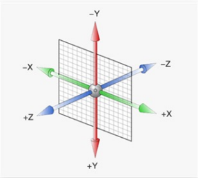
Attribute: transform. The z-axis is perpendicular to the screen. The positive direction points to the user and the negative direction points to the inside of the screen.
Spatial displacement:
Compound syntax: transform:translate3d(x,y,z);
Separate syntax: Transform: translatex (value); Transform: translatey (value); Transform: translatez (value);
x. The change on the y-axis is no different from the 2d displacement. The movement on the z-axis needs to add perspective: pixel unit value to the parent; Achieve perspective effect.
Example:
For two pink and blue squares of the same size, if you don't add perspective, you can't see the change after hover, but in fact box2 moves to the z axis. After hover, box2 and box1 are not at the same level, and there is a gradient between them. The positive effect is that box2 is larger than box1, because box2 is closer to the user.


<style>
    .box{
      margin:100px auto;
      width: 700px;
      perspective: 1100px;
    }
    .box1 {
      width: 200px;
      height: 200px;
      margin:0 30px;
      float: left;
      background-color: pink;
    }
    .box2 {
      width: 200px;
      height: 200px;
      margin:0 30px;
      float: left;
      background-color: rgb(116, 211, 248);
    }

    .box2:hover {
      transform: translateZ(100px);
    }
  </style>
</head>
<body>
<div class="box">
    <div class="box1"></div>
    <div class="box2"></div>
</div>
</body>
Space rotation:
Compound syntax: transform:rotate3d(x,y,z, angle degree);
x. The values of y and z are 0-1. Compound syntax is used to set the position and rotation angle of user-defined rotation axis, which is rarely used.
Separate syntax: transform:rotateX();transform:rotateY();transform:rotateZ();
Rotate around the axis.
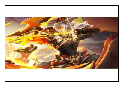
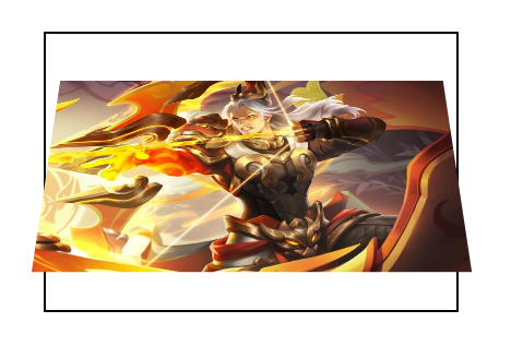
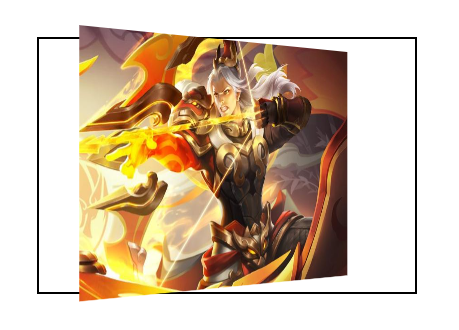
Example:
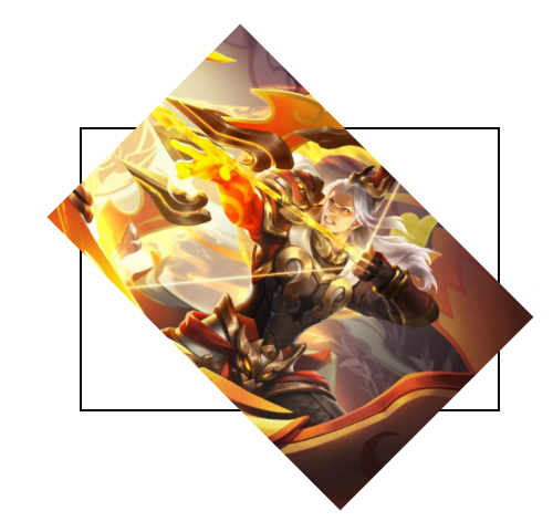
The following pictures are the original picture, the effect of 45 degrees around the x-axis without perspective, and the effect of 45 degrees around the positive direction of the x-axis, y-axis and z-axis after adding perspective 1000px.

<style>
        .box {
            width: 300px;
            margin: 100px auto;
            border: 2px solid #000;
            perspective: 1000px;
        }

        img {
            width: 300px;
            transition: all 2s;
        }

        .box img:hover {
            /* transform: rotateX(45deg); */
            /* transform: rotateY(45deg); */
            transform: rotateZ(45deg);
        }
    </style>
</head>
<body>
    <div class="box">
        <img src="./images/hero.jpeg" alt="">
    </div>
</body>
Judge the rotation direction:
Stereoscopic rendering:
perspective can only present the visual effects of near large and far small, near real and far virtual, so that the z-axis displacement can see the change, but it can not present the effects of three-dimensional graphics, such as turning over.
Therefore, you need to add transform style: preserve-3d to the parent; Make child elements in real 3D space
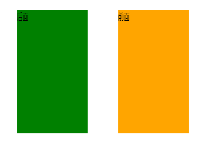
Example: for two blocks with the same size and different colors, one in front and one in back, use transform style: preserve-3d; The effect of.

<style>
        .cube {
            position: relative;
            width: 200px;
            height: 200px;
            margin: 100px auto;
            background-color: pink;
            transition: all 2s;
            /*Place child elements in 3D space*/
            transform-style: preserve-3d;
        }
        .cube div {
            position: absolute;
            left: 0;
            top: 0;
            width: 200px;
            height: 200px;
        }
        .front {
            background-color: orange;
            /* Approach me 200px */
            transform: translateZ(200px);/*The two faces are hierarchically separated in space*/
        }
        .back {
            background-color: green;
        }
        /* cube hover To see the effect of space */
        .cube:hover {
            transform: rotateY(55deg);
        }
    </style>
</head>
<body>
    <div class="cube">
        <div class="front">front</div>
        <div class="back">behind</div>
    </div>
</body>
</html>