Plotly Express is a new advanced Python visualization library, which is plotly Py, which provides simple syntax for complex charts. The most important thing is that plotly can be perfectly combined with Pandas data type DataFrame. It is too convenient for data analysis and visualization, and it is completely free, which is very worth trying
Next, we use several built-in data sets of ployy to demonstrate the drawing of relevant charts
data set
All data sets built in plot are in DataFrame format, which is the embodiment of the depth fit with Pandas
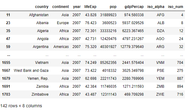
GDP income and life expectancy in different countries over the years
Including fields: country, continent, year, life expectancy, population, GDP, country abbreviation and country number
gap = px.data.gapminder()
gap2007 = gap.query("year==2007")
gap2007
Output
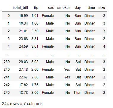
Restaurant order flow
Including fields: general ledger sheet, tip, gender, smoking or not, day of week, dining time and number of people
tips = px.data.tips()
tips
Output
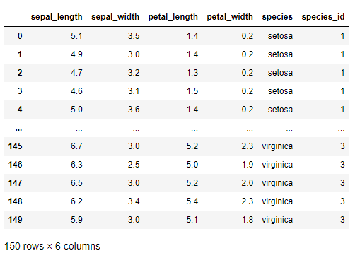
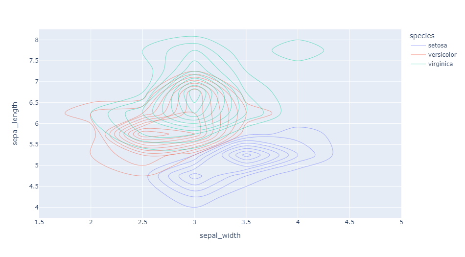
Iris
Include fields: sepal length, sepal width, petal length, petal width, species, species number
iris = px.data.iris()
iris
Output
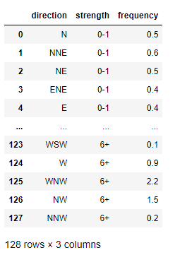
Wind data
Contains fields: direction, strength, and value
wind = px.data.wind()
wind
Output
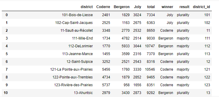
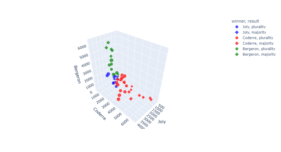
Voting results of 2013 Montreal mayoral election
Including fields: region, Coderre votes, Bergeron votes, Joly votes, total votes, winner and result (proportion classification)
election = px.data.election()
election
Output
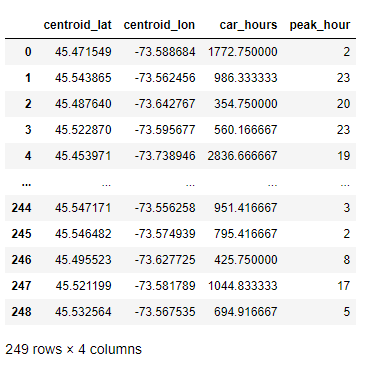
Availability of car sharing services near a regional center in Montreal
Including fields: latitude, longitude, car hours and peak hours
carshare = px.data.carshare()
carshare
Output
Built in palette
Plotly also has many advanced color palettes, which makes us no longer worry about color matching when drawing charts
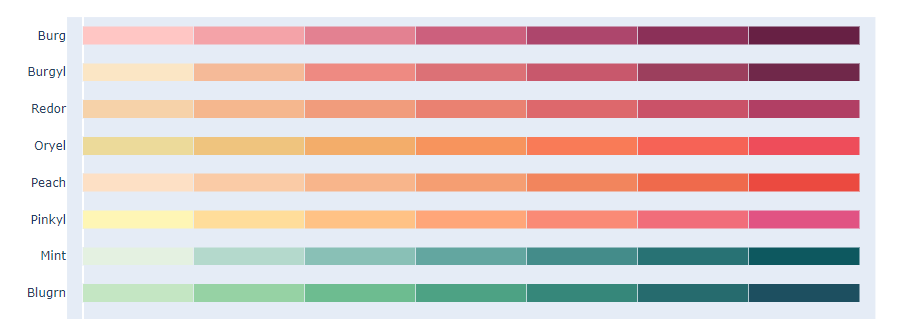
Color and sequence of cartoons
px.colors.carto.swatches()
Output
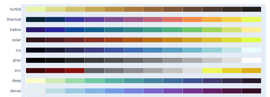
Color scale of CMOcean project
px.colors.cmocean.swatches()
Output
There are many other color palettes to choose from. I won't show them one by one. Only the code is given below. You can run the code to view the specific color style
Color scale of ColorBrewer2 project
px.colors.colorbrewer
Periodic color code, suitable for continuous data with natural periodic structure
px.colors.cyclical
Disperse color scale, suitable for continuous data with natural end points
px.colors.diverging
Qualitative color code, applicable to data without natural sequence
px.colors.qualitative
Sequential color code, applicable to most continuous data
px.colors.sequential
Plot express basic drawing
Scatter diagram
Plotting a scatter plot is very easy and can be done in one line of code
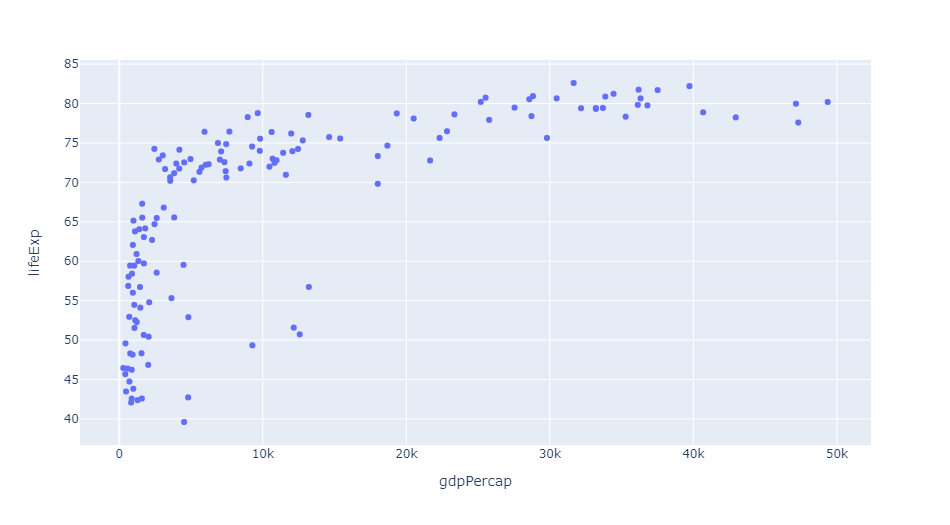
px.scatter(gap2007, x="gdpPercap", y="lifeExp")
Output
Different data categories can also be distinguished by the parameter color
px.scatter(gap2007, x="gdpPercap", y="lifeExp", color="continent")
Output
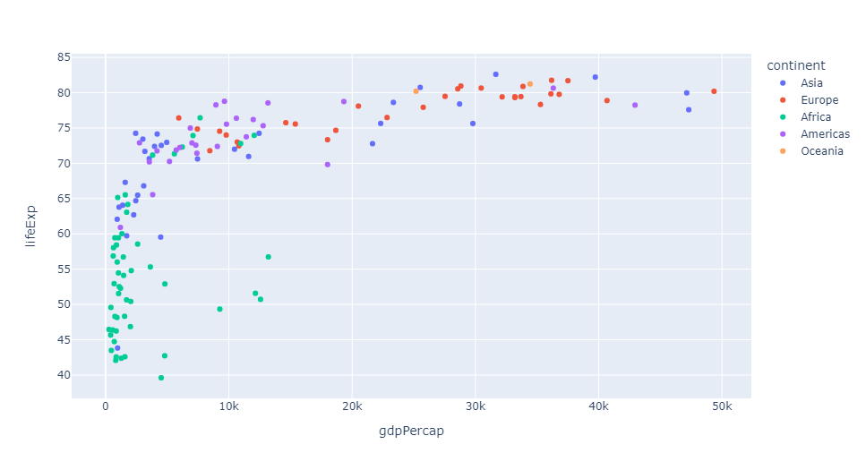
Each dot here represents a country, and different colors represent different continents
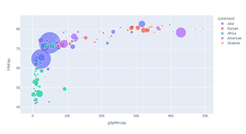
You can use the parameter size to reflect the size of the data
px.scatter(gap2007, x="gdpPercap", y="lifeExp", color="continent", size="pop", size_max=60)
Output
You can also use the parameter hover_name to specify the information displayed when the mouse hovers
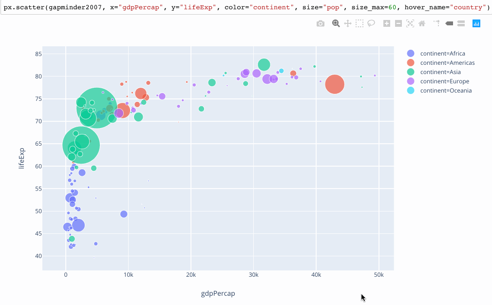
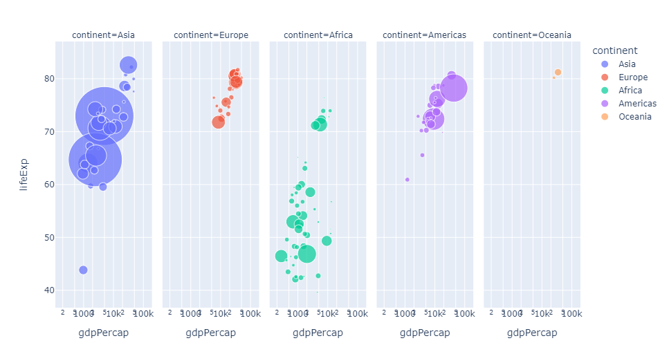
You can also split charts according to different data types in the dataset
px.scatter(gap2007, x="gdpPercap", y="lifeExp", color="continent", size="pop",
           size_max=60, hover_name="country", facet_col="continent", log_x=True)
Output
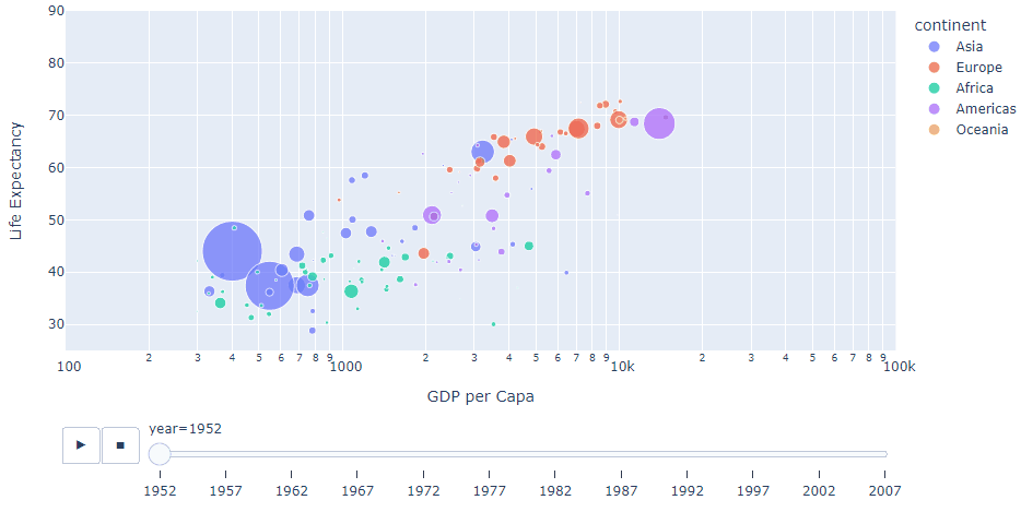
Of course, we can also view the data of different years and generate dynamic charts for automatic switching
px.scatter(gap, x="gdpPercap", y="lifeExp", color="continent", size="pop",
           size_max=60, hover_name="country", animation_frame="year", animation_group="country", log_x=True,
          range_x=[100, 100000], range_y=[25, 90], labels=dict(pop="Population", gdpPercap="GDP per Capa", lifeExp="Life Expectancy"))
Output
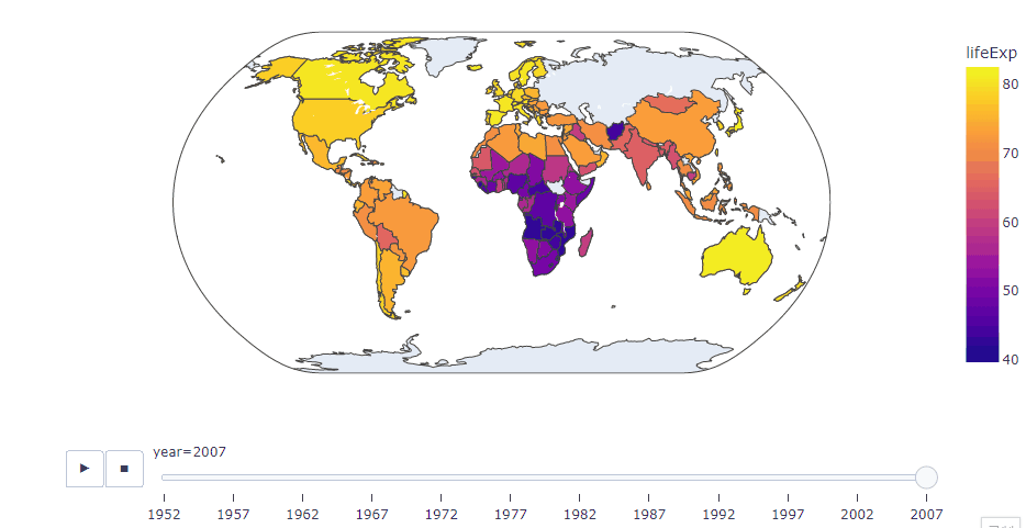
Geographic Information Map
Plotly is also very convenient to draw dynamic geographic information charts. In the form of this map, we can clearly see that the data set lacks relevant data of the former Soviet Union
px.choropleth(gap, locations="iso_alpha", color="lifeExp", hover_name="country", animation_frame="year",
              color_continuous_scale=px.colors.sequential.Plasma, projection="natural earth")
Output
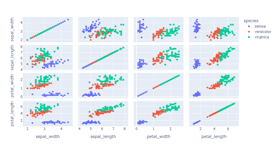
Matrix scatter diagram
px.scatter_matrix(iris, dimensions=['sepal_width', 'sepal_length', 'petal_width', 'petal_length'], color='species', symbol='species')
Output
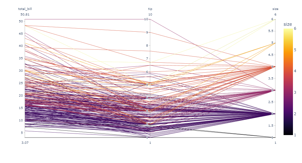
Parallel coordinate diagram
px.parallel_coordinates(tips, color='size', color_continuous_scale=px.colors.sequential.Inferno)
Output
Ternary scatter diagram
px.scatter_ternary(election, a="Joly", b="Coderre", c="Bergeron", color="winner", size="total", hover_name="district",
                   size_max=15, color_discrete_map = {"Joly": "blue",
                   "Bergeron": "green", "Coderre":"red"} )
Output

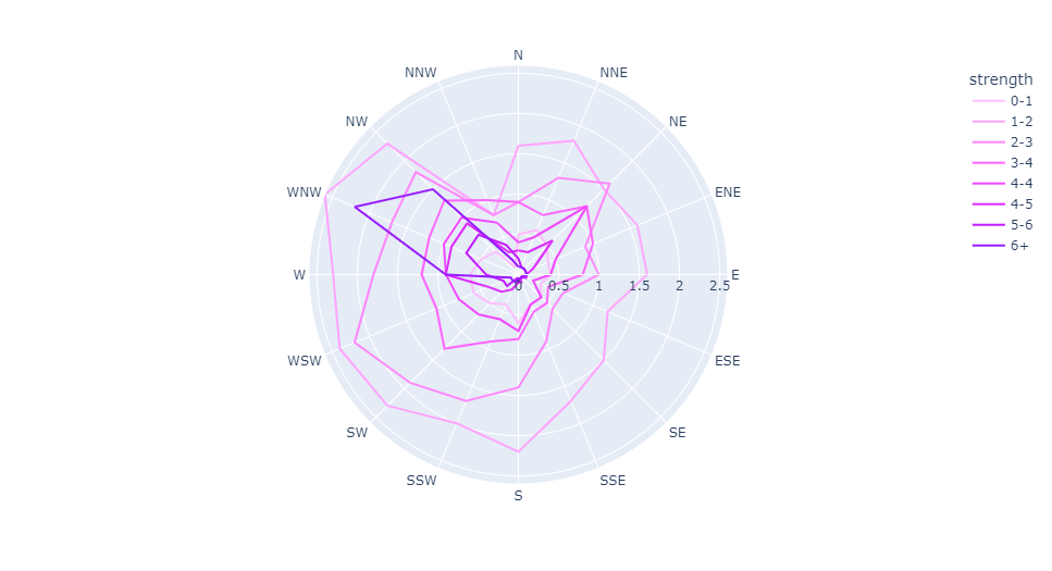
Polar line drawing
px.line_polar(wind, r="frequency", theta="direction", color="strength",
            line_close=True,color_discrete_sequence=px.colors.sequential.Plotly3[-2::-1])
Output
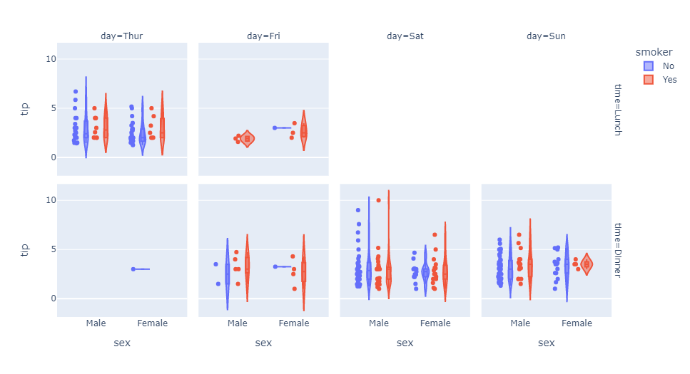
Violin picture
px.violin(tips, y="tip", x="sex", color="smoker", facet_col="day", facet_row="time",box=True, points="all",
          category_orders={"day": ["Thur", "Fri", "Sat", "Sun"], "time": ["Lunch", "Dinner"]},
          hover_data=tips.columns)
Output
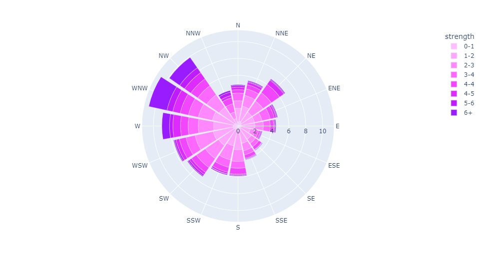
Polar bar chart
px.bar_polar(wind, r="frequency", theta="direction", color="strength",
            color_discrete_sequence= px.colors.sequential.Plotly3[-2::-1])
Output
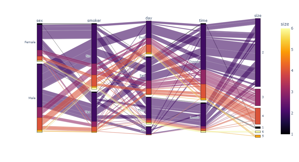
Parallel category graph
px.parallel_categories(tips, color="size", color_continuous_scale=px.
            colors.sequential.Inferno)
Output
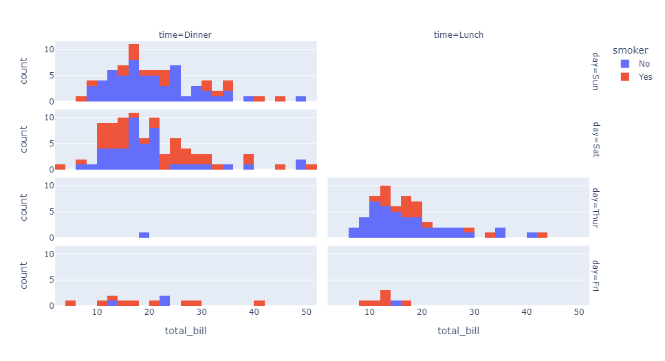
histogram
px.histogram(tips, x="total_bill", color="smoker",facet_row="day", facet_col="time")
Output
3D scatter diagram
px.scatter_3d(election, x="Joly", y="Coderre", z="Bergeron", color="winner",
              size="total", hover_name="district",symbol="result",
              color_discrete_map = {"Joly": "blue", "Bergeron": "green",
              "Coderre":"red"})
Output
Density contour map
px.density_contour(iris, x="sepal_width", y="sepal_length", color="species")
Output
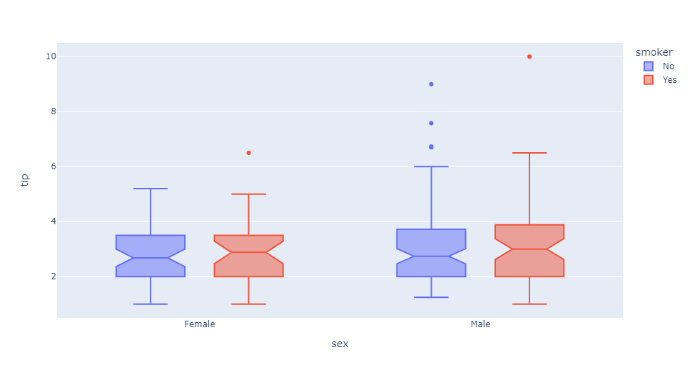
Box diagram
px.box(tips, x="sex", y="tip", color="smoker", notched=True)
Output
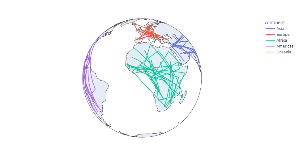
Geographic coordinate line drawing
px.line_geo(gap.query("year==2007"), locations="iso_alpha",
            color="continent", projection="orthographic")
Output
Bar graph
px.line(gap, x="year", y="lifeExp", color="continent",
        line_group="country", hover_name="country",
        line_shape="spline", render_mode="svg")
Output

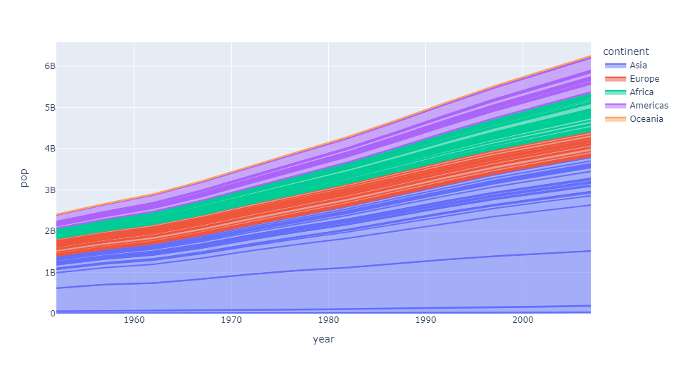
Area map
px.area(gap, x="year", y="pop", color="continent",
        line_group="country")
Output
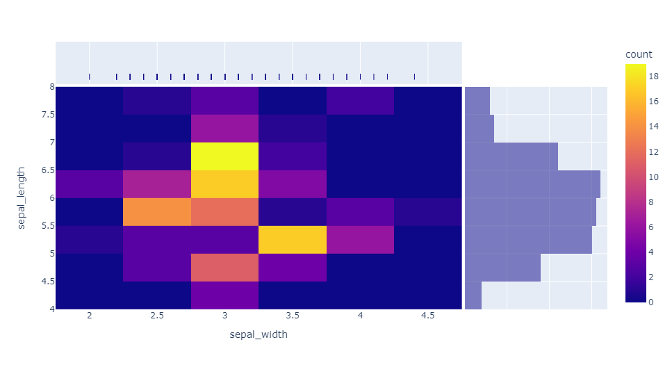
Thermodynamic diagram
px.density_heatmap(iris, x="sepal_width", y="sepal_length",
                   marginal_x="rug", marginal_y="histogram")
Output
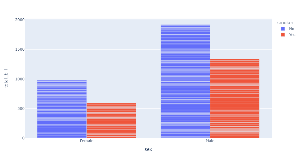
Bar chart
px.bar(tips, x="sex", y="total_bill", color="smoker", barmode="group")
Output
In general, plot / plot express is still a very powerful drawing tool, which is worth studying in detail~