1. Preface
I have written more than a dozen articles in my column, all related to js. I haven't written any articles about CSS3 yet. Css3, it gives me the feeling that it's not difficult, but it's hard to play freely. Today, we use CSS3 to achieve three special effects. I hope these three special effects can inspire you. We use CSS3 to make better and more dazzling animation effects. By comparing these three special effects with JS special effects, we hope to help you learn some knowledge of CSS3. Today's three cases can be said to be a preview or warm-up bar, will also write about CSS3 better works or articles in the future, recently I am also writing a CSS3 animation library!
2. Transition and Animation Concept Understanding
CSS 3 transition
To paraphrase the novice tutorial, CSS3 transition is a gradual change of elements from one style to another. To achieve this, two things must be specified: 1. Specify CSS attributes to add effects. 2. The duration of the specified effect.
css3 animation
To paraphrase the novice tutorial, CSS3 animation is to specify a CSS style and animation according to the @keyframes rule, which will gradually change from the current style to a new one. Specify that at least two CSS3 animation attributes are bound to a selector: 1. Specify the name of the animation. 2. Set the length of the animation.
3. Transition case - cool drop-down
3-1 Principle Analysis
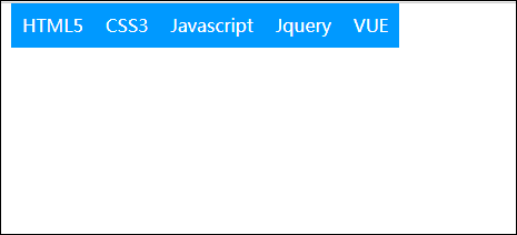
1. First of all, there is a navigation drop-down, that is, a drop-down list appears on the mouse.
2. Then it was found that each option appeared in two different directions on the Lower Larry side.
3. The way of occurrence is that the odd term enters from the left, the even term enters from the right, and the way of entry is sliding and fading in.
3-2 Implementation Process
1. First of all, the layout of the page, which should be known to all, menu is nothing more than a ul-li list, drop-down list is a ul-li below li.
reset.css (Style Reset Table and Personal Style Encapsulation)
*{margin:0;padding:0}h1,h2,h3,h4,h5,h6{font-size:100%;font-weight:400}ol,ul{list-style:none}address,caption,cite,code,dfn,em,strong,th,var{font-style:normal;font-weight:400}fieldset,img{border:0}textarea{resize:none}a{color:#000;text-decoration:none}.fontsize24,h1{font-size:24px}.fontsize20,h2{font-size:20px}.fontsize18,h3{font-size:18px}.fontsize16,h4{font-size:16px}.fontsize14,h5{font-size:14px}.fontsize12,h6{font-size:12px}.bold{font-weight:700}.fllil li{float:left}.fllir li{float:right}.fl{float:left}.fr{float:right}.radius{border-radius:100%}.positionCenterLeft{left:0;right:0;margin:auto}.positionCenterTop{top:0;bottom:0;margin:auto}.positionCenter{top:0;bottom:0;left:0;right:0;margin:auto}.distable{display:table}.distablecell{display:table-cell;vertical-align:middle}.textels{overflow:hidden;white-space:nowrap;text-overflow:ellipsis}.marginCenter{margin:0 auto}.t_l{text-align:left}.t_c{text-align:center}.t_r{text-align:right}.unLine{text-decoration:underline}.fiexd{position:fixed}.absolute{position:absolute}.relative{position:relative}.wrapper{clear:both;overflow:hidden}.o-hidden{overflow:hidden}.hidden{display:none}.block{display:block}.lblock{display:inline-block}.clear{clear:both}.pointer{cursor:pointer}img{border:0;vertical-align:middle}
The html code is as follows
<div class="demo-nav">
    <!--.fllil,.clear Is the style reset table( reset.css)Written style,.fllil li{fload:left;}.clear{clear:both;}-->
    <ul class="menu fllil">
        <li>HTML5
            <ul class="sub-menu">
                <li>article</li>
                <li>section</li>
                <li>menu</li>
                <li>nav</li>
            </ul>
        </li>
        <li>CSS3
            <ul class="sub-menu">
                <li>animation</li>
                <li>transition</li>
                <li>circular</li>
                <li>Frame</li>
            </ul>
        </li>
        <li>Javascript
            <ul class="sub-menu">
                <li>Character string</li>
                <li>array</li>
                <li>object</li>
                <li>Boer</li>
            </ul>
        </li>
        <li>Jquery
            <ul class="sub-menu">
                <li>animation</li>
                <li>Special effects</li>
                <li>AJAX</li>
            </ul>
        </li>
        <li>VUE</li>
    </ul>
    <div class="clear"></div>
</div>
The css code is as follows
    .demo-nav {
        width: 500px;
        margin: 0 auto;
    }

    .demo-nav li {
        line-height: 40px;
        padding: 0 10px;
        background: #09f;
        color: #fff;
        position: relative;
    }

    .demo-nav li ul {
        position: absolute;
        left: 0;
        top: 40px;
        height: 0;
        overflow: hidden;
    }

    .demo-nav li ul li {
        float: none;
        /*Transition code*/
        transition: all .3s;
        background: #f90;
        opacity: 0;
    }
    /*The odd term is initially shifted 100% to the right.*/
    .demo-nav li ul li:nth-of-type(1n) {
        transform: translate3d(100%, 0, 0);
    }
    /*Even terms are initially offset 100% to the left.*/
    .demo-nav li ul li:nth-of-type(2n) {
        transform: translate3d(-100%, 0, 0);
    }

    .demo-nav li:hover ul {
        overflow: visible;
    }
    /*Transparency and interaction go hand in hand*/
    .demo-nav li:hover ul li {
        opacity: 1;
        transform: translate3d(0, 0, 0);
    }
Note 1: In the operation of displaying drop-down list, you can't hide the style of the submenu UL at the beginning. demo-nav li ul{display:none;}. demo-nav li ul{height: 0;overflow:hidden;}, when the mouse is placed on the parent li, it shows that UL can not write like this.demo-nav li:hover ul{display:block;}, so to write,.demo-nav li:hover ul{overflow: visible;} because at first if the sub-menu UL is hidden, when the mouse is placed on the parent li, the sub-menu UL appears, so that the sub-menu UL can be seen under the sub-menu ul. Li's animation.

Note 2: The submenu UL should be hidden with. demo-nav liul {height: 0; overflow: hidden;} and set. demo-nav li:hover ul{overflow: visible;} when displayed. This step should not be saved, otherwise problems will arise. If not, in fact, the sub-menu ul, and the Li under the sub-menu UL have been on the page, if the mouse moves up the sub-menu ul, and the Li under the sub-menu ul. It actually triggers the hover of the parent li.
Comparisons between 3-3 and JS implementations
The effect of js can also be achieved, and it is not difficult to implement, but the problem of calling timer. But it certainly writes more than css3, and the logic is more complex than css3.
1. First, the parent Li must bind a mouse out and in event, and also define an attribute to record the timer (different parent Li can not share a timer, otherwise it will be interfered, it must have an attribute record timer under each parent li). obj.timer=setInterval(function(){},100)
2. Implementing with js is also the operation of class or css. So css3 is better than js in performance!
3. For this animation, css3 is also better than js.
3-4 complete code
<!DOCTYPE html>
<html lang="en">
<head>
    <meta charset="UTF-8">
    <title>ec-css Navigation bar</title>
    <link rel="stylesheet" href="reset.css">
    <style>
        .demo-nav {
            width: 500px;
            margin: 0 auto;
        }

        .demo-nav li {
            line-height: 40px;
            padding: 0 10px;
            background: #09f;
            color: #fff;
            position: relative;
        }

        .demo-nav li ul {
            position: absolute;
            left: 0;
            top: 40px;
            /*height: 0;*/
            /*overflow: hidden;*/
        }

        .demo-nav li ul li {
            float: none;
            transition: all .3s;
            background: #f90;
            opacity: 0;
        }

        .demo-nav li ul li:nth-of-type(1n) {
            transform: translate3d(100%, 0, 0);
        }

        .demo-nav li ul li:nth-of-type(2n) {
            transform: translate3d(-100%, 0, 0);
        }

        .demo-nav li:hover ul {
            /*overflow: visible;*/
        }

        .demo-nav li:hover ul li {
            opacity: 1;
            transform: translate3d(0, 0, 0);
        }
        /*Up to 10 levels, more than 10 levels, have to write js*/
        .demo-nav li ul li:nth-of-type(2) {
            transition-delay: .1s;
        }

        .demo-nav li ul li:nth-of-type(3) {
            transition-delay: .2s;
        }

        .demo-nav li ul li:nth-of-type(4) {
            transition-delay: .3s;
        }
        .demo-nav li ul li:nth-of-type(5) {
            transition-delay: .4s;
        }

        .demo-nav li ul li:nth-of-type(6) {
            transition-delay: .5s;
        }

        .demo-nav li ul li:nth-of-type(7) {
            transition-delay: .6s;
        }
        .demo-nav li ul li:nth-of-type(8) {
            transition-delay: .7s;
        }

        .demo-nav li ul li:nth-of-type(9) {
            transition-delay: .8s;
        }

        .demo-nav li ul li:nth-of-type(10) {
            transition-delay: .9s;
        }
    </style>
</head>
<body>
<div class="demo-nav">
    <ul class="menu fllil">
        <li>HTML5
            <ul class="sub-menu">
                <li>article</li>
                <li>section</li>
                <li>menu</li>
                <li>nav</li>
            </ul>
        </li>
        <li>CSS3
            <ul class="sub-menu">
                <li>animation</li>
                <li>transition</li>
                <li>circular</li>
                <li>Frame</li>
            </ul>
        </li>
        <li>Javascript
            <ul class="sub-menu">
                <li>Character string</li>
                <li>array</li>
                <li>object</li>
                <li>Boer</li>
            </ul>
        </li>
        <li>Jquery
            <ul class="sub-menu">
                <li>animation</li>
                <li>Special effects</li>
                <li>AJAX</li>
            </ul>
        </li>
        <li>VUE</li>
    </ul>
    <div class="clear"></div>
</div>
</body>
</html>
4. Transition case - accordion
4-1 Principle Analysis
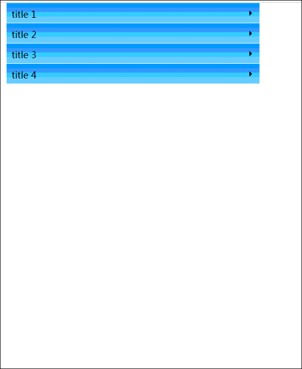
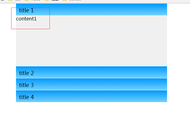
This is not difficult to see, but also a ul-li, mouse move into the title color under li, li, background color, arrow change, Li under the div height change!
4-2 Implementation Process
1. First of all, we typeset ul-li. There's a title under Li (this uses h3), and a content (div).
html is as follows
<div class="demo-slide-tab">
    <ul>
        <li>
            <h3>title 1</h3>
            <div>content1</div>
        </li>
        <li>
            <h3>title 2</h3>
            <div>content2conte nt2content2content2content2conten t2content2content2content2content2conte nt2content2content2content2conte nt2content2content2content2 content2content2content 2content2content2content2content2conten t2content2c ontent2content2content2</div>
        </li>
        <li>
            <h3>title 3</h3>
            <div>content3</div>
        </li>
        <li>
            <h3>title 4</h3>
            <div>content4.</div>
        </li>
    </ul>
</div>
The css code is as follows
<style>
    .demo-slide-tab {
        width: 500px;
        margin: 0 auto;
    }

    .demo-slide-tab ul {
        width: 100%;
        margin: 0;
        padding: 0;
    }

    .demo-slide-tab li {
        list-style: none outside none;
        display: block;
        margin: 0;
        padding: 0;
        height: 40px;
        width: 100%;
        overflow: hidden;
        background: #f0f0f0;
        transition: height 0.3s ease-in-out;
    }

    .demo-slide-tab h3 {
        margin: 0;
        padding: 10px;
        height: 19px;
        border-top: 1px solid #f0f0f0;
        color: #000;
        background: #ccc;
        background: linear-gradient(#0099ff, #71d1fd);
        custor: pointer;
        position: relative;
    }

    .demo-slide-tab h3:before {
        content: "";
        border-width: 5px;
        border-color: transparent transparent transparent #000;
        position: absolute;
        right: 10px;
        top: 15px;
        width: 0;
        height: 0;
    }

    .demo-slide-tab div {
        margin: 0;
        voerflow: auto;
        padding: 10px;
        max-height: 220px;
    }
    //Mouse into li, height change
    .demo-slide-tab li:hover {
        height: 280px;
    }
    //Mouse move in li, h3 background color and font color change
    .demo-slide-tab li:hover h3 {
        color: #fff;
        background: #000;
        background: linear-gradient(#faa305, #fcc054);
    }
    //Mouse into li, arrow direction changes
    .demo-slide-tab li:hover h3:before{
        border-color: transparent transparent transparent #fff;
        transform: rotate(90deg);
    }
</style>
Because of this chestnut, the div in Li is padding in style. So I suggest that I change the Li setting to overflow: hidden;height:40px; /* height equals the height of the title, and initially hide div */. Because if the mouse moves into li, it's Div.
There will be a small problem! Chestnuts like this!
Some of the code was changed to read as follows
.demo-slide-tab li {
    display: block;
    margin: 0;
    padding: 0;
    width: 100%;
    background: #f0f0f0;
}
.demo-slide-tab div {
    margin: 0;
    height: 0;
    overflow: hidden;
    transition: height 0.3s ease-in-out;
}
.demo-slide-tab li:hover div {
    padding: 10px;
    height: 220px;
}
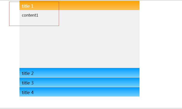
You can see that the moment the mouse moves out, you can see that the contents of the div are also edged! I just want to avoid this, by manipulating the height of li to control the height of div!
Comparisons between 4-3 and JS implementations
1. This animation, I feel that although the performance of css3 is better than js. After all, JS is also implemented by controlling css or class!
2. Flexibility, this is worse than js, such as div display and hiding. I don't want to move in and out of the mouse control, if I want to control div display and hiding by clicking. For the way of js, this is the trigger event. For the plug-in, maybe it's just a plug-in! For the implementation of css3, this will not only change the CSS style, but also the html structure!
Here, my suggestion is that the best result of this animation is js and css3, and the result is the best. If the demand for flexibility is not high, only CSS3 can be used.
4-4 complete code
<!DOCTYPE html>
<html lang="en">
<head>
<meta charset="UTF-8">
<title>ec-css Accordion</title>
<link rel="stylesheet" href="reset.css">
<style>
    .demo-slide-tab {
        width: 500px;
        margin: 0 auto;
    }

    .demo-slide-tab ul {
        width: 100%;
        margin: 0;
        padding: 0;
    }

    .demo-slide-tab li {
        list-style: none outside none;
        display: block;
        margin: 0;
        padding: 0;
        height: 40px;
        width: 100%;
        overflow: hidden;
        background: #f0f0f0;
        transition: height 0.3s ease-in-out;
    }

    .demo-slide-tab h3 {
        margin: 0;
        padding: 10px;
        height: 19px;
        border-top: 1px solid #f0f0f0;
        color: #000;
        background: #ccc;
        background: linear-gradient(#0099ff, #71d1fd);
        custor: pointer;
        position: relative;
    }

    .demo-slide-tab h3:before {
        content: "";
        border-width: 5px;
        border-color: transparent transparent transparent #000;
        position: absolute;
        right: 10px;
        top: 15px;
        width: 0;
        height: 0;
    }

    .demo-slide-tab div {
        margin: 0;
        voerflow: auto;
        padding: 10px;
        max-height: 220px;
    }

    .demo-slide-tab li:hover {
        height: 280px;
    }

    .demo-slide-tab li:hover h3 {
        color: #fff;
        background: #000;
        background: linear-gradient(#faa305, #fcc054);
    }

    .demo-slide-tab li:hover h3:before{
        border-color: transparent transparent transparent #fff;
        transform: rotate(90deg);
    }
</style>
</head>
<body>
<div class="demo-slide-tab">
<ul>
    <li>
        <h3>title 1</h3>
        <div>content1</div>
    </li>
    <li>
        <h3>title 2</h3>
        <div>content2conte nt2content2content2content2conten t2content2content2content2content2conte nt2content2content2content2conte nt2content2content2content2 content2content2content 2content2content2content2content2conten t2content2c ontent2content2content2</div>
    </li>
    <li>
        <h3>title 3</h3>
        <div>content3</div>
    </li>
    <li>
        <h3>title 4</h3>
        <div>content4.</div>
    </li>
</ul>
</div>
</body>
</html>
5. Animation Case - Seamless Rolling
As shown above, seamless rolling, also known as horse-running lights, is something that moves to the left. When the mouse is put on, the animation stops! Interaction is like this, let's look at the implementation process!
5-1 Principle Analysis
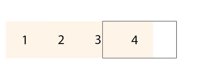
1. First, the initial state is as follows, then move slowly to the right (the black box is the visual area).
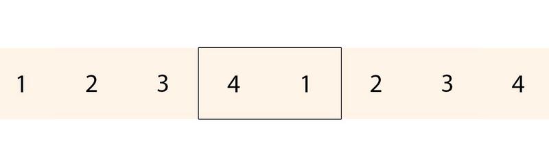
2. But then, when you scroll to the last one, there will be problems! The following figure
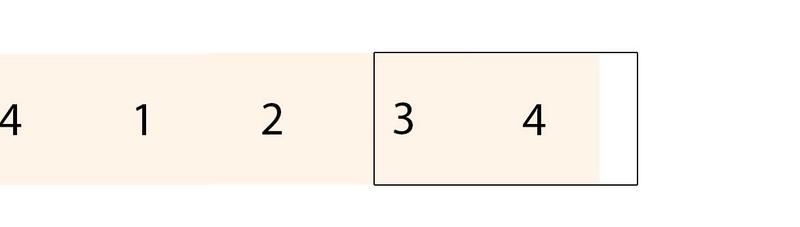
3. So the correct posture should be, so you need to copy the scrolling content once!
4. But the second step is still unavoidable.
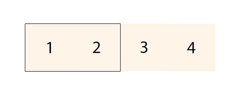
5. We need to do one step here, just as we roll to the first picture of the next wheel. The following figure (in this case, excluding the four li copies, there are four, each 200 px, when Fang ul scrolls 800 px)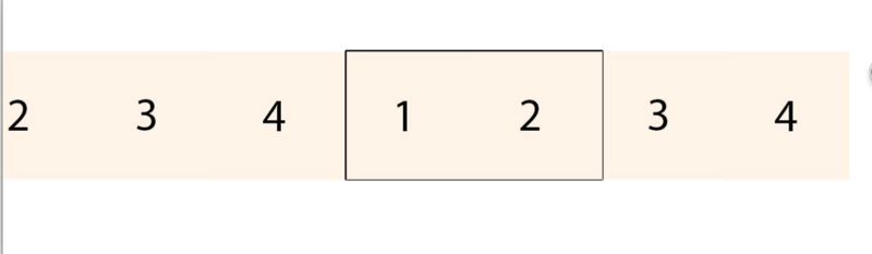
6. Scroll here, pull back instantly, return to the original position, and then scroll (when ul scrolls 800px, pull back to the original position instantly, equivalent to not start scrolling)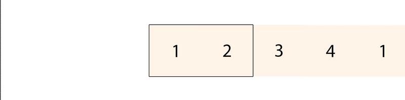
5-2 Implementation Process
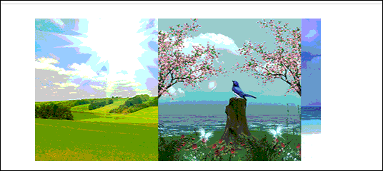
1. First of all, the layout is a div in a black box, and the ul-li layout with 1234 in orange.
Look at the following code comments, combined with the above principles, you will understand very well!
The html code is as follows
<div class="demo-marquee">
    <ul class="fllil">
        <li><img src="image/1.jpg"/>
        </li>
        <li><img src="image/2.jpg"/>
        </li>
        <li><img src="image/3.jpg"/>
        </li>
        <li><img src="image/4.jpg"/>
        </li>
        <!--The following four li It's copying content.-->
        <li><img src="image/1.jpg"/>
        </li>
        <li><img src="image/2.jpg"/>
        </li>
        <li><img src="image/3.jpg"/>
        </li>
        <li><img src="image/4.jpg"/>
        </li>
    </ul>
    <div class="clear"></div>
</div>
css code
<style>
    .demo-marquee {
        width: 400px;
        margin: 20px auto;
        overflow: hidden;
    }

    .demo-marquee ul {
        /*In this case, ul width should be the number of li * li width*/
        width: 1600px;
        /*Execute animation*/
        animation: ec-marquee-move 6s infinite linear;
    }

    .demo-marquee ul:hover {
        /*When the mouse is put on, the animation pauses*/
        animation-play-state: paused;
    }
    /*Define animation*/
    /*When you scroll 800px to the left, it's time to end, and then by the way, go back to the starting point for the next animation.*/
    @keyframes ec-marquee-move {
        0% {
            transform: translateX(0px);
        }
        100% {
            transform: translateX(-800px);
        }
    }
</style>
5-3 and JS implementation comparison
1. This animation, of course, is better in performance than css3, and certainly in flexibility. For example, do the following figure. Click the left and right arrows to change direction!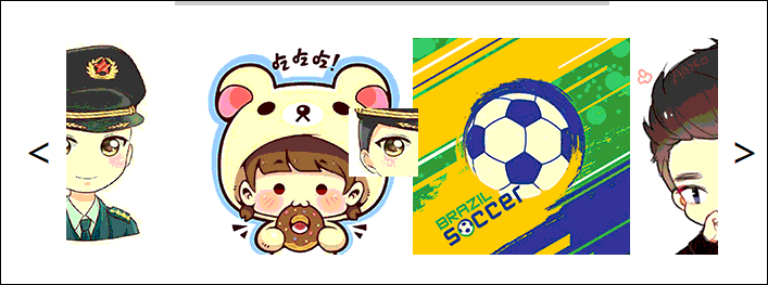
Another is that, for example, in the case above, the number of li is changing, so the width of ul is also to be calculated with js, and if the content of ul is to be copied, the programmer's thinking should also be using js, rather than manually replicating!
2. Therefore, this animation is recommended to use the combination of js and css3, so that the best results, performance and flexibility have been compromised, cost-effective is undoubtedly the best!
5-4 complete code
<!DOCTYPE html>
<html lang="en">
<head>
    <meta charset="UTF-8">
    <title>ec-css Seamless rolling</title>
    <link rel="stylesheet" href="reset.css">
    <style>
        .demo-marquee {
            width: 400px;
            margin: 20px auto;
            overflow: hidden;
        }

        .demo-marquee ul {
            width: 1600px;
            animation: ec-marquee-move 6s infinite linear;
        }

        .demo-marquee ul:hover {
            animation-play-state: paused;
        }

        @keyframes ec-marquee-move {
            0% {
                transform: translateX(0px);
            }
            100% {
                transform: translateX(-800px);
            }
        }
    </style>
</head>
<body>
<div class="demo-marquee">
    <ul class="fllil">
        <li><img src="image/1.jpg"/>
        </li>
        <li><img src="image/2.jpg"/>
        </li>
        <li><img src="image/3.jpg"/>
        </li>
        <li><img src="image/4.jpg"/>
        </li>
        <li><img src="image/1.jpg"/>
        </li>
        <li><img src="image/2.jpg"/>
        </li>
        <li><img src="image/3.jpg"/>
        </li>
        <li><img src="image/4.jpg"/>
        </li>
    </ul>
    <div class="clear"></div>
</div>
</body>
</html>
5. Summary
About css3, my development principle is to use CSS3 to solve, I will not write js, but if I want to write js, I will not be stingy not to write js, only use CSS3 to write back and ask for the effect! CSS3 with js, can make a lot of unexpected shock effect, which depends on how big the hole is!
Okay, today we have a preliminary understanding of the transition and animation of CSS3 through three cases. Hope to give you a warm-up role, or you see these three cases, know how to develop other cases, divergent thinking! But this is just the tip of the iceberg for the transition and animation of css3. Even if CSS3 has no other new features, the charm of transition and animation is enough. You can also search the case of CSS3 online! You know the charm of css3! I will continue to write about the new features of CSS3 in the future.
Finally, it's the old saying. If you think I'm writing poorly and wrong, you are welcome to give me some advice. Let's learn from each other and help each other!