And find out how much he takes me as a brother
The story goes like this:
I went to a pancake shop happily
.


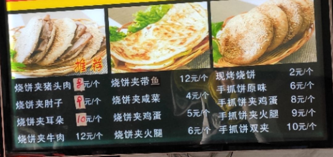
Looking up, the two brothers raised their prices again
Sigh, you really can't eat meat burgers anymore
Order two scones and a bowl of wonton
Near the end of the meal, I received a letter from my friend Adong
Adong is my junior high school classmate and has not been in touch for some days

Looking at him, he was almost talking about the block chain. Although it was unreliable, he promised to let Adong do the drawing for him.
I finished my last bite and went back to the company and decided not to nap.
Start!
Adong wants such a picture:

Line chart, get data first
Just the picture shows the data source:'China Pig Net*
Open the official website, find and jump to the pork price website http://zhujia.zhuwang.cc*

F12, Network looks at the asynchronous request XHR and finds the price interface successfully.

A new tab opens and Json data is parsed online. Friends who don't know this can click on it. Playing with Json data in python

Partial crawler code (see download address at the end of the article for full code):
def get_comments(url):
    doc = get_json(url)
    dic = {}
    dic['pigprice'] = doc['pigprice']
    dic['pig_in'] = doc['pig_in']
    dic['pig_local'] = doc['pig_local']
    dic['maizeprice'] = doc['maizeprice']
    dic['bean'] = doc['bean']
    a = '-'.join(doc['time'][3])
    b = time.strftime('%Y-%m-%d',time.localtime(time.time()))
    print(dateRange(a,b))
    dic['time'] = dateRange(a,b)
    return pd.DataFrame(dic)

data =get_comments('http://zhujia.zhuwang.cc/index/api/chartData?areaId=-1&aa=1571997555296')
Run result:

Successfully Acquired Prices for the Last Year
Let's start with a line chart for Adong:
The first foreign ternary is the best choice for the price of pigs*
Line charts can be easily made using matplotlib.
from pylab import mpl
import  matplotlib.pyplot as plt
mpl.rcParams['font.sans-serif'] = ['SimHei'] #Specify the default font
mpl.rcParams['axes.unicode_minus']

plt.figure(figsize=(8,4), dpi=80)
plt.plot(data['time'],data['pigprice'], color="r",linestyle = "-")
plt.xticks(data['time'][2::121], rotation=0)
plt.xlabel("Pig*(Foreign ternary) element/Kg.")

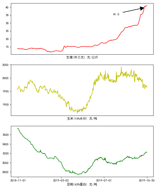
Feels like it's a little short, so you can mark the price for the latest day
Now that you have the price of corn and soybean meal, let's do it together.
Use plt.subplot to draw multiple subgraphs
from pylab import mpl
import  matplotlib.pyplot as plt
mpl.rcParams['font.sans-serif'] = ['SimHei'] #Specify the default font
mpl.rcParams['axes.unicode_minus']

plt.figure(figsize=(8,10), dpi=80)
plt.figure(1)
ax1 = plt.subplot(311)
plt.plot(data['time'],data['pigprice'], color="r",linestyle = "-")
plt.xticks([])
plt.annotate(data['pigprice'][365], xy=(data['time'][365], 40), xytext=(data['time'][270], 35), arrowprops=dict(facecolor='black', shrink=0.1, width=0.5))
plt.xlabel("Pig*(Foreign ternary) element/Kg.")

ax2 = plt.subplot(312)
plt.plot(data['time'],data['maizeprice'],color="y",linestyle = "-")
plt.xticks([])
plt.xlabel("Corn(15%Water content) element/ton")

ax3 = plt.subplot(313)
plt.plot(data['time'],data['bean'],color="g",linestyle = "-")
plt.xlabel("Soybean meal(43%protein) element/ton")
plt.xticks(data['time'][2::121], rotation=0)

To be finished,
To Adong.
But get this reply


Originally, in his heart, he defined a friend like this.
Yes?
It's very East Brother,
This is a brother.
One-click crawl for the latest pork price*Visual code uploaded github:
https://github.com/zpw1995/aotodata/tree/master/interest/pig