Preface
The text and pictures of this article are from the Internet, only for learning and communication, not for any commercial purpose. The copyright belongs to the original author. If you have any questions, please contact us in time for handling.
Author: I was bitten by a dog
When we talk about data visualization, we usually use matlab lib and pyecharts. But today I'm going to focus on Plotly's visual library.
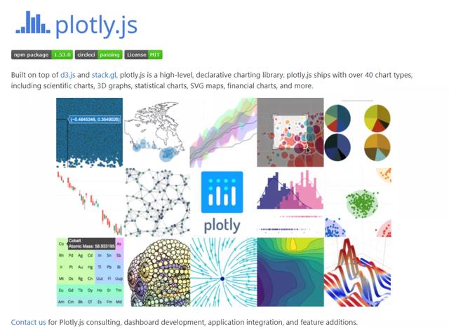
This library is written on the front end using js, so the drawing is very beautiful, not as stiff as that drawn by matplotlylib. plotly provides Python support library. You can use pip to install directly:
pip install plotly
Using plot in python is very simple. Let's first look at a simple histogram example:
import plotly.graph_objects as go
animals=['giraffes', 'orangutans', 'monkeys']

fig = go.Figure(data=[
    go.Bar(name='SF Zoo', x=animals, y=[20, 14, 23]),
    go.Bar(name='LA Zoo', x=animals, y=[12, 18, 29])
])
# Change the bar mode
fig.update_layout(barmode='group')
fig.show()
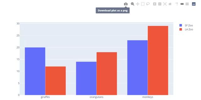
It's very convenient to use. It's similar to the drawing steps of matplotlylib. Let's take a look at a group of examples about personalized display:
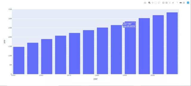
Draw a simple histogram with the data set of plot express:
import plotly.express as px
data_canada = px.data.gapminder().query("country == 'Canada'")
fig = px.bar(data_canada, x='year', y='pop')
fig.show()
This kind of chart still looks plain. We can use parameters to define the style of the bar chart:
import plotly.express as px
data = px.data.gapminder()

data_canada = data[data.country == 'Canada']
fig = px.bar(data_canada, x='year', y='pop',
             hover_data=['lifeExp', 'gdpPercap'], color='lifeExp',
             labels={'pop':'population of Canada'}, height=400)
fig.show()
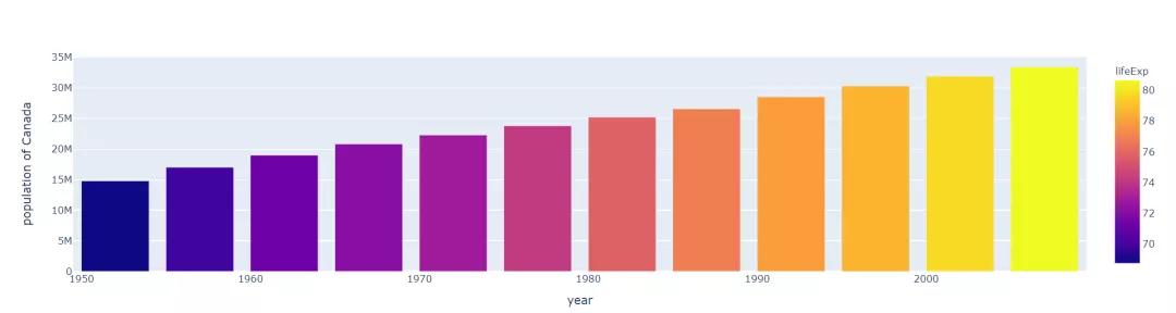
After adjusting the style, it will be obvious that the data display will be more friendly and can clearly see the growth of the data.
In addition to the histogram, there are other scatter charts, line charts, pie charts, bar charts, box charts and so on (also including some heat charts, climbing charts, map distribution and so on).
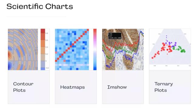
Next, we use Python to draw some demos of the basic plot of ploty:
(if you need to collect with Plotly's suggestions!)
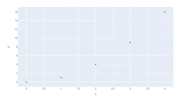
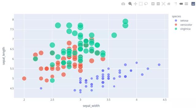
Scatter diagram
The core value of scatter chart is to find the relationship between variables. Do not simply understand this relationship as a linear regression relationship. There are many relationships among variables, such as linear relationship, exponential relationship, logarithmic relationship, etc. of course, no relationship is also an important relationship. Scatter chart is more research chart, which can help us find the hidden relationship between variables and make important guidance for our decision-making.
import plotly.express as px
fig = px.scatter(x=[0, 1, 2, 3, 4], y=[0, 1, 4, 9, 16])
fig.show()
import plotly.express as px
df = px.data.iris()  # px Own data set
fig = px.scatter(df, x="sepal_width", y="sepal_length", color="species",
                 size='petal_length', hover_data=['petal_width'])
fig.show()
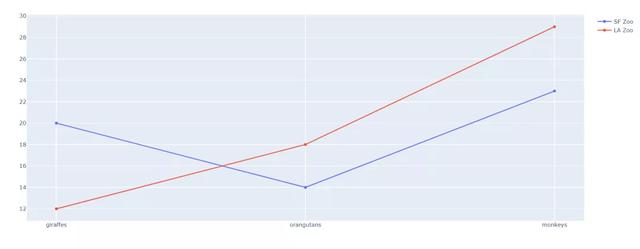
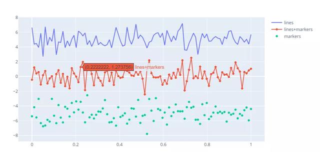
Line chart
Line chart can display continuous data changing with time (according to the common scale setting), so it is very suitable for displaying the trend of data at the same time interval. For example, the monitoring data graphs we often see are generally line graphs.
import plotly.graph_objects as go
animals = ['giraffes', 'orangutans', 'monkeys']

fig = go.Figure(data=[
    go.Scatter(name='SF Zoo', x=animals, y=[20, 14, 23]),
    go.Scatter(name='LA Zoo', x=animals, y=[12, 18, 29])
])
fig.show()
import plotly.graph_objects as go
import numpy as np
np.random.seed(1)

N = 100
random_x = np.linspace(0, 1, N)
random_y0 = np.random.randn(N) + 5
random_y1 = np.random.randn(N)
random_y2 = np.random.randn(N) - 5

# Create traces
fig = go.Figure()
fig.add_trace(go.Scatter(x=random_x, y=random_y0,
                    mode='lines',
                    name='lines'))
fig.add_trace(go.Scatter(x=random_x, y=random_y1,
                    mode='lines+markers',
                    name='lines+markers'))
fig.add_trace(go.Scatter(x=random_x, y=random_y2,
                    mode='markers', name='markers'))

fig.show()
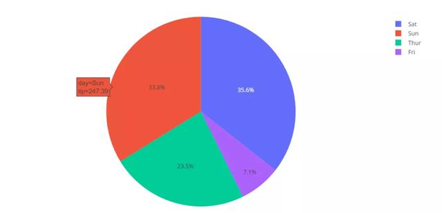
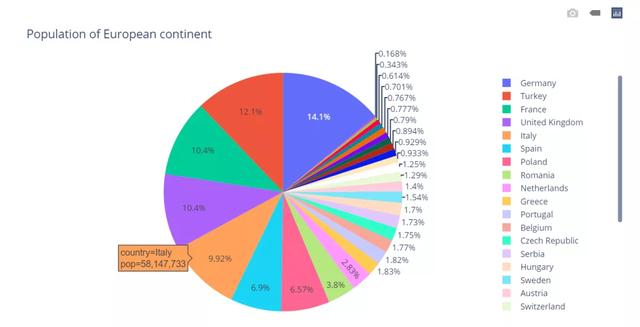
Pie chart
Pie chart is mainly used to study the proportion of each component in the whole. It can analyze the component structure and proportion of the project intuitively and describe the weight sharing at a glance. For example, when we count the total expenditure of all kinds of expenses, we can clearly see the big spending by using pie chart at this time.
import plotly.express as px
# This dataframe has 244 lines, but 4 distinct values for `day`
df = px.data.tips()
fig = px.pie(df, values='tip', names='day')
fig.show()
import plotly.express as px# plotly Data set of,type:DataFramedf = px.data.gapminder().query("year == 2007").query("continent == 'Europe'")
df.loc[df['pop'] < 2.e6, 'country'] = 'Other countries' # Represent only large countries
fig = px.pie(df, values='pop', names='country', title='Population of European continent')
fig.show()
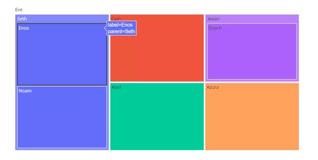
Treemap (rectangular tree)
The rectangular Tree chart is suitable for displaying data with hierarchical relationship, and can intuitively reflect the comparison between peers. A Tree like structure is transformed into a plane space rectangle, just like a map, which guides us to discover the story behind the exploration data.
The rectangular tree graph uses the rectangle to represent the nodes in the hierarchical structure, and the hierarchical relationship between the parent and child nodes is expressed by the mutual nesting metaphor between the rectangles. Starting from the root node, the screen space is divided into several rectangles according to the number of corresponding child nodes, and the area size of rectangles usually corresponds to the attributes of nodes. Each rectangle is divided recursively according to the child nodes of the corresponding nodes until the leaf nodes are known.
import plotly.express as px
fig = px.treemap(
    names = ["Eve","Cain", "Seth", "Enos", "Noam", "Abel", "Awan", "Enoch", "Azura"],
    parents = ["", "Eve", "Eve", "Seth", "Seth", "Eve", "Eve", "Awan", "Eve"]
)
fig.show()
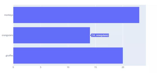
Horizontal histogram
Just like the vertical histogram, it is used to list and compare the differences between multiple individuals. Through the length of the histogram, we can clearly see the differences between the data.
import plotly.graph_objects as go
# Just modify the horizontal parameters
fig = go.Figure(go.Bar(
            x=[20, 14, 23],
            y=['giraffes', 'orangutans', 'monkeys'],
            orientation='h'))

fig.show()
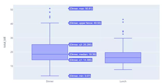
Box diagram
Box plot, also known as box plot or box line plot, is a statistical chart used to display a group of data dispersion. Named for its shape like a box. It is also often used in various fields, common in quality management. It is mainly used to reflect the distribution characteristics of the original data, and also to compare the distribution characteristics of multiple groups of data.
import plotly.express as px
df = px.data.tips()
fig = px.box(df, x="time", y="total_bill")
fig.show()
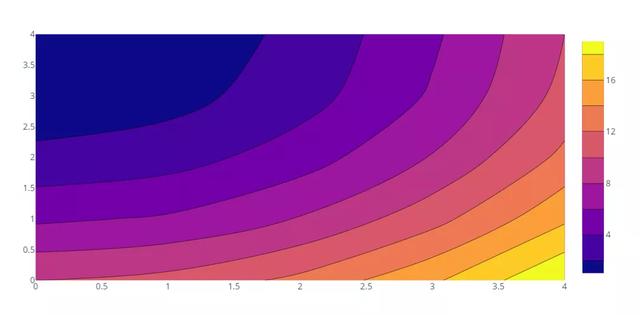
Contour map
There are two-dimensional and three-dimensional contour maps. In data analysis, the height is expressed as the number or occurrence of the point, and the same indicator is at a loop line (or height).
import plotly.graph_objects as go

fig = go.Figure(data =
    go.Contour(
        z=[[10, 10.625, 12.5, 15.625, 20],
           [5.625, 6.25, 8.125, 11.25, 15.625],
           [2.5, 3.125, 5., 8.125, 12.5],
           [0.625, 1.25, 3.125, 6.25, 10.625],
           [0, 0.625, 2.5, 5.625, 10]]
    ))
fig.show()
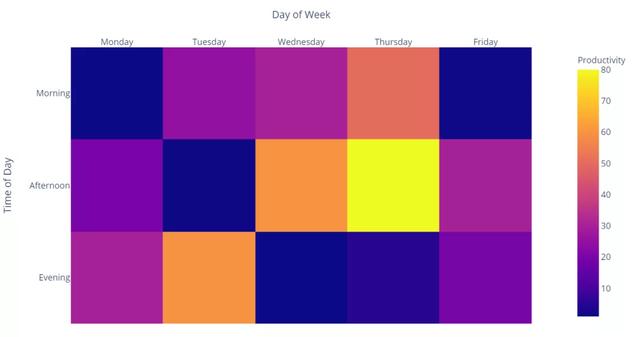
Thermogram
Thermogram refers to the use of thermogram to show the user's behavior on the website. Places with large number of views and large number of clicks are red, while places with small number of views and small number of clicks are colorless and blue. There are seven kinds of common heat maps: click heat map, attention heat map, analysis heat map, comparison heat map, sharing heat map, floating layer heat map and historical heat map.
import plotly.express as px
data=[[1, 25, 30, 50, 1], [20, 1, 60, 80, 30], [30, 60, 1, 5, 20]]
fig = px.imshow(data,
                labels=dict(x="Day of Week", y="Time of Day", color="Productivity"),
                x=['Monday', 'Tuesday', 'Wednesday', 'Thursday', 'Friday'],
                y=['Morning', 'Afternoon', 'Evening']
               )
fig.update_xaxes(side="top")
fig.show()
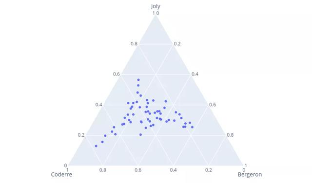
Ternary graph
A Ternary plot, also known as a Ternary plot, has three coordinate axes. Its three coordinate axes are connected "head to tail" to form an equilateral triangle with an included angle of 60 degrees. The "element" is the component, or part. The ternary diagram is mainly used to show the proportion of the three components of different samples, which is common in physical chemistry.
import plotly.express as px
df = px.data.election()
fig = px.scatter_ternary(df, a="Joly", b="Coderre", c="Bergeron")
fig.show()
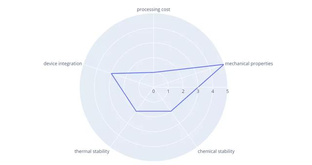
Radar chart
Radar map shows multidimensional data in two-dimensional form, so that the observer can know the strength of the object in various indicators at a glance, the most typical is to measure the multi-dimensional ability value of a character in the game.
import plotly.express as px
import pandas as pd
df = pd.DataFrame(dict(
    r=[1, 5, 2, 2, 3],
    theta=['processing cost','mechanical properties','chemical stability',
           'thermal stability', 'device integration']))
fig = px.line_polar(df, r='r', theta='theta', line_close=True)
fig.show()
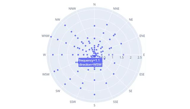
Polar chart
Polar plot is mainly used to plot the frequency response characteristics of the whole frequency domain on one plot.
import plotly.express as px
df = px.data.wind()
fig = px.scatter_polar(df, r="frequency", theta="direction")
fig.show()
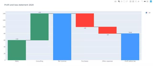
Waterfall Plot
Waterfall map is called Waterfall Plot because it looks like waterfall water. This kind of chart combines absolute value and relative value, and is suitable for expressing the quantitative change relationship between several specific values.
import plotly.graph_objects as go

fig = go.Figure(go.Waterfall(
    name = "20", orientation = "v",
    measure = ["relative", "relative", "total", "relative", "relative", "total"],
    x = ["Sales", "Consulting", "Net revenue", "Purchases", "Other expenses", "Profit before tax"],
    textposition = "outside",
    text = ["+60", "+80", "", "-40", "-20", "Total"],
    y = [60, 80, 0, -40, -20, 0],
    connector = {"line":{"color":"rgb(63, 63, 63)"}},
))

fig.update_layout(
        title = "Profit and loss statement 2020",
        showlegend = True
)

fig.show()
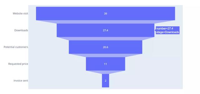
Funnel chart
Generally speaking, the conversion rate (such as marketing customer conversion) represents different levels from the top to the bottom, and the conversion rate gradually reduces and forms a funnel shape.
import plotly.express as px
data = dict(
    number=[39, 27.4, 20.6, 11, 2],
    stage=["Website visit", "Downloads", "Potential customers", "Requested price", "invoice sent"])
fig = px.funnel(data, x='number', y='stage')
fig.show()
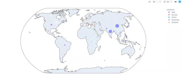
Bubble distribution map (including configuration base map)
import plotly.express as px
df = px.data.gapminder().query("year==2007")
fig = px.scatter_geo(df, locations="iso_alpha", color="continent",
                     hover_name="country", size="pop",
                     projection="natural earth")
fig.show()
PS: if you want to learn Python or are learning python, there are many Python tutorials, but are they the latest ones? Maybe you have learned something that someone else probably learned two years ago. Share a wave of the latest Python tutorials in 2020 in this editor. Access to the way, private letter small "information", you can get free Oh!