preface
The text and pictures of this article are from the Internet, only for learning and communication, not for any commercial purpose. The copyright belongs to the original author. If you have any questions, please contact us in time for handling.
time series
1. Time series diagram
Time series graph is used to visualize how a given index changes with time. Here, you can learn how air passenger traffic changed between 1949 and 1969.
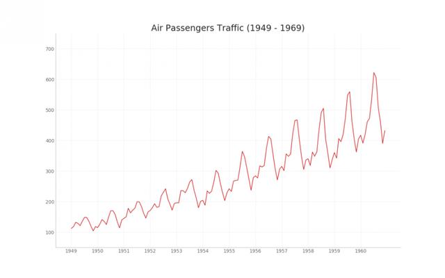
# Import Data
df = pd.read_csv('https://github.com/selva86/datasets/raw/master/AirPassengers.csv')

# Draw Plot
plt.figure(figsize=(16,10), dpi= 80)
plt.plot('date', 'traffic', data=df, color='tab:red')

# Decoration
plt.ylim(50, 750)
xtick_location = df.index.tolist()[::12]
xtick_labels = [x[-4:] for x in df.date.tolist()[::12]]
plt.xticks(ticks=xtick_location, labels=xtick_labels, rotation=0, fontsize=12, horizontalalignment='center', alpha=.7)
plt.yticks(fontsize=12, alpha=.7)
plt.title("Air Passengers Traffic (1949 - 1969)", fontsize=22)
plt.grid(axis='both', alpha=.3)

# Remove borders
plt.gca().spines["top"].set_alpha(0.0)
plt.gca().spines["bottom"].set_alpha(0.3)
plt.gca().spines["right"].set_alpha(0.0)
plt.gca().spines["left"].set_alpha(0.3)
plt.show()
2. Time series with markers
The following time series plots all peaks and troughs, and notes the occurrence of selected special events.
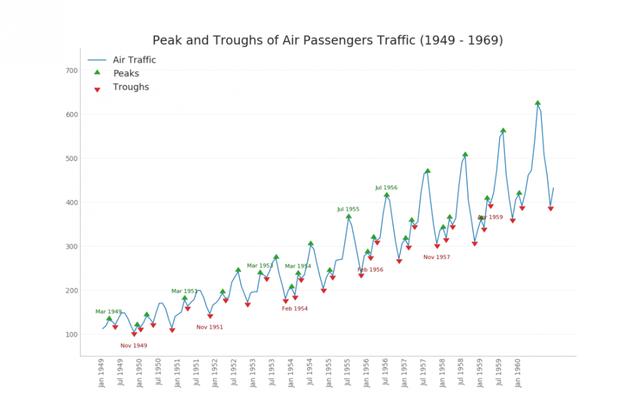
# Import Data
df = pd.read_csv('https://github.com/selva86/datasets/raw/master/AirPassengers.csv')

# Get the Peaks and Troughs
data = df['traffic'].values
doublediff = np.diff(np.sign(np.diff(data)))
peak_locations = np.where(doublediff == -2)[0] + 1

doublediff2 = np.diff(np.sign(np.diff(-1*data)))
trough_locations = np.where(doublediff2 == -2)[0] + 1

# Draw Plot
plt.figure(figsize=(16,10), dpi= 80)
plt.plot('date', 'traffic', data=df, color='tab:blue', label='Air Traffic')
plt.scatter(df.date[peak_locations], df.traffic[peak_locations], marker=mpl.markers.CARETUPBASE, color='tab:green', s=100, label='Peaks')
plt.scatter(df.date[trough_locations], df.traffic[trough_locations], marker=mpl.markers.CARETDOWNBASE, color='tab:red', s=100, label='Troughs')

# Annotate
for t, p in zip(trough_locations[1::5], peak_locations[::3]):
    plt.text(df.date[p], df.traffic[p]+15, df.date[p], horizontalalignment='center', color='darkgreen')
    plt.text(df.date[t], df.traffic[t]-35, df.date[t], horizontalalignment='center', color='darkred')

# Decoration
plt.ylim(50,750)
xtick_location = df.index.tolist()[::6]
xtick_labels = df.date.tolist()[::6]
plt.xticks(ticks=xtick_location, labels=xtick_labels, rotation=90, fontsize=12, alpha=.7)
plt.title("Peak and Troughs of Air Passengers Traffic (1949 - 1969)", fontsize=22)
plt.yticks(fontsize=12, alpha=.7)

# Lighten borders
plt.gca().spines["top"].set_alpha(.0)
plt.gca().spines["bottom"].set_alpha(.3)
plt.gca().spines["right"].set_alpha(.0)
plt.gca().spines["left"].set_alpha(.3)

plt.legend(loc='upper left')
plt.grid(axis='y', alpha=.3)
plt.show()
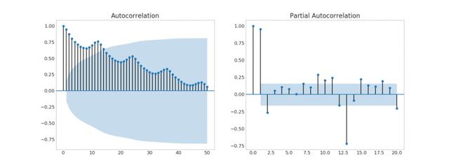
3. Autocorrelation (ACF) and partial autocorrelation (PACF) graphs
The ACF chart shows the correlation between the time series and its own lag. Each vertical line (on the autocorrelation graph) represents the correlation between the sequence and the lag starting from lag 0. The blue shaded area in the image is the level of significance. Those above the blue line are huge lags.
So how to explain?
For air passengers, we see as many as 14 lags that have crossed the blue line, so it's significant. This means that the 14 year old air passenger volume has an impact on today's passenger volume.
On the other hand, PACF shows the autocorrelation between any given (Time Series) lag and the current series, but removes the lag between the two.
# Import Data
df = pd.read_csv("https://github.com/selva86/datasets/raw/master/economics.csv")

x = df['date']
y1 = df['psavert']
y2 = df['unemploy']

# Plot Line1 (Left Y Axis)
fig, ax1 = plt.subplots(1,1,figsize=(16,9), dpi= 80)
ax1.plot(x, y1, color='tab:red')

# Plot Line2 (Right Y Axis)
ax2 = ax1.twinx()  # instantiate a second axes that shares the same x-axis
ax2.plot(x, y2, color='tab:blue')

# Decorations
# ax1 (left Y axis)
ax1.set_xlabel('Year', fontsize=20)
ax1.tick_params(axis='x', rotation=0, labelsize=12)
ax1.set_ylabel('Personal Savings Rate', color='tab:red', fontsize=20)
ax1.tick_params(axis='y', rotation=0, labelcolor='tab:red' )
ax1.grid(alpha=.4)

# ax2 (right Y axis)
ax2.set_ylabel("# Unemployed (1000's)", color='tab:blue', fontsize=20)
ax2.tick_params(axis='y', labelcolor='tab:blue')
ax2.set_xticks(np.arange(0, len(x), 60))
ax2.set_xticklabels(x[::60], rotation=90, fontdict={'fontsize':10})
ax2.set_title("Personal Savings Rate vs Unemployed: Plotting in Secondary Y Axis", fontsize=22)
fig.tight_layout()
plt.show()
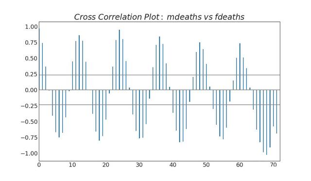
4. Cross correlation graph
The cross correlation graph shows the time lag between two time series.
from scipy.stats import sem

# Import Data
df = pd.read_csv("https://raw.githubusercontent.com/selva86/datasets/master/user_orders_hourofday.csv")
df_mean = df.groupby('order_hour_of_day').quantity.mean()
df_se = df.groupby('order_hour_of_day').quantity.apply(sem).mul(1.96)

# Plot
plt.figure(figsize=(16,10), dpi= 80)
plt.ylabel("# Orders", fontsize=16)
x = df_mean.index
plt.plot(x, df_mean, color="white", lw=2)
plt.fill_between(x, df_mean - df_se, df_mean + df_se, color="#3F5D7D")

# Decorations
# Lighten borders
plt.gca().spines["top"].set_alpha(0)
plt.gca().spines["bottom"].set_alpha(1)
plt.gca().spines["right"].set_alpha(0)
plt.gca().spines["left"].set_alpha(1)
plt.xticks(x[::2], [str(d) for d in x[::2]] , fontsize=12)
plt.title("User Orders by Hour of Day (95% confidence)", fontsize=22)
plt.xlabel("Hour of Day")

s, e = plt.gca().get_xlim()
plt.xlim(s, e)

# Draw Horizontal Tick lines
for y in range(8, 20, 2):
    plt.hlines(y, xmin=s, xmax=e, colors='black', alpha=0.5, linestyles="--", lw=0.5)

plt.show()
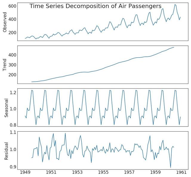
5. Time series decomposition diagram
The decomposition diagram of time series shows the decomposition of time series by trend, season and residual components.
"Data Source: https://www.kaggle.com/olistbr/brazilian-ecommerce#olist_orders_dataset.csv"
from dateutil.parser import parse
from scipy.stats import sem

# Import Data
df_raw = pd.read_csv('https://raw.githubusercontent.com/selva86/datasets/master/orders_45d.csv',
                     parse_dates=['purchase_time', 'purchase_date'])

# Prepare Data: Daily Mean and SE Bands
df_mean = df_raw.groupby('purchase_date').quantity.mean()
df_se = df_raw.groupby('purchase_date').quantity.apply(sem).mul(1.96)

# Plot
plt.figure(figsize=(16,10), dpi= 80)
plt.ylabel("# Daily Orders", fontsize=16)
x = [d.date().strftime('%Y-%m-%d') for d in df_mean.index]
plt.plot(x, df_mean, color="white", lw=2)
plt.fill_between(x, df_mean - df_se, df_mean + df_se, color="#3F5D7D")

# Decorations
# Lighten borders
plt.gca().spines["top"].set_alpha(0)
plt.gca().spines["bottom"].set_alpha(1)
plt.gca().spines["right"].set_alpha(0)
plt.gca().spines["left"].set_alpha(1)
plt.xticks(x[::6], [str(d) for d in x[::6]] , fontsize=12)
plt.title("Daily Order Quantity of Brazilian Retail with Error Bands (95% confidence)", fontsize=20)

# Axis limits
s, e = plt.gca().get_xlim()
plt.xlim(s, e-2)
plt.ylim(4, 10)

# Draw Horizontal Tick lines
for y in range(5, 10, 1):
    plt.hlines(y, xmin=s, xmax=e, colors='black', alpha=0.5, linestyles="--", lw=0.5)

plt.show()
6. Multiple time series diagram
You can plot multiple time series measuring the same value on the same chart, as shown below.
"Data Source: https://www.kaggle.com/olistbr/brazilian-ecommerce#olist_orders_dataset.csv"
from dateutil.parser import parse
from scipy.stats import sem

# Import Data
df_raw = pd.read_csv('https://raw.githubusercontent.com/selva86/datasets/master/orders_45d.csv',
                     parse_dates=['purchase_time', 'purchase_date'])

# Prepare Data: Daily Mean and SE Bands
df_mean = df_raw.groupby('purchase_date').quantity.mean()
df_se = df_raw.groupby('purchase_date').quantity.apply(sem).mul(1.96)

# Plot
plt.figure(figsize=(16,10), dpi= 80)
plt.ylabel("# Daily Orders", fontsize=16)
x = [d.date().strftime('%Y-%m-%d') for d in df_mean.index]
plt.plot(x, df_mean, color="white", lw=2)
plt.fill_between(x, df_mean - df_se, df_mean + df_se, color="#3F5D7D")

# Decorations
# Lighten borders
plt.gca().spines["top"].set_alpha(0)
plt.gca().spines["bottom"].set_alpha(1)
plt.gca().spines["right"].set_alpha(0)
plt.gca().spines["left"].set_alpha(1)
plt.xticks(x[::6], [str(d) for d in x[::6]] , fontsize=12)
plt.title("Daily Order Quantity of Brazilian Retail with Error Bands (95% confidence)", fontsize=20)

# Axis limits
s, e = plt.gca().get_xlim()
plt.xlim(s, e-2)
plt.ylim(4, 10)

# Draw Horizontal Tick lines
for y in range(5, 10, 1):
    plt.hlines(y, xmin=s, xmax=e, colors='black', alpha=0.5, linestyles="--", lw=0.5)

plt.show()
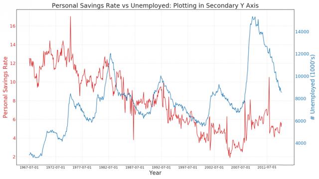
7. Double y-axis graph
If you want to display two time series measuring two different quantities at the same time point, you can draw the second series again on the second Y-axis on the right.
"Data Source: https://www.kaggle.com/olistbr/brazilian-ecommerce#olist_orders_dataset.csv"
from dateutil.parser import parse
from scipy.stats import sem

# Import Data
df_raw = pd.read_csv('https://raw.githubusercontent.com/selva86/datasets/master/orders_45d.csv',
                     parse_dates=['purchase_time', 'purchase_date'])

# Prepare Data: Daily Mean and SE Bands
df_mean = df_raw.groupby('purchase_date').quantity.mean()
df_se = df_raw.groupby('purchase_date').quantity.apply(sem).mul(1.96)

# Plot
plt.figure(figsize=(16,10), dpi= 80)
plt.ylabel("# Daily Orders", fontsize=16)
x = [d.date().strftime('%Y-%m-%d') for d in df_mean.index]
plt.plot(x, df_mean, color="white", lw=2)
plt.fill_between(x, df_mean - df_se, df_mean + df_se, color="#3F5D7D")

# Decorations
# Lighten borders
plt.gca().spines["top"].set_alpha(0)
plt.gca().spines["bottom"].set_alpha(1)
plt.gca().spines["right"].set_alpha(0)
plt.gca().spines["left"].set_alpha(1)
plt.xticks(x[::6], [str(d) for d in x[::6]] , fontsize=12)
plt.title("Daily Order Quantity of Brazilian Retail with Error Bands (95% confidence)", fontsize=20)

# Axis limits
s, e = plt.gca().get_xlim()
plt.xlim(s, e-2)
plt.ylim(4, 10)

# Draw Horizontal Tick lines
for y in range(5, 10, 1):
    plt.hlines(y, xmin=s, xmax=e, colors='black', alpha=0.5, linestyles="--", lw=0.5)

plt.show()
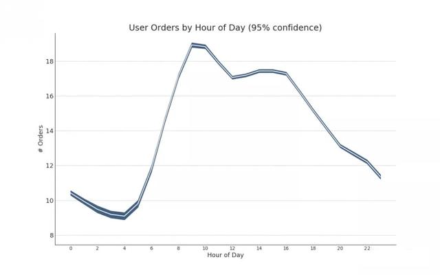
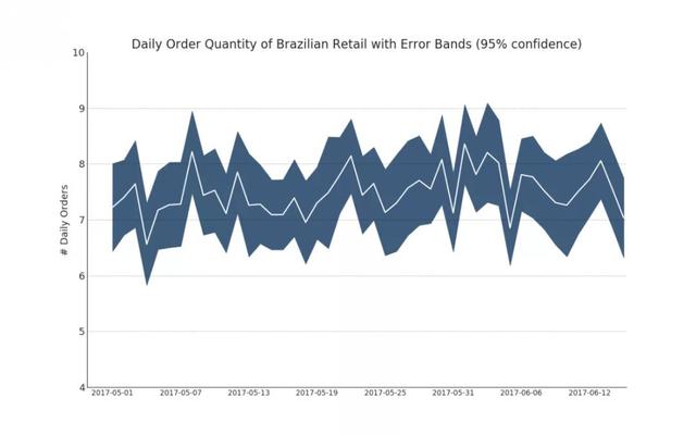
8. Time series with error band
If you have a time series dataset with multiple observations at each time point (date / time stamp), you can build a time series with error bands. You can see some examples below based on orders placed at different times of the day. Another example is the number of orders that arrive in 45 days.
In this method, the average number of orders is represented by a white line. Then 95% confidence band is calculated and plotted around the mean.
"Data Source: https://www.kaggle.com/olistbr/brazilian-ecommerce#olist_orders_dataset.csv"
from dateutil.parser import parse
from scipy.stats import sem

# Import Data
df_raw = pd.read_csv('https://raw.githubusercontent.com/selva86/datasets/master/orders_45d.csv',
                     parse_dates=['purchase_time', 'purchase_date'])

# Prepare Data: Daily Mean and SE Bands
df_mean = df_raw.groupby('purchase_date').quantity.mean()
df_se = df_raw.groupby('purchase_date').quantity.apply(sem).mul(1.96)

# Plot
plt.figure(figsize=(16,10), dpi= 80)
plt.ylabel("# Daily Orders", fontsize=16)
x = [d.date().strftime('%Y-%m-%d') for d in df_mean.index]
plt.plot(x, df_mean, color="white", lw=2)
plt.fill_between(x, df_mean - df_se, df_mean + df_se, color="#3F5D7D")

# Decorations
# Lighten borders
plt.gca().spines["top"].set_alpha(0)
plt.gca().spines["bottom"].set_alpha(1)
plt.gca().spines["right"].set_alpha(0)
plt.gca().spines["left"].set_alpha(1)
plt.xticks(x[::6], [str(d) for d in x[::6]] , fontsize=12)
plt.title("Daily Order Quantity of Brazilian Retail with Error Bands (95% confidence)", fontsize=20)

# Axis limits
s, e = plt.gca().get_xlim()
plt.xlim(s, e-2)
plt.ylim(4, 10)

# Draw Horizontal Tick lines
for y in range(5, 10, 1):
    plt.hlines(y, xmin=s, xmax=e, colors='black', alpha=0.5, linestyles="--", lw=0.5)

plt.show()
9. Stacked area map
Stacked area map shows the contribution of multiple time series intuitively, so it can be easily compared with each other.
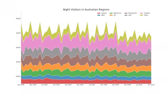
# Import Data
df = pd.read_csv('https://raw.githubusercontent.com/selva86/datasets/master/nightvisitors.csv')

# Decide Colors
mycolors = ['tab:red', 'tab:blue', 'tab:green', 'tab:orange', 'tab:brown', 'tab:grey', 'tab:pink', 'tab:olive']

# Draw Plot and Annotate
fig, ax = plt.subplots(1,1,figsize=(16, 9), dpi= 80)
columns = df.columns[1:]
labs = columns.values.tolist()

# Prepare data
x  = df['yearmon'].values.tolist()
y0 = df[columns[0]].values.tolist()
y1 = df[columns[1]].values.tolist()
y2 = df[columns[2]].values.tolist()
y3 = df[columns[3]].values.tolist()
y4 = df[columns[4]].values.tolist()
y5 = df[columns[5]].values.tolist()
y6 = df[columns[6]].values.tolist()
y7 = df[columns[7]].values.tolist()
y = np.vstack([y0, y2, y4, y6, y7, y5, y1, y3])

# Plot for each column
labs = columns.values.tolist()
ax = plt.gca()
ax.stackplot(x, y, labels=labs, colors=mycolors, alpha=0.8)

# Decorations
ax.set_title('Night Visitors in Australian Regions', fontsize=18)
ax.set(ylim=[0, 100000])
ax.legend(fontsize=10, ncol=4)
plt.xticks(x[::5], fontsize=10, horizontalalignment='center')
plt.yticks(np.arange(10000, 100000, 20000), fontsize=10)
plt.xlim(x[0], x[-1])

# Lighten borders
plt.gca().spines["top"].set_alpha(0)
plt.gca().spines["bottom"].set_alpha(.3)
plt.gca().spines["right"].set_alpha(0)
plt.gca().spines["left"].set_alpha(.3)

plt.show()
10. Area map (not stacked)
Unstacked area maps are used to visualize the progress (up and down) of two or more series relative to each other. In the chart below, you can see clearly how the personal saving rate will decrease as the median of unemployment increases. The unstacked area map shows this phenomenon well.

import matplotlib as mpl
import calmap

# Import Data
df = pd.read_csv("https://raw.githubusercontent.com/selva86/datasets/master/yahoo.csv", parse_dates=['date'])
df.set_index('date', inplace=True)

# Plot
plt.figure(figsize=(16,10), dpi= 80)
calmap.calendarplot(df['2014']['VIX.Close'], fig_kws={'figsize': (16,10)}, yearlabel_kws={'color':'black', 'fontsize':14}, subplot_kws={'title':'Yahoo Stock Prices'})
plt.show()
11. Calendar heat map
Calendar map is an alternative to time series to visualize time-based data, rather than the preferred method. Although visually appealing, the values are not very obvious. However, it can effectively depict extreme values and holiday effects.
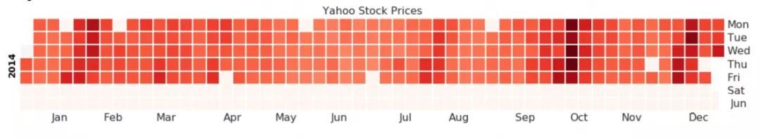
import matplotlib as mpl
import calmap

# Import Data
df = pd.read_csv("https://raw.githubusercontent.com/selva86/datasets/master/yahoo.csv", parse_dates=['date'])
df.set_index('date', inplace=True)

# Plot
plt.figure(figsize=(16,10), dpi= 80)
calmap.calendarplot(df['2014']['VIX.Close'], fig_kws={'figsize': (16,10)}, yearlabel_kws={'color':'black', 'fontsize':14}, subplot_kws={'title':'Yahoo Stock Prices'})
plt.show()
12. Seasonal map
The seasonal chart can be used to compare the time series performance of the same day (year / month / week, etc.) of the previous season.
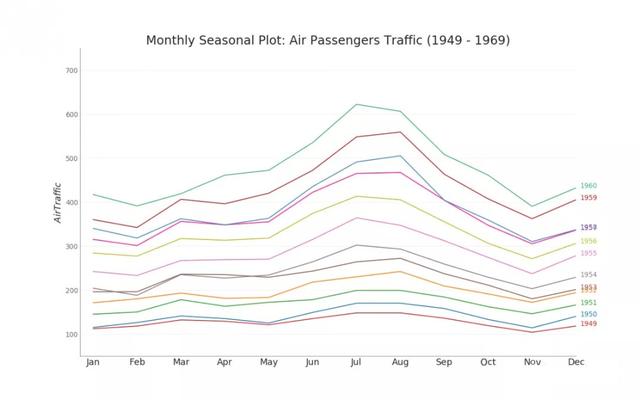
from dateutil.parser import parse

# Import Data
df = pd.read_csv('https://github.com/selva86/datasets/raw/master/AirPassengers.csv')

# Prepare data
df['year'] = [parse(d).year for d in df.date]
df['month'] = [parse(d).strftime('%b') for d in df.date]
years = df['year'].unique()

# Draw Plot
mycolors = ['tab:red', 'tab:blue', 'tab:green', 'tab:orange', 'tab:brown', 'tab:grey', 'tab:pink', 'tab:olive', 'deeppink', 'steelblue', 'firebrick', 'mediumseagreen']
plt.figure(figsize=(16,10), dpi= 80)

for i, y in enumerate(years):
    plt.plot('month', 'traffic', data=df.loc[df.year==y, :], color=mycolors[i], label=y)
    plt.text(df.loc[df.year==y, :].shape[0]-.9, df.loc[df.year==y, 'traffic'][-1:].values[0], y, fontsize=12, color=mycolors[i])

# Decoration
plt.ylim(50,750)
plt.xlim(-0.3, 11)
plt.ylabel('$Air Traffic$')
plt.yticks(fontsize=12, alpha=.7)
plt.title("Monthly Seasonal Plot: Air Passengers Traffic (1949 - 1969)", fontsize=22)
plt.grid(axis='y', alpha=.3)

# Remove borders
plt.gca().spines["top"].set_alpha(0.0)
plt.gca().spines["bottom"].set_alpha(0.5)
plt.gca().spines["right"].set_alpha(0.0)
plt.gca().spines["left"].set_alpha(0.5)
# plt.legend(loc='upper right', ncol=2, fontsize=12)
plt.show()
No matter you are zero foundation or have foundation, you can get the corresponding study gift pack! It includes Python software tools and the latest introduction to practice in 2020. Add 695185429 for free.