The requirement is that you have a series of data that you write to death in the JS and use these data points to draw a line graph.The interface is then called to get the data for a point (only the transverse coordinates), which is represented on the line graph and displayed as the point data (tooltip).
First look at this babyChart.jsDraw an effect picture:
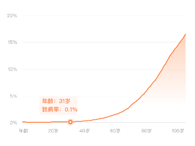
How about it? It's still pretty?Almost native to the UI designer's draft.
Say nothing but code first.
This is HTML:
<canvas id='mychart' width='300' height='200'></canvas>This is javascript, including the raw data:
function  drawImg(useryear){

    function range(s,e){
    var res =[]

    while(s!==e){
        res.push(s)
        s < e ? s++ : s--;
        }
    res.push(e) // or  res.push(s)
    return res
    }

var yearRange = range(0,105)


var sick  = '0.000705   0.0005905   0.000501    0.000434    0.000385    0.000355    0.0003315   0.000315    0.00031 0.00031 0.000316    0.0003245   0.000335    0.000346    0.0003575   0.000371    0.000386    0.0004025   0.000422    0.000444    0.0004685   0.0004965   0.0005285   0.0005665   0.0006105   0.0006605   0.000715    0.000773    0.0008345   0.000899    0.000968    0.0010435   0.00113 0.001232    0.001353    0.001496    0.00166 0.001847    0.002058    0.002294    0.0025585   0.0028545   0.0031835   0.003549    0.003952    0.004394    0.0048735   0.005375    0.005895    0.0064355   0.007002    0.007601    0.008242    0.008931    0.009672    0.0104615   0.0112935   0.0121585   0.013052    0.013975    0.0149355   0.0159485   0.017035    0.01822 0.01953 0.0211115   0.022795    0.02486 0.0269205   0.0291885   0.0318095   0.034342    0.03706 0.0393155   0.0417365   0.044381    0.0472995   0.050519    0.0532625   0.0562475   0.05972 0.0633585   0.0671325   0.070567    0.074136    0.0778795   0.0818525   0.0861115   0.0905695   0.0953985   0.100051    0.104925    0.1099105   0.1148875   0.119757    0.124417    0.128804    0.13315 0.1368325   0.140642    0.144481    0.1484965   0.1524595   0.1565535   0.160782    0.16515'

var sickData = sick.split(/\s+/).map(function(item){return +item})

const ORANGE = 'rgb(255,135,67)', FONT_COLOR = '#ff8743' , TOOL_COLOR = '#fff6f2'

var ctx = mychart.getContext('2d')

var gradient = ctx.createLinearGradient(0,0,0,200);

gradient.addColorStop(0,'rgba(255,135,67,0.5)');
gradient.addColorStop(0.5,'rgba(255,135,67,0.25)');
gradient.addColorStop(0.9,'rgba(255,135,67,0.05)');
gradient.addColorStop(1,'rgba(255,135,67,0)');

var linechartdata = {
    labels:yearRange,
    datasets:[{
        label:'Morbidity',
        data:sickData,
        backgroundColor: gradient,
        borderColor:ORANGE,
        pointBackgroundColor: 'transparent',
        pointBorderColor: 'transparent',
        pointHoverBackgroundColor: 'rgba(0,0,0, .5)',
        borderWidth:2,
        lineTension:0,
    }]
}


var drawTooltip = function(year,chartbody){

    return function(){

    var label__year = 'Age:' + year + 'year', label__sick = 'Morbidity:' + (100 * sickData[+year]).toFixed(1,10) + '%'

    var model = chartbody.chart.controller.getDatasetMeta(0).data[year]._model

    var ctx = chartbody.chart.ctx

    ctx.lineWidth = 2

    ctx.strokeStyle = 'rgba(255,135,67,.4)'

    ctx.fillStyle = '#fff'

    ctx.beginPath()

    ctx.arc(model.x,model.y,6,0,2*Math.PI)

    ctx.closePath()

    ctx.stroke()

    ctx.fill()

    ctx.lineWidth = 3

    ctx.strokeStyle = ORANGE + ''

    ctx.beginPath()

    ctx.arc(model.x,model.y,3.5,0,2*Math.PI)

    ctx.closePath()

    ctx.stroke()

    ctx.strokeStyle = TOOL_COLOR

    ctx.fillStyle = TOOL_COLOR

    var rectX = model.x, rectY = model.y - 20

    var rectWidth = 40, rectHeight = 30

    var cornerRadius = 10, margin = 5, dist = 30

    ctx.lineJoin = 'round'

    ctx.lineWidth = cornerRadius

    ctx.strokeRect(rectX -2 * dist,rectY - dist , rectWidth + dist, rectHeight )

    ctx.fillRect(rectX  - 2 * dist,rectY - dist , rectWidth  + dist, rectHeight )

    ctx.font = '700 12px PingFangSC-Regular'

    ctx.fillStyle = FONT_COLOR

    ctx.fillText(label__year,rectX -2 * dist,rectY - (dist/2) - margin)

    ctx.fillText(label__sick,rectX -2 * dist,rectY - (dist/2) + 2.5 * margin)

    }


}


var options = {
    animation:{
            easing:'easeInOutCubic',
            duration:100,
            onComplete:function(){
                var that = this
                setTimeout(drawTooltip(useryear,that),100)
                $('#mychart').click(function(e) {
                    $('.chart--root').css('pointer-events','none')
                });

            }
    },
    tooltips: {
            enabled:false
    },
    layout: { padding: { top:10, left: 17, bottom: 15, right: 20 } },
    scales:{
        xAxes:[{
            borderColor:'transparent',
            ticks:{
                fontColor:'#999',
                fontFamily:'PingFangSC-Regular',
                fontSize:10,
                // maxTicksLimit:5,
                autoSkip:false,
                maxRotation:0,
                callback:function(value){
                    if(value === 20 || value=== 40 ||value === 60 || value === 80 || value === 100){
                    return value + 'year';
                    }
                    else if(value===1){
                        return 'Age'
                    }
                    else return ''
                },


            },
            gridLines:{
                display:false,
            },

        }],
        yAxes:[{
            type:'linear',
            gridLines:{
                color:'#e5e9f2',
                lineWidth:.5,
                drawTicks:false,
                drawBorder:false,
                zeroLineColor:'transparent'
            },
            ticks:{
                fontColor:'#999',
                fontFamily:'PingFangSC-Regular',
                fontSize:10,
                maxTicksLimit:5,
                callback:function(value){
                    return Math.round(+value*100)+'%'
                }
            }
        }]
    },
    legend:{
        display:false,

    },
    elements:{
        point: {
            radius:0
        },
        line:{
            capBezierPoints:false,
        }
    }

}


var myline = new Chart(ctx,{
    type: 'line',
    data: linechartdata,
    options: options

})

}
Everyone is smart. I believe I can read it at a glance and I won't write any notes.There's a hole here, that data point sometimes disappears when the mouse point curve is drawn, so set the CSS attribute pointer-events of the canvas element and the iframe parent element outside of it to'none'in the callback function of the animation.(This graph doesn't require a single point to display the data for that point, so you can do it or, more simply, write pointer-events directly in CSS).
Specific debugging can be seen Chart.jsDocumentation , I feel a little confused about writing, small and small, without that big, all-round table.