
⌛ preface
For the front end, css is a necessary knowledge for beginners. Basically, after dabbling in html, you learn css. At the same time, css is also a necessary knowledge point for the front-end, such as horizontal and vertical center, two column layout, three column layout and bfc, which are both common and necessary test points for interview. Therefore, in the following article, we will systematically sort out the problems encountered in the autumn recruitment process on Monday.
Study together ⑧~~ ⏰
✏️ 1, CSS framework first
Let's use a mind map to understand some frequently asked questions about css. See the figure below for details 👇
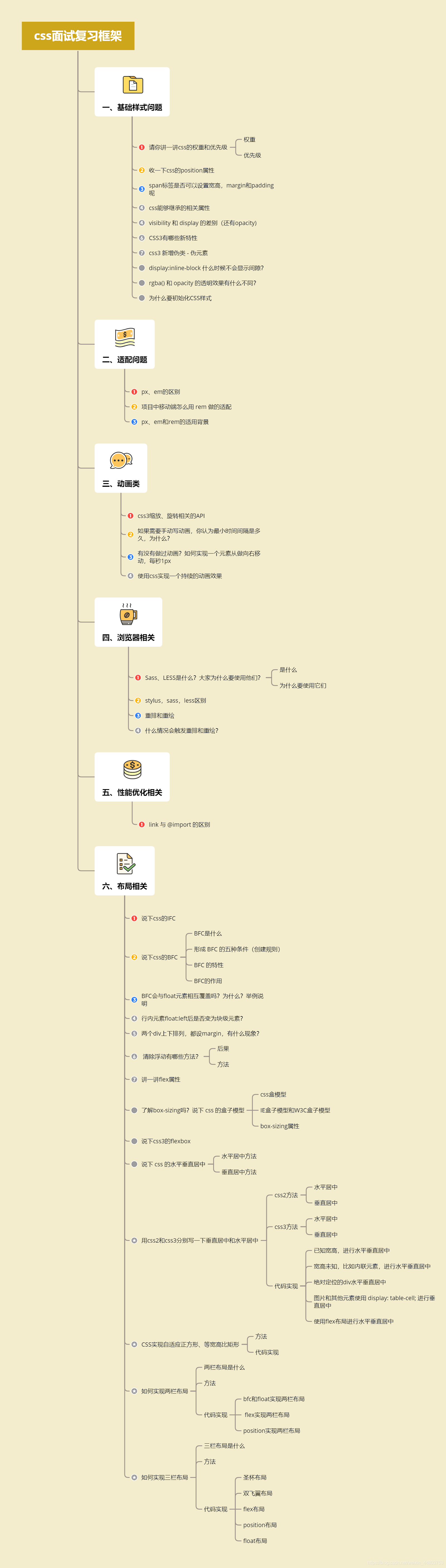
Let's start sorting out the answers to each question~ ⏳
🖌️ 2, Basic style problem
1. Please talk about the weight and priority of css
(1) Weight
| Grade | definition | Calculated value |
|---|---|---|
| Level 0 | Wildcard selectors, selectors, and logical composition pseudo classes | 0 |
| Level 1 | tag chooser | 1 |
| Level 2 | Class selectors, property selectors, and pseudo classes | 10 |
| Level 3 | ID Selector | 100 |
| Level 4 | style attribute inline | 1000 |
| Level 5 | !important | 10000 |
(2) Priority
The weight is the same, and the principle of "catching up from behind" written in the back covers the front
use! Important reaches the maximum priority and is used! When important, the priority of heavy weight is high
- Detailed article supplement 👇
- Original text: Who moved my selector? Deep understanding of CSS selector priorities
- Link: https://juejin.cn/post/6994580720807051301
2. Let's talk about the position property of CSS
static: no special positioning. The object follows the normal document flow. top, right, bottom, left and other attributes will not be applied.
relative: the object follows the normal document flow, but will be offset in the normal document flow according to the top, right, bottom, left and other attributes. Its cascade is defined by the z-index attribute.
Absolute: the object is separated from the normal document flow, and the top, right, bottom, left and other attributes are used for absolute positioning. Its cascade is defined by the z-index attribute.
fixed: the object breaks away from the normal document flow and uses the top, right, bottom, left and other attributes to locate it with the window as the reference point. When the scroll bar appears, the object will not scroll with it. Its cascade is defined by the z-index attribute.
sticky: similar to relative and fixed, apply relative before scrolling the viewport to the threshold, and apply fixed layout after scrolling to the threshold, which is determined by top.
- Detailed article supplement 👇
- Original text: You may have some misunderstandings about position and z-index
- Link: https://juejin.cn/post/6993468505773309982
3. Can I set the width, height, margin and padding for the span tag?
This question examines the effects of margin and padding on inline elements.
span tags are inline elements and cannot be set in width or height. However, margin and padding can be set, but it is worth noting that when setting margin and padding, only the horizontal direction has an effect, but the vertical direction has no effect.
See this explanation in an article:
While padding can be applied to all sides of an inline element,only left and right padding will have an effect on surrounding content.In the example below,50px of padding has been applied to all sides of the element.As you can see,it has an affect on the content on each side,but not on content above or below.
The above paragraph explains that when padding is applied to inline elements, it only affects the left and right horizontal directions, but has no effect on the up and down vertical directions.
4. css can implement inherited properties
(1) Font family properties
- Font: combined font
- Font family: Specifies the font family of the element
- Font weight: sets the font weight
- Font size: sets the font size
- Font style: defines the style of the font
- Font variant: set the font of small uppercase letters to display text, which means that all lowercase letters will be converted to uppercase, but all letters using small uppercase fonts have smaller font size than other text.
- Font stretch: stretch and deform the current font family. All mainstream browsers do not support.
- Font size adjust: specify an aspect value for an element to maintain the x-height of the preferred font.
(2) Text Series Properties
- Text indent: text indent
- Text align: align text horizontally
- Line height: line height
- Word spacing: increase or decrease the space between words (i.e. word spacing)
- Letter spacing: increase or decrease the space between characters (character spacing)
- Text transform: controls the case of text
- Direction: Specifies the writing direction of the text
- Color: text color
(3) Element visibility
- visibility
(4) Table layout properties
- caption-side,border-collapse,border-spacing,empty-cells,table-layout
(5) List layout properties
- list-style-type,list-style-image,list-style-position,list-style
(6) Generate content properties
- quotes
(7) Cursor properties
- cursor
(8) Page style properties
- page,page-break-inside,windows,orphans
(9) Sound style properties
- speak,speak-punctuation,speak-numeral,speak-header,speech-rate,volume,voice-family,pitch,pitch-range,stress,richness,,azimuth,elevation
- Detailed article stamp link below 👇
- Original text: Properties that can and cannot be inherited in CSS
- Link: https://www.cnblogs.com/thislbq/p/5882105.html
5. The difference between visibility and display (and opacity)
- visibility: setting hidden will hide the element, but its position still exists in the page document stream and will not be deleted, so it will trigger the redrawing of the browser rendering engine;
- display: setting the none attribute will hide the element and its position will not be preserved, so it will trigger the reflow and redrawing of the browser rendering engine;
- Opacity: the element will be set to be transparent, but its position is also in the page document stream and will not be deleted, so it will trigger the redrawing of the browser rendering engine; at the same time, it is worth noting that opacity can set the transition effect.
6. What are the new features of CSS3
- New CSS selectors (: not(.input): indicates all nodes where class is not input)
- Fillet (border radius: 8px)
- Multi column layout
- Shadows and Reflections (Shadow\Reflect)
- Text shadow
- Linear gradient
- Rotate, scale, position, tilt (transform)
- Animation
- Multi background, background clipping
7. css3 new pseudo class - pseudo element
Group 1:
- p: First of type selects each element that belongs to the first element of its parent element.
- p: Last of type selects each element that belongs to the last element of its parent element.
- p: Only of type selects each element that is unique to its parent element.
- p: Only child selects each element that belongs to the only child element of its parent element.
- p: Nth child (2) selects each element that belongs to the second child element of its parent element.
Group 2:
- : enabled enabled enabled form elements.
- : disabled disabled form elements.
- : checked radio box or check box is selected.
- :: before adds content before the element.
- : after adds content after the element. It can also be used to clear floating.
- :: first line adds a special style to the first line.
- :: first letter adds a special style to the first letter of the text.
Group 3:
- Pseudo class syntax is a: it is to make up for the deficiency of css regular class selector.
- Pseudo element syntax has two: it is an element generated by a virtual container created out of thin air.
8. Display: when does the inline block not display gaps?
-
float
-
Remove spaces
-
Use a negative margin value
-
Use font size: 0
-
Letter spacing
-
Word spacing
11. What is the difference in transparency between rgba() and opacity?
- Both rgba() and opacity can achieve transparency, but the biggest difference is that opacity acts on elements and the transparency of all contents in elements;
- rgba() only works on the color of the element or its background color. (child elements of elements that set rgba transparency will not inherit the transparency effect)
12. Why initialize CSS styles
Because of the compatibility of browsers, the default values of some tags are different for different browsers. If CSS is not initialized, there will often be page display differences between browsers.
Of course, the initialization style will have a certain impact on SEO, but you can't have both fish and bear's paw, but try to initialize with the least impact.
The simplest initialization method:
* {
        padding: 0;
        margin: 0;
    }
Taobao style initialization code:
body, h1, h2, h3, h4, h5, h6, hr, p, blockquote, dl, dt, dd, ul, ol, li, pre, form, fieldset, legend, button, input, textarea, th, td {
        margin: 0;
        padding: 0;
    }

body, button, input, select, textarea {
    font: 12px/1.5tahoma, arial;
}

h1, h2, h3, h4, h5, h6 {
    font-size: 100%;
}

address, cite, dfn, em, var {
    font-style: normal;
}

code, kbd, pre, samp {
    font-family: couriernew, courier, monospace;
}

small {
    font-size: 12px;
}

ul, ol {
    list-style: none;
}

a {
    text-decoration: none;
}

a:hover {
    text-decoration: underline;
}

sup {
    vertical-align: text-top;
}

sub {
    vertical-align: text-bottom;
}

legend {
    color: #000;
}

fieldset, img {
    border: 0;
}

button, input, select, textarea {
    font-size: 100%;
}

table {
    border-collapse: collapse;
    border-spacing: 0;
}
📁 3, Adaptation problem
1. Difference between px and em
- px and em are both length units. The difference is:
- px value is fixed and easy to calculate.
- The em value is not fixed. It is a relative unit. The font size of its corresponding parent element will be adjusted
2. How to adapt the mobile terminal with rem in the project
rem acts on the root element, that is, on the html element. In an actual project, it is usually set in the initialization style as follows:
html{
	font-size: 625%; /* I.e. 16px * 625% = 100px */
}
body{
	font-size: 0.16rem; /* I.e. 0.16rem * 100 = 16px */
}
3. Application background of px, em and rem
- px, absolute length unit, most commonly used;
- em, relative length unit, not commonly used;
- rem, a unit of relative length, often used in responsive layouts.
📂 4, Animation class
1. css3 scaling and rotation related API s
To understand the API s related to css animation, especially the attributes of animation, transition, transform and translate, you should know the differences between them. The details are as follows:
- Animation: used to set animation attributes. It is a short attribute, including 6 attributes;
- transition: used to set the style of elements. It has a similar effect to animation, but the details are very different;
- transform: used to rotate, scale, move or tilt elements, which has nothing to do with the animating styles;
- Translate: translate is only an attribute value of transform, that is, move. In addition, scale and so on.
2. If you need to write animation manually, what do you think is the minimum time interval and why?
The default frequency of most displays is 60Hz, i.e. 60 refreshes per second, so the theoretical minimum interval is 1 × 1000 m s 60 = 16.7 m s \frac{1×1000ms}{60}=16.7ms 601×1000ms=16.7ms
3. Have you ever done animation? How to move an element from doing to right, 1px per second
- translate transition transform
- requestAnimationFrame
- Animation animation
4. Use css to achieve a continuous animation effect
animation:mymove 5s infinite;

@keyframes mymove {
    from {
        top: 0px;
    }

    to {
        top: 200px;
    }
}
🗂️ 5, Browser related
1. What are Sass and LESS? Why do people use them?
(1) What is it
They are CSS preprocessors, dynamic style languages, and an abstraction layer on CSS. They are a special syntax / language compiled into CSS.
For example, LESS is a dynamic style language. CSS is endowed with the characteristics of dynamic language, such as variables, inheritance, operations and functions. LESS can be run on the client (IE 6 +, WebKit and Firefox are supported) or on the server (with the help of Node.js).
(2) Why use them?
- The structure is clear and easy to expand.
- It can easily shield browser private syntax differences. Needless to say, it encapsulates the repeated processing of browser syntax differences and reduces meaningless mechanical labor.
- Multiple inheritance can be easily implemented.
- Fully compatible with CSS code, it can be easily applied to old projects. LESS only extends CSS syntax, so old CSS code can also be compiled with LESS code.
2. Stylistic, sass, less differences
- They all have five basic characteristics of "variable", "mixing", "nesting", "inheritance" and "color mixing".
- The syntax of SASS and LESS is relatively rigorous. LESS requires that curly braces {} be used. Sass and Stylus can represent hierarchical and nested relationships through indentation.
- Sass has no concept of global variables, and LESS and Stylus have scope concepts similar to those of other languages.
- Sass is based on Ruby language, while LESS and Stylus can download corresponding libraries based on NodeJS NPM and compile them; This is why errors are sometimes reported when installing sass, and python scripts need to be installed.
3. What are rearrangement and redrawing
Redrawing does not necessarily need to be rearranged. Rearrangement will inevitably lead to redrawing.
Rearrangement: when a part of the render tree must be updated and the size of the node changes, the browser invalidates the affected part of the render tree and reconstructs the render tree.
Generally speaking, when DOM changes cause changes in the geometric attributes of elements, such as changing the width, height and position of elements, the browser has to recalculate the geometric attributes of elements and rebuild the rendering tree. This process is called "rearrangement".
Redraw: refers to the browser behavior triggered by the change of the appearance of an element. The browser will redraw the element according to the new attributes of the element to make the element present a new appearance.
Generally speaking, after the rearrangement, the reconstructed rendering tree should be rendered to the screen. This process is "redrawing".
DOM tree: represents the structure of the page
Render tree: indicates how the nodes of the page are displayed.
Once the rendering tree is built, you are ready to paint the page elements.
4. When will the rearrangement problem occur?
- Add, delete and update DOM nodes.
- Hide a DOM node through display: none -- trigger rearrangement and redrawing.
- Hide a DOM node through visibility: hidden -- only redrawing is triggered because there is no geometric change.
- Move or animate DOM nodes in the page.
- Add a style sheet and adjust style properties.
- User behavior, such as resizing windows, changing font size, or scrolling.
| Common rearrangement elements | |||
|---|---|---|---|
| width | height | padding | margin |
| display | border-width | border | top |
| position | font-size | float | text-align |
| overflow-y | font-weight | overflow | left |
| font-family | line-height | vertical-align | right |
| clear | white-space | bottom | min-height |
5. How to reduce the impact of rearrangement on performance?
-
Limit the influence range of rearrangement as much as possible, and try to be on low-level DOM nodes. As in the following example, if you want to change the style of p, don't add class to div. it's not good to influence child elements through parent elements.
<body>
    <div class="hello">
        <h4>hello</h4>
        <p><strong>Name:</strong>BDing</p>
        <h5>male</h5>
        <ol>
            <li>coding</li>
            <li>loving</li>
        </ol>
    </div>
</body>
When reflow rearrangement occurs on the p node, hello and body will be re rendered, and even h5 and ol will be affected.
-
Avoid setting a large number of style attributes, because if you change the node style by setting the style attribute, each setting will trigger reflow, so it is best to use the class attribute.
-
To realize the animation of elements, its position attribute should preferably be set to absorb or fixed, which will not affect the selection of the speed of the implementation of layout animation of other elements. For example, to realize an animation, moving in units of 1 pixel is the smoothest, but reflow will be too frequent and consume a lot of CPU resources. It will be much better if moving in units of 3 pixels.
-
Do not use the table layout, because once a certain element in the table triggers reflow, the entire table element will trigger reflow. Then, if you have to use table, you can set table layout: Auto; Or table layout: fixed; In this way, the table can be rendered line by line, which is also to limit the influence range of reflow.
-
If there is a calculation expression in CSS, it will be recalculated every time and start reflow once.
📏 6, Performance optimization related
1. The difference between link and @ import
link is HTML and @ import is CSS.
link supports parallel downloading to the maximum extent. Too much nesting of @ import leads to serial downloading and FOUC (document style is temporarily invalid).
link you can specify candidate styles through rel="alternate stylesheet".
The browser supports link earlier than @ import. You can use @ import to hide the style from the old browser.
@Before import ing a style rule, you can reference other files in the css file it introduces.
Generally speaking, link is better than @ import, and link has higher priority.
📐 7, Layout related
1. Tell me about the IFC of css
IFC is an intra line format context with the following characteristics:
- The inner Box will be placed horizontally;
- The horizontal spacing is determined by margin, padding and border.
2. Talk about the BFC of css
(1) What is BFC
BFC (Block Formatting Context) is a block level format context. It is the CSS rendering mode of box model layout in Web pages. It refers to an independent rendering area or an isolated independent container.
(2) Five conditions for forming BFC (creation rules)
- Root element (html is a bfc)
- Floating element (float has no value of none)
- Absolute positioning element (position value is absolute or fixed)
- The display value is one of inline block, table cell, table caption, flex and inline flex
- overflow does not include elements with visible value (hidden, auto, scroll)
(3) Characteristics of BFC
- The inner boxes will be placed one by one in the vertical direction.
- The distance in the vertical direction is determined by margin
- The area of bfc does not overlap the element area of float.
- When calculating the height of bfc, floating elements also participate in the calculation
- bfc is an independent container on the page. The child elements in the container will not affect the external elements.
(4) Role of BFC
- Can contain floating elements
- Not overwritten by floating elements
- Prevent margin folding of parent-child elements
3. Will BFC and float elements overlap each other? Why? Examples
No, because BFC is an independent isolation container in the page, and its internal elements will not interact with external elements. For example, two divs, the upper div has a float set. If the lower element is not BFC and the float is not set, the content of the upper element will be wrapped. If the lower element is set as overflow: hidden; Attribute, the classic two column layout can be realized. The content on the left has a fixed width, and the right is BFC, so it will be adaptive.
4. Does the inline element become a block level element after float:left?
When an inline element is set to float, it becomes more like an inline block (an inline block element with this attribute will have both inline and block level characteristics. The most obvious difference is that its default width is not 100%). At this time, setting padding top and padding bottom or width and height for inline elements is effective
5. Two div s are arranged up and down, with margin set. What's the phenomenon?
- Are taking the big one
- One plus one minus
Q: why is this phenomenon? Can you explain?
- It is determined by the block level format context. In BFC, the elements will be arranged up and down in BFC, and then the vertical distance is determined by margin, and overlap will occur. Specifically, the same positive takes the maximum, the same negative takes the maximum absolute value, and one positive and one negative are added;
- BFC is an independent isolation container in the page, and the internal child elements will not affect the external elements.
6. What are the ways to clear the float?
(1) Consequences
Height collapse will occur if floating is not cleared: the height of the parent element of the floating element is adaptive (when the parent element does not write the height, the parent element will collapse after the child element writes the floating)
(2) Method
- Clear clear floating (add empty div method) add an empty div under the floating element and write css style for the element: {clear:both;height:0;overflow:hidden;};
- Set the height of the parent of the floating element;
- The parent is floating at the same time (floating needs to be added to the parent's sibling elements);
- If the parent is set to inline block, its margin: 0, auto centering mode is invalid;
- Add overflow:hidden to the parent to clear the floating method;
- Universal clearing method after pseudo class clearing floating (now the mainstream method, recommended), the code is as follows:
.float_div:after {
    content: ".";
    clear: both;
    display: block;
    height: 0;
    overflow: hidden;
    visibility: hidden;
}

.float_div {
	zoom: 1
}
7. Talk about flex properties
Do you know the flex layout? Talk about the css attribute of flex and its meaning. What does flex:1 stand for and what does flex basis mean?
- Elastic box layout, a new property of CSS3, is used to facilitate layout, such as vertical centering
- The flex attribute is short for flex growth, flex shrink, and flex basis
8. Do you know box sizing? Say the box model of css
(1) css box model
CSS box model is essentially a box that encapsulates the surrounding HTML elements. It includes four attributes: margin, border, padding and actual content. CSS box model: standard model + IE model
Standard box model: width = content + border + padding
Low version ie box model: width = content width (content+border+padding). How to set it to IE box model:
box-sizing: border-box;
(2) IE box model and W3C box model
- W3C box model: content, padding, margin and border;
- box-sizing: content-box
- width = content width;
- Ie box model: the content part of IE calculates the border and padding;
- box-sizing: border-box
- width = border + padding + content width
(3) Box sizing properties
The box sizing attribute can be used to adjust these performances:
- Content box is the default value. If you set the width of an element to 100px, the content area of the element will be 100px wide, and the width of any border and inner margin will be increased to the width of the last drawn element.
- Border box tells the browser that the border and inner margin values you want to set are included in width. That is, if you set the width of an element to 100px, the 100px will contain its border and padding. The actual width of the content area is the value of width minus (border + padding). In most cases, this makes it easier to set the width and height of an element.
9. Say css3's flexbox
- CSS3's flexbox, that is, the elastic box layout model. It is a new CSS3 function for page layout. Flexbox can put the list in the same direction (from top to bottom, from left to right), and make the list extend to occupy the available space.
- More complex layouts can also be realized by nesting a flex container.
- Elements with Flex layout are called Flex containers, or "containers" for short.
- All its child elements automatically become container members, called Flex items, or "projects".
- The conventional layout is based on block and inline flow direction, while the Flex layout is based on Flex flow flow, which can be easily used in the office and can be adaptive to different screen sizes.
- There is more flexible space in the layout than before.
10. Say that the css is horizontally and vertically centered
(1) Horizontal centering method
- Element is an inline element. Set the parent element text align: Center
- If the element width is fixed, you can set the left and right margin to auto;
- If the element is absolutely positioned, set the parent element position to relative and the element left:0;right:0;margin:auto ;
- Using the flex box layout, specify the justify content attribute as center
- Set display to tab ceil
(2) Vertical centering method
- Set the display mode to table, display: table cell, and set vertical align: middle
- Use the flex layout and set it to align item: center
- In absolute positioning, set bottom:0,top:0, and margin:auto
- When the height is fixed in absolute positioning, set top:50%, and the margin top value is a negative value of half the height
- Center the text vertically and set line height to the height value
11. Write vertical center and horizontal center with css2 and css3 respectively
(1) css2 method
Horizontal center:
- div + margin: auto;
- span + text-align.
Vertical center:
- Use position, then left/top and margin to center vertically (known width and height and unknown width and height);
- Use position + margin;
- Use display: table cell.
(2) css3 method
Horizontal center:
- flex layout
Vertical center:
- flex layout
(3) Code implementation
I. known width and height, horizontal and vertical centering
<!DOCTYPE html>
<html lang="en">

<head>
    <meta charset="UTF-8" />
    <meta name="viewport" content="width=device-width, initial-scale=1.0" />
    <title>Given the width and height, center horizontally and vertically</title>
    <style>
        .outer {
            position: relative;
            width: 400px;
            height: 600px;
            background: yellow;
        }

        .inner {
            position: absolute;
            width: 200px;
            height: 300px;
            background: gray;
            left: 50%;
            top: 50%;
            margin: -150px 0 0 -100px;
        }
    </style>
</head>

<body>
    <div class="outer">
        <div class="inner"></div>
    </div>
</body>

</html>
II. The width and height are unknown, such as inline elements, which are centered horizontally and vertically
<!DOCTYPE html>
<html lang="en">
  <head>
    <meta charset="UTF-8" />
    <meta name="viewport" content="width=device-width, initial-scale=1.0" />
    <title>The width and height are unknown, such as inline elements, which are centered horizontally and vertically</title>
    <style>
      .outer {
        position: relative;
        width: 400px;
        height: 600px;
        background: yellow;
      }

      .inner {
        position: absolute;
        background: gray;
        left: 50%;
        top: 50%;
        /* translate,Refers to the x-axis translation and y-axis translation;
                x Axis: a positive number indicates translation to the right, and a negative number indicates translation to the left
                y Axis: a positive number indicates downward translation, and a negative number indicates upward translation */
        transform: translate(-50%, -50%);
      }
    </style>
  </head>

  <body>
    <div class="outer"><span class="inner">I want to center</span></div>
  </body>
</html>
III. The absolute positioning div is horizontally and vertically centered
<!DOCTYPE html>
<html lang="en">

<head>
    <meta charset="UTF-8" />
    <meta name="viewport" content="width=device-width, initial-scale=1.0" />
    <title>Using absolute positioning div Center horizontally and vertically</title>
    <style>
        .outer {
            width: 400px;
            height: 600px;
            background-color: yellow;
            position: relative;
        }

        .inner {
            position: absolute;
            background: gray;
            left: 0;
            right: 0;
            bottom: 0;
            top: 0;
            width: 200px;
            height: 300px;
            margin: auto;
        }
    </style>
</head>

<body>
    <div class="outer">
        <div class="inner">I want to center</div>
    </div>
</body>
</html>
IV. use display: table cell for pictures and other elements; Center vertically
<!DOCTYPE html>
<html lang="en">

<head>
    <meta charset="UTF-8" />
    <meta name="viewport" content="width=device-width, initial-scale=1.0" />
    <title>use tabel-cell Center horizontally and vertically</title>
    <style>
        .outer {
            width: 400px;
            height: 600px;
            background-color: yellow;
            /* Make it a cell element */
            display: table-cell;
            /* Vertical centering of text */
            vertical-align: middle;
        }

        .inner {
            background: gray;
            width: 200px;
            height: 300px;
            /* When margin and padding are set for inline elements, only the horizontal direction has an effect, but the vertical direction has no effect */
            /* Horizontal center mode */
            margin: 0 auto;
        }
    </style>
</head>

<body>
    <div class="outer">
        <div class="inner">I want to center</div>
    </div>
</body>

</html>
Ⅴ. Use flex layout for horizontal and vertical centering
<!DOCTYPE html>
<html lang="en">

<head>
    <meta charset="UTF-8">
    <meta http-equiv="X-UA-Compatible" content="IE=edge">
    <meta name="viewport" content="width=device-width, initial-scale=1.0">
    <title>css3 Achieve vertical and horizontal centering</title>
</head>
<style>
    .outer {
        width: 400px;
        height: 400px;
        display: flex;
        justify-content: center;
        align-items: center;
        background-color: yellow;
    }

    .inner {
        width: 200px;
        height: 200px;
        display: flex;
        justify-content: center;
        align-items: center;
        background-color: gray;
    }
</style>

<body>
    <div class="outer">
        <div class="inner">Center display</div>
    </div>
</body>

</html>
12. CSS realizes adaptive square and equal aspect ratio rectangle
(1) Method
- padding support
- Pseudo element setting margin top: 100% raised
(2) Code implementation
<!DOCTYPE html>
<html lang="en">

<head>
    <meta charset="UTF-8">
    <meta http-equiv="X-UA-Compatible" content="IE=edge">
    <meta name="viewport" content="width=device-width, initial-scale=1.0">
    <title>CSS Realize adaptive square and equal aspect ratio rectangle</title>
</head>
<style>
    /* The first method: padding, hold high and draw a square */
    .outer1 {
        width: 400px;
        height: 600px;
        background-color: beige;
    }

    .inner1 {
        width: 100%;
        padding-bottom: 100%;
        background-color: green;
    }

    /* The second method: set margin top for pseudo elements */
    .inner2 {
        width: 100px;
        overflow: hidden;
        background-color: cadetblue;
    }

    .inner2::after {
        content: '';
        margin-top: 100%;
        /* Block, so that its width and height can be set for normal display */
        display: block;
    }
</style>

<body>
    <!-- The first method: padding Raise and draw a square -->
    <div class="outer1">
        <div class="inner1"></div>
    </div>
    <!-- The second method: pseudo element setting margin-top -->
    <div class="inner2"></div>
</body>

</html>
13. How to realize two column layout
(1) What is the two column layout
The so-called two column layout is to set the width on the left and adaptive on the right.
(2) Method
- bfc and float
- flex
- position
(3) Code implementation
I. bfc and float realize two column layout
<!DOCTYPE html>
<html lang="en">

<head>
    <meta charset="UTF-8">
    <meta http-equiv="X-UA-Compatible" content="IE=edge">
    <meta name="viewport" content="width=device-width, initial-scale=1.0">
    <title>bfc and float Realize two column layout</title>
</head>
<style>
    div {
        height: 500px;
    }

    .aside {
        width: 200px;
        float: left;
        background-color: yellow;
    }

    .main {
        /* overflow:hidden Trigger a bfc */
        overflow: hidden;
        background-color: gray;
    }
</style>

<body>
    <div class="aside"></div>
    <div class="main"></div>
</body>

</html>
Ⅱ. flex realizes two column layout
<!DOCTYPE html>
<html lang="en">

<head>
    <meta charset="UTF-8">
    <meta http-equiv="X-UA-Compatible" content="IE=edge">
    <meta name="viewport" content="width=device-width, initial-scale=1.0">
    <title>flex Realize two column layout</title>
</head>
<style>
    div {
        height: 100%;
    }

    .container {
        display: flex;
    }

    .left {
        flex: 0 0 200px;
        /* flex-grow/flex-shrink/flex-basis */
        background-color: yellow;
    }

    .right {
        /*
        When container_ When width > sum (flex_basis), the flex shrink value will not take effect, and each item will allocate the remaining space in proportion according to flex growth
        When container_ When width < sum (flex_basis), the flex growth value will not take effect. Each item is based on flex basis and scaled down according to flex shrink
        */
        flex: 1 1;
        background-color: grey;
    }
</style>

<body>
    <div class="container">
        <div class="left">left</div>
        <div class="right">right</div>
    </div>
</body>

</html>
III. position realizes two column layout
<!DOCTYPE html>
<html lang="en">

<head>
    <meta charset="UTF-8">
    <meta http-equiv="X-UA-Compatible" content="IE=edge">
    <meta name="viewport" content="width=device-width, initial-scale=1.0">
    <title>position Realize two column layout</title>
</head>
<style>
    .container {
        display: flex;
        position: relative;
    }

    .left {
        position: absolute;
        width: 300px;
        background-color: yellow;
    }

    .right {
        width: 100%;
        margin-left: 300px;
        background-color: gray;
    }
</style>

<body>
    <div class="container">
        <div class="left">hello</div>
        <div class="right">hi</div>
    </div>
</body>

</html>
14. How to realize three column layout
(1) What is the three column layout
The so-called three column layout is to set the width on the left and right and adapt to the right.
(2) Method
- Grail layout
- Dual wing layout
- flex layout
- position layout
- float layout
(3) Code implementation
I. Holy Grail layout
<!DOCTYPE html>
<html lang="en">

<head>
    <meta charset="UTF-8">
    <meta http-equiv="X-UA-Compatible" content="IE=edge">
    <meta name="viewport" content="width=device-width, initial-scale=1.0">
    <title>Realize the Holy Grail layout of three column layout</title>
</head>

<style>
    .container {
        padding: 0 300px 0 200px;
    }

    .center {
        float: left;
        background-color: yellow;
        width: 100%;
    }

    .left {
        float: left;
        width: 200px;
        background-color: green;
        margin-left: -100%;
        position: relative;
        left: -200px;
    }

    .right {
        float: left;
        width: 300px;
        margin-left: -300px;
        background-color: grey;
        position: relative;
        right: -300px;
    }
</style>

<body>
    <div class="container">
        <div class="center">Intermediate area</div>
        <div class="left">Left area</div>
        <div class="right">Right area</div>
    </div>
</body>

</html>
II. Double wing layout
<!DOCTYPE html>
<html lang="en">

<head>
    <meta charset="UTF-8">
    <meta http-equiv="X-UA-Compatible" content="IE=edge">
    <meta name="viewport" content="width=device-width, initial-scale=1.0">
    <title>Realize two column layout</title>
</head>
<style>
    .container {
        width: 100%;
        float: left;
        background-color: green;
    }

    .center {
        margin-left: 200px;
        margin-right: 300px;
    }

    .left {
        width: 200px;
        float: left;
        background-color: yellow;
        margin-left: -100%;
    }

    .right {
        width: 300px;
        float: left;
        background-color: grey;
        margin-left: -300px;
    }
</style>

<body>
    <!--
        It is similar to the Holy Grail mode, except that a content box is added to the middle box, and the left and right are set with the content box margin,Leave it in the left and right boxes to avoid obscuring the content.(No need to locate)
        1: Middle box width width:100%;Exclusive row
        2: Three box settings float:  left;
        3: use margin-left Property to pull the left and right boxes back into the same row as the middle box
            .left{ margin-left: -100%};The width of one parent box to the left
            .right{ margin-left: Negative self width}
        4: The content box in the middle main box is set on the left and right margin,Avoid obscured content
    -->
    <div class="container">
        <div class="center">center</div>
    </div>
    <div class="left">left</div>
    <div class="right">right</div>
</body>

</html>
III. flex layout
<!DOCTYPE html>
<html lang="en">

<head>
  <meta charset="UTF-8">
  <meta http-equiv="X-UA-Compatible" content="IE=edge">
  <meta name="viewport" content="width=device-width, initial-scale=1.0">
  <title>flex Realize three column layout</title>
</head>
<style>
  .container {
    display: flex;
  }

  .center {
    flex: 1 1;
    /* order Used to set the order of elastic box object elements */
    order: 2;
    background-color: yellow;
  }

  .left {
    flex: 0 0 200px;
    order: 1;
    background-color: green;
  }

  .right {
    flex: 0 0 300px;
    order: 3;
    background-color: gray;
  }
</style>

<body>
  <div class="container">
    <div class="center">center</div>
    <div class="left">left</div>
    <div class="right">right</div>
  </div>
</body>

</html>
IV. position layout
<!DOCTYPE html>
<html lang="en">

<head>
    <meta charset="UTF-8">
    <meta http-equiv="X-UA-Compatible" content="IE=edge">
    <meta name="viewport" content="width=device-width, initial-scale=1.0">
    <title>position Realize two column layout</title>
</head>
<style>
    div {
        height: 500px;
    }

    .container {
        position: relative;
    }

    .left {
        width: 200px;
        background-color: green;
        position: absolute;
        left: 0;
        top: 0;
    }

    .right {
        width: 200px;
        background-color: yellow;
        position: absolute;
        right: 0;
        top: 0;
    }

    .middle {
        background-color: grey;
        margin-left: 200px;
        margin-right: 200px;
    }
</style>

<body>
    <div class="container">
        <div class="left">left</div>
        <div class="middle">middle</div>
        <div class="right">right</div>
    </div>
</body>

</html>
V. float layout
<!DOCTYPE html>
<html lang="en">

<head>
    <meta charset="UTF-8">
    <meta http-equiv="X-UA-Compatible" content="IE=edge">
    <meta name="viewport" content="width=device-width, initial-scale=1.0">
    <title>float Realize three column layout</title>
</head>
<style>
    div {
        height: 500px;
    }

    .left {
        float: left;
        width: 200px;
        background-color: green;
    }

    .right {
        float: right;
        width: 200px;
        background-color: yellow;
    }

    .middle {
        background-color: grey;
        /* Trigger a bfc */
        overflow: hidden;
    }
</style>

<body>
    <div class="container">
        <div class="left">left</div>
        <div class="right">right</div>
        <div class="middle">middle</div>
    </div>
</body>
</html>
💡 8, Conclusion
For css interview, position, css selector priority and handwritten layout are long-standing topics. Therefore, in the process of review, we should understand the contents involved in each knowledge point, so that it is not difficult to be asked by the interviewer in the interview!
Here, the explanation of the frequently asked questions about css is over! I hope it will help you~
If there are errors in the article or new contents to be added, please add me to wechat to point out, 👉 vx: MondayLaboratory ~
In the future, if there is any new supplement to the column content, it will also be placed in the update address below. You can stamp the link below directly!
🐣 One More Thing
(: Data Acquisition)
👉 WeChat pays attention to official account number Monday, and answers key css interview pdf.
👉 Reply to the interview Daquan pdf to obtain a full range of information!
(: update address)
👉 The offer came to the interview column
(: Fan Wai Pian)
- If you think this article is helpful to you, you might as well like it and support it~~ 😉
- The above is the whole content of this article! See you next time! 👋👋👋