Regression filling
First import the required package
import pandas as pd
import numpy as np
import matplotlib.pyplot as plt
import seaborn as sns
import random
import missingno as mno

import warnings
warnings.filterwarnings('ignore')
Then import the data
data=np.loadtxt('data\Magic.txt')
tmp_columns=list('abcdefghij')
tmp_columns.append('class')
magic=pd.DataFrame(data=data,columns=tmp_columns)
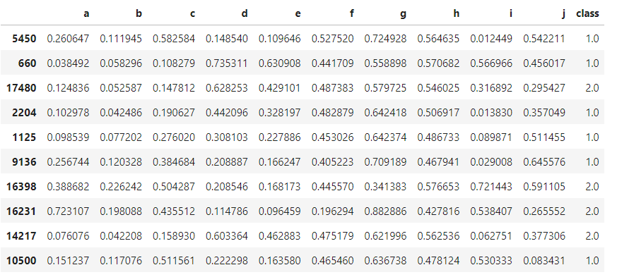
10 pieces of data were randomly selected for observation
magic.sample(10)
View the missing values of the dataset
magic.isnull().sum()
We found no missing values
We draw the heat map between features and observe the correlation between features
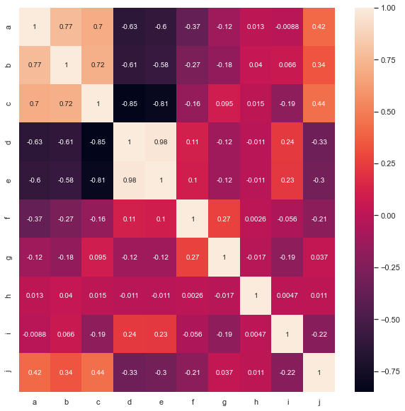
%matplotlib inline
'''''
It can be seen that a-b,a-c,b-c,d-e,j-a,j-b,j-c
'''
complete_features=magic.loc[:,magic.columns.difference(['class'])]
# Draw thermal diagram
plt.figure(figsize=(10,10))
sns.heatmap(complete_features.corr(),annot=True)
Then, according to the correlation between features, we select a, b and c as the columns with missing values
We randomly extract 10% of the data from a, b and c
prob_missing = 0.1
col_incomplete=['a','b','c']
ind_incomplete=[magic.columns.get_loc(i) for i in col_incomplete]
df_incomplete = magic.copy()
ix = [(row, col) for row in range(magic.shape[0]) for col in ind_incomplete]
for row, col in random.sample(ix, int(round(prob_missing * len(ix)))):
df_incomplete.iat[row, col] = np.nan
# Original feature column
df_complete=magic[col_incomplete]
df_incomplete_copy=df_incomplete.copy()
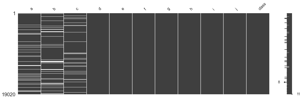
df_incomplete.isna().sum()
mno.matrix(df_incomplete, figsize = (20, 6))
The processed data table is visualized as shown in the following figure
random imputation
Next, we will perform regression filling on columns a, B and C. I intend to use knn regression model. The features of the training set are all features except those to be predicted. However, since more than one row contains vacancy values, we can't predict directly, so we randomly fill columns a, B and C with non empty values in columns a, B and C as the new three feature a_tmp, b_tmp, c_tmp, when we predict a, we can put b_tmp, c_tmp participates in training together as a feature
missing_columns=col_incomplete
def random_imputation(df,feature):
num_missing=df[feature].isnull().sum()
observed_values=df.loc[df[feature].notnull(),feature]
df.loc[df[feature].isnull(),feature+'_imp']=np.random.choice(
observed_values,num_missing,replace=True
)
return df
for feature in missing_columns:
df_incomplete[feature+'_imp']=df_incomplete[feature]
df_incomplete=random_imputation(df_incomplete,feature)
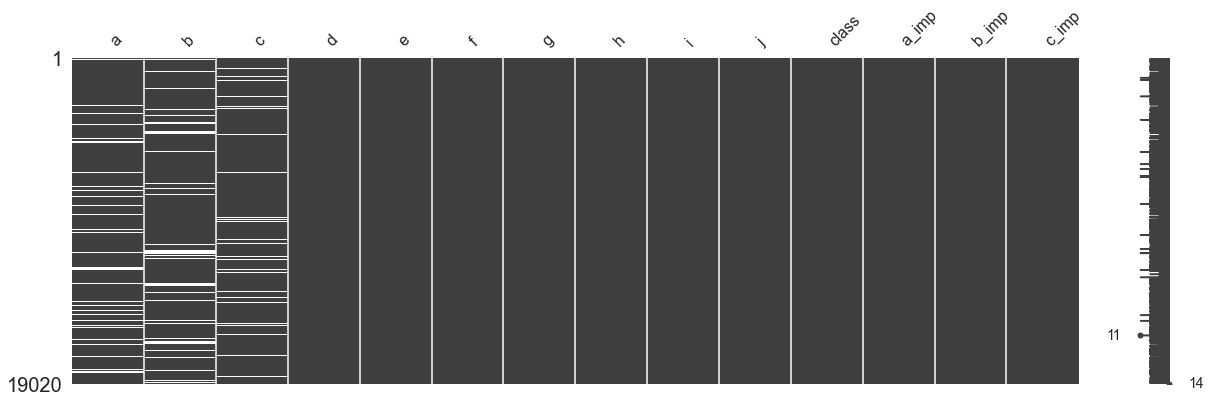
mno.matrix(df_incomplete,figsize=[20,6])
The data table filled with new features is shown in the following figure
deterministic regression imputation
Then, we use knn (n_neighbor = 3) model to predict each missing feature and fill in the missing value
from sklearn.neighbors import KNeighborsRegressor
deter_data=pd.DataFrame(columns=['Det'+name for name in missing_columns])
for feature in missing_columns:
deter_data['Det'+feature]=df_incomplete[feature+'_imp']
para=list(set(df_incomplete.columns)-set(missing_columns)-{feature+'_imp'})
# create model to fit
model=KNeighborsRegressor()
model.fit(X=df_incomplete[para],y=df_incomplete[feature+'_imp'])
deter_data.loc[df_incomplete[feature].isnull(), 'Det'+feature]=model.predict(
df_incomplete[para]
)[df_incomplete[feature].isnull()]
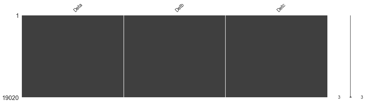
mno.matrix(deter_data,figsize=[20,5])
The filled data table is shown in the following figure. It can be found that the data set does not contain vacancy values
Next, we look at the distribution histogram and box graph of the original data and the filled data
sns.set()
fig,axes=plt.subplots(nrows=3,ncols=2)
fig.set_size_inches(8,8)

for index, variable in enumerate(['a','b','c']):
    sns.distplot(df_incomplete[variable].dropna(),kde=False,ax=axes[index, 0],color='blue')
    sns.distplot(deter_data['Det'+variable],kde=False,ax=axes[index,0],color='red')
    sns.boxplot(data=pd.concat([df_incomplete[variable], deter_data['Det'+variable]],axis=1),ax=axes[index,1])
    plt.tight_layout()

We can find that the feature distribution histogram of the original complete data is higher and narrower than that of the filled feature histogram. In other words, the standard deviation of the feature distribution of the original complete data is smaller than that of the filled feature histogram
The reason for this phenomenon is that we use the regression method to fill in the missing values, which actually fluctuate up and down along the hyperplane of the regression model, which contains some noise
We can also see from the box diagram that the IQ range of the filled data is wider than that of the original data
stochastic regression imputation
Therefore, in order to solve this problem, we will add some interference terms to the regression filled data, which obey the normal distribution
random_data=pd.DataFrame(columns=['Ran'+name for name in missing_columns])
for feature in missing_columns:
    random_data['Ran'+feature]=df_incomplete[feature+'_imp']
    para=list(set(df_incomplete.columns)-set(missing_columns)-{feature+'_imp'})
    # create model to fit
    model=KNeighborsRegressor()
    model.fit(X=df_incomplete[para],y=df_incomplete[feature+'_imp'])
    #---
    predict=model.predict(df_incomplete[para])
    std_error=(predict[df_incomplete[feature].notnull()]
        -df_incomplete.loc[df_incomplete[feature].notnull(), feature+'_imp']).std()
    random_predict=np.random.normal(size=df_incomplete[feature].shape[0],
        loc=predict,scale=std_error
    )
    #---
    random_data.loc[(df_incomplete[feature].isnull())&(random_predict>0),
        'Ran'+feature]=random_predict[(df_incomplete[feature].isnull())
        &(random_predict > 0)]
Then let's visualize it
sns.set()
fig,axes=plt.subplots(nrows=3,ncols=2)
fig.set_size_inches(8,8)

for index, variable in enumerate(['a','b','c']):
    sns.distplot(df_incomplete[variable].dropna(),kde=False,ax=axes[index, 0],color='blue')
    sns.distplot(random_data['Ran'+variable],kde=False,ax=axes[index,0],color='red')
    axes[index, 0].set(xlabel=variable+'/'+variable+'_imp')
    sns.boxplot(data=pd.concat([df_incomplete[variable], random_data['Ran'+variable]],axis=1),ax=axes[index,1])

    plt.tight_layout()
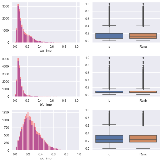
We can find that the feature distribution after filling is better than the original distribution, and retains the shape of the original distribution
After filling, the data no longer contains null values
df_incomplete[missing_columns]=random_data
df_incomplete.drop(columns=['a_imp','b_imp','c_imp'],axis=1,inplace=True)
df_incomplete.isnull().sum()
We calculate the mean square error of knn filling
knn_mse=((df_complete.values-random_data.values)**2).sum()
knn_mse
The result is knn_mse= 32.29607335035754
Cluster filling
Then, we use the K-means method to fill in the missing values
We first construct a dataset without missing columns (a, b, c) for clustering
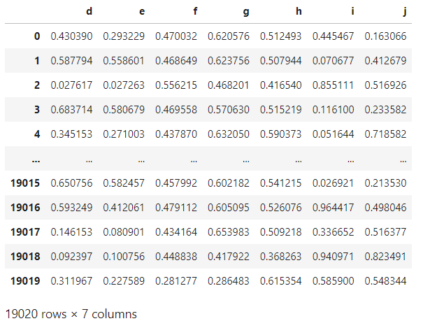
df_incomplete=df_incomplete_copy.copy()
df_cluster=df_incomplete[df_incomplete.columns.difference(['a','b','c','class'])]
df_cluster
The data sheet is shown in the figure below
In order to visualize the clustering of data, I wrote a pca dimension reduction visualization function
from sklearn.decomposition import PCA
from mpl_toolkits.mplot3d import Axes3D

def plot_pca(num,data,label):
    pca=PCA(n_components=num)
    X_pca=pca.fit_transform(data)
    print(pca.components_)
    # Split data
    X_failure=np.array([x for i,x in enumerate(X_pca) if label[i]==1.0])
    X_healthy=np.array([x for i,x in enumerate(X_pca) if label[i]==2.0])

    if num==3:
        fig = plt.figure(figsize=[10,15])
        ax = Axes3D(fig)
        #ax.legend(loc='best')
        ax.set_zlabel('Z', fontdict={'size': 15, 'color': 'red'})
        ax.set_ylabel('Y', fontdict={'size': 15, 'color': 'red'})
        ax.set_xlabel('X', fontdict={'size': 15, 'color': 'red'})
        ax.scatter(X_failure[:,0], X_failure[:,1], X_failure[:,2])
        ax.scatter(X_healthy[:,0], X_healthy[:,1], X_healthy[:,2])
        # Adjust viewing angle
        ax.view_init(elev=50,azim=10)
    elif num==2:
        plt.figure(figsize=[10,10])
        plt.scatter(X_failure[:,0],X_failure[:,1])
        plt.scatter(X_healthy[:,0],X_healthy[:,1])
    else:
        print('i do not want to work.....')
Then, in order to find the appropriate number of clusters, we use the elbow method to calculate the optimal number of clusters
from sklearn.cluster import KMeans
%matplotlib inline
SSE = []  # Store the sum of squares of errors for each result
for k in range(1,9):
    estimator=KMeans(n_clusters=k, random_state=9)
    estimator.fit(df_cluster)
    SSE.append(estimator.inertia_) # estimator.inertia_ Get the sum of clustering criteria
plt.xlabel('k')
plt.ylabel('SSE')
plt.plot(range(1,9),SSE,'o-')
plt.show()
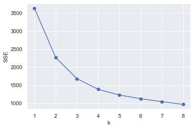
We find that the curvature is the largest when k=2, so the number of clusters we choose to cluster is 2
Next, let's visualize the clustering effect
%matplotlib inline
# Pre clustering
kmeans = KMeans(n_clusters=2, random_state=9)
idxs = kmeans.fit_predict(df_cluster)
# Dimensionality reduction
pca=PCA(n_components=3)
pca.fit(df_cluster)
X_pca=pca.transform(df_cluster)

subX = []
#Traverse the cluster and load the sample points (pixels) into the subX by color
for id in range(len(np.unique(idxs))):
    subX.append(np.array([X_pca[i] for i in range(X_pca.shape[0]) if idxs[i] == id]))

fig = plt.figure(figsize=[8,8])
ax = Axes3D(fig)
#ax.legend(loc='best')
ax.set_zlabel('Z', fontdict={'size': 15, 'color': 'red'})
ax.set_ylabel('Y', fontdict={'size': 15, 'color': 'red'})
ax.set_xlabel('X', fontdict={'size': 15, 'color': 'red'})
# ax.view_init(elev=50,azim=10)

for x in range(len(subX)):
    newX = subX[x]
    # Scatter plot
    ax.scatter(newX[:,0], newX[:,1], newX[:,2])
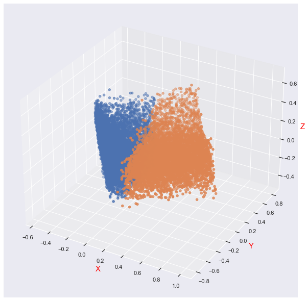
We can find that the distribution of data is not completely cluster distribution
# Calculate the mean of two categories (mean a, mean B, mean C)
df_list=[]
df_data=df_incomplete[df_incomplete.columns.difference(['class'])].values
for id in range(len(np.unique(idxs))):
tmp_cluster_df=pd.DataFrame([df_data[i] for i in range(df_data.shape[0]) if idxs[i]==id]).iloc[:,:3]
df_list.append(tmp_cluster_df.mean().values)
# Cluster data block
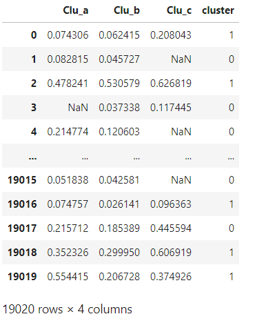
cluster_data=pd.DataFrame(columns=['Clu_'+name for name in missing_columns])
# Fill data
for feature in missing_columns:
cluster_data['Clu_'+feature]=df_incomplete[feature]
cluster_data['cluster']=idxs
cluster_data
The following figure shows our data set
Fill dataset
for i,feature in enumerate(missing_columns):
    cluster_data.loc[(cluster_data['Clu_'+feature].isnull())&
        (cluster_data['cluster']==0),'Clu_'+feature]=df_list[0][i]
for i,feature in enumerate(missing_columns):
    cluster_data.loc[(cluster_data['Clu_'+feature].isnull())&
        (cluster_data['cluster']==1),'Clu_'+feature]=df_list[1][i]
cluster_data.drop(['cluster'],axis=1,inplace=True)
cluster_data.isnull().sum()
Calculate the mean square error of cluster filling
cluster_mse=((df_complete.values-cluster_data.values)**2).sum()
cluster_mse
kmeans_mse= 74.81802220522698
Visualize the feature distribution after filling
sns.set()
fig,axes=plt.subplots(nrows=3,ncols=2)
fig.set_size_inches(8,8)

for index, variable in enumerate(missing_columns):
    sns.distplot(df_incomplete[variable].dropna(),kde=False,ax=axes[index, 0],color='blue')
    sns.distplot(cluster_data['Clu_'+variable],kde=False,ax=axes[index,0],color='red')
    axes[index, 0].set(xlabel=variable)
    sns.boxplot(data=pd.concat([df_incomplete[variable],cluster_data['Clu_'+variable]],axis=1),ax=axes[index,1])

    plt.tight_layout()
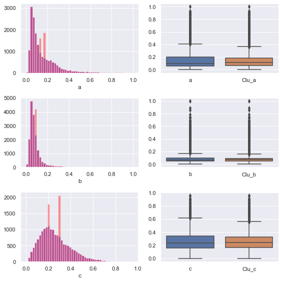
We can find that the filled feature distribution can not fit the original feature distribution well, and the performance of clustering method is not good
It may also be because the number of clusters is too small
Autoencoder filling
I'm lazy. I'll fill the pit later
conclusion
- In this experiment, the clustering method (K-means) does not fill in the missing values well. I guess it is because the data is not well clustered and distributed. The mean square error between the final filled data set and the original data set is 74.81802220522698
- In the regression filling missing values, we can find that the feature distribution histogram of the original complete data is higher and narrower than that of the filled feature histogram. In other words, the standard deviation of the feature distribution of the original complete data is smaller than that of the filled feature histogram.
- The reason for this phenomenon is that we use the regression method to fill in the missing values, which actually fluctuate up and down along the hyperplane of the regression model, which contains some noise
- Therefore, at last, a certain correction term is added to each term filled by regression. These correction terms obey Gaussian distribution. After doing so, the filling effect is obviously better and the mse is relatively small