bootstrap
Simple, intuitive and powerful front-end development framework makes web development more rapid and simple. From Twitter, it is one of the most popular front-end frameworks at present. Bootstrap is based on HTML, CSS and JavaScript, making it easier to write code. Mobile first, responsive layout development.
bootstrap Chinese website: http://www.bootcss.com/
<!DOCTYPE html>
<html lang="en">
<head>
	<meta charset="UTF-8">
	<meta name="viewport" content="width=device-width, user-scalable=no, initial-scale=1.0, maximum-scale=1.0, minimum-scale=1.0">
	<title>bootstrap file</title>
	<!--Need to introduce jquery because bootstrap be based on jquery-->
	<script type="text/javascript" src="js/jquery-1.12.4.min.js"></script>
	<script type="text/javascript" src="js/bootstrap.min.js"></script>
	<link rel="stylesheet" type="text/css" href="css/bootstrap.min.css">
</head>
<body>
	<div></div>


</body>
</html>
bootstrap container
- Container fluid
- container
- 1170
- 970
- 750
- 100%
<div class="container-fluid">Fluid container</div>
<div class="container">Responsive fixed container</div>
bootstrap responsive query interval:
100% for width less than 750
1. 768 or more, width adaptive 750
2. Greater than or equal to 992, width adaptation is 970
3. Greater than or equal to 1200, width adaptation is 1170
<!DOCTYPE html>
<html lang="en">
<head>
	<meta charset="UTF-8">
	<meta name="viewport" content="width=device-width, user-scalable=no, initial-scale=1.0, maximum-scale=1.0, minimum-scale=1.0">
	<title>bootstrap file</title>
	<script type="text/javascript" src="js/jquery-1.12.4.min.js"></script>
	<script type="text/javascript" src="js/bootstrap.min.js"></script>
	<link rel="stylesheet" type="text/css" href="css/bootstrap.min.css">
	<style type="text/css">

		.container-fluid,.container{
			height:50px;
			border:1px solid #000;
			background-color: gold;
		}

	</style>
</head>
<body>
	<div class="container-fluid">Fluid container</div>
	<br>
	<br>
	<br>
	<div class="container">Responsive container</div>


</body>
</html>
bootstrap grid system
bootstrap divides the page horizontally into 12 equal parts. According to the 12 equal parts, it defines style classes suitable for equal parts of different widths. These style classes form a set of responsive and mobile device first streaming grid system:
1. Col LG - more than 1200 in a row, less than 1200 in a row
2. Col MD - greater than 992 in a row, less than 992 in a row
3. Col SM - more than 768 in a row, less than 768 in a row
4. Col XS - always arranged in a row
<!DOCTYPE html>
<html lang="en">
<head>
	<meta charset="UTF-8">
	<meta name="viewport" content="width=device-width, user-scalable=no, initial-scale=1.0, maximum-scale=1.0, minimum-scale=1.0">
	<title>bootstrap file</title>
	<script type="text/javascript" src="js/jquery-1.12.4.min.js"></script>
	<script type="text/javascript" src="js/bootstrap.min.js"></script>
	<link rel="stylesheet" type="text/css" href="css/bootstrap.min.css">
	<style type="text/css">

		div[class*='col-']{
			height:50px;
			background-color:gold;
			border:1px solid #000;
		}

	</style>
</head>
<body>
	<div class="container">
		<div class="row">
		<h2>grid system </h2>
		</div>
	</div>

	<div class="container">
		<div class="row">
			<div class="col-lg-3">col-lg-3</div>
			<div class="col-lg-4">col-lg-4</div>
			<div class="col-lg-2">col-lg-2</div>
			<div class="col-lg-3">col-lg-3</div>
		</div>
		<br>
		<br>
		<div class="row">
			<div class="col-md-4">col-md-4</div>
			<div class="col-md-4">col-md-4</div>
			<div class="col-md-4">col-md-4</div>
		</div>
		<br>
		<br>
		<div class="row">
			<div class="col-sm-3">col-sm-3</div>
			<div class="col-sm-3">col-sm-3</div>
			<div class="col-sm-3">col-sm-3</div>
			<div class="col-sm-3">col-sm-3</div>
		</div>
		<br>
		<br>
		<div class="row">
			<div class="col-xs-5">col-xs-5</div>
			<div class="col-xs-3">col-xs-3</div>
			<div class="col-xs-2">col-xs-2</div>
			<div class="col-xs-2">col-xs-2</div>
		</div>
	</div>


</body>
</html>
Grid responsive layout case
<!DOCTYPE html>
<html lang="en">
<head>
	<meta charset="UTF-8">
	<meta name="viewport" content="width=device-width, user-scalable=no, initial-scale=1.0, maximum-scale=1.0, minimum-scale=1.0">
	<title>bootstrap file</title>
	<script type="text/javascript" src="js/jquery-1.12.4.min.js"></script>
	<script type="text/javascript" src="js/bootstrap.min.js"></script>
	<link rel="stylesheet" type="text/css" href="css/bootstrap.min.css">
	<style type="text/css">
		/* div[class*='col-']{
			background-color:gold;
			border:1px solid #000;
		} */
		.box{
			height:200px;
			max-width:240px;
			background-color:cyan;
			border:1px solid #000;
			margin:20px auto;
		}
	</style>
</head>
<body>
	<div class="container">
		<div class="row">
		<h2>Grid system response</h2>
		</div>
	</div>

	<div class="container">
		<div class="row">
			<div class="col-lg-3 col-md-3 col-sm-6"><div class="box"></div></div>
			<div class="col-lg-3 col-md-3 col-sm-6"><div class="box"></div></div>
			<div class="col-lg-3 col-md-3 col-sm-6"><div class="box"></div></div>
			<div class="col-lg-3 col-md-3 col-sm-6"><div class="box"></div></div>
		</div>
	</div>


</body>
</html>
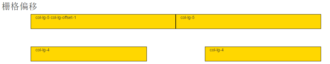
Column offset
1,col-lg-offset-
2,col-md-offset-
3,col-sm-offset-
4,col-xs-offset-
<!DOCTYPE html>
<html lang="en">
<head>
	<meta charset="UTF-8">
	<meta name="viewport" content="width=device-width, user-scalable=no, initial-scale=1.0, maximum-scale=1.0, minimum-scale=1.0">
	<title>bootstrap file</title>
	<script type="text/javascript" src="js/jquery-1.12.4.min.js"></script>
	<script type="text/javascript" src="js/bootstrap.min.js"></script>
	<link rel="stylesheet" type="text/css" href="css/bootstrap.min.css">
	<style type="text/css">
		div[class*='col-']{
			background-color:gold;
			border:1px solid #000;
			height:50px;
		}

	</style>
</head>
<body>
	<div class="container">
		<div class="row">
		<h2>Grid offset</h2>
		</div>
	</div>

	<div class="container">
		<div class="row">
			<div class="col-lg-5 col-lg-offset-1 col-md-5 col-md-offset-1">col-lg-5  col-lg-offset-1</div>
			<div class="col-lg-5 col-md-5">col-lg-5</div>
		</div>
		<br>
		<br>
		<br>
		<div class="row">
			<div class="col-lg-4 col-lg-offset-1 col-md-4 col-md-offset-1">col-lg-4</div>
			<div class="col-lg-4 col-lg-offset-2  col-md-4 col-md-offset-2">col-lg-4</div>
		</div>
	</div>

	<div class="container">
	<div class="row">
	<table class="table table-striped">
      <caption>Optional table caption.</caption>
      <thead>
        <tr>
          <th>#</th>
          <th>First Name</th>
          <th>Last Name</th>
          <th>Username</th>
        </tr>
      </thead>
      <tbody>
        <tr>
          <th scope="row">1</th>
          <td>Mark</td>
          <td>Otto</td>
          <td>@mdo</td>
        </tr>
        <tr>
          <th scope="row">2</th>
          <td>Jacob</td>
          <td>Thornton</td>
          <td>@fat</td>
        </tr>
        <tr>
          <th scope="row">3</th>
          <td>Larry</td>
          <td>the Bird</td>
          <td>@twitter</td>
        </tr>
      </tbody>
    </table>
    </div>

    </div>

</body>
</html>
bootstrap hidden class
1,hidden-xs
2,hidden-sm
3,hidden-md
4,hidden-lg
<!DOCTYPE html>
<html lang="en">
<head>
	<meta charset="UTF-8">
	<meta name="viewport" content="width=device-width, user-scalable=no, initial-scale=1.0, maximum-scale=1.0, minimum-scale=1.0">
	<title>bootstrap file</title>
	<script type="text/javascript" src="js/jquery-1.12.4.min.js"></script>
	<script type="text/javascript" src="js/bootstrap.min.js"></script>
	<link rel="stylesheet" type="text/css" href="css/bootstrap.min.css">
	<style type="text/css">
		div[class*='col-']{
			background-color:gold;
			border:1px solid #000;
			height:50px;
		}

	</style>
</head>
<body>
	<div class="container">
		<div class="row">
		<h2>Grid hiding</h2>
		</div>
	</div>

	<div class="container">
		<div class="row">
			<div class="col-lg-3 col-md-4 col-sm-6">1</div>
			<div class="col-lg-3 col-md-4 col-sm-6">2</div>
			<div class="col-lg-3 col-md-4 col-sm-6">3</div>
			<div class="col-lg-3 col-md-4 hidden-md col-sm-6 hidden-xs">4</div>
		</div>
	</div>


</body>
</html>
bootstrap button
1. btn declaration button
2. BTN default default button style
3,btn-primay
4,btn-success
5,btn-info
6,btn-warning
7,btn-danger
8,btn-link
9,btn-lg
10,btn-md
11,btn-xs
12. BTN block width is a button whose parent is 100% wider
13,active
14,disabled
15. BTN group define button group
<!-- General button group -->
<div class="btn-group">
    <input type="button" name="" value="Button one" class="btn btn-primary">
    <input type="button" name="" value="Button 2" class="btn btn-warning">
    <input type="button" name="" value="Button three" class="btn btn-danger">
</div>

<!-- General bar button group
     If used input Label as a button, you need to use it btn-group Wrap your container
-->
<div class="btn-group btn-group-justified">
    <div class="btn-group">
        <input type="button" name="" value="Button one" class="btn btn-primary">
    </div>
    <div class="btn-group">
        <input type="button" name="" value="Button 2" class="btn btn-warning">
    </div>
    <div class="btn-group">
        <input type="button" name="" value="Button three" class="btn btn-danger">
    </div>
</div>

<!-- Column button group, if used a If the label is used as a button, it can be written directly without the above structure
-->
<div class="btn-group btn-group-justified">
    <a href="#"Class =" BTN BTN primary "> button 1</a>
    <a href="#"Class =" BTN BTN default "> button 2</a>
    <a href="#"Class =" BTN BTN default "> button 3</a>
</div>
<!DOCTYPE html>
<html lang="en">
<head>
	<meta charset="UTF-8">
	<meta name="viewport" content="width=device-width, user-scalable=no, initial-scale=1.0, maximum-scale=1.0, minimum-scale=1.0">
	<title>bootstrap file</title>
	<script type="text/javascript" src="js/jquery-1.12.4.min.js"></script>
	<script type="text/javascript" src="js/bootstrap.min.js"></script>
	<link rel="stylesheet" type="text/css" href="css/bootstrap.min.css">
</head>
<body>
	<div class="container">
		<div class="row">
		<h2>Button</h2>
		</div>
	</div>

	<div class="container">
		<div class="row">
			<input type="button" name="" value="Button" class="btn btn-primary">

			<a href="#"Class =" BTN BTN success "> a label button</a>
			<a href="#"Class =" BTN BTN info "> a label button</a>
			<a href="#"Class =" BTN BTN warning "> a label button</a>
			<a href="#"Class =" BTN BTN danger "> a label button</a>
			<a href="#"Class =" BTN BTN link "> a label button</a>

			<a href="#"Class =" BTN BTN danger active "> a label button</a>

			<a href="#"Class =" BTN BTN danger disabled "> a label button</a>

		</div>
		<br>
		<br>
		<div class="row">
			<a href="#"Class =" BTN BTN success BTN LG "> large button</a>
			<a href="#"Class=" BTN BTN info BTN MD "> medium button</a>
			<a href="#"Class =" BTN BTN warning BTN XS "> small button</a>
			<a href="#"Class =" BTN "BTN danger" > General buttons</a>
		</div>

		<br>
		<br>
		<div class="row">
			<a href="#"Class =" BTN BTN primary BTN block "> button with 100% width</a>
		</div>

		<br>
		<br>
		<div class="row">
			<div class="btn-group">
				<a href="#"Class =" BTN BTN primary "> Step 1</a>
				<a href="#"Class =" BTN BTN primary "> Step 2</a>
				<a href="#"Class =" BTN BTN default "> Step 3</a>
			</div>
		</div>
		<br>
		<br>
		<div class="row">
			<div class="btn-group btn-group-justified">
				<a href="#"Class =" BTN BTN primary "> Step 1</a>
				<a href="#"Class =" BTN BTN primary "> Step 2</a>
				<a href="#"Class =" BTN BTN default "> Step 3</a>
			</div>
		</div>

		<br>
		<br>
		<div class="row">
			<div class="btn-group btn-group-justified">
				<div class="btn-group">
					<input type="button" name="" value="Step 1" class="btn btn-primary">
				</div>
				<div class="btn-group">
				<input type="button" name="" value="Step 2" class="btn btn-primary">
				</div>
				<div class="btn-group">
				<input type="button" name="" value="Step 3" class="btn btn-default">
				</div>
			</div>
		</div>


	</div>
</body>
</html>
bootstrap form
1. Form declares a form field
2. Form inline form field
3. Form horizontal horizontal list single field
4. Form group, including form text and form controls
5. Form control text input box, drop-down list control style
6. Checkbox checkbox inline multi box style
7. Radio inline radio box style
8. Input group form control group
9. Input group addon form control group object style
10. The input group BTN form control group object is the style of the button
11. Form group LG large form
12. Form group SM small form
<!--  form   -->
<form role="form">
  <div class="form-group form-group-lg">
    <label for="exampleInputEmail1">Email address</label>
    <input type="email" class="form-control" id="exampleInputEmail1" placeholder="Enter email">
  </div>
  <div class="form-group">
    <label for="exampleInputPassword1">Password</label>
    <input type="password" class="form-control" id="exampleInputPassword1" placeholder="Password">
  </div>
  <div class="form-group">
    <label for="exampleInputFile">File input</label>
    <input type="file" id="exampleInputFile">
    <p class="help-block">Example block-level help text here.</p>
  </div>
  <div class="checkbox">
    <label>
      <input type="checkbox"> Check me out
    </label>
  </div>
  <button type="submit" class="btn btn-default">Submit</button>
</form>

<!--  Form control group  -->
<div class="input-group">
  <input type="text" class="form-control">
  <span class="input-group-addon">@</span>
</div>

<!--  Form control group  -->
<div class="input-group">
  <input type="text" class="form-control">
  <span class="input-group-btn">
    <button class="btn btn-default" type="button">Go!</button>
  </span>
</div>
<!DOCTYPE html>
<html lang="en">
<head>
	<meta charset="UTF-8">
	<meta name="viewport" content="width=device-width, user-scalable=no, initial-scale=1.0, maximum-scale=1.0, minimum-scale=1.0">
	<title>Document</title>
	<link rel="stylesheet" type="text/css" href="css/bootstrap.min.css">
	<script type="text/javascript" src="js/jquery-1.12.4.min.js"></script>
	<script type="text/javascript" src="js/bootstrap.min.js"></script>
	<style type="text/css">

		.glyphicon-heart{
			font-size:16px;
			color:gold;
		}

		.glyphicon-user{
			font-size:20px;
			color:pink;
		}

	</style>
</head>
<body>
	<div class="container">
		<div class="row">
			<h2>form </h2>
		</div>
	</div>


	<div class="container">
		<div class="row">
			<form>
				<div class="form-group">
					<label for="input01"><span class="glyphicon glyphicon-user"></span></label>
					<input type="text" name="" class="form-control" id="input01">
				</div>

				<div class="form-group">
					<label for="pwd">password:</label>
					<input type="password" name="" class="form-control" id="pwd">
				</div>
			</form>

			<br>
			<br>

			<form class="form-inline">
				<div class="form-group form-group-lg">
					<label for="input02">user name:</label>
					<input type="text" name="" class="form-control" id="input02">
				</div>

				<div class="form-group">
					<label for="pwd02">password:</label>
					<input type="password" name="" class="form-control" id="pwd02">
				</div>
			</form>


			<br>
			<br>

			<form class="form-horizontal">
				<div class="form-group form-group-lg">
					<label for="input03" class="col-xs-2">user name:</label>
					<div class="col-xs-10">
					<input type="text" name="" class="form-control" id="input03">
					</div>
				</div>

				<div class="form-group form-group-sm">
					<label for="input03" class="col-xs-2">mailing address:</label>
					<div class="col-xs-10">
					<input type="text" name="" class="form-control" id="input03">
					</div>
				</div>

				<div class="form-group">
					<label for="pwd03"  class="col-xs-2">password:</label>
					<div class="col-xs-10">
					<input type="password" name="" class="form-control" id="pwd03">
					</div>
				</div>


			</form>
			<br>
			<br>
			<br>
			<form>
				<div class="input-group">
				  <span class="input-group-addon">@</span>
				  <input type="text" class="form-control">
				</div>
				<br>
				<br>

				<div class="input-group">

				  <input type="text" class="form-control">
				  <span class="input-group-btn">
				  	<!-- <input type="button" name="" value="search" class="btn btn-default"> -->

				  	<button class="btn btn-primary">search</button>
				  </span>
				</div>

				<br>
				<br>

				<div class="input-group">

				  <input type="text" class="form-control">
				  <span class="input-group-btn">
				  	<!-- <input type="button" name="" value="search" class="btn btn-default"> -->

				  	<button class="btn btn-primary"><span class="glyphicon glyphicon-heart"></span></button>
				  </span>
				</div>

					<br>
				<br>
					<br>
				<br>
					<br>
				<br>
					<br>
				<br>
					<br>
				<br>

					<br>
				<br>

			</form>


		</div>
	</div>


</body>
</html>
bootstrap navigation bar
1. navbar declaration navigation bar
2. Navbar default declares the default navigation bar style
3. Navbar inverse declares a negative navigation bar style
4. Navbar static top to remove the corner of navigation bar
5. Navbar fixed top navigation bar fixed to the top
6. Navbar fixed bottom navigation bar fixed to the bottom
7. Navbar header declares the container of the logo
8. Navbar brand style for fixed content such as logo
11. NAV navbar NAV defines the menu in the navigation bar
12. Navbar form defines the form in the navigation bar
13. Navbar BTN defines the buttons in the navigation bar
14. Navbar text defines the text in the navigation bar
15. Navbar left menu left
16. Navbar right menu right
<!-- Scalable menu data-target="#.." Need to add#  -->
<div class="navbar navbar-inverse navbar-static-top ">
    <div class="container">
    <div class="navbar-header">
        <button class="navbar-toggle" data-toggle="collapse" data-target="#mymenu">
            <span class="icon-bar"></span>
            <span class="icon-bar"></span>
            <span class="icon-bar"></span>
         </button>
         <a href="#" class="navbar-brand">LOGO</a>
    </div>
    <div class="collapse navbar-collapse" id="mymenu">
        <ul class="nav navbar-nav">
            <li class="active"><a href="#"> Home Page</a></li>
            <li><a href="#"> Company News</a></li>
            <li><a href="#"> industry dynamics</a></li>
        </ul>
        <form class="navbar-form navbar-right">
            <div class="form-group">
                <div class="input-group">
                  <input type="text" class="form-control">
                  <span class="input-group-btn">
                    <button class="btn btn-default" type="button">Go!</button>
                  </span>
                </div>
            </div>
        </form>
    </div>
    </div>
</div>
Path navigation
<ol class="breadcrumb">
  <li><a href="#">Home</a></li>
  <li><a href="#">Library</a></li>
  <li class="active">Data</li>
</ol>
Giant curtain
<div class="jumbotron">
  <div class="container">
    ...
  </div>
</div>
Navigation bar case
<!DOCTYPE html>
<html lang="en">
<head>
	<meta charset="UTF-8">
	<meta name="viewport" content="width=device-width, user-scalable=no, initial-scale=1.0, maximum-scale=1.0, minimum-scale=1.0">
	<title>Document</title>
	<link rel="stylesheet" type="text/css" href="css/bootstrap.min.css">
	<script type="text/javascript" src="js/jquery-1.12.4.min.js"></script>
	<script type="text/javascript" src="js/bootstrap.min.js"></script>

</head>
<body>
	<div class="navbar navbar-inverse navbar-static-top">
		<div class="container">

			<!-- definition logo And toggle small icons   -->
			<div class="navbar-header">

				<button class="navbar-toggle" data-toggle="collapse" data-target="#mymenu">
					<span class="icon-bar"></span>
					<span class="icon-bar"></span>
					<span class="icon-bar"></span>
				</button>

				<a href="#" class="navbar-brand">LOGO</a>
			</div>

			<div class="collapse navbar-collapse" id="mymenu">

				<!-- define menus   -->
				<ul class="nav navbar-nav">
					<li class="active"><a href="#"> Home Page</a></li>
					<li><a href="#"> Company Profile</a></li>
					<li><a href="#"> solutions</a></li>
				</ul>

				<!-- Define the form in the menu   -->
				<form class="navbar-form navbar-right">
					<div class="form-group">
						<div class="input-group">
							<input type="text" name="" class="form-control">
							<span class="input-group-btn">
								<button class="btn btn-default"><span class="glyphicon glyphicon-search"></span></button>
							</span>
						</div>
					</div>
				</form>

			</div>


		</div>
	</div>


</body>
</html>
bootstrap image
IMG responsive declaration response picture
bootstrap Font Icon
By replacing icons with fonts, the font folder needs to be in the same directory as the css folder
Path navigation
<ol class="breadcrumb">
  <li><a href="#">Home</a></li>
  <li><a href="#">Library</a></li>
  <li class="active">Data</li>
</ol>
bootstrap drop-down menu
1,dropdown-toggle
2,dropdown-menu
<div class="row">
    <div class="dropdown">
        <div class="btn btn-primary  dropdown-toggle" data-toggle="dropdown">
            drop-down menu
            <span class="caret"></span>
        </div>
        <ul class="dropdown-menu">
            <li><a href="#"> menu I</a></li>
            <li><a href="#"> menu II</a></li>
            <li><a href="#"> menu III</a></li>
        </ul>
    </div>
</div>
<!DOCTYPE html>
<html lang="en">
<head>
	<meta charset="UTF-8">
	<meta name="viewport" content="width=device-width, user-scalable=no, initial-scale=1.0, maximum-scale=1.0, minimum-scale=1.0">
	<title>Document</title>
	<link rel="stylesheet" type="text/css" href="css/bootstrap.min.css">
	<script type="text/javascript" src="js/jquery-1.12.4.min.js"></script>
	<script type="text/javascript" src="js/bootstrap.min.js"></script>

</head>
<body>
	<div class="container">
		<div class="row">
			<ol class="breadcrumb">
			  <li><a href="#"> Home Page</a></li>
			  <li><a href="#"> Product List</a></li>
			  <li class="active">Fruits</li>
			</ol>
		</div>

		<br>

		<br>

		<div class="row">
		    <div class="dropdown">

		        <div class="btn btn-primary  dropdown-toggle" data-toggle="dropdown">
		            drop-down menu
		           <span class="caret"></span>
		        </div>

		        <ul class="dropdown-menu">
		            <li><a href="#"> menu I</a></li>
		            <li><a href="#"> menu II</a></li>
		            <li><a href="#"> menu III</a></li>
		        </ul>

		    </div>
		</div>

	</div>
</body>
</html>
Giant curtain
<div class="jumbotron">
  <div class="container">
    ...
  </div>
</div>
row in Grid
<!DOCTYPE html>
<html lang="en">
<head>
	<meta charset="UTF-8">
	<meta name="viewport" content="width=device-width, user-scalable=no, initial-scale=1.0, maximum-scale=1.0, minimum-scale=1.0">
	<title>Document</title>
	<link rel="stylesheet" type="text/css" href="css/bootstrap.min.css">
	<script type="text/javascript" src="js/jquery-1.12.4.min.js"></script>
	<script type="text/javascript" src="js/bootstrap.min.js"></script>
	<style type="text/css">

		.container{
			height:50px;
			background-color:gold;
		}

		/*  Remove the space between the left and right 15px of the container with a negative margin   */
		.row{
			height:50px;
			background-color:green;

		}

		.col-lg-5{
			height:50px;
			background-color:red;
		}

	</style>

</head>
<body>
	<div class="container">

		<div class="row">
			<div class="col-lg-5">col-lg-5</div>

		</div>

	</div>
</body>
</html>
bootstrap responsive special website example
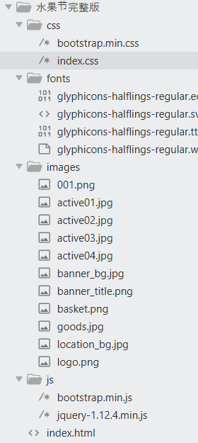
index.css
.navbar-brand{
	padding:5px 15px;
}
.navbar-inverse {
    background-color: #ff722b;
    border-color: #ff722b;
}
.navbar-inverse .navbar-nav>li>a {
    color: #fff;
}
.navbar-inverse .navbar-nav>.active>a,.navbar-inverse .navbar-nav>.active>a:hover,.navbar-inverse .navbar-nav>.active>a:focus {
    color: #fff;
    background-color: #db6226;
}
.navbar-inverse .navbar-toggle {
    border-color: #fff;
}
.navbar-inverse .navbar-toggle:hover,.navbar-inverse .navbar-toggle:focus {
    background-color: #db6226
}
.navbar-inverse .navbar-collapse,.navbar-inverse .navbar-form {
    border-color: #fff
}

.navbar{
	margin-bottom:0;
}

.jumbotron{
	background:url(../images/banner_bg.jpg) center center no-repeat;
	padding:24px 0;
	margin-bottom:0;
}


.banner_title{
	font-size:18px;
	color:#ffff00;
}

.jumbotron .banner_detail{
	font-size:14px;
	color:#fff;
	line-height:28px;
}

.banner_pic_title{
	margin-top:46px;
}


@media (max-width:1200px){
	.banner_pic_title{
		margin-top:20px;
	}

}


@media (max-width:992px){
	.banner_pic_title{
		margin-top:10px;
	}

}

.active_title{
	margin-top:30px;
	font-size:30px;
	color:#333;
}

.active_detail{
	font-size:14px;
	color:#333;
	line-height:21px;
	margin-top:20px;
}

.pic_list{
	margin-top:10px;
}

.pic_list h4{
	font-size:15px;
	color:#333;
	text-align:center;
}

.pic_list .thumbnail{
	max-width:260px;
	margin:0 auto 20px;
}

.common_title{
	background-color:#ff722b;
	margin:0;
	height:40px;
}

.common_title h3{
	font-size:16px;
	color:#fff;
	line-height:40px;
	margin:0;
	text-indent:10px;
}

.common_title a{
	font-size:12px;
	color:#fff;
	margin:20px 10px 0 0;
}

.goods_list{
	margin-top:20px;
}

.goods_list .col-lg-2{
	width:20%;
}

.goods_list h4{
	text-align:center;
	font-size:14px;
	color:#666;
}

.goods_list p{
	text-align:center;
	color:#ff0000;
	font-size:16px;
}

.goods_list p em{
	font-size:22px;
	font-style:normal;
}

.goods_list .thumbnail{
	max-width:260px;
	margin:0 auto 20px;
}


@media (max-width:1200px){

	.goods_list .col-lg-2{
		width:25%;
		float:left;
	}

}


@media (max-width:992px){

	.goods_list .col-lg-2{
		width:50%;
		float:left;
	}

}

@media (max-width:768px){

	.goods_list .col-lg-2{
		width:100%;
		float:left;
	}

}


.footer{
	background-color:#ff722b;
	padding-bottom:20px;
}

.footer .links{
	text-align:center;
	margin-top:35px;
}

.footer .links a{
	color:#fff;
}

.footer .links span{
	color:#fff;
	padding:0 10px;
}

.footer p{
	text-align:center;
	margin:10px 0;
	color:#fff;
}
index.html
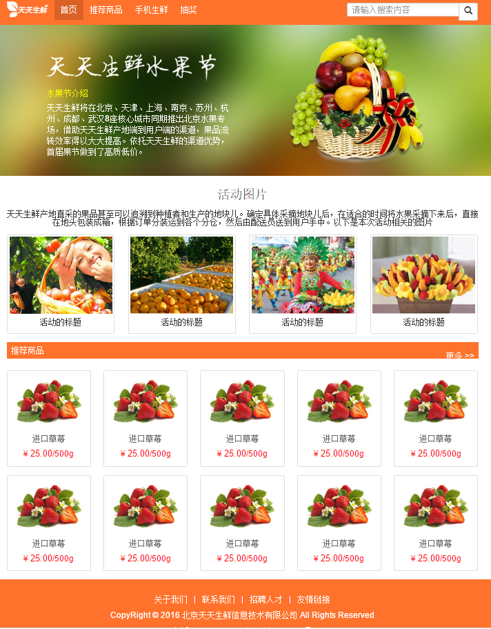
<!DOCTYPE html>
<html lang="en">
<head>
	<meta charset="UTF-8">
	<meta name="viewport" content="width=device-width, user-scalable=no, initial-scale=1.0, maximum-scale=1.0, minimum-scale=1.0">
	<link rel="stylesheet" type="text/css" href="css/bootstrap.min.css">
	<link rel="stylesheet" type="text/css" href="css/index.css">
	<script type="text/javascript" src="js/jquery-1.12.4.min.js"></script>
	<script type="text/javascript" src="js/bootstrap.min.js"></script>
	<title>Fresh every day-Fruit Festival</title>
</head>
<body>
	<div class="navbar navbar-inverse navbar-static-top">
		<div class="container">
			<div class="navbar-header">
				<button class="navbar-toggle" data-toggle="collapse" data-target="#mymenu">
					 <span class="icon-bar"></span>
					 <span class="icon-bar"></span>
					 <span class="icon-bar"></span>
				</button>
				<a href="#"Class =" navbar brand "> < img SRC =" images / logo. PNG "ALT =" fresh logo every day "></a>
			</div>
			<div class="collapse navbar-collapse" id="mymenu">
				<ul class="nav navbar-nav">
					<li class="active"><a href="#"> Home Page</a></li>
					<li><a href="#"> recommended products</a></li>
					<li><a href="#"> fresh mobile phone</a></li>
					<li><a href="#"> lucky draw</a></li>
				</ul>
				<form class="navbar-form navbar-right">
					<div class="form-group">
						<div class="input-group">
							<input type="text" name="" class="form-control" placeholder="Please enter the search content">
							<span class="input-group-btn">
								<button class="btn btn-default"><span class="glyphicon glyphicon-search"></span></button>
							</span>
						</div>
					</div>
				</form>
			</div>
		</div>
	</div>


	<div class="jumbotron">
	  <div class="container">
	    <div class="row">
			<div class="col-lg-5 col-lg-offset-1 col-md-5 col-md-offset-1">
				<img src="images/banner_title.png" alt="banner title" class="banner_pic_title img-responsive">
				<h2 class="banner_title">Introduction to fruit Festival</h2>
				<p class="banner_detail">Tiantian fresh will launch a special Beijing fruit show in 8 core cities: Beijing, Tianjin, Shanghai, Nanjing, Suzhou, Hangzhou, Chengdu and Wuhan. With the help of the channel from the origin to the user, the fruit circulation efficiency can be greatly improved. Relying on the channel advantage of fresh every day, the first fruit Festival achieved high quality and low price.</p>
			</div>

			<div class="col-lg-4 col-lg-offset-1 col-md-4 col-md-offset-1 hidden-sm hidden-xs">
				<img src="images/basket.png" alt="fruit basket." class="img-responsive">
			</div>
	    </div>
	  </div>
	</div>


	<div class="container">
		<h3 class="active_title text-center">Activity picture</h3>
		<p class="active_detail text-center">The fruits directly harvested from fresh producing areas every day can even be traced back to the growers and the plots of production. After determining the specific picking plot, after picking the fruit at a suitable time, it is directly packed into boxes on the ground, sub packed and transported to each sub warehouse according to the order, and then sent to the user by the delivery clerk. The following are the pictures related to this activity</p>
	</div>


	<div class="container pic_list">
		<div class="row">
			<div class="col-lg-3 col-md-3 col-sm-6">
				<div class="thumbnail">
				<img src="images/active01.jpg" alt="Activity picture" class="img-responsive">
				<h4>Title of the activity</h4>
				</div>
			</div>

			<div class="col-lg-3 col-md-3 col-sm-6">
				<div class="thumbnail">
				<img src="images/active02.jpg" alt="Activity picture" class="img-responsive">
				<h4>Title of the activity</h4>
				</div>
			</div>

			<div class="col-lg-3 col-md-3 col-sm-6">
				<div class="thumbnail">
				<img src="images/active03.jpg" alt="Activity picture" class="img-responsive">
				<h4>Title of the activity</h4>
				</div>
			</div>

			<div class="col-lg-3 col-md-3 col-sm-6">
				<div class="thumbnail">
				<img src="images/active04.jpg" alt="Activity picture" class="img-responsive">
				<h4>Title of the activity</h4>
				</div>
			</div>
		</div>
	</div>


	<div class="container">
		<div class="row common_title">
			<h3 class="pull-left">Pick of the week</h3>
			<a href="#"Class =" pull right "> more & gt; & gt</a>
		</div>
	</div>


	<div class="container goods_list">
		<div class="row">
			<div class="col-lg-2">
				<div class="thumbnail">
					<a href="#"> < img SRC =" images / goods. JPG "ALT =" product picture "></a>
					<h4>Imported strawberry</h4>
					<p>¥ <em>25.00</em>/500g</p>
				</div>
			</div>
			<div class="col-lg-2">
				<div class="thumbnail">
					<a href="#"> < img SRC =" images / goods. JPG "ALT =" product picture "></a>
					<h4>Imported strawberry</h4>
					<p>¥ <em>25.00</em>/500g</p>
				</div>
			</div>
			<div class="col-lg-2">
				<div class="thumbnail">
					<a href="#"> < img SRC =" images / goods. JPG "ALT =" product picture "></a>
					<h4>Imported strawberry</h4>
					<p>¥ <em>25.00</em>/500g</p>
				</div>
			</div>
			<div class="col-lg-2">
				<div class="thumbnail">
					<a href="#"> < img SRC =" images / goods. JPG "ALT =" product picture "></a>
					<h4>Imported strawberry</h4>
					<p>¥ <em>25.00</em>/500g</p>
				</div>
			</div>
			<div class="col-lg-2">
				<div class="thumbnail">
					<a href="#"> < img SRC =" images / goods. JPG "ALT =" product picture "></a>
					<h4>Imported strawberry</h4>
					<p>¥ <em>25.00</em>/500g</p>
				</div>
			</div>
			<div class="col-lg-2">
				<div class="thumbnail">
					<a href="#"> < img SRC =" images / goods. JPG "ALT =" product picture "></a>
					<h4>Imported strawberry</h4>
					<p>¥ <em>25.00</em>/500g</p>
				</div>
			</div>
			<div class="col-lg-2">
				<div class="thumbnail">
					<a href="#"> < img SRC =" images / goods. JPG "ALT =" product picture "></a>
					<h4>Imported strawberry</h4>
					<p>¥ <em>25.00</em>/500g</p>
				</div>
			</div>
			<div class="col-lg-2">
				<div class="thumbnail">
					<a href="#"> < img SRC =" images / goods. JPG "ALT =" product picture "></a>
					<h4>Imported strawberry</h4>
					<p>¥ <em>25.00</em>/500g</p>
				</div>
			</div>
			<div class="col-lg-2">
				<div class="thumbnail">
					<a href="#"> < img SRC =" images / goods. JPG "ALT =" product picture "></a>
					<h4>Imported strawberry</h4>
					<p>¥ <em>25.00</em>/500g</p>
				</div>
			</div>
			<div class="col-lg-2">
				<div class="thumbnail">
					<a href="#"> < img SRC =" images / goods. JPG "ALT =" product picture "></a>
					<h4>Imported strawberry</h4>
					<p>¥ <em>25.00</em>/500g</p>
				</div>
			</div>


		</div>
	</div>


	<div class="container-fluid footer">
		<div class="links">
		<a href="#"> about us</a>
		<span>|</span>
		<a href="#"> contact us</a>
		<span>|</span>
		<a href="#"> recruit talent</a>
		<span>|</span>
		<a href="#"> links < / a > < / div >
<p>CopyRight © 2016 Beijing Tiantian fresh information technology Co., Ltd All Rights Reserved</p>
<p>Tel: 010-****888    Beijing ICP prepare*******8 number</p>
</div>


</body>
</html>
regular expression
1. What is a regular expression:
String matching rules that can be read by the computer.
2. Writing of regular expression:
var re=new RegExp('rule', 'Optional parameters');
var re=/rule/parameter;
3. Characters in rules
1) Normal character matching:
For example:/a/ Match character 'a',/a,b/ Match character 'a,b'
2) Escape character matching:
\d matches a number, i.e. 0-9
\D matches a non number except 0-9
\w matches a word character (letter, number, underscore)
\W matches any non word character. Equivalent to [^ A-Za-z0-9_]
\s matches a blank character
\S matches a non whitespace character
\b match word boundaries
\B matches non word boundaries
. match any character
var sTr01 = '123456asdf';
var re01 = /\d+/;
//Match pure numeric string
var re02 = /^\d+$/;
alert(re01.test(sTr01)); //Pop up true
alert(re02.test(sTr01)); //Pop up false
4. Quantifier: defines the number of matching characters on the left
? Zero or one occurrence (up to one occurrence)
+ One or more occurrences (at least one occurrence)
* Zero or more occurrences (any number of occurrences)
{n} appear n second
{n,m} appear n reach m second
{n,} At least n second
5. Any one or range
[abc123] : matching'abc123'Any character in
[a-z0-9] : matching a reach z Or any character from 0 to 9

6,Limit start and end
^ Starts with the next element
$ Ends with the next element
7. Modification parameters:
g:  global,For full-text search, the first result is stopped by default
i:  ingore case,Ignore case, case sensitive by default
8. Common functions
1,test
Usage: if the regular. Test (string) matches successfully, it returns true, otherwise it returns false
2,replace
Usage: string. Replace (regular, new string) matches the successful character to replace the new character
Regular default rule
Matching ends when it is successful. Matching will not continue. It is case sensitive
var sTr01 = 'abcdefedcbaCef';
var re01 = /c/;
var re02 = /c/g;
var re03 = /c/gi;

var sTr02 = sTr01.replace(re01,'*');
var sTr03 = sTr01.replace(re02,'*');
var sTr04 = sTr01.replace(re03,'*');
alert(sTr02); // Pop up ab*defedcbaCef
alert(sTr03); // Pop up ab*defed*baCef
alert(sTr04); // Pop up ab*defed*ba*ef
Common regular rules
//User name verification: (6 to 20 digits of numbers, letters or underscores)
var reUser = /^\w{6,20}$/;

//Mailbox validation:
var reMail = /^[a-z0-9][\w\.\-]*@[a-z0-9\-]+(\.[a-z]{2,5}){1,2}$/i;

//Password verification:
var rePass = /^[\w!@#$%^&*]{6,20}$/;

//Mobile number verification:
var rePhone = /^1[3458]\d{9}$/;
<!DOCTYPE html>
<html lang="en">
<head>
	<meta charset="UTF-8">
	<title>Document</title>
	<script type="text/javascript">

		var re01 = new RegExp('a','i');
		var re02 = /a/;
		var re03 = /\d/;

		var re04 = /\d+/;

		var re05 = /^\d+$/;

		var re06 = /^ab$/i;


		var sTr01 = 'abcdefg';
		var sTr02 = 'cdefgh';
		var sTr03 = '1234abcd';
		var sTr04 = '12345678';
		var sTr05 = 'Ab';


		//alert( re02.test(sTr01));

		//alert(re02.test(sTr02));

		//alert(re03.test(sTr03)); / / true pops up

		//alert(re04.test(sTr03));

		//alert(re05.test(sTr03));

		//alert(re05.test(sTr04));

		alert(re06.test(sTr05));


	</script>
</head>
<body>

</body>
</html>
Form verification principle
$(function(){

	var $username = $('#user_name');
	//Lost focus check
	$username.blur(function(){
		check_username();
	});
	//Focus input box hide prompt
	$username.click(function(){
		$(this).next().hide();
	});

	function check_username(){

		var val = $username.val();
		var re = /^\w{6,20}$/;

		if(val=='')		{
			$username.next().html('User name cannot be empty');
			$username.next().show();
			return;
		}
		//Is it regular
		if(re.test(val))
		{
			$username.next().hide();
		}
		else
		{
			$username.next().html('User names are 6 to 20 digits of numbers, letters, or underlined');
			$username.next().show();
		}

	}


})
Front end performance optimization
In the process from users accessing resources to the complete presentation of resources in front of users, the processing time of each step is shortened through technical means and optimization strategies, so as to improve the access and presentation speed of the whole resources. The performance of the website will directly affect the number of users, and all front-end performance optimization is very important.
Front end performance optimization is divided into the following aspects:
1, Code deployment:
1. Code compression and merging
2. Static resources such as pictures, js and css are stored with different domain names and addresses from the master site, so that unnecessary cookie information will not be brought when transmitting resources.
3. Using content distribution network CDN
4. Set last modified, Expires, and Etag for files
5. Compressed transfer using GZIP
6. Weigh the number of DNS lookups (using different domain names will increase DNS lookups)
7. Avoid unnecessary redirection (add "/")
2, Code
html:
1. Use clear, simple and semantic tags
2. Avoid empty src and href
3. Do not scale the picture in HTML
css:
1. Compact css selector
2. Put CSS on top
3. Avoid introducing styles in @ import mode
4. Replace image files with Base64 image data in CSS to reduce the number of requests. Transfer to Base64 website online: http://tool.css-js.com/base64.html (for small pictures)
<!DOCTYPE html>
<html lang="en">
<head>
	<meta charset="UTF-8">
	<title>Document</title>
	<style type="text/css">

		.box{
			width:200px;
			height:200px;
			background:url("data:image/gif;base64,R0lGODlhIAAgAPcAAP//zP//mf//Zv//M///AP/M///MzP/Mmf/MZv/MM//MAP+Z//+ZzP+Zmf+ZZv+ZM/+ZAP9m//9mzP9mmf9mZv9mM/9mAP8z//8zzP8zmf8zZv8zM/8zAP8A//8AzP8Amf8AZv8AM/8AAMz//8z/zMz/mcz/Zsz/M8z/AMzM/8zMzMzMmczMZszMM8zMAMyZ/8yZzMyZmcyZZsyZM8yZAMxm/8xmzMxmmcxmZsxmM8xmAMwz/8wzzMwzmcwzZswzM8wzAMwA/8wAzMwAmcwAZswAM8wAAJn//5n/zJn/mZn/Zpn/M5n/AJnM/5nMzJnMmZnMZpnMM5nMAJmZ/5mZzJmZmZmZZpmZM5mZAJlm/5lmzJlmmZlmZplmM5lmAJkz/5kzzJkzmZkzZpkzM5kzAJkA/5kAzJkAmZkAZpkAM5kAAGb//2b/zGb/mWb/Zmb/M2b/AGbM/2bMzGbMmWbMZmbMM2bMAGaZ/2aZzGaZmWaZZmaZM2aZAGZm/2ZmzGZmmWZmZmZmM2ZmAGYz/2YzzGYzmWYzZmYzM2YzAGYA/2YAzGYAmWYAZmYAM2YAADP//zP/zDP/mTP/ZjP/MzP/ADPM/zPMzDPMmTPMZjPMMzPMADOZ/zOZzDOZmTOZZjOZMzOZADNm/zNmzDNmmTNmZjNmMzNmADMz/zMzzDMzmTMzZjMzMzMzADMA/zMAzDMAmTMAZjMAMzMAAAD//wD/zAD/mQD/ZgD/MwD/AADM/wDMzADMmQDMZgDMMwDMAACZ/wCZzACZmQCZZgCZMwCZAABm/wBmzABmmQBmZgBmMwBmAAAz/wAzzAAzmQAzZgAzMwAzAAAA/wAAzAAAmQAAZgAAM+4AAN0AALsAAKoAAIgAAHcAAFUAAEQAACIAABEAAADuAADdAAC7AACqAACIAAB3AABVAABEAAAiAAARAAAA7gAA3QAAuwAAqgAAiAAAdwAAVQAARAAAIgAAEe7u7t3d3bu7u6qqqoiIiHd3d1VVVURERCIiIhEREQAAACH5BAEAAAUALAAAAAAgACAAAAiGAAsIHEiwoMGDCBMqXMiwocOHECNK7DOlz0CKFiUKpDil45QCHjtmfMgxpMWSHkcuDMkSJEuPDFG+nClSIU2PAG52TChT50uVBH0K3Wmw51CTB4/6PIhRqcmKC43SBBrTJ1WSM69GnKmRacquCGGC9ap17MexCMuaRZuWbVK3ReHKnUtXYEAAOw==");
		}

	</style>
</head>
<body>
	<div class="box"></div>
</body>
</html>
5. Use css animation instead of javascript animation
6. Use Font Icon
7. Use CSS Sprite
8. Using svg graphics
9. Avoid CSS expressions
body{
background-color: expression( (new Date()).getSeconds()%2 ? "#B8D4FF" : "#F08A00" );
}
10. Avoid using css filters
javascript:
1. Reduce the number of reference libraries
2. Use requirejs or seajs to load js asynchronously
3. JS is placed at the bottom of the page
4. Avoid global lookup
5. Use native methods
6. Replace complex if else statements with switch statements
7. Reduce the number of statements. For example, multiple variable declarations can be written in one sentence
8. Use literal expressions to initialize arrays or objects
9. Replace complex element injection with innerHTML
10. Use event proxy (event delegate)
11. Avoid multiple accesses to the dom selection set
12. High frequency trigger event setting uses function throttling
13. Caching data using Web Storage