1, Jumbotron (large screen)
1. Add the. Jumbotron class to the < div > element to create a jumbotron
2. To create a full screen without rounded corners, you can add. container or. container fluid classes to the div in the. Jumbotron fluid class. For example:
<div class="jumbotron jumbotron-fluid">
  <div class="container">
Difference between. container and. container fluid:
1) Inner and outer margins appear in the container class, but not in the. Container fluid class.
2) The left and right inner margins of container class are always 15px. When the screen is less than or equal to 767px, there is no margin value. When the screen is greater than 767px, there are left and right margin values. When the screen width is 768px and 1000px, the margin value is relatively minimum, 9px and 15px respectively. In other cases, the margin value increases with the increase of the screen The width of the container fluid class is always 100% regardless of the screen width.
2, Information prompt box
1. You can use the. alert class, followed by a color class that specifies a specific meaning. There are. alert success success,. alert info information,. alert warning,. alert danger error,. alert primary preferred,. alert secondary secondary secondary,. alert light gray or. alert dark gray classes to implement
2. To add a link to the prompt box, you can add an alert link class on the label of the link in the prompt box to set the link that matches the color of the prompt box.
3. Close the prompt box: add the. Alert disamissible class to the div in the prompt box, and then add class="close" and data disassiss = "alert" classes on the link of the close button to set the closing operation of the prompt box. For example:
<div class="alert alert-info alert-dismissible">
<button type="button" class="close" data-dismiss="alert">×</button>
<strong>information!</strong> Please pay attention to this information.
</div>
result: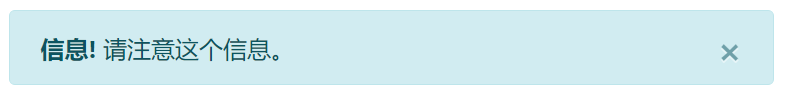
Note: & times; ( ×) Is an HTML entity character to indicate the closing operation, not the letter "x".
4. Prompt box animation:. Fade and. show classes are used to set the fade out and fade in effects of prompt boxes when they are closed.
<div class="alert alert-info alert-dismissible fade show">
content </div>
3, Buttons and button groups
(1) , button
1. Different styles:
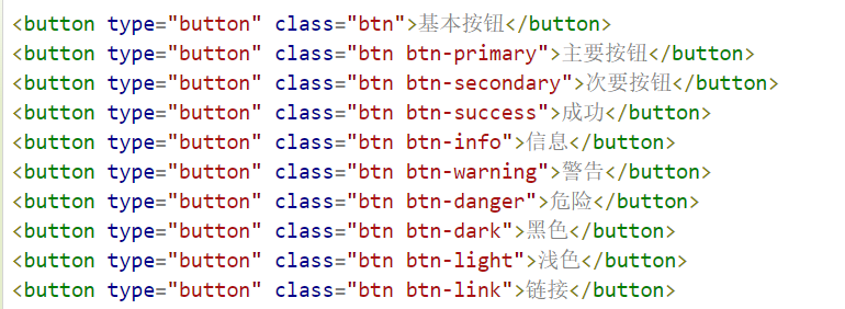
At the same time, the button class can be used on < a >, < button > or < input > elements:
<div class="container">
  <h2>Button element</h2>
  <a href="#"Class =" BTN BTN info "role =" button "> link button</a>
  <button type="button" class="btn btn-info">Button</button>
  <input type="button" class="btn btn-info" value="Input box button">
  <input type="submit" class="btn btn-info" value="Submit button">
</div>
Operation results: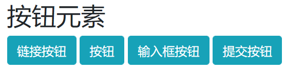
2. Button set border:
<button type="button" class="btn btn-outline-primary">Main button</button>
"More than one outline"
3. Buttons of different sizes:
<button type="button" class="btn btn-primary btn-lg">Large button</button>
  <button type="button" class="btn btn-primary">Default button</button>
  <button type="button" class="btn btn-primary btn-sm">Small button</button>
4. Block level buttons: adding. BTN block classes
5. Activate and disable buttons
Button available: add. active class
Button not clickable: add disable attribute
Link forbidden: add. disabled class
6. Load button (different styles):
<div class="container">
<button class="btn btn-primary">
    <span class="spinner-border spinner-border-sm"></span>
  </button>

  <button class="btn btn-primary">
    <span class="spinner-border spinner-border-sm"></span>
    Loading..
  </button>

  <button class="btn btn-primary" disabled>/*The button is not clickable*/
    <span class="spinner-border spinner-border-sm"></span>
    Loading..
  </button>

  <button class="btn btn-primary" disabled>/*The button is not clickable*/
    <span class="spinner-grow spinner-grow-sm"></span>
    Loading..
  </button>
</div>
Loading effect: use the. Spinner border SM or. Spinner growth SM class to create the size of the loading effect.
result: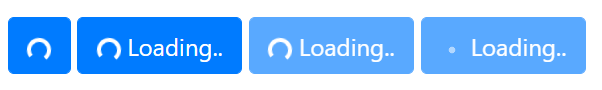
(2) , button group
- Create:. BTN group class is used to create button groups.
- Size:. BTN group lg|sm class sets the size of the button group.
- Style:
(one). Vertical button group: add. BTN group vertical class
(two), embedded button group and drop-down menu:
Example: (add a drop-down menu to one of the button groups)
<div class="btn-group">
      <button type="button" class="btn btn-primary dropdown-toggle" data-toggle="dropdown">
      Sony
      </button>
      <div class="dropdown-menu">
        <a class="dropdown-item" href="#">Tablet</a>
        <a class="dropdown-item" href="#"> smartphone < / a > / * link*/
      </div>
    </div>

(three) split button drop-down menu: separate from the drop-down menu ID, there are two buttons
<div class="btn-group">
    <button type="button" class="btn btn-primary">Sony</button>
    <button type="button" class="btn btn-primary dropdown-toggle dropdown-toggle-split" data-toggle="dropdown">
      <span class="caret"></span>
    </button>
    <div class="dropdown-menu">
      <a class="dropdown-item" href="#">Tablet</a>
      <a class="dropdown-item" href="#">Smartphone</a>
    </div>
  </div>
(four), vertical button group and drop-down menu: refer to the first example code in the button group.
4, Pagination
1. Paging effect creation: to create a basic paging, add a. pagination class on the < UL > element. Then add a. Page item class on the < li > element and a. Page link class on the < a > tag of the < li > element.
2. Current page number status display: highlight with. active class.
3. Non clickable paging links: use the. disabled class.
4. Pagination display size: large font pagination entries use. Pagination LG class, and small font pagination entries use. Pagination SM class.
5. Breadcrumb navigation: Supplement (breadcrumb navigation is to tell visitors where they are in the website and how to return.
It is a "historical record" application method, which aims to help you trace the origin, so it is a linear navigation method.
We often see the way of "main classification > primary classification > secondary classification > tertiary classification >... > final content page".
Generally speaking, the directory structure consists of three layers: Home Page > column page > content page.)
The. Breadcrumb and. Breadcrumb item classes are used to set breadcrumb navigation
5. Pagination alignment: use tool classes to set pagination alignment. Pagination is aligned on the left, pagination justify content end on the right, and pagination justify content center in the middle.