Video Explanation:
11, Power button daq.PowerButton()
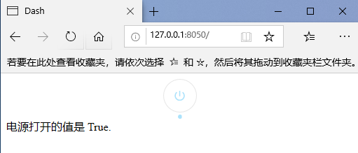
11.1 default power button
import dash
from dash.dependencies import Input, Output
import dash_daq as daq
from dash import html

app = dash.Dash(__name__)

app.layout = html.Div([
    # Power button
    daq.PowerButton(
        id='our-power-button-1',
        on=False,       # Default value

    ),
    html.Div(id='power-button-result-1')
])


@app.callback(
    Output('power-button-result-1', 'children'),
    Input('our-power-button-1', 'on')
)
def update_output(on):
    return f'The power on value is {on}.'


if __name__ == '__main__':
    app.run_server(debug=True)
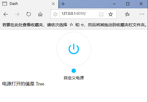
11.2 custom power button
import dash
from dash.dependencies import Input, Output
import dash_daq as daq
from dash import html

app = dash.Dash(__name__)

app.layout = html.Div([
    # Power button
    daq.PowerButton(
        id='our-power-button-1',
        on=True,       # Default value
        label='Custom power supply',
        labelPosition='bottom',
        size=120,
        color='deepskyblue',
    ),
    html.Div(id='power-button-result-1')
])


@app.callback(
    Output('power-button-result-1', 'children'),
    Input('our-power-button-1', 'on')
)
def update_output(on):
    return f'The power on value is {on}.'


if __name__ == '__main__':
    app.run_server(debug=True)
11.3 power button properties
help(dash_daq.PowerButton)
- ID (string; optional): used to identify the ID of this component in the Dash callback.
- className (string; optional): the class applied to the root component element.
- Color (string; optional): the color of the indicator light displayed when the power button is turned on.
- disabled (Boolean; optional): if True, the power button cannot be clicked.
- Label (dict; optional): the description displayed next to the button. To control styles, pass objects with label and style properties.
- label is a string | dictionary with keys:
- label (string; optional)
- Style (dict; optional)
- label is a string | dictionary with keys:
- labelPosition (the value is equal to 'top' or 'bottom'; the default value is' top '): the position of the button label.
- On (Boolean; default false): whether the power button is on.
- persisted_props (the value list is equal to 'on'; default ['on'): the attribute that user interaction will persist after refreshing the component or page. Since onlyon is allowed, this prop can usually be ignored.
- Persistence (Boolean | string | number; optional): used to allow user interaction in the component to be preserved when the component or page is refreshed. If persisted is true and does not change its previous value, the value a that the user changed when using the application will keep the change as long as the new value value also matches the value originally given. Use persistence with_ type.
- persistence_type (the value is equal to 'local', 'session' or 'memory'; the default value is' local '): the location where persistent user changes will be stored: memory: only kept in memory and reset when the page is refreshed. Local: window.localStorage. The data is retained after the browser exits. Session: window.sessionStorage. The data will be cleared after the browser exits.
- Size (number; default 48): the size (diameter) of the power button, in pixels.
- Style (dict; optional): the style applied to the root component element.
- Theme (dict; default light): theme configuration set by ThemeProvider.
12, Scientific counting
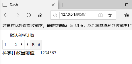
12.1 default scientific count
import dash
from dash.dependencies import Input, Output
import dash_daq as daq
from dash import html

app = dash.Dash(__name__)

app.layout = html.Div([
    # Scientific counting control
    daq.PrecisionInput(
        id='our-precision',
        label='Default scientific count',
        precision=4,        # accuracy
        value=1234567
    ),
    html.Div(id='precision-result')
])


@app.callback(
    Output('precision-result', 'children'),
    Input('our-precision', 'value')
)
def update_output(value):
    return f'Current value of scientific count: {value}.'


if __name__ == '__main__':
    app.run_server(debug=True)
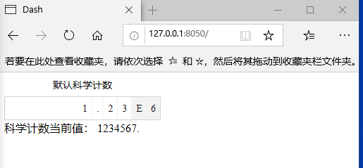
12.2 custom scientific counts
import dash
from dash.dependencies import Input, Output
import dash_daq as daq
from dash import html

app = dash.Dash(__name__)

app.layout = html.Div([
    # Scientific counting control
    daq.PrecisionInput(
        id='our-precision',
        label='Default scientific count',
        precision=3,        # accuracy
        value=1234567,
        min=10,
        max=20,
        size=220,

    ),
    html.Div(id='precision-result')
])


@app.callback(
    Output('precision-result', 'children'),
    Input('our-precision', 'value')
)
def update_output(value):
    return f'Current value of scientific count: {value}.'


if __name__ == '__main__':
    app.run_server(debug=True)
12.3 scientific counting attributes
help(dash_daq.PrecisionInput)
- ID (string; optional): used to identify the ID of this component in the Dash callback.
- className (string; optional): the class applied to the root component element.
- disabled (Boolean; optional): if True, the numeric input cannot be changed.
- Label (dict; optional): description displayed with scientific notation. To control styles, pass objects with label and style properties.
- label is a string | dictionary with keys:
- label (string; optional)
- Style (dict; optional)
- label is a string | dictionary with keys:
- labelPosition (the value is equal to 'top' or 'bottom'; the default value is' top '): enter the position of the label numerically.
- Max (number; default number. Max_safe_integer): the maximum value of the number input.
- Min (number; default 0): the minimum value of digital input.
- persisted_props (value list equals' value '; default [' value ']: the attribute whose user interaction will persist after refreshing the component or page. Since onlyvalue is allowed, this prop can usually be ignored.
- Persistence (Boolean | string | number; optional): used to allow user interaction in the component to be preserved when the component or page is refreshed. If persisted is true and does not change its previous value, the value a that the user changed when using the application will keep the change as long as the new value value also matches the value originally given. Use persistence with_ type.
- persistence_type (the value is equal to 'local', 'session' or 'memory'; the default value is' local '): the location where persistent user changes will be stored: memory: only kept in memory and reset when the page is refreshed. Local: window.localStorage. The data is retained after the browser exits. Session: window.sessionStorage. The data will be cleared after the browser exits.
- Precision (number; default 2): the number of significant digits.
- Size (number; optional): enter the size (length) of a number in pixels.
- Style (dict; optional): the style applied to the root component element.
- Theme (dict; default light): theme configuration set by ThemeProvider.
- Value (number; optional): the value entered numerically.
13, Slider (DAQ. Slider)
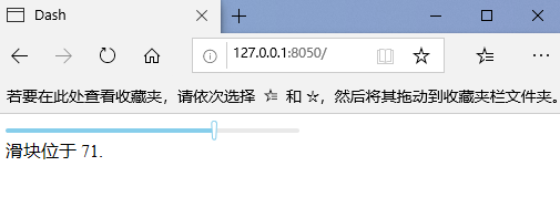
13.1 default slider
import dash
from dash.dependencies import Input, Output
import dash_daq as daq
from dash import html

app = dash.Dash(__name__)

app.layout = html.Div([
    daq.Slider(
        id='my-daq-slider-ex-1',
        value=17
    ),
    html.Div(id='slider-output-1')
])

@app.callback(
    Output('slider-output-1', 'children'),
    Input('my-daq-slider-ex-1', 'value')
)
def update_output(value):
    return f'Slider in {value}.'

if __name__ == '__main__':
    app.run_server(debug=True)
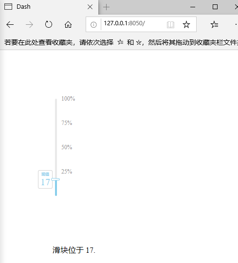
13.2 custom slider
import dash
from dash.dependencies import Input, Output
import dash_daq as daq
from dash import html

app = dash.Dash(__name__)

app.layout = html.Div([
    html.Div(style={'margin':100}, children=
        daq.Slider(
            id='my-daq-slider-ex-1',
            value=17,
            min=0,
            max=100,
            size=200,
            handleLabel={"showCurrentValue": True, "label": "present value"},  # Slider handle
            marks={'25': '25%', '50': '50%', '75': '75%', '100': '100%', },  # Set custom tags
            vertical=True,  # Vertical Slider
        ),
    ),
    html.Div(id='slider-output-1',style={'margin':100})
])

@app.callback(
    Output('slider-output-1', 'children'),
    Input('my-daq-slider-ex-1', 'value')
)
def update_output(value):
    return f'Slider in {value}.'

if __name__ == '__main__':
    app.run_server(debug=True)
13.3 slider properties
help(dash_daq.Slider)
- ID (string; optional): used to identify the ID of this component in the Dash callback.
- className (string; optional): an additional CSS class for the root DOM node.
- Color (dict; default colors. Marker_primary): the color configuration of the slider track.
- color is a string | dictionary with keys:
- default (string; optional): the backup color used when there is a gap in color.ranges.
- Gradient (Boolean; optional): displays the range as a gradient between given colors. color.ranges are required to be continuous throughout the value range of the instrument.
- Ranges (dict; optional): define multiple color ranges on the track of the slider. The key determines the color of the range, and the value is the beginning and end of the range itself.
- ranges is a dictionary with keys:
- color (list of numbers; optional)
- ranges is a dictionary with keys:
- color is a string | dictionary with keys:
- disabled (Boolean; optional): if True, the handle cannot be moved.
- Dots (Boolean; optional): if you want to render a slider with points when the step value is greater than 1, you can set dots to True. Note: points are automatically disabled when color.ranges is used.
- handleLabel (dict; optional): configuration of slider handle label. Passing a false value disables the label.
- handleLabel is a string | dictionary with keys:
- color (string; optional)
- label (string; optional)
- showCurrentValue (Boolean; optional)
- Style (dict; optional)
- handleLabel is a string | dictionary with keys:
- Included (Boolean; optional): if the value is True, it means continuous values are included. Otherwise, it is an independent value.
- labelPosition (the value is equal to 'top' or 'bottom'; the default value is' bottom '): the position of the component label.
- Marks (dict; optional): marks on the slider. The key determines the position, and the value determines what is displayed. If you want to style a specific marker point, the value should be the object that contains the style and label properties.
- marks is a dictionary with keys:
- Number (dict; optional)
- number is a string | dictionary with keys:
- label (string; optional)
- Style (dict; optional)
- marks is a dictionary with keys:
- max (numeric; optional): the maximum allowable value of the slider.
- Min (number; default 0): the minimum allowable value of the slider.
- persisted_props (value list equals' value '; default [' value ']: the attribute whose user interaction will persist after refreshing the component or page. Since onlyvalue is allowed, this prop can usually be ignored.
- Persistence (Boolean | string | number; optional): used to allow user interaction in the component to be preserved when the component or page is refreshed. If persisted is true and does not change its previous value, the value a that the user changed when using the application will keep the change as long as the new value value also matches the value originally given. Use persistence with_ type.
- persistence_type (the value is equal to 'local', 'session' or 'memory'; the default value is' local '): the location where persistent user changes will be stored: memory: only kept in memory and reset when the page is refreshed. Local: window.localStorage. The data is retained after the browser exits. Session: window.sessionStorage. The data will be cleared after the browser exits.
- Size (number; default 265): the size of the slider in pixels.
- step (number; optional): the value that increases or decreases.
- Targets (dict; optional): targets on the slider. The key determines the position, and the value determines what is displayed. If you want to style a specific target point, the value should be the object that contains the style and label properties.
targets is a dictionary with keys:- Number (dict; optional)
- number is a string | dictionary with keys:
- color (string; optional)
- label (string; optional)
- showCurrentValue (Boolean; optional)
- Style (dict; optional)
- number is a string | dictionary with keys:
- Number (dict; optional)
- Theme (dict; default light): theme configuration set by ThemeProvider.
- updatemode (the value is equal to 'mouseup' or 'drag'; the default value is' mouseup '): determines when the component should update its value. If mouseup, the slider will only trigger its value when the user finishes dragging the slider. If you drag, the slider will constantly update its value as you drag. Use drag only if your updates are fast.
- Value (numeric; optional): the value entered.
- Vertical (Boolean; optional): if True, the slider will be vertical.
14, Stop button daq.StopButton()
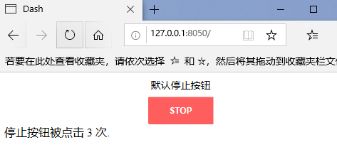
14.1 default stop button
import dash
from dash.dependencies import Input, Output
import dash_daq as daq
from dash import html

app = dash.Dash(__name__)

app.layout = html.Div([
    # Stop button control
    daq.StopButton(
        id='my-stop-button-1',
        label='Default stop button',
        n_clicks=0
    ),
    html.Div(id='stop-button-output-1')
])

@app.callback(
    Output('stop-button-output-1', 'children'),
    Input('my-stop-button-1', 'n_clicks')
)
def update_output(n_clicks):
    return f'The stop button is clicked {n_clicks} second.'

if __name__ == '__main__':
    app.run_server(debug=True)
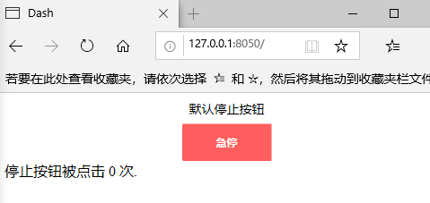
14.2 custom stop button
import dash
from dash.dependencies import Input, Output
import dash_daq as daq
from dash import html

app = dash.Dash(__name__)

app.layout = html.Div([
    # Stop button control
    daq.StopButton(
        id='my-stop-button-1',
        label='Default stop button',
        size=100,
        buttonText='Emergency stop',
        n_clicks=0
    ),
    html.Div(id='stop-button-output-1')
])

@app.callback(
    Output('stop-button-output-1', 'children'),
    Input('my-stop-button-1', 'n_clicks')
)
def update_output(n_clicks):
    return f'The stop button is clicked {n_clicks} second.'

if __name__ == '__main__':
    app.run_server(debug=True)
14.3 stop button properties
help(dash_daq.StopButton)
- Children (list or single dash component, string or number; optional): children of the button.
- ID (string; optional): used to identify the ID of this component in the Dash callback.
- buttonText (string; default 'Stop'): the text displayed in the button.
- className (string; optional): the class applied to the root component element.
- disabled (Boolean; optional): if True, the button cannot be pressed.
- Label (dict; optional): the description displayed next to the button. To control styles, pass objects with label and style properties.
- label is a string | dictionary with keys:
- label (string; optional)
- Style (dict; optional)
- label is a string | dictionary with keys:
- labelPosition (the value is equal to 'top' or 'bottom'; the default value is' top '): the position where the label is located.
- n_ Clicks (number; default 0): the number of times a button is clicked.
- Size (number; default 92): the size (width) of the stop button, in pixels.
- Style (dict; optional): the style applied to the root component element.
- Theme (dict; optional): theme configuration set by ThemeProvider.
15, Water column daq.Tank()
15.1 default water column
import dash
from dash.dependencies import Input, Output
import dash_daq as daq
from dash import dcc, html


app = dash.Dash(__name__)

app.layout = html.Div([
    # Water column control
    daq.Tank(
        id='my-tank-1',
        value=5,
        min=0,
        max=10,
        style={'margin-left': '50px'}
    ),
    dcc.Slider(
        id='tank-slider-1',
        value=5,
        min=0,
        max=10,
        marks={str(i): str(i) for i in range(11)}
    ),
])

@app.callback(Output('my-tank-1', 'value'), Input('tank-slider-1', 'value'))
def update_tank(value):
    return value

if __name__ == '__main__':
    app.run_server(debug=True)

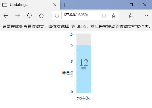
15.2 custom water column
import dash
from dash.dependencies import Input, Output
import dash_daq as daq
from dash import dcc, html


app = dash.Dash(__name__)

app.layout = html.Div([
    # Water column control
    daq.Tank(
        id='my-tank-1',
        label='Water column',
        labelPosition='bottom',
        value=12,
        min=0,
        max=15,
        showCurrentValue=True,
        units='milliliter',
        width=50,
        height=200,
        scale={'interval': 2, 'labelInterval': 2,   # Scale interval
                   'custom': {'5': 'Mark point'}},
        style={'margin-left': '50px'}
    ),
])


if __name__ == '__main__':
    app.run_server(debug=True)
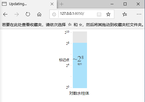
15.3 log water column
import dash
from dash.dependencies import Input, Output
import dash_daq as daq
from dash import dcc, html


app = dash.Dash(__name__)

app.layout = html.Div([
    # Water column control
    daq.Tank(
        id='my-tank-1',
        label='Logarithmic water column',
        labelPosition='bottom',
        value=256,
        min=0,
        max=10,
        logarithmic=True,       # Logarithmic scale
        base=2,                     # base number
        showCurrentValue=True,
        units='milliliter',
        width=50,
        height=200,
        scale={'interval': 2, 'labelInterval': 2,   # Scale interval
                   'custom': {'5': 'Mark point'}},
        style={'margin-left': '50px'}
    ),
])


if __name__ == '__main__':
    app.run_server(debug=True)
15.4 water column properties
help(dash_daq.Tank)
The IDE we recommend for writing Dash applications is the data science workspace of Dash Enterprise, which has pre input support for Dash component properties. Find out if your company is using Dash Enterprise.
- ID (string; optional): used to identify the ID of this component in the Dash callback.
- Base (number; default 10): base used in logarithmic scale.
- className (string; optional): the class applied to the root component element.
- Color (string; optional): the color of the tank fill.
- Height (number; default 192): tank height in pixels.
- Label (dict; optional): description displayed with the control. To control styles, pass objects with label and style properties.
- label is a string | dictionary with keys:
- label (string; optional)
- Style (dict; optional)
- label is a string | dictionary with keys:
- labelPosition (the value is equal to 'top' or 'bottom'; the default value is' top '): the position of the component label.
- Logarithmic (Boolean; optional): if set to True, the logarithmic scale is used.
- Max (number; default 10): the maximum value of the tank. If it is a logarithm, it represents the maximum exponent.
- Min (number; default 0): the minimum value of the tank. If it is a logarithm, it represents the minimum exponent.
- Scale (dict; optional): configuration of component scale.
- scale is a dictionary with keys:
- Custom (dict; optional): custom scale markers. The key determines the position and the value determines the display content. If you want to style a specific marker point, the value should be the object that contains the style and label properties.
- custom is a numeric dictionary with keys:
- label (string; optional)
- style (string; optional)
- custom is a numeric dictionary with keys:
- Interval (numeric; optional): the interval at which the proportion rises. By default, attempts to dynamically divide the min max range.
- labelInterval (numeric; optional): adds a label to the interval of the tick mark. The default is 2 (each other tag has a label).
- Start (number; optional): the value of the start scale. The default is minutes.
- Custom (dict; optional): custom scale markers. The key determines the position and the value determines the display content. If you want to style a specific marker point, the value should be the object that contains the style and label properties.
- scale is a dictionary with keys:
- showCurrentValue (Boolean; optional): if True, the current value of the tank is displayed.
- Style (dict; optional): the style applied to the root component element.
- units (string; optional): label of the current value.
- Value (number; optional): the value of tank. If it is a logarithm, the displayed value will be the logarithm of the input value.
- Width (number; default 112): the width of the tank, in pixels.