CSS3 video through train from getting started to mastering:
CSS3 from entry to mastery, super many case practice, easy to start and easy to understand!
1, CSS3 2D and 3D conversion
CSS3 transformations can move, scale, rotate, elongate, or stretch elements.
How does it work?
The effect of conversion is to make an element change shape, size and position.
You can use 2D or 3D conversion to convert your elements.
Browser support
The number in the table represents the first browser version number that supports this attribute.
The number immediately preceding - webkit-, -ms - or - moz - is the first browser version number that supports the prefix attribute.
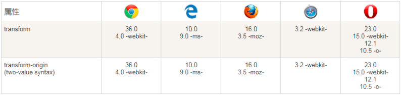
Internet Explorer 10, Firefox, and Opera support the transform attribute
Chrome and Safari require the prefix webkit version
Note: Internet Explorer 9 requires the prefix ms version
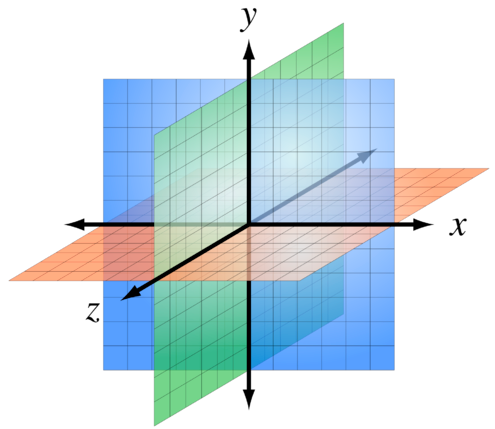
Browser axis:
CSS3 2D conversion
New conversion properties:
| Property | describe |
|---|---|
| transform | Elements suitable for 2D or 3D conversion |
2D conversion method:
| Function (transform style value) | describe |
|---|---|
| matrix(n,n,n,n,n,n) | Define a 2D transformation using a matrix of six values. |
| translate(x,y) | Defines a 2D transformation that moves elements along the x and Y axes. x and y are pixel values; It can be positive or negative |
| translateX(n) | Defines a 2D transformation that moves elements along the X axis. |
| translateY(n) | Defines a 2D transformation that moves elements along the Y axis. |
| scale(x,y) | Define the 2D scaling transformation and change the width and height of the element. x and y are numerical values representing the magnification or reduction times; |
| scaleX(n) | Define the 2D scaling transformation and change the width of the element. |
| scaleY(n) | Define the 2D scaling transformation and change the height of the element. |
| rotate(angle) | Define the 2D rotation and specify the angle in the parameters. |
| skew(x-angle,y-angle) | Defines the 2D tilt conversion along the X and Y axes. |
| skewX(angle) | Defines the 2D tilt conversion, along the X axis. |
| skewY(angle) | Defines the 2D tilt conversion, along the Y axis. |
translate() method
The translate() method moves from the current element position according to the parameters given by the left (X-axis) and top (Y-axis) positions.
The translate value (50px, 100px) is 50 pixels from the left element and 100 pixels from the top.
div {
    transform: translate(50px,100px);

    /* IE 9 */
    -ms-transform: translate(50px,100px);

    /* Safari and Chrome */
    -webkit-transform: translate(50px,100px);
}
rotate() method
The rotate() method rotates the element clockwise at a given number of degrees. Negative values are allowed, so that the element rotates counterclockwise.
The rotate value (30deg) element rotates 30 degrees clockwise.
div{
    transform: rotate(30deg);
    -ms-transform: rotate(30deg); /* IE 9 */
    -webkit-transform: rotate(30deg); /* Safari and Chrome */
}
scale() method
The size of the increase or decrease of this element depends on the parameters of width (X axis) and height (Y axis):
scale (2,3) transforms the width to twice its original size and the height to three times its original size.
div {
    -ms-transform:scale(2,3); /* IE 9 */
    -webkit-transform: scale(2,3); /* Safari */
    transform: scale(2,3); /* Standard grammar */
}
skew() method
Syntax:
transform:skew(<angle> [,<angle>]);
It contains two parameter values, which respectively represent the inclination angle of X-axis and Y-axis. If the second parameter is empty, it defaults to 0. If the parameter is negative, it indicates inclination in the opposite direction.
skewX(<angle>); Indicates tilt only in the X-axis (horizontal direction).
skewY(<angle>); Indicates that it is tilted only in the Y-axis (vertical direction).
div{
    transform: skew(30deg,20deg);
    -ms-transform: skew(30deg,20deg); /* IE 9 */
    -webkit-transform: skew(30deg,20deg); /* Safari and Chrome */
}
The skew(30deg,20deg) element tilts 20 degrees and 30 degrees on the X and Y axes.
matrix() method (multi value writing method is recommended, separated by spaces)
The matrix() method combines the 2D transformation methods into one.
The matrix method has six parameters, including rotation, scaling, moving (translation) and tilting functions.
Receive 6 parameters: a, b, c, d, e and f
The calculation rules are:

Where x and Y represent the coordinates of the center point of the matrix offset element before transformation; X '= ax + cy + e and y' = bx + dy + f represent the transformed coordinates respectively.
The coordinates of the center point are fixed to (0, 0), which is independent of the value of transform origin; That is, even if the value of transform origin is specified (assuming) 30px 30px from the default 50%, 50%, it means that the coordinate (0, 0) moves from the position of 50%, 50% to the position of 30px 30px; 30px 30px this point is the new center point, and its coordinates are (0, 0).
Assume matrix(1,0,0,1,30,30);
Then x 'and y' are equal to x + 30 and y +30 respectively;
That is, after matrix transformation, (0,0) becomes (30,30), (1,1) becomes (31,31), and so on... Until all the coordinates of the transformation element are changed, a new graph is formed in the new position.
The result is exactly the same as translate(30px, 30px).
Rotate div element by 30 ° using matrix() method
div {
	transform:matrix(0.866,0.5,-0.5,0.866,0,0);
}

div {
    transform:scale(2,3);
    rotate(30deg);
}
In depth understanding of the matrix: Understand the matrix in CSS3 transform
transform-origin
The transform origin attribute allows you to change the position of the transform element.
2D conversion elements can change the X and Y axes of elements. You can also change the Z axis of an element when converting elements in 3D.
grammar
transform-origin: x-axis y-axis z-axis;
| value | describe |
|---|---|
| x-axis | Defines where the view is placed on the X axis. Possible values: left/center/right/length /% |
| y-axis | Defines where the view is placed on the Y axis. Possible values: left/center/right/length /% |
| z-axis | Defines where the view is placed on the Z axis. Possible values: length |
Case demonstration (understanding):
<!DOCTYPE html>
<html>
<head>
<style>
#div1
{
    position: relative;
    height: 200px;
    width: 200px;
    margin: 50px;
    padding:10px;
    border: 1px solid black;
}

#div2
{
    padding:50px;
    position: absolute;
    border: 1px solid black;
    background-color: red;
    transform: rotate(45deg);
    transform-origin:20% 40%;
    -ms-transform: rotate(45deg); /* IE 9 */
    -ms-transform-origin:20% 40%; /* IE 9 */
    -webkit-transform: rotate(45deg); /* Safari and Chrome */
    -webkit-transform-origin:20% 40%; /* Safari and Chrome */
    -moz-transform: rotate(45deg); /* Firefox */
    -moz-transform-origin:20% 40%; /* Firefox */
    -o-transform: rotate(45deg); /* Opera */
    -o-transform-origin:20% 40%; /* Opera */
}
</style>
<script>
function changeRot(value)
{
    document.getElementById('div2').style.transform="rotate(" + value + "deg)";
    document.getElementById('div2').style.msTransform="rotate(" + value + "deg)";
    document.getElementById('div2').style.webkitTransform="rotate(" + value + "deg)";
    document.getElementById('div2').style.MozTransform="rotate(" + value + "deg)";
    document.getElementById('div2').style.OTransform="rotate(" + value + "deg)";
    document.getElementById('persp').innerHTML=value + "deg";
}

function changeOrg()
{
    var x=document.getElementById('ox').value;
    var y=document.getElementById('oy').value;
    document.getElementById('div2').style.transformOrigin=x + '% ' + y + '%';
    document.getElementById('div2').style.msTransformOrigin=x + '% ' + y + '%';
    document.getElementById('div2').style.webkitTransformOrigin=x + '% ' + y + '%';
    document.getElementById('div2').style.MozTransformOrigin=x + '% ' + y + '%';
    document.getElementById('div2').style.OTransformOrigin=x + '% ' + y + '%';
    document.getElementById('origin').innerHTML=x + "% " + y + "%";
}
</script>
</head>

<body>

<p>Rotate the red div element, try changing its X-axis and Y-axis:</p>

<div id="div1">
<div id="div2">HELLO</div>
</div>

Rotate:
<input type="range" min="-360" max="360" value="45" onchange="changeRot(this.value)" />
transform: rotateY:(<span id="persp">45deg</span>);
<br><br>
X-axis:<input type="range" min="-100" max="200" value="20" onchange="changeOrg()" id="ox" /><br>
Y-axis:<input type="range" min="-100" max="200" value="40" onchange="changeOrg()" id="oy" />
transform-origin: <span id="origin">20% 40%</span>;

</body>
</html>
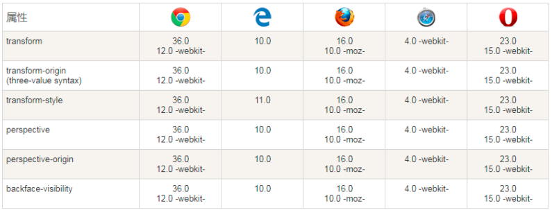
CSS3 3D conversion (understand)
CSS3 allows you to format elements using 3D transformations.
Browser support
The number in the table represents the first browser version number that supports this attribute.
The number immediately preceding - webkit-, -ms - or - moz - is the first browser version number that supports the prefix attribute.
| function | describe |
|---|---|
| matrix3d(n,n,n,n,n,n, n,n,n,n,n,n,n,n,n,n) | Define 3D conversion, using a 4x4 matrix of 16 values. |
| translate3d(x,y,z) | Define 3D conversion. |
| translateX(x) | Define the 3D conversion, using only the values for the X axis. |
| translateY(y) | Define the 3D conversion, using only the values for the Y axis. |
| translateZ(z) | Define the 3D conversion, using only the values for the Z axis. |
| scale3d(x,y,z) | Defines the 3D scale conversion. |
| scaleX(x) | Defines the 3D scaling transformation by giving a value for the X axis. |
| scaleY(y) | Defines the 3D scaling transformation by giving a value for the Y axis. |
| scaleZ(z) | Defines the 3D scaling transformation by giving a value for the Z axis. |
| rotate3d(x,y,z,angle) | Define 3D rotation. |
| rotateX(angle) | Defines the 3D rotation along the X axis. |
| rotateY(angle) | Defines the 3D rotation along the Y axis. |
| rotateZ(angle) | Defines the 3D rotation along the Z axis. |
case
How many pixels of 3D elements are defined from the perspective attribute of the view. This property allows you to change how 3D elements view the perspective.
When defining the perspective attribute, it is the child element of an element, the perspective, not the element itself.
Note: the perspective attribute only affects 3D conversion elements.
Value: pixel value, the distance of the element from the view, in pixels.
<!doctype html>
<html lang="en">
<head>
  <meta charset="UTF-8">
  <title>Document</title>
  <style type="text/css">
    #div0{
        width: 300px;
        margin: 30px;
        border: 2px solid red;
        perspective:1000px;
        background: red;
    }
    #div1,#div2,#div3{
        width: 200px;
        height: 150px;
        font-size: 50px;
        margin: 30px auto;
        background: green;
    }

    #div1:hover{
    /*transform: translate3d(0,0,-300px);*/
        transform:translateZ(-500px);
    }
    #div2:hover{
        transform: rotate3d(0,1,0,45deg);
        transform-origin:right;
    }

    #div3:hover{
        transform: scaleZ(2) rotateX(60deg);
        transform-origin:top;
    }

    body{
        perspective:1000px;
    }

    #div0:hover{
        transform:rotateX(45deg);
        -webkit-transform:rotateX(45deg);
        -moz-transform:rotateX(45deg);
        -o-transform:rotateX(45deg);
        -ms-transform:rotateX(45deg);
    }
  </style>
 </head>
 <body>
  <div id="div0">
      <div id="div1">3D translation</div>
      <div id="div2">3D rotate</div>
      <div id="div3">3D zoom</div>
    </div>
 </body>
</html>
2, CSS3 transition
In CSS3, when we can change from one style to another in order to add some effect, we don't need to use Flash animation or JavaScript.
How does it work?
CSS3 transition is the effect of elements gradually changing from one style to another.
To achieve this, two elements must be specified:
-
Specify the CSS properties to add the effect to
-
Specifies the duration of the effect.
| attribute | describe |
|---|---|
| transition | Short attribute, used to set four transition attributes in one attribute. |
| transition-property | Specifies the name of the CSS property to which the transition is applied. |
| transition-duration | Defines the time taken for the transition effect. The default is 0. (in seconds or milliseconds) |
| transition-timing-function | Specify the time curve of the transition effect. The default is "ease". linear: Specifies the transition effect from beginning to end at the same speed. ease: Specifies the transition effect of starting slowly, then getting faster, and then ending slowly. Ease in: Specifies the transition effect starting at a slow speed. Ease out: Specifies the transition effect ending at a slow speed. Ease in out: Specifies the transition effect starting and ending at a slow speed. |
| transition-delay | Specify when the transition effect begins. The default is 0. |
The transition effect applied to the width attribute is 2 seconds long:
div {
	transition: width 2s;
}

/*be careful:   If no period is specified, transition will have no effect because the default value is 0.
The effect changes when the value of the specified CSS property changes. A typical CSS attribute change is when the user mouse over an element: Specifies that when the mouse pointer hovers (: hover) over the < div > element:*/
div:hover {
	width: 400px;
}
Multiple changes:
To add transformation effects for multiple styles, the added attributes are separated by commas:
<style>
div {
    width: 100px;
    height: 100px;
    background: red;
    -webkit-transition: width 2s, height 2s, -webkit-transform 2s; /* For Safari 3.1 to 6.0 */
    transition: width 2s, height 2s, transform 2s;
}

div:hover {
    width: 200px;
    height: 200px;
    -webkit-transform: rotate(180deg); /* Chrome, Safari, Opera */
    transform: rotate(180deg);
}
</style>

<p><b>be careful:</b>The instance cannot be in Internet Explorer 9 And earlier IE Work on version.</p>

<div>Move the mouse to div Element to see the transition effect.</div>
In one example, use all transition attributes:
<style>
div
{
    width:100px;
    height:100px;
    background:red;
    transition-property:width;
    transition-duration:1s;
    transition-timing-function:linear;
    transition-delay:2s;
    /* Safari */
    -webkit-transition-property:width;
    -webkit-transition-duration:1s;
    -webkit-transition-timing-function:linear;
    -webkit-transition-delay:2s;
}

div:hover
{
    width:200px;
}

<p><b>be careful:</b>The instance cannot be in Internet Explorer 9 And earlier IE Work on version.</p>

<div></div>

<p>Move the mouse to div Element to see the transition effect.</p>
<p><b>be careful:</b> The transition effect needs to wait two seconds before it starts.</p>
The transition effect is the same as the above example, but the short transition attribute is used:
div{
    transition: width 1s linear 2s;
    /* Safari */
    -webkit-transition:width 1s linear 2s;
}
3, CSS3 animation (keyframe animation)
CSS3 can create animation, which can replace many web page animation images, Flash animation and JavaScript effects.
Animation properties of CSS3
The following table lists the @ keyframes rule and all animation attributes:
| attribute | describe |
|---|---|
| @keyframes | Specify animation. |
| animation | Short for all animation attributes, except the animation play state attribute. |
| animation-name | Specifies the name of the @ keyframes animation. |
| animation-duration | Specifies the seconds or milliseconds it takes for the animation to complete a cycle. The default is 0. |
| animation-timing-function | Specifies the speed curve of the animation. The default is "ease". linear: the speed of the animation is the same from beginning to end. ease: default. The animation starts at a low speed, then speeds up and slows down before it ends. Ease in: the animation starts at a low speed. Ease out: the animation ends at a low speed. Ease in out: the animation starts and ends at a low speed. |
| animation-fill-mode | Specifies the style (not set) to be applied to the element when the animation does not play (when the animation is completed, or when the animation does not start playing with a delay). |
| animation-delay | Specifies when the animation starts. The default is 0. Defines the time, in seconds or milliseconds, to wait before the animation starts. |
| animation-iteration-count | Specifies the number of times the animation is played. The default is 1. n: A number that defines how many times the animation should be played. infinite specifies that the animation should be played indefinitely (forever) |
| animation-direction | Specifies whether the animation plays backwards in the next cycle. The default is normal. normal defaults. The animation plays normally. reverse animation plays backwards. alternate animation plays forward an odd number of times (1, 3, 5...) and backwards an even number of times (2, 4, 6...). alternate reverse animation plays backwards in odd times (1, 3, 5...) and forwards in even times (2, 4, 6...). |
| animation-play-state | Specifies whether the animation is running or paused. The default is "running". |
CSS3 @keyframes rules
To create CSS3 animation, you need to understand the @ keyframes rule.
Animation is the effect of gradually changing elements from one style to another.
You can change the style as many times as you like.
Please specify the time of change in percentage, or use the keywords "from" and "to", which are equivalent to 0% and 100%.
0% is the beginning of the animation and 100% is the completion of the animation.
For best browser support, you should always define 0% and 100% selectors.
@ The keyframes rule is to create animation.
@ A CSS style and animation specified in the keyframes rule will be gradually changed from the current style to the new style.
@keyframes myfirst {
	from {background: red;}
	to {background: yellow;}
}
@-webkit-keyframes myfirst /* Safari With Chrome */ {
	from {background: red;}
	to {background: yellow;}
}
CSS3 animation
When creating an animation in @ keyframes, bind it to a selector, otherwise the animation will not have any effect.
Specify that the animation properties of at least two CSS3 are bound to a selector:
-
Specifies the name of the animation
-
Specify the duration of the animation
Bind "myfirst" animation to div element, duration: 5 seconds:
div {
    animation: myfirst 5s;
    -webkit-animation: myfirst 5s; /* Safari With Chrome */
}
Note: you must define the name of the animation and the duration of the animation. If the duration of is omitted, the animation will not run because the default value is 0.
Percentage keyframe animation
Animation is the effect of gradually changing elements from one style to another.
You can change the style as many times as you like.
Please specify the time of change in percentage, or use the keywords "from" and "to", which are equivalent to 0% and 100%.
0% is the beginning of the animation and 100% is the completion of the animation.
For best browser support, you should always define 0% and 100% selectors.
Change the background color when the animation is 25% and 50%, and then change again when the animation is 100% complete:
div{
    width:100px;
    height:100px;
    background:red;
    animation:myfirst 5s;
    -moz-animation:myfirst 5s; /* Firefox */
    -webkit-animation:myfirst 5s; /* Safari and Chrome */
    -o-animation:myfirst 5s; /* Opera */
}

@keyframes myfirst
{
    0%   {background:red;}
    25%  {background:yellow;}
    50%  {background:blue;}
    100% {background:green;}
}
Change background color and position:
div{
    width:100px;
    height:100px;
    background:red;
    position:relative;
    animation:myfirst 5s;
    -webkit-animation:myfirst 5s; /* Safari and Chrome */
}

@keyframes myfirst
{
    0%   {background:red; left:0px; top:0px;}
    25%  {background:yellow; left:200px; top:0px;}
    50%  {background:blue; left:200px; top:200px;}
    75%  {background:green; left:0px; top:200px;}
    100% {background:red; left:0px; top:0px;}
}
Set all properties
<!DOCTYPE html>
<html>
<head>
<meta charset="utf-8">
<title>All attribute effects</title>
<style>
div
{
    width:100px;
    height:100px;
    background:red;
    position:relative;
    animation-name:myfirst;
    animation-duration:5s;
    animation-timing-function:linear;
    animation-delay:2s;
    animation-iteration-count:infinite;
    animation-direction:alternate;
    animation-play-state:running;
    /* Safari and Chrome: */
    -webkit-animation-name:myfirst;
    -webkit-animation-duration:5s;
    -webkit-animation-timing-function:linear;
    -webkit-animation-delay:2s;
    -webkit-animation-iteration-count:infinite;
    -webkit-animation-direction:alternate;
    -webkit-animation-play-state:running;
}

@keyframes myfirst
{
    0%   {background:red; left:0px; top:0px;}
    25%  {background:yellow; left:200px; top:0px;}
    50%  {background:blue; left:200px; top:200px;}
    75%  {background:green; left:0px; top:200px;}
    100% {background:red; left:0px; top:0px;}
}

@-webkit-keyframes myfirst /* Safari and Chrome */
{
    0%   {background:red; left:0px; top:0px;}
    25%  {background:yellow; left:200px; top:0px;}
    50%  {background:blue; left:200px; top:200px;}
    75%  {background:green; left:0px; top:200px;}
    100% {background:red; left:0px; top:0px;}
}
</style>
</head>
<body>

<p><b>be careful:</b> The instance is in Internet Explorer 9 And earlier IE The version is invalid.</p>

<div></div>

</body>
</html>
It is the same as the animation above, but uses the short animation attribute:
div{
    animation: myfirst 5s linear 2s infinite alternate;
    /* Safari And Chrome: */
    -webkit-animation: myfirst 5s linear 2s infinite alternate;
}