1, Classification prediction based on logistic regression
1 Introduction and application of logistic regression
1.1 introduction to logistic regression
Although Logistic regression (LR) has the word "regression", it is actually a classification model and is widely used in various fields. Although deep learning is more popular than these traditional methods, in fact, these traditional methods are still widely used in various fields because of their unique advantages.
For logistic regression, the most prominent two points are its simple model and strong interpretability.
Advantages and disadvantages of logistic regression model:
- Advantages: simple implementation, easy to understand and implement; The computing cost is not high, the speed is fast, and the storage resources are low
- Disadvantages: it is easy to under fit, and the classification accuracy may not be high
1.2 application of logistic regression
Logistic regression models are widely used in various fields, including machine learning, most medical fields and social sciences. For example, trauma and injury severity score (TRISS) developed by Boyd et al. Was widely used to predict mortality in injured patients. Logistic regression was used to analyze and predict the risk of specific diseases (such as diabetes, coronary heart disease) based on observed patient characteristics (age, gender, body mass index, blood test results, etc.). Logistic regression model is also used to predict the possibility of system or product failure in a given process. It is also used in marketing applications, such as predicting customers' tendency to buy products or stop ordering. In economics, it can be used to predict the possibility of a person choosing to enter the labor market, while business applications can be used to predict the possibility of homeowners defaulting on their mortgages. Conditional random fields are extensions of logistic regression to sequential data for natural language processing.
Logistic regression model is also the basic component of many classification algorithms, such as credit card transaction anti fraud and CTR (click through rate) estimation based on GBDT algorithm + LR logistic regression in classification tasks. Its advantage is that the output value naturally falls between 0 and 1 and has probability significance. The model is clear and has the corresponding theoretical basis of probability. The fitted parameters represent the influence of each feature on the results. It is also a good tool for understanding data. But at the same time, because it is essentially a linear classifier, it can not deal with more complex data. Many times, we will use logistic regression model to do some baseline (basic level) of task attempt.
After talking about the concept and application of logistic regression, we should have expected it, so let's start now!!!
2.Demo practice
Step 1: library function import
##  Basic function library
import numpy as np

## Import drawing library
import matplotlib.pyplot as plt
import seaborn as sns

## Import logistic regression model function
from sklearn.linear_model import LogisticRegression
Step 2: model training
##Demo demonstrates LogisticRegression classification

## Construct dataset
x_fearures = np.array([[-1, -2], [-2, -1], [-3, -2], [1, 3], [2, 1], [3, 2]])
y_label = np.array([0, 0, 0, 1, 1, 1])

## Call logistic regression model
lr_clf = LogisticRegression()

## The constructed data set was fitted with logistic regression model
lr_clf = lr_clf.fit(x_fearures, y_label) #The fitting equation is y=w0+w1*x1+w2*x2
Step3: view model parameters
## View the w of its corresponding model
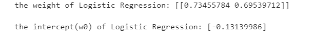
print('the weight of Logistic Regression:',lr_clf.coef_)
## View w0 of its corresponding model
print('the intercept(w0) of Logistic Regression:',lr_clf.intercept_)
Step4: data and model visualization
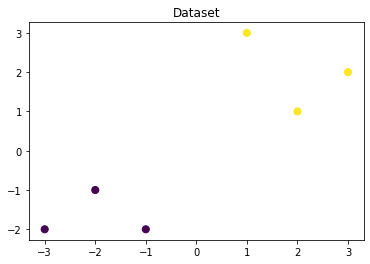
## Visually constructed data sample points
plt.figure()
plt.scatter(x_fearures[:,0],x_fearures[:,1], c=y_label, s=50, cmap='viridis')
plt.title('Dataset')
plt.show()
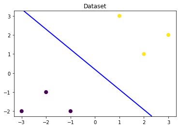
# Visual decision boundary
plt.figure()
plt.scatter(x_fearures[:,0],x_fearures[:,1], c=y_label, s=50, cmap='viridis')
plt.title('Dataset')

nx, ny = 200, 100
x_min, x_max = plt.xlim()
y_min, y_max = plt.ylim()
x_grid, y_grid = np.meshgrid(np.linspace(x_min, x_max, nx),np.linspace(y_min, y_max, ny))

z_proba = lr_clf.predict_proba(np.c_[x_grid.ravel(), y_grid.ravel()])
z_proba = z_proba[:, 1].reshape(x_grid.shape)
plt.contour(x_grid, y_grid, z_proba, [0.5], linewidths=2., colors='blue')

plt.show()
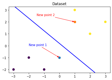
### Visual prediction of new samples

plt.figure()
## new point 1
x_fearures_new1 = np.array([[0, -1]])
plt.scatter(x_fearures_new1[:,0],x_fearures_new1[:,1], s=50, cmap='viridis')
plt.annotate(s='New point 1',xy=(0,-1),xytext=(-2,0),color='blue',arrowprops=dict(arrowstyle='-|>',connectionstyle='arc3',color='red'))

## new point 2
x_fearures_new2 = np.array([[1, 2]])
plt.scatter(x_fearures_new2[:,0],x_fearures_new2[:,1], s=50, cmap='viridis')
plt.annotate(s='New point 2',xy=(1,2),xytext=(-1.5,2.5),color='red',arrowprops=dict(arrowstyle='-|>',connectionstyle='arc3',color='red'))

## training sample
plt.scatter(x_fearures[:,0],x_fearures[:,1], c=y_label, s=50, cmap='viridis')
plt.title('Dataset')

# Visual decision boundary
plt.contour(x_grid, y_grid, z_proba, [0.5], linewidths=2., colors='blue')

plt.show()
Step5: model prediction
## In the training set and test set, the trained model is used to predict
y_label_new1_predict = lr_clf.predict(x_fearures_new1)
y_label_new2_predict = lr_clf.predict(x_fearures_new2)

print('The New point 1 predict class:\n',y_label_new1_predict)
print('The New point 2 predict class:\n',y_label_new2_predict)

## Since the logistic regression model is a probability prediction model (p = p(y=1|x,\theta) introduced earlier), we can use predict_ Probabilities predicted by proba function
y_label_new1_predict_proba = lr_clf.predict_proba(x_fearures_new1)
y_label_new2_predict_proba = lr_clf.predict_proba(x_fearures_new2)

print('The New point 1 predict Probability of each class:\n',y_label_new1_predict_proba)
print('The New point 2 predict Probability of each class:\n',y_label_new2_predict_proba)
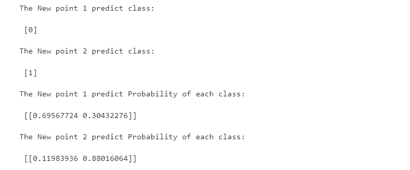
It can be found that the trained regression model will X_new1 is predicted as category 0 (lower left side of discrimination plane), X_new2 is predicted as category 1 (upper right side of the discrimination plane). The discriminant surface with a probability of 0.5 of the trained logistic regression model is the blue line in the figure above.
3. Practice of logistic regression classification based on iris data set
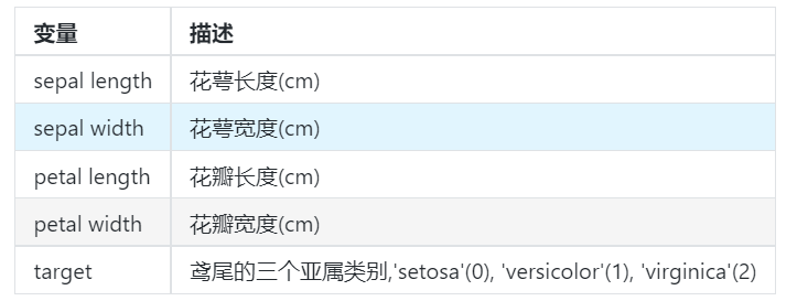
This time, we choose iris data to train the method. The data set contains 5 variables, including 4 characteristic variables and 1 target classification variable. There are 150 samples, and the target variable is the category of flowers, which all belong to three subgenera of iris, namely iris setosa, iris versicolor and iris Virginia. The four features of the three Iris species are calyx length (cm), calyx width (cm), petal length (cm) and petal width (cm). These morphological features have been used to identify species in the past.
Step 1: library function import
##  Basic function library
import numpy as np
import pandas as pd

## Drawing function library
import matplotlib.pyplot as plt
import seaborn as sns
Step 2: data reading / loading
## We load iris data from sklearn as data and convert it into DataFrame format using Pandas
from sklearn.datasets import load_iris
data = load_iris() #Get data characteristics
iris_target = data.target #Get the label corresponding to the data
iris_features = pd.DataFrame(data=data.data, columns=data.feature_names) #Convert to DataFrame format using Pandas
Step 3: simple view of data information
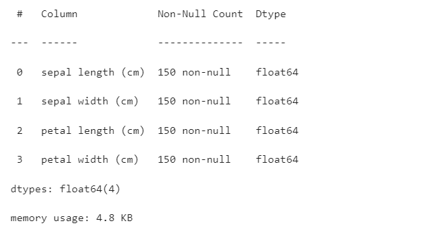
## Use. info() to view the overall information of the data
iris_features.info()
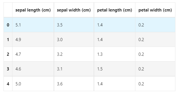
## For simple data viewing, we can use. head() header and. tail() tail
iris_features.head()
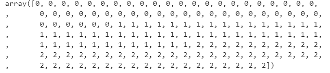
## The corresponding category labels are, where 0, 1 and 2 represent the categories of 'setosa', 'versicolor' and 'virginica' respectively.
iris_target
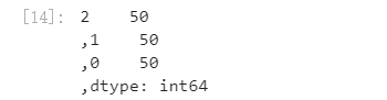
## Use value_ The counts function looks at the number of each category
pd.Series(iris_target).value_counts()
## Make some statistical description for the characteristics
iris_features.describe()
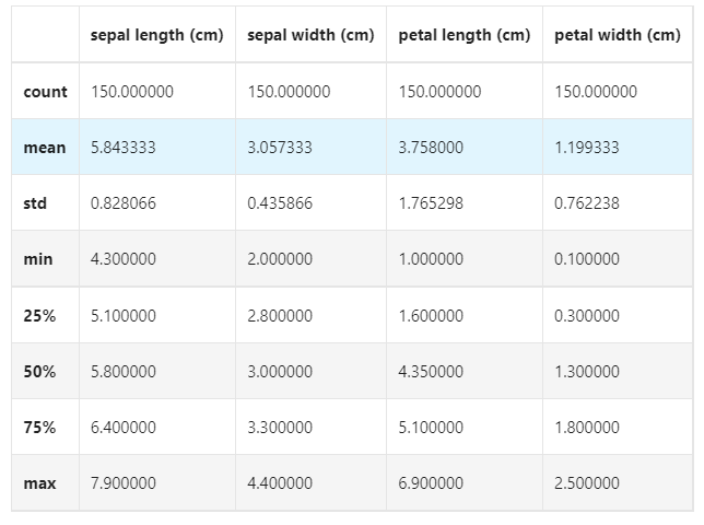
From the statistical description, we can see the variation range of different numerical characteristics.
Step4: visual description
## Merge label and feature information
iris_all = iris_features.copy() ##Make shallow copies to prevent modifications to the original data
iris_all['target'] = iris_target
## Scatter visualization of feature and label combination
sns.pairplot(data=iris_all,diag_kind='hist', hue= 'target')
plt.show()
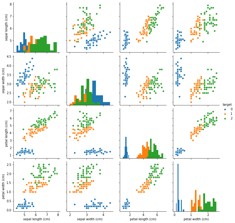
It can be found from the above figure that in 2D, different feature combinations have scattered distribution for different types of flowers and approximate discrimination ability.
for col in iris_features.columns:
    sns.boxplot(x='target', y=col, saturation=0.5,palette='pastel', data=iris_all)
    plt.title(col)
    plt.show()
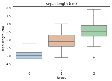
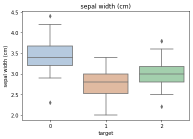
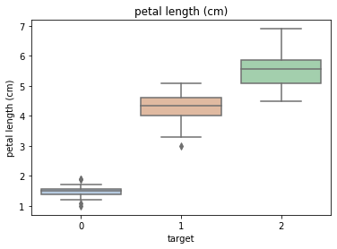
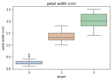
Using the box graph, we can also get the distribution differences of different categories in different features.
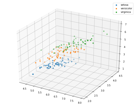
# Select the first three features to draw a three-dimensional scatter diagram
from mpl_toolkits.mplot3d import Axes3D

fig = plt.figure(figsize=(10,8))
ax = fig.add_subplot(111, projection='3d')

iris_all_class0 = iris_all[iris_all['target']==0].values
iris_all_class1 = iris_all[iris_all['target']==1].values
iris_all_class2 = iris_all[iris_all['target']==2].values
# 'setosa'(0), 'versicolor'(1), 'virginica'(2)
ax.scatter(iris_all_class0[:,0], iris_all_class0[:,1], iris_all_class0[:,2],label='setosa')
ax.scatter(iris_all_class1[:,0], iris_all_class1[:,1], iris_all_class1[:,2],label='versicolor')
ax.scatter(iris_all_class2[:,0], iris_all_class2[:,1], iris_all_class2[:,2],label='virginica')
plt.legend()

plt.show()
Step5: use logistic regression model for training and prediction on binary classification
## In order to correctly evaluate the model performance, the data is divided into training set and test set, the model is trained on the training set, and the model performance is verified on the test set.
from sklearn.model_selection import train_test_split

## Select samples with categories 0 and 1 (excluding samples with category 2)
iris_features_part = iris_features.iloc[:100]
iris_target_part = iris_target[:100]

## The test set size is 20%, 80% / 20% points
x_train, x_test, y_train, y_test = train_test_split(iris_features_part, iris_target_part, test_size = 0.2, random_state = 2020)
## Import logistic regression model from sklearn
from sklearn.linear_model import LogisticRegression
## Define logistic regression model
clf = LogisticRegression(random_state=0, solver='lbfgs')
# Training logistic regression model on training set
clf.fit(x_train, y_train)
## View its corresponding w
print('the weight of Logistic Regression:',clf.coef_)

## View its corresponding w0
print('the intercept(w0) of Logistic Regression:',clf.intercept_)

## The distribution on the training set and test set is predicted by the trained model
train_predict = clf.predict(x_train)
test_predict = clf.predict(x_test)
from sklearn import metrics

## The model effect is evaluated by accuracy [the proportion of the number of correctly predicted samples to the total number of predicted samples]
print('The accuracy of the Logistic Regression is:',metrics.accuracy_score(y_train,train_predict))
print('The accuracy of the Logistic Regression is:',metrics.accuracy_score(y_test,test_predict))

## View the confusion matrix (statistical matrix of various situations of predicted value and real value)
confusion_matrix_result = metrics.confusion_matrix(test_predict,y_test)
print('The confusion matrix result:\n',confusion_matrix_result)

# Visualization of results using thermal maps
plt.figure(figsize=(8, 6))
sns.heatmap(confusion_matrix_result, annot=True, cmap='Blues')
plt.xlabel('Predicted labels')
plt.ylabel('True labels')
plt.show()
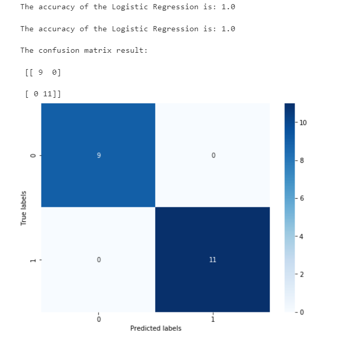
We can find that its accuracy is 1, which means that all samples are predicted correctly.
Step6: use logistic regression model to train and predict on three classifications (multiple classifications)
## The test set size is 20%, 80% / 20% points
x_train, x_test, y_train, y_test = train_test_split(iris_features, iris_target, test_size = 0.2, random_state = 2020)
Other codes are the same as those of category II
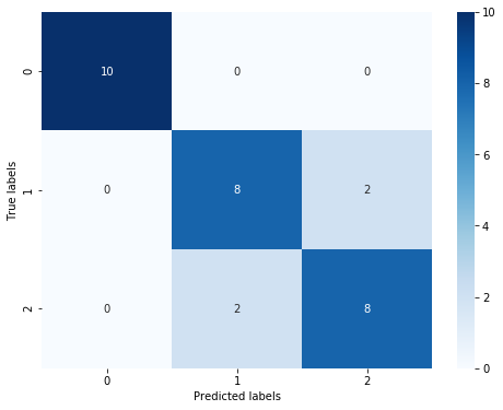
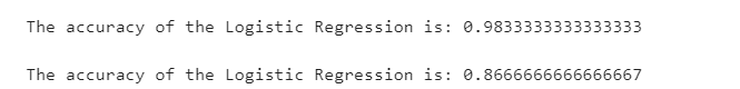
Through the results, we can find that the prediction accuracy of the three classification results has decreased, and its accuracy in the test set is:
86.67
%
, this is due to the characteristics of 'versicolor' (1) and 'virginica' (2). We can also find that the boundary of the characteristics is fuzzy (the boundary categories are mixed, and there is no obvious distinction between the boundaries). There are some errors in the prediction of these two types.
2, Classification prediction based on XGBoost
1.XGBoost and Application
Introduction to XGBoost
XGBoost is an extensible machine learning system developed in 2016 under the leadership of Chen Tianqi of the University of Washington. Strictly speaking, XGBoost is not a model, but a software package for users to easily solve classification, regression or sorting problems. It implements the gradient lifting tree (GBDT) model internally, and optimizes many algorithms in the model. It not only obtains high precision, but also maintains a very fast speed. For a period of time, it has become a weapon of mass destruction in the field of data mining and machine learning at home and abroad.
More importantly, XGBoost has made in-depth consideration in system optimization and machine learning principles. It is no exaggeration to say that the scalability, portability and accuracy provided by XGBoost promote the upper limit of machine learning computing restrictions. The system runs ten times faster on a single machine than the popular solutions at that time, and even can process billions of data in distributed systems.
Main advantages of XGBoost:
**Easy to use** Compared with other machine learning libraries, users can easily use XGBoost and get quite good results.
**Efficient and scalable** When dealing with large-scale data sets, it has fast speed, good effect and low requirements for hardware resources such as memory.
**Strong robustness** Compared with the deep learning model, it can achieve close effect without fine tuning.
XGBoost implements the lifting tree model internally, which can automatically handle missing values.
Main disadvantages of XGBoost:
Compared with the deep learning model, it can not model the spatio-temporal position, and can not capture high-dimensional data such as image, voice, text and so on.
When we have a large amount of training data and can find an appropriate deep learning model, the accuracy of deep learning can be far ahead of XGBoost.
Application of 1.2XGboost
XGBoost is widely used in the field of machine learning and data mining. According to statistics, among the 29 award-winning schemes on Kaggle platform in 2015, 17 teams used XGBoost; In the 2015 KDD cup, the top ten teams used XGBoost, and the integration of other models can not compare with the improvement brought by adjusting the parameters of XGBoost. These real examples show that XGBoost can achieve very good results on various problems.
At the same time, XGBoost has also been successfully applied to various problems in industry and academia. For example, store sales forecast, high energy physics event classification, web text classification; User behavior prediction, motion detection, advertising click through rate prediction, malware classification, disaster risk prediction, online course drop out rate prediction. Although the domain is related to data analysis and Feature Engineering in these solutions
2. Practice of XGBoost classification based on weather data set
Dataset: Weather data set
Step 1: function library import
##  Basic function library
import numpy as np
import pandas as pd

## Drawing function library
import matplotlib.pyplot as plt
import seaborn as sns
This time, we choose the weather data set to try to train the method. Now there are some daily rainfall data provided by the weather station. We need to predict the probability of rain tomorrow according to the historical rainfall data. The format of the test set data test.csv involved in the sample is exactly the same as that of train.csv, but its RainTomorrow is not given. It is a predictive variable.
The characteristics of the data are described as follows:
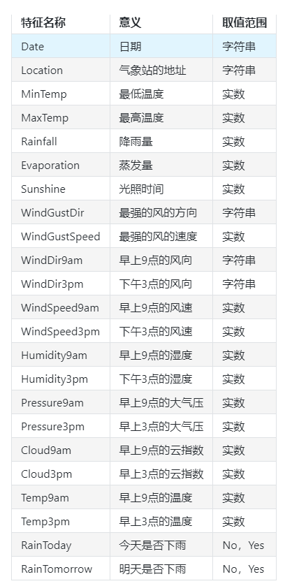
Step 2: data reading / loading
## We use the read provided by Pandas_ CSV function reads and converts to DataFrame format

data = pd.read_csv('train.csv')
Step 3: simple view of data information
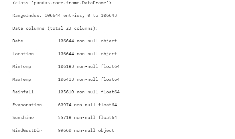
## Use. info() to view the overall information of the data
data.info()
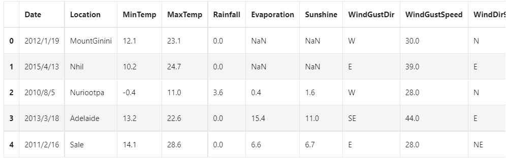
## For simple data viewing, we can use. head() header and. tail() tail
data.head()
Because there are too many variables, only some variables are shown here
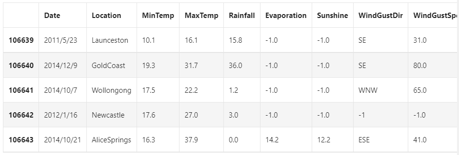
Here we find that NaN exists in the data set. Generally, we believe that NaN represents a missing value in the data set, which may be an error during data collection or processing. Here, we use - 1 to fill in the missing value. There are other missing value processing methods such as "median filling and average filling". If you are interested, please check another blog: [data analysis series] Python data preprocessing summary , the basic operations of data preprocessing are explained in detail here
data = data.fillna(-1)
data.tail()
## Use value_ The counts function views the number of training set labels
pd.Series(data['RainTomorrow']).value_counts()
No 82786
,Yes 23858
,Name: RainTomorrow, dtype: int64
We find that the number of negative samples in the data set is much larger than the number of positive samples. This common problem is called "data imbalance" problem, which needs some special treatment in some cases. The methods to solve the data imbalance include data transformation or data interpolation and so on.
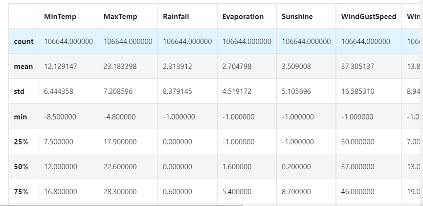
## Make some statistical description for the characteristics
data.describe()
Step4: visual description
For convenience, we first record digital features and non digital features:
numerical_features = [x for x in data.columns if data[x].dtype == np.float]
numerical_features = [x for x in data.columns if data[x].dtype == np.float]

## Scatter visualization based on the combination of three features and labels
sns.pairplot(data=data[['Rainfall',
'Evaporation',
'Sunshine'] + ['RainTomorrow']], diag_kind='hist', hue= 'RainTomorrow')
plt.show()
It can be found from the above figure that in 2D, different feature combinations have the scattered distribution of rain and no rain the next day, as well as the approximate discrimination ability. The combination of Sunshine and other features has more distinguishing ability
for col in data[numerical_features].columns:
    if col != 'RainTomorrow':
        sns.boxplot(x='RainTomorrow', y=col, saturation=0.5, palette='pastel', data=data)
        plt.title(col)
        plt.show()
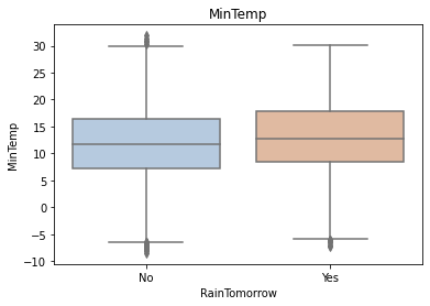
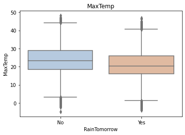
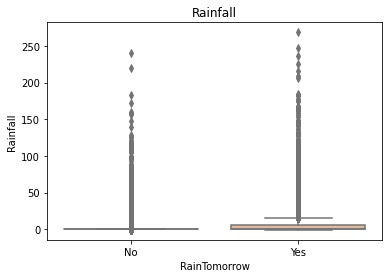
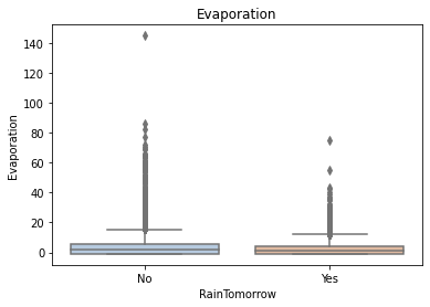
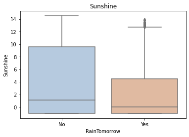
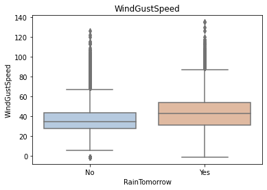
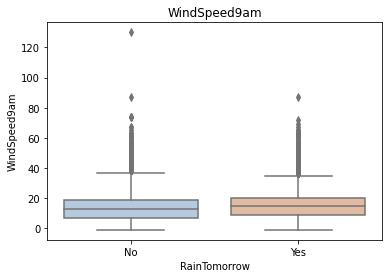
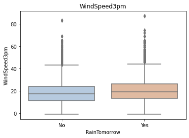
Using the box graph, we can also get the distribution differences of different categories in different features. We can find that sunshine, humidity3pm, cloud9am and cloud3pm have strong discrimination ability
tlog = {}
for i in category_features:
    tlog[i] = data[data['RainTomorrow'] == 'Yes'][i].value_counts()
flog = {}
for i in category_features:
    flog[i] = data[data['RainTomorrow'] == 'No'][i].value_counts()
plt.figure(figsize=(10,10))
plt.subplot(1,2,1)
plt.title('RainTomorrow')
sns.barplot(x = pd.DataFrame(tlog['Location']).sort_index()['Location'], y = pd.DataFrame(tlog['Location']).sort_index().index, color = "red")
plt.subplot(1,2,2)
plt.title('Not RainTomorrow')
sns.barplot(x = pd.DataFrame(flog['Location']).sort_index()['Location'], y = pd.DataFrame(flog['Location']).sort_index().index, color = "blue")
plt.show()
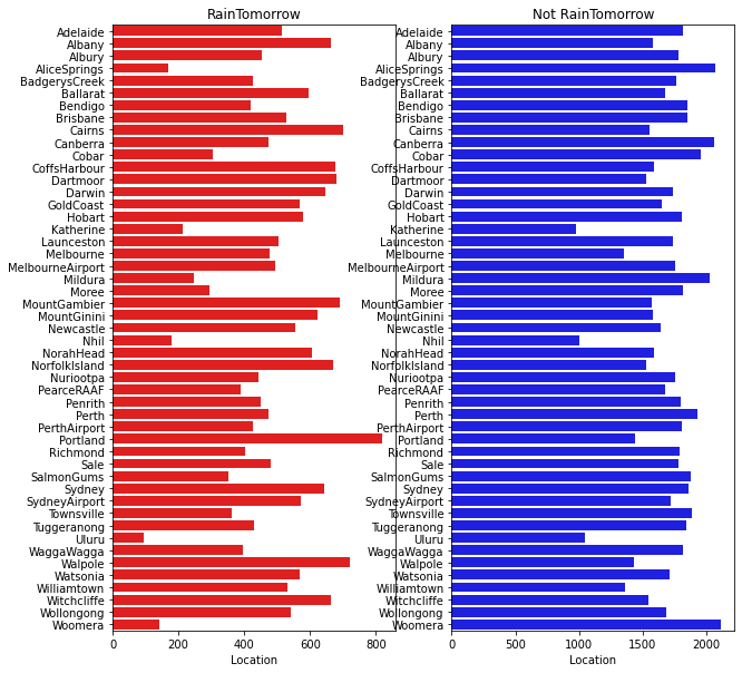
It can be seen from the above figure that rainfall varies greatly in different regions, and some places are obviously easier to rainfall
plt.figure(figsize=(10,2))
plt.subplot(1,2,1)
plt.title('RainTomorrow')
sns.barplot(x = pd.DataFrame(tlog['RainToday'][:2]).sort_index()['RainToday'], y = pd.DataFrame(tlog['RainToday'][:2]).sort_index().index, color = "red")
plt.subplot(1,2,2)
plt.title('Not RainTomorrow')
sns.barplot(x = pd.DataFrame(flog['RainToday'][:2]).sort_index()['RainToday'], y = pd.DataFrame(flog['RainToday'][:2]).sort_index().index, color = "blue")
plt.show()

In the above figure, we can find that it rains today and not necessarily tomorrow, but it doesn't rain today and it doesn't rain the next day.
Step5: Code discrete variables
Since XGBoost cannot handle string data, we need some methods to convert string data into data. The simplest method is to encode all features of the same category into the same value, such as female = 0, male = 1, dog = 2, so the last encoded feature value is an integer between [0, number of features - 1]. In addition, there are methods such as unique heat coding, summation coding, leaving one method coding and so on, which can get better results.
## All features of the same category are encoded into the same value
def get_mapfunction(x):
    mapp = dict(zip(x.unique().tolist(),
         range(len(x.unique().tolist()))))
    def mapfunction(y):
        if y in mapp:
            return mapp[y]
        else:
            return -1
    return mapfunction
for i in category_features:
    data[i] = data[i].apply(get_mapfunction(data[i]))
## The encoded string feature becomes a number

data['Location'].unique()
Step6: training and prediction with XGBoost
## In order to correctly evaluate the model performance, the data is divided into training set and test set, the model is trained on the training set, and the model performance is verified on the test set.
from sklearn.model_selection import train_test_split

## Select samples with categories 0 and 1 (excluding samples with category 2)
data_target_part = data['RainTomorrow']
data_features_part = data[[x for x in data.columns if x != 'RainTomorrow']]

## The test set size is 20%, 80% / 20% points
x_train, x_test, y_train, y_test = train_test_split(data_features_part, data_target_part, test_size = 0.2, random_state = 2020)
## Import XGBoost model
from xgboost.sklearn import XGBClassifier
## Define XGBoost model
clf = XGBClassifier()
# Training XGBoost model on training set
clf.fit(x_train, y_train)
## The distribution on the training set and test set is predicted by the trained model
train_predict = clf.predict(x_train)
test_predict = clf.predict(x_test)
from sklearn import metrics

## The model effect is evaluated by accuracy [the proportion of the number of correctly predicted samples to the total number of predicted samples]
print('The accuracy of the Logistic Regression is:',metrics.accuracy_score(y_train,train_predict))
print('The accuracy of the Logistic Regression is:',metrics.accuracy_score(y_test,test_predict))

## View the confusion matrix (statistical matrix of various situations of predicted value and real value)
confusion_matrix_result = metrics.confusion_matrix(test_predict,y_test)
print('The confusion matrix result:\n',confusion_matrix_result)

# Visualization of results using thermal maps
plt.figure(figsize=(8, 6))
sns.heatmap(confusion_matrix_result, annot=True, cmap='Blues')
plt.xlabel('Predicted labels')
plt.ylabel('True labels')
plt.show()
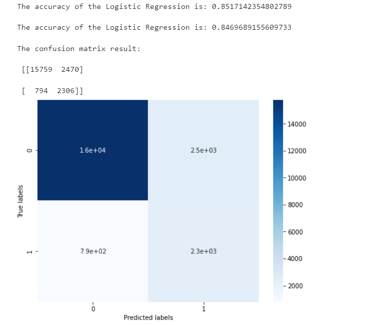
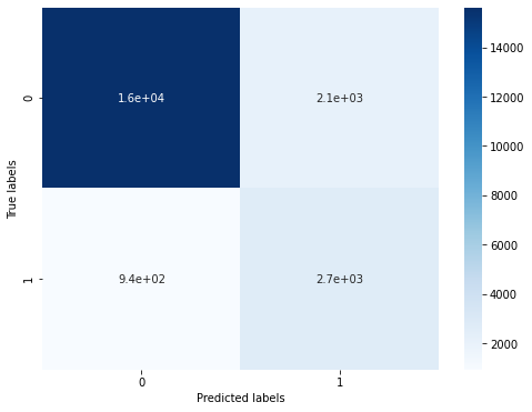
We can find that a total of 15759 + 2306 samples are predicted correctly and 2470 + 794 samples are predicted incorrectly.
Step7: feature selection using XGBoost
sns.barplot(y=data_features_part.columns, x=clf.feature_importances_)
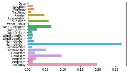
From the picture, we can find that the humidity at 3 p.m. and whether it rains today are the most important factors to determine whether it rains the next day
In addition to the first time, we can also use the following important attributes in XGBoost to evaluate the importance of features.
weight: it is evaluated by the number of times the feature is used
gain: evaluation Gini index when using features for division
cover: it is divided by the average value of the second derivative of an index covering the sample (the specific principle is unclear and needs to be explored).
total_gain: total Gini index
total_cover: total coverage
from sklearn.metrics import accuracy_score
from xgboost import plot_importance

def estimate(model,data):

    #sns.barplot(data.columns,model.feature_importances_)
    ax1=plot_importance(model,importance_type="gain")
    ax1.set_title('gain')
    ax2=plot_importance(model, importance_type="weight")
    ax2.set_title('weight')
    ax3 = plot_importance(model, importance_type="cover")
    ax3.set_title('cover')
    plt.show()
def classes(data,label,test):
    model=XGBClassifier()
    model.fit(data,label)
    ans=model.predict(test)
    estimate(model, data)
    return ans

ans=classes(x_train,y_train,x_test)
pre=accuracy_score(y_test, ans)
print('acc=',accuracy_score(y_test,ans))
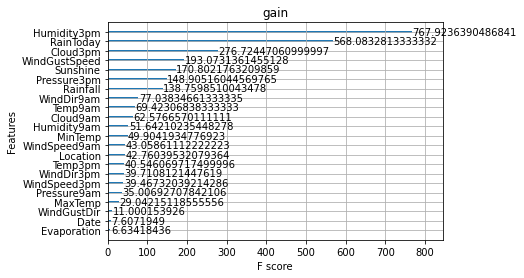
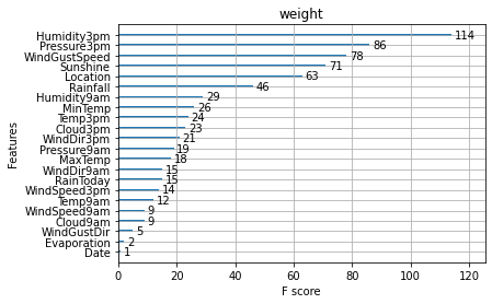
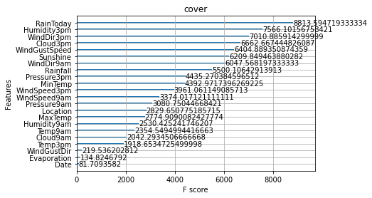
These diagrams can also help us better understand other important features.
Step8: get better results by adjusting parameters
XGBoost includes but is not limited to the following parameters that have a great impact on the model:
learning_rate: sometimes called eta. The system default value is 0.3. The step size of each iteration is very important. It is too large, the operation accuracy is not high, it is too small, and the operation speed is slow.
subsample: 1 by default. This parameter controls the proportion of random sampling for each tree. If the value of this parameter is reduced, the algorithm will be more conservative and avoid over fitting. The value range is zero to one.
colsample_bytree: the system default value is 1. We usually set it to about 0.8. It is used to control the proportion of the number of columns sampled randomly per tree (each column is a feature).
max_depth: the default value is 6. We usually use a number between 3 and 10. This value is the maximum depth of the tree. This value is used to control
Fitted. max_ The greater the depth, the more specific the model learning.
The methods of adjusting model parameters include greedy algorithm, grid parameter adjustment, Bayesian parameter adjustment and so on. Here we use grid parameter adjustment. Its basic idea is exhaustive search: in all candidate parameter selection, try every possibility through cyclic traversal, and the best parameter is the final result
## Import grid parameter adjustment function from sklearn Library
from sklearn.model_selection import GridSearchCV

## Define parameter value range
learning_rate = [0.1, 0.3, 0.6]
subsample = [0.8, 0.9]
colsample_bytree = [0.6, 0.8]
max_depth = [3,5,8]

parameters = { 'learning_rate': learning_rate,
              'subsample': subsample,
              'colsample_bytree':colsample_bytree,
              'max_depth': max_depth}
model = XGBClassifier(n_estimators = 50)

## Perform grid search
clf = GridSearchCV(model, parameters, cv=3, scoring='accuracy',verbose=1,n_jobs=-1)
clf = clf.fit(x_train, y_train)
## The best model parameters are used to predict the distribution on the training set and test set

## Define XGBoost model with parameters
clf = XGBClassifier(colsample_bytree = 0.6, learning_rate = 0.3, max_depth= 8, subsample = 0.9)
# Training XGBoost model on training set
clf.fit(x_train, y_train)

train_predict = clf.predict(x_train)
test_predict = clf.predict(x_test)

## The model effect is evaluated by accuracy [the proportion of the number of correctly predicted samples to the total number of predicted samples]
print('The accuracy of the Logistic Regression is:',metrics.accuracy_score(y_train,train_predict))
print('The accuracy of the Logistic Regression is:',metrics.accuracy_score(y_test,test_predict))

## View the confusion matrix (statistical matrix of various situations of predicted value and real value)
confusion_matrix_result = metrics.confusion_matrix(test_predict,y_test)
print('The confusion matrix result:\n',confusion_matrix_result)

# Visualization of results using thermal maps
plt.figure(figsize=(8, 6))
sns.heatmap(confusion_matrix_result, annot=True, cmap='Blues')
plt.xlabel('Predicted labels')
plt.ylabel('True labels')
plt.show()
Originally there were 2470 + 790 errors, but now there are 2112 + 939 errors, which has significantly improved the accuracy.