preface
Last article "Some good D3.js resources of Amway - niuyi ancient willow 2021.06.29" The response was pretty good. I remember a new group of friends said that they added it only after the supervisor pushed her article. It's also very magical.
In the blink of an eye, it hasn't been updated for another month. In fact, I have always wanted to write simple D3.js introductory articles / tutorials, but I always wanted to write them comprehensively, carefully, interesting and easy to understand. Even if I could benchmark Daniel Shiffman's output in Processing and P5.js, I would really let more people get started with D3.js visualization more smoothly. Related reading: Creative programming with P5.js into the pit - niuyi ancient willow June 28, 2019
The ideal is full and the reality is skinny. Gu Liu doesn't mention it if he doesn't have enough level. So far, he hasn't accumulated many cases to support the realization of the above goals. He often forgets all about D3.js because he hasn't contacted D3.js for a period of time. He stutters when he picks it up again, not to mention outputting tutorials?
It's also frustrating. Gu Liu always felt that he couldn't provide any valuable content related to visualization. If he couldn't even write an introductory tutorial, he really didn't know what else to do.
But it's not good to drag and don't act all the time. I'm still unwilling. Even if you can't output more systematic, comprehensive and easy to understand tutorials as soon as you come up, you may not be able to achieve your goals in many places, but let's take action first and see what kind of content you can write. It is also too late to carry out the optimization iteration after some output.
Therefore, with this article and the first article in this series, Gu Liu doesn't know how much this series can be written and what it will be like. Let's let time explain everything. In addition, although we go for the goal that beginners can easily understand, Gu Liu doesn't know how we feel after reading it, So I hope you can give more feedback and continue to improve what can be improved in the follow-up articles.
The supporting code and data used in this series will be open source to this warehouse. Welcome to Star. If you have any other questions, you can communicate in the group: https://github.com/DesertsX/d3-tutorial
text
Basic code structure
First, the following code structure is introduced. The div element with id "chart" will be used for the SVG canvas added later; Import the D3.js library downloaded locally (v5.9 version); The JS part is the focus of this code and is implemented in the drawChart() function. In addition, CSS style is mainly used for subsequent canvases to be full without leaving blank.
<!DOCTYPE html>
<html lang="en">

<head>
    <meta charset="UTF-8">
    <meta http-equiv="X-UA-Compatible" content="IE=edge">
    <meta name="viewport" content="width=device-width, initial-scale=1.0">
    <title>D3.js course</title>
    <style> * {
            margin: 0;
            padding: 0;
        }

        html,
        body {
            overflow: hidden;
        }</style>
</head>
<body>
    <div id="chart"></div>
    <!-- You can download it locally or reference the online version -->
    <script src="./d3.js"></script>
    <!-- <script src="https://cdn.bootcdn.net/ajax/libs/d3/5.9.7/d3.js"></script> -->
    <script> function drawChart() {
            // code
        }

        drawChart()</script>
</body>
Add SVG canvas
The following JS code is in drawChart().
For visualization with D3.js, you can use the SVG of vector graph, scalar graph and pixel canvas. Because Gu Liu uses more SVG, take this as an example.
The visual drawing process is simply to map the data into visual elements, and then lay them out on the canvas in a specific way. The visual elements can be circles in the scatter diagram, rectangles in the column diagram, histogram, lines in the broken line diagram, etc; The core of layout is to know the x/y coordinates of each element, which can be calculated by yourself or generated by many layout functions of D3.js.
Next, take the rectangle as an example to show you some usage of D3.js.
First, you need an SVG canvas to place subsequent visual elements. In fact, you can also put titles / axes / legends, etc. they may not be used here, which will be introduced later.
Select the div element with the id of chart through d3.select(), where # is the id, and if it is class, it is. A very simple CSS selector usage;
Then add the svg element through append, and then set its width, height and background color. Here, for the convenience of demonstration, set it to all the height and half the width of the browser Web window. You can also fill the web window, or use a fixed size such as 900 * 600, depending on your needs.
const width = window.innerWidth
const height = window.innerHeight
const svg = d3.select('#chart')
.append('svg')
.attr('width', width / 2)
.attr('height', height)
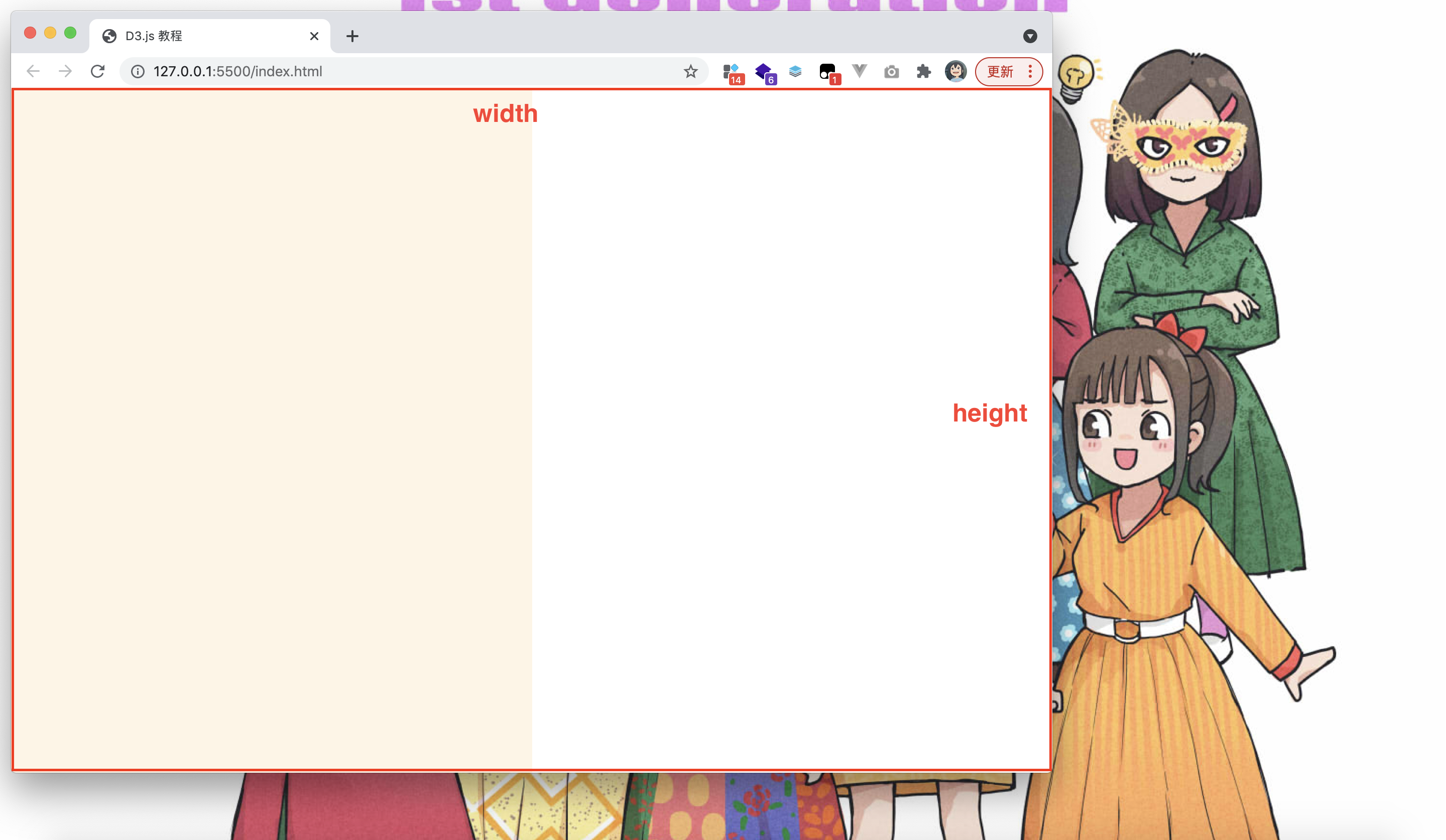
.style('background', '#FEF5E5')window.innerWidth and window.innerHeight are the width and height of the web page window when it is opened at a certain size, that is, the red box in the figure, and you can see that the canvas accounts for half of the size.
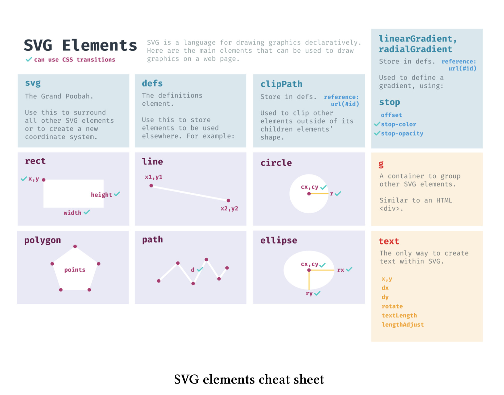
After setting the canvas, you can add visual elements to it. Just like many tools / software come with some basic graphic elements, SVG also has common elements such as circle/rect/ellipse/polygon/line/path/text, and each element can set corresponding attributes, such as position, width, height, radius, color, stroke, transparency, etc. (the picture is taken from fullstack d3), It will be introduced gradually in the follow-up meeting, which is not complicated.
Now, we need to draw a rectangle / rect in the canvas. We can also add the element name with append, and then set the x/y position coordinates (the coordinates of the upper left corner of the rectangle, not the coordinates of the center point), the width and height of the rectangle (the numbers are pixel values, such as 100 is 100px) and the color.
It should be noted that the origin of the rectangular coordinate system is in the upper left corner of the web page window, the horizontal right is the positive axis of the x axis, and the vertical down is the positive axis of the y axis.
svg.append('rect')
    .attr('x', 30)
    .attr('y', 50)
    .attr('width', 50)
    .attr('height', 100)
    .attr('fill', '#00AEA6')
The corresponding HTML generated in the browser is as follows.
<svg width="518.5" height="680" style="background: rgb(254, 245, 229);">
    <rect x="30" y="50" width="50" height="100" fill="#00AEA6"></rect>
</svg>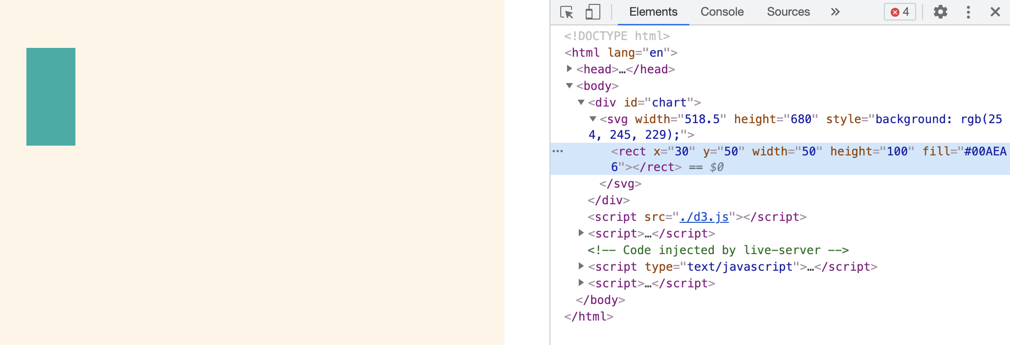
If the rectangle is drawn on the edge of the canvas, the part beyond the canvas is invisible. Therefore, if there is too much data, it needs to be displayed on a new line. How to deal with it will be demonstrated later.
svg.append('rect')
    .attr('x', width / 2 - 25)
    .attr('y', 50)
    .attr('width', 50)
    .attr('height', 100)
    .attr('fill', '#EB5C36')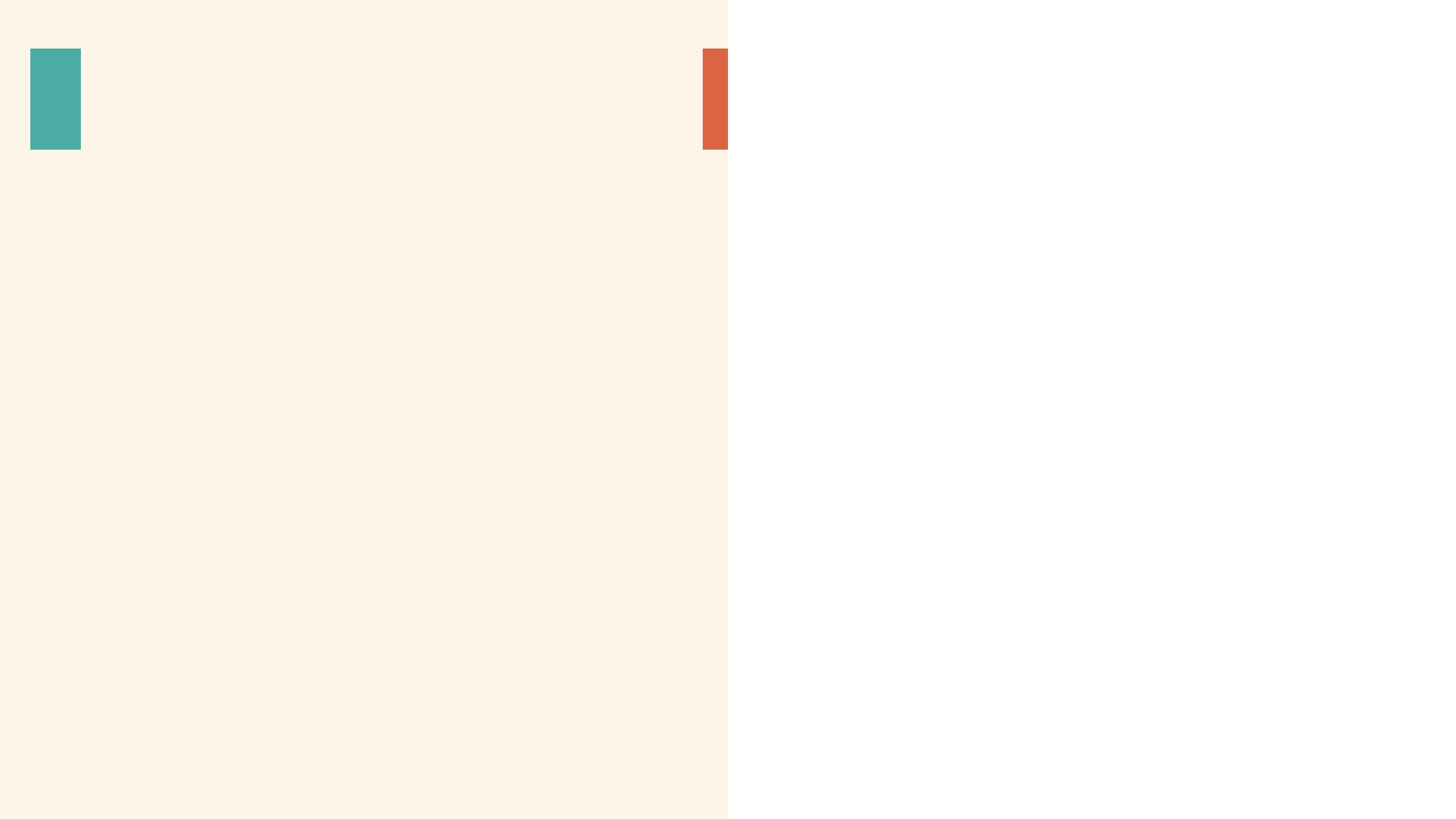
The above shows how to add an element, but more often we need to add multiple elements according to the data set. What should we do?
Some people may think that you can traverse the loop data to add elements... In fact, it's not completely impossible.
Construct simple data
Here, d3.range(20) is used to simply construct an array containing 0-19 numbers - [0, 1, 2,..., 19] - as the data set for demonstration;
const dataset = d3.range(20)
console.log(dataset) // [0, 1, 2, ..., 19]

const colors = ['#00AEA6', '#DB0047', '#F28F00', '#EB5C36', '#242959', '#2965A7']
Six colors are prepared to simulate the mapping of a Category attribute to different colors during visualization. The color is taken from this picture. It's very nice. Do you have any, but Gu Liu chose it calmly!

Because the color data is also an array, and the retrieval of an element in the array can be carried out through the index. For example, the first color is colors[0], the index starts from 0 to the end of the array length minus 1, that is, colors.length - 1, and the corresponding color is colors[colors.length - 1], which are the basic JS for comparison.
Traverse the data to add elements
Then you can traverse the data to add elements in this way. Of course, you can also use the for loop. Here, you can simply use forEach to traverse each element. d is 0-19 each number in turn. If it is arranged in a row, it can be arranged at an interval of 70px. d * 70 is equivalent to an equal difference sequence; Cannot display all because it will exceed the canvas.
dataset.forEach(d => {
    svg.append('rect')
        .attr('x', 20 + d * 70)
        .attr('y', 20)
        .attr('width', 50)
        .attr('height', 100)
        .attr('fill', colors[d % colors.length])
})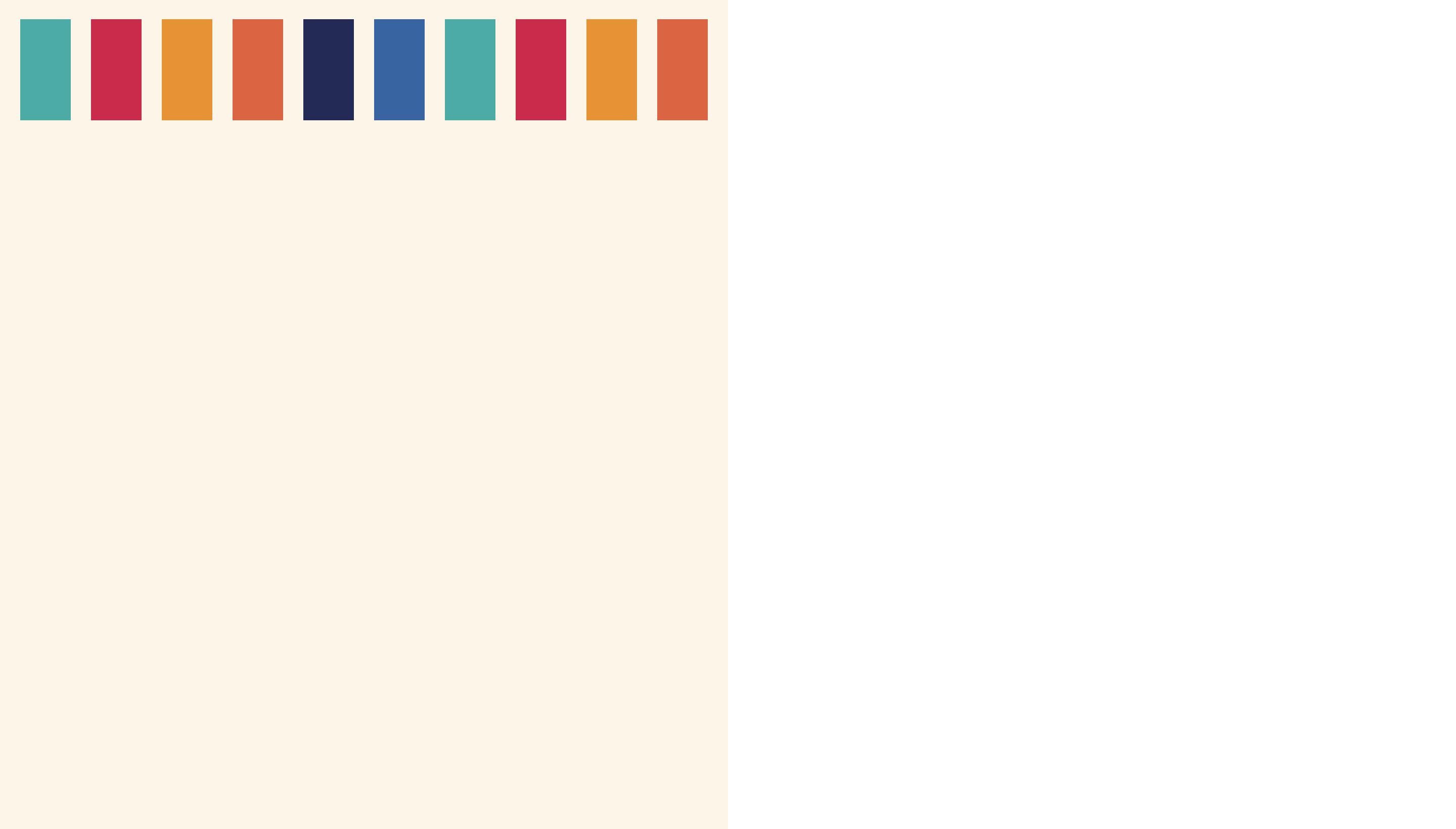
For each rectangle color, the remainder of the color array length is taken as the index value, and then the color is taken from the color array. Rounding and remainder of values is a very useful operation, which will often occur in the follow-up. The following are some specific examples of remainder.
0 % 6 => 0 => colors[0]
1 % 6 => 1 => colors[1]
2 % 6 => 2 => colors[2]
...
5 % 6 => 5 => colors[5]
6 % 6 => 0 => colors[0]
7 % 6 => 1 => colors[1]
...
19 % 6 => 1 => colors[1]
D3.js method of adding elements based on data
Returning to the blank canvas, the following code achieves the same effect as the above traversal loop.
Although it is sometimes feasible to traverse cyclic data to add elements, it is generally not implemented in this way. A more general and more D3.js way is to add elements based on data with such a set of commands. selectAll('rect').data(dataset).join('rect').
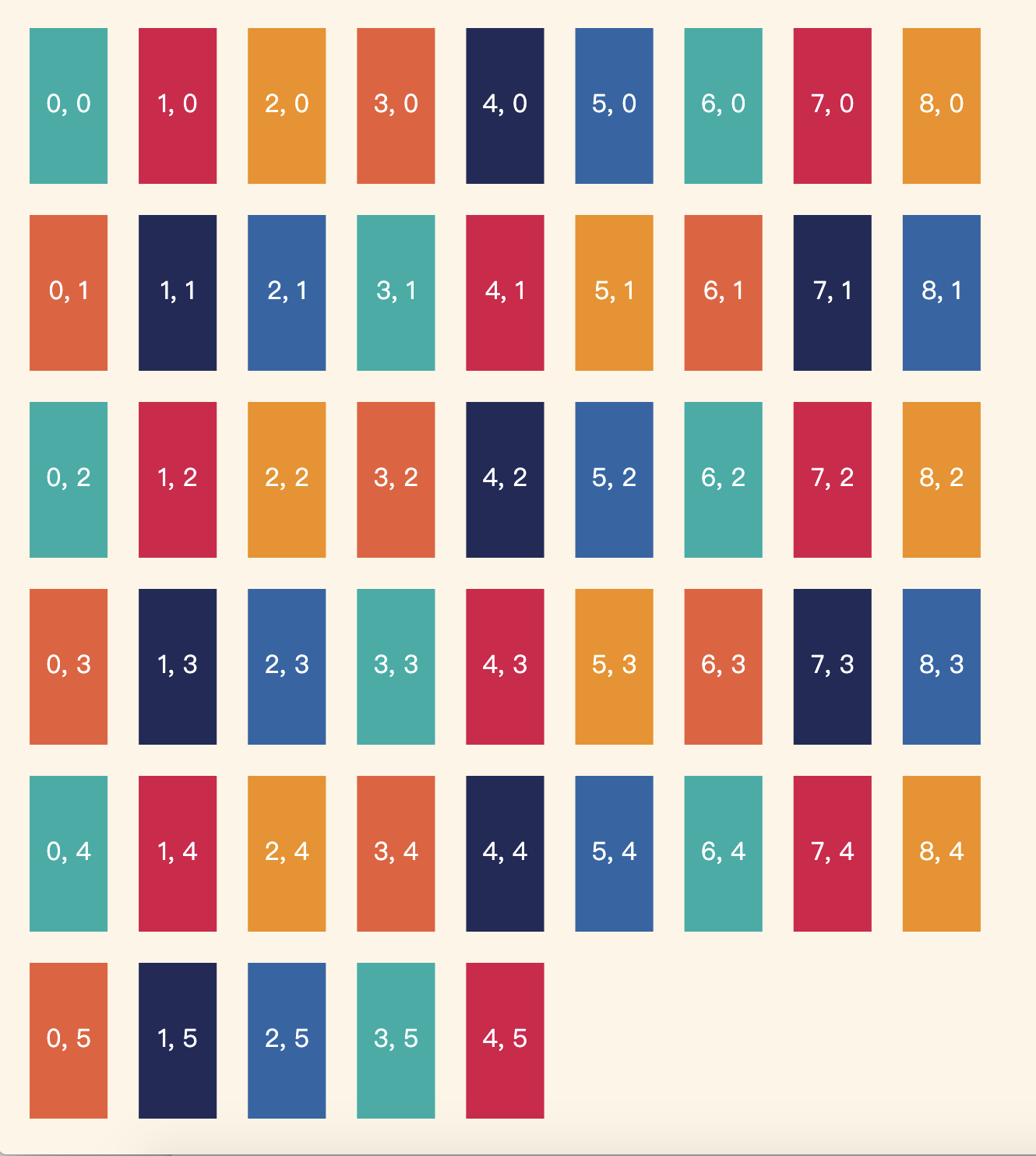
const rects = svg.selectAll('rect')
    .data(dataset)
    .join('rect')
    .attr('x', d => 20 + d * 70)
    .attr('y', 20)
    .attr('width', 50)
    .attr('height', 100)
    .attr('fill', d => colors[d % colors.length])
I think it's strange for many people to contact this way for the first time, right? To draw rectangles with data, you need to select all ('rect ') to select all rectangles, but now it is clear that the canvas is empty and there is no rect element, as if you selected a lonely? Later. data(dataset) is to bind the dataset to the selected element join('rect ') is the operation that actually adds elements.
Then, the attributes of each element are set through the callback function, where d is the data of each item in the dataset. Fixed value attributes can be written directly without function writing.
I won't explain too much here for the time being. In fact, the real reason is that Gu Liu can't explain well. He also involves a set of concepts such as enter update exit (the picture is also taken from fullstack D3). Many people are confused by these concepts when they get started. Therefore, at present, we just need to remember that this is a routine operation and very important. It is often used when binding data to draw elements, And remember these three sentences.
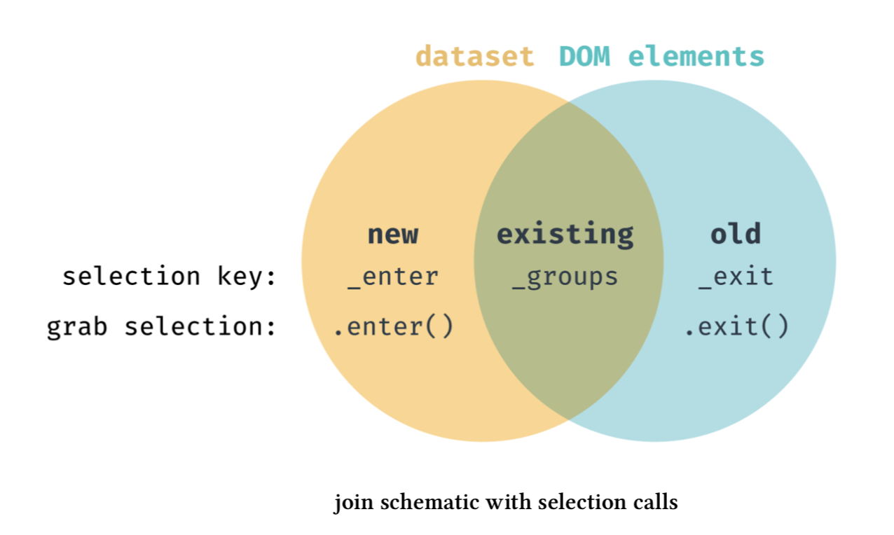
Of course, if you look at the online examples, you will see the following writing methods. Among them. enter().append() is the writing method of the previous version D3.js, which can be replaced by. join(). It's not good to write one sentence less; function() {} can also be replaced by the arrow function = > of ES6, which is more concise and convenient. It is recommended that you write as above after learning some basic JS.
const rects = svg.selectAll('rect')
    .data(dataset)
    .enter()
    .append('rect')
    .attr('x', function (d) {
        return 20 + d * 70
    })
    .attr('y', 20)
    .attr('width', 50)
    .attr('height', 100)
    .attr('fill', function (d) {
        return colors[d % colors.length]
    })
Adjust layout to wrap
In the above example, rectangles are arranged in a row, and more data will exceed the canvas. Next, adjust the layout to achieve the effect of line feed display.
The calculation formula of x coordinate is 20 + d * 70. Here, it is expected that the last rectangle of each line is in the canvas as a whole, that is, the x coordinate plus the width of the rectangle should be less than the width of the canvas. Thus, the maximum number of rectangles in a row can be calculated to col_num naming. Note that the nth element here is actually n-1 for D, because d starts from 0, and the element does start from the first element.
// formula
20 + (col_num - 1) * 70 + 50 <= witdh / 2

// Equivalent to
col_num <= witdh / 2 / 70
The calculation formula is as above. Because the Division has decimals, you need to take an integer down here. You can use Math.floor() or parseInt.
const col_num = parseInt(width / 2 / 70)
// const col_num = Math.floor(width / 2 / 70)
console.log(col_num)
After calculating the number of each column, you can continue to use the rounding and remainder operation mentioned above to calculate the x/y coordinates of each element. Its essence is to know which row and column each element is in.
const dataset = d3.range(50)

const rects = svg.selectAll('rect')
    .data(dataset)
    .join('rect')
    .attr('x', d => 20 + d % col_num * 70)
    .attr('y', d => 20 + Math.floor(d / col_num) * 120)
    .attr('width', 50)
    .attr('height', 100)
    .attr('fill', d => colors[d % colors.length])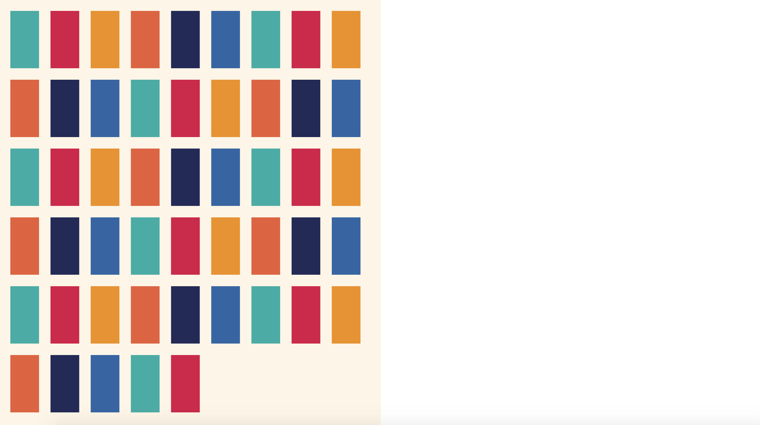
For example, the x coordinate of each row changes by equal difference through d% col_ Num to get the position of the element in each line and calculate it to the x coordinate; The y coordinate of each column is equidistant, and the position of the element in each column is obtained by rounding Math.floor(d / col_num) and calculated on the y coordinate. Here beginners can comb it again if they don't make it clear.
It should be noted that the dataset is changed above to generate 50 pieces of data of 0-49, so as to fill the canvas as much as possible. So far, all the data have been drawn on the canvas by using the operation of remainder and rounding.
But what if the maximum height is exceeded when there is more data?
Maybe it can narrow the width of the rectangle, and then adjust the distance to fix it step by step. (the ancient willow is out of tune here, which mainly leads to this problem)
const dataset = d3.range(100)

const rects = svg.selectAll('rect')
    .data(dataset)
    .join('rect')
    .attr('x', d => 20 + d % col_num * 70)
    .attr('y', d => 20 + Math.floor(d / col_num) * 120)
    .attr('width', 50 / 2)
    .attr('height', 100 / 2)
    .attr('fill', d => colors[d % colors.length])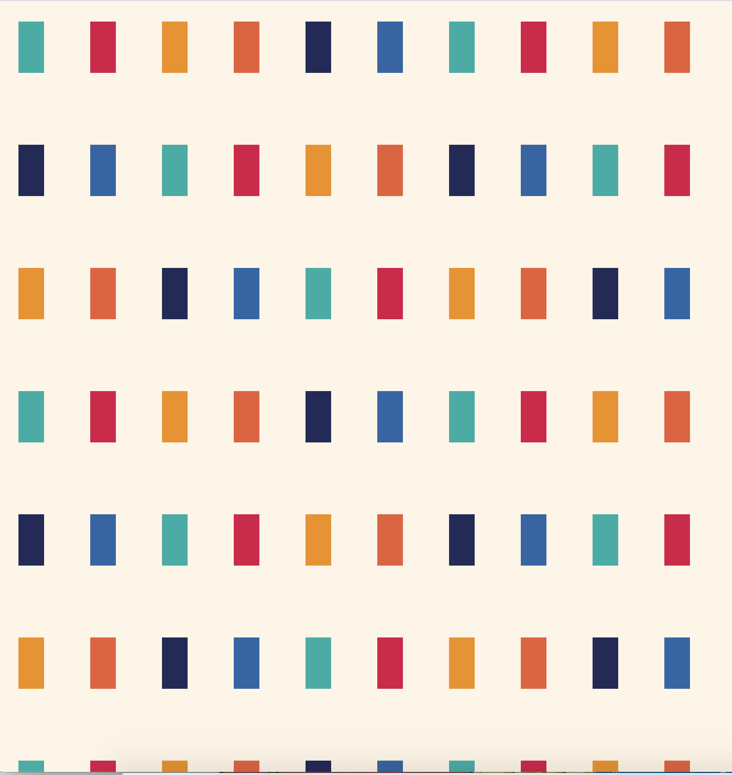
But can I automatically calculate the width, height and spacing of each rect based on the data size and canvas width, and then automatically layout it?
Just before Gu Liu gnawed on the source code of Atlantic manuscript visualization works, he saw the implementation method that can solve the above problems. He will share it with you in the next article. More D3.js content will continue to be explained in the next article. Please look forward to it.
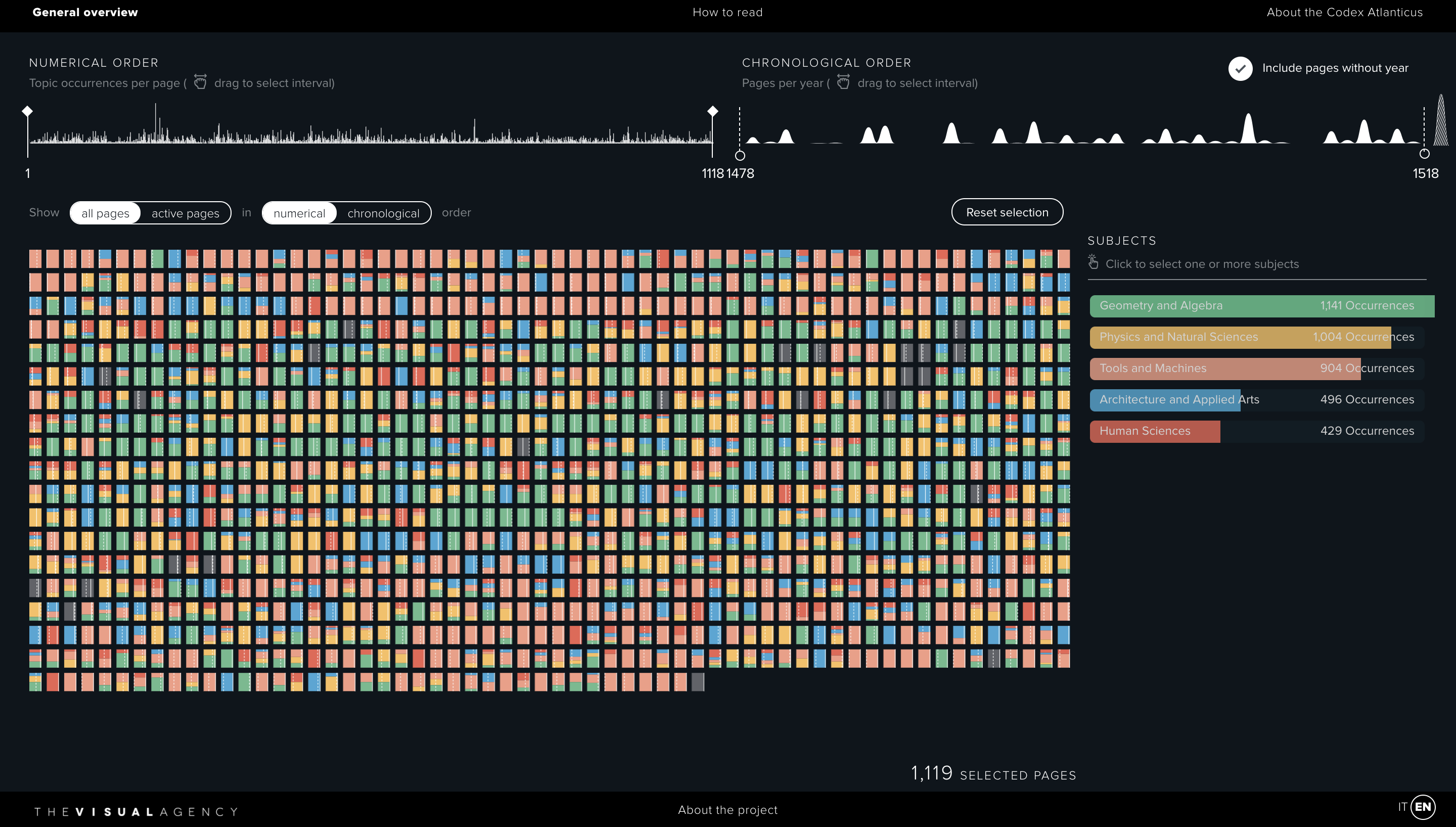
Related reading: "Atlantic ancient manuscript" (Part 1) - niuyi ancient willow, June 17, 2021,"Atlantic ancient manuscript" (Part 2) - niuyi ancient willow, June 22, 2021