This series of D3.js data visualization articles is written by Gu Liu according to the logic he wants to write. It may be different from the online tutorials. Gu Liu doesn't know how many articles he will write and what kind he will write. Although he goes for the goal that beginners can easily understand, Gu Liu really doesn't know how everyone feels after reading them, Therefore, I hope you can give more feedback, and continue to improve what can be improved in the follow-up articles. If you have the opportunity, you can make another video tutorial based on this series, but that's later.
The supporting code and data used will be open source to this warehouse. Welcome to Star https://github.com/DesertsX/d3-tutorial
preface
The first two articles "Take you to D3.js data visualization series (I) - niuyi ancient willow - July 30, 2021","Take you to D3.js data visualization series (II) - niuyi ancient willow - August 10, 2021" The main purpose is to familiarize you with D3.js drawing SVG elements and other operations, so how to do it in other places is simple. For example, the natural number array directly generated from data is enough, so avoid introducing more concepts. Instead of instilling too much content in the novice tutorial at one time, try to split the knowledge points as much as possible.
const dataset = d3.range(30)
Now that you are familiar with drawing elements on canvas, Gu Liu will continue to explain how to read real data sets, process data accordingly, draw elements based on data, map category attributes to corresponding colors, use of scale, drawing text elements, implementation of legend and other related contents.
Of course, everything is based on the previous two articles, so this time we still use rectangle as the main visual element.
At the beginning, Gu Liu's idea is that the data should have category type attributes, which is convenient to explain the color scale and realize the legend about the number of categories, and it is also convenient to pave the way for subsequent articles.
Originally, I wanted to use data sets such as books (or movies), so that when you sort out the list of books you have read at the end of the year (if you really read a lot of books, doge), you may be able to refer to the code in this article to visually and clearly show what type of books you have read.
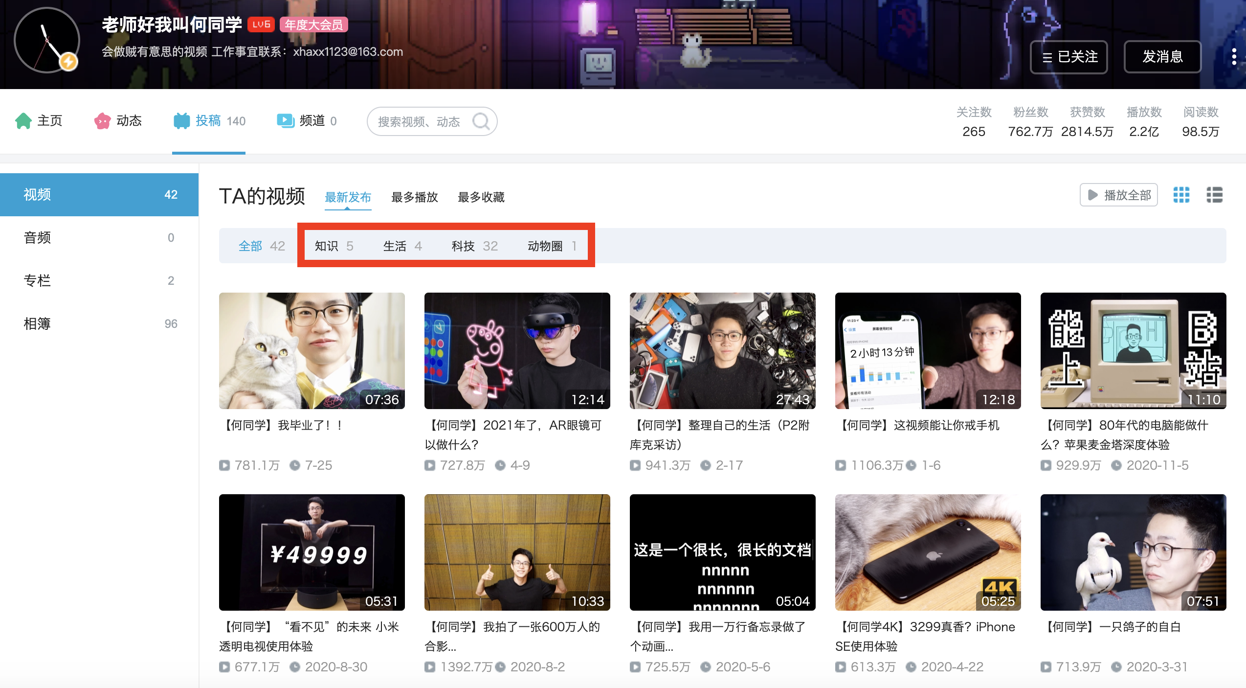
But Gu Liu didn't expect a suitable book data set. Later, he thought that the data of the top 100 Up owners of station b in 2020 was OK. You can take it to see what partition they are. Of course, this article does not involve the steps of obtaining data. The explanation will be very lengthy. Later, an external article will be written to introduce it.
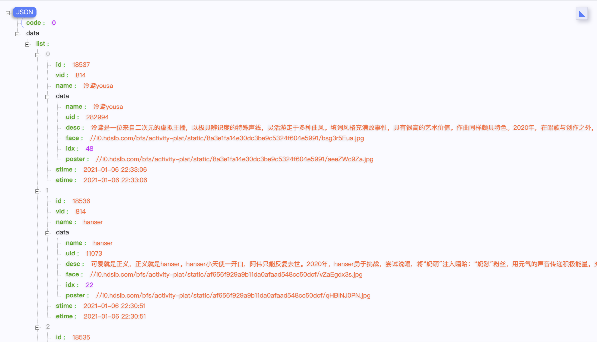
Here, you only need to know that the partition data is obtained from the "video" under the "contribution" column of the Up main personal home page, and simply take the largest number of partitions as the Up main partition, which is not necessarily very accurate, but only as an example demonstrated in the tutorial.
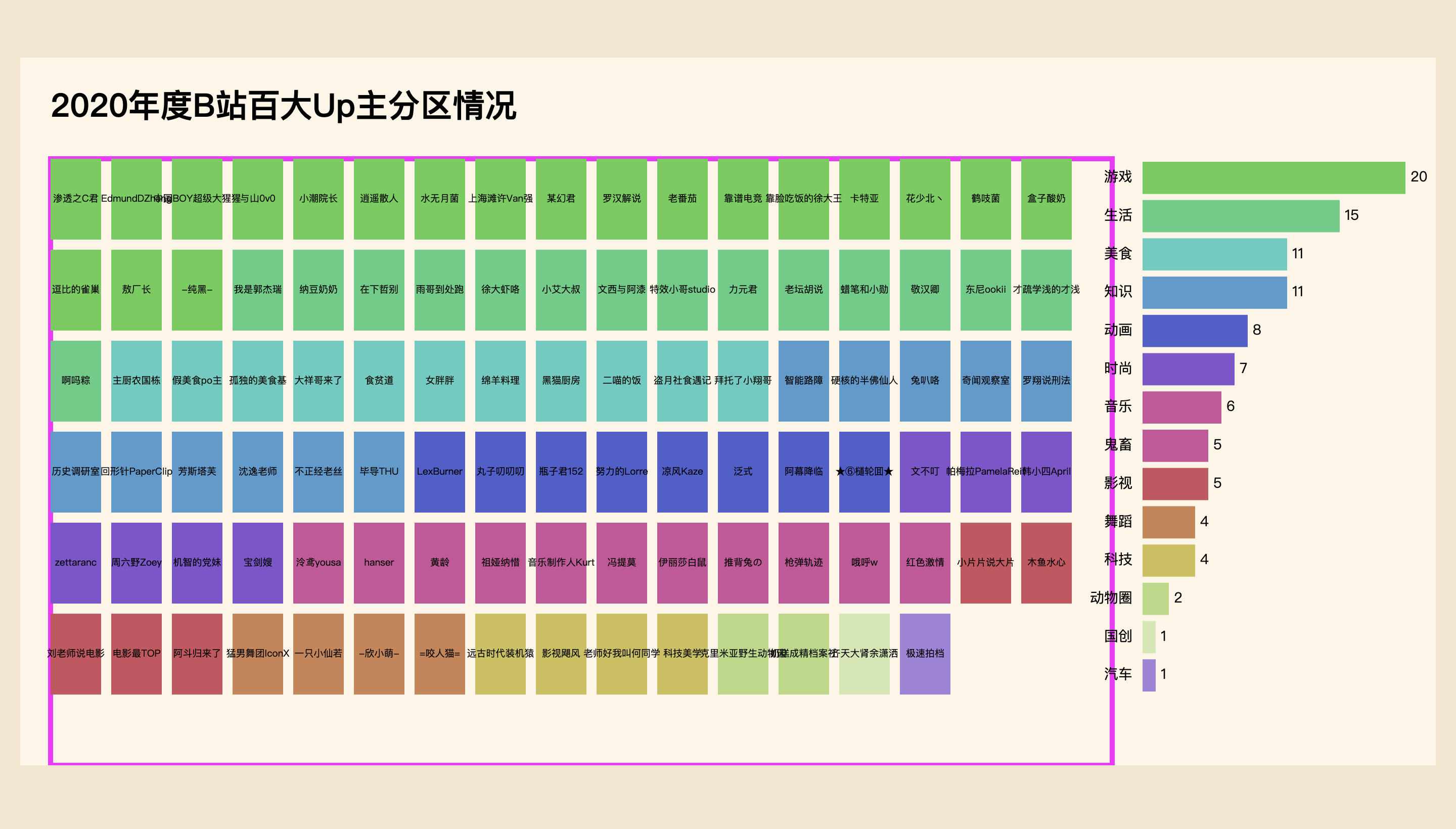
Let's take a look at the final rendering first,

Basic code
The style of this time is slightly different from that of the previous two articles. It is mainly to place div#chart elements in the middle, and the subsequent SVG canvases are set in a fixed width and height manner. However, these are not very critical. It depends on how you set your needs.
<!DOCTYPE html>
<html lang="en">

<head>
    <meta charset="UTF-8">
    <meta http-equiv="X-UA-Compatible" content="IE=edge">
    <meta name="viewport" content="width=device-width, initial-scale=1.0">
    <title>Take your hand D3.js Data visualization series (III)- Ancient willow</title>
    <style>
        * {
            margin: 0;
            padding: 0;
        }

        body {
            background: #f5e6ce;
            height: 100vh;
            display: flex;
            justify-content: center;
            align-items: center;
        }
    </style>
</head>

<body>
    <div id="chart"></div>
    <script src="./d3.js"></script>
    <script>
        function drawChart() {
            // ...
        }

        drawChart()
    </script>
</body>

</html>
Read data
Many times, the data used for visualization is stored in CSV or JSON files. At this time, you can directly read the data with d3.csv() or d3.json(). However, since reading data is an asynchronous operation, you need to add the await keyword to ensure that the subsequent code is executed after reading the data. At the same time, you also need to add the async keyword in addition to the function. The concepts of asynchronous operation and synchronous operation, macro task and micro task are not explained here. You can understand them by yourself.
async function drawChart() {
    let dataset = await d3.json('2020_bilibili_upzhu.json')
    console.log(dataset[0])
    console.table(dataset)
}

drawChart()
You only need to know that in the future, operations like reading data below can be changed to async await above, which is more comfortable to write.
d3.csv("data.csv", function (error, dataset) {
     console.log(dataset)
});

d3.json('data.json').then(dataset => {
    console.log(dataset[0])
    console.table(dataset)
})
data format
Here is the data format. The json file contains the relevant data of 100 up masters. This paper only uses the nickname name and partition data tlist for the time being, and two attributes field and fieldId will be added after data processing for subsequent use.
[
  {
    name: "Hello, teacher. My name is classmate he",
    uid: "163637592",
    tlist: [
        { tid: 160, count: 4, name: "life" },
        { tid: 188, count: 32, name: "science and technology" },
        { tid: 217, count: 1, name: "Animal circle" },
        { tid: 36, count: 5, name: "knowledge" },
    ],
    likes: 28123374,
    view: 216333794,
    desc: "6 million fans ID Put in a group photo and make a running kitten with a ten thousand line memo - he is classmate he who will be a thief on holiday. He maintains the same curiosity about the past and the future, and his unrestrained ideas are polished into neat contributions. As a fan of he, while paying attention to technological progress, he will also care about the human life itself affected by digital.",
    face: "http://i0.hdslb.com/bfs/activity-plat/static/af656f929a9b11da0afaad548cc50dcf/F8frVz9MD.jpg",
    // field: "technology",
    // fieldId: 10,
  },
]
data processing
field, that is, the primary partition of Up, is obtained by sorting the partition array in descending order based on the count quantity and taking the first partition name. The specific processing process is as follows.
dataset.forEach(d => {
if (d.tlist !== 0) {
d.tlist.sort((a, b) => b.count - a.count)
} else {
// Witty party sister uid: '466272' tlist: 0
d.tlist = [{ tid: 129, count: 100, name: "fashion" }]
}
d.field = d.tlist[0].name
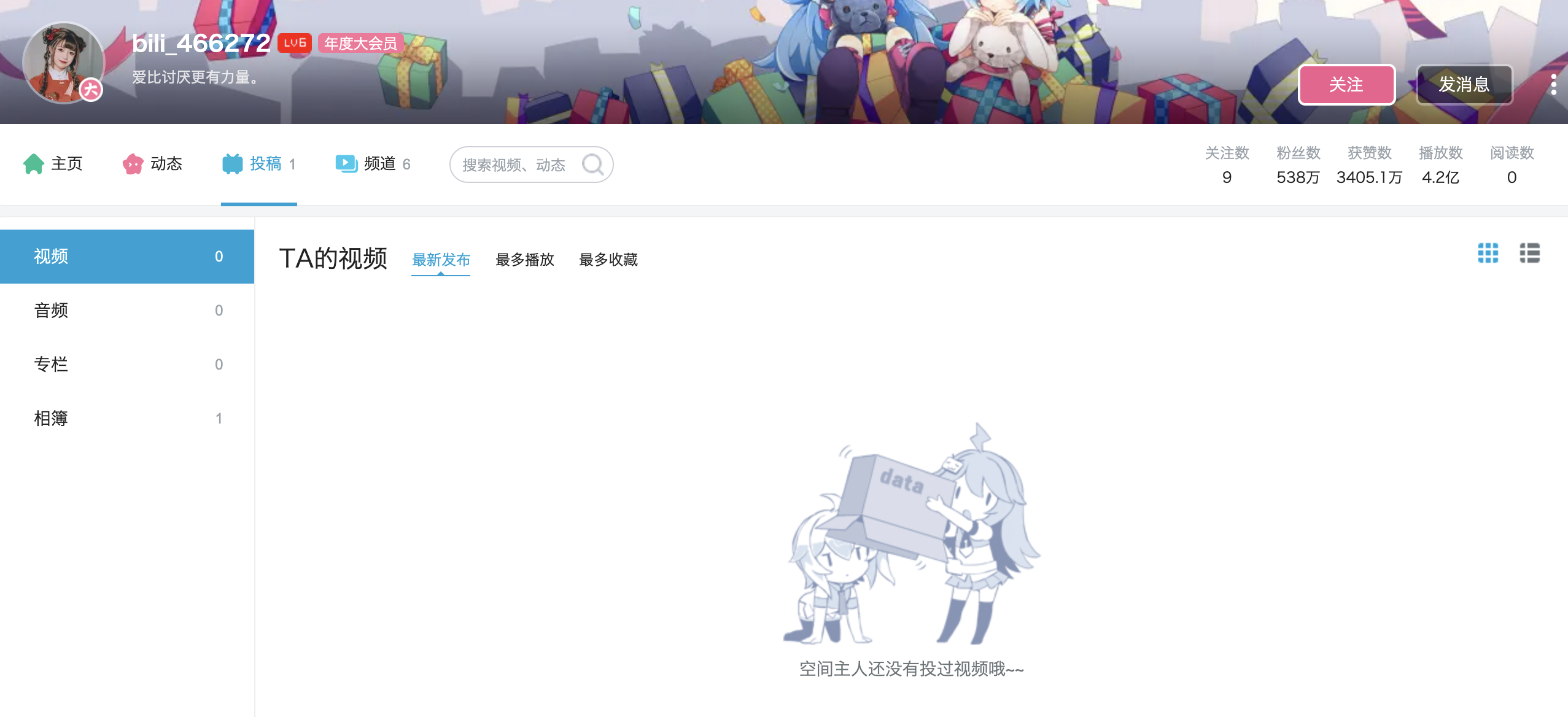
})Since several of the top 100 ups have overturned and cooled down, special treatment is needed. For example, the "witty dangmei" deleted all videos, so it is impossible to know the partition data, and Gu Liu set its tlist to 0 when crawling the data. Therefore, after screening, it is manually set to the "fashion" area again, and the count is set to 100, tid is the official of station b. refer to the up master data of other fashionable areas, copy it, and save it in array format, so as to use the index to get the first partition. Other cool up master data are still normal, so no additional processing is needed here.
With the data of all up primary partitions, count the number of partitions.
let fieldCount = {}

const fields = dataset.map(d => d.field)

fields.forEach(d => {
    if (d in fieldCount) {
        fieldCount[d]++
    }
    else {
        fieldCount[d] = 1
    }
})

// console.log(fieldCount)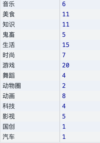
Convert the object format of the statistical results into the array format through Object.entries(), in which each element is also an array format. Here, it is sorted according to the number of partitions. fieldCountArray will also be used to draw the legend / legend.
let fieldCountArray = Object.entries(fieldCount)
fieldCountArray.sort((a, b) => b[1] - a[1])

// console.log(fieldCountArray)

// fieldCountArray
[
  ["game", 20],
  ["life", 15],
  ["delicious food", 11],
  ["knowledge", 11],
  ["animation", 8],
  ["fashion", 7],
  ["music", 6],
  ["Ghost animal", 5],
  ["Movies", 5],
  ["dance", 4],
  ["science and technology", 4],
  ["Animal circle", 2],
  ["Guochuang", 1],
  ["automobile", 1]
]
Finally, based on the partition attribute field of the up master, set its index in fieldCountArray as fieldId to the original data set, so that the data set can also be sorted in descending order according to the number of partitions. Otherwise, because there are many partitions and many colors behind, it will be too fancy and difficult to identify if they are arranged randomly.
dataset.map(d => d.fieldId = fieldCountArray.findIndex(f => f[0] === d.field))
dataset.sort((a, b) => a.fieldId - b.fieldId)
The above is the operations related to data processing. You know what you need, and then process the data in the corresponding format. As for the intermediate process and how to write the code, everyone may have their own implementation method, which is not a big problem.
Canvas settings
This time, the width and height of the canvas are fixed. There is nothing to say. You can set the canvas based on your actual needs.
The difference is that margin is also set this time, which is generally used to leave corresponding space for the upper, lower, left and right of the drawing area. For example, there is a y axis on the left and an x axis below. At this time, it is necessary to leave space for the coordinate axis, scale and label, and the left and bottom will be set larger accordingly.
const width = 1400
const height = 700

const margin = {
    top: 100,
    right: 320,
    left: 30
}

const svg = d3.select('#chart')
    .append('svg')
    .attr('width', width)
    .attr('height', height)
    .style('background', '#FEF5E5')

const bounds = svg.append('g')
    .attr('transform', `translate(${margin.left}, ${margin.top})`)
This time, space is reserved at the top for the title, and space is reserved at the right for the legend, so the top and right will be larger, while the left also has some empty areas to avoid too close to the edge.
After adding the SVG canvas, add a g element to SVG, that is, group, and then translate the corresponding pixels horizontally to the right and vertically downward. In this way, the coordinate origin of the subsequent elements drawn in g starts at the upper left corner of the framed area in the figure, not the upper left corner of the canvas.
The g element may be the "group" in the designer's mouth. In fact, it will not render the content in the page, but it is convenient to distinguish the "group" in different areas of the web page and to translate the elements in a group. It is a very useful element and will be used frequently in the future.
Color data
The color array will correspond to the partitions counted in the fieldCountArray one by one. After listening to many people's feedback that the color is not good-looking, it is changed to this color, which will be mentioned in the external article.
const colors = [
    '#5DCD51', '#51CD82', '#51CDC0', '#519BCD', '#515DCD',
    '#8251CD', '#CD519B', '#CD519B', '#CD515D', '#CD8251',
    '#CDC051', '#B6DA81', '#D2E8B0', '#A481DA'
]
Add title
The text in SVG needs to be realized by adding text elements, and so does the title. Here, the title is placed at the top left position, and the x/y coordinates are easy to understand;. text() is the specific text content; font related CSS styles, such as font size and weight, need to be set through. style().
const title = svg.append('text')
    .attr('x', margin.left)
    .attr('y', margin.top / 2)
    .attr('dominant-baseline', 'middle')
    .text('2020 year B Station Baida Up Main partition')
    .style('font-size', '32px')
    .style('font-weight', 600)
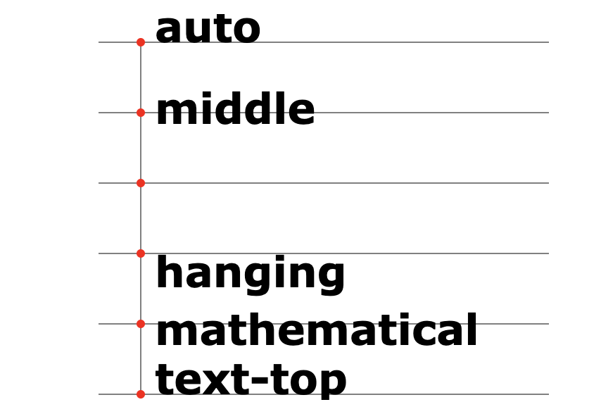
It is worth noting that you need to set dominant baseline: middle to align the horizontal axis of the text with the x/y coordinate points. Gu Liu learned this attribute only recently from Fullstack D3 and is now learning and using it. The effects of other settings are shown in the figure. The same vertical axis alignment coordinate points can be set by setting text anchor: middle. This should be used more frequently, which will be used below. Link: https://developer.mozilla.org/en-US/docs/Web/SVG/Attribute/dominant-baseline
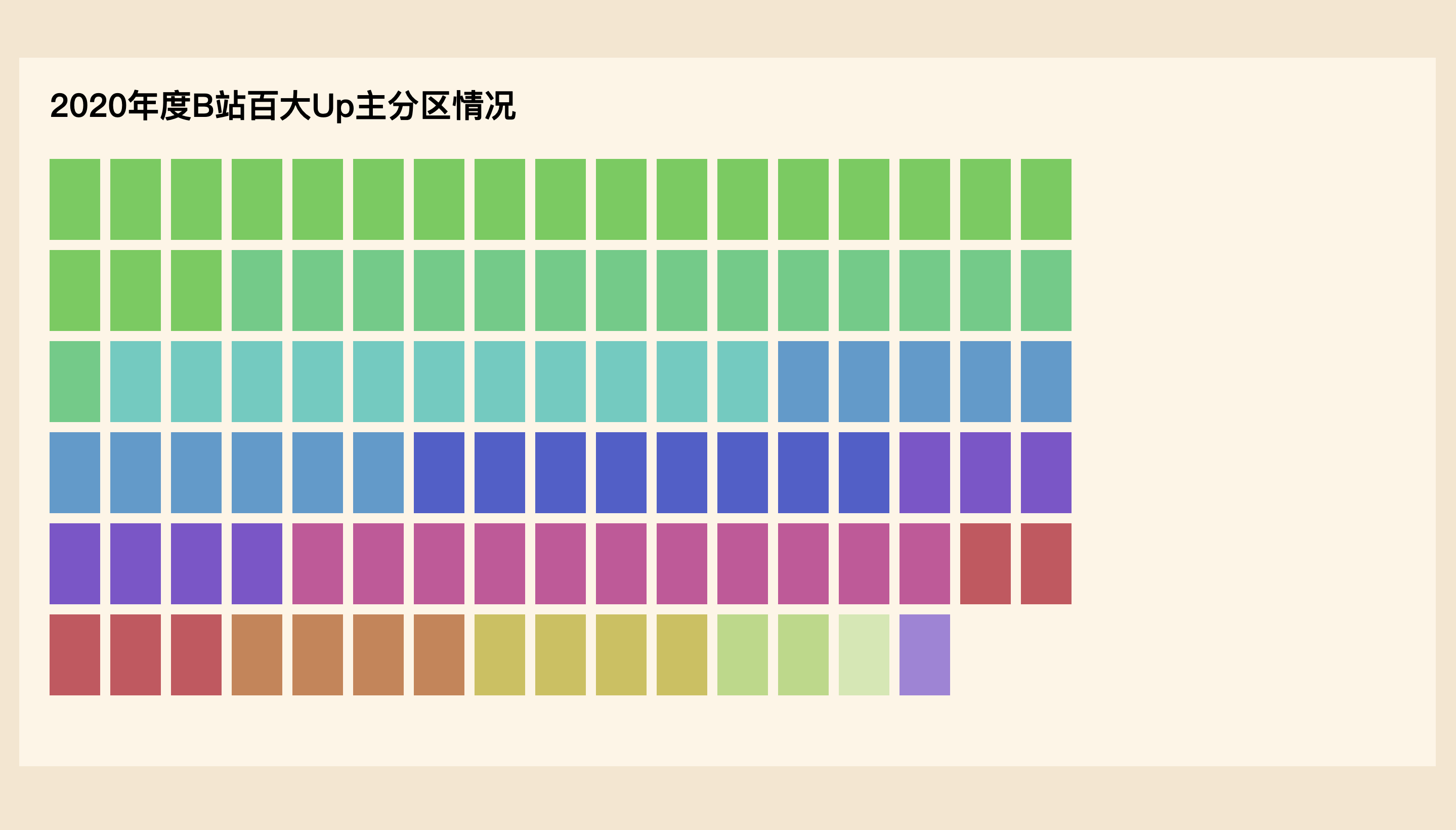
Draw visual body diagram
Next is the operation of drawing elements based on data mentioned many times in the previous two articles. I think you should be familiar with it. Here, the rectangular width rectWidth is 50px, the height rectHeight is 80px, the spacing between the top, bottom, left and right of the rectangle is 10px, and there are at most 17 rectangles in each line. You can layout by specifying the coordinates of each rectangle through the operation of rounding.
Note that it is added in the boundaries element that has been translated horizontally and vertically, not in svg; and a group g is added first to distinguish it from other areas. If you add rectangles directly in boundaries, because there are rectangles in subsequent legends, then boundaries. SelectAll ('rect ') When you select a rectangle, you may select the rectangle here, which needs to be avoided by setting the class style name. It will be demonstrated when adding a legend below, but in short, it is not bad to "group" more.
const rectTotalWidth = 60
const rectTotalHeight = 90
const rectPadding = 10
const rectWidth = rectTotalWidth - rectPadding
const rectHeight = rectTotalHeight - rectPadding
const columnNum = 17

const rectsGroup = bounds.append('g')
const rects = rectsGroup.selectAll('rect')
    .data(dataset)
    .join('rect')
    .attr('x', (d, i) => i % columnNum * rectTotalWidth)
    .attr('y', (d, i) => Math.floor(i / columnNum) * rectTotalHeight)
    .attr('width', rectWidth)
    .attr('height', rectHeight)
    .attr("fill", d => colors[fieldCountArray.findIndex(item => item[0] === d.field)])
In addition, when fill ing the rectangle color, you need to find the index value from the fieldCountArray according to the field partition data of each up master, and then take the corresponding color at the same position from the color array colors. The main reason is that the writing method of JS is not familiar enough, which may be difficult to implement if novices are not familiar with it.
The bound data can be in multiple formats
Gu Liu thinks it may be necessary to talk about it separately. The array data bound to the element or D3 selection set can be in multiple formats. Just remember to set the attribute in. attr() or the style in. style(). If it is a fixed value, write it directly; if it is related to the data, specify it through the callback function, in which the function parameters (d, i) Each element and element index in the array.
.selectAll('rect')
.data(dataset)
.attr('x', (d, i) => d * 10)
For example, every item in the array is a number, and d is a number; the array is a nested array, and every element is also an array. d is an array; the array is an object, and d is an object... Then when setting in the specific callback function, you can get data from d accordingly.
dataset => [0, 1, 2, 3] => d It's numbers
dataset => [['game', 21], ['', 10], ['', ]] => d It's a subarray
dataset => [{ name: '', field: '' }, { name: '', field: '' }, { name: '', field: '' }] => d Is the object
Show up primary name
Then add the name of the up master at the center of each rectangle, and set the text anchor and dominant baseline to middle, so that the text can be displayed in the middle. Of course, the effect here is not good enough, and there is a problem of text overlap, because it is only a small example in the tutorial, just for a rough look at those up masters, so there is no more optimization.
const texts = rectsGroup.selectAll('text')
    .data(dataset)
    .join('text')
    .attr('x', (d, i) => rectWidth / 2 + i % columnNum * rectTotalWidth)
    .attr('y', (d, i) => rectHeight / 2 + Math.floor(i / columnNum) * rectTotalHeight)
    .text(d => d.name)
    .attr('text-anchor', 'middle')
    .attr('dominant-baseline', 'middle')
    .attr('fill', '#000')
    .style('font-size', '9.5px')
    .style('font-weight', 400)
    // .style('writing-mode', 'vertical-rl')
Add legend
Next, draw a legend on the right side of the canvas to show the top 100 up quantities of each partition. Originally, 320px was reserved on the right side, but there is still some space on the right side of the main figure on the left, so when adding g elements to the legend, horizontally shift to the left to the appropriate position. You can adjust it after drawing later.
const legendPadding = 30

const legendGroup = bounds.append('g')
    .attr('class', 'legend')
    .attr('transform', `translate(${width - margin.right - legendPadding}, 0)`)
Similarly, legendPadding space is reserved on the left and right sides of the rectangle in the right legend for adding partition text and corresponding numbers.
In order to map the partition value size to the pixel value of the right area width, you need to use the very useful scale in D3.js. In fact, the essence is a function. The linear scale is a linear function. Set the minimum and maximum values in the data through. domain(), set the minimum value here to 0, and the maximum value through d3.max() The second attribute of the specified element in the nested array fieldCountArray, that is, the partition statistical value, is calculated automatically, and then the pixel value size of the area on the canvas is set through. range(). The minimum value is also 0, and the maximum value is the value of the right blank minus the reserved legendPadding size on both sides. Note that all these are passed in the format of array. (the scale may not be clear enough here, which will be explained in subsequent articles)
const legendWidthScale = d3.scaleLinear()
    .domain([0, d3.max(fieldCountArray, d => d[1])])
    .range([0, margin.right - legendPadding * 2])
Then, in order to make the overall height of the legend consistent with the main figure on the left, calculate the height legendTotalHeight on the left. In fact, there are 6 lines in total. It is easy to calculate through rectTotalHeight and rectPadding. It is more complex here, but you can know what you are doing; then legendBarTotalHeight is equal to the height of the legend rectangle legendBarHeight plus legendBarPadding of the lower spacing.
const legendBarPadding = 3
const legendTotalHeight = (Math.floor(dataset.length / columnNum) + 1) * rectTotalHeight - rectPadding
const legendBarTotalHeight = legendTotalHeight / fieldCountArray.length
const legendBarHeight = legendBarTotalHeight - legendBarPadding * 2
Finally, draw the rectangle, partition name and corresponding value of the legend respectively. Class is brought in. selectAll() to select the element. In particular, there are two groups of text, so it must be added. It can also be abbreviated as. SelectAll ('. Legend label'), but these two sentences must be set to. Join ('text '). Attr ('class',' Legend label ').
In addition, it is also said that the scale bar is actually a function, so when directly setting the rectangular width, you can directly call legendwidethscale() and pass in the partition value of each item in the dataset. Most of the other properties have been mentioned before, so you just need to pay more attention to where you want to put them.
const legendBar = legendGroup.selectAll('rect.legend-bar')
    .data(fieldCountArray)
    .join('rect')
    .attr('class', 'legend-bar')
    .attr('x', 30)
    .attr('y', (d, i) => legendBarPadding + legendBarTotalHeight * i)
    .attr('width', d => legendWidthScale(d[1]))
    .attr('height', legendBarHeight)
    .attr('fill', (d, i) => colors[i])

const legendLabel = legendGroup.selectAll('text.legend-label')
    .data(fieldCountArray)
    .join('text')
    .attr('class', 'legend-label')
    .attr('x', 30 - 10)
    .attr('y', (d, i) => legendBarTotalHeight * i + legendBarTotalHeight / 2)
    .style('text-anchor', 'end')
    .attr('dominant-baseline', 'middle')
    .text(d => d[0])
    .style('font-size', '14px')

const legendNumber = legendGroup.selectAll('text.legend-number')
    .data(fieldCountArray)
    .join('text')
    .attr('class', 'legend-number')
    .attr('x', d => 35 + legendWidthScale(d[1]))
    .attr('y', (d, i) => legendBarTotalHeight * i + legendBarTotalHeight / 2)
    .attr('dominant-baseline', 'middle')
    .text(d => d[1])
    .style('font-size', 14)
    .attr('fill', '#000')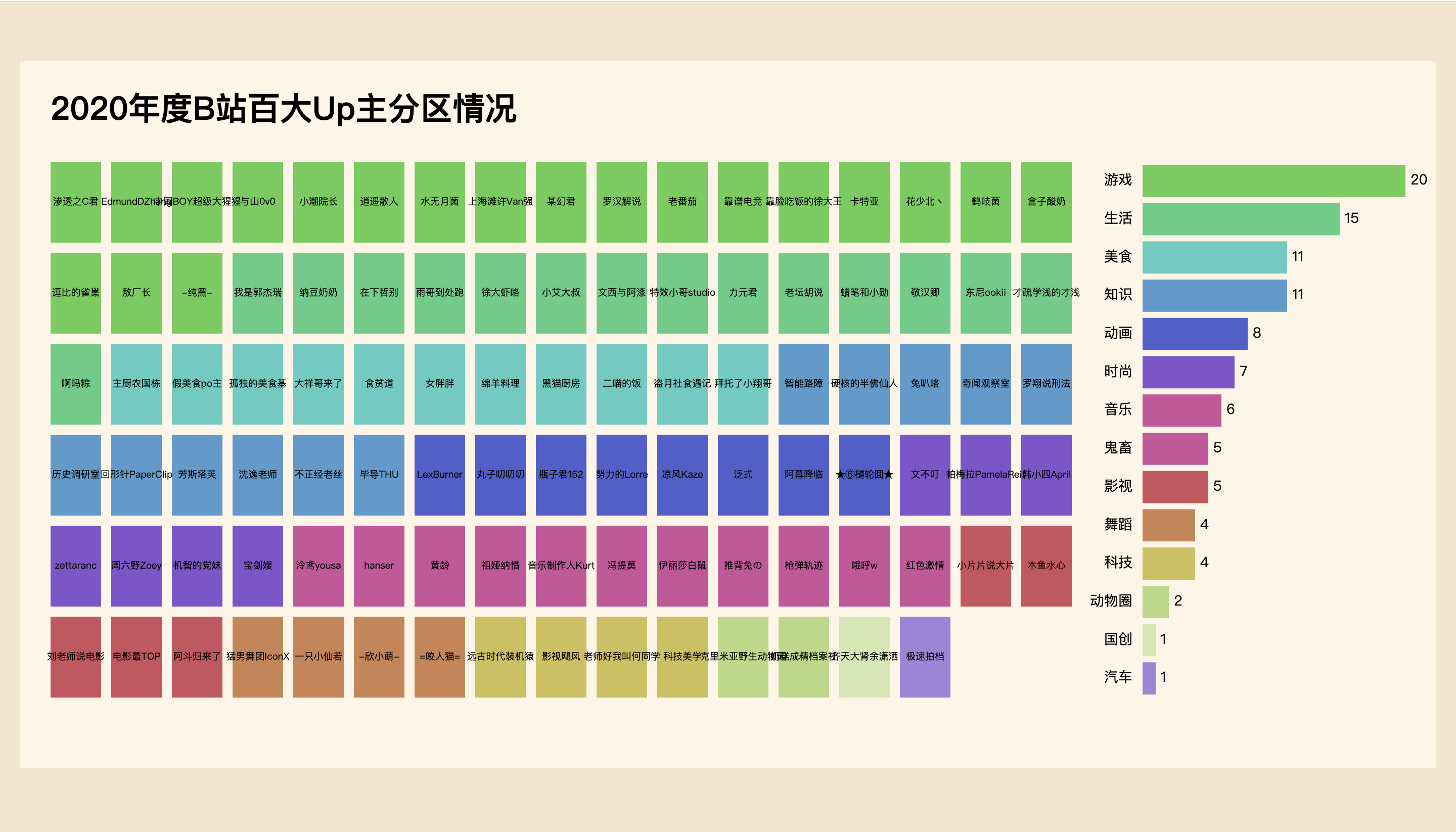
Summary
In this paper, Gu Liu takes you to draw a visual diagram with real data sets, which also explains the usage of D3.js. There may be many problems in the final effect drawing. For example, a group of friends mentioned that the large value in the legend can be set to dark color, and the small value can be set to light color, which may be better. However, it has taken a lot of time to prepare this article. What you want to talk about is enough. Further optimization is left to you.