Jetpack Compose is a new library released by Google at the 2009 Google I / O conference. It is a modern toolkit for building native Android UI. It has powerful tools and intuitive Kotlin API to simplify and accelerate UI development on Android. It can help developers create views with less and more intuitive code, have more powerful functions, and improve development speed.
Today I want to share with you a simple and easy-to-use composite skeleton screen. I think it's great to use. You can have a look. I hope it will be helpful to everyone's study and work.
(PS: open source address at the end of the text)
preface
The skeleton screen is a blank version of the page. Usually, before the page is fully rendered, it will roughly outline the outline through some gray blocks, and then replace it with the real content after the data is loaded.
The loading effect of skeleton screen can provide more information and better user experience than the traditional loading effect, so it has become more and more popular
This paper mainly introduces how to use Compose to realize a simple and easy-to-use skeleton screen effect
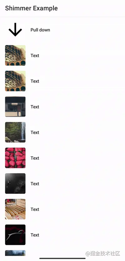
design sketch
First look at the final rendering
characteristic
- Easy to use, reusable page UI, no need to customize UI for skeleton screen
- It supports setting whether the skeleton screen is displayed, which is generally used in combination with the loading state
- Support setting skeleton screen background and highlight color
- It supports setting the height, width and gradient width of the skeleton screen
- Support setting the angle and direction of skeleton screen animation
- Support setting the time and interval of skeleton screen animation
use
Access
Step 1: in the project build Add to gradle:
allprojects {
	repositories {
		...
		mavenCentral()
	}
}
Step 2: build in the application Add to gradle:
dependencies {
        implementation 'io.github.shenzhen2017:shimmer:1.0.0'
}
Simple use
@Composable
fun ShimmerSample() {
    var loading: Boolean by remember {
        mutableStateOf(true)
    }
    Column(
        modifier = Modifier
            .fillMaxWidth()
            .shimmer(loading,config = ShimmerConfig())
    ) {
        repeat(3) {
            PlaceHolderItem()
            Spacer(modifier = Modifier.height(10.dp))
        }
    }
}
As shown above:
- Just add shimmer to the Modifier of the Column, and all components under the Column can achieve the skeleton screen effect
- You can control whether the skeleton screen effect is displayed through the loading parameter
- If you need to customize the skeleton screen animation effect, you can also configure it through some parameters
The main parameters are as follows
data class ShimmerConfig(
    // Unhighlight color
    val contentColor: Color = Color.LightGray.copy(alpha = 0.3f),
    // Highlight color
    val higLightColor: Color = Color.LightGray.copy(alpha = 0.9f),
    // Gradient width
    @FloatRange(from = 0.0, to = 1.0)
    val dropOff: Float = 0.5f,
    // Highlight width
    @FloatRange(from = 0.0, to = 1.0)
    val intensity: Float = 0.2f,
    //Skeleton screen animation direction
    val direction: ShimmerDirection = ShimmerDirection.LeftToRight,
    //Animation rotation angle
    val angle: Float = 20f,
    //Animation duration
    val duration: Float = 1000f,
    //Interval between animations
    val delay: Float = 200f
)
Main principle
Reuse page UI through image blending mode
If we want to achieve the skeleton screen effect, we first think that we need to write another set of UI according to the page structure, and then display this set of UI when loading, otherwise it will be hidden
The general loading effect is realized in this way, but this will bring a problem. Different page structures are different, so don't we rewrite a set of UI for one page? This is clearly unacceptable
We can think of the structure of the page. In fact, we have written it once. Wouldn't it be good if we could reuse the page structure we wrote?
We can do this through image blending mode
Image blending mode defines the final display of images when two images are combined. In Androd, there is a corresponding API interface to support image blending mode, namely Xfermode
There are mainly 16 image blending modes. The following picture vividly illustrates the role of image blending to a certain extent. Two graphics, one circle and one side, produce different combination effects through certain calculations, as follows
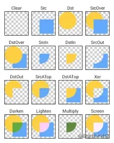
We will introduce some commonly used. Other interested students can refer to them by themselves
- SRC_IN: draw [source image] only where the source image and target image intersect
- DST_IN: draw the [target image] only at the intersection of the source image and the target image. The drawing effect is affected by the transparency of the corresponding place of the source image
- SRC_OUT: only draw the [source image] where the source image and the target image do not intersect. The intersecting places are filtered according to the alpha of the corresponding place of the target image. If the target image is completely opaque, it is completely filtered, and if it is completely transparent, it is not filtered
- DST_OUT: draw the [target image] only at the place where the source image and the target image do not intersect. Filter according to the alpha of the source image at the intersection. If the source image is completely opaque, it will be completely filtered, and if it is completely transparent, it will not be filtered
If we take the UI structure of the page as the target image and the skeleton screen effect as the source image, then use SRC_IN mixed mode, the skeleton screen can be displayed only on the structure of the page and not in the blank part, so as to avoid repeated writing of the UI
Animation by panning
Above, we have realized that the skeleton screen is displayed on the page structure, but the skeleton screen effect also has an animation effect
In fact, it's also very simple. Set a gradient effect for the skeleton screen, and then make a translation animation, and then it looks like the flash animation of the skeleton screen
fun Modifier.shimmer(): Modifier = composed {
    var progress: Float by remember { mutableStateOf(0f) }
    val infiniteTransition = rememberInfiniteTransition()
    progress = infiniteTransition.animateFloat().value  // Animation effects, calculating percentages
    ShimmerModifier(visible = visible, progress = progress, config = config)
}

internal class ShimmerModifier(progress:Float) : DrawModifier, LayoutModifier {
    private val paint = Paint().apply {
        blendMode = BlendMode.SrcIn //Set blend mode
        shader = LinearGradientShader(Offset(0f, 0f),toOffset,colors,colorStops)//Set gradient
    }

    override fun ContentDrawScope.draw() {
        drawContent()
        val (dx, dy) = getOffset(progress) //Set the position of translation according to progress
        paint.shader?.postTranslate(dx, dy) // Translation operation
        it.drawRect(Rect(0f, 0f, size.width, size.height), paint = paint)//Draw skeleton screen effect
    }
}
As shown above, the main steps are:
- Start the animation, get the current progress, and get the position of the current translation according to the progress
- Set the background gradient color and blending mode of the skeleton screen
- Draw skeleton screen effect
Custom skeleton screen effect
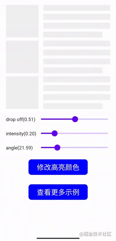
As described above, we provide some parameters to customize the effect of the skeleton screen. Other parameters are easy to understand, mainly because the following two parameters are a little difficult to understand
- dropOff: gradient section width
- intensity: highlight width
We know that you can customize the color of the normal part through contentColor and the color of the highlighted part through higLightColor
But how are the two colors distributed? What is the scale of the gradient? You can see the following code:
    private val paint = Paint().apply {
        shader = LinearGradientShader(Offset(0f, 0f),toOffset,colors,colorStops)//Set gradient
    }

    private val colors = listOf(
        config.contentColor,
        config.higLightColor,
        config.higLightColor,
        config.contentColor
    )

    private val colorStops: List<Float> = listOf(
        ((1f - intensity - dropOff) / 2f).coerceIn(0f, 1f),
        ((1f - intensity - 0.001f) / 2f).coerceIn(0f, 1f),
        ((1f + intensity + 0.001f) / 2f).coerceIn(0f, 1f),
        ((1f + intensity + dropOff) / 2f).coerceIn(0f, 1f)
    )
It can be seen that our color gradient has the following characteristics:
- The gradient color distribution is: contentcolor - > higlightcolor - > higlightcolor - > contentcolor
- LinearGradientShader uses colors to define colors, colorStops to define the distribution of color gradients, and colorStops is calculated from intensity and dropoff
- Intensity determines the width of the highlighted part, that is, the greater the intensity, the larger the highlighted part
- dropOff determines the width of the gradient part, that is, the larger the dropOff, the larger the gradient part
summary
Special Thanks
In the process of realizing the skeleton screen of Compose version, the following open source framework ideas are mainly used for reference. Interested students can also learn about it
Facebook's open source shimmer Android
Habib Kazemi's open source compose Shimmer
Project address
Easy to use composite skeleton screen
Open source is not easy. If the project is helpful to you, welcome to like, Star and collect~
Sorting of learning materials
Organize the general catalogue
Chapter 1 getting to know Jetpack Compose and sorting out information
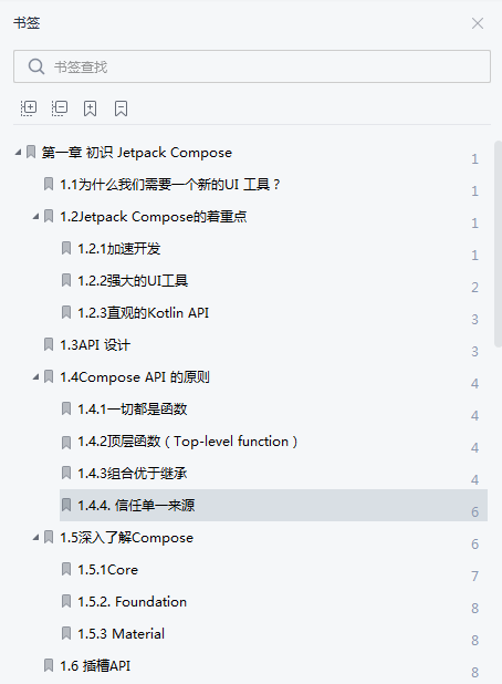
-
Why do we need a new UI tool?
-
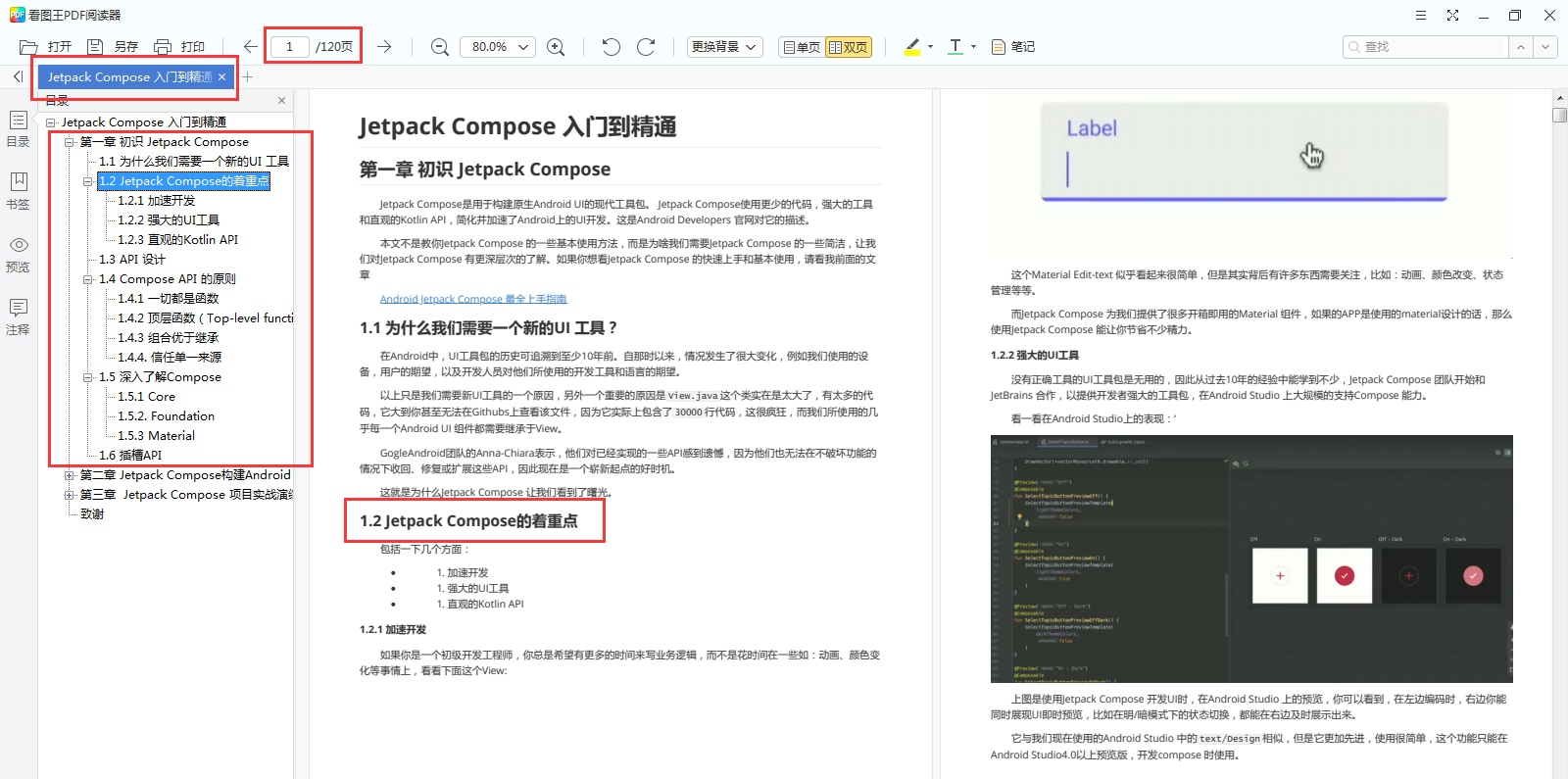
Jetpack Compose focus
Accelerate development
Powerful UI tools
Intuitive Kotlin API
-
API design
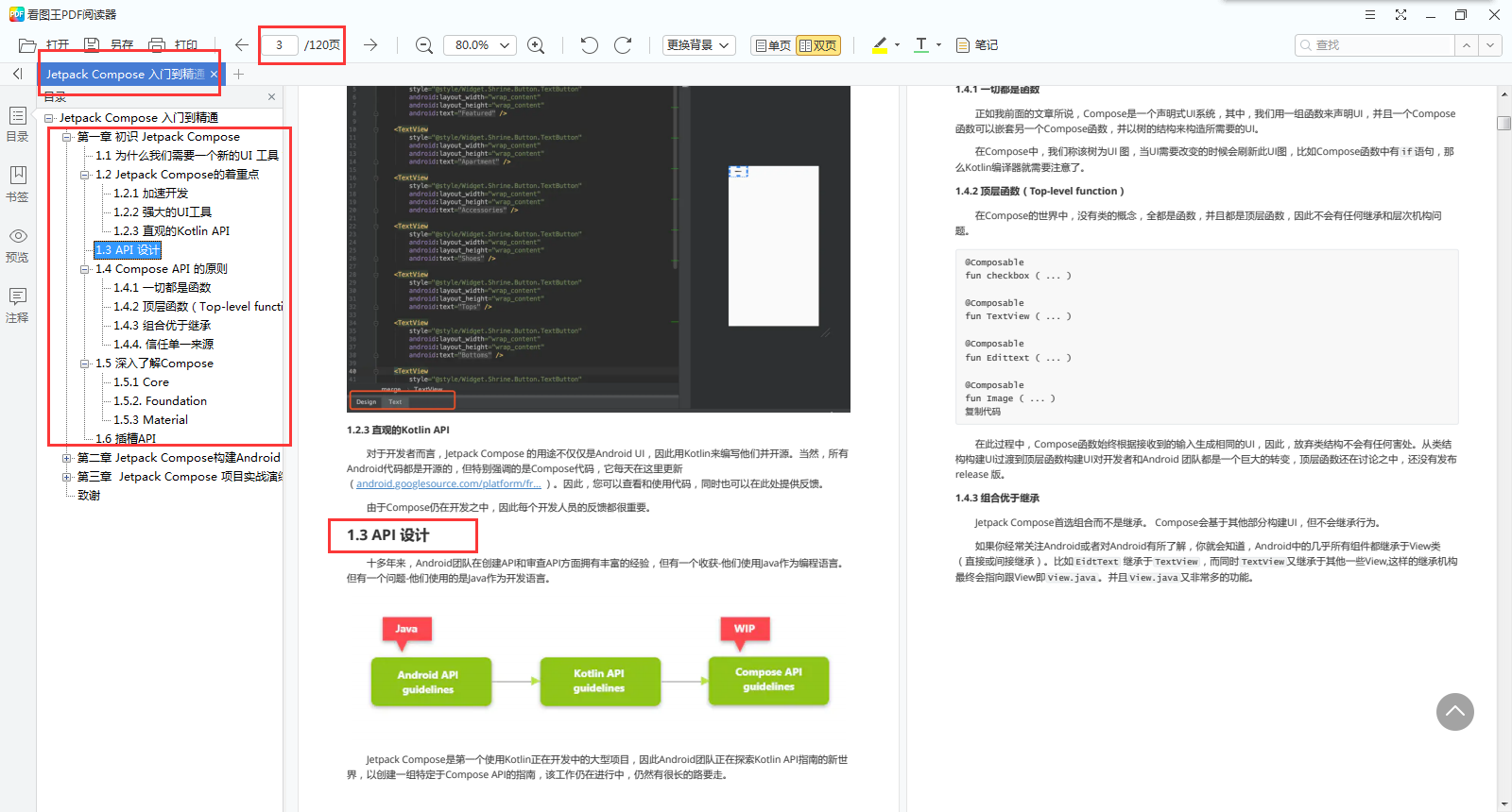
-
Principles of Compose API
Everything is a function
Top level function
Combination is better than inheritance
Trust a single source -
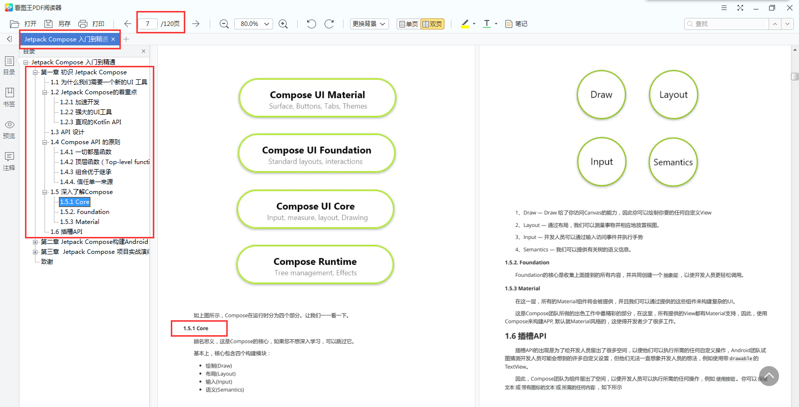
Learn more about Compose
Core
Foundation
Material
-
Slot API
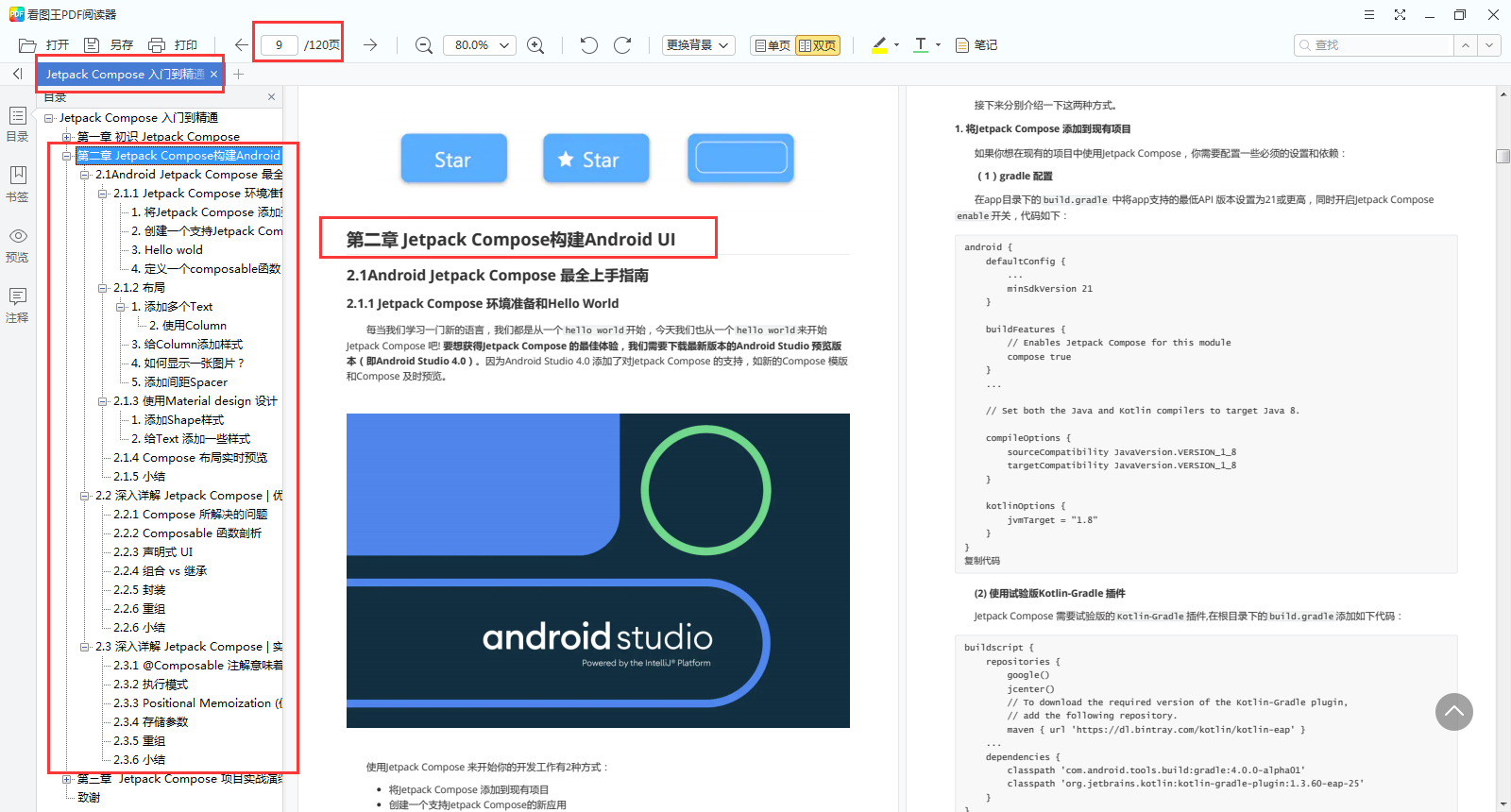
Chapter 2 Jetpack Compose builds Android UI and organizes information
-
Android Jetpack Compose most complete Getting Started Guide
Jetpack Compose environment preparation and Hello World
layout
Design with Material design
Composite layout live preview
......
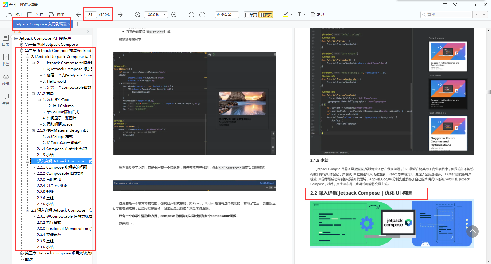
-
In depth explanation of jetpack composition | optimizing UI construction
Problems solved by Compose
Analysis of Composable function
Declarative UI
Combination vs inheritance
encapsulation
recombination
......
-
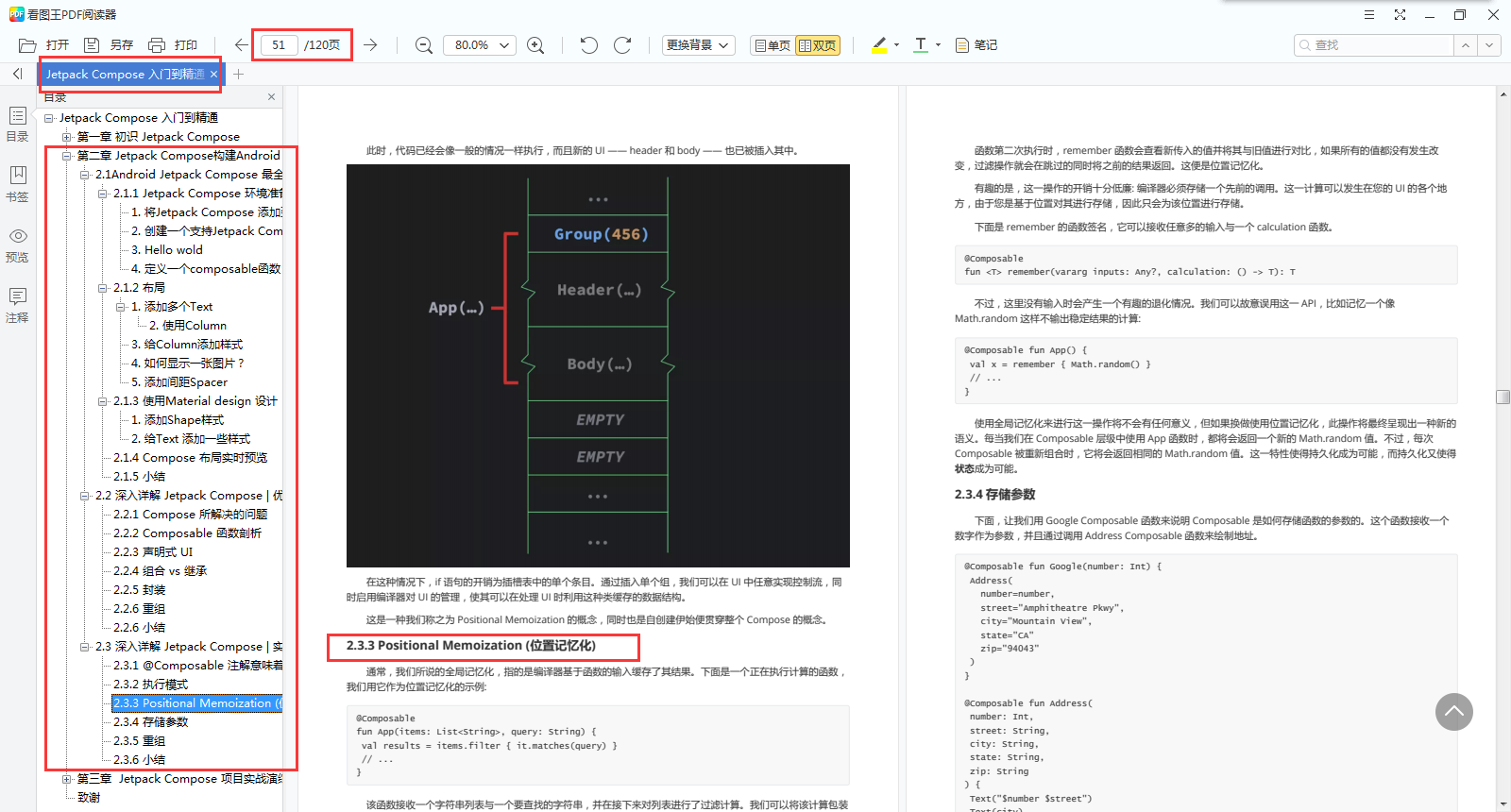
Thoroughly explain the implementation principle of Jetpack Compose |
@What does the Composable annotation mean?
Execution mode
Positional memory
Storage parameters
recombination
......
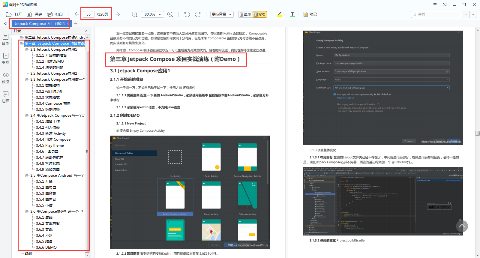
Chapter III Jetpack Compose project actual combat drill (with Demo) sorting information
-
Jetpack Compose app 1
Preparation before start
Create DEMO
Problems encountered
-
Jetpack Compose app 2
-
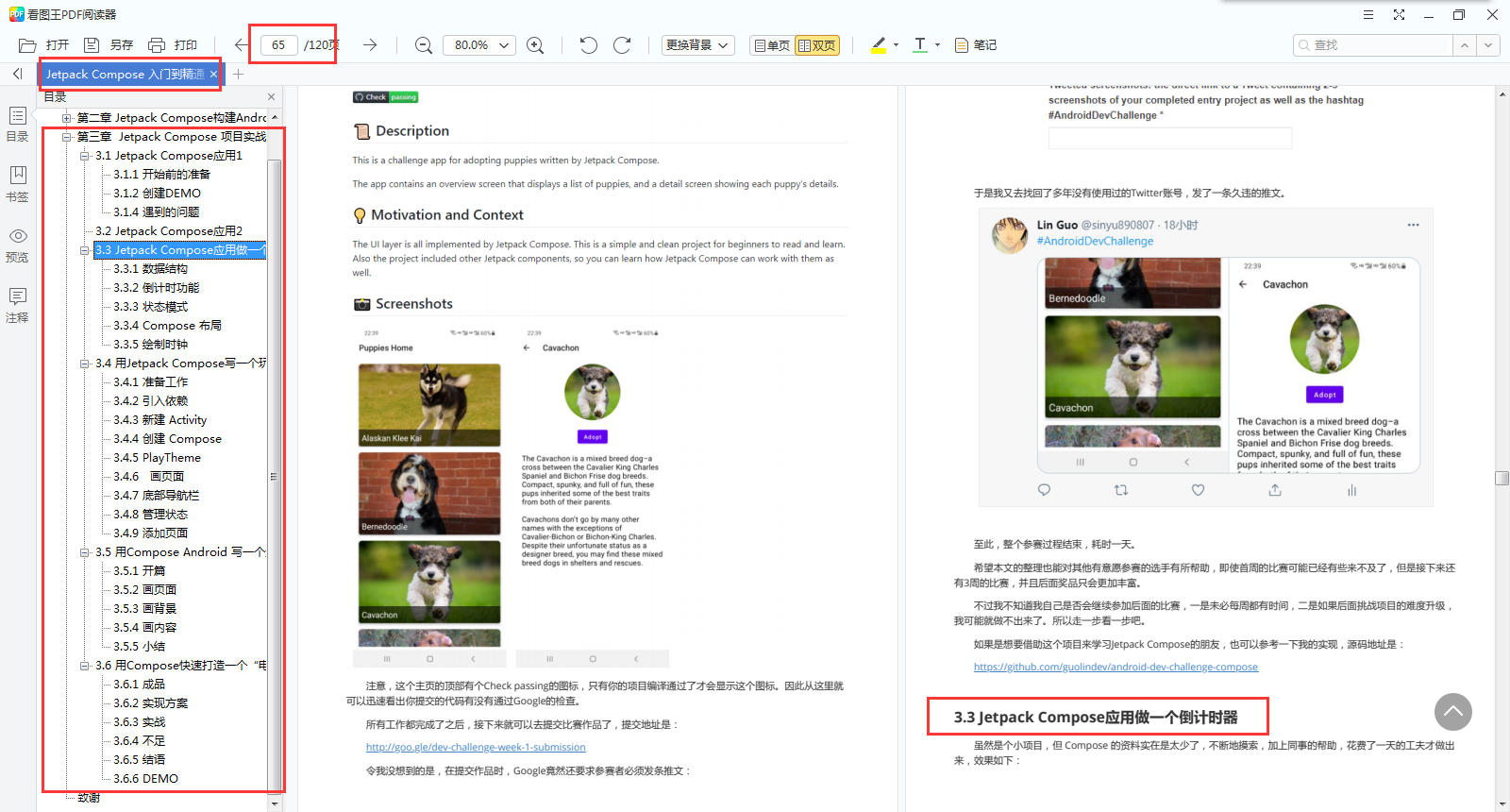
The Jetpack Compose application is used as a countdown timer
data structure
Countdown function
State mode
Compose layout
Draw clock
-
Write an android App with Jetpack Compose
preparation
Introduce dependency
New Activity
Create composite
PlayTheme
Draw page
Bottom navigation bar
Management status
Add page -
Write a weather application with Compose Android
Opening
Draw page
Painting background
Painting content
...... -
Quickly create a "movie App" with Compose
finished product
Implementation scheme
actual combat
Insufficient
......
Friends in need can[ Scan QR code below ]Get it directly from me for free.

I hope this material can be a reference for small partners who want to understand, learn and apply Android Jetpack Compose.