The interface in HarmonyOS is realized through Page Ability and Java UI; Page Ability is inseparable from ability. In harmony OS, various capabilities are abstracted, called ability; Ability is an important part of the program; Various functions and capabilities of Hongmeng are displayed through ability. It can be said that the development of Hongmeng applications is inseparable from ability. This article will explain in detail the applications and cases related to Page Ability.
Ability is divided into two categories: one is FA(Feature Ability), which supports Page Ability with pages and provides an interactive interface with users; The other is pa (particle capability), which represents a capability with no interface. It is subdivided into service capability (service capability, such as beauty function) and data capability (providing unified data access abstraction, local data access and data sharing between devices). The following figure shows the relationship between FA and PA:
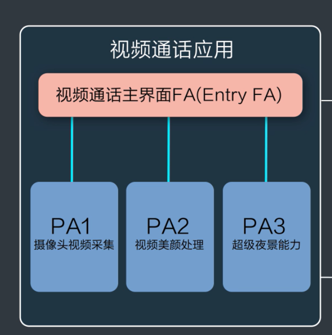
1. Ability framework
HarmonyOS provides three capabilities, which can be easily built based on Page template, Service template and data template; The jump and interaction between capabilities are realized through Intent; This article first focuses on Page Ability and Intent. (Service and data are not mentioned here because they are relatively independent and are not necessary for Page Ability. Data must be used for subsequent device migration, which is more smooth.)
1.1 Page Ability} introduction
Page ability (hereinafter referred to as page) provides the ability to interact with users. It is composed of one or more AbilitySlice. AbilitySlice is the sum of single page content (such as news list and details) and its control logic (display news, return list, etc.).
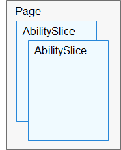
The comparison has the following characteristics:
1) multiple AbilitySlice of content with high Page relevance (for example, one Page for news subject module and one Page for Sports Subject Module)
2) the Page itself does not initialize the specific content (it has no UI layout), but is only responsible for controlling the Page entry (the home Page, the first displayed AbilitySlice), routing (the AbilitySlice initiates Page Jump through the action, and the Page will not jump, but this action needs to be registered / associated during Page initialization)
3) HarmonyOS supports internal Page jumps, supports Page jumps, and supports direct jump to target Page Ability (for example, takeaway payment, jump directly from the hungry Page page to Alipay's payment page (AbilitySlice, payment page is not home page).
1.2 Page Ability life cycle
Life cycle is the most important concept in all object-oriented development processes. During the continuous operation of Page by users, There will be various state changes (initialization, fallback, background, destruction, etc.), which may require some operations (such as releasing resources, such as transferring some user data). In each state change, HarmonyOS provides a callback function for developers to embed their own operations. See the change in the declaration cycle of Page in the following figure for details:
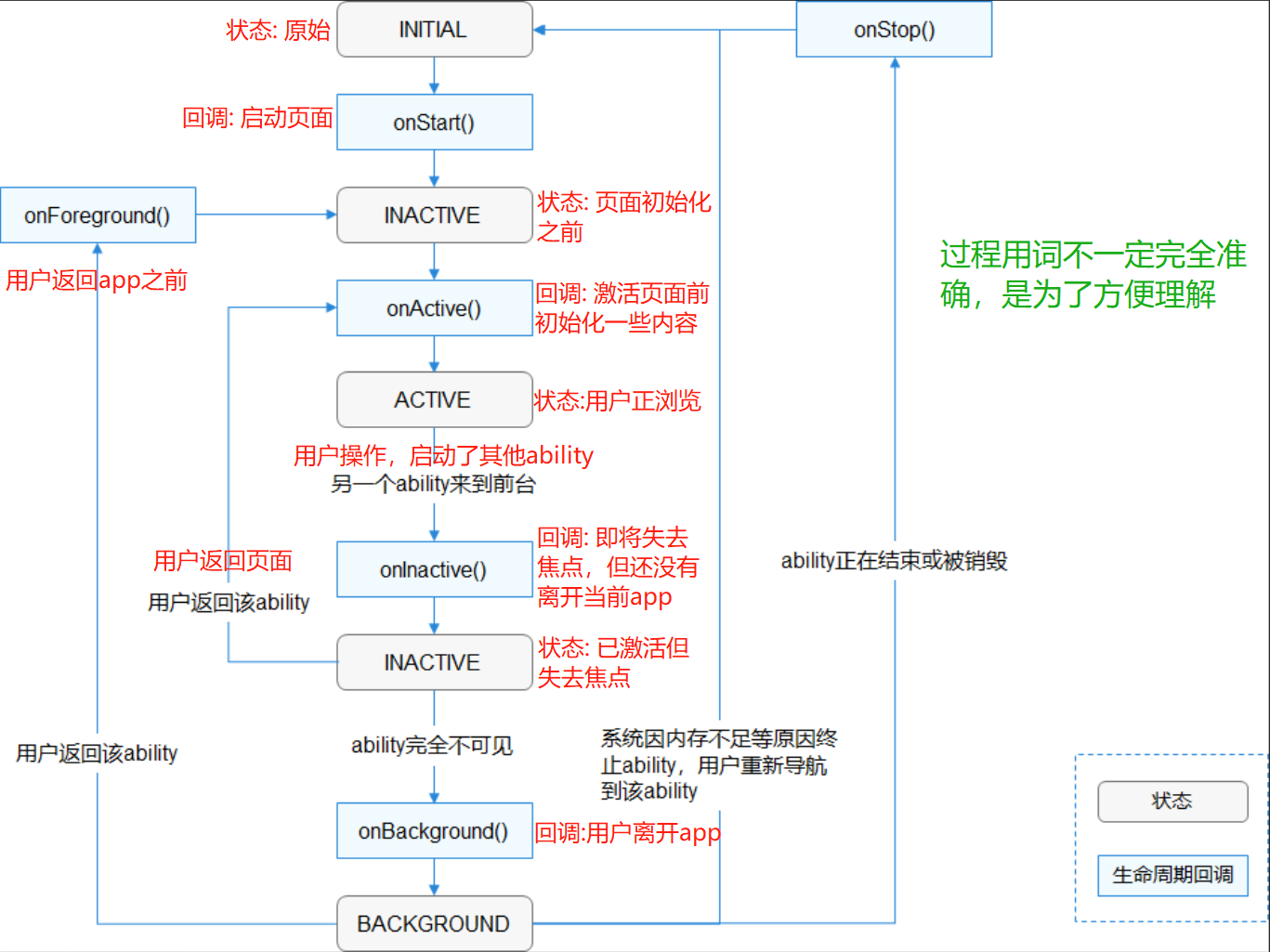
Note: when I first saw it, I felt that the two callbacks onStart() and onActive() were somewhat repeated. Theoretically, the initialization interface and data can be used in both methods; After careful study, it is found that if it is the first initialization, there is really only slight difference between the two, and the user's return and reactivation is best to start from onActive.
The life cycle and callback methods of abilityslice are the same as those of Page, and are generally created and managed by the application app; But in certain circumstances, when navigating to a AbilitySlice, the system is responsible, such as starving, jumping to paying, and then HUAWEI's support for voice interaction through the "little art small Alipay health code". This time, it must be instantiated by the system.
When there are two abilityslice under a Page - FooAbilitySlice and BarAbilitySlice, the time execution sequence when jumping from Foo Page to Bar Page:
1) event execution sequence: Foo departure lost focus time -- > Bar startup (Bar has been started and returned is not considered here) - > Bar activation -- > Foo background event departure;
2) execution sequence of corresponding methods: fooabilityslice onInactive() --> BarAbilitySlice. onStart() --> BarAbilitySlice. onActive() --> FooAbilitySlice. onBackground().
1.3 # AbilitySlice page navigation
Intent is the carrier for transferring information between objects. When one Ability needs to start another Ability, or the AbilitySlice needs to jump to another AbilitySlice, specify the start target and related parameters through intent.
There are two types of navigation: internal navigation of one Page and navigation between different pages.
1.3.1 Page internal navigation
The internal navigation of Page is divided into two cases: one does not need to return results, and the other needs to return results. The latter can inherit and implement an onResult method.
//There is no need to play the result. The method has only two parameters
 Button button = ...;
    button.setClickedListener(listener -> present(new TargetSlice(), new Intent()));

//You need one more parameter to return the result, and you need to override the onResult method
Button button = ...;
    button.setClickedListener(
        listener -> presentForResult(new TargetSlice(), new Intent(), positiveInteger));
//Override a method
@Override
protected void onResult(int requestCode, Intent resultIntent) {
    if (requestCode == positiveInteger) {
        // Process resultIntent here.
    }
}
1.3. 2 different Page navigation
Navigation between different pages can also be started according to the full name and attribute:
1) start according to full name: the Ability can be started by locating the determined Ability according to BundleName and AbilityName; Add the name by constructing OperationBuilder;
// Construct the operation object through the OperationBuilder class in Intent, and specify the device ID (empty string represents the current device), application package name and capability name
Intent intent = new Intent();
Operation operation = new Intent.OperationBuilder()
        .withDeviceId("")
        .withBundleName("com.demoapp")
        .withAbilityName("com.demoapp.FooAbility")
        .build();
// Set operation to intent
intent.setOperation(operation);
startAbility(intent);
2) start according to the Operation attribute: when the developer needs to start an application and doesn't care or is not sure which application the user uses, it is described by attributes, such as opening a link in the browser, opening a document in the reader, etc. For example, if the weather is queried below, the user may have the system's own or ink weather on his mobile phone;
private void queryWeather() {
    Intent intent = new Intent();
    Operation operation = new Intent.OperationBuilder()
            .withAction(Intent.ACTION_QUERY_WEATHER)
            .build();
    intent.setOperation(operation);
    startAbilityForResult(intent, REQ_CODE_QUERY_WEATHER);
}

@Override
protected void onAbilityResult(int requestCode, int resultCode, Intent resultData) {
    switch (requestCode) {
        case REQ_CODE_QUERY_WEATHER:
            // Do something with result.
            ...
            return;
        default:
            ...
    }
}
2. Java UI Basics
Here, the Java UI foundation is included. First, Page is related to UI, and second, it is completely to make the learning process go smoothly; If you want to debug and write simple programs, students who have not contacted Hongmeng or Android development at all may not be able to go on without understanding the UI.
2.1 Java UI component classification
1) by type: the contents of all user interfaces in Java UI are composed of Component (Component object) and ComponentContainer (Component object container);
2) according to meaningful usage description, components can be divided into two categories: Component and layout (the layout of Hongmeng system is named in XXXLayerout, which is a kind of ComponentContainer). In addition, each layout configures the properties of the layout through LayoutConfig to restrict the sub components.
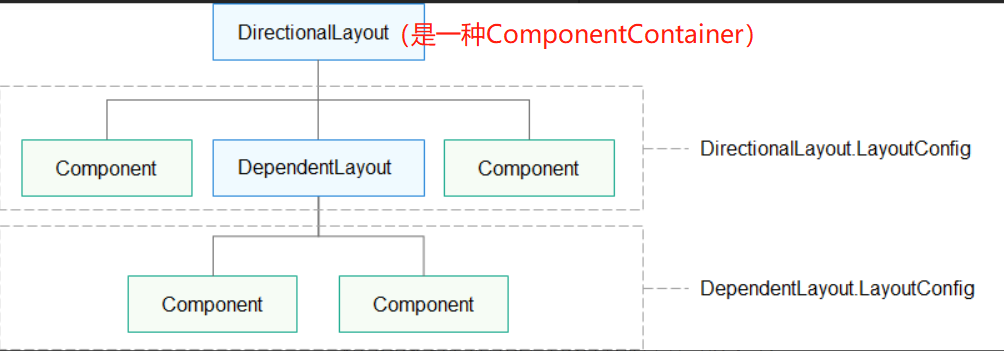
3) divided by function: layout components, display components (Text, Image, Clock, TickTimer, ProgressBar) and interactive components (input, click, scroll, selection, etc.);
4) creation type: it supports creation in java code (setting attributes and parameters) and UI declaration in XML (described by hierarchy, configuring parameters and attributes in XML, and supporting preview);
There is no essential difference between the two creation methods; XML created components can be modified through Java code.
2.2 creating UI
2.2. 1 create UI through Java code
The following code declares a Layerout, then declares a Button and a Text, puts them into Layerout, and finally initializes the page.
It is worth noting that there is a directionallayout Layoutconfig, which literally defines the configuration of Layerout and unifies the constraints of Layerout on its internal components; It's a bit like editing a Table in Word. For example, if the text is centered, the text in each grid will be centered.
Similarly, as usual, take the height as an example. If the sub object does not set the height, the height defined in LayoutConfig will be used. If the Button defines the height itself, it will replace the height in LayerConfig.
// Declaration layout
DirectionalLayout directionalLayout = new DirectionalLayout(getContext());
// Set layout size
directionalLayout.setWidth(ComponentContainer.LayoutConfig.MATCH_PARENT);
directionalLayout.setHeight(ComponentContainer.LayoutConfig.MATCH_PARENT);
// Set layout properties
directionalLayout.setOrientation(Component.VERTICAL);
directionalLayout.setPadding(32, 32, 32, 32);

//Create a Button
Button button = new Button(getContext());
layoutConfig.setMargins(0, 50, 0, 0);

button.setText("My name is Button.");
button.setTextSize(50);
//Set background, fillet, etc
ShapeElement background = new ShapeElement();
background.setRgbColor(new RgbColor(0, 125, 255));
background.setCornerRadius(25);
button.setBackground(background);
button.setPadding(10, 10, 10, 10);
button.setClickedListener(new Component.ClickedListener() {
      @Override
       // Add click event detection in the component
       public void onClick(Component component) {
            // Click here to add the operation to be performed
        }
});

// Add the layout properties of the corresponding layout for the component
DirectionalLayout.LayoutConfig layoutConfig = new DirectionalLayout.LayoutConfig(ComponentContainer.LayoutConfig.MATCH_CONTENT, ComponentContainer.LayoutConfig.MATCH_CONTENT);
layoutConfig.alignment = LayoutAlignment.HORIZONTAL_CENTER;
//Add layout attributes for components and constraints of parent objects on child objects;
//Like the table in Word, for example, uniformly adjust the text center, and each grid will be centered
button.setLayoutConfig(layoutConfig);

//Create a text
Text text = new Text(getContext());
text.setText("My name is Text.");
text.setTextSize(50);
text.setId(100);
text.setLayoutConfig(layoutConfig);

// Add Text to layout
directionalLayout.addComponent(text);
directionalLayout.addComponent(button);

// Adds a layout to the view tree as the root layout
super.setUIContent(directionalLayout);
2.2. 2 create UI through XML
The creation of xml is more intuitive and can be previewed directly through the viewer; You can directly set the properties of components through xml. If some unsupported properties are set, they will be ignored, such as text_color is only supported by Text;
1) set a meaningful unique ID for the component, which will be compiled into a constant and used in Java code;
//Declare an id in xml
ohos:id="$+id:text_input"

//In java, the system automatically compiles a constant according to ID: ResourceTable.Id_text_input
//If the ID is duplicate, return the first Component found; Try not to repeat and avoid confusion
Text text=findComponentById(ResourceTable.Id_text_input);
2) component width and height settings support three methods: 1. Value: 10 (pixels) and 10vp (screen pixels); 2. match_parent (occupying all the remaining content of the parent component); 3. match_content, which is adaptive according to the content;
3) DevEco Studio provides a special Layout Resource File template to create layouts
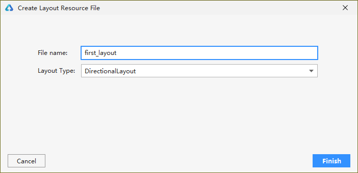
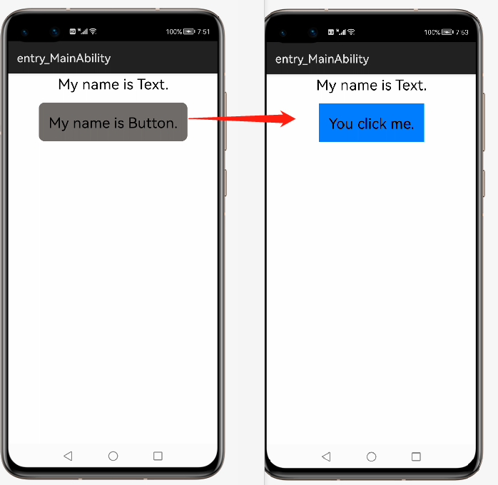
After creation, you can modify and configure attributes in xml, or modify attributes and binding attributes through Java code. The following code demonstrates that when you click a button, the button color changes from gray to blue, and the text prompt "You click me";
//XML code for creating UI
<?xml version="1.0" encoding="utf-8"?>
<DirectionalLayout
    xmlns:ohos="http://schemas.huawei.com/res/ohos"
    ohos:height="match_parent"
    ohos:width="match_parent"
    ohos:orientation="vertical">
    <Button
        ohos:id="$+id:button"
        ohos:margin="50"
        ohos:padding="50"
        ohos:width="match_content"
        ohos:height="match_content"
        ohos:layout_alignment="horizontal_center"
        ohos:text="My name is Button."
        ohos:background_element="$graphic:background_ability__change"
        ohos:text_size="25fp"/>
</DirectionalLayout>
Register the click event through java code, change the button color when clicking, and prompt that the button is clicked
public class MainAbility2Slice extends AbilitySlice {
    @Override
    public void onStart(Intent intent) {
        super.onStart(intent);
        super.setUIContent(ResourceTable.Layout_ability_change_button);
        Button button=findComponentById(ResourceTable.Id_button);
        if(button!=null){
            button.setClickedListener(clickListenner-> {
                ShapeElement shpe=new ShapeElement();
                shpe.setRgbColor(new RgbColor(0, 125, 255));
                button.setBackground(shpe);
                button.setText("You click me.");

            });
        }
    }
}
3. Examples of important UI applications
3.1 common components
HarmonyOS provides many basic components, such as Text, Button, Image, DatePicker (time selector), progress bar, table list, scroll bar, prompt box, etc. the use of Button has been shown above, and the reference document is very detailed. Here we will not list the attributes one by one, but only some key points:
1. HarmonyOS defines the base class general Component. All components integrate the properties of Component. The general Component properties define:
1) basic XML attribute;
2) XML attributes related to spacing;
3) XML attributes related to the scroll bar;
4) XML attributes related to rotation and scaling;
5) focus related XML attributes;
Most of the above components are required, so they are defined in the Component. The content is very rich. Please refer to the API yourself
2. Specific components also inherit from each other
For example, TextField and Button components are implemented by inheriting from Text, and TabList inherits from ScrollView; Many other components are also inherited.
3.2 common layout
3.2. 1. Common layout classification
The layout of core importance is divided into six categories according to different layout rules:
1) directional layout: arrange the components according to the direction without line feed, and the excess part will not be displayed
2) dependentlayout: each component depends on the same level or parent component, such as left_of, which means it is on the left of a component;
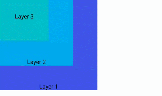
3) StackLayout: display on the screen by superposition according to the absolute position. The first added components are at the bottom, and the last added components are at the top, covering (covering) each other;
4) TableLayout: it is displayed as a regular table, with one column and multiple rows by default. Columns and columns can be specified through column_count and row_count. It also supports the table merging function similar to that in Word (irregular table layout in which a table occupies multiple grids). Currently, it only supports the Java code of TableLayout.LayoutConfig, and does not support the direct implementation of xml
5) PositionLayout (absolute position): take the upper left corner as (0,0) and display according to the value;
ohos:position_x="50vp"
ohos:position_y="8vp"
6)AdaptiveBoxLayout (adaptive box layout): construct a separate box for each sub component, and the layout reference of the sub components is mainly box; divide the width of each box by the number of columns to adapt automatically; automatically adapt to the highest component according to match_content; automatically block in the horizontal direction, so the horizontal direction does not support match_content, only match_parent or fixed value;
Adaptive BoxLayout is mainly used to meet the automatic adaptation of different types of equipment to typesetting and layout.
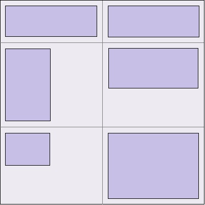
There are two core methods: addadaptive rule (int minwidth, int maxwidth, int columns) and removeadaptive rule (int minwidth, int maxwidth, int columns)
3.2. 2 common layout applications
Note: the layout itself has some properties. Different layouts will lead to different component properties. For example, the DependentLayout depends on the layout and has a left_ The of attribute indicates that the button in the DependentLayout will have a left on the left side of a component_ Of attribute; On the contrary, DirectionalLayout is a directional layout, which arranges components according to the direction, and the buttons in it have no left_of attribute, even if there is a contradiction.
1, Directional layout: arranges the internal components horizontally or vertically. It is the simplest and most commonly used layout. It can also be combined with other layouts to provide richer layout methods. There are three core attributes: alignment (object mode, values such as left, top, etc.) and orientation (layout direction, values horizontal, vertical, horizontal or vertical), total_weight.
Additional sub component properties: layout_alignment,weight
2. Dependentlayout: the position of each component relative to its sibling component or parent component; core attribute alignment
Additional sub component properties:
1) relative position of components at the same level: left_of,start_of,above,align_left,align_bottom, etc,
2) parent component dependency align_parent_left,align_parent_start,center_in_parent et al
In addition, attribute combinations are supported:
ohos:text="align_parent_left and align_parent_top"
Some attribute combination results;
 //There are too many contents, just list two
   <Text
        ohos:id="$+id:text_center"
        ohos:height="210vp"
        ohos:width="210vp"
        ohos:background_element="#878787"
        ohos:center_in_parent="true"
        ohos:text="center"
        ohos:text_alignment="center"
        ohos:text_size="20fp"
        ohos:text_color="#FFFFFF"/>

    <Text
        ohos:id="$+id:text_left_and_above"
        ohos:height="match_content"
        ohos:width="100vp"
        ohos:left_of="$id:text_center"
        ohos:above="$id:text_center"
        ohos:background_element="#FF9912"
        ohos:padding="8vp"
        ohos:multiple_lines="true"
        ohos:text="left_of and above"
        ohos:text_size="18fp"
        ohos:text_color="#FFFFFF"/>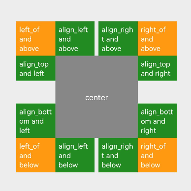
Note: if multiple attribute combinations sometimes conflict, for example: align_parent_start,align_parent_end priority is higher than align_parent_right attribute; Refer to API for more information.
3.2. 3 others
1. Customize components and layout
Hongmeng supports advanced functions such as custom components and layout, which are realized by inheriting Component and ComponentContainer respectively; This part is relatively complex and will be explained in a special chapter later.
2. Animation development
HarmonyOS supports frame animation (playing pictures circularly according to time), numerical animation (using java code to change picture position values in a circular way to realize animation), attribute animation (realizing position change, rotation, circulation, etc. through attributes), and a variety of animation sets.
3. Hongmeng's characteristic function "visible can be said"
On smart products, support voice interaction on the interface, and then carry out some operations according to the voice to achieve "what you see can be said".
The implementation method is to register "hot words" and support Chinese and English, so that the system can capture key voice; Support multiple hot words
//Add the two hot words OK and OK to the component
Component component = new Component(getContext());
component.VoiceEvent eventKeys = new Component.VoiceEvent("ok");
eventKeys.addSynonyms("determine");
//Complete registration
component.subscribeVoiceEvents(eventKeys);

//Register a callback method, speechEventListener
component.setSpeechEventListener(speechEventListener);
//Implement the interface of callback class and respond
private Component.SpeechEventListener speechEventListener = new Component.SpeechEventListener(){
    @Override
    public boolean onSpeechEvent(Component v, SpeechEvent event) {
        if (event.getActionProperty().equals("ok")) {
            ... // Detect the registered hot words and handle them accordingly
        }
        return false;
  };
}
Through this article, you can simply understand the relevant contents of the interaction page between Hongmeng and users. This part is relatively basic, easy to start but not available. The UI content is miscellaneous but very important. It is recommended to do more and experience the differences and characteristics between different components. You don't have to implement them one by one. You can choose some important UI components to practice and compare the characteristics of each component!