1 Preface
1.1 data set
-
The data in this case comes from the real data of Toronto in 2018-2019 on Airbnb website.
-
The data set contains the listing data set, with about 20000 pieces of data, recording all the house information, including dozens of information fields including price.
-
Another data set in the data set is calendar, which contains about 6.5 million rental transaction data and has the entry information of each house every day.
1.2 data analysis ideas
Routine data analysis, data field loading and common data ETL four Board axe cleaning
-
Method 1: isnull(). Sum() check null condition
-
Method 2: shape check data size
-
Method 3: describe() view data field data type
-
Method 4: value_ Counts() to view the data collection and data distribution
Finally, the data analyst should present the results in a visual way, so the data obtained from the analysis should be displayed graphically. Since the main objective of this case study is the price dependent factor, we use the comparison between price and another factor to observe. Common graphics include:
-
Figure 1: histogram to observe the distribution of data
-
Figure 2: box diagram to observe the range of data
-
Figure 3: scatter matrix to observe the relationship between different factors
-
Figure 4: thermodynamic diagram to quickly screen out information factors with high correlation
The traditional data analysis generally ends here, but for the exploratory test data analysis, things have just begun. In order to conduct more in-depth data analysis, this case begins to introduce the machine learning model. Since the machine learning model is essentially a mathematical model, we need to carry out feature engineering on the data set, To change the data set into an array convenient for model recognition, the following steps are adopted in this example:
- Step 1: standardization of data
- Step 2: repair of missing data
- Step 3: encoding string data
- Step 4: data type conversion and unit unification
For many fields in this example, simple linear regression and other models can not capture the dynamics of data well, so we use some machine learning models, that is, we use a series of related features to combine strong features. In this example, we use two models:
-
Model 1: random forest model. This model is a composite model, which arranges and combines the features and labels arbitrarily, and then models them in a probabilistic way to minimize the occurrence of over fitting.
-
Model 2: Microsoft's LightGBM model is also a very popular composite model in recent years. In this example, we use this model to compare with the random forest model, and use the R2 value to select the most appropriate machine learning model.
2 data analysis
2.1 data loading
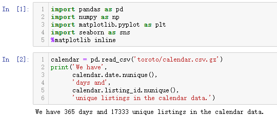
The code is written on the jupyter notebook in Anaconda integrated environment. First, import the modules and data sets required for data analysis
import pandas as pd
import numpy as np
import matplotlib.pyplot as plt
import seaborn as sns
%matplotlib inline

calendar = pd.read_csv('toroto/calendar.csv.gz')
print('We have', calendar.date.nunique(), 'days and', calendar.listing_id.nunique(), 'unique listings in the calendar data.')
The output results are as follows: (the data contains 17333 room information in 365 days. The nunique() method queries the unique value of the field and returns the number of unique elements in the field)
2.2 data viewing
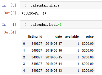
(1) Data dimension and field information
calendar.shape

calendar.head()
The output results are as follows: (there are 630w + transaction records and 4 fields. listing_id: House data number, date: current record time, available: whether the current room is not leased, price. If it is not leased, the price will be displayed.)
(2) Start and end date of transaction
calendar.date.min(), calendar.date.max()
The output results are as follows: (the transaction time range is from October 6, 2018 to October 5, 2019, a whole year)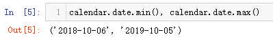
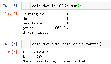
(3) Field missing values and field statistics
calendar.isnull().sum()

calendar.available.value_counts()
The output results are as follows: (in the price field, there is no price display after the house is rented, and there is only price if it is not rented, so there is a missing value in this field; in the available field, f (false) represents that it has been rented, and t(true) represents that it can be rented)
3 data visualization
3.1 daily occupancy rate
The read data contains more than 1w houses, with a total of 600w + transaction records, covering the start and end dates of transactions. Therefore, you can explore the occupancy of houses every day (the number of rooms occupied on that day divided by the total number of rooms). The specific analysis steps are as follows:
#Extract the time, date and room status fields and assign new variables
calendar_new = calendar[['date', 'available']]
#Add a new field to record that the listing is enough to be rented
calendar_new['busy'] = calendar_new.available.map( lambda x: 0 if x == 't' else 1)
#Add a new field to record that the listing is enough to be rented
calendar_new = calendar_new.groupby('date')['busy'].mean().reset_index()
#Finally, the time and date are converted to datetime time format
calendar_new['date'] = pd.to_datetime(calendar_new['date'])
#View the first five lines of the processed results
calendar_new.head()
The output results are as follows: (the date field is the time and date, and the busy field represents the average occupancy rate per day)
The summary of output results shows that there is a pink alert output alert xxxWarning. It is necessary to understand that the version and various modules will be compatible in the process of data processing and analysis of pandas. xxxWarning is a kind of goodwill alert, not an xxxError. This kind of alert will not affect the normal operation of the program, and can also be imported into the module for reminding and ignoring
import warnings
warnings.filterwarnings('ignore')
After importing and running, re execute the above analysis process, and the output results are as follows: (there is no pink xxwarning reminder at this time)
After the occupancy rate is solved every day, the visual drawing can be carried out. Because the x-axis part of the drawing graph is the time date and the time span is large, the broken line graph is generally used to draw the graph
#Sets the size of the drawing
plt.figure(figsize=(10, 5))
#Specify the x and y axis data to draw
plt.plot(calendar_new['date'], calendar_new['busy'])
#Add drawing title
plt.title('Airbnb Toronto Calendar')
#Add y-axis label
plt.ylabel('busy')
The output results are as follows: (we can see from the figure that October November is the busiest, and then July September of the second year. Since this data is from aibiying Toronto, it can be inferred that the occupancy rate of the whole short rent house will be relatively strong in the second half of the year)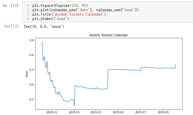
3.2 monthly house price trend
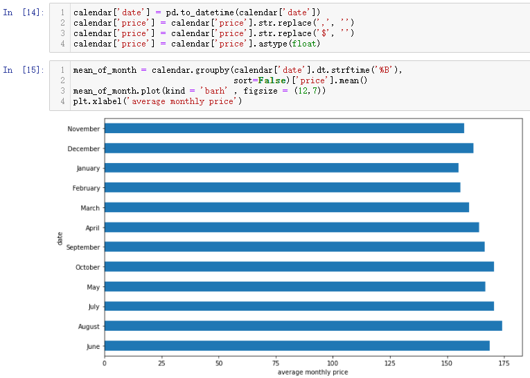
There are two analysis techniques this time. Because the price part has the $symbol and the sign, we need to format the data and convert the time field. After processing the time field, we use the histogram for data analysis
#First, convert the time and date field into datetime field to facilitate the extraction of month data
calendar['date'] = pd.to_datetime(calendar['date'])
#Clean the $symbol and sign in the price field, and finally convert them into floating-point numbers to facilitate memory calculation
calendar['price'] = calendar['price'].str.replace(',', '')
calendar['price'] = calendar['price'].str.replace('$', '')
calendar['price'] = calendar['price'].astype(float)

#Group and summarize by month to find the average price
mean_of_month = calendar.groupby(calendar['date'].dt.strftime('%B'),
                                 sort=False)['price'].mean()
#Draw bar chart
mean_of_month.plot(kind = 'barh' , figsize = (12,7))
#Add x-axis label
plt.xlabel('average monthly price')
The output results are as follows: (the last converted datetime data type is the date field in the calendar_new variable, but the data type of the date field in the calendar variable is still the string data type, so it needs to be converted to the datetime data type.)
If you want the month to be output sequentially from January to December, you can specify the index again. The existing indexes are placed in a list, sorted and passed into the reindex() function. The operation is as follows
#Check the original index value first
mean_of_month.index

#Adjust the display position order according to the original index value
month_index = ['December', 'November', 'October', 'September', 'August',
               'July','June', 'May',  'April','March', 'February', 'January']
#Drawing after reassigning the index
mean_of_month = mean_of_month.reindex(month_index)
mean_of_month.plot(kind = 'barh' , figsize = (12,7))
plt.xlabel('average monthly price')
The output results are as follows: (it can be seen from the figure that July, August and October are the three months with the highest average price)
3.3 house price characteristics
#Gets the name of the specific number of days of the week
calendar['dayofweek'] = calendar.date.dt.weekday_name
#Then specify the index order to display
cats = [ 'Monday', 'Tuesday', 'Wednesday', 'Thursday', 'Friday', 'Saturday', 'Sunday']
#Extract the two fields to analyze
price_week=calendar[['dayofweek','price']]
#Group by week, solve the average price and reset the index
price_week = calendar.groupby(['dayofweek']).mean().reindex(cats)
#Delete unnecessary fields
price_week.drop('listing_id', axis=1, inplace=True)
#Drawing graphics
price_week.plot()
#Specifies the value of the axis scale and the corresponding label value
ticks = list(range(0, 7, 1))
labels = "Mon Tues Weds Thurs Fri Sat Sun".split()
plt.xticks(ticks, labels)

#If you don't want to display xticks information, you can add PLT show()
plt.show()
The output results are as follows: (if you directly specify the DataFrame to draw the graph, the scale and label information of the x-axis may not be displayed. At this time, you can specify the scale number and the corresponding label value. Most short-term rental houses exist for tourism, so the price on Friday and Saturday is one grade higher than that on other days. It is a weekend holiday, so the arrival time is two nights late on Friday and Saturday.)
3.4 number of houses in different communities
Read another data file, group according to each listing community, and count the number of listings (the id field corresponds to the unique number of listings)
listings = pd.read_csv('toroto/listings.csv.gz')
print('We have', listings.id.nunique(), 'listings in the listing data.')

listings.groupby(by='neighbourhood_cleansed').count()[['id']].sort_values(by='id', ascending=False).head(10)
The output results are as follows: (the grouping solution process of the two fields is basically the execution process of the last line of code. Finally, you can sort and view the amount of data according to the fields.)
3.5 housing supply score
By reviewing_ scores_ The rating score field is used to draw the distribution map, and you can view the distribution range of prices
#Set canvas size
plt.figure(figsize=(12,6))
#Draw distribution map
sns.distplot(listings.review_scores_rating.dropna(), rug=True)
#Cancels the right and upper axes
sns.despine()
The output results are as follows: (the scoring standard here is 0-100. It can be seen from the above table that aibiying's house has a very high praise rate on the whole)
3.6 housing price
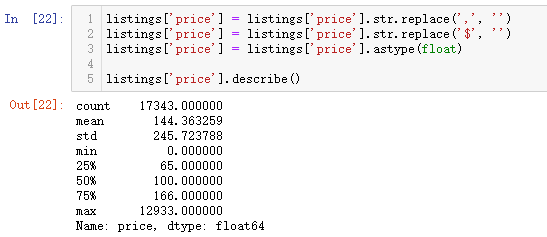
Previously, we explored the relationship between house price and week, but the information of house price field is not explored. You can use describe to view the price
listings['price'] = listings['price'].str.replace(',', '')
listings['price'] = listings['price'].str.replace('$', '')
listings['price'] = listings['price'].astype(float)

listings['price'].describe()
The output results are as follows: (the price of the most expensive Airbnb house in Toronto is $12933 / night (at that time, the current price is $64818 / night). The following is the link of the house: https://www.airbnb.ca/rooms/16039481?locale=en . Through the link, you can find that it is about 100 times more expensive than the average price, mainly because this house is an art collector's attic in Toronto's most fashionable community. The value of these art collections has greatly raised the price of this house, making it 100 times lower than the average)
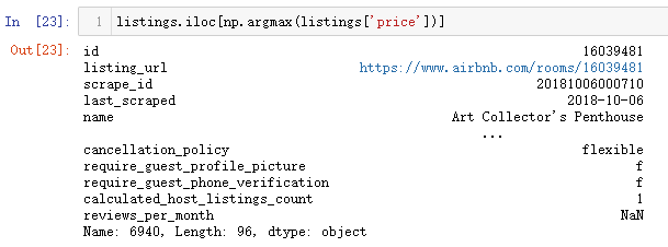
If you need to check the record corresponding to the maximum or minimum value, you can use the following code argmax or argmin
listings.iloc[np.argmax(listings['price'])]
The output results are as follows: (it can be verified through the name information that this house listing belongs to the Art Collector)
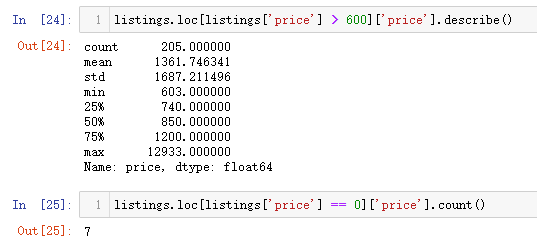
In data analysis, we need to obey the principle of normal distribution. We need to clean up the existence of such extreme cases, so we filter the abnormal price data, and the final price is to retain the data between 0-600. To select a specific value, you need to look at the proportion of the number of listings corresponding to the current value above in the whole. Here, there are only 200 + listings above 600, accounting for a small proportion of 1w +, and only 7 listings are free
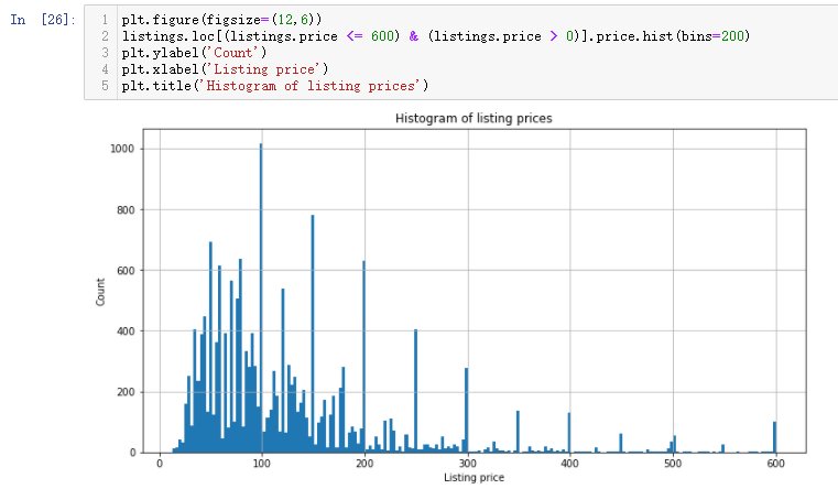
After removing the extreme value, we continue to observe the current price distribution and draw the histogram
plt.figure(figsize=(12,6))
listings.loc[(listings.price <= 600) & (listings.price > 0)].price.hist(bins=200)
plt.ylabel('Count')
plt.xlabel('Listing price')
plt.title('Histogram of listing prices')
The output results are as follows: (the bin quantity can be freely specified. It can be seen that the price is mainly between 30-200)
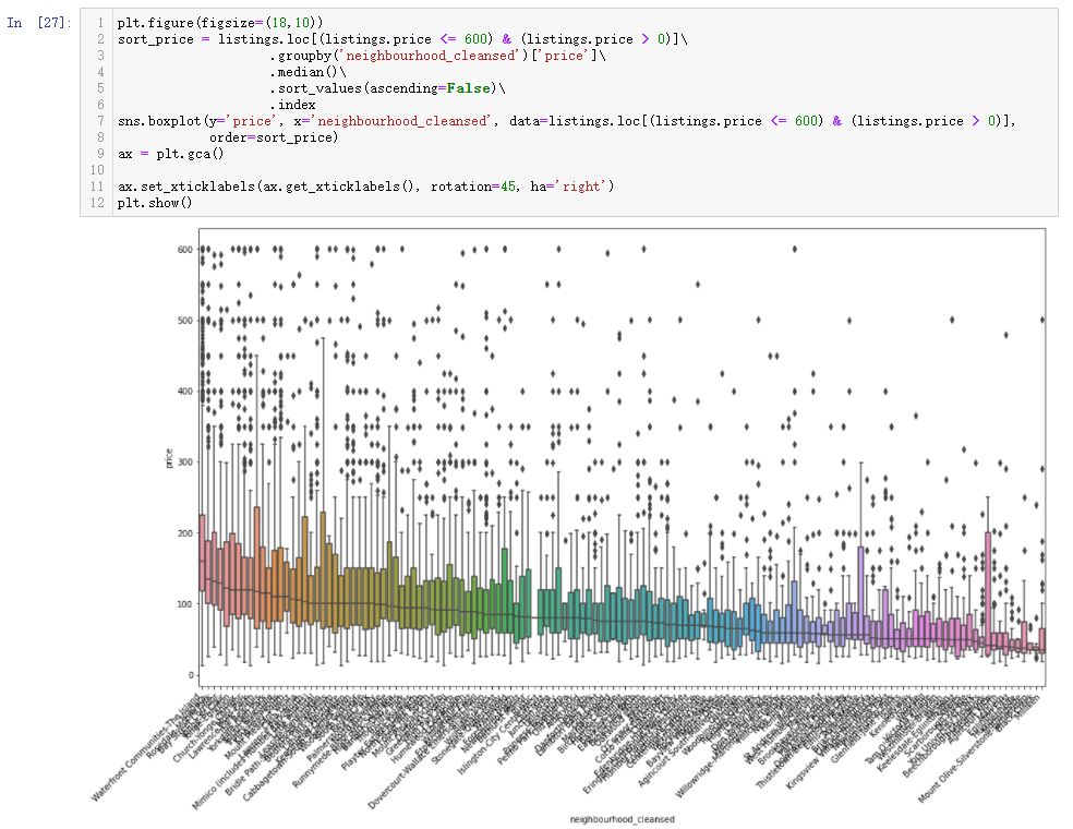
3.7 relationship between different communities and housing prices
Previously, we explored the relationship between different communities and the number of houses. Here we can further explore the relationship between different communities and the price of houses
plt.figure(figsize=(18,10))
sort_price = listings.loc[(listings.price <= 600) & (listings.price > 0)]\
                    .groupby('neighbourhood_cleansed')['price']\
                    .median()\
                    .sort_values(ascending=False)\
                    .index
sns.boxplot(y='price', x='neighbourhood_cleansed', data=listings.loc[(listings.price <= 600) & (listings.price > 0)],
            order=sort_price)
ax = plt.gca()

ax.set_xticklabels(ax.get_xticklabels(), rotation=45, ha='right')
plt.show()
The output results are as follows: (the best community not only has the highest price of houses, but also the average price is the highest among all communities, which is very representative)
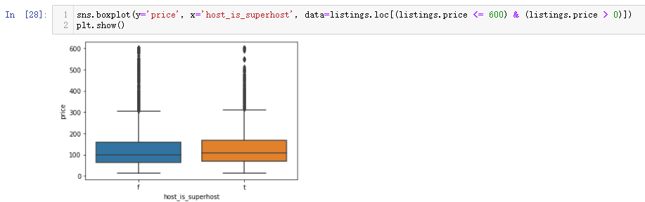
3.8 quality room and ordinary room
When booking a hotel, quality listings and ordinary listings are often displayed on the browsing page. There are also fields in this data set to record this information. You can compare and study the prices of the two
sns.boxplot(y='price', x='host_is_superhost', data=listings.loc[(listings.price <= 600) & (listings.price > 0)])
plt.show()
The output results are as follows: (the price of high-quality houses is higher than that of ordinary houses)
3.8 relationship between supporting facilities and house price
The soft decoration characteristics and quantity in the hotel are also closely related to the house price. You can analyze it by exploring the house price in different communities. The code can basically modify the field
plt.figure(figsize=(18,10))
sort_price = listings.loc[(listings.price <= 600) & (listings.price > 0)]\
                    .groupby('property_type')['price']\
                    .median()\
                    .sort_values(ascending=False)\
                    .index
sns.boxplot(y='price', x='property_type', data=listings.loc[(listings.price <= 600) & (listings.price > 0)], order=sort_price)
ax = plt.gca()
ax.set_xticklabels(ax.get_xticklabels(), rotation=45, ha='right')
plt.show()
The output results are as follows: (when drawing such graphs in the future, the code can be directly copied and the corresponding fields and limits can be modified. It can be seen from this figure that if the extreme values are not processed during data processing, such a strange situation will be displayed. For example, the keyword Aparthotel apartment hotel has the highest price, but we can see from boxplot, In fact, there is only one such real estate, so the data is not complete. Keywords such as tent and parking space are also few in number, which leads to inaccurate data display)
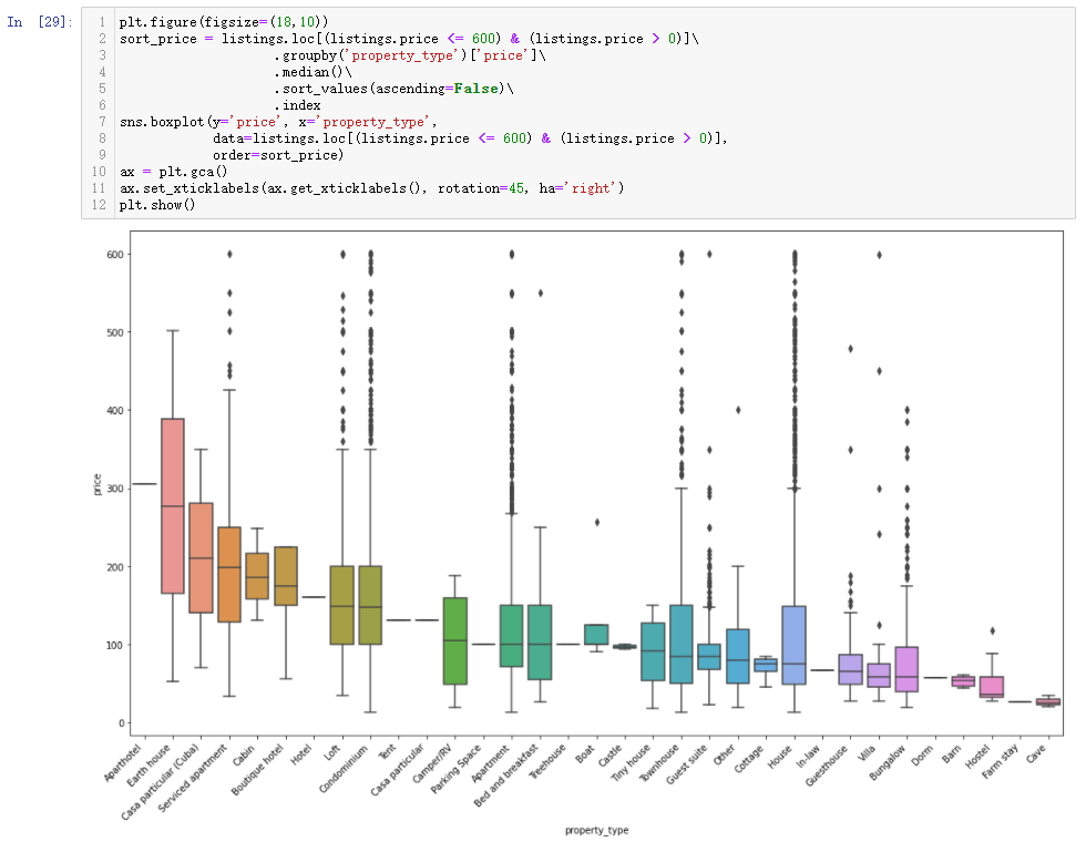
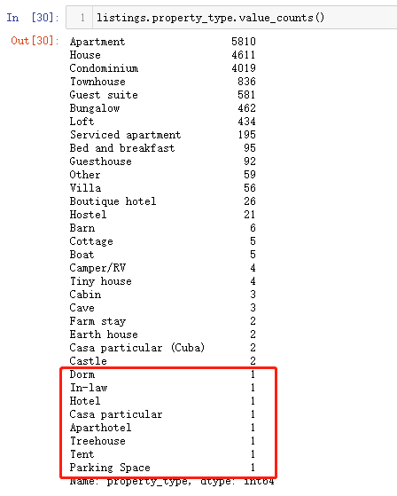
The fundamental reason is that there are too few data values in the classification. You can use value_ Count(). For the classification with few values, you can also set a value as the dividing point for extraction, or directly extract the data of the top 5, top 10 and top 15 according to the display requirements
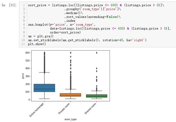
3.9 relationship between house type and house price
When renting a house, there are whole rent and joint rent, and there are some situations where many people share a room (a little similar to a youth hostel). You can try to explore the relationship between different house types and house prices
sort_price = listings.loc[(listings.price <= 600) & (listings.price > 0)]\
                    .groupby('room_type')['price']\
                    .median()\
                    .sort_values(ascending=False)\
                    .index
sns.boxplot(y='price', x='room_type', data=listings.loc[(listings.price <= 600) & (listings.price > 0)], order=sort_price)
ax = plt.gca()
ax.set_xticklabels(ax.get_xticklabels(), rotation=45, ha='right')
plt.show()
The output results are as follows: (the whole rent is the most expensive, followed by joint rent, and the cheapest is shared by multiple people)
In addition to viewing the house price information of each room type in the field, you can also reverse thinking to see the number of rentals of different room types according to the price, and try to explore it through the stacking diagram
listings.loc[(listings.price <= 600) & (listings.price > 0)].pivot(columns = 'room_type',
                                                                   values = 'price').plot.hist(stacked = True, bins=100)
plt.xlabel('Listing price')
The output results are as follows: (there is an obvious dividing line, that is, there is a large gap between the number of whole rental houses before and after 100 and the other two types of houses. The sharing before 100 accounts for a large proportion, but after 100 is the absolute advantage of the whole rental.)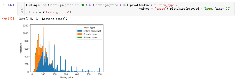
3.10 necessary types of supporting facilities
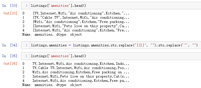
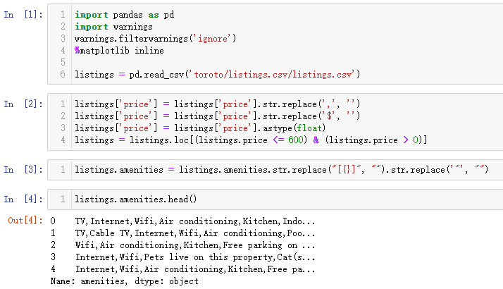
For the supporting facilities of the rooms in the hotel, such as wifi, toilet, window opening, 24-hour hot water and other conditions, try to explore the supporting facilities of Beibei in the rental room. First, clean the data in the amenities field and extract the specific facilities inside
listings['amenities'].head()

listings.amenities = listings.amenities.str.replace("[{}]", "").str.replace('"', "")

listings['amenities'].head()
The output results are as follows: (the curly braces and quotation marks need to be removed, and finally separated by commas)
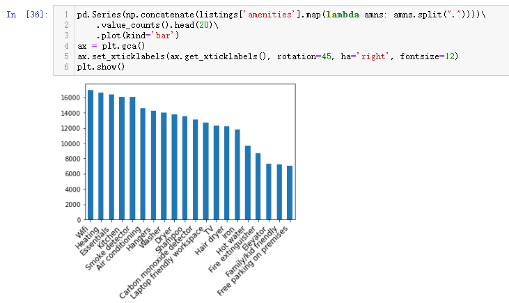
Identify the top 20 most important amenities
pd.Series(np.concatenate(listings['amenities'].map(lambda amns: amns.split(","))))\
    .value_counts().head(20)\
    .plot(kind='bar')
ax = plt.gca()
ax.set_xticklabels(ax.get_xticklabels(), rotation=45, ha='right', fontsize=12)
plt.show()
The output results are as follows: (Wifi heating, kitchen and other conveniences are the most important part. This part has a very common function, that is, to merge multiple elements in a field, count them and draw an image)
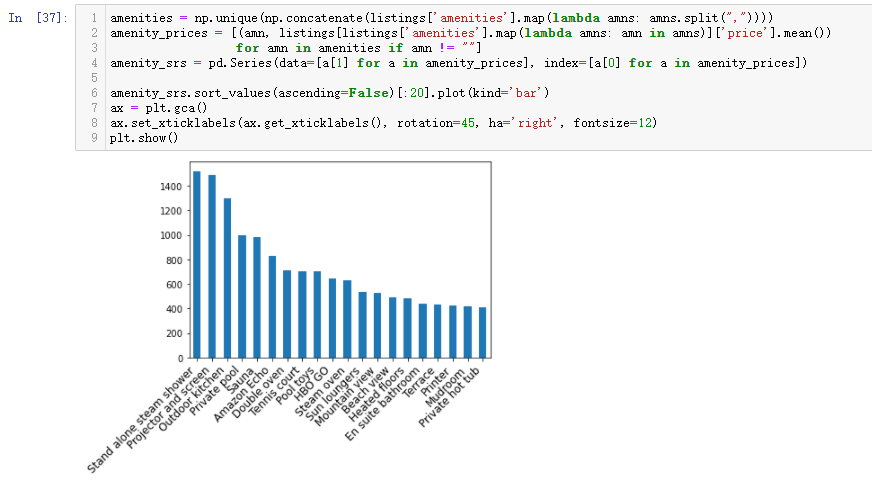
The relationship between supporting facilities and house prices. Understanding the first three lines of code below will yield a lot
#Gets the unique element in the field
amenities = np.unique(np.concatenate(listings['amenities'].map(lambda amns: amns.split(","))))
#The contained elements are statistically averaged and null values are excluded
amenity_prices = [(amn, listings[listings['amenities'].map(lambda amns: amn in amns)]['price'].mean()) for amn in amenities if amn != ""]
#Index by element and average price as value
amenity_srs = pd.Series(data=[a[1] for a in amenity_prices], index=[a[0] for a in amenity_prices])

#Draw the top 20 bar charts
amenity_srs.sort_values(ascending=False)[:20].plot(kind='bar')
ax = plt.gca()
ax.set_xticklabels(ax.get_xticklabels(), rotation=45, ha='right', fontsize=12)
plt.show()
The output results are as follows: (the first two lines of code are also very practical functions to realize the process of statistical averaging of the elements contained in the field, and the result is that the element and the corresponding price mean can be obtained)
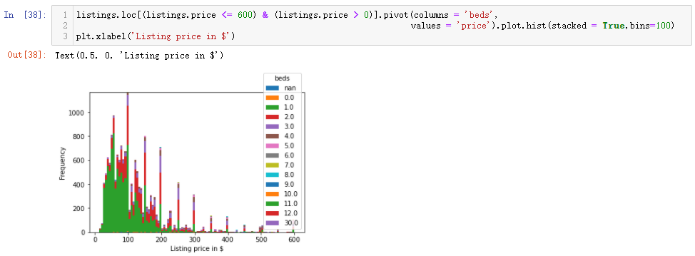
3.11 relationship between number of beds and house price
listings.loc[(listings.price <= 600) & (listings.price > 0)].pivot(columns = 'beds',values = 'price').plot.hist(stacked = True,bins=100)
plt.xlabel('Listing price in $')
The output results are as follows: (first, check the quantity distribution of different beds in each rental room, mainly concentrated in 1, 2 and 3, and the price is mainly in the range of 0-200)
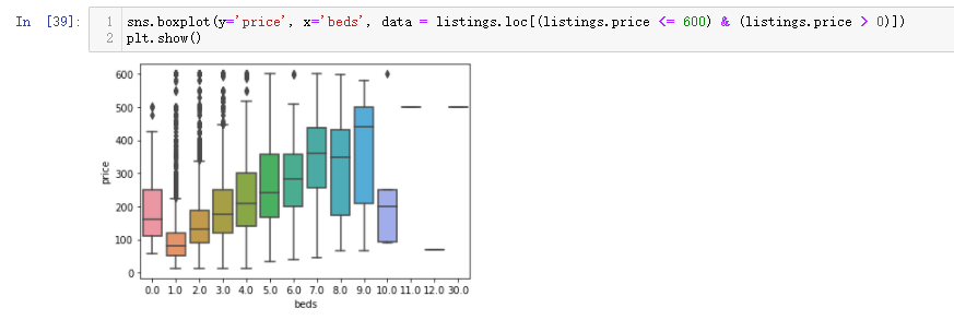
Then check the price relationship of each bed quantity as follows
sns.boxplot(y='price', x='beds', data = listings.loc[(listings.price <= 600) & (listings.price > 0)])
plt.show()
The output results are as follows: (in this data, it is amazing to find that the price of a house without a bed is more expensive than that of a house with two beds)
3.12 Relationship Exploration
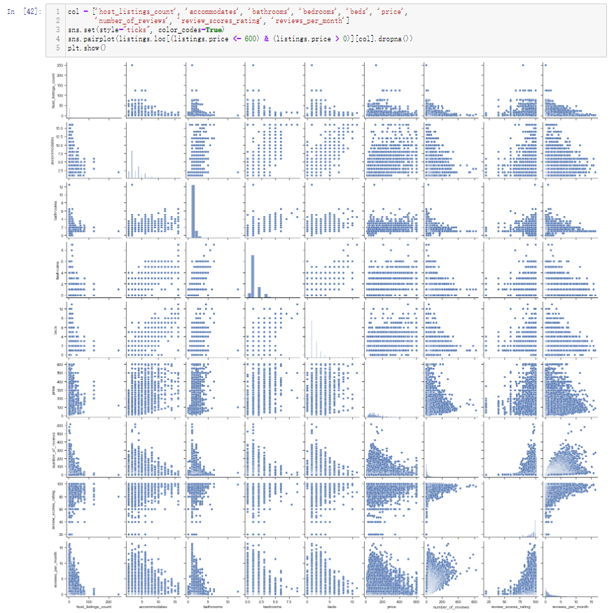
The previous tentative exploration was to specify two fields and then conduct pairwise analysis. You can view all field names through columns, and the output is as follows
The analysis of two separate fields is based on common sense. In daily life, we have subconsciously thought that the two fields may be related. If we have been using this method all the time, it is difficult to excavate potential valuable information. Therefore, we can use pairplot to draw multi field pairwise comparison map or heatmap thermal map to explore the potential relevance
col = ['host_listings_count', 'accommodates', 'bathrooms', 'bedrooms', 'beds', 'price', 'number_of_reviews', 'review_scores_rating', 'reviews_per_month']
sns.set(style="ticks", color_codes=True)
sns.pairplot(listings.loc[(listings.price <= 600) & (listings.price > 0)][col].dropna())
plt.show()
The output results are as follows: (only some fields are selected)
When drawing the thermal map, it should be noted that the graphics drawn by pairplot and heatmap only need to look at the images on the upper and lower sides of the main diagonal, because the generated graphics are symmetrical about the main diagonal
plt.figure(figsize=(18,10))
corr = listings.loc[(listings.price <= 600) & (listings.price > 0)][col].dropna().corr()
plt.figure(figsize = (6,6))
sns.set(font_scale=1)
sns.heatmap(corr, cbar = True, annot=True, square = True, fmt = '.2f', xticklabels=col, yticklabels=col)
plt.show()
The output results are as follows: (the closer the number is to 1, the stronger the correlation between fields. The values of the main diagonal do not need to be 1)
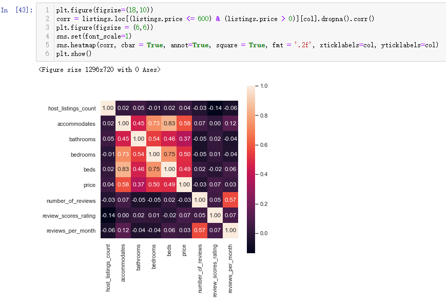
In addition to checking the correlation, the thermodynamic diagram is also important to show the relationship between the three fields. For example, in the correlation diagram above, you can see that the price field has a strong correlation with the bathrooms beds and bedrooms fields. You can use the thermodynamic diagram to show the relationship between the three fields
plt.figure(figsize=(18,10))
sns.heatmap(listings.loc[(listings.price <= 600) & (listings.price > 0)]\
                .groupby(['bathrooms', 'bedrooms'])\
                .count()['price']\
                .reset_index()\
                .pivot('bathrooms', 'bedrooms', 'price')\
                .sort_index(ascending=False),
            cmap="Oranges", fmt='.0f', annot=True, linewidths=0.5)
plt.show()
The output results are as follows: (the thermal diagram explores the relationship between the number of washrooms and bedrooms and the number of houses)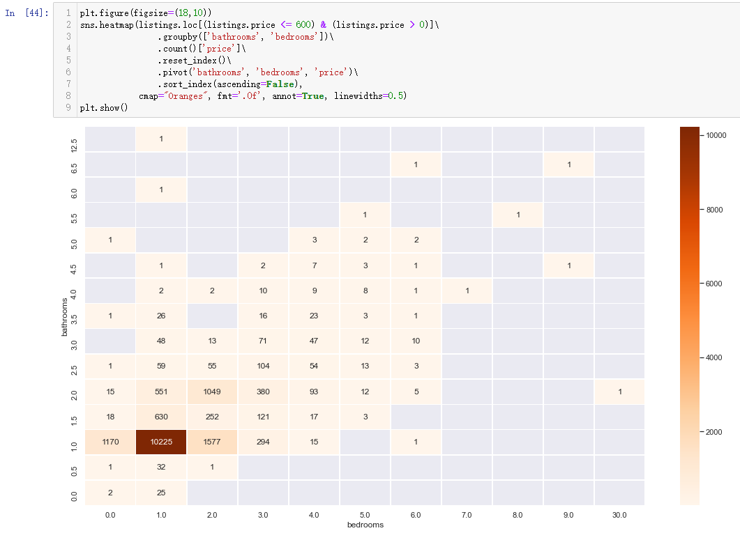
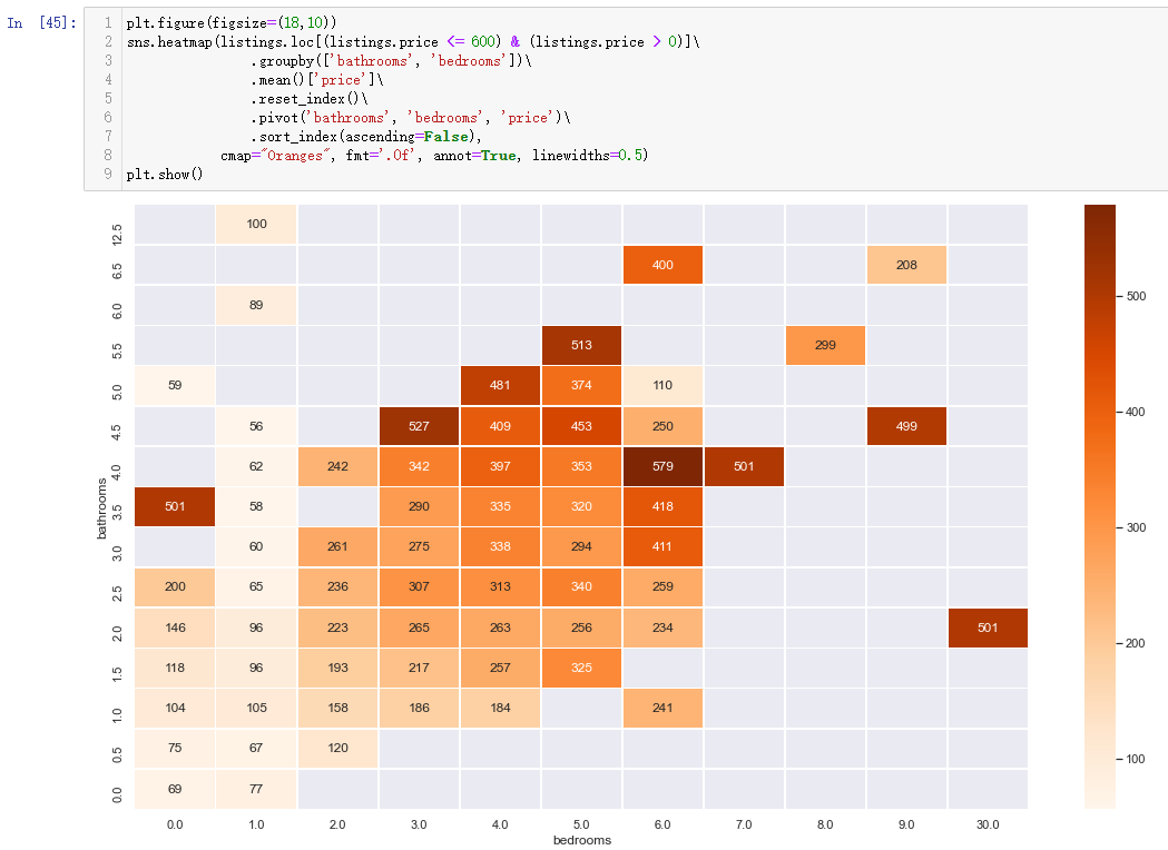
Then changing count() to mean() becomes to explore the relationship between the number of washrooms and bedrooms and the average price of the house
plt.figure(figsize=(18,10))
sns.heatmap(listings.loc[(listings.price <= 600) & (listings.price > 0)]\
                .groupby(['bathrooms', 'bedrooms'])\
                .mean()['price']\
                .reset_index()\
                .pivot('bathrooms', 'bedrooms', 'price')\
                .sort_index(ascending=False),
            cmap="Oranges", fmt='.0f', annot=True, linewidths=0.5)
plt.show()
The output results are as follows:
4 characteristic Engineering
The above contents are the contents to be completed by the traditional data analysis. The analysis process depends on the experience of the data analyst, and the results are displayed in the form of charts. One pain point is that when there are many fields, a lot of images are required for analysis, such as the analysis of three fields and the thermal diagram. At this time, we can explore with the help of machine learning model, but before exploring, we need to process field data and carry out feature engineering. In order to prevent insufficient memory, it is recommended to restart the kernel before feature engineering to ensure the normal operation of subsequent programs. Otherwise, it will remind you of insufficient memory and the program will report an error
import pandas as pd
listings = pd.read_csv('toroto/listings.csv/listings.csv')

listings['price'] = listings['price'].str.replace(',', '')
listings['price'] = listings['price'].str.replace('$', '')
listings['price'] = listings['price'].astype(float)
listings = listings.loc[(listings.price <= 600) & (listings.price > 0)]

listings.amenities = listings.amenities.str.replace("[{}]", "").str.replace('"', "")

listings.amenities.head()
The output results are as follows: (after reading the data, preprocess the price field and facility field according to the previous processing method. Note that the label after the program is run again after restart)
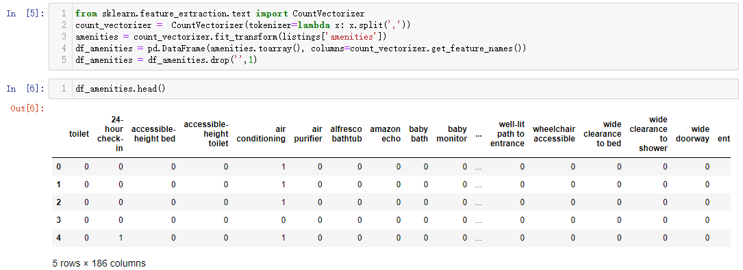
Then carry out feature engineering, first process the text data, characterize the text data, import it into the module processing the text data, and transform the word vector
from sklearn.feature_extraction.text import CountVectorizer
count_vectorizer =  CountVectorizer(tokenizer=lambda x: x.split(','))
amenities = count_vectorizer.fit_transform(listings['amenities'])
df_amenities = pd.DataFrame(amenities.toarray(), columns=count_vectorizer.get_feature_names())
df_amenities = df_amenities.drop('',1)
The output results are as follows: (this process is to encode all categories in the names field, and then form the DataFrame data type)
Then, the two classification fields are processed, and the classifications of true and false are replaced with the 1 and 0 classifications recognized by the computer. When there are multiple binary fields, the for loop can be used for unified data conversion. The code operations are as follows
columns =  ['host_is_superhost', 'host_identity_verified', 'host_has_profile_pic',
                   'is_location_exact', 'requires_license', 'instant_bookable',
                   'require_guest_profile_picture', 'require_guest_phone_verification']
for c in columns:
    listings[c] = listings[c].replace('f',0,regex=True)
    listings[c] = listings[c].replace('t',1,regex=True)
Then fill in the missing values of the price related fields and clean the noise data. Finally, don't forget to convert the numeric fields into floating-point numbers. The code operation is as follows
listings['security_deposit'] = listings['security_deposit'].fillna(value=0)
listings['security_deposit'] = listings['security_deposit'].replace( '[\$,)]','', regex=True ).astype(float)
listings['cleaning_fee'] = listings['cleaning_fee'].fillna(value=0)
listings['cleaning_fee'] = listings['cleaning_fee'].replace( '[\$,)]','', regex=True ).astype(float)
Not all fields in the read data are useful. For example, when judging the correlation between fields in the thermodynamic diagram, the correlation between some fields is 0, so these fields can be directly discarded and the related fields can be selected to form a data set
listings_new = listings[['host_is_superhost', 'host_identity_verified', 'host_has_profile_pic','is_location_exact',
                         'requires_license', 'instant_bookable', 'require_guest_profile_picture',
                         'require_guest_phone_verification', 'security_deposit', 'cleaning_fee',
                         'host_listings_count', 'host_total_listings_count', 'minimum_nights',
                     'bathrooms', 'bedrooms', 'guests_included', 'number_of_reviews','review_scores_rating', 'price']]
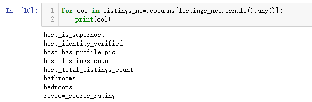
Then let's see if there are still missing values in these fields. Only some fields have been processed above. Here, the missing values still need to be processed after selecting the fields
for col in listings_new.columns[listings_new.isnull().any()]:
    print(col)
The output results are as follows: (it indicates that there are still missing values of fields that have not been processed)
Then, the missing values of these fields are processed and filled according to the median. When the field is a category field, the filling method is median filling, and the price field previously processed is a continuous field, which is filled with the mean value
for col in listings_new.columns[listings_new.isnull().any()]:
    listings_new[col] = listings_new[col].fillna(listings_new[col].median())
Then, the classification fields are uniquely encoded, and the encoded results are combined with the new data
for cat_feature in ['zipcode', 'property_type', 'room_type', 'cancellation_policy', 'neighbourhood_cleansed', 'bed_type']:
    listings_new = pd.concat([listings_new, pd.get_dummies(listings[cat_feature])], axis=1)
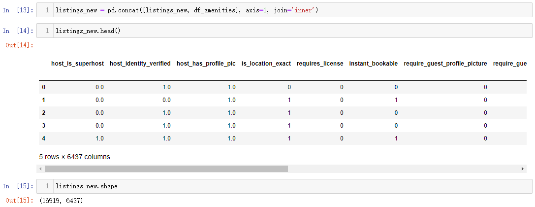
At this time, don't forget that the DataFrame data encoded by text at the beginning also needs to be merged. The merging method is to take the intersection, and finally to the data processed by feature engineering
listings_new = pd.concat([listings_new, df_amenities], axis=1, join='inner')

listings_new.head()

listings_new.shape
The output results are as follows: (only about 1.7w of data is left, but the number of fields has increased to 6000 +)
5 machine learning
5.1 random forest
After the feature engineering is completed, the machine learning model should be created. First, the random forest regression model should be used to see the final effect. The process of model creation and evaluation are as follows
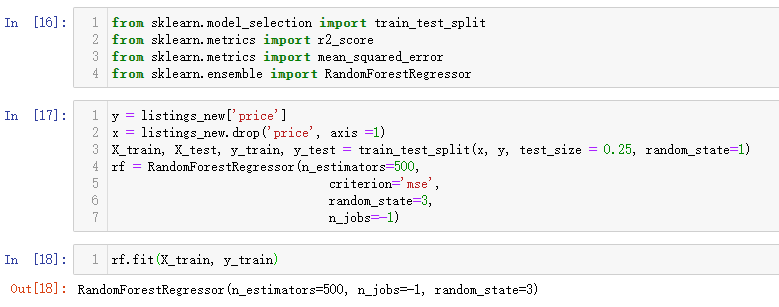
from sklearn.model_selection import train_test_split
from sklearn.metrics import r2_score
from sklearn.metrics import mean_squared_error
from sklearn.ensemble import RandomForestRegressor

y = listings_new['price']
x = listings_new.drop('price', axis =1)
X_train, X_test, y_train, y_test = train_test_split(x, y, test_size = 0.25, random_state=1)
rf = RandomForestRegressor(n_estimators=500,
                               criterion='mse',
                               random_state=3,
                               n_jobs=-1)

rf.fit(X_train, y_train)
The output results are as follows: (x is the remaining fields without labels, y is the label field, and the segmentation data set is generally opened according to 73. Here, the training set is 75%, the test set is 25%, and the random seed state is set to 1. Finally, 500 trees are set for the decision tree model, the evaluation method is mean square difference mse, the random seed state is 3, and - 1 represents that the performance of the selected processor is fully open.)
The training process will be related to the performance of the selected machine. It takes a certain time to run. After running, the model can be used for prediction
y_train_pred = rf.predict(X_train)
y_test_pred = rf.predict(X_test)
rmse_rf= (mean_squared_error(y_test,y_test_pred))**(1/2)

print('RMSE test: %.3f' % rmse_rf)
print('R^2 test: %.3f' % (r2_score(y_test, y_test_pred)))
The output results are as follows: (note that the variables in the brackets of predict are passed in, X_train corresponds to the prediction label calculated by the training set, and X_test corresponds to the prediction label calculated by the test set. The final prediction result can be calculated by comparing the results of the final training set and the test set.)

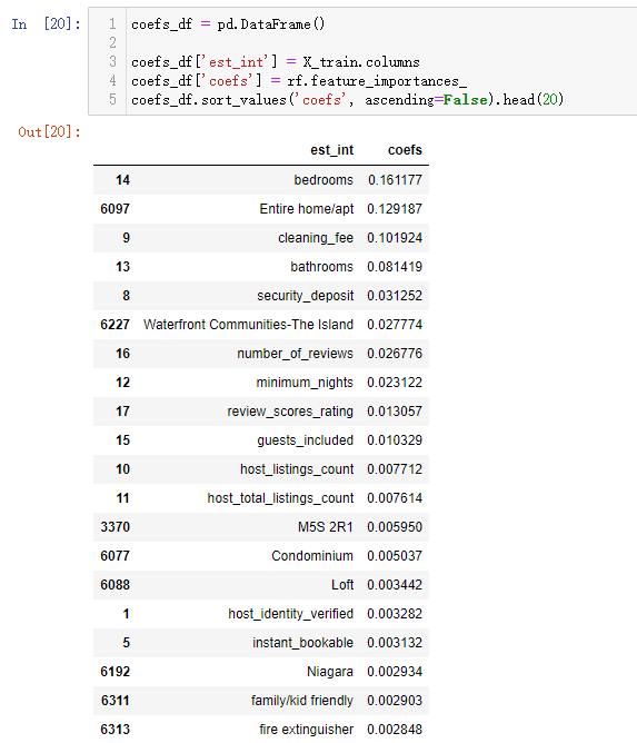
After the prediction results of the model come out, you can also view the most important influencing factors obtained by the model
coefs_df = pd.DataFrame()

coefs_df['est_int'] = X_train.columns
coefs_df['coefs'] = rf.feature_importances_
coefs_df.sort_values('coefs', ascending=False).head(20)
The output results are as follows: (the influencing factors column is the name of the incoming field, and the importance of the influence can be obtained through the feature_imports_ attribute under the trained model)
5.2 LightGBM
The results obtained by modeling with only one model are not comparable, and it is impossible to judge whether the final prediction result is good or bad. Therefore, when making prediction, it is often not only one model, but at least two models are used for comparison, and then the LightGBM model is used for prediction
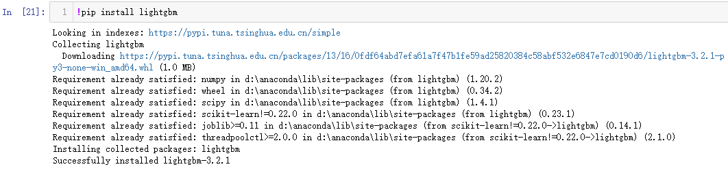
The LightGBM module needs to be installed first. The operation is as follows:
Then, the regression model is imported from the module, and the model is constructed after dividing the data set
from lightgbm import LGBMRegressor

y = listings_new['price']
x = listings_new.drop('price', axis =1)
X_train, X_test, y_train, y_test = train_test_split(x, y, test_size = 0.25, random_state=1)
fit_params={
    "early_stopping_rounds":20,
            "eval_metric" : 'rmse',
            "eval_set" : [(X_test,y_test)],
            'eval_names': ['valid'],
            'verbose': 100,
            'feature_name': 'auto',
            'categorical_feature': 'auto'
           }

X_test.columns = ["".join (c if c.isalnum() else "_" for c in str(x)) for x in X_test.columns]

class LGBMRegressor_GainFE(LGBMRegressor):
    @property
    def feature_importances_(self):
        if self._n_features is None:
            raise LGBMNotFittedError('No feature_importances found. Need to call fit beforehand.')
        return self.booster_.feature_importance(importance_type='gain')

clf = LGBMRegressor_GainFE(num_leaves= 25, max_depth=20,
                         random_state=0,
                         silent=True,
                         metric='rmse',
                         n_jobs=4,
                         n_estimators=1000,
                         colsample_bytree=0.9,
                         subsample=0.9,
                         learning_rate=0.01)
#reduce_train.columns = ["".join (c if c.isalnum() else "_" for c in str(x)) for x in reduce_train.columns]
clf.fit(X_train.values, y_train.values, **fit_params)
The output results are as follows:
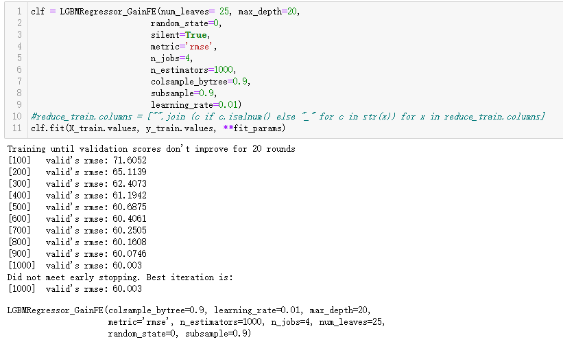
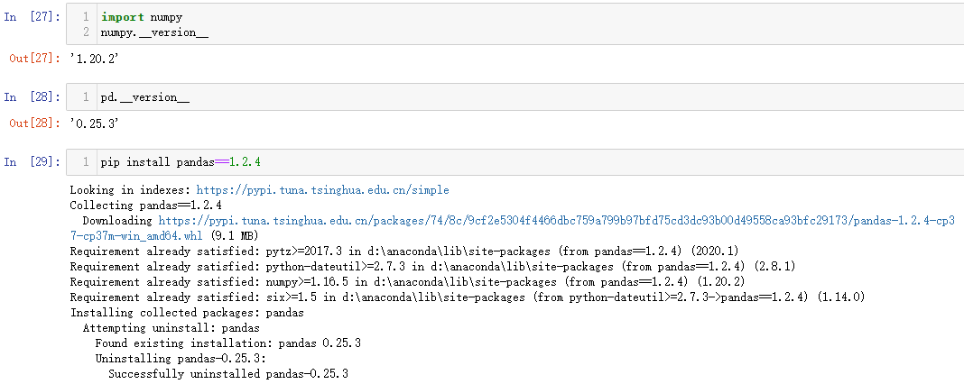
If the output result displayed on the display shows that the model training is successful, but the process is not necessarily smooth. The following errors can be reported: typeerror: cannot interpret '< attribute' dtype 'of' numpy Generic 'Objects >' as a data type. At this time, you can upgrade pandas and numpy versions, such as upgrading pandas to 1.2 4. Upgrade numpy to 1.20 2. Then rerunning the current notebook can perfectly solve this problem
Then you can use the trained model to predict and view the model score, and by the way, you can visualize the important influencing factors
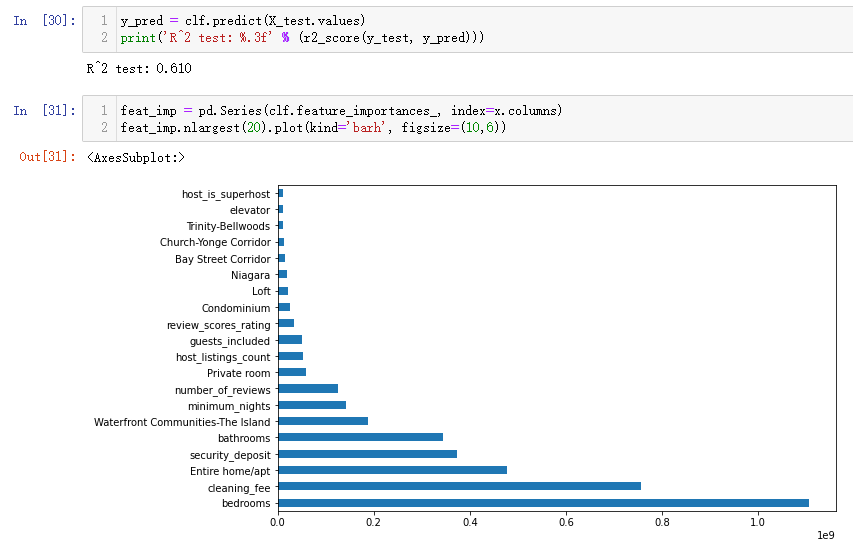
y_pred = clf.predict(X_test.values)
print('R^2 test: %.3f' % (r2_score(y_test, y_pred)))

feat_imp = pd.Series(clf.feature_importances_, index=x.columns)
feat_imp.nlargest(20).plot(kind='barh', figsize=(10,6))
The output results are as follows: (the final score predicted by LightGBM model is higher than that of random forest model, indicating that this data set is more suitable for LightGBM model)
Finally, by comparing the important influencing factors finally given by the two models, it can be found that the first five are the same, but there are differences in order. In addition, the specific explanation of the model will be introduced in detail in the subsequent machine learning section. Here is to clarify the process of data analysis cases and know how to call modules to create models and forecasts