Data visualization
The main purpose of data visualization is to clearly and effectively convey and communicate information with the help of graphical means.
Scenario of data visualization: data visualization is often used in Internet companies for general data reports, mobile charts, large screen visualization, graph editing & graph analysis, geographic visualization, etc.
Common data visualization Libraries
- D3.js is currently the Javascript visual tool library with the highest evaluation on the Web side (difficult to start).
- ECharts.js Baidu produced an open source Javascript data visualization library.
- Highcharts.js foreign front-end data visualization library, non-commercial and free, is used by many large foreign companies.
- AntV ant financial is a new generation of data visualization solution.
Echarts
Echarts - Introduction
ECharts, an open-source visualization library implemented with JavaScript, can run smoothly on PC s and mobile devices, is compatible with most current browsers (IE8/9/10/11, Chrome, Firefox, Safari, etc.), and the underlying layer relies on vector graphics library ZRender , provide intuitive, interactive and highly personalized data visualization charts.
- Is a JS plug-in
- Good performance, smooth operation of PC and mobile devices
- Compatible with mainstream browsers
- Many common charts are available and can be customized.
- Official website: https://echarts.apache.org/zh/index.html
- Official course: [five minutes to start echarts]( https://www.echartsjs.com/zh/tutorial.html#5 Minutes (ECharts)
Echarts - basic use steps
- Step 1: Download Echarts and introduce Echarts: https://echarts.apache.org/zh/download.html ——The chart depends on this js library
<script src="js/echarts.min.js"></script>
- Step 2: prepare a DOM container with size - the generated chart will be put into this container (the container must be size)
<div id="main" style="width: 600px;height:400px;"></div>
- Step 3: initialize the ecarts instance object - instantiate the ecarts object
var myChart = echarts.init(document.getElementById('main'));
- Step 4: specify configuration items and options - modify configuration options according to specific requirements
var option = {
            title: {
                text: 'ECharts Getting started example'
            },
            tooltip: {},
            legend: { //Legend: Legend component (component) legend component shows different series of symbols, colors and names
                data:['sales volume']
            },
            xAxis: { //Axis: axis
                data: ["shirt","cardigan","Chiffon shirt","trousers","high-heeled shoes","Socks"]
            },
            yAxis: {},
            series: [{ //Series: Custom series (Series)
                name: 'sales volume',
                type: 'bar',
                data: [5, 20, 36, 10, 10, 20]
            }]
        };
- Step 5: set the configuration item to the ecarts instance object -- make the ecarts object take effect according to the modified configuration
myChart.setOption(option);
Example code:
<!DOCTYPE html>
<html lang="en">
<head>
    <meta charset="UTF-8">
    <meta name="viewport" content="width=device-width, initial-scale=1.0">
    <meta http-equiv="X-UA-Compatible" content="ie=edge">
    <title>ECharts experience</title>
    <style>
        .box {
            width: 400px;
            height: 400px;
            background-color: pink;
        }
    </style>
    <!-- 1. Download import EChart.js file -->
    <script src="js/echarts.min.js"></script>
</head>
<body>
    <!-- 2. Prepare a box to hold the generated chart. Note: the box must be large and small -->
   <div class="box"></div>
   <script>
    //    3. Initialize the ecarts instance object
     var myChart =  echarts.init(document.querySelector('.box'));
    //  4. Specify configuration items and data
     var option = {
            title: {
                text: 'ECharts Getting started example'
            },
            tooltip: {},
            legend: {
                data:['sales volume']
            },
            xAxis: {
                data: ["shirt","cardigan","Chiffon shirt","trousers","high-heeled shoes","Socks"]
            },
            yAxis: {},
            series: [{
                name: 'sales volume',
                type: 'bar',
                data: [5, 20, 36, 10, 10, 20]
            }]
        };
        // 5. Set the configuration item and data (option) to the instance object (myChart)
        myChart.setOption(option);
   </script>
</body>
</html>
Echarts basic configuration
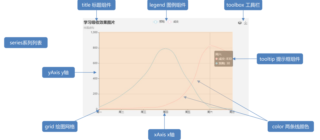
Main configurations to understand: series xAxis yAxis grid tooltip title legend color
For specific configuration items, refer to the configuration item manual on the official website: https://echarts.apache.org/zh/option.html#title
- title: title Component
- tooltip: prompt box component
- legend: legend component
- toolbox: toolbars
- Grid: drawing grid in rectangular coordinate system
- xAxis: the x-axis in the rectangular coordinate system grid
boundaryGap: the blank strategy on both sides of the coordinate axis is true. At this time, the scale is only used as a separation line, and the label and data point will be in the middle of the band between the two scales.
-
yAxis: the y axis in the rectangular coordinate system grid
-
Series: series list
Type: type (what type of chart) for example, line is a broken line bar column, etc
Name: series name, used to display tooltip and filter legend of legend
Stack: data stack. If the same value is set, the data is stacked.
Data stacking: after the series on the same category axis are configured with the same stack value, the values of the next series will be added to the values of the previous series.
Second data value = first data value + second data value
Third data value = second data value + third data value Sequential superposition
If you specify a different value for stack or remove this attribute, the data heap will not occur
-
Color: palette color list
Example code:
<!DOCTYPE html>
<html lang="en">
<head>
<meta charset="UTF-8">
<meta name="viewport" content="width=device-width, initial-scale=1.0">
<meta http-equiv="X-UA-Compatible" content="ie=edge">
<title>customized ECharts Chart related configuration</title>
<style>
.box {
width: 450px;
height: 450px;
background-color: pink;
}
</style>
<script src="js/echarts.min.js"></script>
</head>
<body>
<div class="box"></div>
<script>
var myChart = echarts.init(document.querySelector('.box'));
var option = {
color: ['pink', 'blue', 'green', 'skyblue', 'red'],
title: {
text: 'My line chart'
},
tooltip: {
trigger: 'axis'
},
legend: {
data: ['Live marketing', 'Alliance advertising', 'Video advertising', 'Direct access']
},
grid: {
left: '3%',
right: '3%',
bottom: '3%',
// Whether the grid area contains the scale label of the coordinate axis when the scale label overflows. If true, the scale label is displayed
// If left right is set to 0%, the scale label will overflow. At this time, decide whether to display the scale label
containLabel: true
},
toolbox: {
feature: {
saveAsImage: {}
}
},
xAxis: {
type: 'category',
// The white space strategy on both sides of the coordinate axis is true. At this time, the scale is only used as a separation line, and the label and data point will be in the middle of the band between the two scales.
boundaryGap: false,
data: ['Monday', 'Tuesday', 'Wednesday', 'Thursday', 'Friday', 'Saturday', 'Sunday']
},
yAxis: {
type: 'value'
},
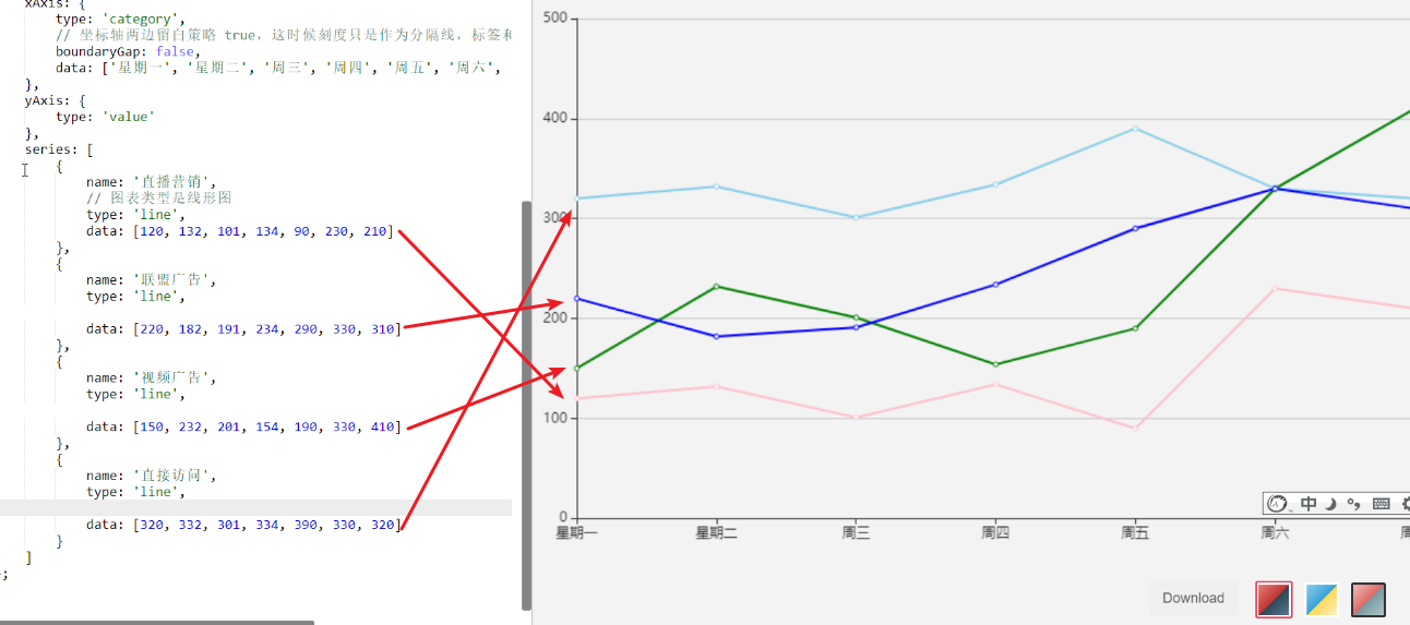
series: [
{
name: 'Live marketing',
// The chart type is linear
type: 'line',
data: [120, 132, 101, 134, 90, 230, 210]
},
{
name: 'Alliance advertising',
type: 'line',
data: [220, 182, 191, 234, 290, 330, 310]
},
{
name: 'Video advertising',
type: 'line',
data: [150, 232, 201, 154, 190, 330, 410]
},
{
name: 'Direct access',
type: 'line',
data: [320, 332, 301, 334, 390, 330, 320]
}
]
};
myChart.setOption(option);
</script>
</body>
</html>
summary
Echarts community
https://gallery.echartsjs.com/explore.html#sort=rank~timeframe=all~author=all
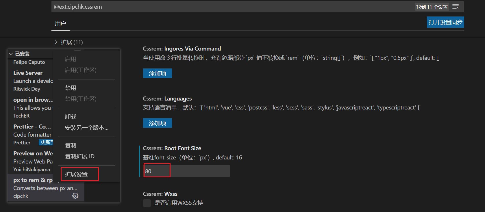
Set the baseline value of the cssrem plug-in
Steps: plug in - configure button - configure extension settings - set in Root Font Size.
But don't forget to restart the vscode software to ensure that it takes effect.
Border images
In order to achieve colorful border effects, a new border image attribute is added in CSS3. This new attribute allows you to specify an image as the border of the element.
Border picture usage scenario
The box sizes are different, but the border styles are the same. At this time, you need a border picture to complete it
Frame picture cutting principle
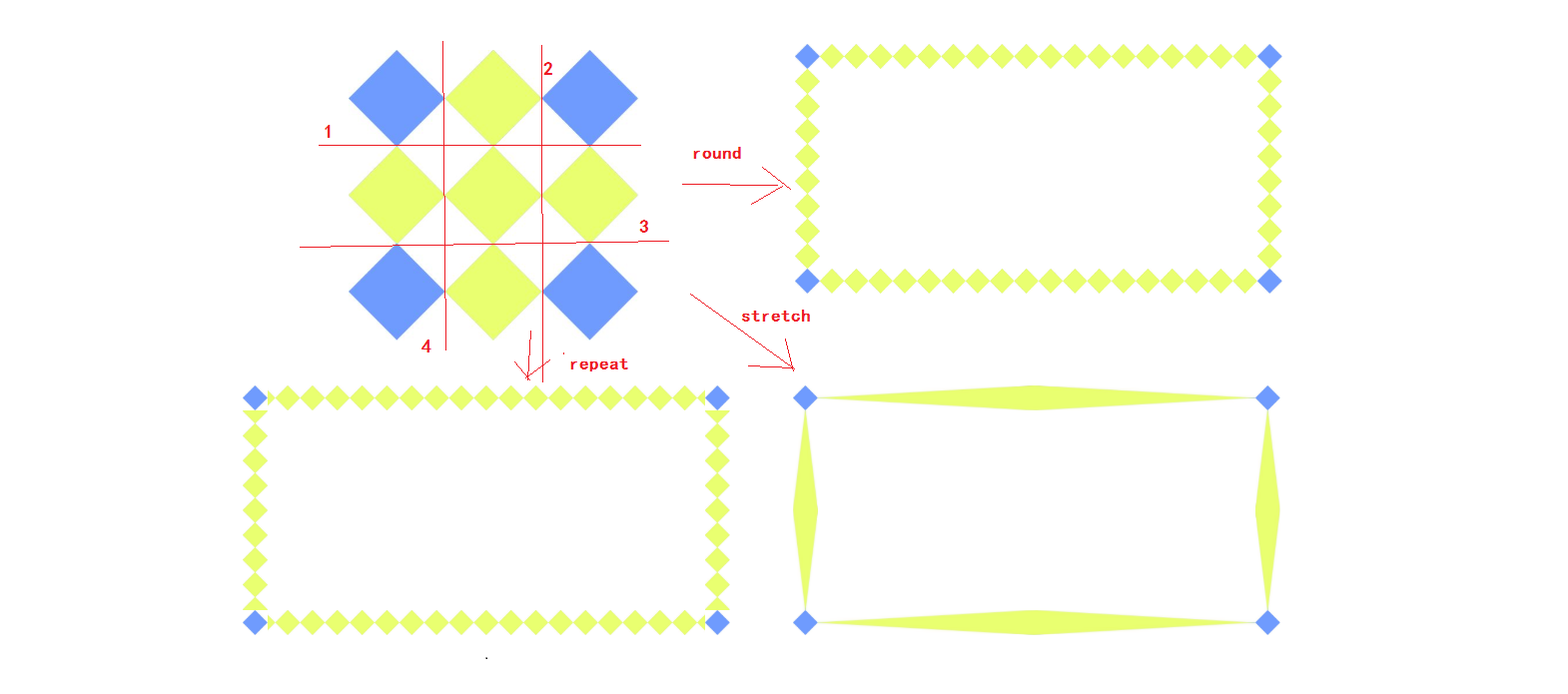
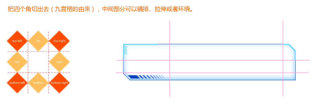
Cut in the order of top right bottom left
Border picture syntax
| attribute | describe |
|---|---|
| border-image-source | The path of the picture used in the border |
| border-image-slice | The picture border is offset inward. (the cut size must be in the order of top, right, bottom and left without adding units) |
| border-image-width | Width of picture border (unit required) |
| border-image-repeat | Whether the picture border should be tiled, round ed, or stretch ed by default |
Combination:
border-image: url("images/border.jpg") 167/20px round;
Split writing:
border-image-source: url("images/border.jpg");
border-image-slice: 167 167 167 167;
border-image-width: 20px;
border-image-repeat: round;
Supplement:
- The unit of clipping size (top right bottom left) is px by default, and 100% can be used.
- The width of the border picture, the default border width.
- Tiling method:
- Stretch stretch (default)
- repeat tiling, starting from the center of the border to both sides, incomplete pictures will appear.
- round surround is a complete tiling using the cut image.
Sample code
<!DOCTYPE html>
<html lang="en">
<head>
    <meta charset="UTF-8">
    <title>Border picture</title>
    <style>
        ul{
            margin: 0;
            padding: 0;
            list-style: none;
        }
        li{
            width: 350px;
            height: 160px;
            border: 20px solid pink;
            margin-top: 20px;
        }
        li:nth-child(1){
            /*border-image: url(images/border.jpg) 167/20px round;*/
            border-image-source: url(images/border.png);
            /* Don't talk to the unit */
            border-image-slice: 30 30 30 30;
            /* border-image-slice: 30; */
            /* This attribute defaults to the width of the border, but there is a difference. This is the width of the border picture and will not squeeze the text */
            border-image-width: 30px;
            /*The surround is complete and tiled using the cut image*/
            border-image-repeat: round;
        }
        li:nth-child(2){
            /*Tiling starts from the center of the border to both sides. Incomplete pictures will appear*/
          border-image: url(images/border.png) 167/20px repeat;
        }
        li:nth-child(3){
            /*Default tiling*/
            border-image: url(images/border.png) 167/20px stretch;
        }
    </style>
</head>
<body>
<ul>
    <li>Origi</li>
    <li></li>
    <li></li>
</ul>
</body>
</html>
Font Icon
Call Font Icon by class name
To use font icons
1. css file in font icon of HTML page
<link rel="stylesheet" href="../style.css">
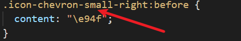
2. The tag can directly call the class name corresponding to the icon.
<span class="icon-chevron-small-right"></span>
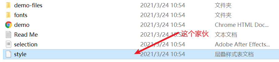
Import a font picture file and change style CSS is placed in the fonts directory, and the modified path is as follows
Note: when importing css files and declaring font icons, you must pay attention to the path problem
Example code:
<!DOCTYPE html>
<html lang="en">

<head>
    <meta charset="UTF-8">
    <meta name="viewport" content="width=device-width, initial-scale=1.0">
    <title>Document</title>
    <link rel="stylesheet" href="fonts/style.css">
</head>

<body>
    <div class="icon-codeigniter"></div>
    <div class="icon-codepen"></div>
</body>

</html>
Call Font Icon through Icon
Steps for using font icons
Font icons are common small icons on some web pages. We can download them directly online. Therefore, the use can be divided into:
- Font icon download
- Introduction of Font Icon (introduced into our html page)
- Addition of font icons (add new small icons later)
Introduction of font icons
After downloading, pay attention not to delete the original file, which will be used later.
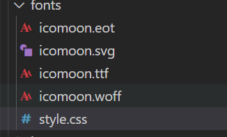
Step 1: put the fonts folder in the download package into the page root directory

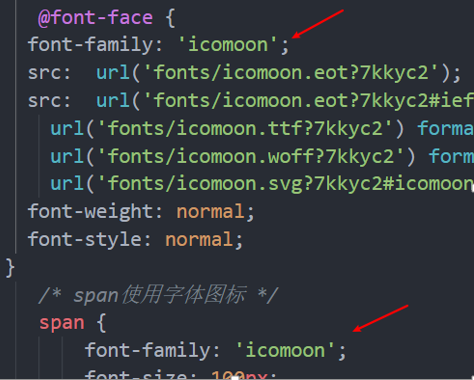
Step 2: declare fonts globally in css Style: simply understand how to introduce these font files into our page through css.
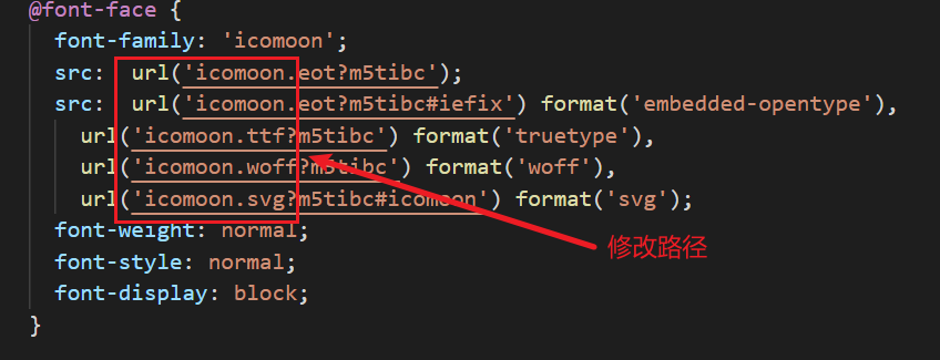
Be sure to pay attention to the font file path
 @font-face {
   font-family: 'icomoon';
   src:  url('fonts/icomoon.eot?7kkyc2');
   src:  url('fonts/icomoon.eot?7kkyc2#iefix') format('embedded-opentype'),
     url('fonts/icomoon.ttf?7kkyc2') format('truetype'),
     url('fonts/icomoon.woff?7kkyc2') format('woff'),
     url('fonts/icomoon.svg?7kkyc2#icomoon') format('svg');
   font-weight: normal;
   font-style: normal;
 }
Step 3: add a small icon in the html tag.
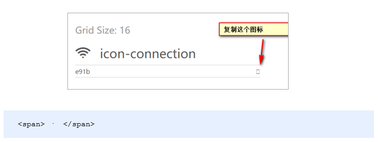
Step 4: define the font for the label.
 span {
   font-family: "icomoon";
 }
Note: make sure this font is consistent with the font in @ font face above
Execute now function usage
In order to prevent variable name conflict (variable pollution), we adopt the immediate execution function strategy
(function () {}) ();

// for example
(function(){
 var num = 10;
})();
(function(){
 var num = 10;
})();
Note: multiple immediate functions must be separated by a semicolon
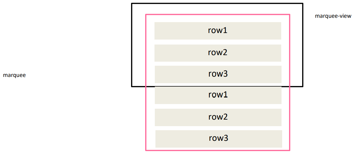
Seamless rolling principle
Step 1: Clone all row s in marquee and append them later
Step 2: realize the animation scrolling marquee through the animation of CSS3
- Use translateY to shift up 50%
- The animation time is 15s, which is played at a uniform speed and executed circularly
Step 3: stop the animation after the mouse passes marquee
animation-play-state: paused;