Next is snowflakes ❄, christmas tree 🎄, new year 💌 And better us
There is no Santa Claus in the world. All gifts come from people who love you
Today, I bring you some beautiful Christmas trees based on HTML+CSS (+ JS). I hope Santa Claus can put you I like on my bed on Christmas day
snowflake and cherry blossoms as well as Romantic greeting card I just did it two days ago. If you are interested, you can also see my blog in the previous two issues:
Snowflakes: https://haiyong.blog.csdn.net/article/details/105786233
cherry blossoms: https://haiyong.blog.csdn.net/article/details/122008942
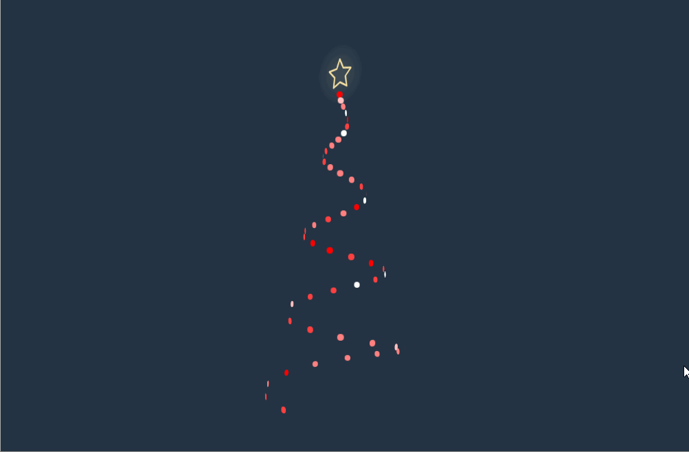
1, Animated Christmas tree using CSS only
Demo address: http://haiyong.site/christmastree1 (it is recommended to use the computer to open it. If there is no response, the mobile terminal will be deformed, or you can look at the Christmas tree behind it)

HTML code:
The HTML code here is complete without deletion
<div class="card-container">
  <div class="snow-flakes-1"></div>
  <div class="snow-flakes-2"></div>
  <h2>Then there are snowflakes, Christmas trees, new year and</h2>
  <h1>Better us</h1>
  <div class="tree-container">
    <div class="ball-0"></div>
    <div class="tree-p1">
      <ul>
        <li>
          <div class="xmas-ball ball-1"></div>
          <div class="tree-left-branch"></div>
        </li>
        <li><div class="tree-right-branch"></div></li>
      </ul>
    </div>
    <div class="tree-p2">
      <ul>
        <li>
          <div class="xmas-ball ball-2"></div>
          <div class="tree-left-branch"></div>
        </li>
        <li>
          <div class="xmas-ball ball-3"></div>
          <div class="tree-right-branch"></div>
        </li>
      </ul>
    </div>
    <div class="tree-p3">
      <ul>
        <li>
          <div class="xmas-ball ball-6"></div>
          <div class="tree-left-branch"></div>
        </li>
        <li>
          <div class="xmas-ball ball-5"></div>
          <div class="xmas-ball ball-4"></div>
          <div class="tree-right-branch"></div>
        </li>
      </ul>
    </div>
    <div class="tree-p4">
      <ul>
        <li>
          <div class="xmas-ball ball-7"></div>
          <div class="xmas-ball ball-8"></div>
          <div class="tree-left-branch"></div>
        </li>
        <li>
          <div class="xmas-ball ball-9"></div>
          <div class="xmas-ball ball-10"></div>
          <div class="tree-right-branch stubborn"></div>
        </li>
      </ul>
    </div>
    <div class="wood"></div>
    <div class="presents">
      <div class="present-container-1">
        <div class="tie"></div>
        <div class="lid"></div>
        <div class="box"></div>
      </div>
      <div class="present-container-2">
        <div class="tie"></div>
        <div class="lid"></div>
        <div class="box"></div>
      </div>
    </div>
  </div>
  <h3>Merry Christmas!</h3>
  <p><span>from haiyong</span></p>
</div>
CSS main code
CSS is quite numerous. I have intercepted some main codes, and I need to have full code to pay attention to the official account [Hai Hui] reply [Christmas tree] or send it to me through the bottom card of the article.
body {
  height: 100vh;
  display: flex;
  justify-content: center;
  align-items: center;
  color: #000;
}

ul {
  list-style-type: none;
}

ul li {
  display: inline-block;
}

h1 {
  font-family: "Mountains of Christmas", cursive;
  font-size: 42px;
  line-height: 60px;
  -webkit-background-clip: text;
  -webkit-text-fill-color: transparent;
}

h1::before, h1::after {
  content: "❆";
  margin: 0 10px;
}

h2 {
  font-family: "Source Sans Pro", sans-serif;
  font-size: 14px;
  text-transform: uppercase;
  letter-spacing: 2px;
}

h3 {
  font-family: "Open Sans Condensed", sans-serif;
  font-weight: 300;
  font-size: 18px;
  letter-spacing: 2px;
  margin-bottom: 5px;
}

p {
  font-family: "Dancing Script", cursive;
  font-size: 20px;
  font-weight: 700;
}

span {
  font-family: "Roboto", sans-serif;
  font-size: 14px;
  font-weight: 400;
}

.card-container {
  height: 675px;
  width: 675px;
  padding: 30px;
  background-color: rgba(255, 255, 255, 0.6);
  border: 8px double #fff;
  border-radius: 20px;
  text-align: center;
  border-radius: 50%;
  -webkit-border-radius: 50%;
  overflow: hidden;
  position: relative;
  -webkit-mask-image: -webkit-radial-gradient(white, black);
}
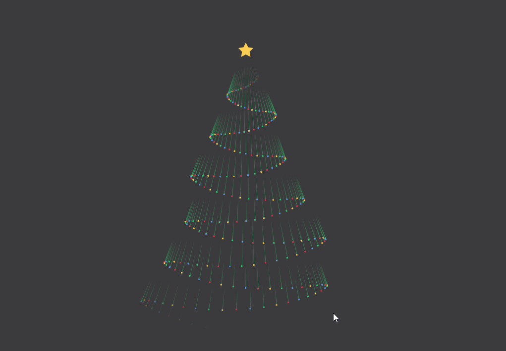
2, Spiral Christmas tree made using CSS only
Demo address: http://haiyong.site/christmastree2 (perfect response on both mobile phone and PC)
HTML code
<div class="tree">
		  <div class="tree__light" style="--appear: 0; --y: 0; --rotate: 1440; --radius: 12.5; --speed: 9.235939340131775; --delay: -2.416794939166802;"></div>
		  <div class="tree__light" style="--appear: 1; --y: 2; --rotate: 1411.2; --radius: 12.25; --speed: 7.165430171444827; --delay: -2.992603509592233;"></div>
		  <div class="tree__light" style="--appear: 2; --y: 4; --rotate: 1382.4; --radius: 12; --speed: 3.5061879558149545; --delay: -0.7704234444726743;"></div>
		  <div class="tree__light" style="--appear: 3; --y: 6; --rotate: 1353.6000000000001; --radius: 11.75; --speed: 4.727223159267884; --delay: -9.55238654379912;"></div>
		  <div class="tree__light" style="--appear: 4; --y: 8; --rotate: 1324.8; --radius: 11.5; --speed: 0.702989829906826; --delay: -4.2545348853934435;"></div>
		  <div class="tree__light" style="--appear: 5; --y: 10; --rotate: 1296; --radius: 11.25; --speed: 6.842573668088441; --delay: -4.560144802030952;"></div>
		  <div class="tree__light" style="--appear: 6; --y: 12; --rotate: 1267.2; --radius: 11; --speed: 5.8193198565131965; --delay: -8.605875056439737;"></div>
		  <!-- The same rule has been written style="--appear: 49;Omitted here for blog brevity-->
		  <div class="tree__light" style="--appear: 49; --y: 98; --rotate: 28.8; --radius: 0.25; --speed: 1.7070837859932286; --delay: -3.8515175108122546;"></div>
		  <svg class="tree__star" xmlns="http://www.w3.org/2000/svg" viewBox="0 0 113.32 108.44" style="--delay: 50">
		    <path d="M90.19 104.33L57.12 87.38 24.4 105l5.91-36.69L3.44 42.65l36.72-5.72 16.1-33.5L73.06 36.6l36.83 4.97-26.35 26.21z" fill="none" stroke-width="6.88" stroke-linecap="round" stroke-linejoin="round"></path>
		  </svg>
		</div>
Complete CSS code
Copy and paste, and you can leave a message in the comment area at the bottom or get the source code according to the way at the end of the text
* {
  box-sizing: border-box;
}
body {
  background: #233343;
  min-height: 100vh;
  display: flex;
  align-items: center;
  justify-content: center;
  perspective: 1200px;
  transform-style: preserve-3d;
}
.tree {
  position: relative;
  height: 50vmin;
  width: 25vmin;
  transform-style: preserve-3d;
  -webkit-animation: spin 2s infinite linear;
          animation: spin 2s infinite linear;
}
.tree__light {
  transform-style: preserve-3d;
  position: absolute;
  height: 1vmin;
  width: 1vmin;
  border-radius: 50%;
  -webkit-animation: flash calc(var(--speed) * 1s) calc(var(--delay) * 1s) infinite steps(4), appear 0.5s calc(var(--appear) * 0.05s) both;
          animation: flash calc(var(--speed) * 1s) calc(var(--delay) * 1s) infinite steps(4), appear 0.5s calc(var(--appear) * 0.05s) both;
  left: 50%;
  transform: translate(-50%, 50%) rotateY(calc(var(--rotate, 0) * 1deg)) translate3d(0, 0, calc(var(--radius, 0) * 1vmin));
  bottom: calc(var(--y, 0) * 1%);
}
.tree__star {
  stroke-width: 5vmin;
  stroke: #f5e0a3;
  filter: drop-shadow(0 0 2vmin #fcf1cf);
  height: 5vmin;
  width: 5vmin;
  overflow: visible !important;
  bottom: 100%;
  left: 50%;
  transform: translate(-50%, 0);
  position: absolute;
  stroke-dasharray: 1000 1000;
  fill: none;
  -webkit-animation: stroke 1s calc((var(--delay) * 0.95) * 0.05s) both;
          animation: stroke 1s calc((var(--delay) * 0.95) * 0.05s) both;
}
@-webkit-keyframes stroke {
  from {
    stroke-dashoffset: -1000;
  }
}
@keyframes stroke {
  from {
    stroke-dashoffset: -1000;
  }
}
@-webkit-keyframes spin {
  to {
    transform: rotateY(360deg);
  }
}
@keyframes spin {
  to {
    transform: rotateY(360deg);
  }
}
@-webkit-keyframes appear {
  from {
    opacity: 0;
  }
}
@keyframes appear {
  from {
    opacity: 0;
  }
}
@-webkit-keyframes flash {
  0%, 100% {
    background: #f00;
  }
  20% {
    background: #fff;
  }
  40% {
    background: #f00;
  }
  60% {
    background: #fff;
  }
  80% {
    background: #f00;
  }
}
@keyframes flash {
  0%, 100% {
    background: #f00;
  }
  20% {
    background: #fff;
  }
  40% {
    background: #f00;
  }
  60% {
    background: #fff;
  }
  80% {
    background: #f00;
  }
}
3, Christmas tree made with HTML+CSS+JS
Demo address: http://haiyong.site/christmastree3 (it is better to preview on the PC side)

HTML is relatively long. It is packaged in the source code and received by yourself at the end of the text
Full CSS
body {
  background-color:#151522;
  overflow: hidden;
    display: flex;
  align-items: center;
  justify-content: center;
}

body,
html {
  height: 100%;
  width: 100%;
  margin: 0;
  padding: 0;
}


svg{
  width:90%;
  height:90%;
  visibility:hidden;

}
Partial JS
MorphSVGPlugin.convertToPath('polygon');
	var xmlns = "http://www.w3.org/2000/svg",
	  xlinkns = "http://www.w3.org/1999/xlink",
	select = function(s) {
	    return document.querySelector(s);
	  },
	  selectAll = function(s) {
	    return document.querySelectorAll(s);
	  },
	  pContainer = select('.pContainer'),
	  mainSVG = select('.mainSVG'),
	  star = select('#star'),
	  sparkle = select('.sparkle'),
	  tree = select('#tree'),
	  showParticle = true,
	  particleColorArray = ['#E8F6F8', '#ACE8F8', '#F6FBFE','#A2CBDC','#B74551', '#5DBA72', '#910B28', '#910B28', '#446D39'],
	  particleTypeArray = ['#star','#circ','#cross','#heart'],
	  particlePool = [],
	  particleCount = 0,
	  numParticles = 201


	gsap.set('svg', {
	  visibility: 'visible'
	})

	gsap.set(sparkle, {
		transformOrigin:'50% 50%',
		y:-100
	})

	let getSVGPoints = (path) => {

		let arr = []
		var rawPath = MotionPathPlugin.getRawPath(path)[0];
		rawPath.forEach((el, value) => {
			let obj = {}
			obj.x = rawPath[value * 2]
			obj.y = rawPath[(value * 2) + 1]
			if(value % 2) {
				arr.push(obj)
			}
		})
		return arr;
	}
	let treePath = getSVGPoints('.treePath')
	var treeBottomPath = getSVGPoints('.treeBottomPath')
	var mainTl = gsap.timeline({delay:0, repeat:0}), starTl;
	function flicker(p){
	  gsap.killTweensOf(p, {opacity:true});
	  gsap.fromTo(p, {
	    opacity:1
	  }, {
			duration: 0.07,
	    opacity:Math.random(),
	    repeat:-1
	  })
	}

	function createParticles() {
	  var i = numParticles, p, particleTl, step = numParticles/treePath.length, pos;
	  while (--i > -1) {

	    p = select(particleTypeArray[i%particleTypeArray.length]).cloneNode(true);
	    mainSVG.appendChild(p);
	    p.setAttribute('fill', particleColorArray[i % particleColorArray.length]);
	    p.setAttribute('class', "particle");
	    particlePool.push(p);
	    gsap.set(p, {
	                 x:-100,
	                 y:-100,
	   transformOrigin:'50% 50%'
	                 })
	  }

	}

	var getScale = gsap.utils.random(0.5, 3, 0.001, true);

	function playParticle(p){
	  if(!showParticle){return};
	  var p = particlePool[particleCount]
	 gsap.set(p, {
		 x: gsap.getProperty('.pContainer', 'x'),
		 y: gsap.getProperty('.pContainer', 'y'),
		 scale:getScale()
	    }
	    );
	var tl = gsap.timeline();
	  tl.to(p, {
			duration: gsap.utils.random(0.61,6),
	      physics2D: {
	        velocity: gsap.utils.random(-23, 23),
	        angle:gsap.utils.random(-180, 180),
	        gravity:gsap.utils.random(-6, 50)
	      },
	      scale:0,
	      rotation:gsap.utils.random(-123,360),
	      ease: 'power1',
	      onStart:flicker,
	      onStartParams:[p],
	      //repeat:-1,
	      onRepeat: (p) => {
	        gsap.set(p, {
	            scale:getScale()
	        })
	      },
	      onRepeatParams: [p]

	    });

	  particleCount++;
	  particleCount = (particleCount >=numParticles) ? 0 : particleCount

	}

	function drawStar(){

	  starTl = gsap.timeline({onUpdate:playParticle})
	  starTl.to('.pContainer, .sparkle', {
			duration: 6,
			motionPath :{
				path: '.treePath',
	      autoRotate: false
			},
	    ease: 'linear'
	  })
	  .to('.pContainer, .sparkle', {
			duration: 1,
	    onStart:function(){showParticle = false},
	    x:treeBottomPath[0].x,
	    y:treeBottomPath[0].y
	  })
	  .to('.pContainer, .sparkle',  {
			duration: 2,
	    onStart:function(){showParticle = true},
			motionPath :{
				path: '.treeBottomPath',
	      autoRotate: false
			},
	    ease: 'linear'
	  },'-=0')
	.from('.treeBottomMask', {
			duration: 2,
	  drawSVG:'0% 0%',
	  stroke:'#FFF',
	  ease:'linear'
	},'-=2')

	}


	createParticles();
	drawStar();
	//ScrubGSAPTimeline(mainTl)

	mainTl.from(['.treePathMask','.treePotMask'],{
		duration: 6,
	  drawSVG:'0% 0%',
	  stroke:'#FFF',
		stagger: {
			each: 6
		},
	    duration: gsap.utils.wrap([6, 1,2]),
	  ease:'linear'
	})
	.from('.treeStar', {
		duration: 3,
	  //skewY:270,
	  scaleY:0,
	  scaleX:0.15,
	  transformOrigin:'50% 50%',
	  ease: 'elastic(1,0.5)'
	},'-=4')

	 .to('.sparkle', {
		duration: 3,
	    opacity:0,
	    ease:"rough({strength: 2, points: 100, template: linear, taper: both, randomize: true, clamp: false})"
	  },'-=0')
	  .to('.treeStarOutline', {
		duration: 1,
	    opacity:1,
	    ease:"rough({strength: 2, points: 16, template: linear, taper: none, randomize: true, clamp: false})"
	  },'+=1')
	mainTl.add(starTl, 0)
	gsap.globalTimeline.timeScale(1.5);
4, Meteor Christmas tree using CSS only
Demo address: http://haiyong.site/christmastree4 (responsive, preview on both mobile phone and PC)
HTML code
<ul>
 <li></li>
  <li></li>
  <li></li>
  <li></li>
  <li></li>
</ul>
<ul>
<!-- 256 lines are omitted here <li></li> -->
</ul>
CSS code
:root {
  --background:#3C3B3D;
}

body {
  background: var(--background);
}
body ul {
  padding: 0;
}
body ul li {
  list-style: none;
}
body ul:nth-child(1) {
  position: absolute;
  top: 20vh;
  left: 50%;
  width: 1rem;
  height: 1rem;
  border-radius: 100%;
  transform: translate(-50%, -50%);
}
body ul:nth-child(1) li {
  position: absolute;
  width: 0;
  height: 0;
  border-width: 0 0.5rem 1rem 0.5rem;
  border-style: solid;
  border-color: transparent;
  border-bottom-color: #FFCE54;
  transform-origin: 0.5rem 1rem;
}
body ul:nth-child(1) li:nth-child(0) {
  transform: rotate(0deg);
}
body ul:nth-child(1) li:nth-child(1) {
  transform: rotate(72deg);
}
body ul:nth-child(1) li:nth-child(2) {
  transform: rotate(144deg);
}
body ul:nth-child(1) li:nth-child(3) {
  transform: rotate(216deg);
}
body ul:nth-child(1) li:nth-child(4) {
  transform: rotate(288deg);
}
body ul:nth-child(2) li {
  position: absolute;
  top: 20vh;
  left: 50%;
  width: 0.0625rem;
  height: 60vh;
  transform-origin: 50% 0%;
}
body ul:nth-child(2) li:nth-child(1) {
  transform: rotate(4.9322004015deg);
}
body ul:nth-child(2) li:nth-child(1):before, body ul:nth-child(2) li:nth-child(1):after {
  -webkit-animation-delay: -0.015625s;
          animation-delay: -0.015625s;
}
body ul:nth-child(2) li:nth-child(2) {
  transform: rotate(7.7960629984deg);
}
body ul:nth-child(2) li:nth-child(2):before, body ul:nth-child(2) li:nth-child(2):after {
  -webkit-animation-delay: -0.03125s;
          animation-delay: -0.03125s;
}
body ul:nth-child(2) li:nth-child(3) {
  transform: rotate(10.5294548885deg);
}
body ul:nth-child(2) li:nth-child(3):before, body ul:nth-child(2) li:nth-child(3):after {
  -webkit-animation-delay: -0.046875s;
          animation-delay: -0.046875s;
}
/* ...... */
/* The same rule until 256 */
body ul:nth-child(2) li:nth-child(256) {
  transform: rotate(2deg);
}
body ul:nth-child(2) li:nth-child(256):before, body ul:nth-child(2) li:nth-child(256):after {
  -webkit-animation-delay: -4s;
          animation-delay: -4s;
}
body ul:nth-child(2) li:before, body ul:nth-child(2) li:after {
  content: "";
  position: absolute;
  top: 0%;
  -webkit-animation: fall 4s linear infinite;
          animation: fall 4s linear infinite;
}
body ul:nth-child(2) li:before {
  width: 0.0625rem;
  height: 3rem;
  background: linear-gradient(rgba(46, 204, 113, 0), rgba(46, 204, 113, 0.5));
}
body ul:nth-child(2) li:after {
  bottom: 0;
  transform: translate(-50%, 3rem);
  width: 0.1875rem;
  height: 0.1875rem;
  border-radius: 100%;
  background: #ffce54;
}
body ul:nth-child(2) li:nth-child(4n):after {
  background: #D8334A;
}
body ul:nth-child(2) li:nth-child(4n+1):after {
  background: #FFCE54;
}
body ul:nth-child(2) li:nth-child(4n+2):after {
  background: #2ECC71;
}
body ul:nth-child(2) li:nth-child(4n+3):after {
  background: #5D9CEC;
}

@-webkit-keyframes fall {
  0% {
    opacity: 0;
    top: 0%;
  }
  5% {
    opacity: 0;
  }
  15%, 90% {
    opacity: 1;
  }
  100% {
    opacity: 0;
    top: 100%;
  }
}

@keyframes fall {
  0% {
    opacity: 0;
    top: 0%;
  }
  5% {
    opacity: 0;
  }
  15%, 90% {
    opacity: 1;
  }
  100% {
    opacity: 0;
    top: 100%;
  }
}
5, Christmas tree in crystal ball
Demo address: http://haiyong.site/christmastree5 (responsive, preview on both mobile phone and PC)

CSS complete code
html, body {
    margin:0;
    width: 100%;
    height: 100%;
    position: absolute;
    overflow: hidden;
    background: linear-gradient(135deg, rgba(180,186,214,1) 0%, rgba(232,203,192,1) 100%);
}

.content {
    text-align: center;
    width: 100%;
}

svg {
    max-width: 575px;
}

#canvas {
    border-radius: 50%;
    position: relative;
    width: 310px;
    height: 290px;
    top: 10px;
    left: 0px;
}

.canvas_container {
    position: absolute;
    width: 100%;
}

.draw_container {
    position: absolute;
    top: 50px;
    width: 100%;
}
JS complete code
$(function() {
		    var canvas = $("#canvas")[0];
		    var ctx = canvas.getContext("2d");
		    var WIDTH = 320;
		    var HEIGHT = 320;
		    canvas.width = WIDTH;
		    canvas.height = HEIGHT;
		    clearCanvas();

		    var particles = [];
		    for (var i = 0; i < WIDTH; i++) {
		        particles.push({
		            x: Math.random() * WIDTH,
		            y: Math.random() * HEIGHT,
		            r: Math.random() * 2 + 1
		        })
		    }

		    function draw() {
		        clearCanvas();
		        ctx.fillStyle = "rgba(255, 255, 255, 0.6)";
		        ctx.beginPath();

		        for (let i = 0; i < WIDTH; i++) {
		            let p = particles[i];
		            ctx.moveTo(p.x, p.y);
		            ctx.arc(p.x, p.y, p.r, 0, Math.PI * 2, true);
		        }
		        ctx.fill();
		        update();
		    }

		    function update() {
		        for (let i = 0; i < WIDTH; i++) {
		            let p = particles[i];
		            p.y += p.r;
		            if (p.y > canvas.height) {
		                particles[i] = {
		                    x: Math.random() * canvas.width,
		                    y: -10,
		                    r: p.r
		                };
		            }
		        }
		    }
		    var timer = setInterval(draw, 50);

		    function clearCanvas() {
		        ctx.clearRect(0, 0, canvas.width, canvas.height);
		    }

		})
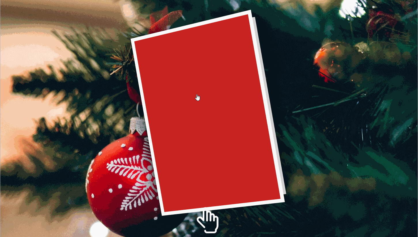
6, Christmas card
Demo address: http://haiyong.site/shengdanheka
There are more interesting and interesting articles. If you are interested, you can see:
- Making 3D cherry blossoms and romantic envelopes with HTML
- Using HTML, CSS and JS to achieve simple snow effects
- Eleven Valentine's Day confession cute games and animations based on HTML/CSS/JS
- Responsive Santa Claus over the cliff games based on HTML5/CSS/JS
I have packed all the codes in this article and give them to you as Christmas gifts for free. There are three ways to get them:
1.CSDN resource download (this needs to be paid, and white prostitutes can look down) https://download.csdn.net/download/qq_44273429/66838216
2., pay attention to official account.
3. Get the contact information of the blogger through the card below, and remember to note CSDN 👇👇👇