When we use the styles of third-party component libraries, we often need to modify the default styles of components according to our own needs.
When we use the third-party component library, the style of the component we write appears in the front, and the style of the plug-in (third-party component library) will come in from the back and overwrite the style we write. Therefore, if we directly add classes and styles to this component, we cannot successfully modify the original style of the component.
1. The role of scoped
scoped works only for the current component and does not pollute the global style
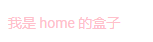
For example, if I'm at home Vue is written in this component as follows
 <template>
  <div class="test">
    <div class="box">I am home My box</div>
  </div>
</template>


<script>
export default {
  name: 'home'
}
</script>


<style lang="scss" scoped>
.test{
  .box{
    color:pink;
  }
}
</style>
 <template>
  <div class="test">
    <div class="box">I am index My box</div>
  </div>
</template>


<script>
export default {
  name: 'index'
}
</script>


<style lang="scss" scoped>
.test{
  .box{
    color: skyblue;
  }
}
</style>
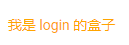
 <template>
  <div class="test">
    <div class="box">I am login My box</div>
  </div>
</template>


<script>
export default {
  name: 'login'
}
</script>

<style lang="scss" scoped>
.test{
  .box{
    color: orange;
  }
}
</style>
index. The running style of Vue is

login.vue's style is

This is the role of scoped, although we are in the three components index vue, home.vue and login The style class names written in Vue are the same, but due to scoped, the style can only be used in the current component. Therefore, the color of box in the three pages corresponds to the css style in their pages.
Look, if I remove the scoped in the three pages at the same time, and then refresh the page, we will find that at this time, in the process of switching the three pages for many times, the styles of the three pages will pollute each other, and the styles are very chaotic, It's not that we want the three pages to have different colors (the following screenshot is just one of them. You can test it by yourself. Here we just want to explain that the running style can't realize the fonts of three different colors on the three pages).


The reason for this is that we have removed the scoped. The css style written in the current component will pollute (affect) the styles of other components, so it can not achieve the style effect we want. Therefore, in general development, the scoped attribute will be added to prevent the styles from directly polluting each other.
2. Style penetration
When using a third-party library, if we want to use the style of the third-party library, we don't want to modify the global style of the attribute of the third-party library.
Simply put, for example, the default width of the button button of a component of a third-party library is 70px (the default style can be understood as one of the global styles of the button of the third-party component library).I hope I use this button on page A, but I don't think it's wide enough. I want to change it to 150px. At the same time, I want to use the button on another page B, but on page B, I think 70px is just good. At this time, I just want to modify page B. the width of the button on this page is 150px, and the width of the button on other pages remains unchanged. It is still the default global style of 70px.
In this case, I want to modify the button style of the third-party component library. At the same time, we also need to use scoped to prevent the style in the B page I modify from polluting the button style of other pages. However, if we directly add a style to this component in css, we will find that the css we add will not take effect.
The reason is that we said at the beginning that the style of the component we wrote appears in the front, and the style of the plug-in (third-party component library) will come in from the back and overwrite the style we wrote.
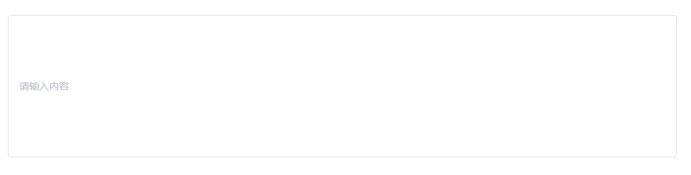
For example, using the input of element UI, the default style of code and operation is as follows
<el-input placeholder="Please enter the content"></el-input>

Now I want to change the height of the input field to 200px, and try the following ways
(1) Add a class description and style to it
<template>
  <div class="test">
      <el-input class="input-box" placeholder="Please enter the content"></el-input>
  </div>
</template>


<style lang="scss" scoped>
.test {
  .input-box {
    height: 200px;
  }
}
</style>
After running, we found that this writing does not take effect
(2) F12 call out the console, find the html corresponding to input, and find the class name added to input by default by the third-party library

Here you are el-input__ Adding styles inside and removing scoped is effective, but we should use style penetration when we don't want to remove scoped.
.test {
  .el-input__inner {
    height: 200px;
  }
}
(3) Penetration scoped
At this time, you need to modify the third-party component library style in local components without removing the scoped attribute, resulting in style coverage between components. At this time, we can penetrate the scoped in a special way.
1,stylus Style penetration
Outer layer >>> Third party components {
    style
}

2,sass and less Style penetration
// grammar
 Outer layer /deep/ Third party components {
    style
}
The code should be modified as follows. The outer container is test, that is, this part of css only takes effect in the test container.
<template>
  <div class="test">
      <el-input class="input-box" placeholder="Please enter the content"></el-input>
  </div>
</template>

<style lang="scss" scoped>
  .test /deep/ .el-input__inner {
    height: 200px;
  }
</style>
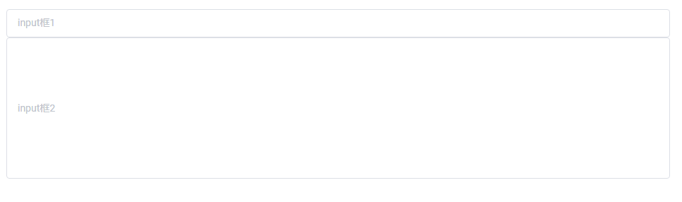
At this time, you can see that the input is successfully modified to 200px high
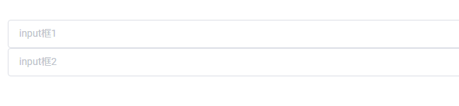
If we add another input outside the test container, we will find that the height of the input added later is still the default height, not 200px, because the outer container is test, and the modified style only takes effect in the test container, but does not work in the container outside test.
<el-input class="input-box" placeholder="input Box 1"></el-input>
<div class="test">
  <el-input class="input-box" placeholder="input Box 2"></el-input>
</div>


<style lang="scss" scoped>
.test /deep/ .el-input__inner {
  height: 200px;
}
</style>
3. Style penetration and inline style
When I was using ElementUI components, I found that style penetration did not take effect. Later, I saw that the official provided modifiable properties. Directly modifying the value of the officially provided properties can take effect.
(but * * if we add inline styles directly to the third-party library, we can't achieve the desired style effect * *)
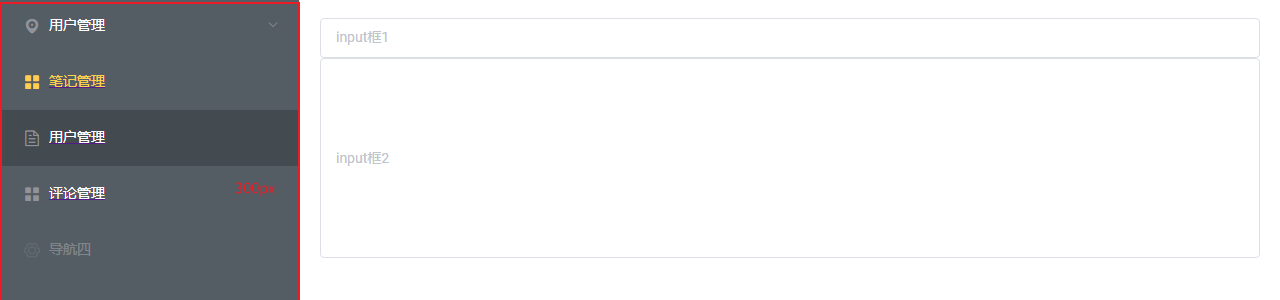
For example, we directly add an inline style="height: 200px" to input
<el-input  placeholder="input Box 1" ></el-input>
<div class="test">
    <el-input style="height:  200px" placeholder="input Box 2"></el-input>
</div>
It can be found that adding inline styles directly without style penetration does not effectively change the input box of the input box to 200px. But the overall box of our input becomes 200px.

So that's why you want to use style penetration instead of inline style to modify directly.
However, if the official provides a modifiable parameter, you can directly modify the style through this parameter.
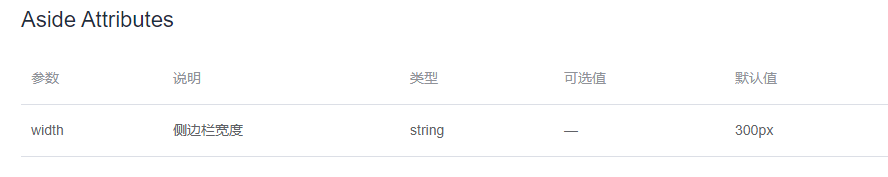
- It refers to a left menu bar of elementUI, with a default width of 300px
<el-aside >
	Omitted here
</el-aside>
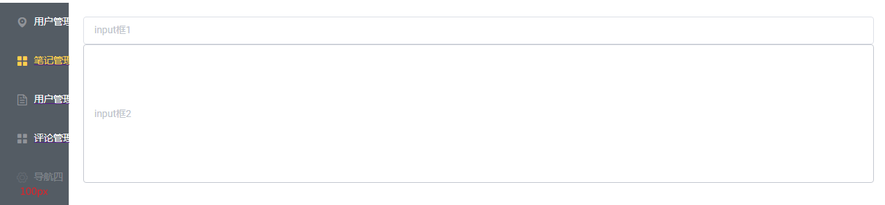
- Through style penetration, change the width to 100px (not effective)
.admin /deep/ .el-aside{
  width: 100px;
}
- It takes effect by modifying the official inline style
<el-aside style="width: 100px">
	ellipsis
</el-aside>
Review the priority of styles
Inline style > ID selector > class selector = attribute selector = pseudo class selector > label selector = pseudo element selector
In other words, inline styles have the highest priority. The modifiable attribute officially provided by ElementUI is to modify inline styles directly.
The modified style through style penetration only modifies the style of the class selector encapsulated by the ElementUI. The priority is lower than the inline style, so it cannot take effect.
The above is only personal understanding. Please correct it in time.