More than one fan asked questions in the communication group. The results of his single cell difference analysis showed that the p value was too significant and infinitely close to 0, resulting in a very strange volcanic map!
This is due to the characteristics of a single cell. The number of cells in its two groups is too large, and the probability will lead to the p value being too significant and infinitely close to 0. Let's take the pbmc3k data set in SeuratData package as an example:
library(SeuratData) #Load the seurat dataset
getOption('timeout')
options(timeout=10000)
# InstallData("pbmc3k")
data("pbmc3k")
sce <- pbmc3k.final
library(Seurat)
table(Idents(sce))
deg = FindMarkers(sce,ident.1 = 'NK',
            ident.2 = 'B')
head(deg[order(deg$p_val),])
It can be seen that we use the difference results of NK cells and B cells here:
> head(deg[order(deg$p_val),])
            p_val avg_log2FC pct.1 pct.2    p_val_adj
GZMB 3.186146e-97   5.507567 0.961 0.017 4.369480e-93
NKG7 1.262672e-94   6.262287 1.000 0.087 1.731628e-90
PRF1 1.835435e-93   4.612813 0.948 0.029 2.517115e-89
GZMA 3.036581e-93   4.466820 0.929 0.015 4.164367e-89
CTSW 3.151498e-93   4.203776 0.987 0.070 4.321965e-89
CST7 9.767143e-92   4.380031 0.948 0.038 1.339466e-87
> table(Idents(sce))

 Naive CD4 T Memory CD4 T   CD14+ Mono            B        CD8 T
         697          483          480          344          271
FCGR3A+ Mono           NK           DC     Platelet
         162          155           32           14
The difference analysis result at this time is actually the marker genes of the two single-cell subsets. Compared with B cells, the genes that are statistically significantly up-regulated in the NK cell subsets shown above are "gzmB", "nkg7", "PRF1", "gzma", "ctsw" and "cst7", which are characteristic marker genes of NK cells.
A simple volcano map, using the enhanced volcano package, with the code as follows:
library(EnhancedVolcano)
EnhancedVolcano(res,
                lab = rownames(res),
                x = 'avg_log2FC',
                y = 'p_val_adj')
The effect is as follows:
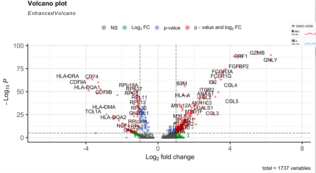
Or a good volcanic map
Because the volcanic map of this example is OK, there is no situation that the p value is too significant and infinitely close to 0. Because the number of cells is not large, it is only the difference analysis of 155 NK cells and 344 B cells. However, if it is a real single-cell data set, the number of cells is very considerable, and it is easy to see that the p value is too significant and infinitely close to 0. The volcanic map code above may have strange visualization effects.
I happened to see an interesting presentation recently, that is to ignore the p value of this statistical index, because it is statistically significant anyway, which can be greater than 0.01. No matter how small the p value is, it is not the focus of our concern.
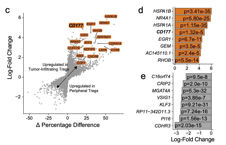
The article published in NATURE COMMUNICATIONS | (2021): CD177 modules the function and homeostasis of tumor infiltrating regulatory T cells, the link is: https://www.nature.com/articles/s41467-021-26091-4
As follows:
Another way to map volcanoes
The article describes the two diagrams as follows:
- c Differential gene expression analysis using the log-fold change expression versus the difference in the percentage of cells expressing the gene comparing TI versus PB Treg cells (Δ Percentage Difference). Genes labeled have log-fold change > 1, Δ Percentage Difference > 20% and adjusted P-value from Wilcoxon rank sum test <0.05.
- d Top eight upregulated genes by log-fold change in TI Treg cells with adjusted P-value <0.05.
Figure c on the left is a general scatter diagram, but some genes are added:
plot(deg$avg_log2FC,(deg$pct.1 - deg$pct.2))
The d and e graphs on the right are simpler. They are ordinary bar graphs. The more time-consuming one should write the p value into the bar graph. It is better to use ggplot related syntax, which will be more convenient.