Recently, I want to develop a wechat applet, and then I see that tabbar of other applets looks like this 👇
Then I also want to do such a depressed tabbar (actually called by the leader). How does he realize the effect of this depression? I searched a lot on the Internet and didn't find the idea of realization. Later, I realized it after my own research and shared the idea with friends in need.
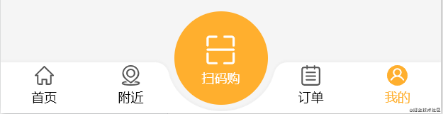
This is the effect I finally achieved by myself 👇

Idea 1: realize with png pictures
It's very simple. Ask your UI designer to draw a png picture like this 👇

Be sure png, the sunken place must be transparent.
Then the others will be laid out by themselves
Idea 2: use the shadow attribute of css to realize
Some friends may not understand what I said, so I will write it in code 👇
First take a look at the html and css code structure
<view class="u-flex custom-tabbar">
    <view class="u-flex-1 h100 bg-white left-tabbar-wrapper"></view>
        <view class="h100 transparent-circle-wrapper">
            <view class="transparent-circle"></view>
        </view>
    <view class="u-flex-1 h100 bg-white right-tabbar-wrapper"></view>
</view>
Custom css
.bg-white{
    background-color: #FFFFFF;
}
.u-flex-1{
    flex: 1;
}
.h100{
    height: 100%;
}
.u-flex{
    display: flex;
    align-items: center;
}
The view here can be regarded as a div of html, and the view in the applet. Here, several custom classnames are used.
According to the html structure, we can see that we are divided into three view s. The parent flex layout arranges them into a column, and then there is a transparent circle in the middle, with block level elements with a white background on both sides
Then the important css comes. Fix it at the bottom first (I use scss here)
.custom-tabbar {
    height: 50px;
    position: fixed;
    bottom: 0;
    width: 100%;
    .left-tabbar-wrapper {
	border-top-right-radius: 21px;
	}
    .right-tabbar-wrapper {
        border-top-left-radius: 21px;
    }
 }
For the block level elements on both sides, we round the corresponding top, and then the effect is like this 👇

The middle is also a block level element. It sets a width of 100px and does not give a background color, so the middle is transparent
Set the relative positioning for the view in the middle and the absolute positioning for the circle. It is the classic child Jue father phase
.transparent-circle-wrapper {
    position: relative;
    width: 100px;
    .transparent-circle {
        position: absolute;
        left: -3px;
        top: -50px;
        width: 106px;
        height: 100px;
        border-radius: 50%;
    }
}
The transparent circle top:-50px here is for levitation. I'm sure you can understand it. I won't elaborate more on others. Let's look at the css attribute of the core implementation
Set a white shadow for the circle and enlarge the shadow
Modify the third parameter. For example, I set 100px here
box-shadow: 0 0 0 100px #ffffff;
The modified effect is like this 👇

Then modify the shadow offset of the circle
Modify the second parameter to offset the shadow downward
box-shadow: 0 100px 0 100px #ffffff;
When it is changed to 100px, we see the effect is like this 👇

See here, I guess you should understand. Finally, I modified the offset to 156px, and finally realized it. Of course, you may need to adjust yourself. After all, the width and height are different from mine. be accomplished 👇
Complete code 👇
html
<view class="u-flex custom-tabbar">
    <view class="u-flex-1 h100 bg-white left-tabbar-wrapper"></view>
        <view class="h100 transparent-circle-wrapper">
            <view class="transparent-circle"></view>
        </view>
    <view class="u-flex-1 h100 bg-white right-tabbar-wrapper"></view>
</view>
css
.bg-white{
    background-color: #FFFFFF;
}
.u-flex-1{
    flex: 1;
}
.h100{
    height: 100%;
}
.u-flex{
    display: flex;
    align-items: center;
}
.custom-tabbar {
    height: 50px;
    position: fixed;
    bottom: 0;
    width: 100%;
    .left-tabbar-wrapper {
        border-top-right-radius: 21px;
    }
    .right-tabbar-wrapper {
        border-top-left-radius: 21px;
    }
    .transparent-circle-wrapper {
        position: relative;
        width: 100px;
        .transparent-circle {
            position: absolute;
            left: -3px;
            top: -50px;
            width: 106px;
            height: 100px;
            border-radius: 50%;
            box-shadow: 0 156px 0 100px #ffffff;
        }
    }
}
summary
Both ideas can be realized here. For the second, you need to adjust the shadow compilation, the width and height of the circle, the left and top values to achieve the desired effect. Of course, if the shadow exceeds the outside, you can give an overflow:hidden at the parent level. I don't need it here.
The above is my share. I hope it can help you 😀.