The front is the official document, and the following has its own supplement. After all, the official document is insufficient! While learning from each other, it can also prevent you from reviewing when you meet these needs in the future
waterfall
app side nvue special components.
The < waterfall > component is the core component that provides waterfall flow layout. Waterfall flow, also known as waterfall flow layout, is a popular page layout with uneven multi column layout. As the page scroll bar scrolls down, this layout can also continuously load data blocks and attach them to the current tail.
In nvue, using ordinary view as waterfall flow can not realize reuse and invisible rendering resource release. Using components, after specifying the cell, the native engine will automatically optimize the performance.
Subcomponents
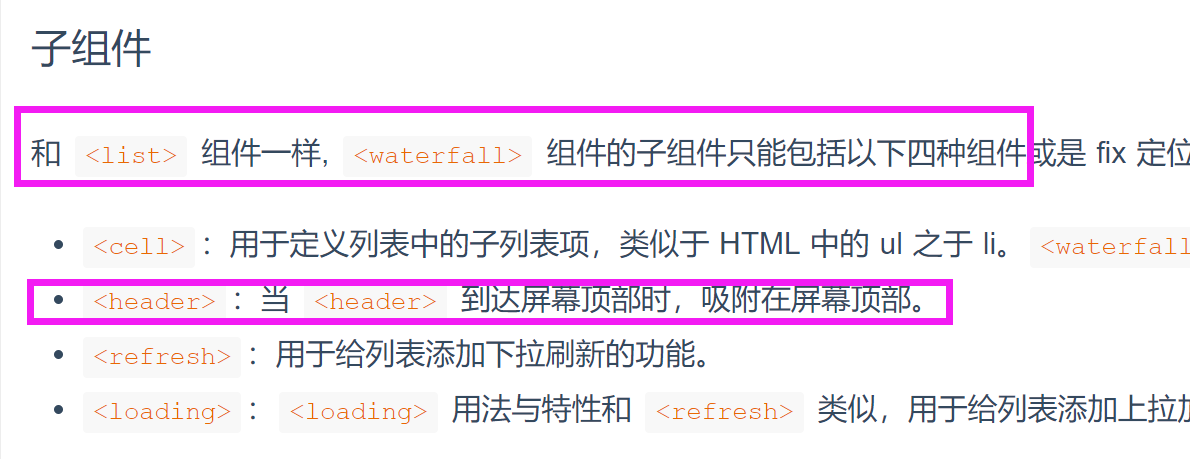
Like the < list > component, the sub components of the < waterfall > component can only include the following four components or fix positioned components, and other forms of components will not be rendered correctly.
- < cell >: used to define sub list items in the list, similar to ul in HTML to li< Waterfall > will perform efficient memory reclamation on < cell > to achieve better performance.
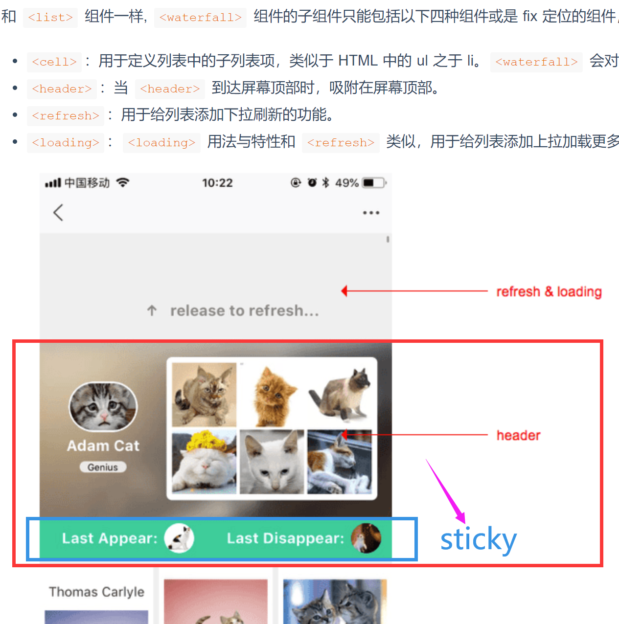
- < header >: when < header > reaches the top of the screen, it is adsorbed on the top of the screen.
- < refresh >: used to add drop-down refresh to the list.
- < loading >: < loading > is similar to < refresh > in usage and features. It is used to add more functions to the list.

attribute
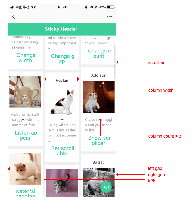
- Show scrollbar: [optional] the optional value is true/ false, and the default value is true. Controls whether scroll bars appear.
- Column count: [optional] the number of columns describing the waterfall flow
auto: means that the number of columns is determined by other attributes (such as column width)
< integer >: the optimal number of columns. If both column width and column count specify non-zero values, column count represents the maximum number of columns.
- Column width: [optional] describes the column width of each column of the waterfall flow
auto: means that the column width is determined by other attributes (such as column count)
< length >: the optimal column width. The actual column width may be wider (the remaining space needs to be filled) or narrower (if the remaining space is smaller than the column width). The value must be greater than 0
- Column gap: [optional] the gap between columns If normal is specified, it corresponds to 32
- Left gap: [optional] the gap between the left cell and the list If not specified, it corresponds to 0
- Right gap: [optional] the gap between the right cell and the list If not specified, it corresponds to 0
See < list > component properties for other supported properties
< waterfall > has the same attributes as < list >, such as the loadmore event
event
All common events are supported:
- Click: used to listen for click events. (for example, it is generally bound to sub components to trigger jump).
- longpress: used to listen to long press events (usually bound to subcomponents. For example, long press can be deleted).
- Appearance: it is used to listen for events occurring in subcomponents (usually bound to subcomponents. For example, listen for the occurrence of the last element and load new data)
- disappear: used to listen for screen sliding events of subcomponents (usually bound to subcomponents)
be careful
waterfall refers to area scrolling, which will not trigger page scrolling and cannot trigger pages JSON configured drop-down refresh, page bottoming onReachBottomDistance, and transparent gradient of titleNView.
The following is to supplement the lack of official documents
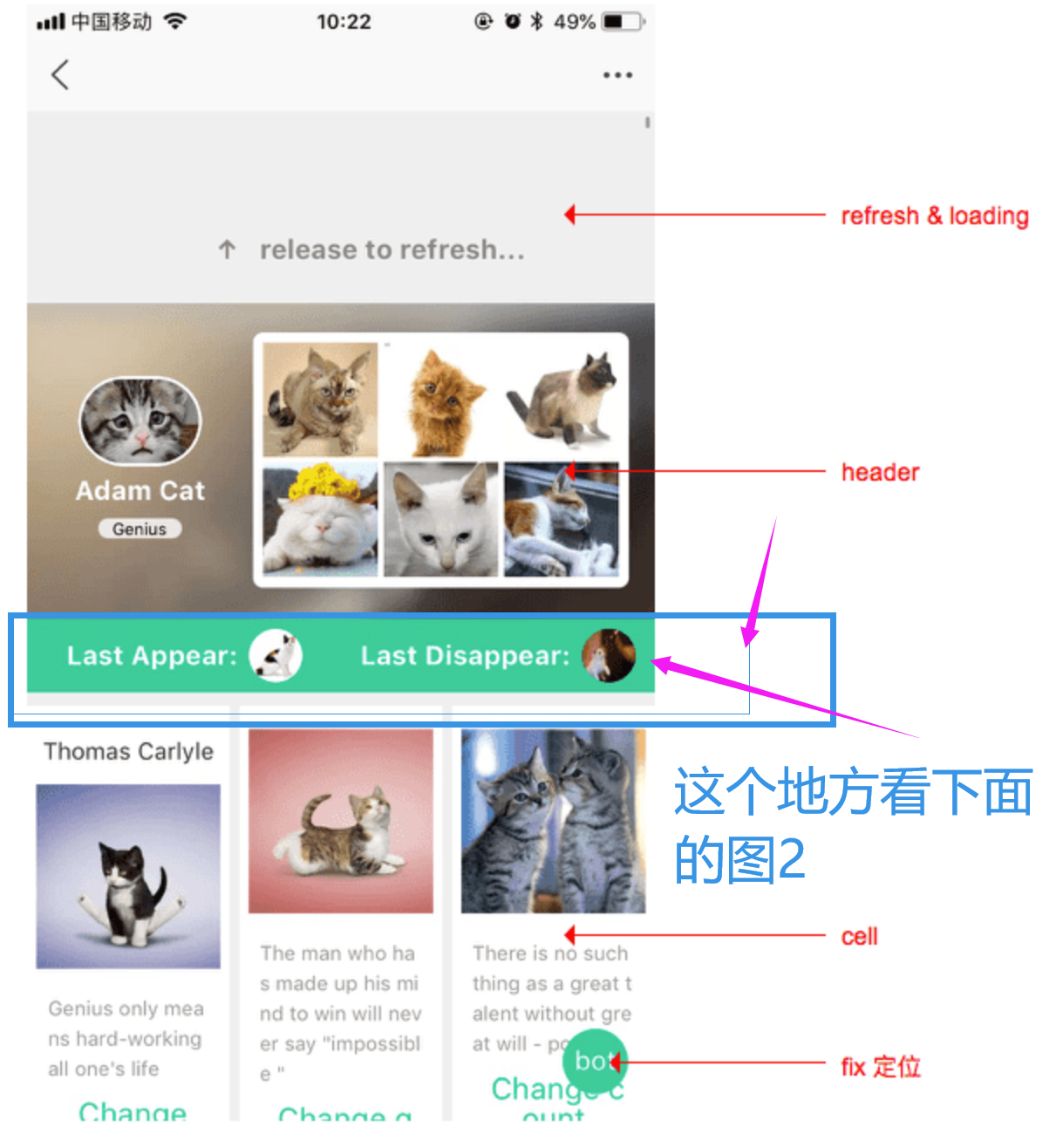
The usage of header, a sub component of waterfall, is completely different from that of list. Please pay attention to the following instructions
First two pictures, pay attention to the places in the picture where I circle with red and blue boxes

Here are the questions I encountered at that time. When I asked the group, it was useless. There was no management answer at all! Sometimes they are too busy to understand. After all, when we encounter problems, we often find ways to solve them ourselves!
This is too laggy. Because my project is nvue, then all the sub categories of the front page and the front page are all waterfall streams. vue I tried, and after classifying, the more data, the more stuck, and the vue performance is not nvue high.

Then when I was going to do waterfall flow, I found that < waterfall > cannot be used as a sub component of < list >, and then I went to see the official document again. It turned out that < waterfall > and < list > are of the same level, and they are both parent containers. Cannot nest each other as child containers.
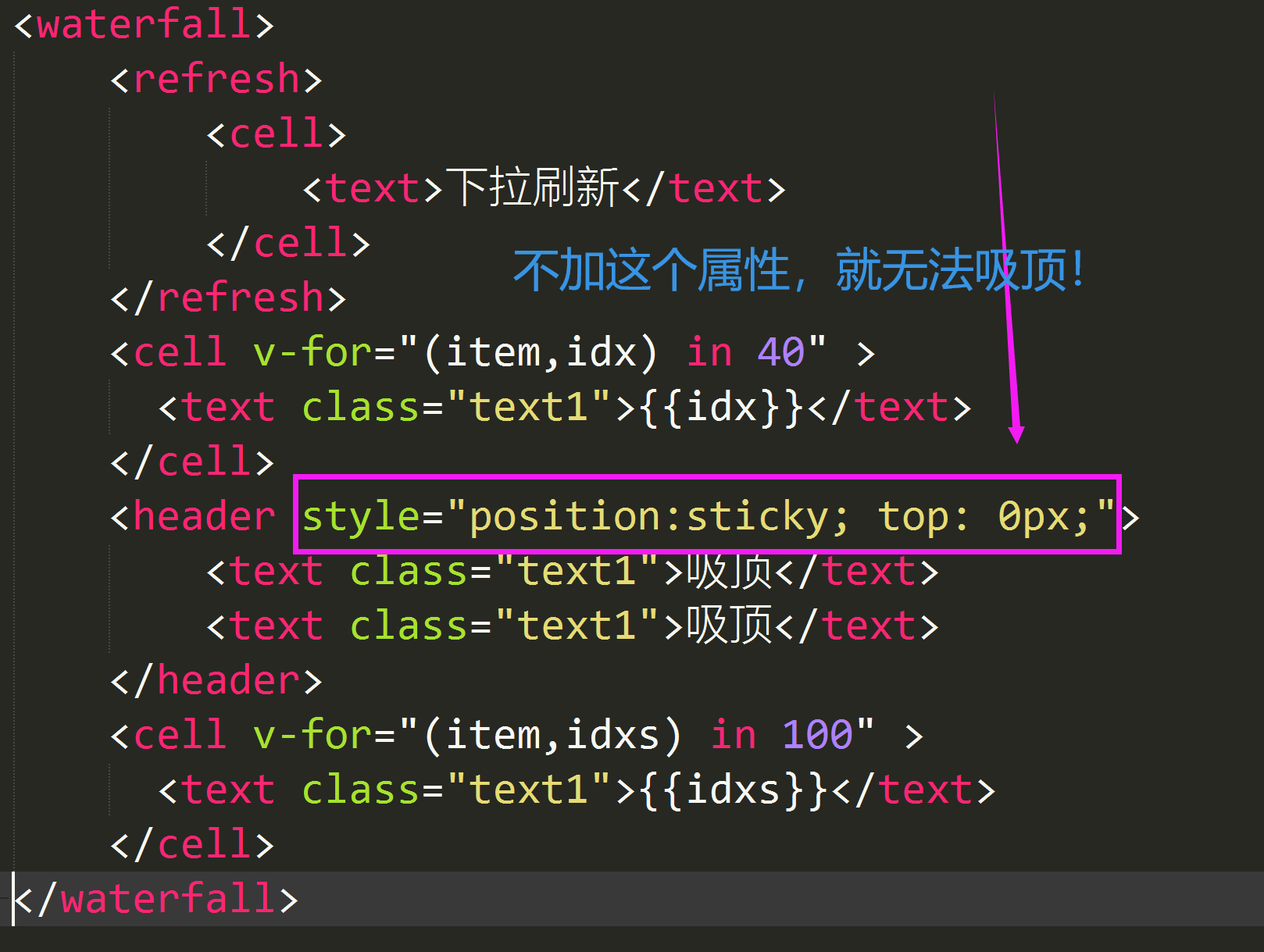
Then, I changed < list > to < waterfall >, but a BUG appeared. The sub component < header > can't attract the top, but using < list > as the parent container can attract the top. This is very painful. Pay attention to the official paragraph. It doesn't explain in detail!
Officials say that when < header > reaches the top of the screen, it will automatically suck the top, but it is not possible in actual projects. It also says less that it is necessary to set a CSS ceiling attribute for < header >
See the screenshot below for the code
There are also official pictures, but they are easy to be ignored!

The ceiling effect in the project has been achieved. Here is a demo video
For the waterfall flow and ceiling effect under uniapp nvue, you can see the tutorial link in the review
The following is the code structure of the project, for reference, with notes
<uni-waterfall :border="false"
		@scrolltolower="loadMoreNVUE"
		@scrollend="scrollendNVUE"
		>
			<!-- No ceiling -->
			<!-- banner-ad [Banner poster advertisement] -->
			<uni-header>
				<FatFatMeng-banner-ad
				Image_ad="https://r1.ykimg.com/material/0A03/A1/202107/0720/3070562/1626770419878/0D01000060F68C903891682302504A46.jpg"
				></FatFatMeng-banner-ad>
			</uni-header>
			<!-- No ceiling -->
			<!-- grid-srcoll-x [grid Gong Ge Icon Quick navigation] -->
			<uni-header>
				<FatFatMeng-grid-scroll-x
				:gridlist="gridlist"
				></FatFatMeng-grid-scroll-x>
			</uni-header>

			<!-- Ceiling, because it is set position:sticky; top: 0px;attribute -->
			<!-- tabs-mfw [Imitation horse honeycomb sliding navigation bar,With ceiling effect] -->
			<uni-header style="position:sticky; top: 0px;">
				<FatFatMeng-Tabs-mfw
				:isFixedTop="Number(55)+Number(statusBarHeight)"
				:isFixed="isFixed"
				:tabslist="tabslist"
				:current="TabCurIndex"
				:windowWidth="screenWidth"
				@change="TabsTap"
				></FatFatMeng-Tabs-mfw>
			</uni-header>


			<!-- 1 -->
			<uni-cell>
				<view style="height: 400px;background-color: #727D8D;">
					<text>{{flag}}</text>
				</view>
				<view style="height: 400px;background-color: #F0AD4E;">
					<text v-for="(item,index) in 100">111111111</text>
				</view>
			</uni-cell>
			<!-- 2 -->
			<uni-cell>
				<view style="height: 200px;background-color: #07C160;">
					<text>{{flag}}</text>
				</view>
				<view style="height: 400px;background-color: #F0AD4E;">
					<text v-for="(item,index) in 100">111111111</text>
				</view>
			</uni-cell>
			<!-- 3 -->
			<uni-cell>
				<view style="height: 400px;background-color: #727D8D;">
					<text>{{flag}}</text>
				</view>
				<view style="height: 400px;background-color: #F0AD4E;">
					<text v-for="(item,index) in 100">111111111</text>
				</view>
			</uni-cell>
			<!-- 4 -->
			<uni-cell>
				<view style="height: 400px;background-color: #727D8D;">
					<text>{{flag}}</text>
				</view>
				<view style="height: 400px;background-color: #F0AD4E;">
					<text v-for="(item,index) in 100">111111111</text>
				</view>
			</uni-cell>

		</uni-waterfall>
Finally, if this article helps you, please point a praise and support. Thank you for your help