Interaction difficulties:
- Expand and collapse button in the lower right corner of multiline text
- Switching between "expand" and "stow"
- When the text does not exceed the specified number of lines, the expand and collapse button is not displayed
To be honest, it was not easy to look at the layout alone before, even with the help of JavaScript (you need to calculate the text width and dynamically intercept the text, vue-clamp That's what I did), not to mention the following interaction and judgment logic, but after some thinking, in fact, pure CSS can also be perfectly implemented. Let's take a step-by-step look at how to implement it~
Text style
1. Multi line text truncation
<div class="text">
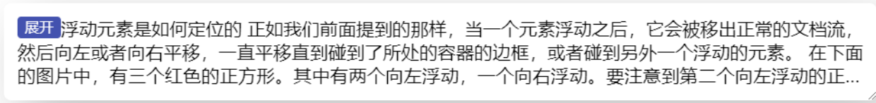
How are floating elements located
As we mentioned earlier, when an element floats, it will be removed from the normal document flow,
Then pan left or right until you touch the border of the container or another floating element.
</div>It is also common to set multiple lines beyond the display of ellipsis for such a piece of text
It mainly uses} line clamp. The key styles are as follows
.text {
  display: -webkit-box;
  -webkit-line-clamp: 3;
  -webkit-box-orient: vertical;
  overflow: hidden;
}
2. Expand and stow the float in the lower right corner
When it comes to text wrapping effect, you can generally think of floating. Yes, don't think floating is a thing of the past. Specific scenes are still very useful. For example, put a button below and set the float
<div class="text">
<button class="btn">open</button>
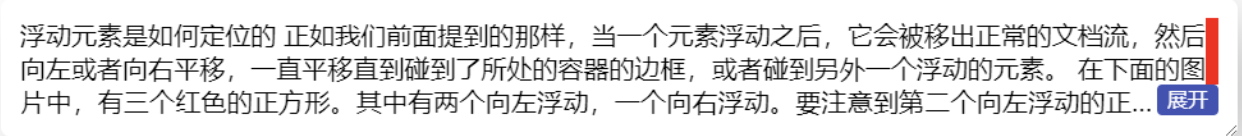
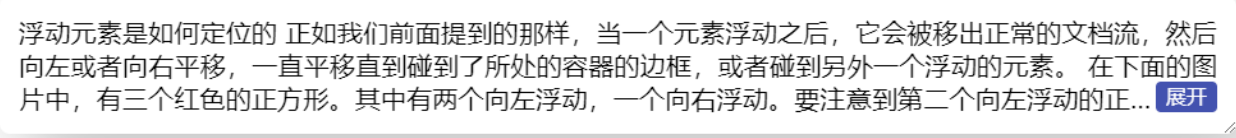
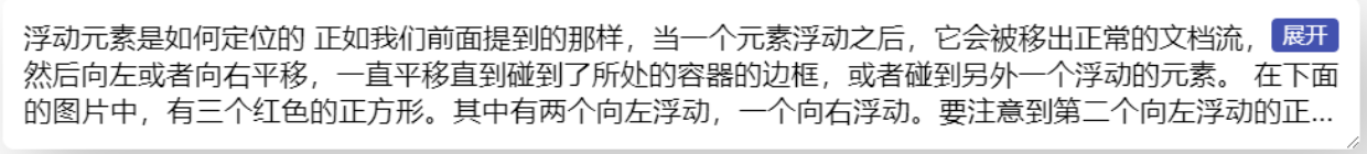
How are floating elements located
As we mentioned earlier, when an element floats, it will be removed from the normal document flow,
Then pan left or right until you touch the border of the container or another floating element.
</div>
.btn {
float: left;
/*Other decorative styles*/
}
If we set it to float: right
.btn {
  float: right;
  /*Other decorative styles*/
}

On the right side, it has been implemented, but it is not in the lower right corner. We can use the margin attribute
.btn {
  float: right;
  margin-top: 50px;
  /*Other decorative styles*/
}
The current effect, although the button is located in the lower right corner, the text does not surround the space above the button, leaving a large section empty. Can it be realized?
Although "margin" can't solve the problem, the whole text is still affected by the floating button. What happens if there are multiple floating elements? The pseudo element:: before is used instead
.text::before{
  content: '';
  float: right;
  width: 10px;
  height: 50px;/*Set any height first*/
  background: red
}
Now that you see the button to the left of the pseudo element, how do you move it down? Very simple, clear: both; That's it
.btn {
  float: right;
  clear: both;
  /*Other decorative styles*/
}
You can see that the text is now completely surrounded by two floating elements on the right. As long as the width of the pseudo element on the red background is set to 0 (or no width is set, the default is 0), the effect of surrounding the lower right corner is realized
3. Height adaptive extension
Although the upper and lower right surround is completed, the height is fixed. How to set it dynamically? Here, you can use {calc} to calculate. Subtract the height of the button from the height of the whole container, as shown below
.text::before{
  content: '';
  float: right;
  width: 0;
  height: calc(100% - 24px);
}
Unfortunately, it doesn't seem to have any effect. Open the console and find that the calc(100% - 24px) calculation height is 0

In fact, it is easy to think of the reason that the height is 100% invalid. There are many online analysis of such problems. The usual solution is to specify a height for the parent. However, the height here changes dynamically, and there is an expansion state. The height is unpredictable, so it is not advisable to set the height.
In addition, there is another way, which is to use the} flex layout. The approximate method is to calculate the change height by percentage in the sub item of "flex layout". For details, please refer to http://w3.org About css-flexbox Description of
Therefore, we need to pay attention here text , wrap one layer and set , display: flex
<div class="wrap">
  <div class="text">
    <button class="btn">open</button>
    How do floating elements locate? As we mentioned earlier, when an element floats,
    It will be moved out of the normal document flow, and then translated to the left or right until it touches the border of the container,
    Or encounter another floating element.
  </div>
</div>

.wrap{
  display: flex;
}
In this way, the calculation height just now takes effect. Change the number of lines of the text, which is also located in the lower right
In addition, the dynamic height can also be achieved by using a negative margin (the performance will be slightly better than calc)
.text::before{
  content: '';
  float: right;
  width: 0;
  /*height: calc(100% - 24px);*/
  height: 100%;
  margin-bottom: -24px;
}
Here, the effect of surrounding in the lower right corner is basically completed, and the ellipsis is also located before the expand button
Expand and collapse status
When it comes to CSS state switching, everyone can think of "input type="checkbox ". We also need to use this feature here. First, add an "input", then replace the previous "button" with "label", and associate it through the "for" attribute
<div class="wrap">
  <input type="checkbox" id="exp">
  <div class="text">
    <label class="btn" for="exp">open</label>
    How are floating elements located
  As we mentioned earlier, when an element floats, it will be moved out of the normal document flow, and then translated to the left or right until it touches the border of the container or touches another floating element.
  </div>
</div>
In this way, when you click "label", you actually click the "input" element. Now let's add two statuses: only display 3 rows and no row limit
.exp:checked+.text{
  -webkit-line-clamp: 999; /*Just set a large enough number of rows*/
  max-height: none;
}
Here is another small problem. The "expand" button should become "stow" after clicking. How to modify it?
There is a trick. Anyone who needs to dynamically modify the content can use the pseudo class {content} generation technology. The specific method is to remove or hide the text in the button and generate it with pseudo elements
<label class="btn" for="exp"></label><!--Remove button text-->

.btn::after{
  content:'open' /*Generated by content*/
}
Add: checked status
.exp:checked+.text .btn::after{
  content:'Put away'
}
The compatible version needs extra processing because the previous ellipsis is simulated and cannot be hidden automatically
.exp:checked+.text .btn::before {
    visibility: hidden; /*Hide ellipsis in expanded state*/
}
With a little animation, it doesn't look so stiff
.text{
  transition: .3s max-height;
}
.exp:checked+.text{
  max-height: 200px; /*Just exceed the maximum row height*/
}
Judgment of the number of text lines
The above interaction has basically met the requirements, but there will still be problems. For example, when there is less text, there is no truncation, that is, there is no ellipsis, but the expand button is still in the lower right corner. How to hide it?
Usually, the solution of js is very easy. Just compare the element's "scrollHeight" and "clientHeight", and then add the corresponding class name. Here is the pseudo code
if (el.scrollHeight > el.clientHeight) {
  // Text exceeds
  el.classList.add('trunk')
}
So, how does CSS implement this kind of judgment?
To be sure, CSS has no such logical judgment, and most of us need to use "cover up" from other angles. For example, in this scenario, when no truncation occurs, it means that the text is completely visible. At this time, if an element (small red square) is added at the end of the text, in order not to affect the original layout, absolute positioning is set here
.text::after {
    content: '';
    width: 10px;
    height: 10px;
    position: absolute;
    background: red;
}
As you can see, the small red square here completely follows the ellipsis. When the ellipsis appears, the small red square must disappear because it has been squeezed. Here, you can see what the principle is by hiding the parent "overflow: hidden" temporarily
Then, you can set the small red square to a large enough size, such as 100% * 100%
.text::after {
    content: '';
    width: 100%;
    height: 100%;
    position: absolute;
    background: red;
}
You can see that the red blocks have covered the lower right corner. Now change the background to white (the same background color as the parent), and the parent {overflow: hidden adds it again
.text::after {
    content: '';
    width: 100%;
    height: 100%;
    position: absolute;
    background: #fff;
}
Now, after you expand it, you find that the button is missing (it is covered by the pseudo element just now, and you can't click it). What if you want it to be visible after clicking? Add the following: the checked state is OK, and the overlay is hidden when expanding
.exp:checked+.text::after{
    visibility: hidden;
}
In this way, the function of hiding the expansion button in the case of less text is realized
Summary and description
Generally speaking, the focus is on the layout. The interaction is relatively easy. The overall implementation cost is actually very low, and there are no rare attributes. In addition to the layout, the webkit box seems to be a bit bug gy (after all, it is the webkit kernel, which Firefox just draws on, so it is inevitable to have some problems), Fortunately, the effect of multi line text truncation can be realized in another way. The compatibility is quite good and basically fully compatible (IE10 +). Here is the key point of implementation
- The text wrapping effect first considers float ing
- flex layout child elements can calculate the height by percentage
- Multi line text truncation can also be realized by Max height simulation combined with text wrapping effect
- State switching can be done with the help of {checkbox
- CSS change text can be generated using pseudo elements
- Use CSS to cover up
The effect of multi line text expansion and retraction can be said to be a long-standing problem in the industry. There are many js solutions, but they don't feel very perfect. I hope this new CSS solution can bring you different inspiration. Thank you for reading.
Complete code:
label:
<div class="wrapper">
<input id="exp1" class="exp" type="checkbox">
<div class="text">
<label class="btn" for="exp1"></label>
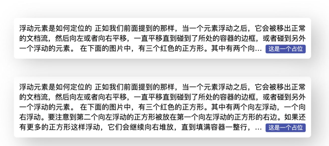
How are floating elements located
As we mentioned earlier, when an element floats, it will be moved out of the normal document flow, and then translated to the left or right until it touches the border of the container or touches another floating element.
In the picture below, there are three red squares. Two of them float to the left and one to the right. Notice that the second left floating square is placed to the right of the first left floating square. If more squares float like this, they will continue to stack to the right until a whole row of containers is filled, and then wrap to the next row.
</div>
</div>
<div class="wrapper">
<input id="exp2" class="exp" type="checkbox">
<div class="text">
<label class="btn" for="exp2"></label>
How are floating elements located
As we mentioned earlier, when an element floats, it will be moved out of the normal document flow, and then translated to the left or right until it touches the border of the container or touches another floating element.
</div>
</div>Style file:
.wrapper {
  display: flex;
  margin: 50px auto;
  width: 800px;
  overflow: hidden;
  border-radius: 8px;
  padding: 15px ;
  box-shadow: 20px 20px 60px #bebebe,
    -20px -20px 60px #ffffff;
}
.text {
  font-size: 20px;
  overflow: hidden;
  text-overflow: ellipsis;
  text-align: justify;
  /* display: flex; */
  display: -webkit-box;
  -webkit-line-clamp: 3;
  -webkit-box-orient: vertical;
  position: relative;
}
.text::before {
  content: '';
  height: calc(100% - 24px);
  float: right;
}
.btn{
  float: right;
  clear: both;
  margin-left: 10px;
  font-size: 16px;
  padding: 0 8px;
  background: #3F51B5;
  line-height: 24px;
  border-radius: 4px;
  color:  #fff;
  cursor: pointer;
  border:0;
  /* margin-top: -30px; */
}
button{
  float: right;
  clear: both;
  margin-left: 10px;
  /* margin-top: -30px; */
}