preface
Do you have 10000 friends who see the problem ❓ Do you want to ask what the hell Ancol PCA is. I don't know normal, because I made the word 2333333
Why it's called this name: as we all know, the English of descent is Ancestry, and the English of location is location. These two words take the first three letters, loc and then reverse to remove c. when combined, it's Ancol. PCA means principal component analysis. The meaning remains unchanged
The following tutorial begins:
Programming language: Python 3 eight
Module: pandas numpy sklearn matplotlib geopy
Overall idea: first reduce the multi-dimensional data of the calculator to two-dimensional data and make it as the x and y axes, then convert the position data into one-dimensional data and make it as the z axis, and finally combine it into three-dimensional data and visualize it
code:
# Gets the latitude and longitude of the position
from geopy.geocoders import Nominatim

geolocator = Nominatim(user_agent = 'google_map')
location = geolocator.geocode('location')
(location.latitude, location.longitude)

# Dimensionality reduction and visualization
from sklearn.decomposition import PCA
import matplotlib.pyplot as plt
from mpl_toolkits.mplot3d import Axes3D
import  pandas as pd
import numpy as np

# Data preprocessing part
## data fetch
df = pd.read_csv('new_pca.csv', index_col = 0, header = 0)
## Obtain the ethnic group of the sample
label = df.index
## Select the e11 calculator data section
data = df.loc[:, 'Africa':'America']
## Select the latitude and longitude part
df = df.loc[:, 'latitude':'longitude']
# Start dimensionality reduction
## Convert longitude and latitude into radian system and reduce the dimension to one-dimensional data
pca = PCA(n_components = 1)
z = pca.fit_transform(np.deg2rad(df))
## Reduce the dimension of 11 dimensional data of e11 calculator to two dimensions
pca = PCA(n_components = 2)
data_2 = pca.fit_transform(data)
# Merge two arrays
data = np.concatenate((data_2, z), axis = 1)
# Scatter visualization
fig = plt.figure()
ax = Axes3D(fig)
for i in range(len(label)):
    x, y, z = data[i][0], data[i][1], data[i][-1]
    if label[i] == 'the republic of korea':
        ax.scatter(x, y, z, color = 'blue')
    elif label[i] == 'Jilin Province':
        ax.scatter(x, y, z, color = 'red')
plt.show()
Result display:
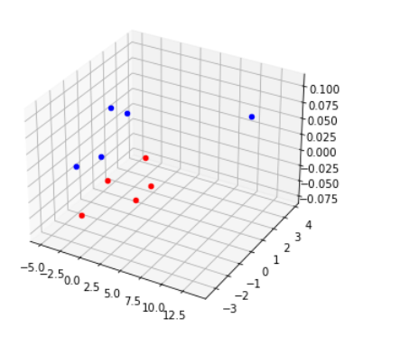
(this example is an Ancol PCA diagram based on the e11 data and location information of Koreans and Korean people in Jilin Province)
Advantages of this method:
Two or more populations with very similar calculator results can be dispersed on the scatter diagram, and a more scientific combination analysis of gene level and individual level is realized
Disadvantages of this method:
The Euclidean distance between points can not accurately reflect the genetic distance between populations. In addition, it is difficult to read data for people who are dizzy in 3D.
Significance of this method:
In the past, when we looked at the analysis method of Zuyuan, we just looked at the calculator results directly, and then asked where people and families, and inferred. At most, it will be combined with the traditional PCA. However, this method can digitize the location information and trace the source more scientifically.
The following is the flow chart of implementing Ancol PCA:
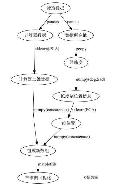
And the code used to draw the flow chart:
from graphviz import Digraph
dot = Digraph(comment = 'The Round Table')
# fixed point
dot.node('#',' read data ')
dot.node('a', 'Calculator data')
dot.node('b', 'Calculator 2D data')
dot.node('c', 'Data location')
dot.node('d', 'Longitude and latitude')
dot.node('e', 'Radian position information')
dot.node('f', 'One dimensional position')
dot.node('+', 'Form a new array')
dot.node('g', '3D visualization')
# Connect
dot.edge('#', 'a', 'pandas')
dot.edge('a', 'b', 'sklearn(PCA)')
dot.edge('b', '+', 'numpy(concatenate)')
dot.edge('#', 'c', 'pandas')
dot.edge('c', 'd', 'geopy')
dot.edge('d', 'e', 'numpy(deg2rad)')
dot.edge('e', 'f', 'sklearn(PCA)')
dot.edge('f', '+', 'numpy(concatenate)')
dot.edge('+', 'g', 'matplotlib')
# Output PDF
dot.render('ancol_pca.pdf')
thank:
Data provided by: maternal mtDNA ancestral group QQ: 923891525
Programming language available: Python official website: https://www.python.org
Provide modules:
Pandas official website: https://pandas.pydata.org
Numpy official website: https://www.numpy.org/
Matplotlib official website: https://matplotlib.org
sklearn official website: https://scikit-learn.org/stable/
Geopy project website: https://github.com/geopy/geopy
Graphviz official website: http://www.graphviz.org
©️ Yang Haolin
Please indicate the source when reprinting