Hello, everyone. Seaborn, which is based on Matplotlib, is a Python library for making statistical graphics. The content of this article is long. It is recommended to read it slowly after collection.
Seaborn's advantages:
-
Rich charts, easier to use than matplotlib
-
Combined with pandas
-
Support value type multivariable diagram
-
Support value type data distribution diagram
-
Support category type data visualization
-
Support regression model and visualization
-
Easily build structured multi graph grid
I compiled a mind map of seaborn's core knowledge points
In order to facilitate learning, friends who need HD original can obtain it in the following ways
Acquisition method
Mind map has been packaged and placed in the background. The acquisition method is as follows:
Method 1. WeChat search official account: Python learning and data mining, background reply: seaborn
Method 2. Scan QR code or send pictures to wechat for recognition, and the background reply is seaborn

Now let's learn about this powerful Searborn.
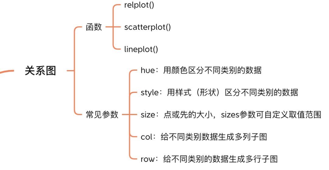
1. Multivariable relationship diagram
Multivariable relationship graph is actually a two-dimensional scatter graph and line graph, which can be drawn by these functions: relplot(), scatterplot(), and lineplot().
scatterplot() can only plot scatter plots and lineplot() can only plot line plots.
relplot() can be drawn and distinguished by the kind parameter:
-
kind="scatter" (default) is equivalent to scatterplot()
-
kind="line" is equivalent to lineplot()
In seaborn, it is common to define a general function and specify the graphics to be drawn with the kind parameter. The advantage of this approach is that you can draw a variety of graphics by calling a function.
1.1 drawing
Scatter plot
import seaborn as sns
import pandas as pd
import numpy as np
sns.set_theme(style="darkgrid")
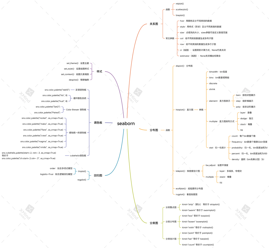
tips = sns.load_dataset("tips", data_home='seaborn-data', cache=True)
sns.relplot(x="total_bill", y="tip", data=tips);
Scatter diagram
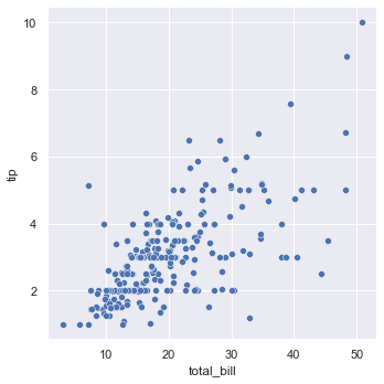
Draw line diagram
df = pd.DataFrame({'a': range(10), 'b': np.random.randn(10)})
sns.relplot(x="a", y="b", kind="line", data=df)
Line diagram
seaborn can directly read the columns in the pandas DataFrame as the x-axis and y-axis. One line of code can complete the drawing, which is easier to use than matplotlib.
1.2 common parameters
There are some common parameters in the relplot() function, which can help us draw more complex graphs.
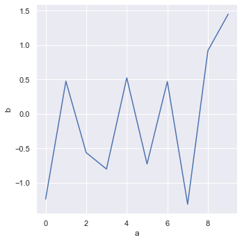
Take the scatter chart above as an example. By setting hue parameter, different colors can be drawn for different categories of points.
sns.relplot(x="total_bill", y="tip", hue="smoker", data=tips);
hue parameter
Smoker is a column in tips, and the values are Yes and No. in the scatter diagram above, when smoker=Yes, the point is blue, and when smoker=No, the point is orange.
By setting col parameter, data can be plotted in different scatter charts
sns.relplot(x="total_bill", y="tip", col="smoker", data=tips);
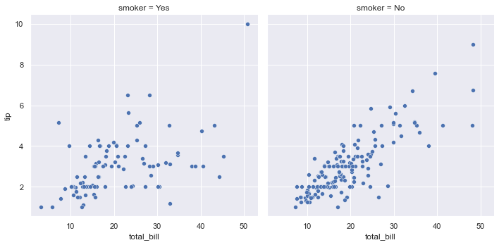
col parameter
The data of smoker=Yes are drawn in the scatter diagram in row 1 and column 1; The data with smoker=No are plotted in the scatter chart in row 1 and column 2.
By setting the style parameter, you can draw different shapes for different categories of points.
sns.relplot(x="total_bill", y="tip", style="smoker", data=tips);
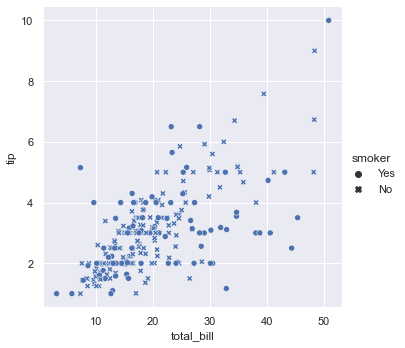
style parameter
smoker=Yes is a dot; smoker=No is an asterisk.
The following figure lists other parameters of replot, which are used in a similar way to the above, and will not be repeated here.
parameter
These parameters are also applicable to the line diagram, and the parameters can be combined arbitrarily.
1.3 special line diagram
In the line diagram drawn above, the value of abscissa x is unique, but in practice, the value of abscissa of some data is not unique. Drawing it with relplot() is the following effect.
fmri = sns.load_dataset("fmri", data_home='seaborn-data', cache=True)
sns.relplot(x="timepoint", y="signal", kind="line", data=fmri);
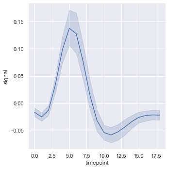
Line graph of abscissa aggregation
The solid blue line is the mean of x, and the surrounding shadow is the 95% confidence interval of the mean.
The surrounding shadow can be set by ci parameter. For example, ci='sd 'means to draw the standard deviation instead of the confidence interval.
sns.relplot(x="timepoint", y="signal", kind="line", ci='sd', data=fmri);
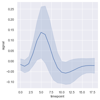
ci parameter
ci=None no shadows can be displayed.
Set the estimator=None parameter to turn off aggregation
sns.relplot(x="timepoint", y="signal", estimator=None, kind="line", data=fmri);
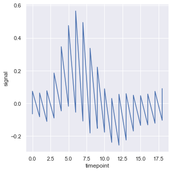
estimator
2. Data distribution diagram
seaborn provides histplot(), kdeplot(), ecdfplot() and rugplot() functions to draw histogram, kernel density estimation map, empirical cumulative distribution map and vertical scale respectively.
The general function of the distribution map is plot (). Different maps are drawn by specifying kind:
-
kind="hist" (default) is equivalent to histplot()
-
kind="kde" is equivalent to kdeplot()
-
kind="ecdf" is equivalent to ecdfplot()
Because rugplot() is only used to identify the scale, it does not need to be specified by kind, but whether it needs to be displayed in the drawing through rug=True or rug=False (the default).
2.1 histogram
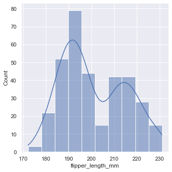
Histogram is a common data distribution map, and its drawing is also very simple.
sns.displot(penguins, x="flipper_length_mm")
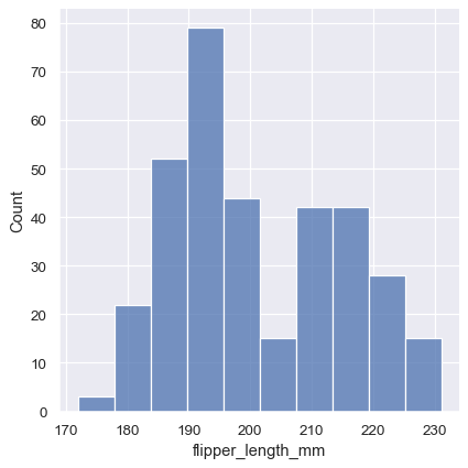
histogram
seaborn provides binwidth, bins and other parameters to set the width and quantity of histogram bin, so as to draw histograms of different shapes.
Here you can also set the hue parameter to draw different types of histograms in a picture with different colors. When drawing multiple histograms in a graph, you need to set the element and multiple parameters to specify the combination mode of multiple histograms.
For example, multiple="stack" stands for stack display.
sns.displot(penguins, x="flipper_length_mm", hue="species", multiple="stack")
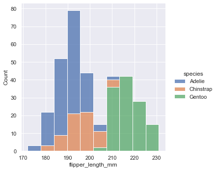
multiple="stack"
Set the stat parameter to normalize the histogram. For example, setting stat="probability" can make the sum of bar height 1.
sns.displot(penguins, x="flipper_length_mm", hue="species", stat="probability")
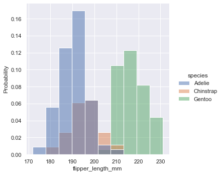
stat="probability"
The following are the common parameters and values of histogram
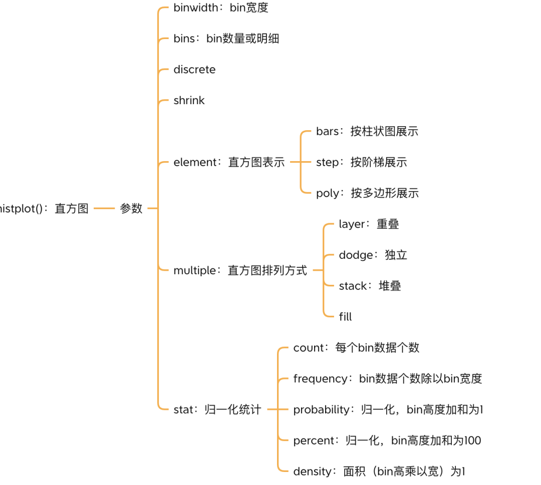
parameter
2.2 nuclear density estimation diagram
The purpose of histogram is to approximate the potential probability density function of data through box division and counting observation. Kernel density estimation (KDE) provides different solutions to this problem.
sns.displot(penguins, x="flipper_length_mm", kind="kde")
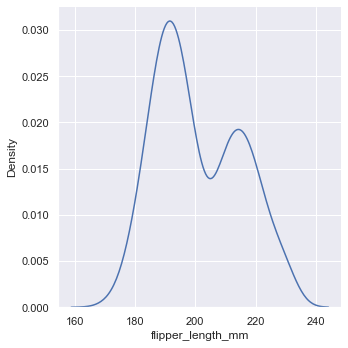
Kernel density estimation diagram
seaborn only supports Gaussian kernel functions from version 0.11.0.
Set bw_ The adjust parameter can make the KDE graph smoother.
sns.displot(penguins, x="flipper_length_mm", kind="kde", bw_adjust=2)
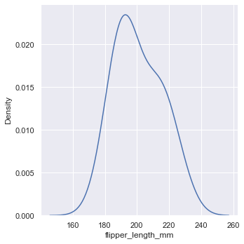
bw_adjust=2
If you set kde=True instead of kind="kde", you can draw histogram and KDE diagram at the same time.
sns.displot(penguins, x="flipper_length_mm", kde=True)
kde=True
2.3 experience accumulation distribution chart
The empirical cumulative distribution function (ECDF) draws a monotonically increasing curve through each data point, so that the height of the curve reflects the proportion of observations with smaller values.
sns.displot(penguins, x="flipper_length_mm", hue="species", kind="ecdf")
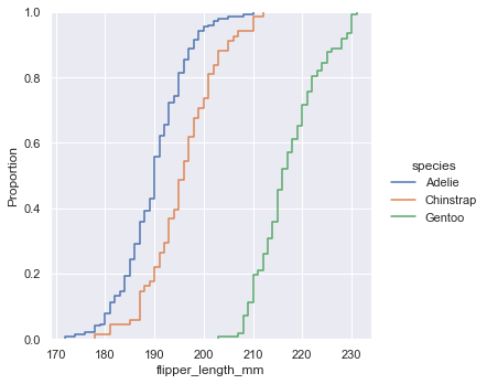
ECDF diagram
2.4 binary distribution diagram
The previous plots are univariate distribution maps, and seaborn can also plot the distribution maps of two variables.
sns.displot(penguins, x="bill_length_mm", y="bill_depth_mm")
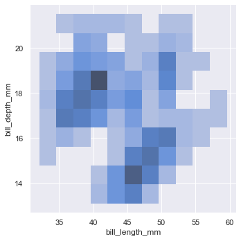
Binary distribution diagram
Using the plan to show the binary histogram can only qualitatively observe the amount of data through the color depth of each block.
Similarly, the binary kernel density estimation map can also be drawn, and the drawn graph is a contour line.
sns.displot(penguins, x="bill_length_mm", y="bill_depth_mm", kind="kde")
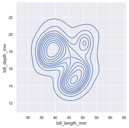
Binary kernel density estimation diagram
Set fill=True to qualitatively observe the height of the face by color.
seaborn also provides the jointplot() function to draw different graphs for binary variables at the same time.
sns.jointplot(data=penguins, x="bill_length_mm", y="bill_depth_mm")
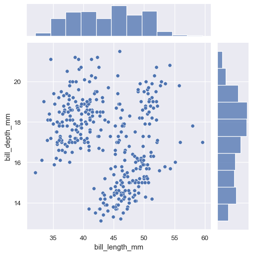
jointplot histogram
By default, jointplot() plots a two variable scatter plot and a single variable histogram.
Set kind=kde to plot the KDE graph.
sns.jointplot(
    data=penguins,
    x="bill_length_mm", y="bill_depth_mm", hue="species",
    kind="kde"
)
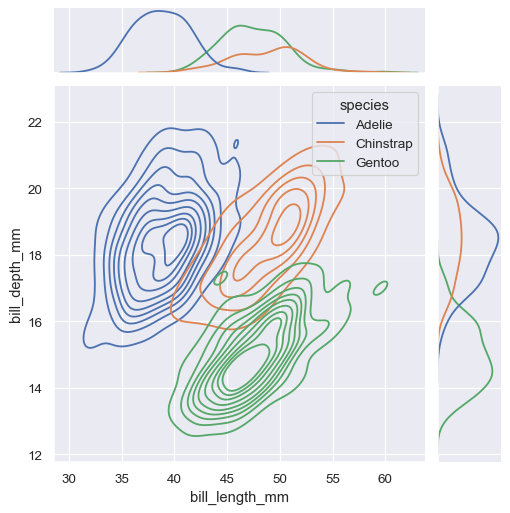
jointplot KDE diagram
seanborn also provides the pairplot() function to plot more variables.
sns.pairplot(penguins)
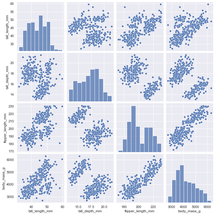
pairplot
The default plot is still histogram and scatter. You can also set kind=kde to draw a multivariable KDE graph.
3. Classification chart
The relationship diagrams we drew before are all numerical variables. When there are category data (discrete values) in the data, we need to use the classification diagram to draw.
seaborn provides the catplot() function to draw the classification map. There are three categories
-
Classified scatter diagram
-
kind="strip" (default) is equivalent to stripplot()
-
kind="swarm" is equivalent to swarm plot ()
-
Classification distribution map
-
kind="box" is equivalent to boxplot()
-
kind="violin" is equivalent to violinplot()
-
kind="boxen" is equivalent to boxenplot()
-
Classification estimation diagram
-
kind="point" is equivalent to pointplot()
-
kind="bar" is equivalent to barplot()
-
kind="count" is equivalent to countlot ()
3.1 classified scatter diagram
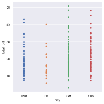
catplot() uses stripplot() by default. It will adjust the position of points on the classification axis with a small amount of random "jitter" to avoid all points overlapping together.
tips = sns.load_dataset("tips", data_home='seaborn-data', cache=True)
sns.catplot(x="day", y="total_bill", data=tips)
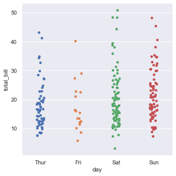
stripplot
Setting the jitter parameter can control the amplitude of jitter. When jitter=False, it means that there is no jitter. The drawn graph is the same as using the relational scatter chart.
sns.catplot(x="day", y="total_bill", jitter=False, data=tips)
Equivalent to
sns.relplot(x="day", y="total_bill", data=tips)
jitter=False
It can be seen that the xy coordinates on the figure coincide with the same data, which is very inconvenient to observe.
Although jitter can be set, it may also cause data overlap. kind="swarm" can draw non overlapping classified scatter diagrams.
sns.catplot(x="day", y="total_bill", kind="swarm", data=tips)
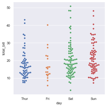
kind="swarm"
3.2 classification distribution map
kind="box" you can draw a box diagram.
sns.catplot(x="day", y="total_bill", kind="box", data=tips)
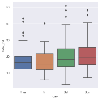
kind="box"
Kind = "box" you can draw an enhanced box diagram.
diamonds = sns.load_dataset("diamonds", data_home='seaborn-data', cache=True)
sns.catplot(x="color", y="price", kind="boxen", data=diamonds.sort_values("color"))
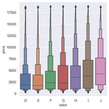
kind="boxen"
kind="violin" you can draw violin pictures.
sns.catplot(x="day", y="total_bill", hue="sex", kind="violin", split=True, data=tips)
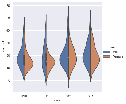
kind="violin"
3.3 classification estimation diagram
kind="bar" displays the data point estimation (average value by default) and confidence interval in the form of rectangular bars, and the confidence interval is drawn with error lines.
titanic = sns.load_dataset("titanic", data_home='seaborn-data', cache=True)
sns.catplot(x="sex", y="survived", hue="class", kind="bar", data=titanic)
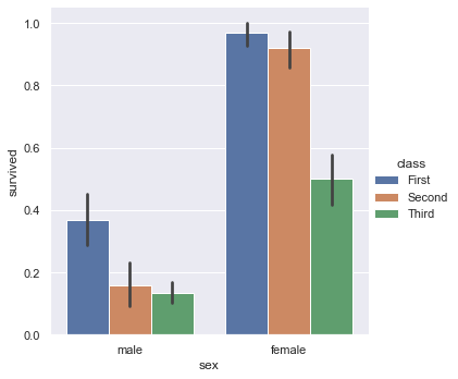
kind="bar"
The height of the rectangular bar is the mean value of the survived column, and the antenna above is the error line.
kind="count" is a common histogram that counts the amount of data corresponding to the x coordinate.
sns.catplot(x="deck", kind="count", data=titanic)
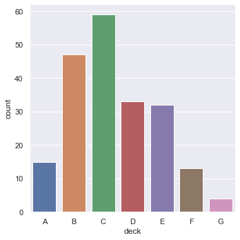
kind="count"
kind="point" draw a point graph to show the estimated value (default mean) and confidence interval of data points, and connect points from the same hue category.
sns.catplot(x="sex", y="survived", hue="class", kind="point", data=titanic)
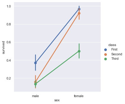
kind="point"
4. Regression chart
seaborn provides linear regression functions to fit data, including regplot() and lmplot(). Most of their functions are the same, but the input data and output graphics are slightly different.
lmplot() function can be used to draw the scatter diagram of two variables x and y, fit the regression model, and draw the regression line and the 95% confidence interval of the regression.
tips = sns.load_dataset("tips")
sns.lmplot(x="total_bill", y="tip", data=tips);
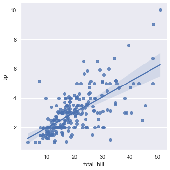
lmplot
Setting order parameter can fit polynomial regression model
anscombe = sns.load_dataset("anscombe", data_home='seaborn-data', cache=True)
sns.lmplot(x="x", y="y", data=anscombe.query("dataset == 'II'"), order=2);
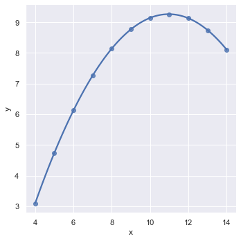
order=2
Setting the logistic=True parameter can fit the logistic regression model
sns.lmplot(x="total_bill", y="big_tip", data=tips, logistic=True, y_jitter=.03);
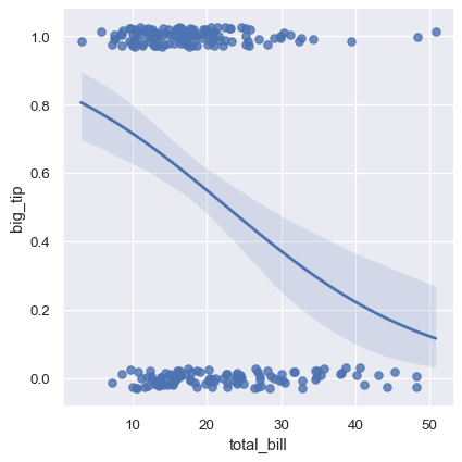
logistic=True
5. Multi graph grid
seaborn provides the FacetGrid class, which can draw multiple graphs at the same time.
g = sns.FacetGrid(tips, row="sex", col="smoker")
g.map(sns.scatterplot, "total_bill", "tip")
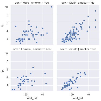
FacetGrid
In fact, it is equivalent to the following code
sns.relplot(x='total_bill', y='tip', row="sex", col="smoker", data=tips)
Of course, the advantage of using FaceGrid is that you can set many graphic properties like matplotlib.
g = sns.FacetGrid(tips, row="sex", col="smoker")
g.map(sns.scatterplot, "total_bill", "tip")
g.set_axis_labels("Total bill", "Tip")
g.set(xticks=[10, 30, 50], yticks=[2, 6, 10])
g.figure.subplots_adjust(wspace=.02, hspace=.02)
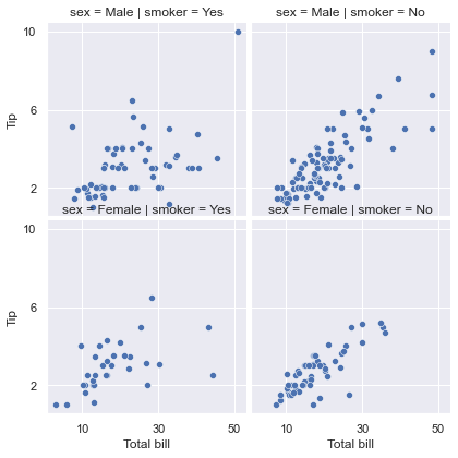
In addition, seaborn also provides PairGrid, which can draw multiple variables at the same time, and the types of graphics can be different.
iris = sns.load_dataset("iris", data_home='seaborn-data', cache=True)
g = sns.PairGrid(iris)
g.map_upper(sns.scatterplot)
g.map_lower(sns.kdeplot)
g.map_diag(sns.kdeplot, lw=3, legend=False)
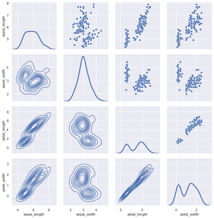
PairGrid
In the above figure, the diagonal and below the diagonal are KDE diagrams, and above the diagonal are scatter diagrams.
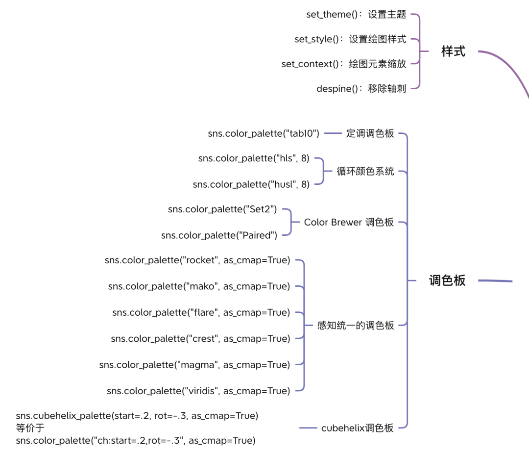
6. Styles and palettes
This part is mainly about the setting of chart appearance. Interested friends can try it by themselves.
Technical exchange
Welcome to reprint, collect, gain, praise and support!

At present, a technical exchange group has been opened, with more than 2000 group friends. The best way to add notes is: source + Interest direction, which is convenient to find like-minded friends
- Method ① send the following pictures to wechat, long press identification, and the background replies: add group;
- Mode ②. Add micro signal: dkl88191, remarks: from CSDN
- WeChat search official account: Python learning and data mining, background reply: add group