Let's start with a code:
cc.Class({
    extends: cc.Component,
    properties: {
        userID: 20,
        userName: "Foobar"
    }
});
This is a CCClass class, which declares two properties with the keyword "properties": userID and userName.
The official documents and example codes have the writing method of JS attribute declaration. Such a declaration can be directly displayed in the attribute panel, and the attribute value can be entered, which is more convenient.
Although the writing method of JS is very simple, I still recommend that you use ts to write game logic, because TS is more standardized and compatible with all the syntax features of JS.
Cocos Creator uses the decorator of Typescript for annotation writing. Annotation development is widely used in many languages.
Creator uses @ property annotation to declare properties, which is essentially a function. The detailed principle is not discussed here, but only the usage.
1
General node attributes
The most common node attributes, such as CC Node,cc.Label,cc.Sprite et al., key points:
-
Using the @ property annotation, the parameter in parentheses is its type
-
backGround , and label , are variable names that can be customized
-
sp:cc.Sprite=null = is the default value. You must give a default value
The codes of TS # are as follows:
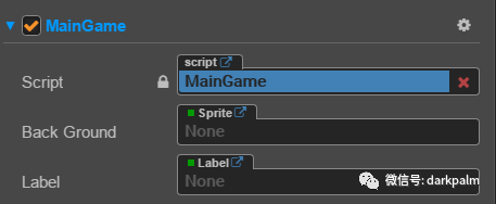
 //Declare a Sprite attribute
 @property(cc.Sprite)
 backGround: cc.Sprite = null;

 //Declare a Label attribute
 @property(cc.Label)
 label: cc.Label = null;
After this declaration, attach the script to a node, and you can view it in the property panel, as shown in the following figure:
2
Add attribute display name
Declare a simple node attribute, and the variable name will be displayed by default on the attribute panel. If the variable is named by hump method, the editor will divide the variable into multiple words according to hump.
In order to display more intuitively on the property panel, you can define a display name displayName for the property when declaring it, so that Chinese can be displayed on the property panel:
//Declare a Sprite attribute
@property({
    type: cc.Sprite,
    displayName: "background"
})
backGround: cc.Sprite = null;

//Declare a Label attribute
@property({
    type: cc.Label,
    displayName: "title"
})
label: cc.Label = null;
The following is displayed on the property panel:

3
Add attribute prompt description
It is intuitive to display the Chinese name of the attribute, but if some attributes use abbreviations or specific names are difficult to understand, you can add a prompt description at this time. Hover the mouse over the name and the prompt text will appear. The code is as follows:
@property({
    type: cc.Node,
    displayName: "base",
    tooltip: "Parent node of the bottom turret"
})
baseNode: cc.Node = null;
Open the property panel, place the mouse on the property {and a text prompt will pop up, as follows:
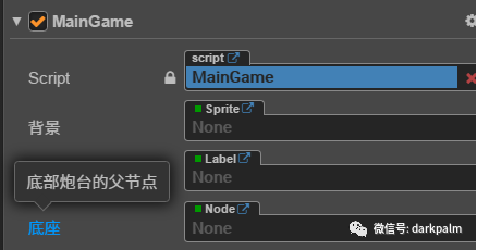
4
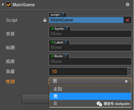
Integer attribute
For some attributes, you may only want to take integers, and have the maximum and minimum values, such as the character's blood volume, maximum 100, minimum 0. Set , type , to , CC Integer, and set , min , and , max , as follows:
@property({
    type: cc.Integer,
    displayName: "Blood volume",
    min: 0,
    max: 10,
    tooltip: "Character's current HP"
})
HP = 10;
The following is displayed on the property panel:
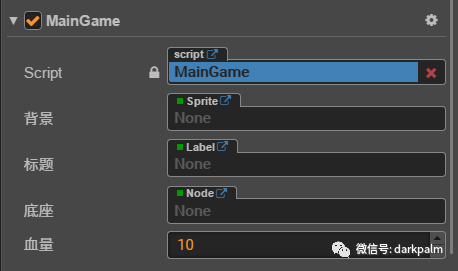
As shown here, the blood volume is an integer. When the size is adjusted in the editor, the maximum will not exceed 10, the minimum can not be less than 0, and the decimal can not be entered.
5
Drop down list
To define the drop-down list on the property panel, you need to define an enumeration type. TS has an enumeration type. In order to use the Chinese character option on the property panel, we must use the Creator's enumeration CC Enum.
let SexyType = cc.Enum({
    UNKNOWN: 0,
    MAN: 1,
    WOMAN: 2
});
@property({
    type: cc.Enum(SexyType),
    displayName: "Gender"
})
sex = SexyType.UNKNOWN;
The operations on the property panel are as follows:
6
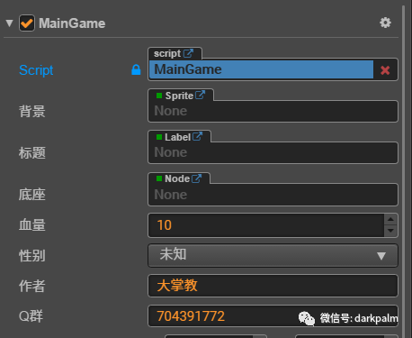
Define text box
The default value is set to string, and there is no need to define type.
@property({displayName: "author"})
author = "Da Zhangjiao";
@property({ displayName: "Q group" })
QQ = "704391772";
The property panel is as follows:
7
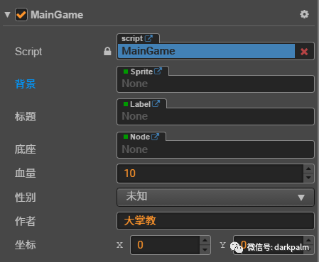
Define ValueType type
If the defined attribute is CC Subclasses of ValueType (cc.Vec2, cc.Vec3, cc.Color, cc.Rect). You can set the default value to its instance without displaying the setting type.
@property({
    displayName: "coordinate"
})
pos: cc.Vec2 = new cc.Vec2(0);
The property panel is as follows:
8
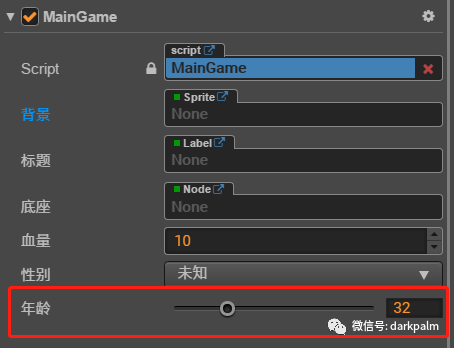
Define slider
If you do not define type, the slider defaults to decimal. If you want to define an integer slider, set type to CC Integer , in addition, you need to define the maximum values , min, max and step, and set slide to , true.
@property({
    type: cc.Integer,
    min:0,
    max:120,
    step: 1,
    slide: true,
    displayName: "Age"
})
age = 32;
The styles on the property panel are as follows:
9
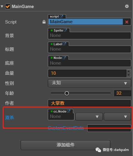
Define event callback
Set # type # to # CC Component. EventHandler, whose default value is set to the event object, can define an event callback. You can bind a callback function on the property panel, similar to the click event binding callback function of {Button}.
@property({
    type: cc.Component.EventHandler,
    displayName: "double play, double kill"
})
doubleKill = new cc.Component.EventHandler();
The following is displayed on the property panel: