A few days ago, the apprentice shared an article published in Cell Reports magazine in 2021 at the single cell data analysis exchange meeting: "TREM2 independent oligodendrocyte, astrocyte, and T cell responses to tau and amyloid pathway in mouse models of Alzheimer's disease", which mentioned how to draw the correlation scatter diagram of the results of two single cell difference analysis, As follows:
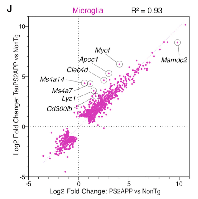
Correlation scatter plot
The legend is also clearly written:
- Scatterplot comparing microglia gene expression fold changes from PS2APP versus nonTg analysis (x axis) against fold changes from TauPS2APP versus nonTg analysis (y axis).
- Only genes called as DEGs (FDR < 0.05, fold change >2 or < 2) for either comparison are shown.
In other words, it does not plot the intersection of statistically significant genes in the two difference analyses, but takes the genes that are statistically significant at least once in the two difference analyses. (it's the same tongue twister. Let's look at the following code)
Here is still the pbmc3k example:
library(SeuratData) #Load the seurat dataset
getOption('timeout')
options(timeout=10000)
#InstallData("pbmc3k")
data("pbmc3k")
sce <- pbmc3k.final
library(Seurat)
table(Idents(sce))
It can be seen that this data set is annotated into 9 single-cell subsets:
> as.data.frame(table(Idents(sce)))
          Var1 Freq
1  Naive CD4 T  697
2 Memory CD4 T  483
3   CD14+ Mono  480
4            B  344
5        CD8 T  271
6 FCGR3A+ Mono  162
7           NK  155
8           DC   32
9     Platelet   14
We can see whether CD14+ Mono and FCGR3A+ Mono have a good correlation with the differential genes of B cells.
First, do two single cell difference analysis:
CD14_deg = FindMarkers(sce,ident.1 = 'CD14+ Mono',
                  ident.2 = 'B')
head(CD14_deg[order(CD14_deg$p_val),])
FCGR3A_deg = FindMarkers(sce,ident.1 = 'FCGR3A+ Mono',
                       ident.2 = 'B')
head(FCGR3A_deg[order(FCGR3A_deg$p_val),])
If at this time, we take the intersection of statistically significant genes of two difference analyses to plot, the code is as follows:
ids=intersect(rownames(CD14_deg),
              rownames(FCGR3A_deg))
df= data.frame(
  FCGR3A_deg = FCGR3A_deg[ids,'avg_log2FC'],
  CD14_deg = CD14_deg[ids,'avg_log2FC']
)
library(ggpubr)
ggscatter(df, x = "FCGR3A_deg", y = "CD14_deg",
          color = "black", shape = 21, size = 3, # Points color, shape and size
          add = "reg.line",  # Add regressin line
          add.params = list(color = "blue", fill = "lightgray"), # Customize reg. line
          conf.int = TRUE, # Add confidence interval
          cor.coef = TRUE, # Add correlation coefficient. see ?stat_cor
          cor.coeff.args = list(method = "pearson",  label.sep = "\n")
)
You can see the correlation, which is very:
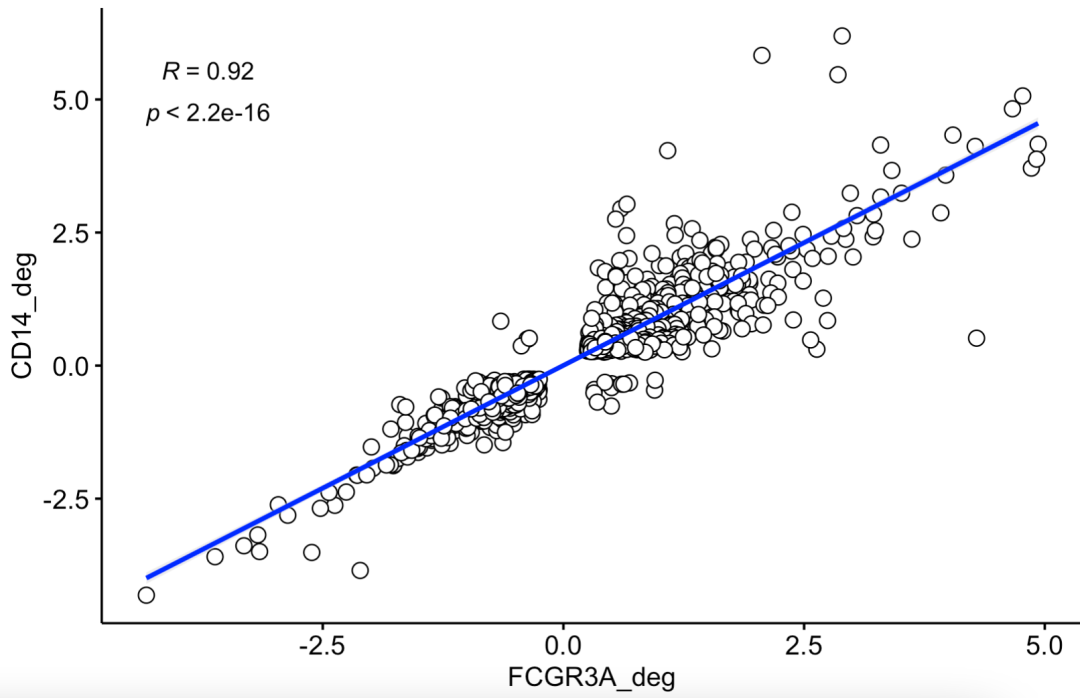
The intersection of statistically significant genes was plotted by two difference analyses
However, the author took the genes that were statistically significant in at least one of the two difference analyses for mapping. The English description is only genes called as DEGs (FDR < 0.05, fold change > 2 or < 2) for either comparison are shown
Therefore, the previous FindMarkers function needs to adjust the parameters. The first is to recommend logfc Threshold = 0, and min.pct = 0, which returns the difference analysis results of all genes. The modified code is as follows:
CD14_deg = FindMarkers(sce,ident.1 = 'CD14+ Mono',
                  ident.2 = 'B',
                  logfc.threshold = 0,
                  min.pct = 0
                  )
head(CD14_deg[order(CD14_deg$p_val),])
FCGR3A_deg = FindMarkers(sce,ident.1 = 'FCGR3A+ Mono',
                       ident.2 = 'B',
                       logfc.threshold = 0,
                       min.pct = 0)
head(FCGR3A_deg[order(FCGR3A_deg$p_val),])


ids=c(rownames(CD14_deg[abs(CD14_deg$avg_log2FC)>2,]),
              rownames(FCGR3A_deg[abs(FCGR3A_deg$avg_log2FC)>2,]))
ids
df= data.frame(
  FCGR3A_deg = FCGR3A_deg[ids,'avg_log2FC'],
  CD14_deg = CD14_deg[ids,'avg_log2FC']
)
library(ggpubr)
ggscatter(df, x = "FCGR3A_deg", y = "CD14_deg",
          color = "black", shape = 21, size = 3, # Points color, shape and size
          add = "reg.line",  # Add regressin line
          add.params = list(color = "blue", fill = "lightgray"), # Customize reg. line
          conf.int = TRUE, # Add confidence interval
          cor.coef = TRUE, # Add correlation coefficient. see ?stat_cor
          cor.coeff.args = list(method = "pearson",  label.sep = "\n")
)
The diagram is as follows;
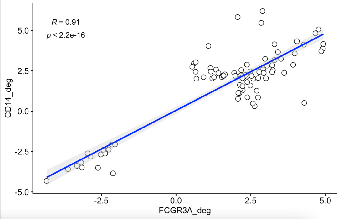
At this time, there will be a conflict between the two difference analysis results, which is not statistically significant in both differences.
If you don't have a basic understanding of single cell data analysis, you can see basic 10:
- 01. Upstream analysis process
- 02. How many samples of the subject and how much sequencing data
- 03. Filter unqualified cells and genes (data quality control is very important)
- 04. Filter mitochondrial ribosomal genes
- 05. Remove cellular and genetic effects
- 06. Dimensionality reduction clustering of single cell transcriptome data
- 07. Cell subpopulation annotation for single cell transcriptome data processing
- 08. Group the obtained subgroups more carefully
- 09. Comparison of cell subsets in single cell transcriptome data processing
The most basic is dimension reduction clustering. Refer to the previous example: Single cell clustering and clustering annotation that everyone can learn