WGCNA basic concepts
WGCNA (weighted correlation network analysis) is a systems biology method used to describe the gene association patterns between different samples. It can be used to identify highly synergistic gene sets, and identify candidate biomarker genes or therapeutic targets according to the interconnection of gene sets and the association between gene sets and phenotypes.
Compared with only focusing on differentially expressed genes, WGCNA uses the information of thousands or nearly 10000 genes with the greatest changes or all genes to identify the gene set of interest and conduct significant correlation analysis with phenotype. One is to make full use of information. The other is to convert the correlation between thousands of genes and phenotypes into the correlation between several gene sets and phenotypes, which eliminates the problem of multiple hypothesis test correction.
To understand WGCNA, you need to understand the following terms and their definitions in WGCNA.
- Coexpression network: defined as weighted gene network. Points represent genes and edges represent gene expression correlation. Weighting refers to the calculation of the correlation value (the value of the correlation value is the soft threshold (power, pickSoftThreshold, which determines the appropriate power). The edge attribute of undirected network is calculated as abs(cor(genex, geney)) ^ power; The calculation method of edge attribute of directed network is (1 + cor (GeneX, geney) / 2) ^ power; The edge attribute of sign hybrid is calculated as cor (GeneX, geney) ^ power if cor > 0 else 0. This processing method strengthens the strong correlation and weakens the weak correlation or negative correlation, making the correlation value more in line with the characteristics of scale-free network and more biological significance. If there is no suitable power, it is generally caused by the great difference between some samples and other samples for some reason. Remove some samples or check the following empirical values according to the specific problems.
- Module: a highly interconnected gene set. In undirected networks, there are highly related genes in the module. In directed networks, there are highly positively correlated genes in the module. After clustering genes into modules, each module can be analyzed at three levels: 1 Functional enrichment analysis to check whether its functional characteristics are consistent with the research purpose; 2. Conduct correlation analysis between modules and traits to find out the module with the highest correlation with concerned traits; 3. Correlation analysis was conducted between the module and the sample to find the module with specific high expression. Gene enrichment related articles GO to the East, the best online GO enrichment analysis tool;GO, GSEA enrichment analysis network;GSEA enrichment analysis - interface operation . Other associations will be mentioned later.
- Connectivity: similar to the concept of "degree" in the network. The connectivity of each gene is the sum of the edge attributes of the genes connected to it.
- Module eigengene E: the first principal component of a given model, representing the gene expression profile of the whole model. This is a very clever combing, as we talked about before PCA analysis Before, it was mainly used for visualization. Now it is used in this place. It is good to replace a matrix with a vector to facilitate later calculation. (in addition to PCA, dimensionality reduction can also be seen tSNE)
- Intrinsic connectivity: the correlation degree between a given gene and other genes in a given model, and judge the relationship between genes.
- Module membership: the correlation between a given gene expression profile and the eigengene of a given model.
- Hub gene: key gene (gene with the most connectivity or connecting multiple modules).
- Adjacency matrix: a matrix composed of weighted correlation values between genes.
- TOM (Topological overlap matrix): convert the adjacency matrix into topological overlap matrix to reduce noise and false correlation, and obtain a new distance matrix. This information can be used to build a network or draw a TOM diagram.
Basic analysis process
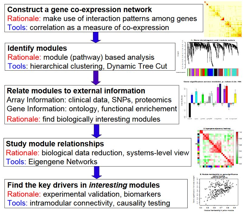
- Construction of gene coexpression network: weighted expression correlation was used.
- Identify gene set: hierarchical cluster analysis is carried out based on weighted correlation, and the clustering results are segmented according to the set standard to obtain different gene modules, which are represented by the branches and different colors of the clustering tree.
- If there is phenotypic information, calculate the correlation between gene modules and phenotypes, and identify the modules related to traits.
- Study the relationship between models and view the interaction networks of different models from the system level.
- Select the driving genes of interest from the key models, or infer the function of unknown genes according to the function of known genes in the model.
- The TOM matrix is derived and the correlation diagram is drawn.
WGCNA package actual combat
R package WGCNA is a functional set used to calculate various weighted association analysis. It can be used for network construction, gene screening, gene cluster identification, topological feature calculation, data simulation and visualization.
Input data and parameter selection
WGCNA is essentially a network analysis method based on correlation coefficient, which is suitable for multi sample data mode, and generally requires more than 15 samples. When the number of samples is more than 20, the effect is better. The more samples, the more stable the result is.
Gene expression matrix: the conventional expression matrix is enough, that is, the gene is in the row and the sample is in the column. Make a transposition before entering the analysis. RPKM, FPKM or other standardization methods have little impact. It is recommended to use the varianceStabilizingTransformation or log2(x+1) of Deseq2 to convert the standardized data. If the data comes from different batches, you need to remove the batch effect first (remember how to operate in the last transcriptome training class). If the data has a system offset, you need to do the next quantitative normalization.
Trait matrix: the trait used for association analysis must be numerical (such as height, weight, diameter in the following example). If it is a region or classification variable, it needs to be converted to the form of 0-1 matrix (1 indicates that it belongs to this group or has this attribute, 0 indicates that it does not belong to this group or does not have this attribute, such as sample grouping information WT, KO, OE).
Signed network and Robust correlation (bicor) are recommended. (according to your own needs, see how each network is calculated and know how to choose)
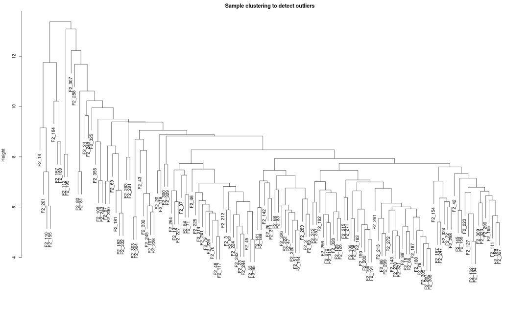
When the power of undirected network is less than 15 or the power of directed network is less than 30, no power value can make the scale-free network map structure R^2 reach 0.8 or the average connectivity drop below 100, which may be caused by the great difference between some samples and other samples. This may be caused by batch effect, sample heterogeneity or too much influence of experimental conditions on expression. You can draw sample clustering to view grouping information, associated batch information, processing information and whether there are abnormal samples (you can use the above methods) Simplify the heat map and add row or column attributes ). If this is indeed caused by meaningful biological changes, the empirical power value in the later program can also be used.
Install WGCNA
WGCNA relies on many packages. The packages on bioconductor need to be installed by itself, and the packages on cran can be installed automatically. Generally, the installation of WGCNA can be completed by running the following four statements in R.
It is recommended to add -- with Blas -- with LAPACK when compiling and installing R to improve the speed of matrix operation. See R and Rstudio installation.
#source("https://bioconductor.org/biocLite.R")
#biocLite(c("AnnotationDbi", "impute","GO.db", "preprocessCore"))
#site="https://mirrors.tuna.tsinghua.edu.cn/CRAN"
#install.packages(c("WGCNA", "stringr", "reshape2"), repos=site)
WGCNA actual combat
The actual combat uses the cleared matrix provided by the official. The original matrix has too much information, which is easy to mislead. The background replies to WGCNA to obtain data.
Data read in
library(WGCNA)

## Loading required package: dynamicTreeCut

## Loading required package: fastcluster

##
## Attaching package: 'fastcluster'

## The following object is masked from 'package:stats':
##
##     hclust

## ==========================================================================
## *
## *  Package WGCNA 1.63 loaded.
## *
## *    Important note: It appears that your system supports multi-threading,
## *    but it is not enabled within WGCNA in R.
## *    To allow multi-threading within WGCNA with all available cores, use
## *
## *          allowWGCNAThreads()
## *
## *    within R. Use disableWGCNAThreads() to disable threading if necessary.
## *    Alternatively, set the following environment variable on your system:
## *
## *          ALLOW_WGCNA_THREADS=<number_of_processors>
## *
## *    for example
## *
## *          ALLOW_WGCNA_THREADS=48
## *
## *    To set the environment variable in linux bash shell, type
## *
## *           export ALLOW_WGCNA_THREADS=48
## *
## *     before running R. Other operating systems or shells will
## *     have a similar command to achieve the same aim.
## *
## ==========================================================================

##
## Attaching package: 'WGCNA'

## The following object is masked from 'package:stats':
##
##     cor

library(reshape2)
library(stringr)

#
options(stringsAsFactors = FALSE)
# Turn on Multithreading
enableWGCNAThreads()

## Allowing parallel execution with up to 47 working processes.

# Conventional expression matrix, after log2 conversion or
# Data transformed by varianceStabilizingTransformation of Deseq2
# If there are batch effects that need to be removed in advance, you can use removeBatchEffect
# If there is a systematic offset (boxplot can be used to check whether the gene expression distribution is consistent),
# Quantitative normalization required

exprMat <- "WGCNA/LiverFemaleClean.txt"

# Officially recommended "signed" or "signed hybrid"
# It is consistent with the original file, so it has not been modified
type = "unsigned"

# Correlation calculation
# Official recommendation: Biweight mid correlation & Bicor
# corType: pearson or bicor
# It is consistent with the original file, so it has not been modified
corType = "pearson"

corFnc = ifelse(corType=="pearson", cor, bicor)
# When calculating the correlation of binary variables, such as sample character information,
# Or when gene expression is heavily dependent on disease status, the following parameters need to be set
maxPOutliers = ifelse(corType=="pearson",1,0.05)

# When associating binary variables of sample traits, set
robustY = ifelse(corType=="pearson",T,F)

##Import data##
dataExpr <- read.table(exprMat, sep='\t', row.names=1, header=T,
                     quote="", comment="", check.names=F)

dim(dataExpr)

## [1] 3600  134

head(dataExpr)[,1:8]

##                 F2_2    F2_3     F2_14    F2_15    F2_19       F2_20
## MMT00000044 -0.01810  0.0642  6.44e-05 -0.05800  0.04830 -0.15197410
## MMT00000046 -0.07730 -0.0297  1.12e-01 -0.05890  0.04430 -0.09380000
## MMT00000051 -0.02260  0.0617 -1.29e-01  0.08710 -0.11500 -0.06502607
## MMT00000076 -0.00924 -0.1450  2.87e-02 -0.04390  0.00425 -0.23610000
## MMT00000080 -0.04870  0.0582 -4.83e-02 -0.03710  0.02510  0.08504274
## MMT00000102  0.17600 -0.1890 -6.50e-02 -0.00846 -0.00574 -0.01807182
##                F2_23    F2_24
## MMT00000044 -0.00129 -0.23600
## MMT00000046  0.09340  0.02690
## MMT00000051  0.00249 -0.10200
## MMT00000076 -0.06900  0.01440
## MMT00000080  0.04450  0.00167
## MMT00000102 -0.12500 -0.06820
Data filtering
## The genes with the first 75% of the median absolute deviation were screened, and at least MAD was greater than 0.01
## Filtering will reduce the amount of computation and lose some information
## You can also make MAD greater than 0 without screening
m.mad <- apply(dataExpr,1,mad)
dataExprVar <- dataExpr[which(m.mad >
                 max(quantile(m.mad, probs=seq(0, 1, 0.25))[2],0.01)),]

## Convert to a matrix of samples in rows and genes in columns
dataExpr <- as.data.frame(t(dataExprVar))

## Detect missing values
gsg = goodSamplesGenes(dataExpr, verbose = 3)

##  Flagging genes and samples with too many missing values...
##   ..step 1

if (!gsg$allOK){
  # Optionally, print the gene and sample names that were removed:
  if (sum(!gsg$goodGenes)>0)
    printFlush(paste("Removing genes:",
                     paste(names(dataExpr)[!gsg$goodGenes], collapse = ",")));
  if (sum(!gsg$goodSamples)>0)
    printFlush(paste("Removing samples:",
                     paste(rownames(dataExpr)[!gsg$goodSamples], collapse = ",")));
  # Remove the offending genes and samples from the data:
  dataExpr = dataExpr[gsg$goodSamples, gsg$goodGenes]
}

nGenes = ncol(dataExpr)
nSamples = nrow(dataExpr)

dim(dataExpr)

## [1]  134 2697

head(dataExpr)[,1:8]

##       MMT00000051 MMT00000080 MMT00000102 MMT00000149 MMT00000159
## F2_2  -0.02260000 -0.04870000  0.17600000  0.07680000 -0.14800000
## F2_3   0.06170000  0.05820000 -0.18900000  0.18600000  0.17700000
## F2_14 -0.12900000 -0.04830000 -0.06500000  0.21400000 -0.13200000
## F2_15  0.08710000 -0.03710000 -0.00846000  0.12000000  0.10700000
## F2_19 -0.11500000  0.02510000 -0.00574000  0.02100000 -0.11900000
## F2_20 -0.06502607  0.08504274 -0.01807182  0.06222751 -0.05497686
##       MMT00000207 MMT00000212 MMT00000241
## F2_2   0.06870000  0.06090000 -0.01770000
## F2_3   0.10100000  0.05570000 -0.03690000
## F2_14  0.10900000  0.19100000 -0.15700000
## F2_15 -0.00858000 -0.12100000  0.06290000
## F2_19  0.10500000  0.05410000 -0.17300000
## F2_20 -0.02441415  0.06343181  0.06627665
Soft threshold filtering
## Check whether there are outlier samples
sampleTree = hclust(dist(dataExpr), method = "average")
plot(sampleTree, main = "Sample clustering to detect outliers", sub="", xlab="")
The screening principle of soft threshold is to make the constructed network more consistent with the characteristics of scale-free network.
powers = c(c(1:10), seq(from = 12, to=30, by=2))
sft = pickSoftThreshold(dataExpr, powerVector=powers,
                        networkType=type, verbose=5)

## pickSoftThreshold: will use block size 2697.
##  pickSoftThreshold: calculating connectivity for given powers...
##    ..working on genes 1 through 2697 of 2697
##    Power SFT.R.sq  slope truncated.R.sq mean.k. median.k. max.k.
## 1      1   0.1370  0.825          0.412 587.000  5.95e+02  922.0
## 2      2   0.0416 -0.332          0.630 206.000  2.02e+02  443.0
## 3      3   0.2280 -0.747          0.920  91.500  8.43e+01  247.0
## 4      4   0.3910 -1.120          0.908  47.400  4.02e+01  154.0
## 5      5   0.7320 -1.230          0.958  27.400  2.14e+01  102.0
## 6      6   0.8810 -1.490          0.916  17.200  1.22e+01   83.7
## 7      7   0.8940 -1.640          0.869  11.600  7.29e+00   75.4
## 8      8   0.8620 -1.660          0.827   8.250  4.56e+00   69.2
## 9      9   0.8200 -1.600          0.810   6.160  2.97e+00   64.2
## 10    10   0.8390 -1.560          0.855   4.780  2.01e+00   60.1
## 11    12   0.8020 -1.410          0.866   3.160  9.61e-01   53.2
## 12    14   0.8470 -1.340          0.909   2.280  4.84e-01   47.7
## 13    16   0.8850 -1.250          0.932   1.750  2.64e-01   43.1
## 14    18   0.8830 -1.210          0.922   1.400  1.46e-01   39.1
## 15    20   0.9110 -1.180          0.926   1.150  8.35e-02   35.6
## 16    22   0.9160 -1.140          0.927   0.968  5.02e-02   32.6
## 17    24   0.9520 -1.120          0.961   0.828  2.89e-02   29.9
## 18    26   0.9520 -1.120          0.944   0.716  1.77e-02   27.5
## 19    28   0.9380 -1.120          0.922   0.626  1.08e-02   25.4
## 20    30   0.9620 -1.110          0.951   0.551  6.49e-03   23.5

par(mfrow = c(1,2))
cex1 = 0.9
# The horizontal axis is Soft threshold (power), and the vertical axis is the evaluation parameter of scale-free network. The higher the value is,
# The more the network conforms to the non scale characteristic (non scale)
plot(sft$fitIndices[,1], -sign(sft$fitIndices[,3])*sft$fitIndices[,2],
     xlab="Soft Threshold (power)",
     ylab="Scale Free Topology Model Fit,signed R^2",type="n",
     main = paste("Scale independence"))
text(sft$fitIndices[,1], -sign(sft$fitIndices[,3])*sft$fitIndices[,2],
     labels=powers,cex=cex1,col="red")
# Screening criteria. R-square=0.85
abline(h=0.85,col="red")

# Soft threshold and average connectivity
plot(sft$fitIndices[,1], sft$fitIndices[,5],
     xlab="Soft Threshold (power)",ylab="Mean Connectivity", type="n",
     main = paste("Mean connectivity"))
text(sft$fitIndices[,1], sft$fitIndices[,5], labels=powers,
     cex=cex1, col="red")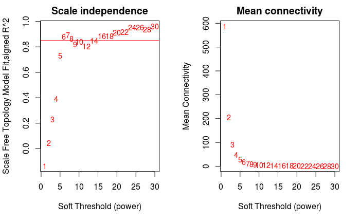
power = sft$powerEstimate
power

## [1] 6
Experience power (selected when there is no power meeting the conditions)
# When the power of undirected network is less than 15 or the power of directed network is less than 30, no power value can make
# The scale-free network map structure R^2 reaches 0.8, and the average connectivity is high. If it is above 100, it may be due to
# Some samples are too different from other samples. This may be influenced by batch effect, sample heterogeneity or experimental conditions
# The influence of expression is too great. You can view grouping information and abnormal samples by drawing sample clustering.
# If this is indeed caused by meaningful biological changes, the following empirical power values can also be used.
if (is.na(power)){
  power = ifelse(nSamples<20, ifelse(type == "unsigned", 9, 18),
          ifelse(nSamples<30, ifelse(type == "unsigned", 8, 16),
          ifelse(nSamples<40, ifelse(type == "unsigned", 7, 14),
          ifelse(type == "unsigned", 6, 12))
          )
          )
}
Network construction
##One step network construction: One-step network construction and module detection##
# power: soft threshold calculated in the previous step
# maxBlockSize: the number of genes of the largest module that the computer can process (5000 by default);
#  4G memory computers can handle 8000-10000, 16G memory computers can handle 20000, and 32G memory computers can
#  To handle 30000
#  If computing resources allow, it is best to put them in a block.
# corType: pearson or bicor
# numericLabels: returns a number instead of a color as the name of the module, which can be converted to a color later
# saveTOMs: the most time-consuming calculation, which is stored for subsequent use
# mergeCutHeight: the threshold of merging modules. The larger the module, the fewer the modules
net = blockwiseModules(dataExpr, power = power, maxBlockSize = nGenes,
                       TOMType = type, minModuleSize = 30,
                       reassignThreshold = 0, mergeCutHeight = 0.25,
                       numericLabels = TRUE, pamRespectsDendro = FALSE,
                       saveTOMs=TRUE, corType = corType,
                       maxPOutliers=maxPOutliers, loadTOMs=TRUE,
                       saveTOMFileBase = paste0(exprMat, ".tom"),
                       verbose = 3)

##  Calculating module eigengenes block-wise from all genes
##    Flagging genes and samples with too many missing values...
##     ..step 1
##  ..Working on block 1 .
##     TOM calculation: adjacency..
##     ..will use 47 parallel threads.
##      Fraction of slow calculations: 0.000000
##     ..connectivity..
##     ..matrix multiplication (system BLAS)..
##     ..normalization..
##     ..done.
##    ..saving TOM for block 1 into file WGCNA/LiverFemaleClean.txt.tom-block.1.RData
##  ....clustering..
##  ....detecting modules..
##  ....calculating module eigengenes..
##  ....checking kME in modules..
##      ..removing 3 genes from module 1 because their KME is too low.
##      ..removing 5 genes from module 12 because their KME is too low.
##      ..removing 1 genes from module 14 because their KME is too low.
##  ..merging modules that are too close..
##      mergeCloseModules: Merging modules whose distance is less than 0.25
##        Calculating new MEs...

# According to the number of genes in the module, they are arranged in descending order and numbered as' 1 - maximum number of modules'.
# **0 (grey) * * indicates that * * is not * * classified into any module.
table(net$colors)

##
##   0   1   2   3   4   5   6   7   8   9  10  11  12  13
## 135 472 356 333 307 303 177 158 102  94  69  66  63  62
Hierarchical clustering tree shows each module
## Gray is * * unclassified * * to module genes.
# Convert labels to colors for plotting
moduleLabels = net$colors
moduleColors = labels2colors(moduleLabels)
# Plot the dendrogram and the module colors underneath
# If you are not satisfied with the results, you can also recutblock wise trees to save computing time
plotDendroAndColors(net$dendrograms[[1]], moduleColors[net$blockGenes[[1]]],
                    "Module colors",
                    dendroLabels = FALSE, hang = 0.03,
                    addGuide = TRUE, guideHang = 0.05)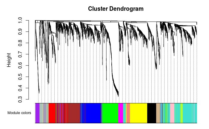
Draw correlation diagram between modules
# module eigengene, which can draw a line diagram as a display of the gene expression trend of each module
MEs = net$MEs

### There is no need to recalculate. Just change the following name
### The official tutorial is recalculated, so it can be started without so much trouble
MEs_col = MEs
colnames(MEs_col) = paste0("ME", labels2colors(
  as.numeric(str_replace_all(colnames(MEs),"ME",""))))
MEs_col = orderMEs(MEs_col)

# The correlation map of each module obtained by clustering according to the expression of genes
# marDendro/marHeatmap sets the bottom, left, top, and right margins
plotEigengeneNetworks(MEs_col, "Eigengene adjacency heatmap",
                      marDendro = c(3,3,2,4),
                      marHeatmap = c(3,4,2,2), plotDendrograms = T,
                      xLabelsAngle = 90)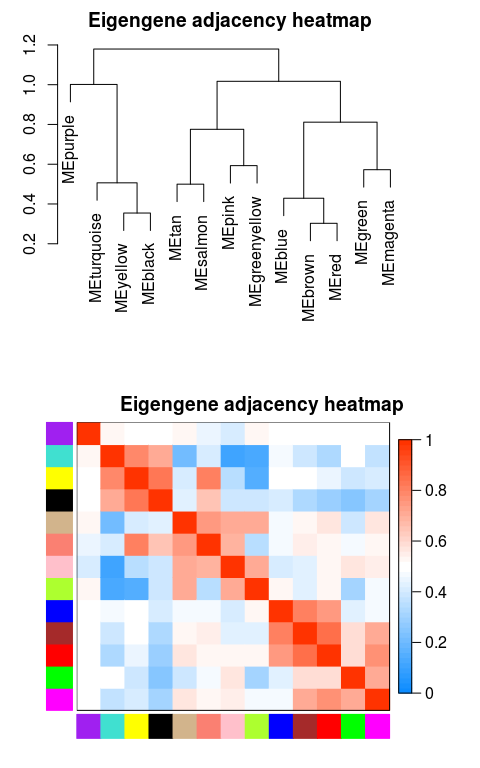
## If there is phenotypic data, it can also be put together with ME data and plotted together
#MEs_colpheno = orderMEs(cbind(MEs_col, traitData))
#plotEigengeneNetworks(MEs_colpheno, "Eigengene adjacency heatmap",
#                      marDendro = c(3,3,2,4),
#                      marHeatmap = c(3,4,2,2), plotDendrograms = T,
#                      xLabelsAngle = 90)
Visual gene network (TOM plot)
# If step-by-step calculation is adopted, or the set blocksize > = total gene number, directly load the calculated TOM results
# Otherwise, it needs to be calculated again, which is time-consuming
# TOM = TOMsimilarityFromExpr(dataExpr, power=power, corType=corType, networkType=type)
load(net$TOMFiles[1], verbose=T)

## Loading objects:
##   TOM

TOM <- as.matrix(TOM)

dissTOM = 1-TOM
# Transform dissTOM with a power to make moderately strong
# connections more visible in the heatmap
plotTOM = dissTOM^7
# Set diagonal to NA for a nicer plot
diag(plotTOM) = NA
# Call the plot function

# This part is particularly time-consuming, and hierarchical clustering is done at the same time
TOMplot(plotTOM, net$dendrograms, moduleColors,
        main = "Network heatmap plot, all genes")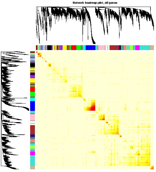
Export network for Cytoscape
The network diagram drawn by Cytoscape is shown in our updated version Video tutorial or https://bioinfo.ke.qq.com/ .
probes = colnames(dataExpr)
dimnames(TOM) <- list(probes, probes)

# Export the network into edge and node list files Cytoscape can read
# The default threshold is 0.5, which can be adjusted according to your own needs, or can be exported in the
# Readjust in cytoscape
cyt = exportNetworkToCytoscape(TOM,
             edgeFile = paste(exprMat, ".edges.txt", sep=""),
             nodeFile = paste(exprMat, ".nodes.txt", sep=""),
             weighted = TRUE, threshold = 0,
             nodeNames = probes, nodeAttr = moduleColors)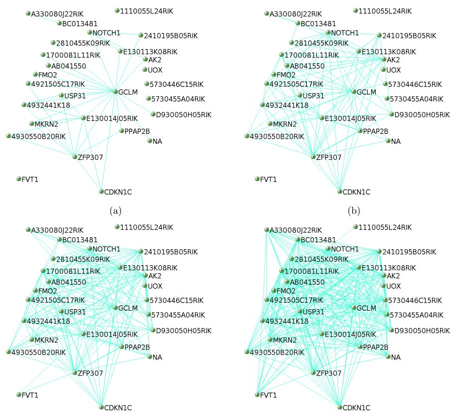
Associated phenotypic data
trait <- "WGCNA/TraitsClean.txt"
# It is not necessary to read phenotypic data
if(trait != "") {
  traitData <- read.table(file=trait, sep='\t', header=T, row.names=1,
                          check.names=FALSE, comment='',quote="")
  sampleName = rownames(dataExpr)
  traitData = traitData[match(sampleName, rownames(traitData)), ]
}

### Module associated with phenotypic data
if (corType=="pearsoon") {
  modTraitCor = cor(MEs_col, traitData, use = "p")
  modTraitP = corPvalueStudent(modTraitCor, nSamples)
} else {
  modTraitCorP = bicorAndPvalue(MEs_col, traitData, robustY=robustY)
  modTraitCor = modTraitCorP$bicor
  modTraitP   = modTraitCorP$p
}

## Warning in bicor(x, y, use = use, ...): bicor: zero MAD in variable 'y'.
## Pearson correlation was used for individual columns with zero (or missing)
## MAD.

# Sign means to keep several decimal places
textMatrix = paste(signif(modTraitCor, 2), "\n(", signif(modTraitP, 1), ")", sep = "")
dim(textMatrix) = dim(modTraitCor)
labeledHeatmap(Matrix = modTraitCor, xLabels = colnames(traitData),
               yLabels = colnames(MEs_col),
               cex.lab = 0.5,
               ySymbols = colnames(MEs_col), colorLabels = FALSE,
               colors = blueWhiteRed(50),
               textMatrix = textMatrix, setStdMargins = FALSE,
               cex.text = 0.5, zlim = c(-1,1),
               main = paste("Module-trait relationships"))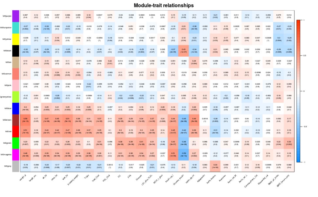
Genes in the module are associated with phenotypic data. From the above figure, we can see MEmagenta and Insulin_ug_l correlation, select these two parts for analysis.
## As can be seen from the above figure, MEmagenta and Insulin_ug_l relevant

## Correlation between gene and phenotype data in module

# Although the correlation between traits and modules is calculated, the most relevant modules can be selected for analysis,
# However, the module itself still contains many genes, and the most important genes need to be further searched.
# All modules can calculate correlation coefficients with genes, and all continuous traits can also be related to gene expression
# Value to calculate the correlation coefficient.
# If genes significantly related to traits are also significantly related to a module, these genes may be very important
# .

### Calculate the correlation matrix between module and gene

if (corType=="pearsoon") {
  geneModuleMembership = as.data.frame(cor(dataExpr, MEs_col, use = "p"))
  MMPvalue = as.data.frame(corPvalueStudent(
             as.matrix(geneModuleMembership), nSamples))
} else {
  geneModuleMembershipA = bicorAndPvalue(dataExpr, MEs_col, robustY=robustY)
  geneModuleMembership = geneModuleMembershipA$bicor
  MMPvalue   = geneModuleMembershipA$p
}

# The correlation matrix between traits and genes was calculated

## Only continuous traits can be calculated. If it is a discrete variable, it will be converted to 0-1 matrix when building the sample table.

if (corType=="pearsoon") {
  geneTraitCor = as.data.frame(cor(dataExpr, traitData, use = "p"))
  geneTraitP = as.data.frame(corPvalueStudent(
             as.matrix(geneTraitCor), nSamples))
} else {
  geneTraitCorA = bicorAndPvalue(dataExpr, traitData, robustY=robustY)
  geneTraitCor = as.data.frame(geneTraitCorA$bicor)
  geneTraitP   = as.data.frame(geneTraitCorA$p)
}

## Warning in bicor(x, y, use = use, ...): bicor: zero MAD in variable 'y'.
## Pearson correlation was used for individual columns with zero (or missing)
## MAD.

# Finally, the two correlation matrices are combined to specify the module of interest for analysis
module = "magenta"
pheno = "Insulin_ug_l"
modNames = substring(colnames(MEs_col), 3)
# Get columns of interest
module_column = match(module, modNames)
pheno_column = match(pheno,colnames(traitData))
# Obtain genes in the module
moduleGenes = moduleColors == module

sizeGrWindow(7, 7)
par(mfrow = c(1,1))
# The genes highly related to traits are also the key genes of the model related to traits
verboseScatterplot(abs(geneModuleMembership[moduleGenes, module_column]),
                   abs(geneTraitCor[moduleGenes, pheno_column]),
                   xlab = paste("Module Membership in", module, "module"),
                   ylab = paste("Gene significance for", pheno),
                   main = paste("Module membership vs. gene significance\n"),
                   cex.main = 1.2, cex.lab = 1.2, cex.axis = 1.2, col = module)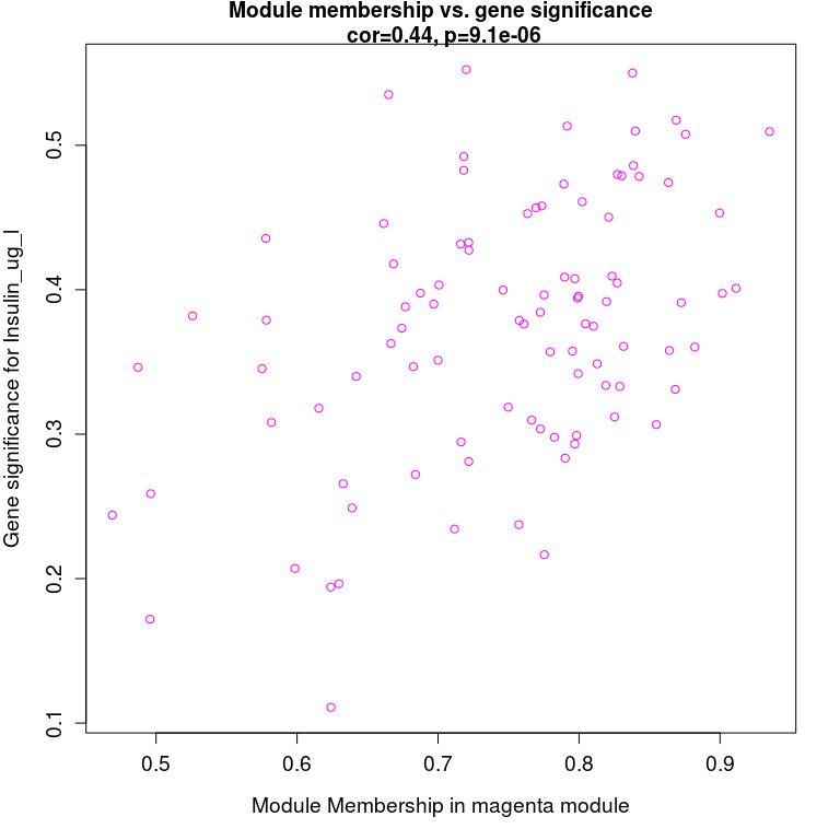
The step-by-step method shows what is done at each step
### Calculate adjacency matrix
adjacency = adjacency(dataExpr, power = power)

### The adjacency matrix is transformed into topological overlap matrix to reduce noise and false correlation and obtain distance matrix.
TOM = TOMsimilarity(adjacency)
dissTOM = 1-TOM

### Hierarchical clustering calculates the distance tree between genes
geneTree = hclust(as.dist(dissTOM), method = "average")

### Module merging
# We like large modules, so we set the minimum module size relatively high:
minModuleSize = 30
# Module identification using dynamic tree cut:
dynamicMods = cutreeDynamic(dendro = geneTree, distM = dissTOM,
                            deepSplit = 2, pamRespectsDendro = FALSE,
                            minClusterSize = minModuleSize)
# Convert numeric lables into colors
dynamicColors = labels2colors(dynamicMods)

### By calculating the representative patterns of modules and evaluating the quantitative similarity between modules, the similarity of expression maps was combined
 Module of
MEList = moduleEigengenes(datExpr, colors = dynamicColors)
MEs = MEList$eigengenes
# Calculate dissimilarity of module eigengenes
MEDiss = 1-cor(MEs)
# Cluster module eigengenes
METree = hclust(as.dist(MEDiss), method = "average")
MEDissThres = 0.25

# Call an automatic merging function
merge = mergeCloseModules(datExpr, dynamicColors, cutHeight = MEDissThres, verbose = 3)
# The merged module colors
mergedColors = merge$colors;
# Eigengenes of the new merged

## Step by step completion
Reference:
- Official website: https://horvath.genetics.ucla.edu/html/CoexpressionNetwork/Rpackages/WGCNA/Tutorials/
- Interpretation of terms: https://horvath.genetics.ucla.edu/html/CoexpressionNetwork/Rpackages/WGCNA/Tutorials/Simulated-00-Background.pdf
- FAQ: https://horvath.genetics.ucla.edu/html/CoexpressionNetwork/Rpackages/WGCNA/faq.html
- Shengxin blog: http://blog.genesino.com
- Here comes the upgraded version of the free online drawing tool with high appearance~~~ (WGCNA analysis can be done online)