See the brief book for the complete original address For more complete Vue notes, see Front end Web notes Updating
Summary of this article
- Project initialization
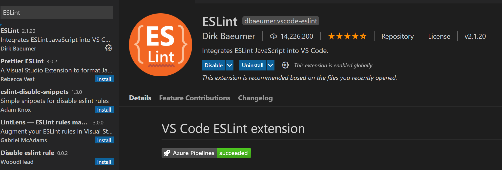
- Install ESLint plug-in
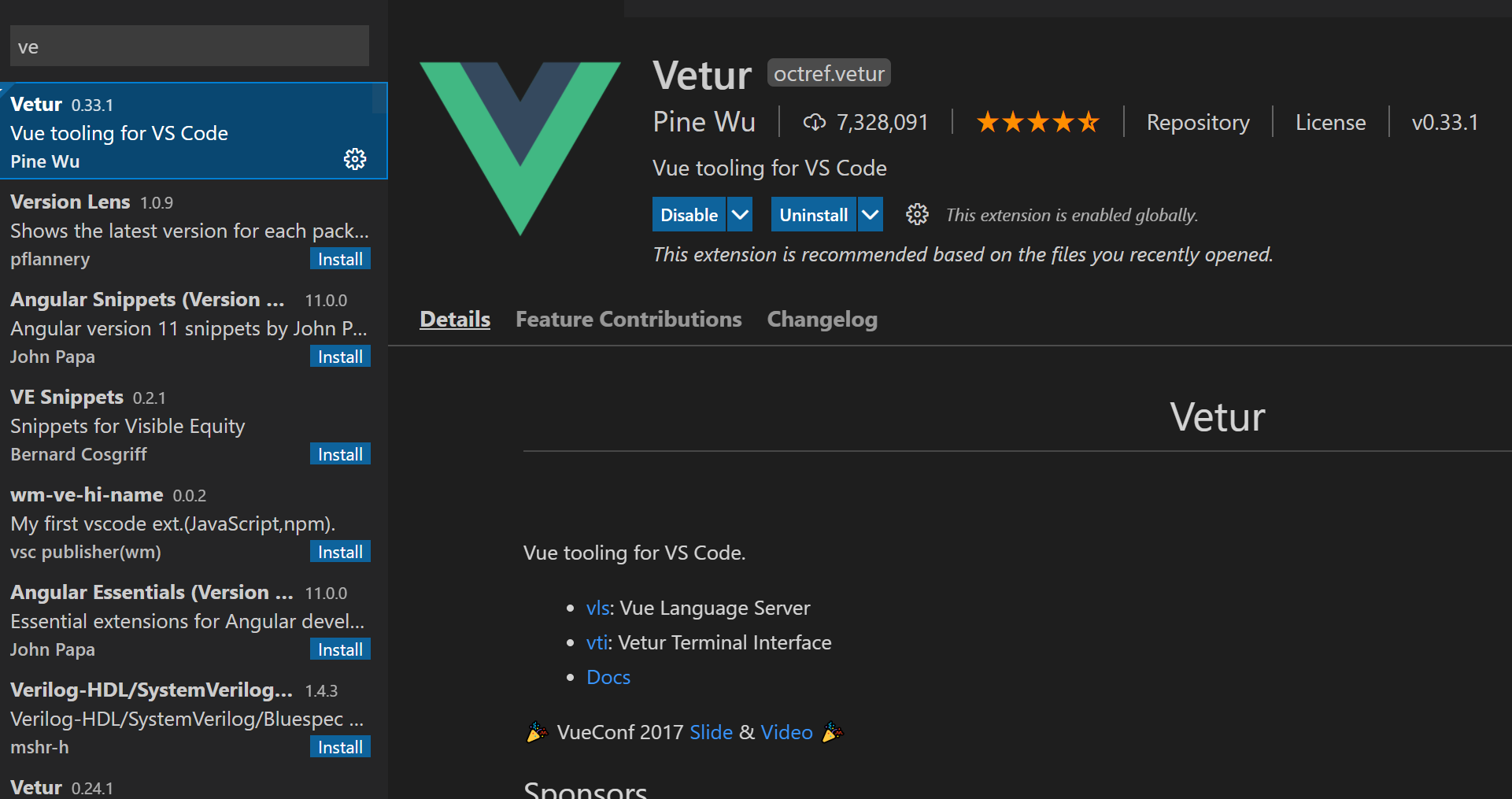
- Install Vetur plug-in
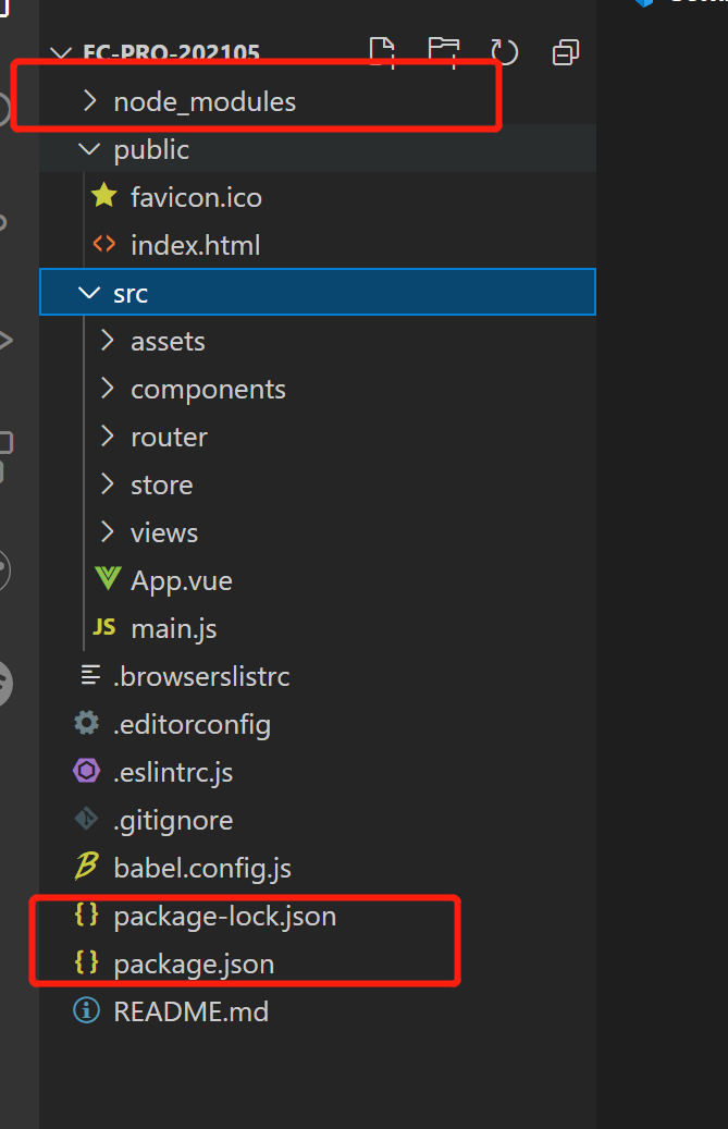
- Directory | node_modules,package.json
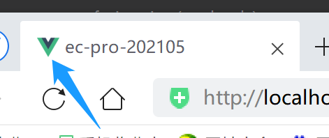
- Directory | public directory
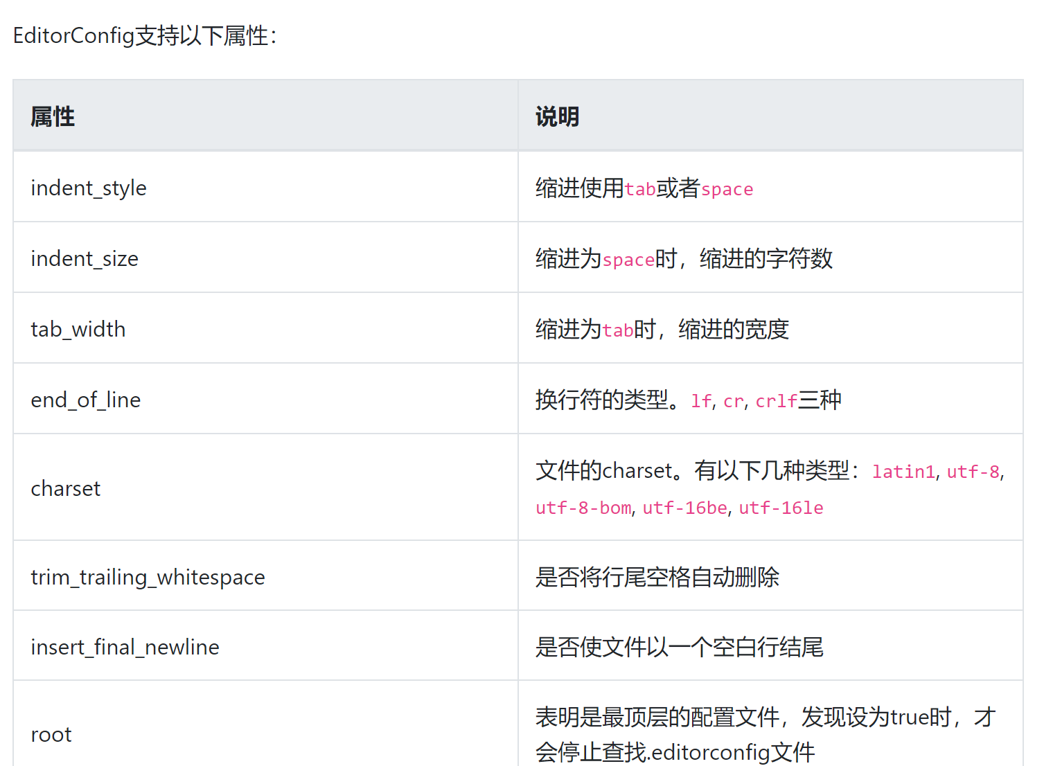
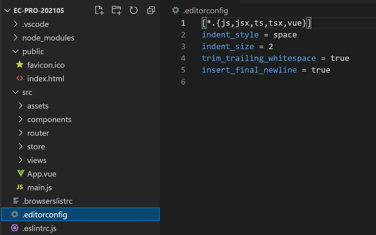
- Contents | editorconfig file
- Directory | package lock json
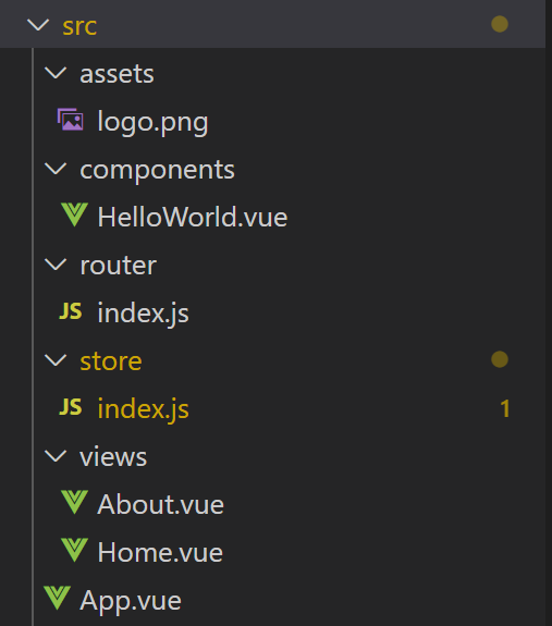
- Directory | src
- Style compatible browser
- Use mobile terminal simulator
- iconfont.cn use of Ali vector icon library [collect icon to project]
- The browser can only use the minimum text size of 12px. If you want to display 10px, you need to write 20px and then reduce it by half
- Optimization | css with dependency can be abbreviated
- Optimization | abbreviation of css introduction
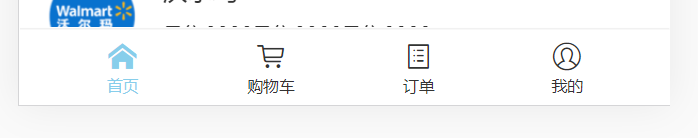
- 1.end the UI in the bottom column is basically completed
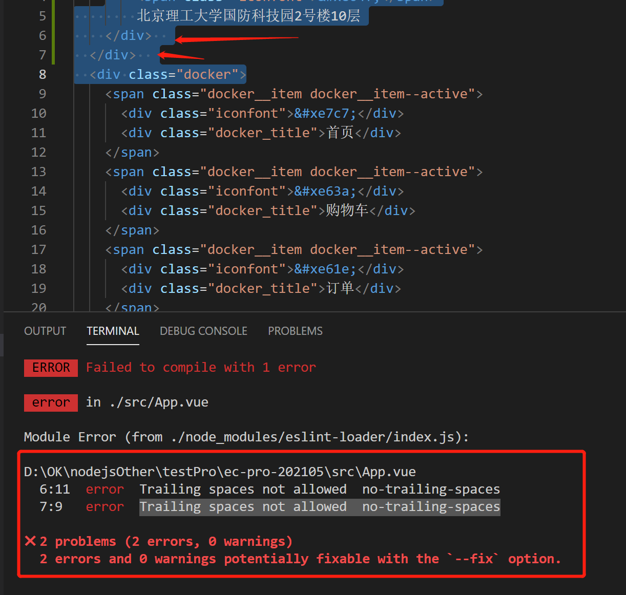
- 2.1 bug | error Trailing spaces not allowed no-trailing-spaces
- 2.2 pay attention to the priority of CSS Class
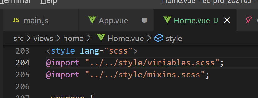
- 2.3 create a new scss file and define a common style variable [similar to android res/style / file]
- 2.4 create a new scss file and encapsulate mixin. The effect is the same as above
- The location bar is now preliminarily completed
- 3. Search and banner area
- 3.1 add the iconfont project icon [search] to update the project link resource code
- 3.2 prevent the icon from loading too slowly during weak network, resulting in jitter of surrounding components
- 4. Icon Grid layout
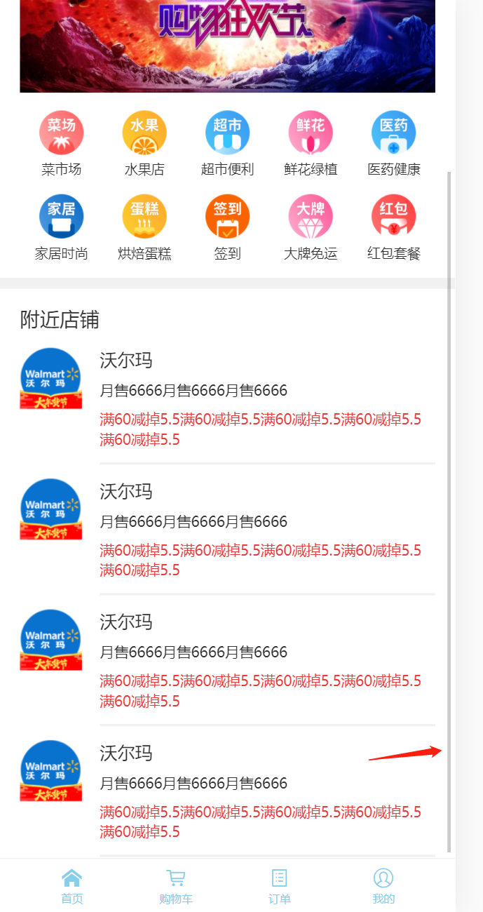
- 5. Nearby column
- 5.1 charm of flow layout
- 5.2 note the default margin of the < p > tag!! (note the default margin for other labels)
- 5.3 [overflow-y: auto] handle overflow so that the bottom navigation bar will not follow
- 6. Split component code
- Then there is the split of the Nearby part
- home. Registered as a sub component in Vue:
- Finally, split the bottom navigation bar
- 7. Use v-for and v-html to optimize the code
- **7.1 iconfont escape problem**
- 7.2 skillfully use expressions to control css processing!!!
- **7.3 string template matching practice**
- 7.4 basic implementation of homepage UI (finished)
- 8.1 scoped limits the scope of the style
- 8.2 installation and use of Vue js devtools
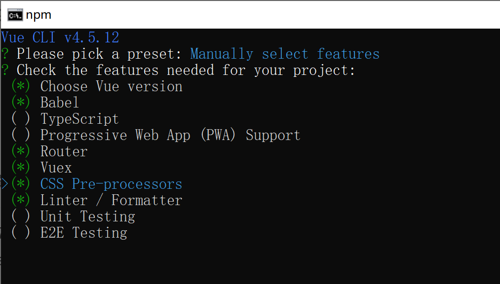
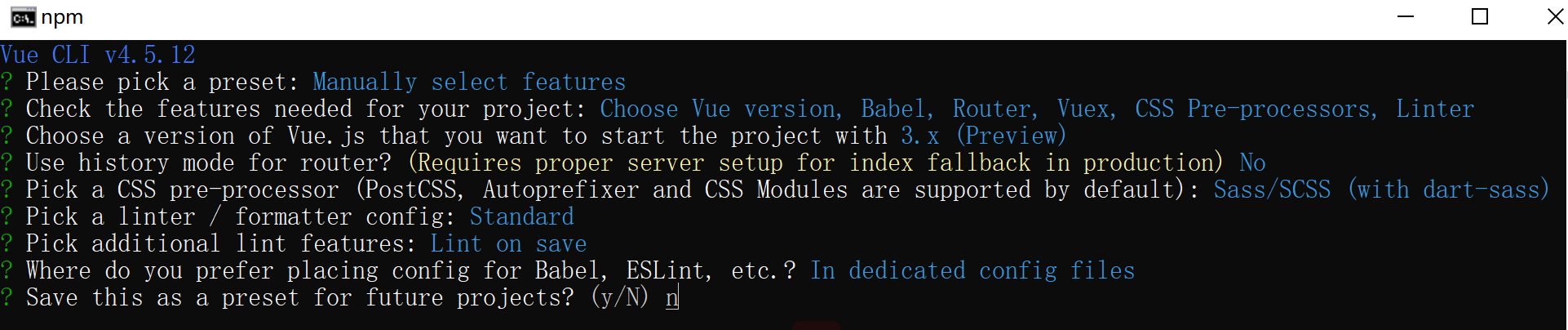
Project initialization
Install ESLint plug-in
Assist in code verification and standardize Code:
Install Vetur plug-in
Identify and highlight Vue syntax:
Directory | node_modules,package.json
After npm install (sometimes the project will be generated automatically, so there is no need for npm install), package.json is a directory that records the dependencies of third-party libraries, node_modules store third-party library dependent modules:
Where, package JSON code actually has a lot of knowledge:
as Detailed explanation of package.json configuration In,
browserslist specifies the version of the project compatible with the browser or device,
"> 1%" refers to browsers with > 1% of users worldwide;
"last 2 versions" means that only the latest two browser versions are supported in the above browsers;
"not dead" means the browser being maintained;
{
"name": "h5-components",
"version": "1.2.0",
"description": "",
"main": "./lib/index",
"module": "./es/index",
"files": [
"lib",
"es",
"dist",
"assets"
],
"repository": "http://.../h5-components.git",
"homepage": "http://...",
"author": "",
"license": "MIT",
"scripts": {
"dll": "webpack --config webpack.dll.config.js",
"rccompile": "rc-tools run compile --babel-runtime --copy-files",
"dev": "webpack-dev-server --env.api dev",
"rcdist": "rc-tools run dist",
"ucs": "yarn upgrade h5-css",
"rclint": "rc-tools run lint",
"build": "yarn rccompile && git add . && git commit -m '[compile]' && git pull && git push"
},
"config": {
"port": 8089,
"entry": {
"h5-components": [
"./index.js"
]
}
},
"dependencies": {
"antd-mobile": "^2.2.0",
"classnames": "^2.2.1",
"exif-js": "^2.3.0"
},
"devDependencies": {
"file-loader": "^1.1.5",
"less-loader": "^4.1.0",
"lodash": "^4.17.4",
"lodash-webpack-plugin": "^0.11.4",
"mini-css-extract-plugin": "^0.4.1"
},
"sideEffects": [
"*.scss"
],
"browserslist": [
"iOS >= 8",
"Firefox >= 20",
"Android > 4.2",
"> 1%",
"last 2 versions",
"not ie <= 10"
]
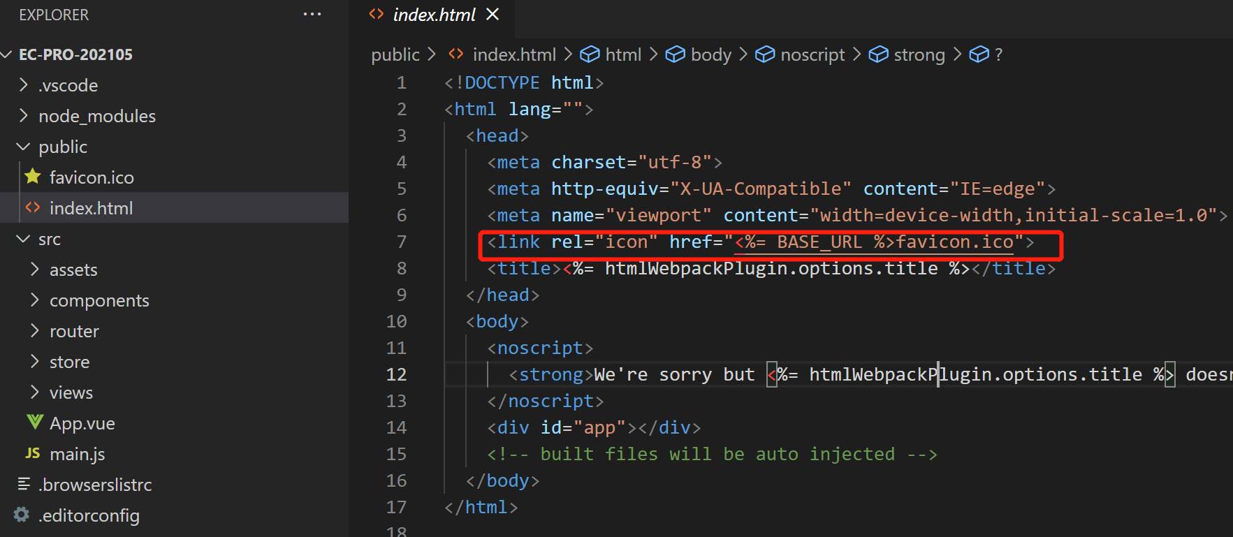
}Directory | public directory
Some general contents are configured here, such as index The icon in HTML configures the icon of the web page:
Contents | editorconfig file
Configure the properties of the editor;
Directory | package lock json
Ensure that there is a fixed version of dependency when multiple people cooperate;
Directory | src
Here, the functions and uses of various file directories have been basically used before; Some static files are placed in the assets directory;
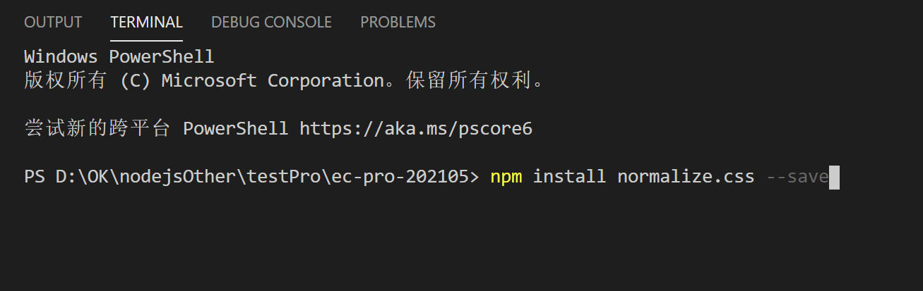
Style compatible browser
Some HTML tags have different display effects on different browsers for the same tag; In order to keep the style consistent in all browsers, You need to use normalize css;
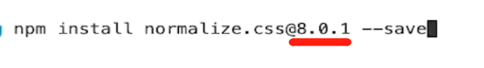
Here, you need to install on the project:
Add @ [version] to specify the installed version:
Create a new style directory under src and a new base SCSS file,
Write a common style,
Specify the style of html tag here - 1rem = font size = 100px;

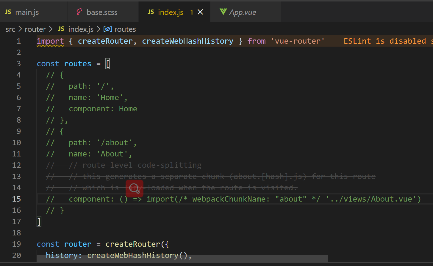
Clean up redundant code in router,
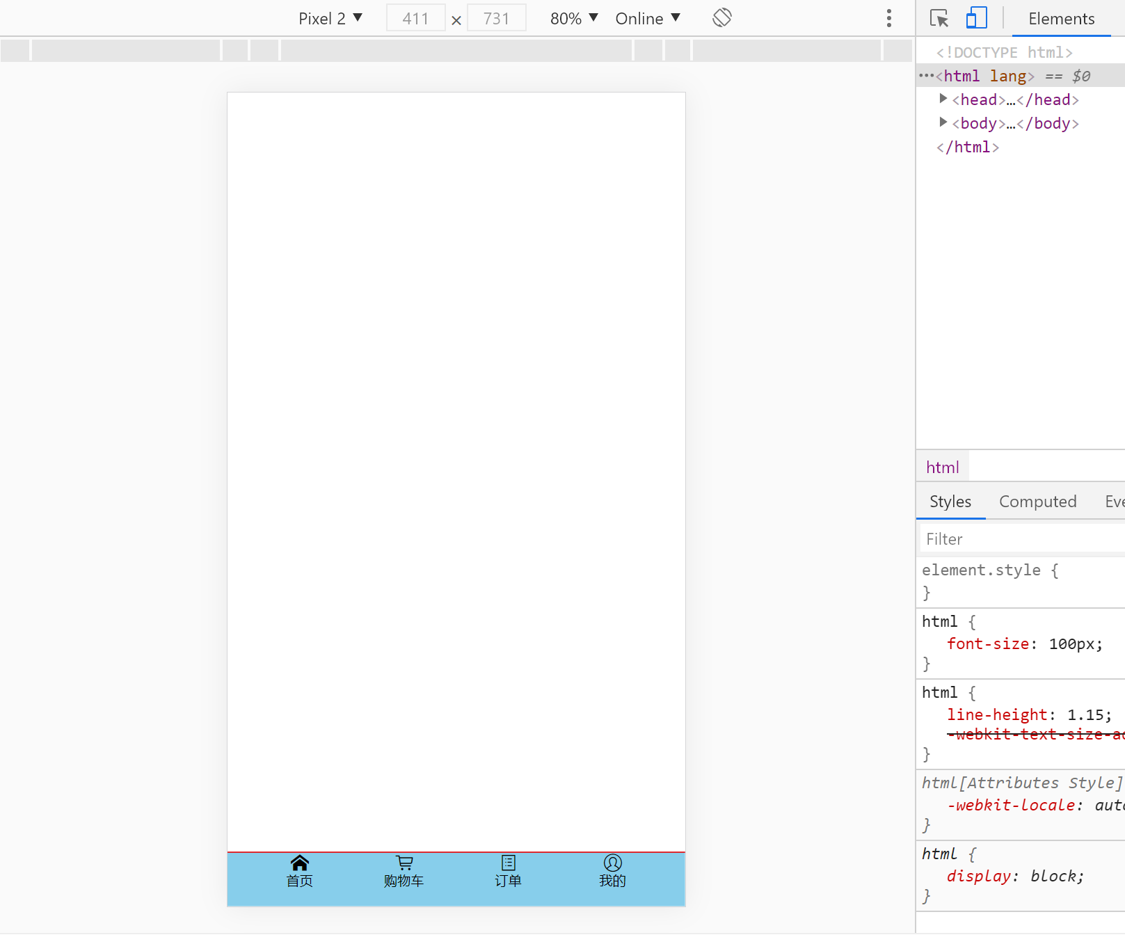
Here is a simple test for the time being:
In main JS:
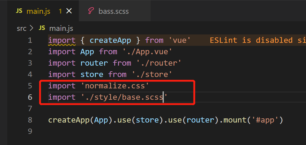
Run project:
You can see that the font is very large,
Because here app The layout of Vue is naturally under the html tag,
Therefore, the style size we just defined is used by default:

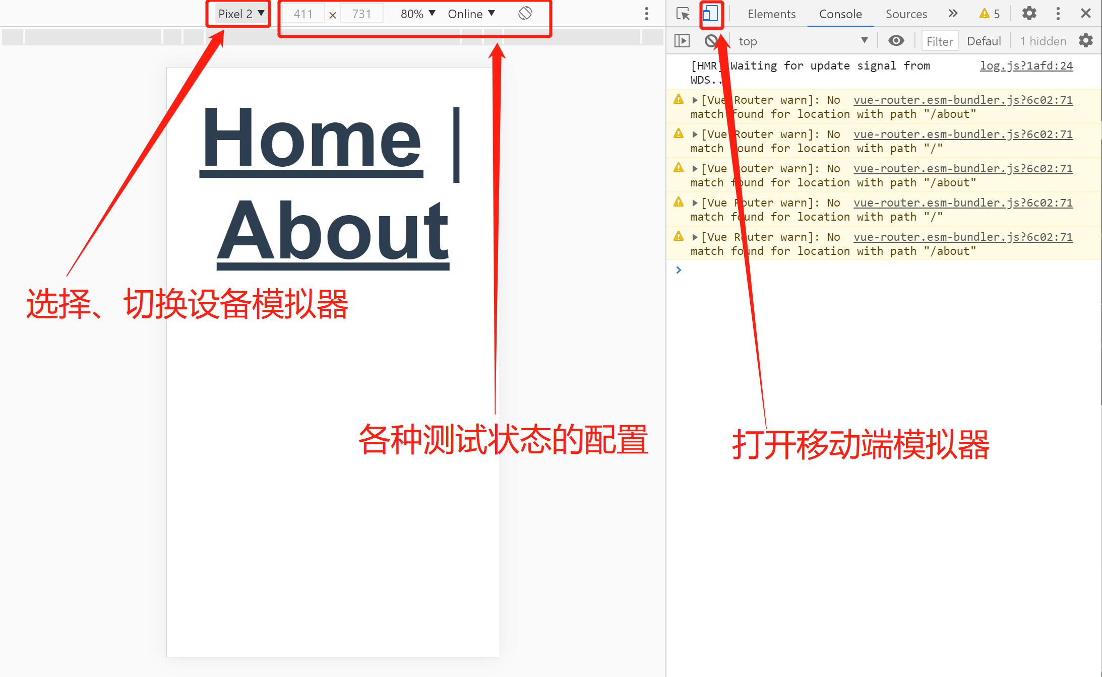
Use mobile terminal simulator
First, you can adjust the position of the test bar:
Then open the mobile terminal simulator:
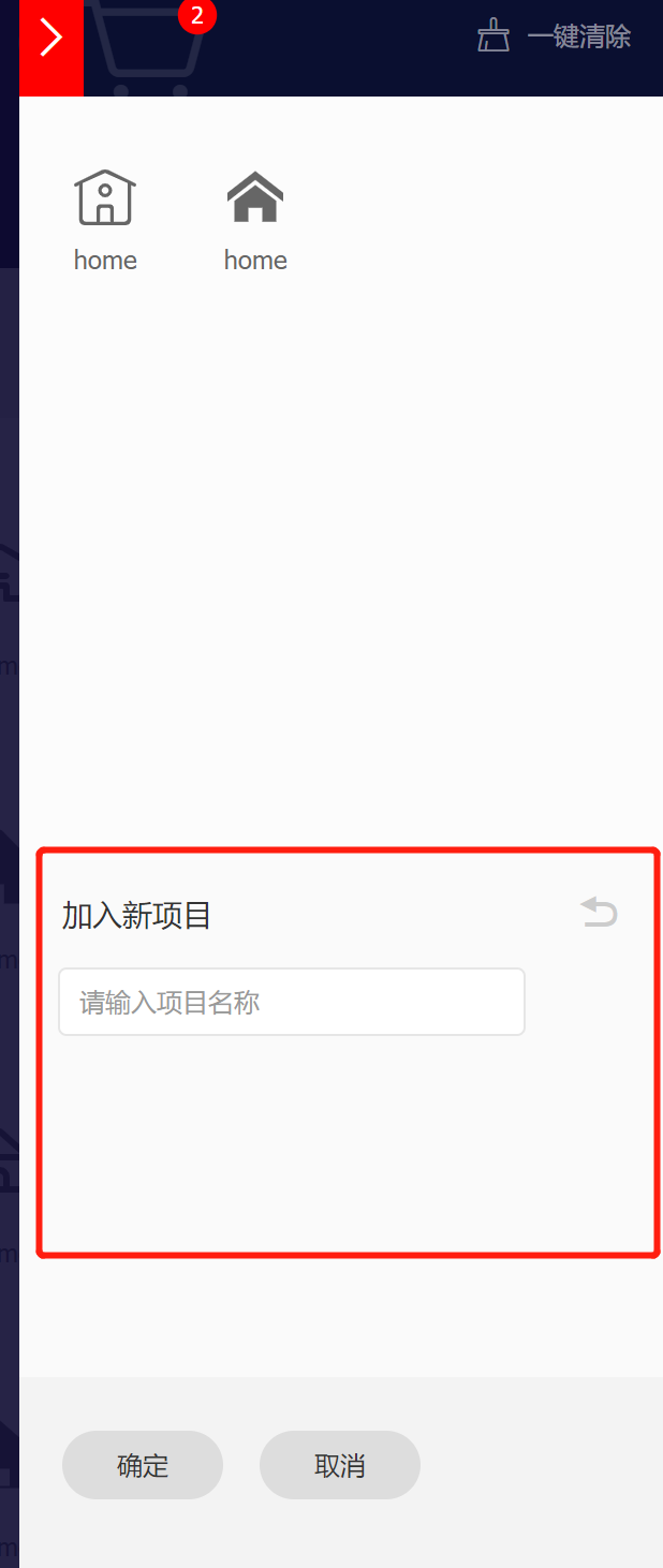
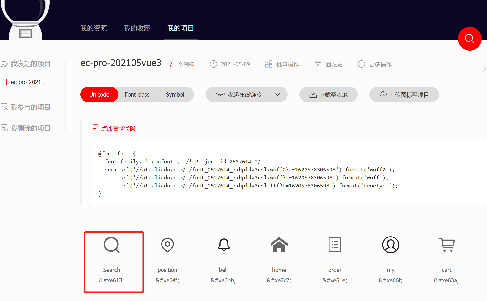
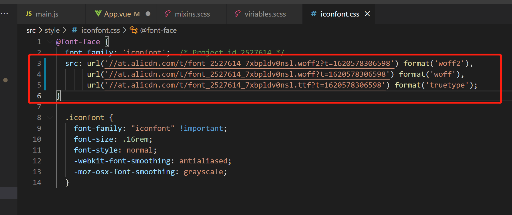
iconfont.cn use of Ali vector icon library [collect icon to project]
After logging in, search for the icon and add to the shopping cart:
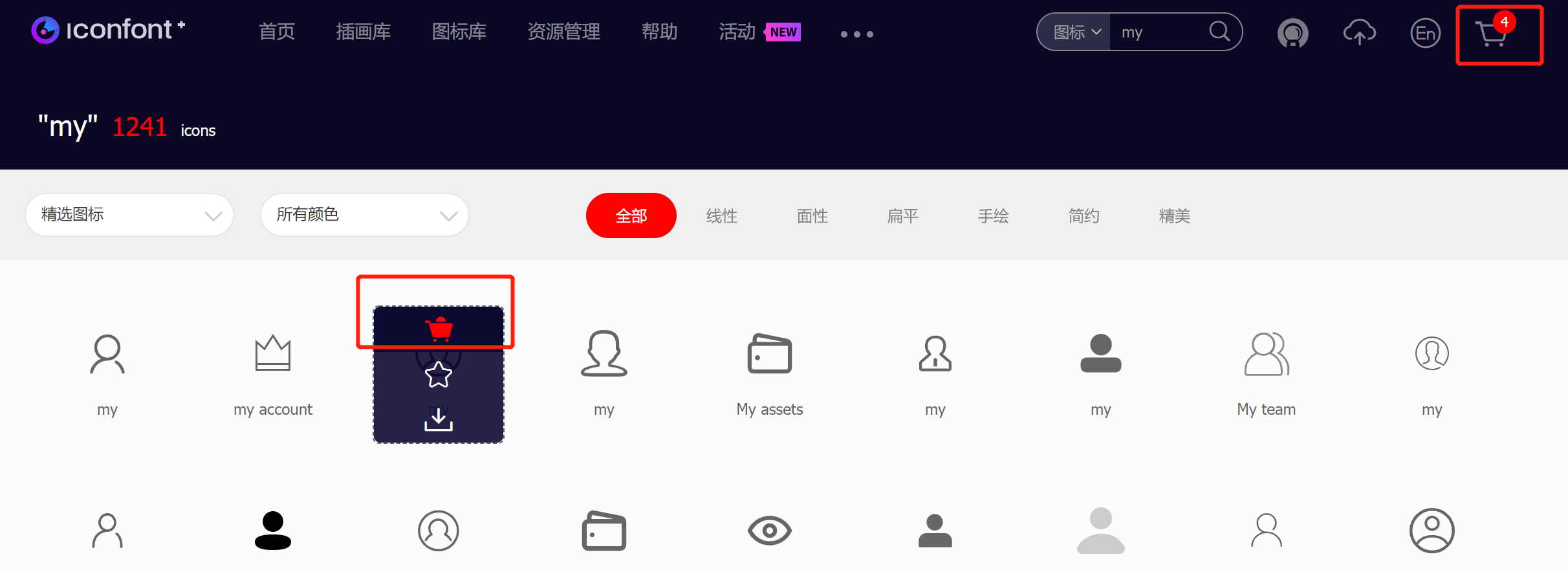
Add the icon in the shopping cart to the item:
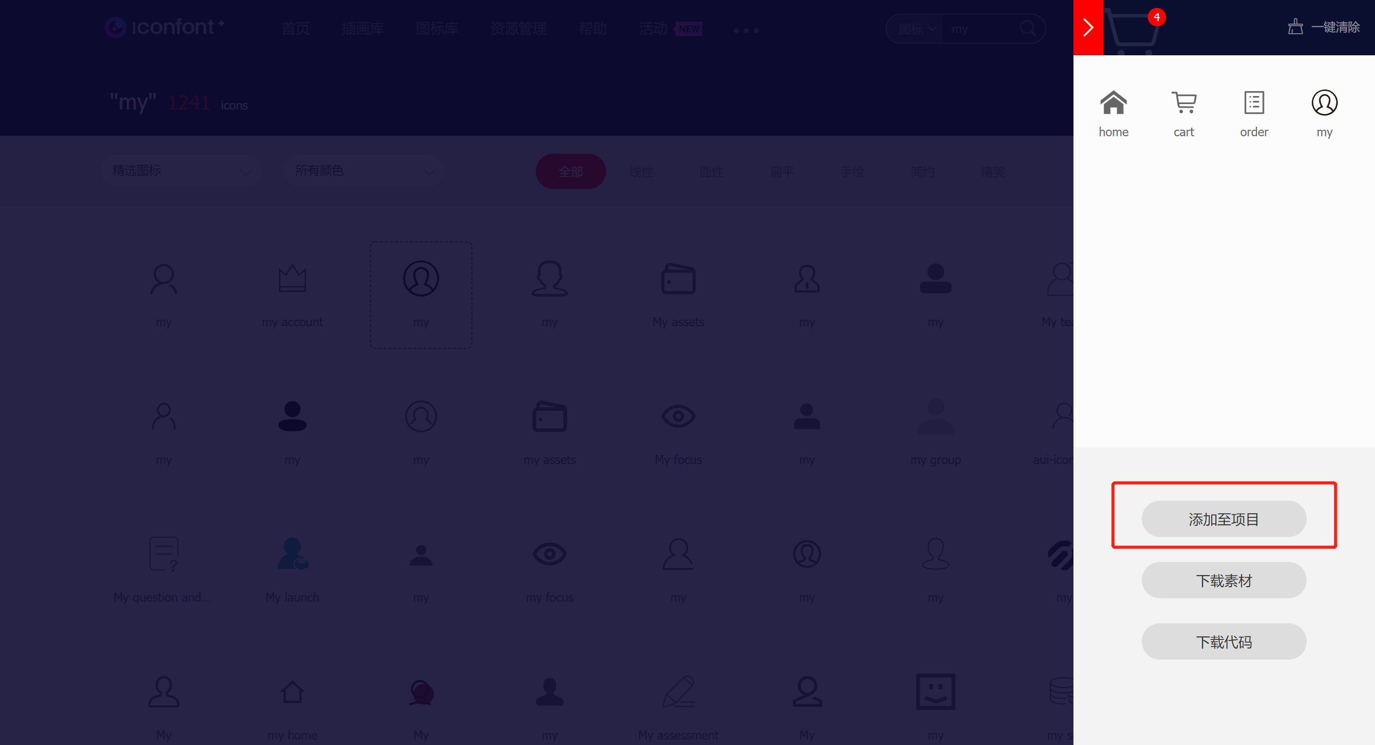
Add existing items:
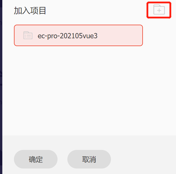
Or create a new project:
Click [my project]:
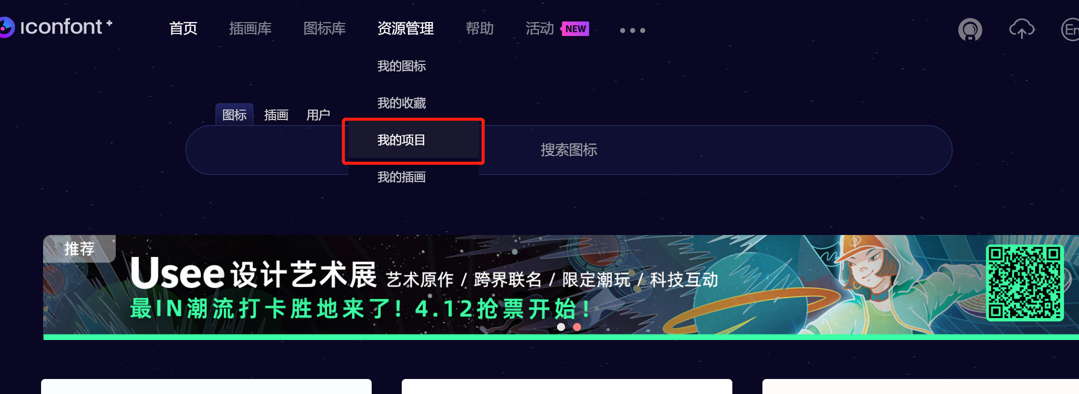
You can view the existing project content:
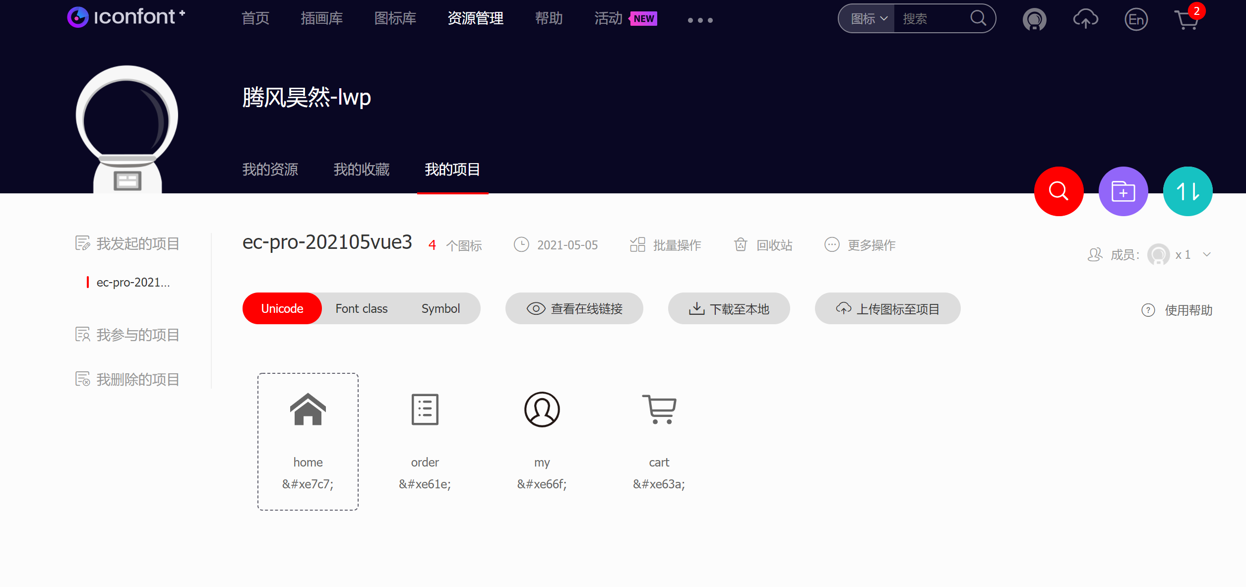
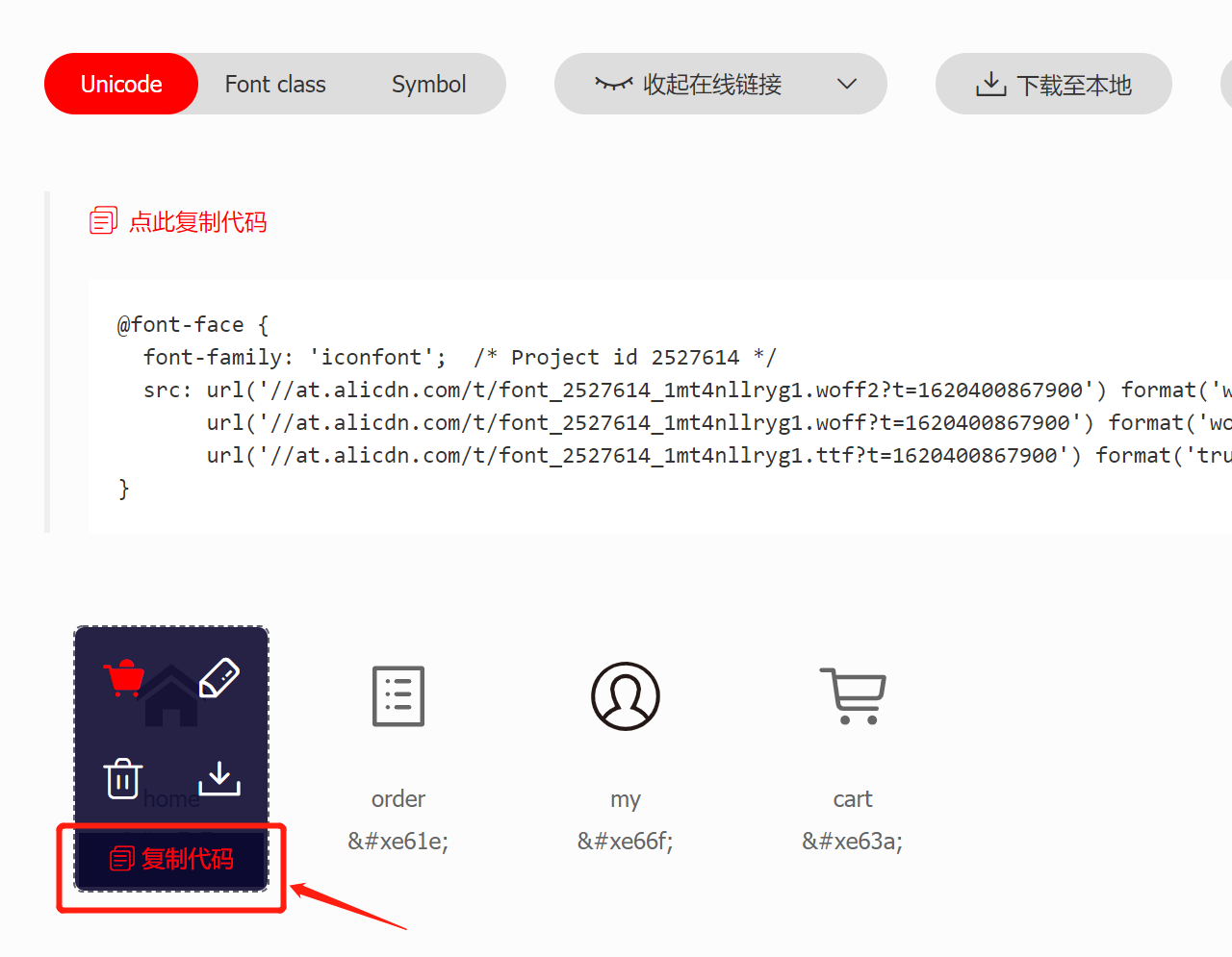
Click download to local,
Various formats of icons in the current directory can be packaged into zip and downloaded:
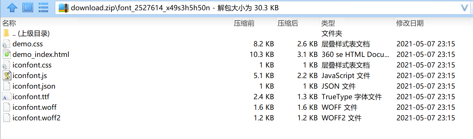
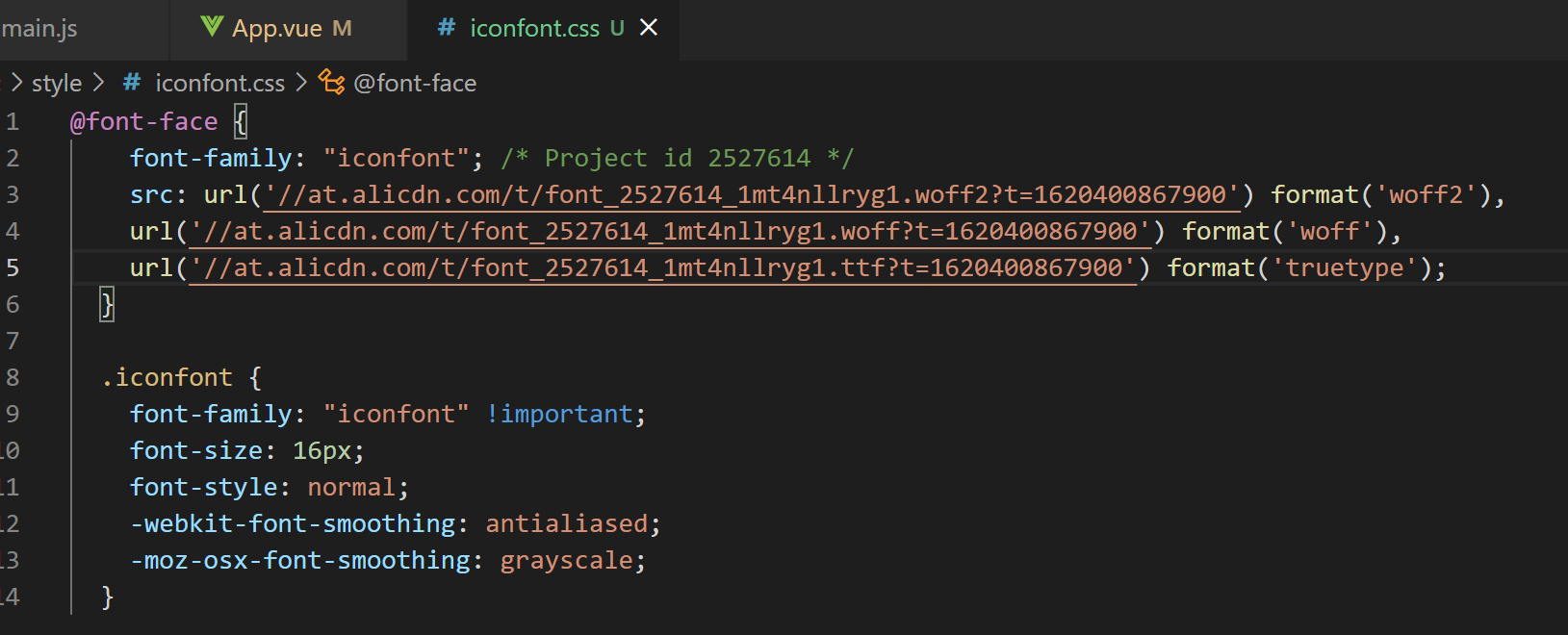
Put iconfont Copy this part of CSS code:
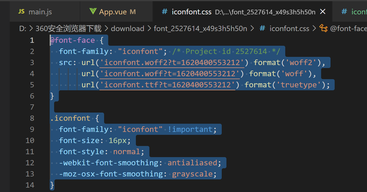
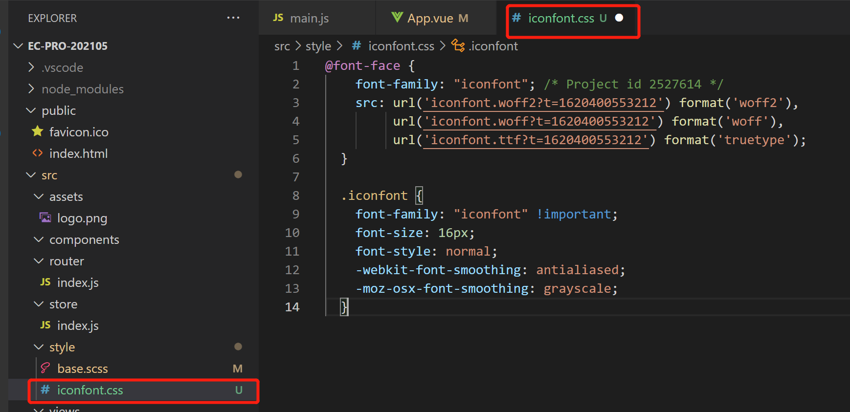
Create a new css file in the style directory, such as iconfont css, paste the copied code here,
But the code referenced here is still local,
We can replace it with online:
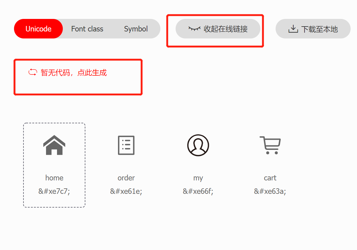
Click to view the online connection,
Click [no code, click here to generate],
Online connection codes can be generated:
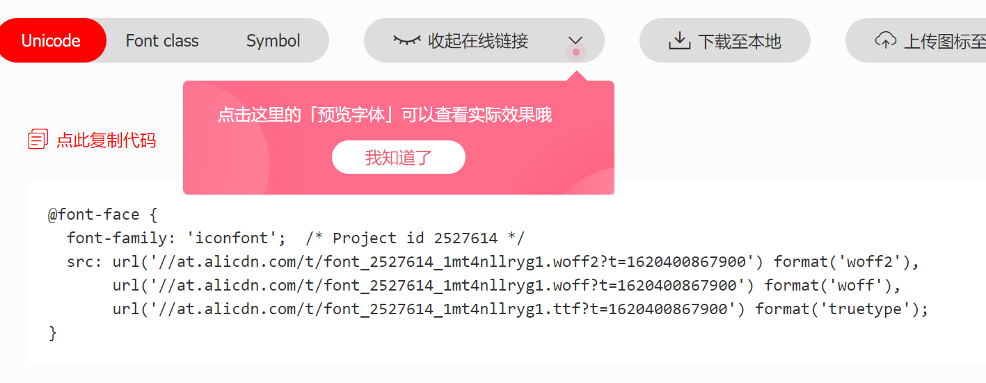
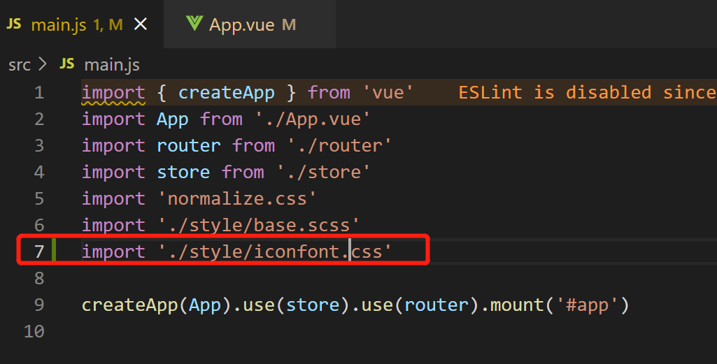
Copy the above online url reference code and paste it into the project:
main.js to import this css file:
Here, the environment configuration is completed;
Then, on the iconfont web page, move to the icon and click to copy the code of the corresponding icon, such as :
Finally, you can use it in the DOM node,
Note that class="iconfont":
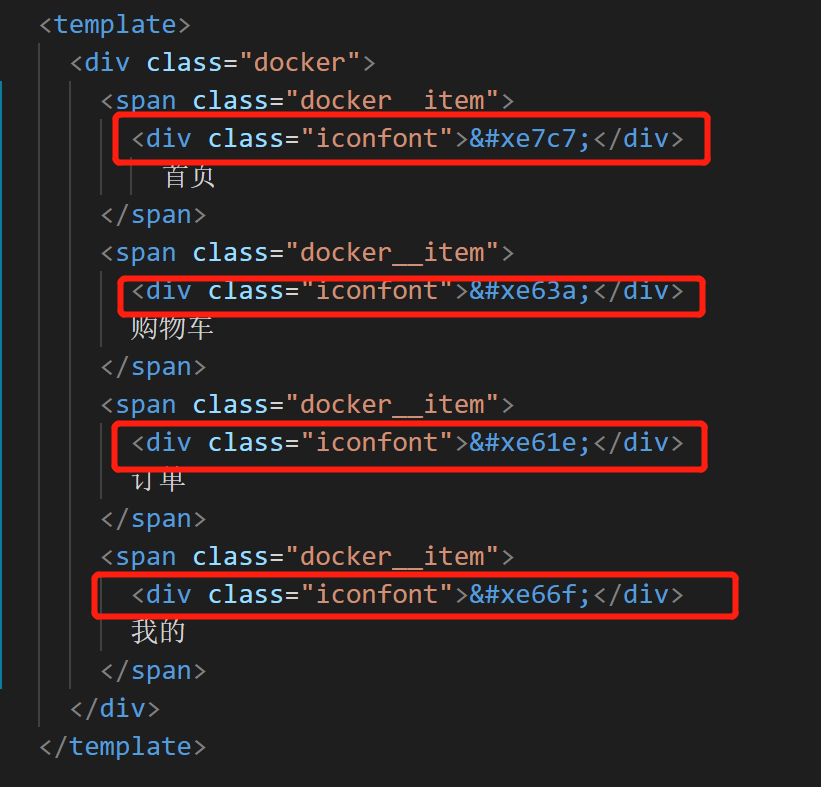
effect:
The browser can only use the minimum text size of 12px. If you want to display 10px, you need to write 20px and then reduce it by half
.docker_title {
  font-size: 20px;
  transform: scaleX(.5) scaleY(.5);//Halve
  transform-origin: center top;//Reduce center point
}
Optimization | css with dependency can be abbreviated
Note the flex streaming layout here
<template>
<div class="docker">
<span class="docker__item docker__item--active">
<div class="iconfont"></div>
<div class="docker_title">home page</div>
</span>
<span class="docker__item docker__item--active">
<div class="iconfont"></div>
<div class="docker_title">Shopping Cart</div>
</span>
<span class="docker__item docker__item--active">
<div class="iconfont"></div>
<div class="docker_title">order</div>
</span>
<span class="docker__item docker__item--active">
<div class="iconfont"></div>
<div class="docker_title">my</div>
</span>
</div>
</template>
<style lang="scss">
.docker {
display: flex;
box-sizing: border-box;
position: absolute;
padding: 0 0.18rem; //interval
left: 0;
bottom: 0;
width: 100%;
height: 0.49rem;
border-top: 1px solid #f10000;
&__item {
//Equivalent to docker__item
flex: 1;
text-align: center;
.iconfont {
margin: 0.07rem 0 0.02rem 0; //Icon interval
font-size: 0.18rem; //Resize Icon
}
&--active {
//Equivalent to docker__item--active
color: skyblue;
}
}
&_title {
//Equivalent to docker_title
font-size: 20px;
transform: scaleX(0.5) scaleY(0.5); //Halve
transform-origin: center top; //Reduce center point
}
}
// .docker__item {
// flex: 1;
// text-align: center;
// .iconfont {
// margin: 0.07rem 0 0.02rem 0; // Icon interval
// font-size: 0.18rem; // Resize Icon
// }
// }
// .docker__item--active {
// color: skyblue;
// }
// .docker_title {
// font-size: 20px;
// transform: scaleX(0.5) scaleY(0.5); // Halve
// transform-origin: center top; // Shrink center point
// }
</style>Optimization | abbreviation of css introduction
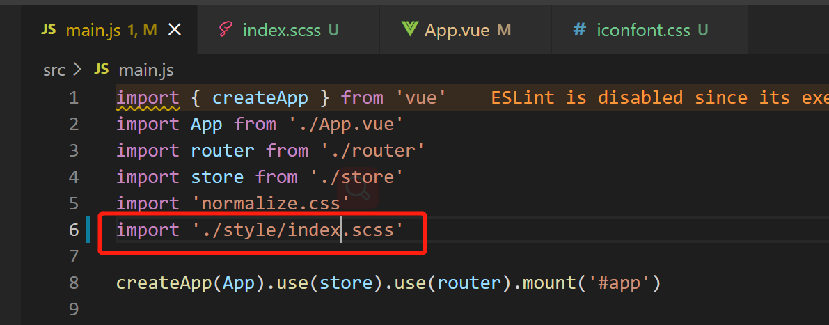
The current css file is imported as follows:
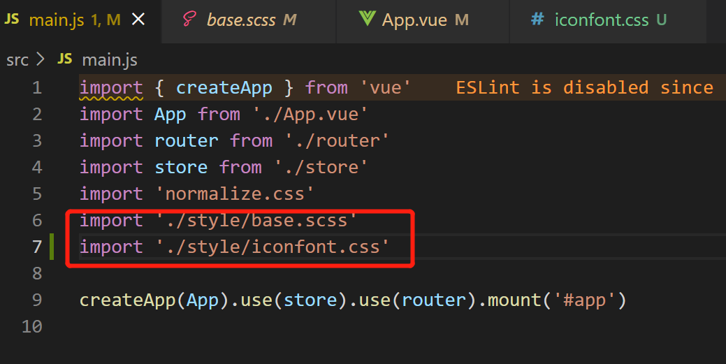
In fact, we can create a new file in the style directory, such as index scss,
Then write all the css files to be referenced here:
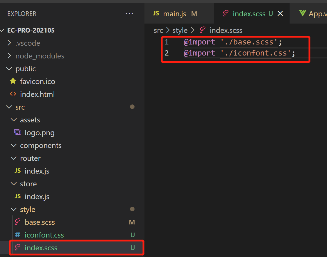
So,
When using, just introduce index SCSS is the "reference summary file":
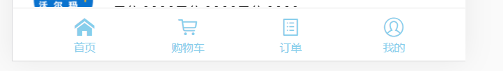
1.end the UI in the bottom column is basically completed
commit a0c19703acc3c0da070c9b2b291bdce11ff33646 (HEAD -> master)
Author: aaLiweipeng <31944741+aaLiweipeng@users.noreply.github.com>
Date:   Sat May 8 22:18:29 2021 +0800

    Preliminary completion of the bottom bar
github-commit: https://github.com/aaLiweipeng/ec-pro-202105/commit/30a33b963c323a12b3c1f5a15b238d3aac289a4e
2.1 bug | error Trailing spaces not allowed no-trailing-spaces
Solution: delete the extra space in the tail
2.2 pay attention to the priority of CSS Class
Sometimes the same label, We may define multiple CSS classes for it:
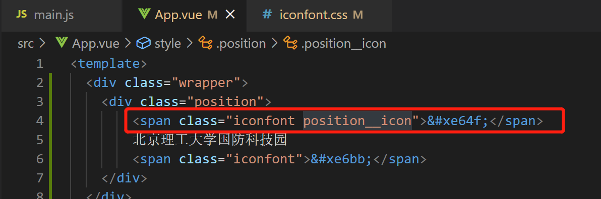
At this time,
We can use this nesting without & In short,
Increase the priority of CSS Class:
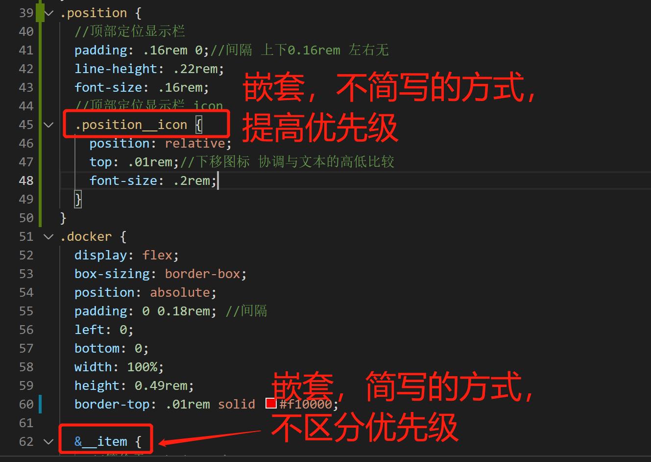
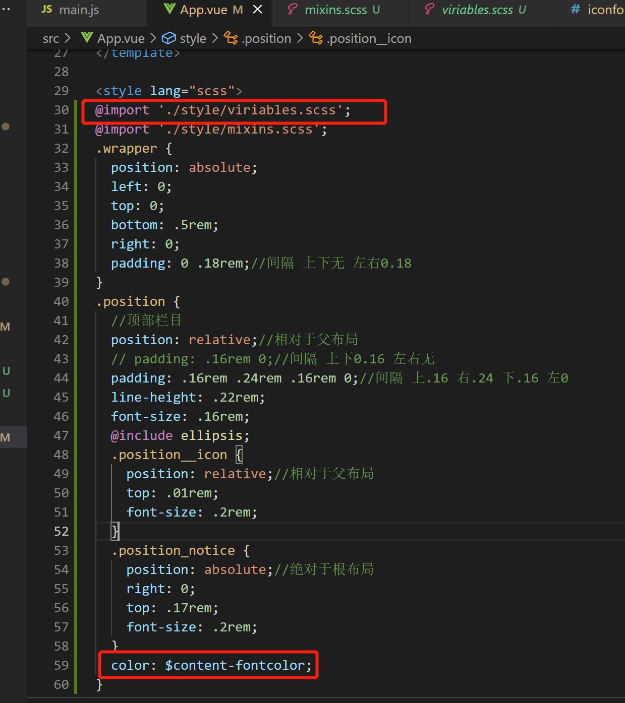
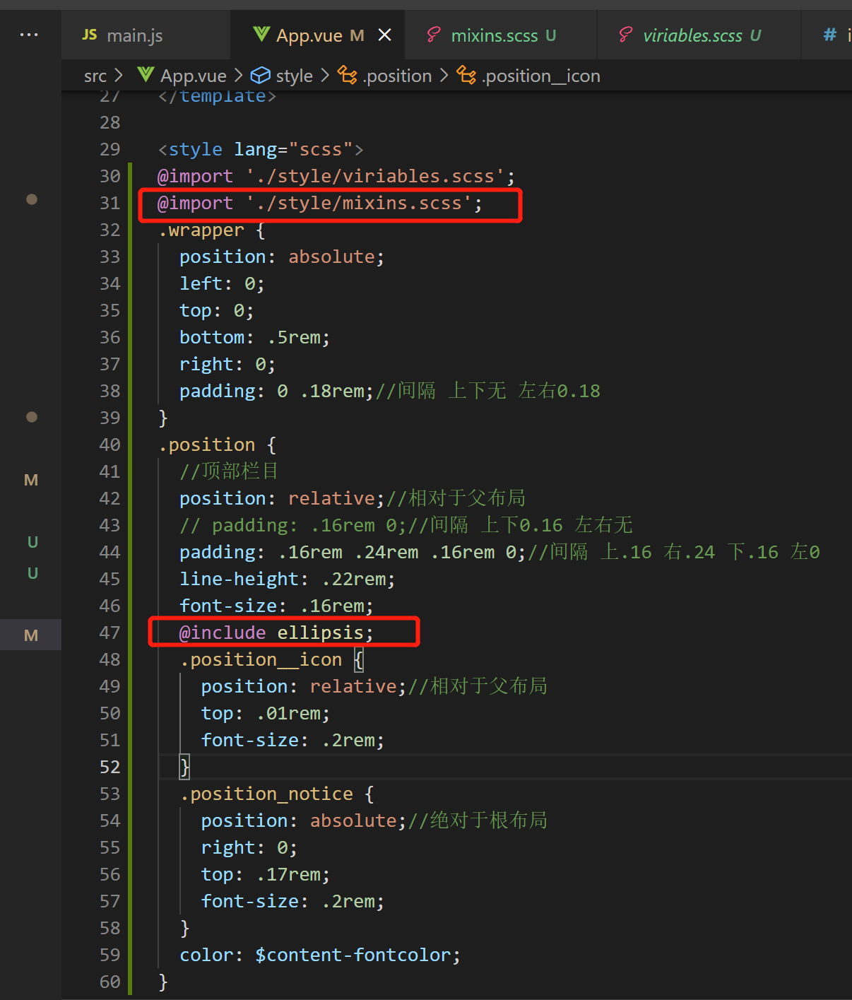
So, position__icon has higher priority than iconfont;
2.3 create a new scss file and define common style variables [similar to android res/style /]
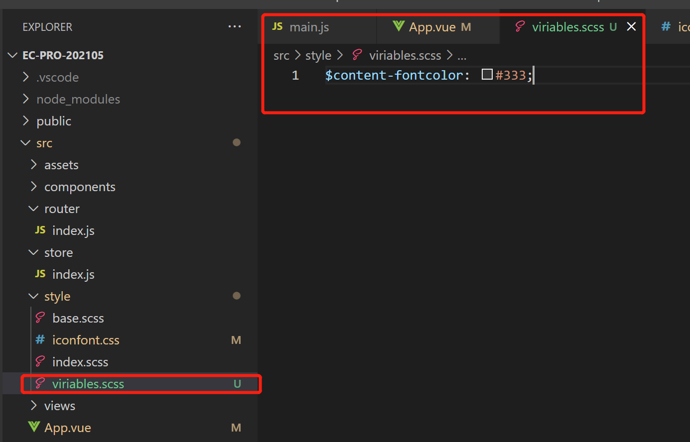
Use example:
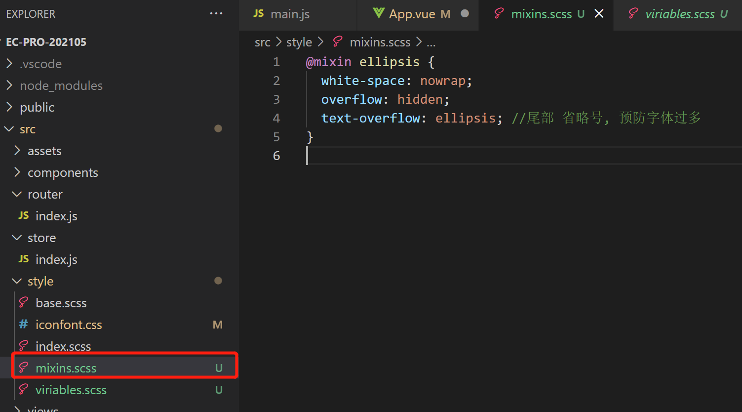
2.4 create a new scss file and encapsulate mixin. The effect is the same as above
Use example:
The location bar is now preliminarily completed
commit d81edf449371f5d14972e5a6f0b328f2693cde8e (HEAD -> main, origin/main, origin/HEAD)
Author: aaLiweipeng <31944741+aaLiweipeng@users.noreply.github.com>
Date:   Mon May 10 00:23:59 2021 +0800

Add the top position bargithub:https://github.com/aaLiweipeng/ec-pro-202105/commit/d81edf449371f5d14972e5a6f0b328f2693cde8
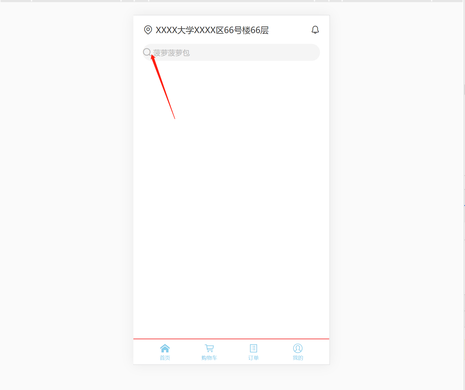
3. Search and banner area
3.1 add the iconfont project icon [search] to update the project link resource code
Operation effect:
3.2 in case of weak network, the icon loading is too slow, resulting in jitter of surrounding components [padding and overflow combined with space occupying skills of picture aspect ratio]
.banner{
  //The following three lines are used to prevent the icon from loading too slowly when the network is weak
  //Cause jitter of surrounding components
  height: 0;
  overflow: hidden;
  padding-bottom: 46.7%;//The aspect ratio of the picture. When the picture is not downloaded well, it occupies 373 / 798 ≈ 0.4674 in advance

  &__img {
    width: 100%;//Full parent layout
  }
}
The search box and banner are preliminarily completed, GitHub:
4. Icon Grid layout
GitHub: **
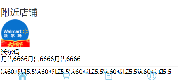
5. Nearby column
GitHub: **
5.1 charm of flow layout
//Nearby column
.nearby {
  &__title {
    margin: .16rem 0 0.04rem 0;
    font-size: .18rem;
    font-weight: normal;
    color: $content-fontcolor;
  }
  &__item {
    // display: flex;
    &__img {
      width: .56rem;
      height: .56rem;
    }
  }
}
//Nearby column
.nearby {
  &__title {
    margin: .16rem 0 0.04rem 0;
    font-size: .18rem;
    font-weight: normal;
    color: $content-fontcolor;
  }
  &__item {
    display: flex;
    &__img {
      width: .56rem;
      height: .56rem;
    }
  }
}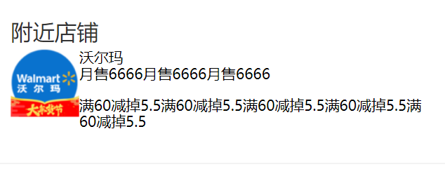
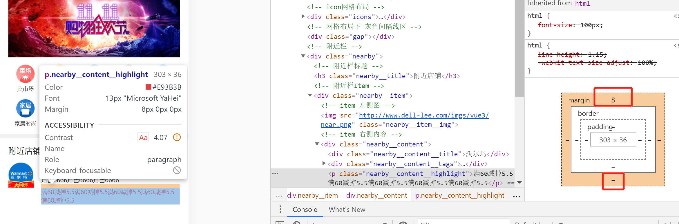
5.2 note the default margin of the < p > tag!! (note the default margin for other labels)
    &__highlight {
      // margin: 0.08rem 0 0 0;
      margin-top: 0.08rem;
      line-height: .18rem;
      font-size: .13rem;
      color: #e93b3b;
    }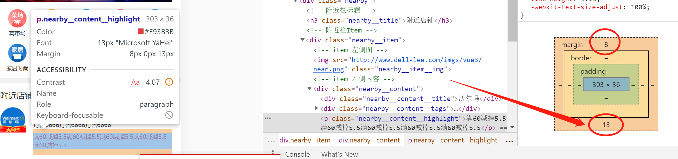
Optimization scheme:
Use the detailed margin style and dispose of the default margin:
    &__highlight {
      margin: 0.08rem 0 0 0;
      line-height: .18rem;
      font-size: .13rem;
      color: #e93b3b;
    }
effect:
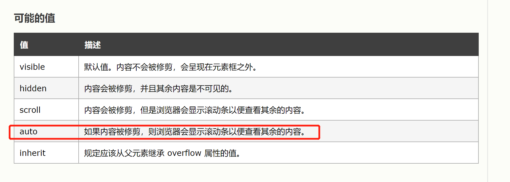
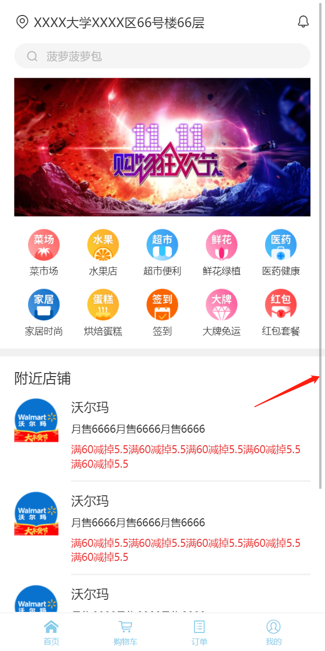
5.3 [overflow-y: auto] handle overflow so that the bottom navigation bar will not follow
.wrapper {
  overflow-y: auto;//Handle the overflow so that the bottom navigation bar does not follow
  //Root layout of content
  position: absolute;
  left: 0;
  top: 0;
  bottom: 0.5rem;
  right: 0;
  padding: 0 0.18rem; //The overall content is left blank with an interval of 0.18 from top to bottom
}
6. Split component code
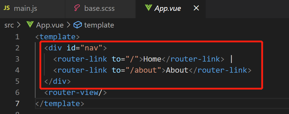
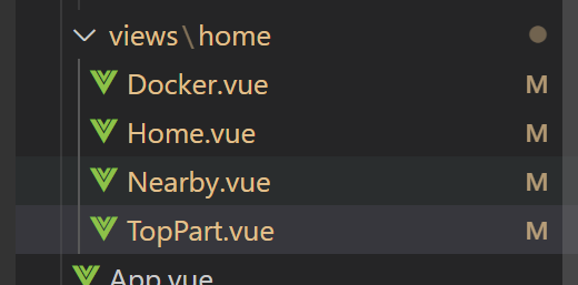
GitHub: ---Create a home directory under the views directory, Create a new home under home vue; Put app Cut the contents of Vue; This time app Vue has no content, Then the reference path in Home needs to be changed:
Then at this time,
App. Change Vue to the content,
It can be displayed normally as before:
<template>
<Home />
</template>
<script>
import Home from './views/home/Home'
export default {
name: 'App',
components: { Home }
}
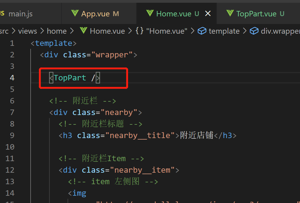
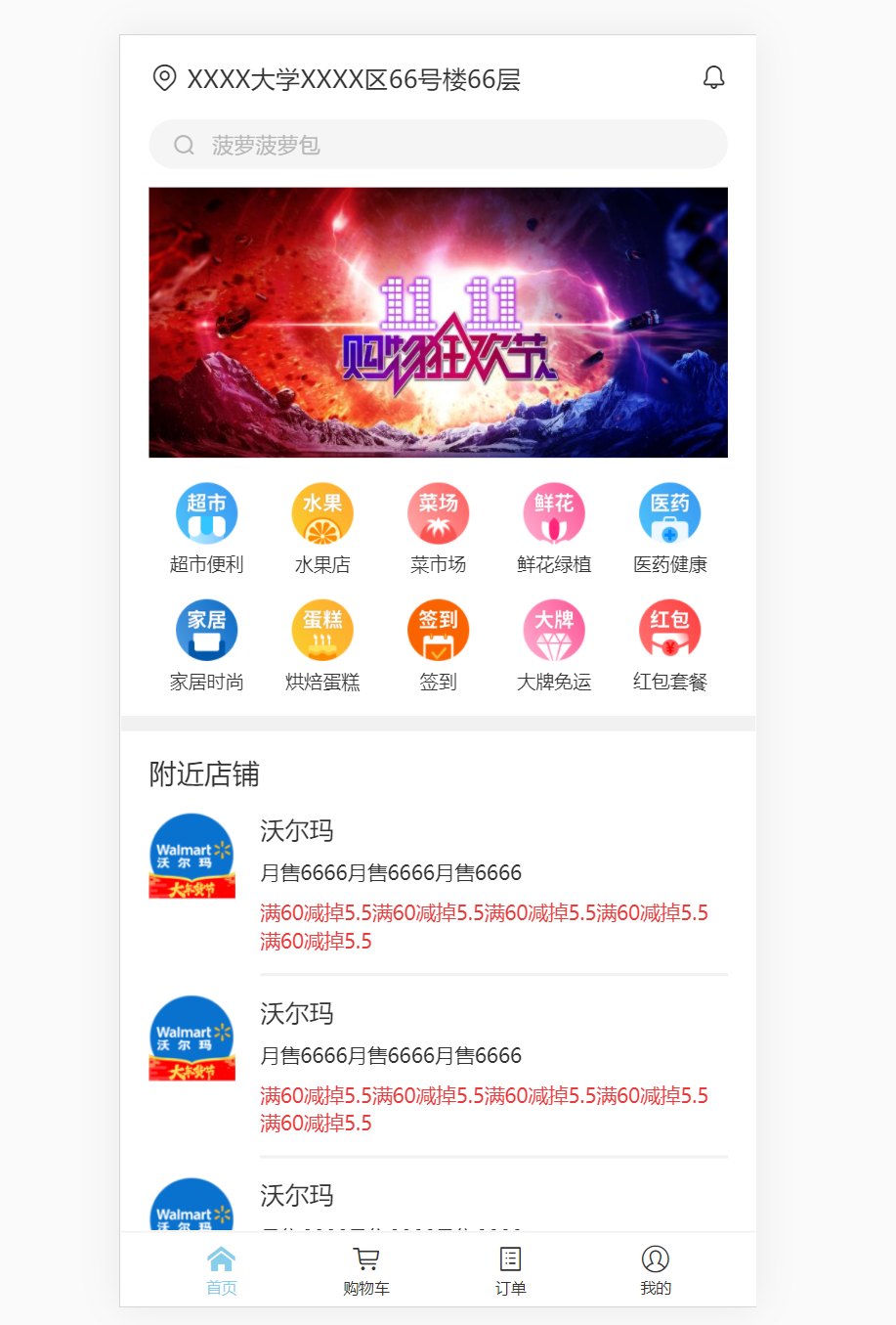
</script>Of course, this is just the home page Vue from app Just removed from Vue, Next, you need to continue splitting; First, split the position part from the gap part, For the top business part [TopPart]:
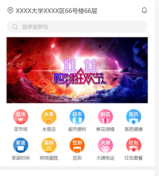
view/home/TopPart.vue:
<template>
<div class="position">
<span class="iconfont position__icon"></span>
XXXX university XXXX 66 / F, building 66, district
<span class="iconfont position_notice"></span>
</div>
<div class="search">
<span class="iconfont"></span>
<span class="search__text">Pineapple bag</span>
</div>
<div class="banner">
<img
class="banner__img"
src="https://gimg2.baidu.com/image_search/src=http%3A%2F%2Fimg.yipic.cn%2Fthumb%2Ff0f77685%2Fbdaa5f3f%2Ffa49ab25%2Fc7151244%2Fbig_f0f77685bdaa5f3ffa49ab25c7151244.png&refer=http%3A%2F%2Fimg.yipic.cn&app=2002&size=f9999,10000&q=a80&n=0&g=0n&fmt=jpeg?sec=1623252871&t=7a27caac9990c344d03ff0dfff8f6c1d"
/>
</div>
<!-- icon Grid layout -->
<div class="icons">
<div class="icons__item">
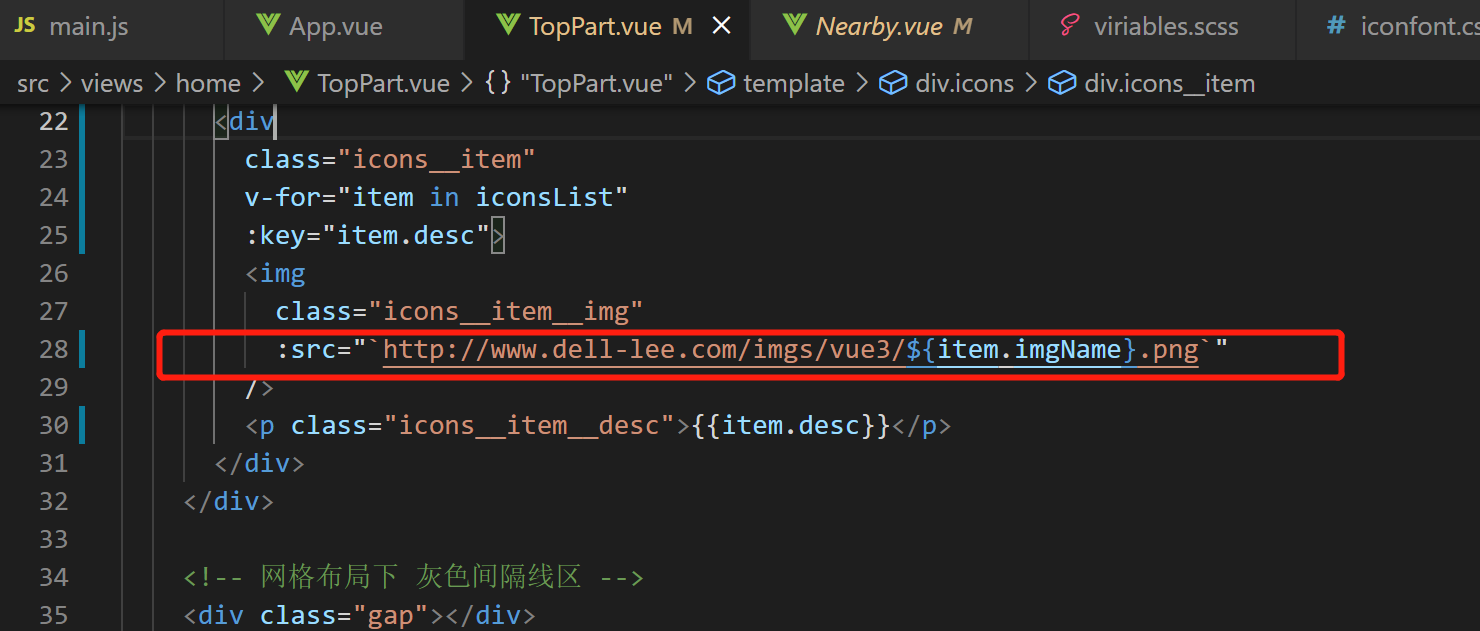
<img
class="icons__item__img"
src="http://www.dell-lee.com/imgs/vue3 / vegetable market png"
/>
<p class="icons__item__desc">food market</p>
</div>
...
</div>
<!-- Gray space line area under grid layout -->
<div class="gap"></div>
</template>
<style lang="scss">
...
.position {
...
.position__icon {
...
}
.position_notice {
...
}
color: $content-fontcolor;
}
.search {
...
.iconfont {
...
}
&__text {
...
}
} //search
//icon grid layout
.icons {
...
&__item {
...
&__img {
...
}
&__desc {
...
}
}
}
.banner {
...
&__img {
...
}
}
//Gray space line area under grid layout
.gap {
...
}
</style>Then it is introduced into home as a sub component vue:
<script>
import TopPart from './TopPart'

export default {
  name: 'Home',
  components: { TopPart }
}
</script>
use:
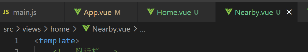
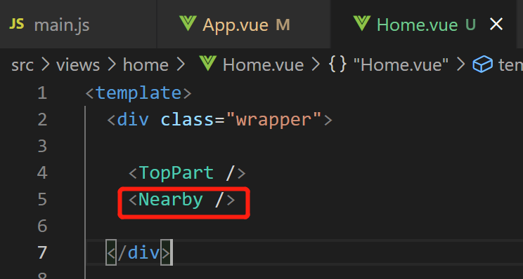
Then there is the split of the Nearby part
New file, views/home/Nearby.vue, Move the relevant codes of [nearby column] in home:
home. Registered as a sub component in Vue:
<script>
import TopPart from './TopPart'
import Nearby from './Nearby'

export default {
  name: 'Home',
  components: { TopPart, Nearby }
}
</script>
use:
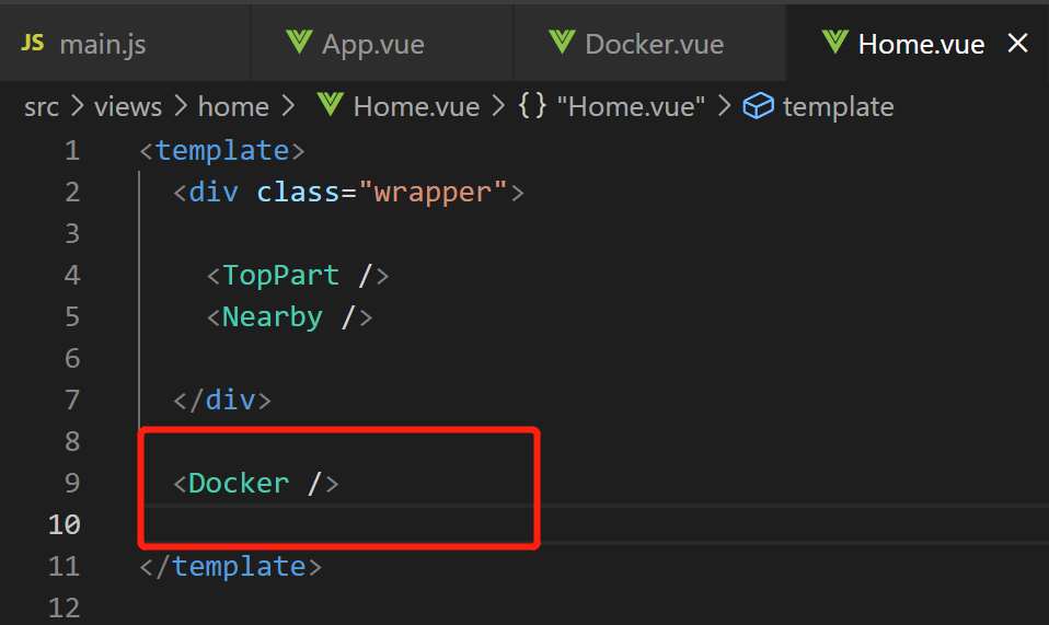
Finally, split the bottom navigation bar
Create new views / home / docker vue, Move the relevant codes of [bottom navigation bar] in home:; home. Registered as a sub component in Vue:
<script>
import TopPart from './TopPart'
import Nearby from './Nearby'
import Docker from './Docker'

export default {
  name: 'Home',
  components: { TopPart, Nearby, Docker }
}
</script>
use:
7. Use v-for and v-html to optimize the code
It mainly optimizes the list features such as Grid menu, nearby bar and bottom navigation bar, See GitHub for details:
7.1 iconfont escape problem
<!-- Bottom navigation bar -->
  <div class="docker">
    <div
      v-for = "item in dockerList"
      class="docker__item docker__item--active"
      :key="item.icon"
    >

      <!-- Interpolation expressions are not allowed here,
      because &# Will be automatically escaped to text,
      Symbol properties cannot be implemented;
      Remember to refresh the next page after changing!!! -->
      <!-- <div class="iconfont">{{item.icon}}</div> -->

      <div class="iconfont" v-html="item.icon" />
      <div class="docker_title">{{item.text}}</div>
    </div>
  </div>
7.2 skillfully use expressions to control css processing!!!
- Before treatment:
  <!-- Bottom navigation bar -->
  <div class="docker">
    <div
      v-for = "item in dockerList"
      class="docker__item docker__item--active"
      :key="item.icon"
    >
.....
- After treatment, Change the class attribute so that the color style needs to be judged. By default, the first one has blue:
  <!-- Bottom navigation bar -->
  <div class="docker">
    <div
      v-for = "(item, index) in dockerList"
      :class="{ 'docker__item': true, 'docker__item--active': index === 0}"
      :key="item.icon"
    >
7.3 string template matching practice
7.4 basic implementation of homepage UI (finished)
8.
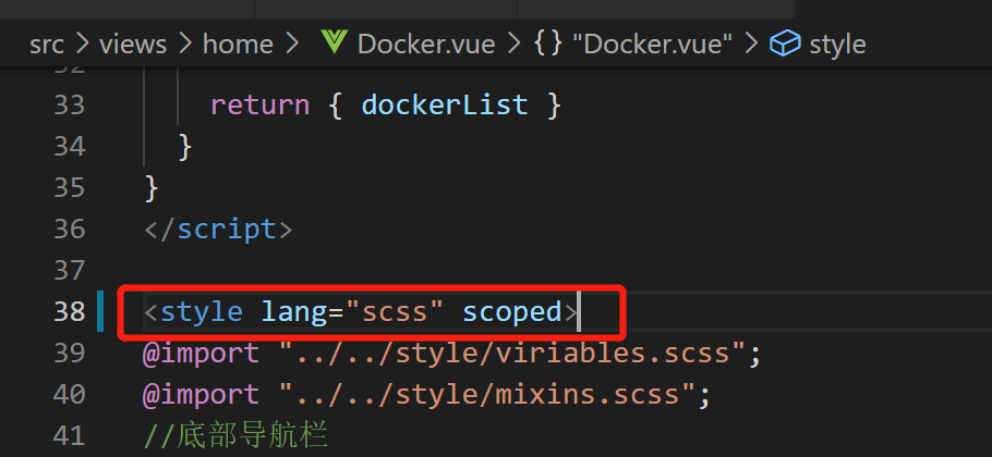
8.1 scoped limits the scope of the style
The style of a component should only work on its own components, Cannot affect external components or other components; The implementation is simple, Just add a scoped to the style tag, It is recommended that if there are no special needs, This feature can be added to the style tag of all single file components:
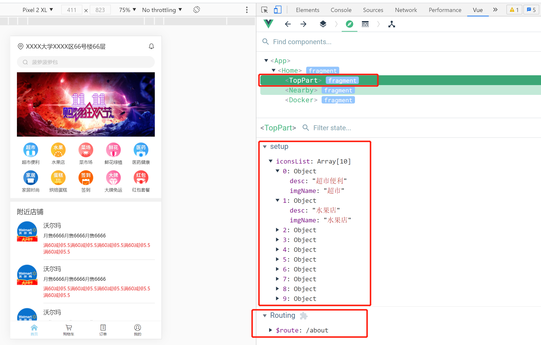
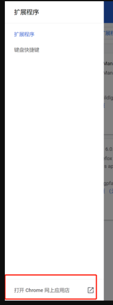
8.2 installation and use of Vue js devtools
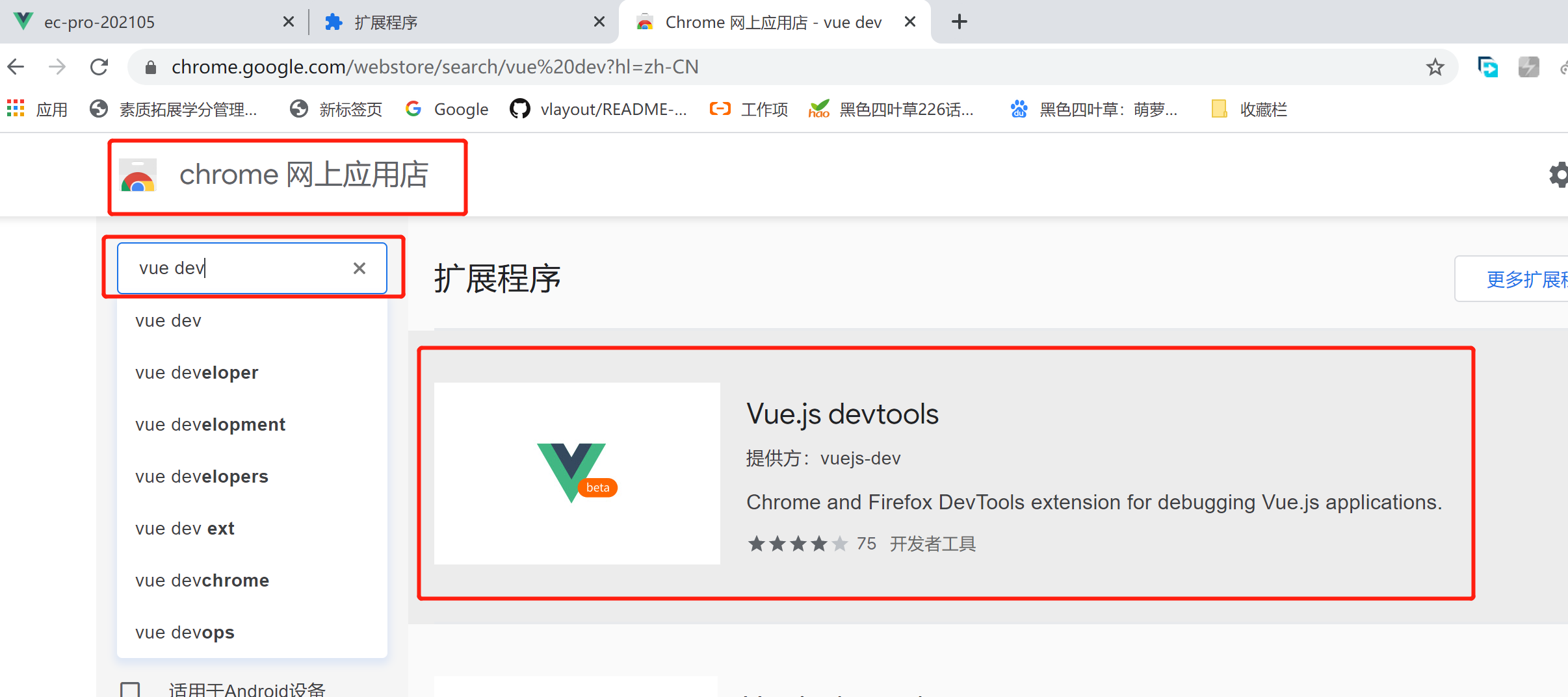
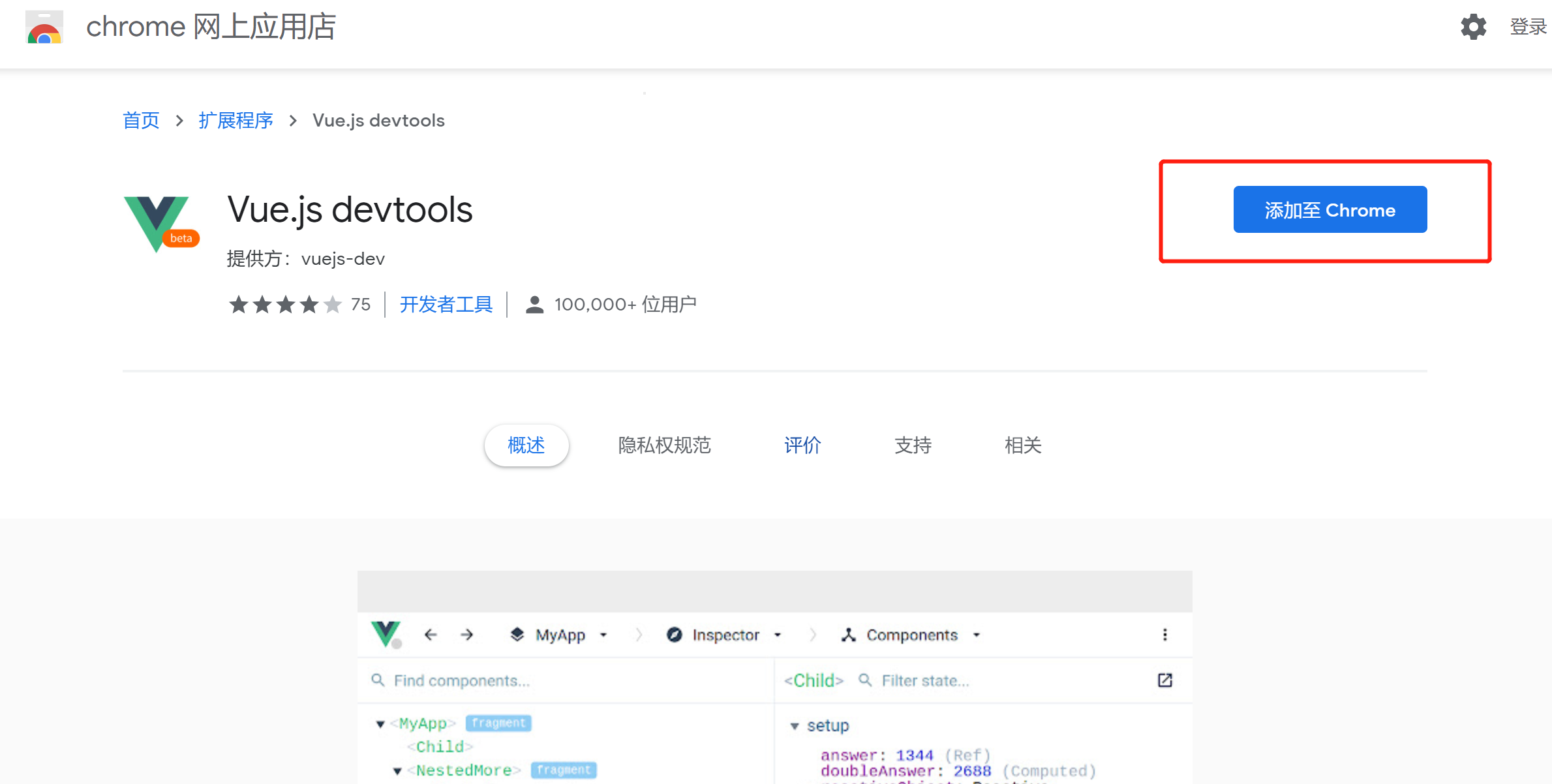
You need a ladder, you need to do it in Chrome, To open an online store:
Search for words like vue dev:
Add the plug-in:
Then enable:

Then restart Chrome, open the project, refresh the page,
Click the position shown in the figure below to open the tool:
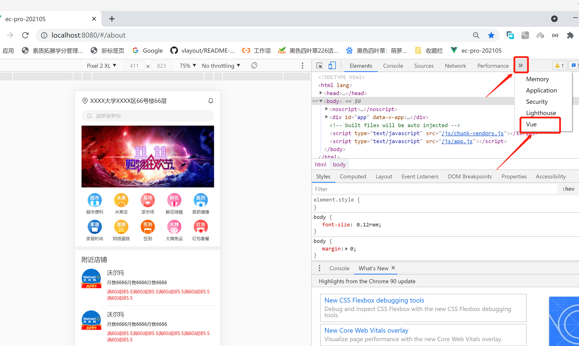
---The first function of Vue devtools -- it can be observed easily and intuitively
Area and sub module / sub component name of each sub module / sub component on the page:
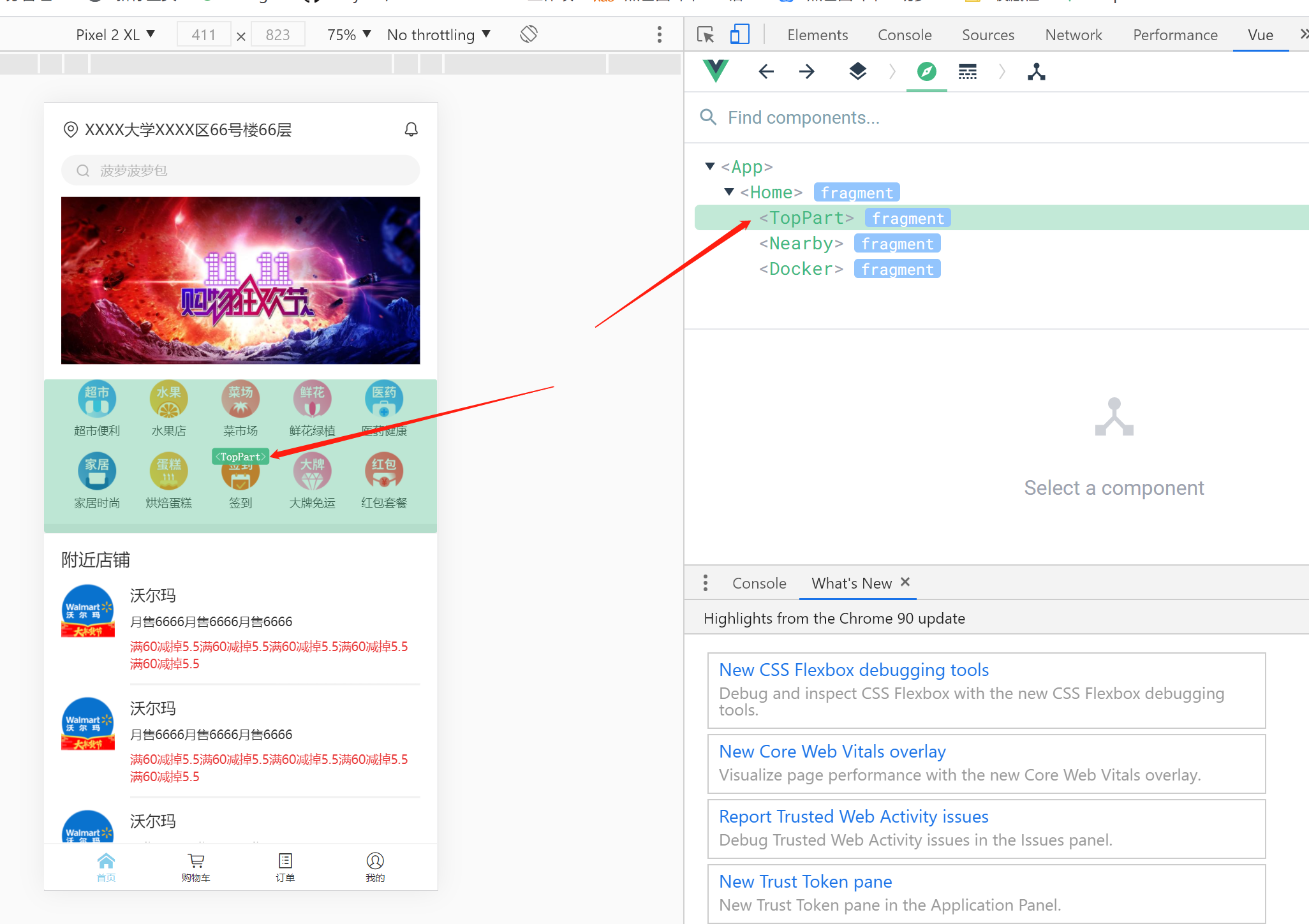
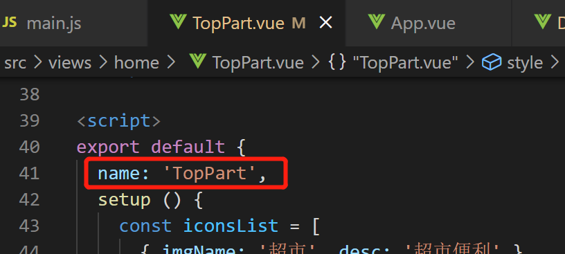
The displayed name depends on the file name of the component [after all, single file component]:
However, if the name attribute is defined in < script > in the file, the display will be processed according to the name attribute:
---The second common function of Vue devtools——
Double click a module to see its corresponding data and routing,
Convenient for parameter adjustment, etc.: