Use of: enabled and: disabled
Use detail points:
- In the input box, set the readonly attribute to match the enabled style
- < a href > < / a > can match the: enabled attribute, but cannot match the: disabled attribute
- The < Select > drop-down box can match: enabled and: disabled
- contenteditable='true 'cannot match the element of tabindex attribute: enabled pseudo class;
- visibility:hidden and display:none are set; You can still match two pseudo classes
To prevent repeated click requests, set disabled=true; The code of a simple and semantic button listening event is as follows:
<style>
  .cs_btn:disabled {
      background: gray;
  }
</style>
<button id="csButton" class="cs_btn">Button</button>
<script>
    csButton.addEventListener('click', function() {
        this.disabled = true;
        console.log("Clicked click");
    })
</script>
: placeholder show pseudo class displayed by placeholder
It is closely related to the placeholder attribute in input; input:placehplder-show {}
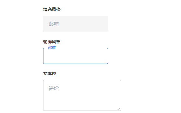
(1) Realize Material Design style
The main codes are as follows:
<style>
.input_box {
    position: relative;
}
.input_value {
    padding: 13px 16px 13px;
    border: 1px solid #d0d0d5;
    border-radius: 4px;
    transition: border-color .25s;
}
.input_value:placeholder-shown::placeholder {
    color: transparent;
}
.input_lab {
    position: absolute;
    left: 16px;
    top: 14px;
    transition: all .25s;
    pointer-events: none; // Skip the event of clicking target
}
.input_value:not(:placeholder-shown) ~ .input_lab,
.input_value:focus ~ .input_lab {
    transform: scale(.75) translate(0, -32px);
}
</style>
<div class="input_box">
	<input class="input_value" type="text" placeholder="youxiang">
	<label for="" class="input_lab">mailbox</label>
</div>
The effects presented are as follows:
Here is an example of quoting Zhang Xinxu's css selector world; Click to view
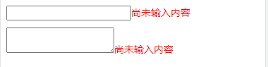
(2) For null value judgment
The code of the example is as follows:
<style>
    input:placeholder-shown + small::before,
    textarea:placeholder-shown + small::before {
        content: 'No content has been entered';
        color: red;
        font-size: 14px;
    }
</style>
<div>
    <input placeholder=" "><small></small>
    <textarea placeholder=" " ></textarea><small></small>
</div>
The display effect is shown in the figure below:
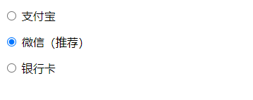
: default default default option instance
: default matching of default options. One of the selected or checked values must be true. If it is not written, it is the first item by default, but it does not match: the pseudo class of default
For the practical application of pseudo class, the recommended tag is as follows:
<style>
    input:default + label::after {
        content: "((recommended)";
    }
</style>
<p><input type="radio" name="pay" id="pay0" value="0"> <label for="pay0">Alipay</label></p>
<p><input type="radio" name="pay" id="pay1" value="1" checked> <label for="pay1">WeChat</label></p>
<p><input type="radio" name="pay" id="pay2" value="2"> <label for="pay2">bank card</label></p>
The display effect is shown in the figure below:
: checked pseudo class of the selected option
Difference between [checkout] and checked:
- : checkout can only match standard form control elements, not other common elements;
:checked { background: darkcyan;} // Effective only for forms
[checked] { border: 1px solid; } // Matching attribute
<canvas checkbox width="120" height="80"></canvas>
- [checkbox] is not real-time, and is used for all purposes: checked does not happen;
- : checked can be inherited from the parent class, but the [checked] attribute cannot
: indeterminate pseudo class of uncertain value; (equivalent to pseudo class with incomplete selection)
1. Use of and check boxes
Examples of css selector books are cited Click to view the instance
2. Use with radio box
Examples of css selector books are cited[ Click to view the instance
Validation of input values
- :valid ,:invalid; By default, matching: valid. When required is set, matching: invalid
- :in-range,:out-of-range ; Is the value of the matching input box within this range
- : required,:optional match required and optional