preface
Anyone who has done Android development knows that Android UI development takes time and effort to achieve irregular picture effects, such as the old round corner and round picture. Either introduce third-party controls or customize ImageView. The third-party controls may not be satisfied, but the customized ImageView has certain requirements for developers and takes time. Google released Android Material component (MDC Android) 1.2.0 last year, which provides rich controls to help improve UI development efficiency. Today's protagonist ShapeableImageView is officially one of them, similar to MaterialButton.
See the effect below:
Let's first look at what ShapeableImageView is

From the class inheritance relationship, ShapeableImageView is just a subclass of ImageView, but it can easily implement various styles in the renderings.
xml attribute
| Attribute name | effect |
|---|---|
| shapeAppearance | Shape appearance style, reference style |
| shapeAppearanceOverlay | Appearance Overlay style, reference style |
| strokeWidth | Stroke Width |
| strokeColor | stroke color |
use
Import material package
implementation 'com.google.android.material:material:1.2.1'
Regular use
<com.google.android.material.imageview.ShapeableImageView
     android:id="@+id/image"
     android:layout_width="110dp"
     android:layout_height="110dp"
     android:padding="1dp"
     android:src="@drawable/head"
/>
Same effect as ImageView.
Various fancy styles
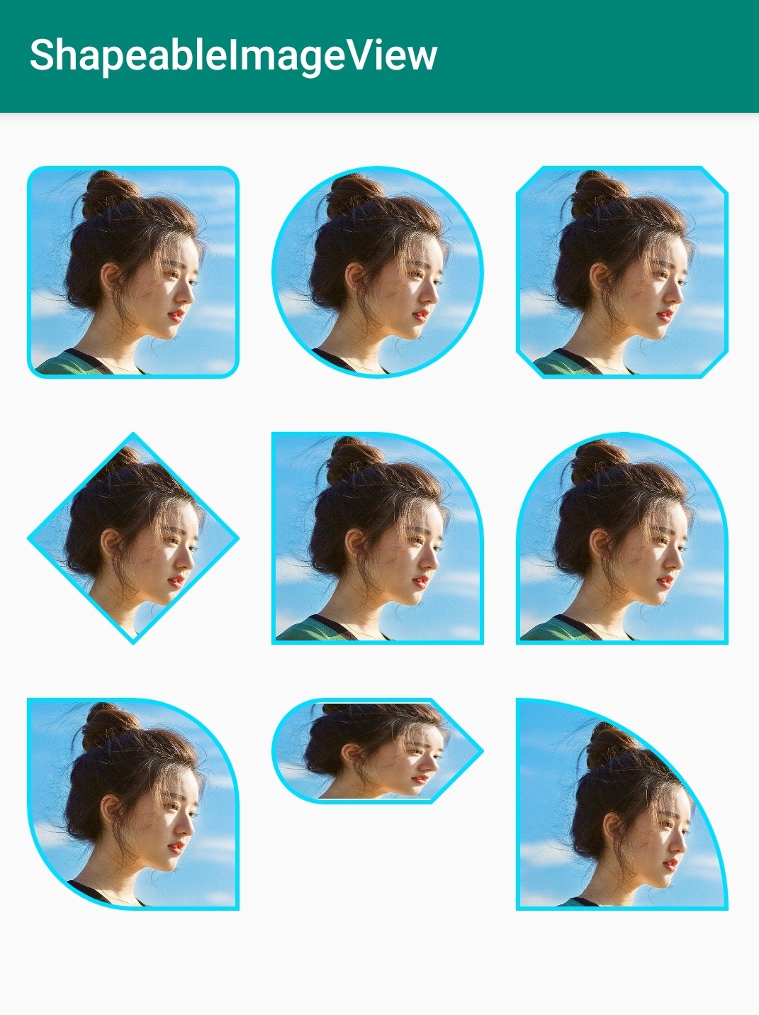
1. Fillet picture
        <com.google.android.material.imageview.ShapeableImageView
            android:id="@+id/image1"
            android:layout_width="110dp"
            android:layout_height="110dp"
            android:padding="1dp"
            android:src="@drawable/head"
            app:shapeAppearance="@style/roundedCornerStyle"
            app:strokeColor="@android:color/holo_blue_bright"
            app:strokeWidth="2dp"/>
Corresponding style:
    <!-- Fillet picture -->
    <style name="roundedCornerStyle">
        <item name="cornerFamily">rounded</item>
        <item name="cornerSize">8dp</item>
    </style>
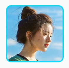
2. Circular picture
 <com.google.android.material.imageview.ShapeableImageView
            android:id="@+id/image2"
            android:layout_width="110dp"
            android:layout_height="110dp"
            android:padding="1dp"
            android:src="@drawable/head"
            app:shapeAppearance="@style/circleStyle"
            app:strokeColor="@android:color/holo_blue_bright"
            app:strokeWidth="2dp"/>
Corresponding style:
    <!-- Circular picture -->
    <style name="circleStyle">
        <item name="cornerFamily">rounded</item>
        <item name="cornerSize">50%</item>
    </style>
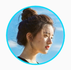
3. Corner cutting picture
 <com.google.android.material.imageview.ShapeableImageView
            android:id="@+id/image3"
            android:layout_width="110dp"
            android:layout_height="110dp"
            android:padding="1dp"
            android:src="@drawable/head"
            app:shapeAppearance="@style/cutCornerStyle"
            app:strokeColor="@android:color/holo_blue_bright"
            app:strokeWidth="2dp"/>
Corresponding style:
    <!-- Corner cutting picture -->
    <style name="cutCornerStyle">
        <item name="cornerFamily">cut</item>
        <item name="cornerSize">12dp</item>
    </style>
4. Diamond picture
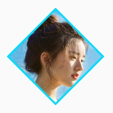
  <com.google.android.material.imageview.ShapeableImageView
            android:id="@+id/image4"
            android:layout_width="110dp"
            android:layout_height="110dp"
            android:padding="1dp"
            android:src="@drawable/head"
            app:shapeAppearance="@style/diamondStyle"
            app:strokeColor="@android:color/holo_blue_bright"
            app:strokeWidth="2dp"/>
Corresponding style:
    <!-- Diamond picture -->
    <style name="diamondStyle">
        <item name="cornerFamily">cut</item>
        <item name="cornerSize">50%</item>
    </style>
5. Top right corner fillet image
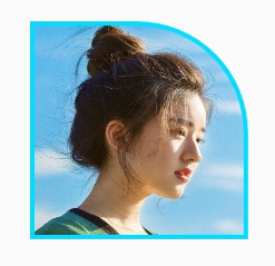
 <com.google.android.material.imageview.ShapeableImageView
            android:id="@+id/image5"
            android:layout_width="110dp"
            android:layout_height="110dp"
            android:padding="1dp"
            android:src="@drawable/head"
            app:shapeAppearance="@style/topRightCornerStyle"
            app:strokeColor="@android:color/holo_blue_bright"
            app:strokeWidth="2dp"/>
Corresponding style:
    <!-- Top right corner fillet image -->
    <style name="topRightCornerStyle">
        <item name="cornerFamilyTopRight">rounded</item>
        <item name="cornerSizeTopRight">50dp</item>
    </style>
6. Small egg picture
   <com.google.android.material.imageview.ShapeableImageView
            android:id="@+id/image6"
            android:layout_width="110dp"
            android:layout_height="110dp"
            android:padding="1dp"
            android:src="@drawable/head"
            app:shapeAppearance="@style/eggStyle"
            app:strokeColor="@android:color/holo_blue_bright"
            app:strokeWidth="2dp"/>
Corresponding style:
    <!-- Small egg picture -->
    <style name="eggStyle">
        <item name="cornerFamilyTopRight">rounded</item>
        <item name="cornerSizeTopRight">50dp</item>
        <item name="cornerSizeTopLeft">50dp</item>
        <item name="cornerFamilyTopLeft">rounded</item>
    </style>
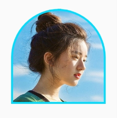
7. Combined radian picture effect

    <com.google.android.material.imageview.ShapeableImageView
            android:id="@+id/image7"
            android:layout_width="110dp"
            android:layout_height="110dp"
            android:padding="1dp"
            android:src="@drawable/head"
            app:shapeAppearance="@style/comCornerStyle"
            app:strokeColor="@android:color/holo_blue_bright"
            app:strokeWidth="2dp"/>
Corresponding style:
    <!-- Combined radian picture effect -->
    <style name="comCornerStyle">
        <item name="cornerFamily">rounded</item>
        <item name="cornerSizeTopRight">50%</item>
        <item name="cornerSizeBottomLeft">50%</item>
    </style>
8. Small Tips

 <com.google.android.material.imageview.ShapeableImageView
            android:id="@+id/image8"
            android:layout_width="110dp"
            android:layout_height="50dp"
            android:padding="1dp"
            android:src="@drawable/head"
            app:shapeAppearance="@style/tipsCornerStyle"
            app:strokeColor="@android:color/holo_blue_bright"
            app:strokeWidth="2dp"/>
Corresponding style:
    <!-- Small Tips -->
    <style name="tipsCornerStyle">
        <item name="cornerFamilyTopLeft">rounded</item>
        <item name="cornerSizeTopLeft">50%</item>
        <item name="cornerFamilyBottomLeft">rounded</item>
        <item name="cornerSizeBottomLeft">50%</item>
        <item name="cornerFamilyTopRight">cut</item>
        <item name="cornerSizeTopRight">50%</item>
        <item name="cornerFamilyBottomRight">cut</item>
        <item name="cornerSizeBottomRight">50%</item>
    </style>
9. Fan picture
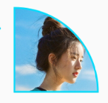
 <com.google.android.material.imageview.ShapeableImageView
            android:id="@+id/image9"
            android:layout_width="110dp"
            android:layout_height="110dp"
            android:padding="1dp"
            android:src="@drawable/head"
            app:shapeAppearance="@style/fanStyle"
            app:strokeColor="@android:color/holo_blue_bright"
            app:strokeWidth="2dp"/>
Corresponding style:
  <!-- sector -->
    <style name="fanStyle">
        <item name="cornerFamilyBottomLeft">rounded</item>
        <item name="cornerFamilyBottomRight">rounded</item>
        <item name="cornerFamilyTopLeft">rounded</item>
        <item name="cornerFamilyTopRight">rounded</item>
        <item name="cornerSizeBottomLeft">0dp</item>
        <item name="cornerSizeBottomRight">0dp</item>
        <item name="cornerSizeTopLeft">0%</item>
        <item name="cornerSizeTopRight">100%</item>
    </style>
Learn knowledge through source code
From the previous application, we can find that various styles can be realized by defining the shapeAppearance attribute style value of ShapeableImageView. What are the attributes of style, what they represent respectively, and what is the principle of defining these styles to realize these style effects? Read the source code with these questions.
 public ShapeableImageView(Context context, @Nullable AttributeSet attrs, int defStyle) {
    super(wrap(context, attrs, defStyle, DEF_STYLE_RES), attrs, defStyle);
    // Ensure we are using the correctly themed context rather than the context that was passed in.
    context = getContext();

    clearPaint = new Paint();
    clearPaint.setAntiAlias(true);
    clearPaint.setColor(Color.WHITE);
    clearPaint.setXfermode(new PorterDuffXfermode(Mode.DST_OUT));
    destination = new RectF();
    maskRect = new RectF();
    maskPath = new Path();
    TypedArray attributes =
        context.obtainStyledAttributes(
            attrs, R.styleable.ShapeableImageView, defStyle, DEF_STYLE_RES);

    strokeColor =
        MaterialResources.getColorStateList(
            context, attributes, R.styleable.ShapeableImageView_strokeColor);

    strokeWidth = attributes.getDimensionPixelSize(R.styleable.ShapeableImageView_strokeWidth, 0);

    borderPaint = new Paint();
    borderPaint.setStyle(Style.STROKE);
    borderPaint.setAntiAlias(true);
    shapeAppearanceModel =
        ShapeAppearanceModel.builder(context, attrs, defStyle, DEF_STYLE_RES).build();
    shadowDrawable = new MaterialShapeDrawable(shapeAppearanceModel);
    if (VERSION.SDK_INT >= VERSION_CODES.LOLLIPOP) {
      setOutlineProvider(new OutlineProvider());
    }
  }
There are two lines of core code in the construction method:
   shapeAppearanceModel =
        ShapeAppearanceModel.builder(context, attrs, defStyle, DEF_STYLE_RES).build();
    shadowDrawable = new MaterialShapeDrawable(shapeAppearanceModel);
It can be seen that the style attribute is managed by ShapeAppearanceModel. After obtaining the style attribute, the MaterialShapeDrawable object is constructed, and the shape is drawn by MaterialShapeDrawable.
Set the properties of edges and corners
Through the R file, you can view the properties of the current ShapeAppearanceModel:
    <declare-styleable name="ShapeAppearance">
      <!-- Corner size to be used in the ShapeAppearance. All corners default to this value -->
      <attr format="dimension|fraction" name="cornerSize"/>
      <!-- Top left corner size to be used in the ShapeAppearance. -->
      <attr format="dimension|fraction" name="cornerSizeTopLeft"/>
      <!-- Top right corner size to be used in the ShapeAppearance. -->
      <attr format="dimension|fraction" name="cornerSizeTopRight"/>
      <!-- Bottom right corner size to be used in the ShapeAppearance. -->
      <attr format="dimension|fraction" name="cornerSizeBottomRight"/>
      <!-- Bottom left corner size to be used in the ShapeAppearance. -->
      <attr format="dimension|fraction" name="cornerSizeBottomLeft"/>

      <!-- Corner family to be used in the ShapeAppearance. All corners default to this value -->
      <attr format="enum" name="cornerFamily">
        <enum name="rounded" value="0"/>
        <enum name="cut" value="1"/>
      </attr>
      <!-- Top left corner family to be used in the ShapeAppearance. -->
      <attr format="enum" name="cornerFamilyTopLeft">
        <enum name="rounded" value="0"/>
        <enum name="cut" value="1"/>
      </attr>
      <!-- Top right corner family to be used in the ShapeAppearance. -->
      <attr format="enum" name="cornerFamilyTopRight">
        <enum name="rounded" value="0"/>
        <enum name="cut" value="1"/>
      </attr>
      <!-- Bottom right corner family to be used in the ShapeAppearance. -->
      <attr format="enum" name="cornerFamilyBottomRight">
        <enum name="rounded" value="0"/>
        <enum name="cut" value="1"/>
      </attr>
      <!-- Bottom left corner family to be used in the ShapeAppearance. -->
      <attr format="enum" name="cornerFamilyBottomLeft">
        <enum name="rounded" value="0"/>
        <enum name="cut" value="1"/>
      </attr>
    </declare-styleable>
      <declare-styleable name="ShapeableImageView">
      <attr name="strokeWidth"/>
      <attr name="strokeColor"/>

      <!-- Shape appearance style reference for ShapeableImageView. Attribute declaration is in the
           shape package. -->
      <attr name="shapeAppearance"/>
      <!-- Shape appearance overlay style reference for ShapeableImageView. To be used to augment
           attributes declared in the shapeAppearance. Attribute declaration is in the shape package.
           -->
      <attr name="shapeAppearanceOverlay"/>
    </declare-styleable>
It can be seen that the ShapeAppearanceModel can define the attributes of various edges and corners.
Draw graphics
The general way to customize irregular pictures is to override the onDraw method of ImageView and use it to deal with edges and corners . What is PorterDuffXfermode?
class Inherited from Android graphics. Xfermode. When drawing with Canvas in Android, you can use PorterDuffXfermode to mix the pixels of the drawn graphics with the pixels at the corresponding position in Canvas according to certain rules to form new pixel values, so as to update the final pixel color value in Canvas, which will create many interesting effects.
The use method will also be simple. Pass it to paint as a parameter Setxfermode (Xfermode xfermode) method, so that when drawing with this brush paint, Android will use the imported PorterDuffXfermode. If you don't want to use Xfermode again, you can execute paint setXfermode(null).
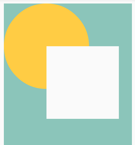
@Override
    protected void onDraw(Canvas canvas) {
        super.onDraw(canvas);
        //Set background color
        canvas.drawARGB(255, 139, 197, 186);

        int canvasWidth = canvas.getWidth();
        int r = canvasWidth / 3;
        //Draw a yellow circle normally
        paint.setColor(0xFFFFCC44);
        canvas.drawCircle(r, r, r, paint);
        //Use CLEAR as the PorterDuffXfermode to draw a blue rectangle
        paint.setXfermode(new PorterDuffXfermode(PorterDuff.Mode.CLEAR));
        paint.setColor(0xFF66AAFF);
        canvas.drawRect(r, r, r * 2.7f, r * 2.7f, paint);
        //Finally, remove Xfermode from the brush
        paint.setXfermode(null);
    }
The effect is as follows:
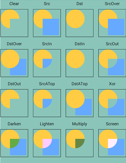
There are many mixing effects that can be achieved, as shown in the figure:
In the construction method of ShapeableImageView, you can see a line:
clearPaint.setXfermode(new PorterDuffXfermode(Mode.DST_OUT));
It can be seen that the principle of ShapeableImageView is to use PorterDuffXfermode to mix the picture with the specified graph to get the desired irregular picture. Its core code is as follows:
  @Override
  protected void onDraw(Canvas canvas) {
    super.onDraw(canvas);
    canvas.drawPath(maskPath, clearPaint);
    drawStroke(canvas);
  }
  @Override
  protected void onSizeChanged(int width, int height, int oldWidth, int oldHeight) {
    super.onSizeChanged(width, height, oldWidth, oldHeight);
    updateShapeMask(width, height);
  }
 private void updateShapeMask(int width, int height) {
    destination.set(
        getPaddingLeft(), getPaddingTop(), width - getPaddingRight(), height - getPaddingBottom());
    pathProvider.calculatePath(shapeAppearanceModel, 1f /*interpolation*/, destination, path);
    // Remove path from rect to draw with clear paint.
    maskPath.rewind();
    maskPath.addPath(path);
    // Do not include padding to clip the background too.
    maskRect.set(0, 0, width, height);
    maskPath.addRect(maskRect, Direction.CCW);
  }
The code is easy to understand. You can see the drawing process from onDraw:
1. First, call onDraw of the parent ImageView to draw the basic picture;
2. Generate irregular pictures. clearPaint sets PorterDuffXfermode(Mode.DST_OUT), that is, remove the overlapping part of src pictures and only keep the rest. maskPath is composed of irregular graphics and rectangular picture borders;
3. Draw the boundary.
summary
The above only analyzes the core code of ShapeableImageView. Many details are not expanded. ShapeableImageView provides rich attributes. Various graphics can be realized by changing the combination of edge and corner values. It is very convenient to use and is worthy of recommendation.
reference resources
ShapeableImageView official document
Detailed explanation of the use and working principle of PorterDuffXfermode for Canvas drawing in Android