Layout a widget
What's the point?
- Even the application itself is a widget
- It's easy to create a widget and add it to the layout widget
- To display the widget on the device, add the layout widget to the app widget.
- Scaffold is the easiest to use. It is a widget in the Material Components library. It provides a default banner and background color, and has an API to add drawer, snake bar and bottom sheet.
- If you wish, you can build your application using only the widgets in the standard widget library
In fluent, text, icons or images can be placed on the screen in just a few steps.
-
Select a widget to save the object.
Depending on how you want to align or constrain visible widgets, from various Layout widget Because these features are usually passed to the included widget s. This example uses Center, which can Center the content horizontally and vertically. -
Create a widget to hold the visible object
Note: the shuttle application uses Dart language Written. Dart will feel very familiar if you know Java or a similar object-oriented programming language. If you don't understand, you can try DartPad -An interactive Dart playground that can be used on any browser. Dart language tour This is an overview of Dart language features.
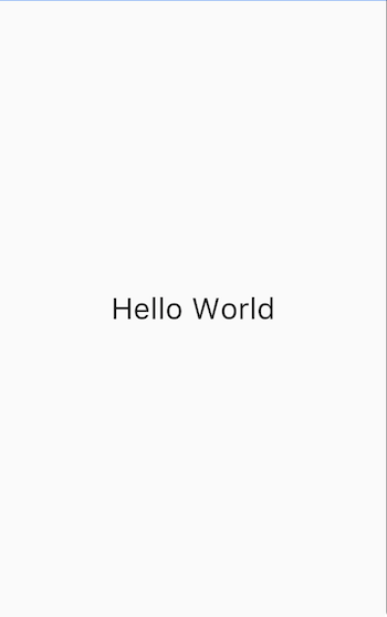
For example, create a Text widget:
new Text('Hello World', style: new TextStyle(fontSize: 32.0))Create an Image widget:
new Image.asset('images/myPic.jpg', fit: BoxFit.cover)Create an Icon widget:
new Icon(Icons.star, color: Colors.red[500])
3. Add the visible widget to the layout widget
All layout widgets have a child attribute (such as Center or Container) or a child attribute if they need a widget list (such as Row, Column, ListView or Stack).
To add a Text widget to a Center widget:
new Center(
  child: new Text('Hello World', style: new TextStyle(fontSize: 32.0))
4. Add the layout widget to the page
The fluent application itself is a widget, and most widgets have one build() method. Create the widget that will be displayed on the device in the build method of the application. For Material applications, you can add the Center widget directly to the body property
class _MyHomePageState extends State<MyHomePage> {
  @override
  Widget build(BuildContext context) {
    return new Scaffold(
      appBar: new AppBar(
        title: new Text(widget.title),
      ),
      body: new Center(
        child: new Text('Hello World', style: new TextStyle(fontSize: 32.0)),
      ),
    );
  }
}
Note: when designing the user interface, you can use the widgets in the standard widget library or Material Components Widgets in. You can mix widgets from the two libraries, customize existing widgets, or build a set of custom widgets.
For non Material applications, you can add the Center widget to the build() method of the application:
-
Note that by default, non Material applications do not contain AppBar, title, or background colors. If you want to use these functions in non Material applications, you must build them yourself. This application changes the background color to white and the text to dark gray to mimic the Material application.
okay! When you run this application, you will see:
Place multiple widget s vertically and horizontally
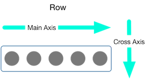
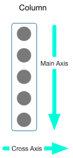
One of the most common layout patterns is to arrange widgets vertically or horizontally. You can arrange widgets horizontally using rows and vertically using columns.
What's the point?
- Row and column are the two most commonly used layout modes.
- Both rows and columns need a list of child widget s.
- The child widget itself can be a row, column, or other complex widget.
- You can specify how rows or columns align their children vertically or horizontally
- You can stretch or limit specific child widget s
- You can specify how child widget s use the available space in rows or columns
Contents
You can control how rows or columns align their children using the mainAxisAlignment and crossAxisAlignment properties. For rows, the main axis is horizontal and the horizontal axis is vertical. For columns, the main axis is vertical and the horizontal axis is horizontal.
MainAxisAlignment And CrossAxisAlignment Class provides many constants that control alignment
Note: when you add pictures to a project, you need to update the pubspec file to access them - this example uses image Asset displays the image. For more information, see the for this example pubspec.yaml File, or Add resources and images to the shuttle . If you are using pictures on the Internet, you do not need to do this. Use image Network.
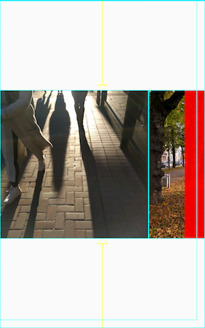
In the following example, each of the three images is 100 pixels wide. The width of the rendering box (in this case, the entire screen) exceeds 300 pixels, so set the spindle alignment to spaceevery, which evenly distributes the free horizontal space between, before and after each image.
appBar: new AppBar(
  title: new Text(widget.title),
),
body: new Center(
  child: new Row(
    mainAxisAlignment: MainAxisAlignment.spaceEvenly,
    children: [
      new Image.asset('images/pic1.jpg'),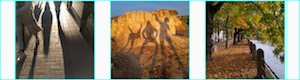
Columns work the same way as rows. The following example shows a column of three pictures, each 100 pixels high. The height of the rendering box (in this case, the entire screen) is greater than 300 pixels, so set the spindle alignment to spaceevery, which evenly distributes free vertical space between, above and below each image.
appBar: new AppBar(
  title: new Text(widget.title),
),
body: new Center(
  child: new Column(
    mainAxisAlignment: MainAxisAlignment.spaceEvenly,
    children: [
      new Image.asset('images/pic1.jpg'),
*Note: if the layout is too large for the equipment, red stripes will appear on the affected edges. For example, the line in the following screenshot is too wide for the screen of the device:
By using the Expanded widget, you can set the size of the widget to fit rows or columns, as shown in the following Adjust widgets Part is described.
Maybe you want a widget to occupy twice the space of its brother widget. You can place children of rows or columns in Expanded Widget to control the size of the widget along the spindle direction. The Expanded widget has a flex attribute, which is an integer used to determine the elasticity coefficient of the widget. The default elasticity coefficient is 1.
For example, to create a row consisting of three widgets, where the width of the middle widget is twice that of the other two widgets, set the elasticity coefficient of the middle widget to 2:
appBar: new AppBar(
  title: new Text(widget.title),
),
body: new Center(
  child: new Row(
    crossAxisAlignment: CrossAxisAlignment.center,
    children: [
      new Expanded(
        child: new Image.asset('images/pic1.jpg'),
      ),
      new Expanded(
        flex: 2,
        child: new Image.asset('images/pic2.jpg'),
      ),
      new Expanded(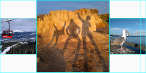
To fix the example in the previous section: there are 3 pictures in one row, the row is too wide for its rendering box, and the problem in the red bar appears on the right, you can use expanded widgets to wrap each widget. By default, the elasticity coefficient of each widget is 1, and one third of the row is allocated to each widget.
appBar: new AppBar(
  title: new Text(widget.title),
),
body: new Center(
  child: new Row(
    crossAxisAlignment: CrossAxisAlignment.center,
    children: [
      new Expanded(
        child: new Image.asset('images/pic1.jpg'),
      ),
      new Expanded(
        child: new Image.asset('images/pic2.jpg'),
      ),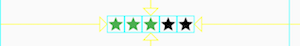
new Expanded(By default, rows or columns take up as much space as possible along their main axis, but if you want to keep children close together, you can set mainAxisSize to mainAxisSize min. The following example uses this attribute to cluster star icons together (if not clustered, the five star icons will be scattered).
class _MyHomePageState extends State<MyHomePage> {
  @override
  Widget build(BuildContext context) {
    var packedRow = new Row(
      mainAxisSize: MainAxisSize.min,
      children: [
        new Icon(Icons.star, color: Colors.green[500]),
        new Icon(Icons.star, color: Colors.green[500]),
        new Icon(Icons.star, color: Colors.green[500]),
        new Icon(Icons.star, color: Colors.black),
        new Icon(Icons.star, color: Colors.black),
      ],
    );

  // ...
}
The layout framework allows you to nest rows and columns within rows and columns as needed. Let's look at the layout code of the part surrounded by the red border below:
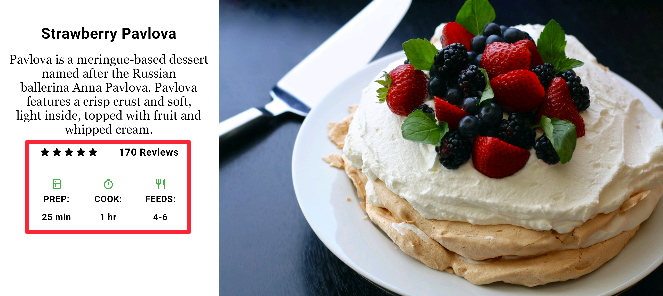
The layout of the red border is realized by two rows. The rating line contains five stars and the number of comments. The icon row contains three columns of icons and text.
widget tree of rating line:
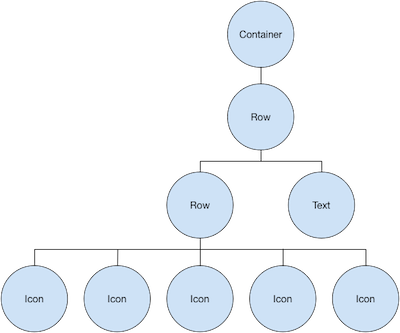
The ratings variable creates a line containing five star icons and one text:
class _MyHomePageState extends State<MyHomePage> {
  @override
  Widget build(BuildContext context) {
    //...

    var ratings = new Container(
      padding: new EdgeInsets.all(20.0),
      child: new Row(
        mainAxisAlignment: MainAxisAlignment.spaceEvenly,
        children: [
          new Row(
            mainAxisSize: MainAxisSize.min,
            children: [
              new Icon(Icons.star, color: Colors.black),
              new Icon(Icons.star, color: Colors.black),
              new Icon(Icons.star, color: Colors.black),
              new Icon(Icons.star, color: Colors.black),
              new Icon(Icons.star, color: Colors.black),
            ],
          ),
          new Text(
            '170 Reviews',
            style: new TextStyle(
              color: Colors.black,
              fontWeight: FontWeight.w800,
              fontFamily: 'Roboto',
              letterSpacing: 0.5,
              fontSize: 20.0,
            ),
          ),
        ],
      ),
    );
    //...
  }
}
Tip: to minimize visual confusion caused by heavily nested layout code, you can implement various parts of the UI in variables and functions.
The icon line below the rating line contains 3 columns; Each column contains an icon and two lines of text, which you can see in its widget tree:
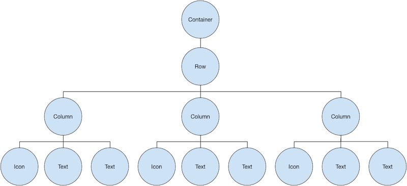
The iconList variable defines the icon line:
class _MyHomePageState extends State<MyHomePage> {
  @override
  Widget build(BuildContext context) {
    // ...

    var descTextStyle = new TextStyle(
      color: Colors.black,
      fontWeight: FontWeight.w800,
      fontFamily: 'Roboto',
      letterSpacing: 0.5,
      fontSize: 18.0,
      height: 2.0,
    );

    // DefaultTextStyle.merge allows you to create a default text style that will be used by it
    // All child nodes inherit
    var iconList = DefaultTextStyle.merge(
      style: descTextStyle,
      child: new Container(
        padding: new EdgeInsets.all(20.0),
        child: new Row(
          mainAxisAlignment: MainAxisAlignment.spaceEvenly,
          children: [
            new Column(
              children: [
                new Icon(Icons.kitchen, color: Colors.green[500]),
                new Text('PREP:'),
                new Text('25 min'),
              ],
            ),
            new Column(
              children: [
                new Icon(Icons.timer, color: Colors.green[500]),
                new Text('COOK:'),
                new Text('1 hr'),
              ],
            ),
            new Column(
              children: [
                new Icon(Icons.restaurant, color: Colors.green[500]),
                new Text('FEEDS:'),
                new Text('4-6'),
              ],
            ),
          ],
        ),
      ),
    );
    // ...
  }
}
The leftColumn variable contains the score and icon lines, as well as the title and text describing Pavlova:
class _MyHomePageState extends State<MyHomePage> {
  @override
  Widget build(BuildContext context) {
    //...

    var leftColumn = new Container(
      padding: new EdgeInsets.fromLTRB(20.0, 30.0, 20.0, 20.0),
      child: new Column(
        children: [
          titleText,
          subTitle,
          ratings,
          iconList,
        ],
      ),
    );
    //...
  }
}
The left column is placed in the container to constrain its width. Finally, put the whole row (including the left column and image) into a Card to build the UI:
Pavlova picture from Pixabay , can be used under the Creative Commons license. You can use image Network downloads the display image directly from the Internet, but for this example, the image is saved to the image directory in the project, added to the pubspec file, and uses images asset. For more information, see Add assertions and pictures in fluent.
body: new Center(
  child: new Container(
    margin: new EdgeInsets.fromLTRB(0.0, 40.0, 0.0, 30.0),
    height: 600.0,
    child: new Card(
      child: new Row(
        crossAxisAlignment: CrossAxisAlignment.start,
        children: [
          new Container(
            width: 440.0,
            child: leftColumn,
          ),
          mainImage,
        ],
      ),
    ),
  ),
),