HTML table and form page structure
Write in front: tables and forms are two special page structures. Tables are used to display data, and forms are used to input and transfer information. Both of them play an important role in the information display and collection of web pages.
1. Forms
Table related labels:
| label | describe |
|---|---|
| < table > | Define table |
| < caption > | Define table title |
| < th > | Defines the header of the table |
| < tr > | Define the rows of the table |
| < td > | Define table cells |
| < thead > | Defines the header of the table |
| < tbody > | Define table body |
| < tfoot > | Defines the footer of the table |
| < col > | Define attributes for table columns |
| < colgroup > | Define groups of table columns |
1.1 table structure
In all tables, the outermost layer is the table element, which wraps the body of the whole table. The tr element represents a row of tables, and the td element represents a cell. The td element must be contained inside the tr element.
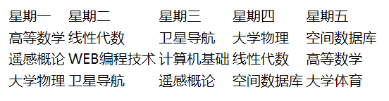
Example (create table):
		<table>
			<tr>
				<td>Monday</td>
				<td>Tuesday</td>
				<td>Wednesday</td>
				<td>Thursday</td>
				<td>Friday</td>
			</tr>
			<tr>
				<td>Advanced mathematics</td>
				<td>linear algebra</td>
				<td>satellite navigation</td>
				<td>College Physics</td>
				<td>Spatial database</td>
			</tr>
			<tr>
				<td>remote sensing </td>
				<td>WEB Programming technology</td>
				<td>Fundamentals of computer</td>
				<td>linear algebra</td>
				<td>Advanced mathematics</td>
			</tr>
			<tr>
				<td>College Physics</td>
				<td>satellite navigation</td>
				<td>remote sensing </td>
				<td>Spatial database</td>
				<td>College Physical Education</td>
			</tr>
		</table>
design sketch:
1.2 table border
The border of the table is set by using the border attribute in the < Table > label. The value of the border is a number. The larger the number, the wider the border.
Example (set the border size to "1"):
<table border="1">
design sketch:

In addition, the border between cells can be changed into a single border by changing the CSS style border collapse.
Value of border collapse:
| value | describe |
|---|---|
| separate | By default, the border will be separated and the border spacing and empty cells attributes will not be ignored |
| collapse | If possible, the borders are merged into a single border, and the border spacing and empty cells properties are ignored |
| inherit | Inherit the value of the border collapse attribute from the parent element |
Example (set to single border):
		table{
			border-collapse: collapse;
		}
design sketch:

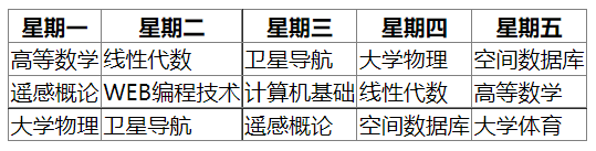
1.3 table head and body
The table is generally divided into two parts: table head and table subject. The table head is wrapped with < thead > label, and the cells inside are marked with < th > label. The default font is bold. The main body of the table is wrapped with < tbody > label, and the cells in < tbody > are represented with < td > label.
Example:
		<table border="1">
			<thead>
				<tr>
					<th>Monday</th>
					<th>Tuesday</th>
					<th>Wednesday</th>
					<th>Thursday</th>
					<th>Friday</th>
				</tr>
			</thead>
			<tbody>
				<tr>
					<td>Advanced mathematics</td>
					<td>linear algebra</td>
					<td>satellite navigation</td>
					<td>College Physics</td>
					<td>Spatial database</td>
				</tr>
				<tr>
					<td>remote sensing </td>
					<td>WEB Programming technology</td>
					<td>Fundamentals of computer</td>
					<td>linear algebra</td>
					<td>Advanced mathematics</td>
				</tr>
				<tr>
					<td>College Physics</td>
					<td>satellite navigation</td>
					<td>remote sensing </td>
					<td>Spatial database</td>
					<td>College Physical Education</td>
				</tr>
			</tbody>
		</table>
design sketch:
In addition, because the table arrangement is calculated in rows, if you want to write a vertical header, you need to insert the < th > label of the header cell into the first place of the label < tr > of each row to get a new column.
(Note: if the cell is empty, use a space to comply with "& nbsp;" (occupied)
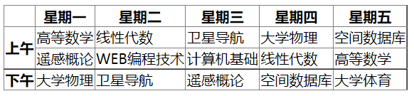
1.4 cell merging
Cross row merge: colspan attribute
<th colspan="2"></th>
Cross column merge: rowspan attribute
<th rowspan="2"></th>
Example:
<table border="1"> <thead> <tr> <th> </th> <th>Monday</th> <th>Tuesday</th> <th>Wednesday</th> <th>Thursday</th> <th>Friday</th> </tr> </thead> <tbody> <tr> <th rowspan="2">morning</th> <td>Advanced mathematics</td> <td>linear algebra</td> <td>satellite navigation</td> <td>College Physics</td> <td>Spatial database</td> </tr> <tr> <td>remote sensing </td> <td>WEB Programming technology</td> <td>Fundamentals of computer</td> <td>linear algebra</td> <td>Advanced mathematics</td> </tr> <tr> <th>afternoon</th> <td>College Physics</td> <td>satellite navigation</td> <td>remote sensing </td> <td>Spatial database</td> <td>College Physical Education</td> </tr> </tbody> </table>
design sketch:
1.5 table title
To make a table title, simply insert the < caption > label into the < Table > label.
<caption>Professional curriculum</caption>

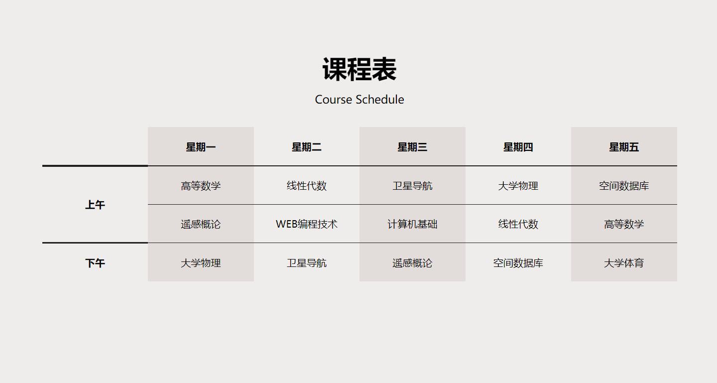
1.6 beautification form
Use CSS style to beautify the table. See the following code for details:
<!DOCTYPE html>
<html>
<head>
<meta charset="utf-8">
<title>table</title>
<style>
body{
background-color: #efedec;
}
table{
margin: 100px auto;
border-collapse: collapse;
}
th,td{
padding: 20px;
text-align: center;
width: 130px;
}
caption{
height: 100px;
margin-bottom: 20px;
}
p{
padding: 0;
margin: 0;
}
.title{
height: 50px;
font:bold 40px/50px "microsoft yahei";
}
.sub-title{
font:18px/50px "sf collegiate solid";
}
tr td,tr th{
border-bottom: 1px solid #221e1f;
}
table tr th:first-of-type{
border-bottom: 3px solid #221e1f;
}
tbody tr:last-of-type th{
border-bottom: none;
}
tbody tr:last-of-type td{
border-bottom: none;
}
thead tr th:nth-of-type(2n){
background-color: #e2ddda;
}
tbody tr td:nth-of-type(2n+1){
background-color: #e2ddda;
}
</style>
</head>
<body>
<table >
<caption>
<p class="title">Class Schedule Card</p>
<p class="sub-title">Course Schedule</p>
</caption>
<thead>
<tr>
<th> </th>
<th>Monday</th>
<th>Tuesday</th>
<th>Wednesday</th>
<th>Thursday</th>
<th>Friday</th>
</tr>
</thead>
<tbody>
<tr>
<th rowspan="2">morning</th>
<td>Advanced mathematics</td>
<td>linear algebra</td>
<td>satellite navigation</td>
<td>College Physics</td>
<td>Spatial database</td>
</tr>
<tr>
<td>remote sensing </td>
<td>WEB Programming technology</td>
<td>Fundamentals of computer</td>
<td>linear algebra</td>
<td>Advanced mathematics</td>
</tr>
<tr>
<th>afternoon</th>
<td>College Physics</td>
<td>satellite navigation</td>
<td>remote sensing </td>
<td>Spatial database</td>
<td>College Physical Education</td>
</tr>
</tbody>
</table>
</body>
</html>
design sketch:
2. Form
2.1 form element
The form element contains a variety of form elements, which can realize the data collection function in a variety of forms.
In the form that can be submitted, the action attribute of the form element defines the submission location of the form. The form will generally be submitted to the server. If the action attribute is not set, the current page will be set by default.
<form action="action_page.php">
2.2 input element
Input is the most commonly used form element. The input element has different forms according to the type attribute.
Value of input attribute:
| value | describe |
|---|---|
| button | Define clickable buttons (usually used with js) |
| checkbox | Define check box |
| file | Define input fields and browse buttons for file upload |
| hidden | Define hidden input fields |
| image | Define submit button in image form |
| password | Define password fields |
| radio | Define radio box |
| reset | Defining the reset button will clear all data in the form |
| submit | Defining the submit button will send the form data to the server |
| text | Defines the text input field for a single line, with a default width of 20 characters |
1. Text field (type = "text")
<input type="text" placeholder="enter one user name"/>

2. Password field (type = "password")
The password field box will automatically convert characters into black dots when entering a password to enhance confidentiality.
<input type="password" placeholder="Please input a password"/>

3. Radio box (type = "radio")
<p>Gender:</p>
<input type="radio" />female
<input type="radio" />male

4. Check box (type = "checkbox")
<p>hobby:</p>
<input type="checkbox" />run
<input type="checkbox" />game
<input type="checkbox" />read

5. Submit button (type = "submit")
When the user clicks the submit button, the form will be submitted, and the address is the action attribute value of the form element. If the action attribute value is not specified, it will be submitted to the current page by default, and the transmitted field will be displayed in the address bar of the browser.
		<form action="">
			user name:<input type="text" placeholder="enter one user name" name="username"/>
			password:<input type="password" placeholder="Please input a password" name="username"/>
			<br />
			<p>Gender:</p>
			<input type="radio" name="sex" value="female"/>female
			<input type="radio" name="sex" value="male"/>male
			<br />
			<p>hobby:</p>
			<input type="checkbox" name="intrest" value="run"/>run
			<input type="checkbox" name="intrest" value="game"/>game
			<input type="checkbox" name="intrest" value="read"/>read
			<input type="submit" />
		</form>
After clicking the submit button:

2.3 other form elements
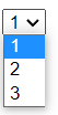
1. Drop down box
The select element can create a single or multiple selection drop-down box. The option element in the select element can be used to create drop-down options.
Common select elements are:
① Disabled -- disable the drop-down list. If you click the drop-down box, there will be no option to list general writing: disabled='disabled 'or write disabled directly.
② size -- specifies that several options can be displayed in the drop-down box, and one option is displayed by default.
			<select name="type" size="1">
				<option value="1">1</option>
				<option value="2">2</option>
				<option value="3">3</option>
			</select>
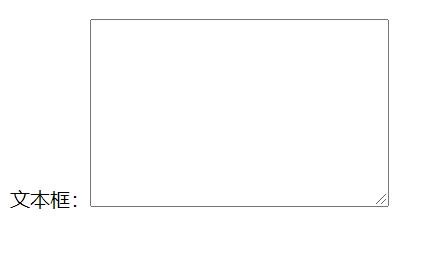
2. Text box
The textarea element defines multiple lines of text input. Its cols attribute indicates the width of the text box and the rows attribute indicates the height of the text box.
Attributes of textarea element:
① disabled: disable changing text area
② readonly: Specifies that the text is read-only
③ maxlength: Specifies the maximum number of words in the text field
Text box:<textarea name="" id="" cols="30" rows="10"></textarea>
3. Button
The button element defines a clickable button.
<button>Click!</button>

It's done! 😀