1, Crawling Movie Reviews
In order to analyze the data of renyin's Spring Festival New Year film "Changjin Lake - shuimen bridge", more than 40000 film reviews were crawled from the cat's eye by means of reptiles.
1. In order to prevent the address from being banned, the proxy address pool is used for crawling:
To set the proxy address, you can get the proxy address from the following free websites
89 free proxy IP - a completely free high-quality HTTP proxy IP supply platform
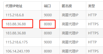
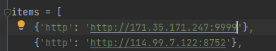
We only need the proxy IP address and port, and save it as a list as follows
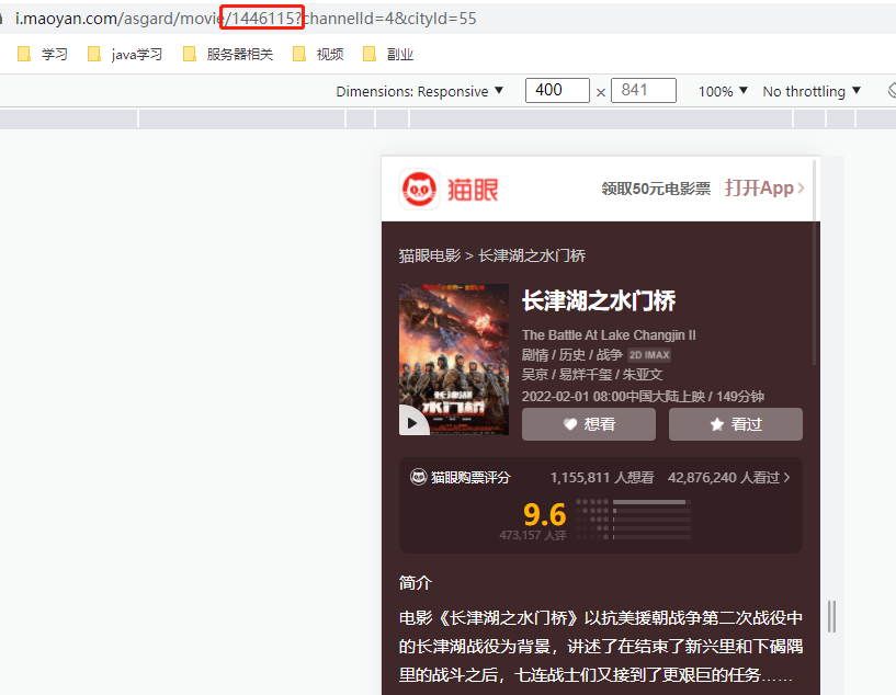
Crawl comments from the cat's eye. I crawl by simulating the request address of the mobile terminal. https://m.maoyan.com/mmdb/comments/movie/1446115.json?_v_=yes&offset=0
1446115 here is to click the movie you want to crawl on the cat's eye website, and the id of the movie will be in the navigation bar
Then, when setting the message header, 'user agent': useragent() Random to prevent restricted crawling. The data crawled by cat's eye starts from the latest date, with 15 entries at a time. If there is no date, only 1000 entries can be crawled, so you can climb to the previous date with the date.
Add an item by yourself, fill in the agent address, and the code for crawling comments is as follows:
import requests
import json
import pandas as pd
import random
from fake_useragent import UserAgent
import time,datetime
import openpyxl
ran_time=random.random() #Request interval length
now_time=datetime.datetime.now().strftime('%Y-%m-%d %H:%M:%S') #current time
end_time="2022-02-01 08:00:00" #Film release time
tomato = pd.DataFrame(columns=['date', 'score', 'city', 'comment', 'nick'])
def startTime(time):
if time>end_time:#Do not convert to timestamp format because the URL in timestamp format cannot display cmts partial comments
run(time)
def run(date):
global id # Define as global variable
global starttime
global tomato
for i in range(67): # Page number, generally only the first 1000 are displayed, 67 * 15 "1000
# Change the space in the time to% 20, otherwise the URL is incomplete
proxies = random.choice(items)
url = 'https://m.maoyan.com/mmdb/comments/movie/1446115.json?_v_=yes&offset={}&startTime={}'.format(i * 15,date.replace(' ','%20'))
print(url)
headers = {
'Accept': 'text/html,application/xhtml+xml,application/xml;q=0.9,image/webp,image/apng,*/*;q=0.8,application/signed-exchange;v=b3;q=0.9',
'Host': 'm.maoyan.com',
# 'Referer': 'http://m.maoyan.com/movie/1446115/comments?_v_=yes',
'Connection': "keep-alive",
'Cookie': '_lxsdk_cuid=17ebd6fcb4396-0232fccb2b266b-f791539-1fa400*****',
'User-Agent': UserAgent().random
}
rsp = requests.get(url, headers=headers, proxies=proxies, verify=False)
try:
comments = json.loads(rsp.content.decode('utf-8'))['cmts']
for item in comments:
tomato = tomato.append({'date': item['startTime'], 'city': item['cityName'], 'score': item['score'],
'comment': item['content'], 'nick': item['nick']}, ignore_index=True)
starttime = item['startTime'] # Time of last comment
except: # There may be less than 1000 comments a day
continue
time.sleep(ran_time)
startTime(starttime)
if __name__ == '__main__':
run(time_excu)
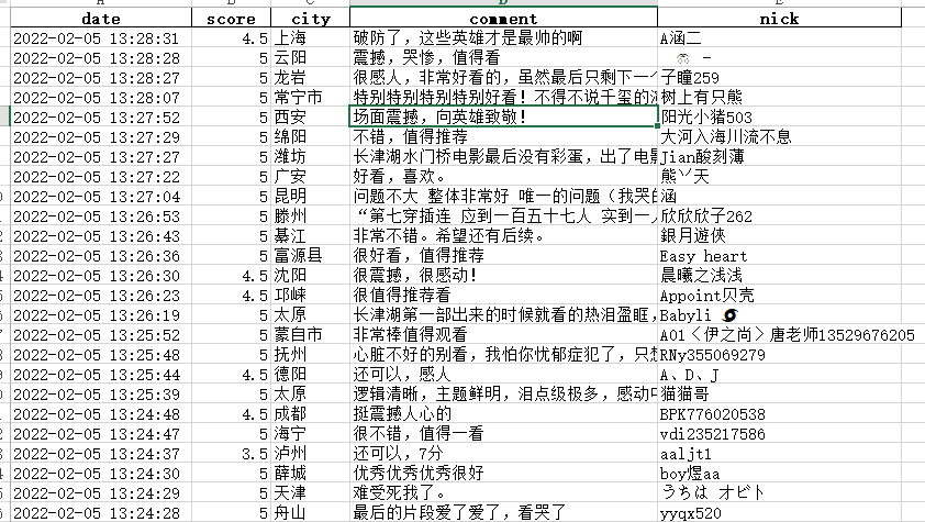
tomato.to_excel("Shuimen bridge review.xlsx", index=False)Here I saved it as xlsx file. My computer csv file is garbled. My friends can also try to save it as csv file.
Because requests Get crawls the https address. When setting the proxy pool address, select the one that supports https. In the requests request, proxies=proxies is the proxy, and verify=False is the url to get https. Execute the game and save it as an xlsx file. I crawled here for about four days. The saved file results are as follows:
II. Data visualization
First, the scoring results are visually displayed with data, and the code is as follows:
# -*- coding: utf-8 -*-
import pyecharts
from pyecharts.charts import Pie
from pyecharts.charts import Bar
from pyecharts import options as opts
import pandas as pd


def score_view(data):
    grouped = data.groupby(by="score")["nick"].size()
    grouped = grouped.sort_values(ascending=False)
    index = grouped.index
    values = grouped.values
    # Histogram
    bar = Bar()   #(init_opts = opts. Initopts (width = "600px", height = "1200px", page_title = "GDP in 2021")
    bar.add_xaxis(index.tolist())
    bar.add_yaxis("", values.tolist())
    bar.set_global_opts(
        xaxis_opts=opts.AxisOpts(axislabel_opts=opts.LabelOpts(rotate=10)),
        title_opts=opts.TitleOpts(title="Score distribution"),
        datazoom_opts=opts.DataZoomOpts(),  #Provides the function of area scaling
    )

    bar.render_notebook()
    bar.render('Movie Watergate bridge score.html')

    pie = Pie()
    pie.add("", [list(z) for z in zip(index.tolist(), values.tolist())],
           radius=["30%", "75%"],
                center=["40%", "50%"],
                rosetype="radius")
    pie.set_global_opts(
                title_opts=opts.TitleOpts(title="Proportion of each score value"),
                legend_opts=opts.LegendOpts(
                    type_="scroll", pos_left="80%", orient="vertical"
                ),
            ).set_series_opts(label_opts=opts.LabelOpts(formatter="{d}%"))
    pie.render_notebook()
    pie.render('Proportion of scores of shuimen Bridge.html')

if __name__ == '__main__':
    df = pd.read_excel("Shuimen bridge review.xlsx")
    data = df.drop_duplicates(keep="first")  # Delete duplicate values
    score_view(data)
The scoring view obtained is as follows:
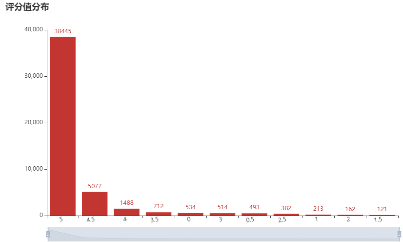
Proportion of each score value in the total score number
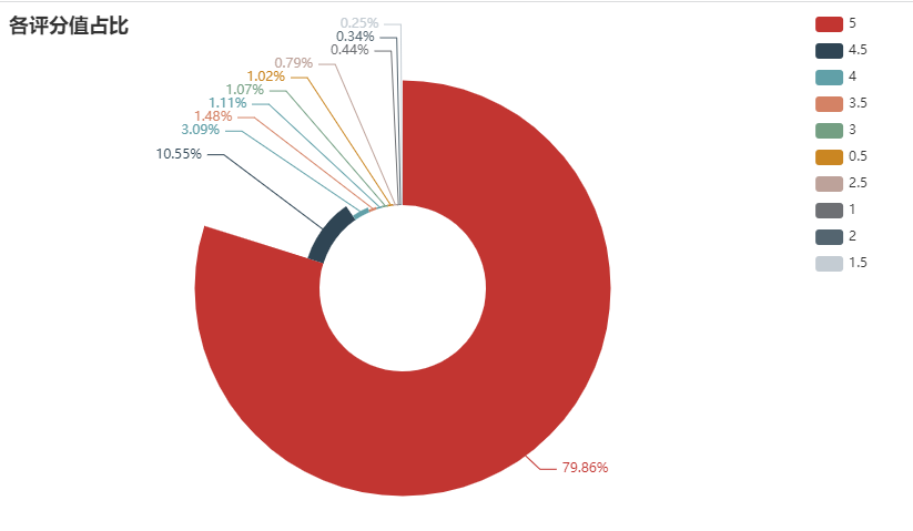
1.11% of the people gave a score of 0, with the highest score of 5, accounting for 79.86%
III. number of film viewers in each city of histogram + broken line
After observing the data crawled down, many people's city information shows districts, counties or county-level cities. The statistical dimension is calculated from the dimension of cities. Therefore, the administrative level of crawled cities is adjusted. Because of the database, many cities can't handle it. Therefore, the number of film viewers in first tier cities and new first tier cities has been sorted out.
The codes for treating counties and districts as cities are as follows:
import cpca

df2 = pd.DataFrame(data)
city_name = data["city"].values.tolist()
df_city = cpca.transform(city_name)

for i in range(len(df_city)):
    if df_city['province'][i]!=None and df_city["city"][i]==None:
        city_name[i] = df_city['province'][i].replace("city","")
    elif df_city['province'][i]!=None and df_city["city"][i]!=None:
        city_name[i] = df_city['city'][i].replace("city","")
# city_new = {"city_new":city_name}
df2["city_new"] = pd.Series(city_name)
The cpca library is used, but the data in the library is incomplete, and some place names can not be recognized.
Extract the number of comments and scores of first tier and new first tier cities from the processed data
city_num = df2["city_new"].value_counts()
city_first = ["Beijing","Shanghai","Guangzhou","Shenzhen"]   #first-tier cities
city_new_first = ["Wuhan","Nanjing","Chengdu","Chongqing","Hangzhou","Tianjin","Suzhou","Changsha","Qingdao","Xi'an","Zhengzhou","Ningbo","Wuxi","Dalian"]  #New frontline
citys_front = city_first + city_new_first
nums = []
city_comment = city_num.index.tolist()
count_comment = city_num.values.tolist()    #Calculate the number of city reviews
for city in citys_front:
    count = 0
    for i in range(len(city_comment)):
        if city_comment[i] ==city :
            count += count_comment[i]
    nums.append(count)   #Number of comments on first tier + new first tier cities
city_first_score_mean = df2[df2.city.isin(citys_front)].groupby(["city"], as_index=False)["score"].mean()   #Average score of first-line + new first-line

bar = Bar(init_opts=opts.InitOpts(width="1500px",height="800px",page_title="Number of first-line and new first-line comments"))   #(init_opts = opts. Initopts (width = "600px", height = "1200px", page_title = "GDP in 2021")
bar.add_xaxis(citys_front)
bar.add_yaxis("", nums)
bar.set_global_opts(
    xaxis_opts=opts.AxisOpts(axislabel_opts=opts.LabelOpts(rotate=10)),
    title_opts=opts.TitleOpts(title="Number of first-line and new first-line comments"),
    datazoom_opts=opts.DataZoomOpts(),  #Provides the function of area scaling
)
line = (
    Line()
        .add_xaxis(citys_front)
        .add_yaxis("", nums,label_opts = opts.LabelOpts(is_show=False))
)

bar.overlap(line)

bar.render_notebook()
bar.render('Number of comments on the first line and new line of Watergate Bridge.html')


line = (
    Line()
        .add_xaxis(city_first_score_mean.city.values.tolist())
        .add_yaxis("", city_first_score_mean.score.values.round(2).tolist(),label_opts = opts.LabelOpts(is_show=False))
)
effe = (
    EffectScatter(init_opts=opts.InitOpts(width="2000px",height="750px"))
        .add_xaxis(city_first_score_mean.city.values.tolist())
        .add_yaxis("", city_first_score_mean.score.values.round(2).tolist())
        .set_global_opts(title_opts=opts.TitleOpts(title="average score"))
)

effe.overlap(line)
# bar.render_notebook()
effe.render('City average score.html')
Here I use overlap, which is to overlay the images, so you can see that there are broken lines on the histogram.
The number of comments received is distributed as follows:
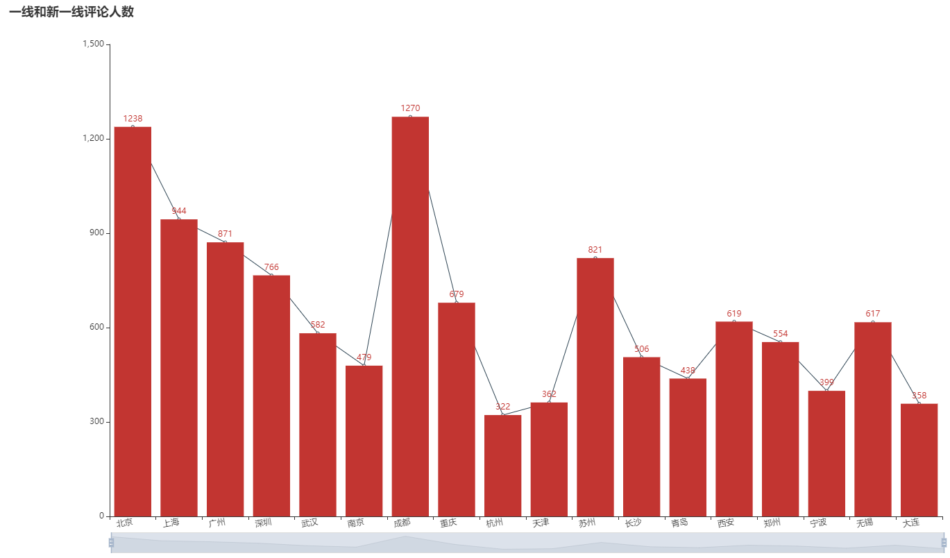
Comparing the distribution of the number of commentators with the urban population can basically reflect the degree to which each city likes to watch movies. From the data, the most pyrotechnic Chengdu people participate in the most commentaries. Hangzhou and Tianjin should be less affected by the epidemic. Beijing seems to like watching movies more than Shanghai.
The average score results are as follows. The actual page has ripple effect:
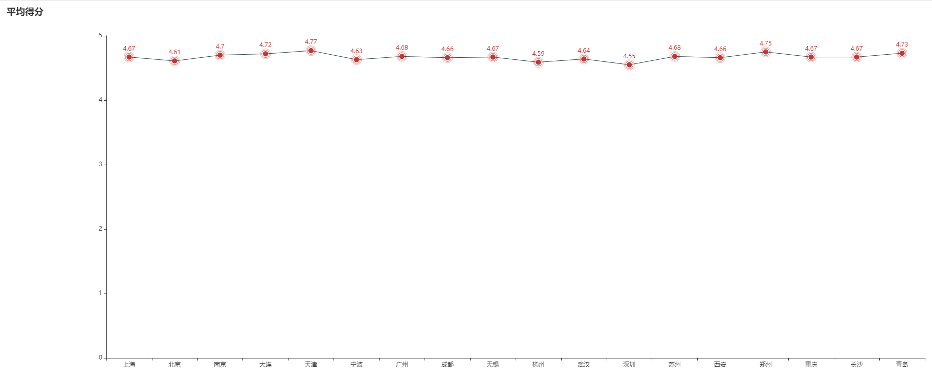
Although the scoring results do not reflect anything, they can be used for analysis, which may be related to people's quality and satisfaction.
4, Generate word cloud
Word cloud is to use the method of word segmentation (NLP) to split the comment content, and then extract some words with high frequency to generate a cloud like graph. The higher the frequency of words, the larger the font on the word cloud.
import pandas as pd
from wordcloud import WordCloud, STOPWORDS, ImageColorGenerator
import jieba
import matplotlib.pyplot as plt
import sys

df = pd.read_excel("Shuimen bridge review.xlsx")

words = " ".join(jieba.cut(df.comment.str.cat(sep=" ")))
stopwords = STOPWORDS
stopwords.add(u"film")

wc = WordCloud(stopwords=stopwords,
               font_path="C:/Windows/Fonts/simkai.ttf",  # Solve the problem of garbled display font
               background_color="white",width=1000,height=880, max_words=100
               )
my_wc = wc.generate_from_text(words)
plt.imshow(my_wc )
plt.rcParams['font.sans-serif']=['SimHei']
plt.rcParams['axes.unicode_minus'] = False    #Prevent Chinese from not displaying
plt.title(r"Shuimen Bridge")
# plt.imshow(my_wc.recolor(color_func=image_colors), )
plt.axis("off")
plt.show()
The resulting word cloud is as follows: