CSS Icon
How to add icons
The easiest way to add icons to an HTML page is to use an icon library, such as Font Awesome.
Adds the name of the specified icon class to any inline HTML element (such as < I > or < span >).
All icons in the following icon library are scalable vectors that can be customized using CSS (size, color, shadow, etc.).
Font Awesome Icon
To use the Font Awesome icon, visit fontawesome COM, log in and get the code to add to the < head > section of the HTML page:
<script src="url"></script>
url for you to visit fontawesome Com login
Tip: no need to download or install!
Bootstrap Icon
To use bootstrap glyphs, add this line in the < head > section of the HTML page:
<link rel="stylesheet" href="https://maxcdn.bootstrapcdn.com/bootstrap/3.3.7/css/bootstrap.min.css">
Tip: no need to download or install!
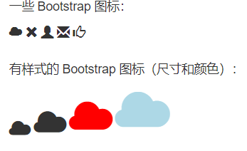
example:
<!DOCTYPE html>
<html>
<head>
<title>Bootstrap Icons</title>
<meta name="viewport" content="width=device-width, initial-scale=1">
<link rel="stylesheet" href="https://maxcdn.bootstrapcdn.com/bootstrap/3.3.7/css/bootstrap.min.css">
</head>
<body class="container">

<p>some Bootstrap Icon:</p>
<i class="glyphicon glyphicon-cloud"></i>
<i class="glyphicon glyphicon-remove"></i>
<i class="glyphicon glyphicon-user"></i>
<i class="glyphicon glyphicon-envelope"></i>
<i class="glyphicon glyphicon-thumbs-up"></i>
<br><br>

<p>Stylized Bootstrap Icon (size and color):</p>
<i class="glyphicon glyphicon-cloud" style="font-size:24px;"></i>
<i class="glyphicon glyphicon-cloud" style="font-size:36px;"></i>
<i class="glyphicon glyphicon-cloud" style="font-size:48px;color:red;"></i>
<i class="glyphicon glyphicon-cloud" style="font-size:60px;color:lightblue;"></i>

</body>
</html>
result:
Google Icon
To use the Google icon, add the following line to the < head > section of the HTML page:
<link rel="stylesheet" href="https://fonts.googleapis.com/icon?family=Material+Icons">
Tip: no need to download or install!
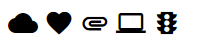
example
<!DOCTYPE html>
<html>
<head>
<link rel="stylesheet" href="https://fonts.googleapis.com/icon?family=Material+Icons">
</head>
<body>

<i class="material-icons">cloud</i>
<i class="material-icons">favorite</i>
<i class="material-icons">attachment</i>
<i class="material-icons">computer</i>
<i class="material-icons">traffic</i>

</body>
</html>
result:
CSS links
Set link style
Links can be styled using any CSS attribute, such as color, font family, background, and so on.
example
a {
  color: hotpink;
}
In addition, you can set different styles of links according to their state.
The four link states are:
- a:link - normal, unreached link
- a:visited - links visited by users
- a:hover - when the user hovers over the link
- a:active - when the link is clicked
example
/* Unreached links */
a:link {
  color: red;
}

/* Visited links */
a:visited {
  color: green;
}

/* Hover over the link */
a:hover {
  color: hotpink;
}

/* Selected link */
a:active {
  color: blue;
}
If you set styles for multiple link states, follow the following sequence rules:
- a:hover must be after a:link and a:visited
- a:active must be after a:hover
Text decoration
The text decoration property is mainly used to remove underscores from links:
example
a:link {
  text-decoration: none;
}

a:visited {
  text-decoration: none;
}

a:hover {
  text-decoration: underline;
}

a:active {
  text-decoration: underline;
}
Background color
The background color property can be used to specify the background color of the link:
example
a:link {
  background-color: yellow;
}

a:visited {
  background-color: cyan;
}

a:hover {
  background-color: lightgreen;
}

a:active {
  background-color: hotpink;
}
Link button
This example demonstrates a more advanced example in which we combine multiple CSS properties to display the link as a box / button:
example
<!DOCTYPE html>
<html lang="en">

<head>
    <meta charset="UTF-8">
    <meta name="viewport" content="width=device-width, initial-scale=1.0">
    <title>Document</title>
    <style>
        a:link,
        a:visited {
            background-color: #f44336;
            color: white;
            padding: 14px 25px;
            text-align: center;
            text-decoration: none;
            display: inline-block;
        }

        a:hover,
        a:active {
            background-color: red;
        }
    </style>
</head>

<body>
    <p><a href="https://www.baidu. com/? tn=98521242_ hao_ pg" target="_ Blank "> link</a></p>
</body>

</html>
cursor
Specifies the type of cursor to display. This example demonstrates different types of cursors (useful for links).
example:
<!DOCTYPE html>
<html>
<body>

<p>Please move the mouse over the word to see the pointer effect:</p>
<span style="cursor:auto">auto</span><br>
<span style="cursor:crosshair">crosshair</span><br>
<span style="cursor:default">default</span><br>
<span style="cursor:e-resize">e-resize</span><br>
<span style="cursor:help">help</span><br>
<span style="cursor:move">move</span><br>
<span style="cursor:n-resize">n-resize</span><br>
<span style="cursor:ne-resize">ne-resize</span><br>
<span style="cursor:nw-resize">nw-resize</span><br>
<span style="cursor:pointer">pointer</span><br>
<span style="cursor:progress">progress</span><br>
<span style="cursor:s-resize">s-resize</span><br>
<span style="cursor:se-resize">se-resize</span><br>
<span style="cursor:sw-resize">sw-resize</span><br>
<span style="cursor:text">text</span><br>
<span style="cursor:w-resize">w-resize</span><br>
<span style="cursor:wait">wait</span><br>

</body>
</html>
CSS list
HTML list and CSS list properties
In HTML, there are two main types of lists:
- Unordered list (< UL >) - list items are bulleted
- Ordered list (< ol >) - list items are marked with numbers or letters
CSS list properties enable you to:
- Set different list item tags for sequential tables
- Set different list item tags for unordered lists
- Set image as list item tag
- Add background colors to lists and list items
example
ul.a {
  list-style-type: circle;
}

ul.b {
  list-style-type: square;
}

ol.c {
  list-style-type: upper-roman;
}

ol.d {
  list-style-type: lower-alpha;
}
Note: some values are used for unordered lists, while others are used for ordered lists.
The image is marked as a list item
The list style image property specifies the image as a list item tag:
example
ul {
  list-style-image: url('sqpurple.gif');
}
Locate list item tag
The list style position property specifies the position of the list item tag (bullet).
“list-style-position: outside;” Indicates that the bullet point will be outside the list item. List items are aligned vertically at the beginning of each line. This is the default
“list-style-position: inside;” Indicates that the bullet will be in the list item. Because it is part of a list item, it becomes part of the text and pushes the text away at the beginning
Delete default settings
The list style type: none attribute can also be used to delete tags / bullets. Note that the list also has default outer and inner margins. To delete this content, add margin:0 and padding:0 to < UL > or < ol >
example
ul {
  list-style-type: none;
  margin: 0;
  padding: 0;
}
List - short attributes
The list style attribute is a shorthand attribute. It is used to set all list properties in one declaration:
example
ul {
  list-style: square inside url("sqpurple.gif");
}
When using abbreviated attributes, the order of attribute values is:
- List style type (if list style image is specified, the value of this attribute will be displayed when the image cannot be displayed for some reason)
- List style position (specifies whether the list item tag should appear inside or outside the content stream)
- List style image (specify image as list item tag)
If one of the above attribute values is missing, the default value of the missing attribute, if any, is inserted.
Sets the color style of the list
We can also use colors to style lists to make them look more interesting.
Any style added to the < ol > or < UL > tag affects the entire list, while attributes added to the < li > tag affect individual list items
CSS table
Table border
To set the table border in CSS, use the border property.
The following example specifies a black border for the < Table >, < th > and < td > elements:
example
table, th, td {
  border: 1px solid black;
}
Note: the table in the above example has a double border. This is because table and < th > and < td > elements have separate borders.
Full width table
In some cases, the above table seems small. If you need a table that can cover the entire screen (full width), add width: 100% to the < Table > element:
example
table {
  width: 100%;
}
Merge Table borders
The border collapse property sets whether to collapse the table border into a single border:
example
table {
  border-collapse: collapse;
}

table, th, td {
  border: 1px solid black;
}
You can change the top double border to a single border
If you only want a border around the table, you only need to specify the border attribute for < Table >:
example
table {
  border: 1px solid black;
}
Table width and height
The width and height of the table are defined by the width and height attributes.
The following example sets the width of the table to 100% and the height of the < th > element to 50px:
example
table {
  width: 100%;
}

th {
  height: 50px;
}
horizontal alignment
The text align attribute sets the horizontal alignment (left, right, or center) of the content in < th > or < td >.
By default, the contents of < th > elements are aligned in the center, while the contents of < td > elements are aligned to the left.
To center the contents of the < td > element, use text align: Center
Vertical alignment
The vertical align attribute sets the vertical alignment (top, bottom, or center) of the content in < th > or < td >.
By default, the vertical alignment of the contents in the table is centered (< th > and < td > elements are both).
The following example sets the vertical text alignment of the < td > element to bottom alignment:
example
td {
  height: 50px;
  vertical-align: bottom;
}
Table inner margin
To control the spacing between borders and table contents, use the padding attribute on < td > and < th > elements
horizontal rule
Add the border bottom attribute to < th > and < td > to achieve the horizontal separation line:
example
th, td {
  border-bottom: 1px solid #ddd;
}
Hoverable table
Use the: hover selector on the < tr > element to highlight the table row on mouse over:
example
tr:hover {background-color: #f5f5f5;}
Bar table
To achieve the zebra print table effect, use the nth child() selector and add background color to all even (or odd) table rows:
example
tr:nth-child(even) {background-color: #f2f2f2;}
Table color
The following example specifies the background color and text color of the < th > element:
example
th {
  background-color: #4CAF50;
  color: white;
}
Response form
If the screen is too small to display everything, the responsive table displays a horizontal scroll bar:
Add a container element with overflow-x:auto around the < Table > element (for example, < div >) to achieve a responsive effect:
example
<div style="overflow-x:auto;">

<table>
... table content ...
</table>

</div>
Note: in OS X Lion (on Mac), the scroll bar is hidden by default and displayed only when in use (even if "overflow:scroll" is set).