
The article has been included in github , welcome to Watch and Star.
brief introduction
In understanding Element source code architecture Next, we build our own component library for the team based on element UI.
Theme configuration
The basic component library has little difference in UI structure. Generally, there will be great difference in theme color. After all, every team has a UI style. For example, the UI design draft of our team is actually based on Ant Design, while the component library is developed based on element UI. Even in this case, there are few changes to the component itself. Therefore, when building the team's own component library based on the open source library, the theme configuration is very important.
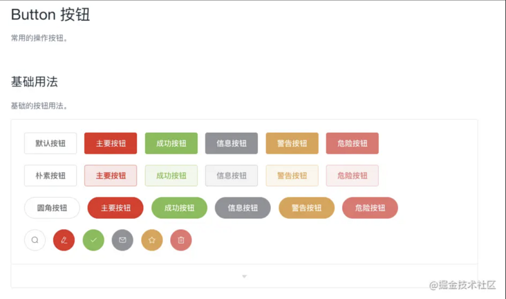
A major feature of element UI is that it supports custom themes. It can customize the styles of all components of element UI through online theme editor, Chrome plug-in or command-line theme tool. So how does element UI do this?
Because the color, font, line and other styles in the element UI component style are introduced through variables, the definitions of these variables can be seen in packages / theme chat / SRC / common / var.scss, which provides convenience for customizing the theme, because we only need to modify these variables to change the component theme.
The online theme editor and Chrome plug-in support real-time preview. And you can download the customized style package and use it. The online theme editor and Chrome plug-in have the advantages of visualization and simplicity, but the biggest disadvantage is that the last downloaded style package is a style package that packages all component styles together. It can't support on-demand loading and is not recommended. Here we use the command line theme tool to customize the style.
Command line theme tool
Initialize the project directory and install the element theme
mkdir theme && cd theme && npm init -y && npm i element-theme -D
Install chalk theme
npm i element-theme-chalk -D
Initialize variable file
node_modules/.bin/et -i
After the command is executed, you may get the following error messages
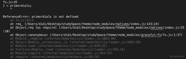
The reason is that the element theme package relies on the lower version of graceful FS, which is in the higher version of node JS is incompatible. The simplest solution is to upgrade graceful FS.
Create NPM - shrinkwrap. Net under the root directory of the project JSON file and add the following:
{
   "dependencies": {
       "graceful-fs": {
           "version": "4.2.2"
       }
   }
}
Re install NPM and re run NPM_ modules/. Bin / ET - I. after execution, element variables will be generated in the current directory SCSS file.
Modify variable
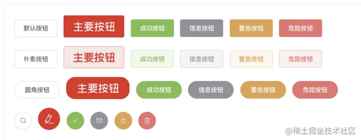
Edit element variables directly SCSS file, for example, change the theme color to red, change the value of $-- color primary in the file to red, $-- color primary: red! default;.
Good comments are written in the document, and the style code is divided and organized according to components, so you can modify the relevant variables one by one according to the design draft given by the design team. If you really feel confused about the code, you can refer to the online topic editor. The variable names on both sides are the same.
Aside: element UI also provides two resource packages for the design team to use, so it is ideal for the design team to issue the design draft according to the resource package of element UI, so that both sides can be unified, and the workload of the R & D team will be greatly reduced. For example, our team is not like this. The design draft given by the design team is based on Ant Design, so the workload and difficulty of changing the component library will be relatively large. Therefore, research and development, design and products must be well communicated.
Compile theme
After modification, save the file, and then execute the following command to compile the theme, which will produce a theme directory. All produced are CSS style files, and the file name corresponds to the component name one by one. It supports on-demand import (the style file of the specified component) and full import (index.css).
Produce uncompressed style files
node_modules/.bin/et --out theme-chalk
Produce compressed style files
node_modules/.bin/et --minimize --out theme-chalk
Help command
node_modules/.bin/et --help
Enable watch mode to compile topics in real time
node_modules/.bin/et --watch --out theme-chalk
Using custom themes
Replace the packages / theme chalk directory in the framework with the newly generated theme chalk directory. Rename the old theme chalk to theme chalk Bak, don't delete it. It needs to be used later
It is recommended to use element variables when generating topics You may need to regenerate the theme file in the project later
Modify / examples / entry js, /examples/play.js,/examples/extension/src/app. Style of component library introduced in JS
// Replace the old default style with the new style
// import 'packages/theme-chalk/src/index.scss
import 'packages/theme-chalk/index.css
Modify / build / bin / iconinit Icon style file introduced in JS
// var fontFile = fs.readFileSync(path.resolve(__dirname, '../../packages/theme-chalk/src/icon.scss'), 'utf8');
var fontFile = fs.readFileSync(path.resolve(__dirname, '../../packages/theme-chalk/icon.css'), 'utf8');
Modify / examples/docs / {four languages} / custom theme md
// @import "~element-ui/packages/theme-chalk/src/index";
@import "~element-ui/packages/theme-chalk/index";
Execute make dev to start the development environment, View effect
At this step, the theme configuration is over. You will find that the component style of the element UI official website is basically the same as that in the design draft. However, after careful comparison, it will be found that the styles of some components are different from the design draft. At this time, it is necessary to deeply customize the styles of these components and overwrite inconsistent styles.
In fact, / build / bin / new. Is missing JS, the changes in this section will be put later
Style depth customization
The theme configuration in the previous step can only solve the theme related styles, but some styles of some components do not belong to the theme style. If this part of the style is just inconsistent with the design draft, you need to rewrite this part of the style to overwrite the style in the previous step.
The following configuration also supports adding styles to custom components
Style catalog
- Configure the theme to the / packages / theme chat. File backed up in the step Bak is renamed to / packages / theme Lyn as the style directory of override components and custom components
- Delete all files in the / packages / theme Lyn / SRC directory
Can you write scss?
- Ignore the next step, and then in the following steps, you just need to replace the corresponding less operation with sass
You can't write scss and extend other grammars. Suppose you can write less
Execute the following command at the root of the project and delete gulp sass
npm i less less-loader gulp-less -D && npm uninstall gulp-sass -D
If the error "TypeError: this.getOptions is not a function" is reported after starting the development environment for a while, the less loader version will be degraded. For example, my version is: less@3.7.1 ,less-loader@7.3.0
Execute the following command in the / packages / theme Lyn directory and delete gulp sass
npm i gulp-less -D && npm uninstall gulp-sass -D
Add / packages / theme Lyn / gulpfile JS to the following
'use strict';

/**
 *  Will/ src/*. The less file is compiled into a css file and output to/ lib directory
 *  Will/ Output all font files in src/fonts / to/ In lib/fonts, if you don't need to overwrite the font style, delete the copy font style
 */
const { series, src, dest } = require('gulp');
const less = require('gulp-less');
const autoprefixer = require('gulp-autoprefixer');
const cssmin = require('gulp-cssmin');
const path = require('path')

function compile() {
  return src('./src/*.less')
    .pipe(less({
      paths: [ path.join(__dirname, './src') ]
    }))
    .pipe(autoprefixer({
      browsers: ['ie > 9', 'last 2 versions'],
      cascade: false
    }))
    .pipe(cssmin())
    .pipe(dest('./lib'));
}

function copyfont() {
  return src('./src/fonts/**')
    .pipe(cssmin())
    .pipe(dest('./lib/fonts'));
}

// You can also extend other functions here, such as copying static resources

exports.build = series(compile, copyfont);
In build / webpack demo. Add rules for parsing less files in JS
{
  test: /\.less$/,
  use: [
    isProd ? MiniCssExtractPlugin.loader : 'style-loader',
    'css-loader',
    'less-loader'
  ]
}
If you want to override some styles of a button component
Create a new button in the / packages / theme Lyn / SRC directory Less file. Please follow the following rules when writing override styles
- It is better to follow the BEM style for the override of component style. The purpose is to provide good namespace isolation and avoid unexpected coverage after style packaging
- Only overwrite the existing style. You can add a new class name on the component, but do not delete it. The purpose is to be compatible with the online code
// Here I want to make the font size of the main buttons larger just for the sake of demonstration effect
.el-button--primary {
  font-size: 24px;
}
Rebuild build / bin / Gen cssfile JS script
/**
 * Place the overwritten style files in packages / theme Lyn / SRC / index Automatically import in less file
 */

var fs = require('fs');
var path = require('path');

// Generate index. In theme Lyn / SRC Less file
function genIndexLessFile(dir) {
  // File list
  const files = fs.readdirSync(dir);
  /**
   * @import 'x1.less';
   * @import 'x2.less;
   */
  let importStr = "/* Automatically generated by './build/bin/gen-cssfile.js' */\n";

  // Files to exclude
  const excludeFile = ['assets', 'font', 'index.less', 'base.less', 'variable.less'];

  files.forEach(item => {
    if (excludeFile.includes(item) || !/\.less$/.test(item)) return;

    // Only less files in non excludeFile are processed
    importStr += `@import "./${item}";\n`;
  });

  // In packages / theme Lyn / SRC / index Write @ import "xx.less" in the less file, that is, in index Introduce all style files into less
  fs.writeFileSync(path.resolve(dir, 'index.less'), importStr);
}

genIndexLessFile(path.resolve(__dirname, '../../packages/theme-lyn/src/'));
Execute the following command at the root of the project
npm i shelljs -D
New file / build-oss-bin / build js
/**
 * Be responsible for merging the two packaged css directories (LIB / theme chalk and lib / theme Lyn)
 * lib/theme-chalk The style files in the directory are automatically generated through theme configuration
 * lib/theme-lyn Is the style of the extension component (overriding the default style and the style of the custom component)
 * Finally, merge the styles into the Lib / theme chalk directory
 */
const fs = require('fs');
const fileSave = require('file-save');
const { resolve: pathResolve } = require('path');
const shelljs = require('shelljs');

const themeChalkPath = pathResolve(__dirname, '../../lib/theme-chalk');
const themeStsUIPath = pathResolve(__dirname, '../../lib/theme-lyn');

// Determine whether the style directory exists
let themeChalk = null;
let themeStsUI = null;
try {
  themeChalk = fs.readdirSync(themeChalkPath);
} catch (err) {
  console.error('/lib/theme-chalk non-existent');
  process.exit(1);
}
try {
  themeStsUI = fs.readdirSync(themeStsUIPath);
} catch (err) {
  console.error('/lib/theme-lyn non-existent');
  process.exit(1);
}

/**
 * Traverse the two style directories, merge the same files, and append the style in theme Lyn to the end of the corresponding style file in theme chat
 * If the file in theme Lyn does not exist in theme chalk (such as the new component of the extension), copy the file directly to theme chalk
 */
const excludeFiles = ['element-variables.css', 'variable.css'];
for (let i = 0, themeStsUILen = themeStsUI.length; i < themeStsUILen; i++) {
  if (excludeFiles.includes(themeStsUI[i])) continue;

  if (themeStsUI[i] === 'fonts') {
    shelljs.cp('-R', pathResolve(themeStsUIPath, 'fonts/*'), pathResolve(themeChalkPath, 'fonts'));
    continue;
  }

  if (themeStsUI[i] === 'assets') {
    shelljs.cp('-R', pathResolve(themeStsUIPath, 'assets'), themeChalkPath);
    continue;
  }

  if (themeChalk.includes(themeStsUI[i])) {
    // Indicates that the current style file overrides the style in element UI
    const oldFileContent = fs.readFileSync(pathResolve(themeChalkPath, themeStsUI[i]), { encoding: 'utf-8' });
    fileSave(pathResolve(themeChalkPath, themeStsUI[i])).write(oldFileContent).write(fs.readFileSync(pathResolve(themeStsUIPath, themeStsUI[i])), 'utf-8').end();
  } else {
    // Indicates that the current style file is a style file for the new component of the extension
    // fs.writeFileSync(pathResolve(themeChalkPath, themeStsUI[i]), fs.readFileSync(pathResolve(themeStsUIPath, themeStsUI[i])));
    shelljs.cp(pathResolve(themeStsUIPath, themeStsUI[i]), themeChalkPath);
  }
}

// Delete lib / theme Lyn
shelljs.rm('-rf', themeStsUIPath);
Transformation package scripts in JSON
{
  "gen-cssfile:comment": "stay /packages/theme-lyn/src/index.less Automatically import the override style file of each component in",
  "gen-cssfile": "node build/bin/gen-cssfile",
  "build:theme:comment": "Building theme styles: in index.less Automatically import the override style file of each component in && adopt gulp take less File compiled into css And output to lib catalogue && Copy base style theme-chalk reach lib/theme-chalk && Copy compiled theme-lyn/lib/* Directory to lib/theme-lyn && merge theme-chalk and theme-lyn",
  "build:theme": "npm run gen-cssfile && gulp build --gulpfile packages/theme-lyn/gulpfile.js && cp-cli packages/theme-lyn/lib lib/theme-lyn && cp-cli packages/theme-chalk lib/theme-chalk && node build/bin/compose-css-file.js",
}
Execute the following command
npm run gen-cssfile
Modification / examples / entry JS and / examples / play js
// Replace the old default style with the new style
// import 'packages/theme-chalk/src/index.scss
import 'packages/theme-chalk/index.css    // Introduce custom styles below this line
// Introducing custom styles
import 'packages/theme-lyn/src/index.less'
Visit the official website , check whether the override style of the button component is effective
Custom components
In the subsequent development and iteration of component library, two methods of customizing components are required:
Add new element UI component
The element UI official website may add a basic component you need at a certain point in time. At this time, you need to integrate it
Add business component
After the basic components are ready, the team will start to promote the construction of business components. At this time, new components will be added to the component library
New element UI component
Element UI provides a script for adding new components. Execute make new < component name > [Chinese name] to generate all the files and configurations required for new components, such as the make new button button. With this script, you can focus on the preparation of components without any configuration.
/build/bin/new.js
However, since we have adjusted the structure of the framework theme library, the script file also needs to be adjusted accordingly. You need to add / build / bin / new The code dealing with styles in JS file is deleted, and the style file no longer needs to be generated automatically by script, but by regenerating the theme.
// /build/bin/new.js delete the following code
{
    filename: path.join('../../packages/theme-chalk/src', `${componentname}.scss`),
    content: `@import "mixins/mixins";
@import "common/var";

@include b(${componentname}) {
}`
},

// Add to index scss
const sassPath = path.join(__dirname, '../../packages/theme-chalk/src/index.scss');
const sassImportText = `${fs.readFileSync(sassPath)}@import "./${componentname}.scss";`;
fileSave(sassPath)
  .write(sassImportText, 'utf8')
  .end('\n');
Makefile
Transform the Makefile file, add & & NPM run build: File command after the new configuration, and regenerate the component library entry file, otherwise the newly added components will not be introduced.
new:
    node build/bin/new.js $(filter-out $@,$(MAKECMDGOALS)) && npm run build:file
Add new components
After completing the above changes, you can create a new element UI component in only two steps:
Execute the command make new < component name > [Chinese name of component] to create a new element UI component
This step will generate many files. You only need to copy the code corresponding to the component from the new element UI source code and fill it into the corresponding file
- Regenerate the theme, and then overwrite the current / packages / theme chat
Business component
Don't start the new business component with el to avoid the same name or misunderstanding with the element component. You need to simulate / build / bin / new JS script write a script for creating a new business component / build / bin / new Lyn UI JS, you can extend it based on this script.
/build/bin/new-lyn-ui.js
'use strict';

/**
 * Create a new component script. Take Lyn City component as an example
 * 1,Create a new component directory under the packages directory and complete the basic creation of the directory structure
 * 2,Create component document
 * 3,Component unit test file
 * 4,Component style file
 * 5,Component type declaration file
 * 6,And automatically add the corresponding files of the above newly created related resources, such as components, to components JSON files and style files are in index Automatic introduction in less, etc
 * In short, you just need to focus on writing your component code, and don't care about anything else
 */

console.log();
process.on('exit', () => {
  console.log();
});

if (!process.argv[2]) {
  console.error('[Component name]Required - Please enter new component name');
  process.exit(1);
}

const path = require('path');
const fs = require('fs');
const fileSave = require('file-save');
const uppercamelcase = require('uppercamelcase');
// Component name: city
const componentname = process.argv[2];
// Component Chinese name city list
const chineseName = process.argv[3] || componentname;
// Component name of big hump in City
const ComponentName = uppercamelcase(componentname);
// Component path: / packages/city
const PackagePath = path.resolve(__dirname, '../../packages', componentname);
const Files = [
  // packages/city/index.js content
  {
    filename: 'index.js',
    content: `import ${ComponentName} from './src/main';

/* istanbul ignore next */
${ComponentName}.install = function(Vue) {
  Vue.component(${ComponentName}.name, ${ComponentName});
};

export default ${ComponentName};`
  },
  // packages/city/src/main.vue component definition
  {
    filename: 'src/main.vue',
    content: `<template>
  <div class="lyn-${componentname}"></div>
</template>

<script>
export default {
  name: 'Lyn${ComponentName}'
};
</script>`
  },
  // Component Chinese document
  {
    filename: path.join('../../examples/docs/zh-CN', `${componentname}.md`),
    content: `## ${ComponentName} ${chineseName}`
  },
  // Component unit test file
  {
    filename: path.join('../../test/unit/specs', `${componentname}.spec.js`),
    content: `import { createTest, destroyVM } from '../util';
import ${ComponentName} from 'packages/${componentname}';

describe('${ComponentName}', () => {
  let vm;
  afterEach(() => {
    destroyVM(vm);
  });

  it('create', () => {
    vm = createTest(${ComponentName}, true);
    expect(vm.$el).to.exist;
  });
});
`
  },
  // Component style file
  {
    filename: path.join(
      '../../packages/theme-lyn/src',
      `${componentname}.less`
    ),
    content: `@import "./base.less";\n\n.lyn-${componentname} {
}`
  },
  // Component type declaration file
  {
    filename: path.join('../../types', `${componentname}.d.ts`),
    content: `import { LynUIComponent } from './component'

/** ${ComponentName} Component */
export declare class Lyn${ComponentName} extends LynUIComponent {
}`
  }
];

// Add a new component to components json
const componentsFile = require('../../components.json');
if (componentsFile[componentname]) {
  console.error(`${componentname} Already exists.`);
  process.exit(1);
}
componentsFile[componentname] = `./packages/${componentname}/index.js`;
fileSave(path.join(__dirname, '../../components.json'))
  .write(JSON.stringify(componentsFile, null, '  '), 'utf8')
  .end('\n');

// In index Style file for introducing new components into less
const lessPath = path.join(
  __dirname,
  '../../packages/theme-lyn/src/index.less'
);
const lessImportText = `${fs.readFileSync(
  lessPath
)}@import "./${componentname}.less";`;
fileSave(lessPath).write(lessImportText, 'utf8').end('\n');

// Add to element UI d.ts
const elementTsPath = path.join(__dirname, '../../types/element-ui.d.ts');

let elementTsText = `${fs.readFileSync(elementTsPath)}
/** ${ComponentName} Component */
export class ${ComponentName} extends Lyn${ComponentName} {}`;

const index = elementTsText.indexOf('export') - 1;
const importString = `import { Lyn${ComponentName} } from './${componentname}'`;

elementTsText =
  elementTsText.slice(0, index) +
  importString +
  '\n' +
  elementTsText.slice(index);

fileSave(elementTsPath).write(elementTsText, 'utf8').end('\n');

// Create all the files just declared
Files.forEach(file => {
  fileSave(path.join(PackagePath, file.filename))
    .write(file.content, 'utf8')
    .end('\n');
});

// Add a new build to NAV config. json
const navConfigFile = require('../../examples/nav.config.json');

Object.keys(navConfigFile).forEach(lang => {
  const groups = navConfigFile[lang].find(item => Array.isArray(item.groups))
    .groups;
  groups[groups.length - 1].list.push({
    path: `/${componentname}`,
    title:
      lang === 'zh-CN' && componentname !== chineseName
        ? `${ComponentName} ${chineseName}`
        : ComponentName
  });
});

fileSave(path.join(__dirname, '../../examples/nav.config.json'))
  .write(JSON.stringify(navConfigFile, null, '  '), 'utf8')
  .end('\n');

console.log('DONE!');
Makefile
Add the following configuration in Makefile:
new-lyn-ui:
    node build/bin/new-lyn-ui.js $(filter-out $@,$(MAKECMDGOALS)) && npm run build:file

help:
    @echo "   \033[35mmake new-lyn-ui <component-name> [Chinese name]\033[0m\t---  Create a new LynUI assembly package. for example 'make new-lyn-ui city City choice'"
Icon icon
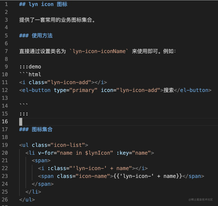
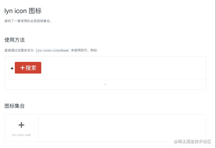
Although element UI provides a large number of icons, it often cannot meet the business needs of the team. Therefore, it is necessary to add business icons to the component library. Here, take icomont as an example. It is not recommended to directly use the pictures or svg given by the design, which takes up too much resources.
- Open iconfont
Login - > resource management - > my project - > new project
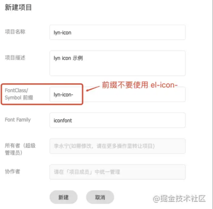
Note that when setting prefix for icon here, do not use El icon - to avoid repetition with icon in element UI. This project is used as a team project. In the future, all business icons of the team will be uploaded to the project, so it's best to register a team account.
- After the creation is successful, click the upload icon to the project, select the upload icon, upload the design to the svg (must be svg), and select the color to keep or not to keep and submit as needed
- After uploading, editing and checking, click download to local
- Copy iconfont Ttf and iconfont Woff to / packages / theme Lyn / SRC / fonts directory
New / packages / theme Lyn / SRC / icon Less file and add the following
@font-face { font-family: 'iconfont'; src: url('./fonts/iconfont.woff') format('woff'), url('./fonts/iconfont.ttf') format('truetype'); font-weight: normal; font-display: auto; font-style: normal; } [class^="lyn-icon-"], [class*=" lyn-icon-"] { font-family: 'iconfont' !important; font-style: normal; font-weight: normal; font-variant: normal; text-transform: none; line-height: 1; vertical-align: baseline; display: inline-block; /* Better Font Rendering =========== */ -webkit-font-smoothing: antialiased; -moz-osx-font-smoothing: grayscale } /** * Example: * .lyn-icon-iconName:before { * content: "\unicode 16 Binary code“ * } * .lyn-icon-add:before { * content: "\e606" * } */- Execute NPM run Gen cssfile
Update / build / bin / iconinit JS file is the following
'use strict'; var postcss = require('postcss'); var fs = require('fs'); var path = require('path'); /** * Resolve the icon name from the specified icon style file (entry) according to the given regular expression (regExp), and then output it to the specified location (output) * @param {*} entry The path of the parsed file relative to the current file, for example:... // packages/theme-chalk/icon.css * @param {*} regExp Regular expressions that are parsed, such as: / \ el-icon-([^:]+):before/ * @param {*} output The parsed resources are output to the specified location relative to the current file, for example:... // examples/icon.json */ function parseIconName(entry, regExp, output) { // Read style file var fontFile = fs.readFileSync(path.resolve(__dirname, entry), 'utf8'); // Resolve style content to style node var nodes = postcss.parse(fontFile).nodes; var classList = []; // Traverse style node nodes.forEach((node) => { // Match the icon name from the style selector according to the given matching rule var selector = node.selector || ''; var reg = new RegExp(regExp); var arr = selector.match(reg); // Put the matched icon name into the classList if (arr && arr[1]) { classList.push(arr[1]); } }); classList.reverse(); // You want to sort the css files in reverse order // Output the icon name array to the specified json file fs.writeFile(path.resolve(__dirname, output), JSON.stringify(classList), () => { }); } // According to icon CSS file generates all icon names parseIconName('../../packages/theme-chalk/icon.css', /\.el-icon-([^:]+):before/, '../../examples/icon.json') // According to icon The less file generates all sts icon icon names parseIconName('../../packages/theme-lyn/src/icon.less', /\.lyn-icon-([^:]+):before/, '../../examples/lyn-icon.json')- Execute npm run build:file, and you will see that a Lyn icon is generated in the / examples directory JSON file
At / examples / entry JS add the following content
import lynIcon from './lyn-icon.json';
Vue.prototype.$lynIcon = lynIcon; // For StsIcon list page
At / examples / NAV config. Add Lyn icon routing configuration in the business configuration part of JSON
{
  "groupName": "LynUI",
  "list": [
    {
      "path": "/lyn-icon",
      "title": "icon Icon"
    }
  ]
}
Add document / examples/docs / {language} / Lyn icon MD, add the following
Check the official website See if the icon works
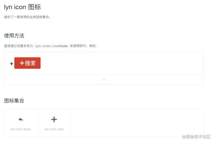
If you need to expand a new icon later
- Upload the new icon in the previously created iconfont project, and then click download to local to download the iconfont Ttf and iconfont Woff copy to / packages / theme Lyn / SRC / fonts directory (replace existing files)
- In / packages / theme Lyn / SRC / icon Set new icon style declaration in less
- Execute npm run build:file
Check the official website See if the icon is added successfully
Upgrade Vue version
Element UI itself depends on vue @ ^ 2.5 x. This version of vue does not support the latest v-slot syntax (v-slot is added in 2.6.0). The use of v-slot syntax in the markdown document of the component does not take effect and will report errors, so you need to upgrade the vue version. Three packages are involved: vue@^2.6.12, @ vue / component compiler utils @ ^ 3.2.0 and vue template compiler @ ^ 2.6.12. Execute the following command to complete the update:
Delete old package
npm uninstall vue @vue/component-compiler-utils vue-template-compiler -D
Install new package
npm install vue@^2.6.12 @vue/component-compiler-utils@^3.2.0 vue-template-compiler@^2.6.12 -D
Update package Peerdependences in JSON
{
  "peerDependencies": {
    "vue": "^2.6.12"
  }
}
extend
Here, the architecture adjustment of the component library has actually been completed. Next, just organize team members to develop components according to the design draft. But for some developers who are obsessed with cleanliness, it's almost.
For example:
- The team's component library doesn't want to be called element UI and has its own name. Even the code of the whole component library doesn't want the word element
- Some functions of element UI are not required by the team, such as the theme, resource module, chrome extension and internationalization related (only Chinese is required) in the official website project (examples)
- Static resources: element UI uploads all static resources to its own CDN. In fact, our access is slow. We can move relevant resources to the team's own CDN
- For the problem of engineering code quality, element UI itself provides eslint and does a little bit of code quality control, but it is not enough, such as format restriction, automatic formatting, etc. you can refer to it Build your own typescript project + develop your own scaffolding tool TS cli To configure the code quality part of
- Replace the official website logo, rendering information, etc
In fact, there is a problem in loading the UI element style library
Although it has solved some problems through webpack packaging, there will still be repeated loading in some cases. For example, if the checkbox component is used in the table component, the style code of the checkbox component will be loaded twice. Energetic students can study
- Your business only needs some basic components of element UI. Deleting unnecessary components can reduce the volume of component library and improve the loading speed
- ...
Some of these works are the tailoring of the official website project (examples), some are the overall optimization of the project, and some are cleanliness. However, I believe that all students who have reached this step have built their own component library for the team. It is no longer necessary to solve the problems listed above, so we will not list the methods one by one here.
link
- Element source code architecture Mind map
- How to quickly build your own component library for the team (Part I) -- Element source code architecture
- Element source code video, WeChat official account, reply: "Element source code video" access
The article has been included in github , welcome to Watch and Star.