preface
Why does your UI feel messy? For small program developers, especially for novice developers or beginners, the quality of typesetting is the core issue to be considered at this stage, that is, details. But many students always pay little attention to this and always want to use it. The interface is very ugly. What's the user experience!
Does it really matter whether the product looks good or not? Think it over for yourself.
Beauty alone cannot build a product, but creating a product without beauty often makes the situation worse. Therefore, I designed and made this exquisite and high-quality postgraduate entrance examination question bank applet.
1. Create and configure pages
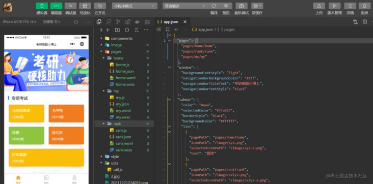
1.1. In the pages folder, create three folders home, rank and my, corresponding to the first page of the question bank, the ranking page and my page respectively;
1.2. Each folder contains these four files respectively js,. json,. wxml,. wxss

1.3 on app Configure pages and tabBar in JSON. The code is as follows:
{
  "pages": [
    "pages/home/home",
    "pages/rank/rank",
    "pages/my/my"
  ],
  "tabBar": {
    "color": "#aaa",
    "selectedColor": "#ffa517",
    "borderStyle": "black",
    "backgroundColor": "#ffffff",
    "list": [
      {
        "pagePath": "pages/home/home",
        "iconPath": "/image/sy2.png",
        "selectedIconPath": "/image/sy2-a.png",
        "text": "Question bank"
      },
      {
        "pagePath": "pages/rank/rank",
        "iconPath": "/image/zxly2.png",
        "selectedIconPath": "/image/zxly2-a.png",
        "text": "ranking"
      },
      {
        "pagePath": "pages/my/my",
        "iconPath": "/image/wd2.png",
        "selectedIconPath": "/image/wd2-a.png",
        "text": "my"
      }
    ]
  },
  "window": {
    "backgroundTextStyle": "light",
    "navigationBarBackgroundColor": "#fff",
    "navigationBarTitleText": "Ph.D. in postgraduate entrance examination",
    "navigationBarTextStyle": "black"
  }
}
2. Question bank home page
2.1. The scene is that there are often information related to the postgraduate entrance examination or preferential exchange activities for answering questions, which need to be displayed by rich rotating advertisements. The swiper component is used to realize the effect of rotating picture. The image tag is used to display the picture, and the mode='aspectFill 'is set to achieve the effect of 100% full screen. The code is as follows:
<swiper class="screen-swiper" autoplay="true" interval="5000" duration="500">
    <swiper-item>
      <image src="/image/b2-y.jpg" mode='aspectFill'></image>
    </swiper-item>
  </swiper>
2.2. For the special examination or special exercise, it is classified according to four subjects. Here I use the style grid to realize the basic layout, col-2 to realize the typesetting effect of two lines, beautiful and eye-catching color matching, and some styles to modify. The overall page effect is simple and beautiful, which is in line with the style of personal minimalism.
<view class='grid col-2 padding-left-sm padding-right-sm'>
      <view class='padding-sm' bindtap="goToAnswer" data-category="Marxist principle">
        <view class='bg-yellow padding radius shadow-warp'>
          <view class="text-lg">Marxist principle</view>
          <view class='margin-top-sm text-Abc'>390 questions in total</view>
        </view>
      </view>
      <view class='padding-sm' bindtap="goToAnswer" data-category="Mao ZHONGTE">
        <view class='bg-orange padding radius shadow-warp'>
          <view class="text-lg">Mao ZHONGTE</view>
          <view class='margin-top-sm text-Abc'>210 questions in total</view>
        </view>
      </view>
      <view class='padding-sm' bindtap="goToAnswer" data-category="Xiusi">
        <view class='bg-olive padding radius shadow-warp'>
          <view class="text-lg">Xiusi</view>
          <view class='margin-top-sm text-Abc'>260 questions in total</view>
        </view>
      </view>
      <view class='padding-sm' bindtap="goToAnswer" data-category="modern history">
        <view class='bg-orange padding radius shadow-warp'>
          <view class="text-lg">modern history</view>
          <view class='margin-top-sm text-Abc'>230 questions in total</view>
        </view>
      </view>
    </view>
3. Ranking page and my
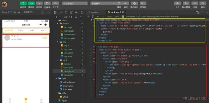
3.1 presentation of layout of ranking page (see warehouse for source code)

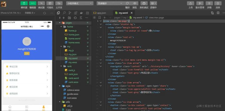
3.2. My page layout demonstration (see the warehouse for the source code)

summary
The cloud development practice of the small program for brushing questions in the postgraduate entrance examination in this issue mainly demonstrates the development process and configuration of the whole page, and explains the key places. You can take a detailed look at the code in detail. In fact, it is not difficult. The difficulty lies in creativity, design and realization. The difference of value lies in that it can see and look good, and it can be used and easy to use.