Introduction: I wonder if you will have a whim one day. Do you want to know whether the size of the classic red background and white LOGO on Lego packaging is standard and unified, or did the designer drag it out with PS?
The author came across an article: Have you ever thought about whether the LEGO trademark size of LEGO packaging is random?
The author suddenly thought of a question. If the LOGO size of Lego is standard, can we calculate the size of the package according to the proportion of the picture?
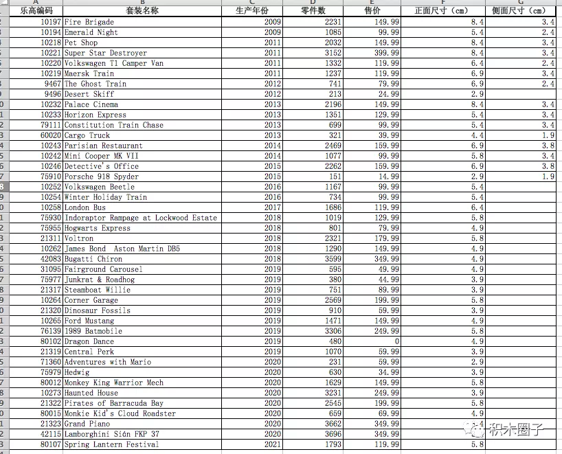
It can be understood from the sense that the more the number of parts, the larger the package, and the larger the logo will be used. But this wonderful guess was soon dashed. According to the data, many giant suits, such as the logo of 42115 Lamborghini, are small and pitiful
 Based on the above reasons, the author of this article carefully studied 40 + packages, and then filled in the results in Excel to continue the analysis.
----------------------------------------------------I'm a dividing line------------------------------------------------------------------------
At that time, the author was forced by limited conditions and could only do simple analysis with excel, which made me wonder whether I could predict the size of LEGO trademark by using multiple linear regression through machine learning technology.
To this end, I have moved out My LEGO box in recent years for research.

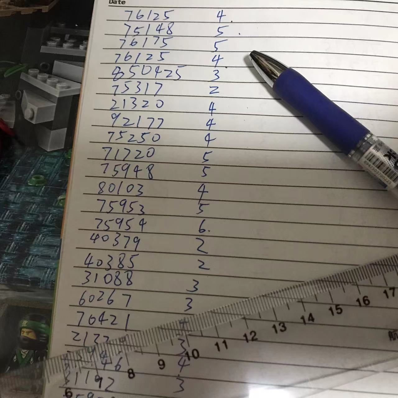
Measure one by one:
 Record the number and logo size
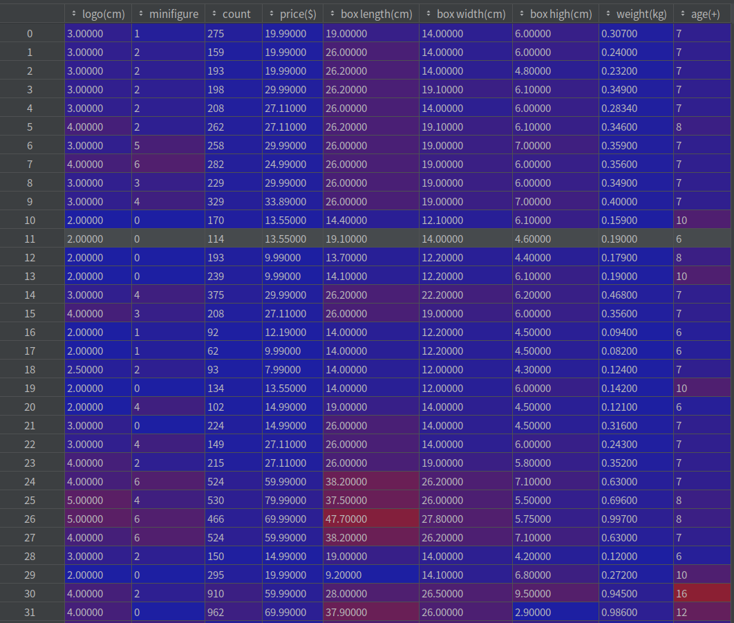
A total of 57 sets, plus 42 data from the author of the previous article, a total of 99 experimental data (100 data are not enough T.T.)
In the previous article, the author used the three dimensions of production year, number of parts and selling price. I think it's still mechanical reading anyway. Why not expand more dimensions. So I added:
The number of people, the length, width and height of the real object, the length, width and height of the box, and the weight are suitable for the age.
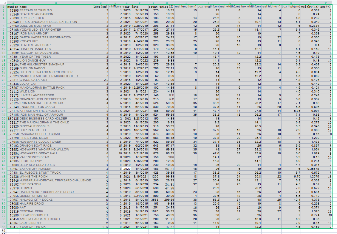
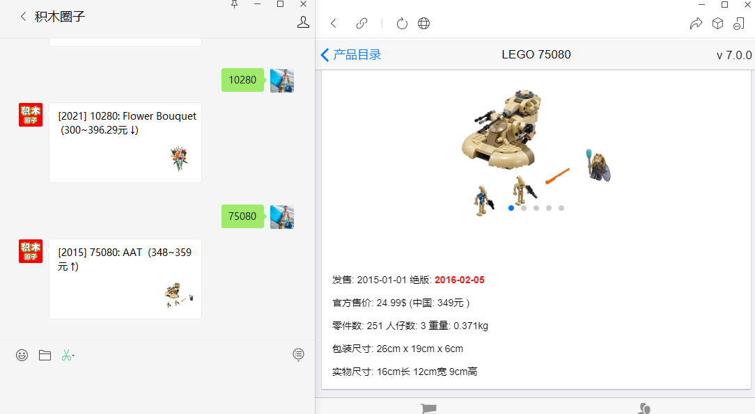
Thanks to the public account of "building block circle", which makes it convenient for me to improve my data:
Python code:
import pandas as pd
import numpy as np
import seaborn as sns
from sklearn.linear_model import LinearRegression
import matplotlib.pyplot as plt
from sklearn.model_selection import train_test_split

#Via read_csv to read our target data set
lego_logo_data = pd.read_csv("lego-logo.csv")
#Cleaning unnecessary data
new_data = lego_logo_data.drop(labels=['name', 'number', 'year', 'date', 'real length(cm)', 'real width(cm)', 'real high(cm)'], axis=1)
#Get the data set we need and check its first few columns and data shape
print('head:', new_data.head(), '\nShape:', new_data.shape)

#Thermodynamic diagram analysis
a = pd.DataFrame(new_data)
fig,ax = plt.subplots(figsize=(16,16))
sns.heatmap(np.round(a.corr(),2),linewidths = 0.5,annot=True,ax=ax, vmax=1,vmin = 0, xticklabels=True , yticklabels=True, square=True)
ax.set_yticklabels(ax.get_xticklabels(), rotation=0,fontsize=16)
ax.set_xticklabels(ax.get_xticklabels(), rotation=90,fontsize=16)
plt.show()
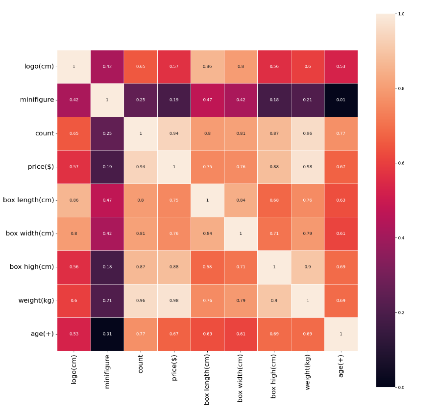
As can be seen from the above thermal diagram, the length of the box has the greatest correlation with the size of the logo label, with a correlation of 0.85, followed by the width of the box, with a correlation of 0.8, and the number of people is the least relevant, with a correlation of only 0.42 (I guessed that there is no correlation between people, I didn't expect it to be more relevant than age, and age also has a correlation of 0.53).
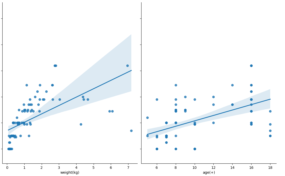
Next, create a scatter chart to see the data distribution in the dataset.
seaborn's pairplot function draws the scatter diagram of each dimension of X and the corresponding Y. Adjust the size and scale of the display by setting the size and aspect parameters.
By adding a parameter kind = 'reg', seaborn can add a best fitting line and 95% confidence band.
sns.pairplot(new_data, x_vars=['minifigure', 'count', 'price($)', 'box length(cm)', 'box width(cm)', 'box high(cm)', 'weight(kg)', 'age(+)'], y_vars='logo(cm)', height=7, aspect=0.8, kind ='reg')
plt.savefig("pairplot.jpg")
plt.show()
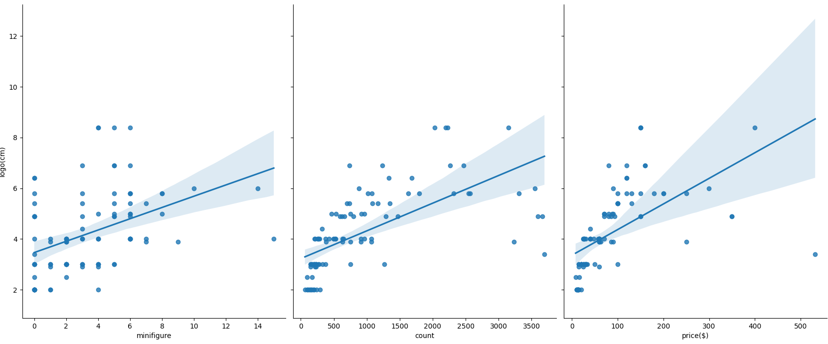
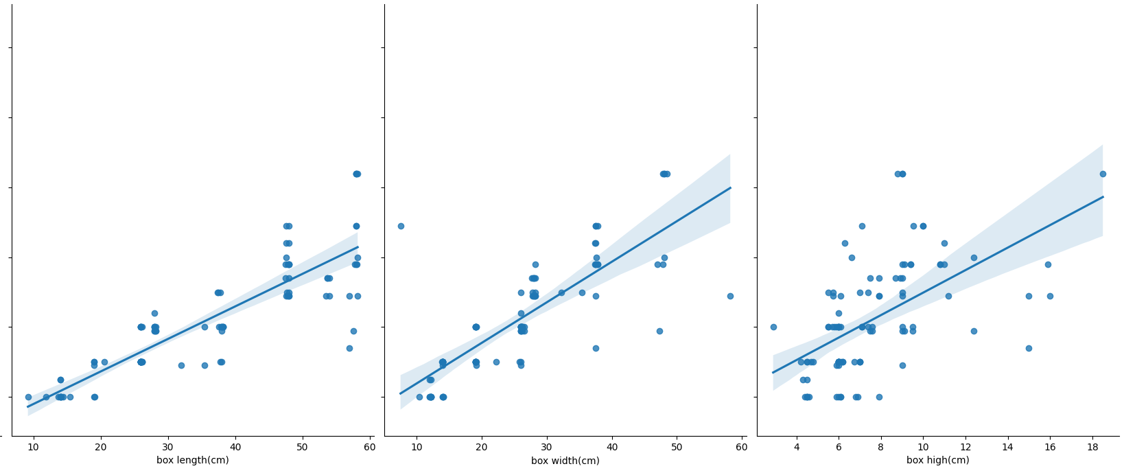
 Physically, it can be seen that the scatter diagram of box length shows a straight line.
There is no laziness here. There is no handwritten LinearRegression(). Use the package in sklearn to divide the data set to create training set and test set
train_size indicates the proportion of training set in the total data set
X_train,X_test,Y_train,Y_test = train_test_split(new_data.iloc[:, 1:9], new_data['logo(cm)'], train_size=.80)

print("Raw data characteristics:", new_data.iloc[:, 1:9].shape,
      ",Training data characteristics:", X_train.shape,
      ",Test data characteristics:", X_test.shape)

print("Raw data label:", new_data['logo(cm)'].shape,
      ",Training data tag:", Y_train.shape,
      ",Test data label:", Y_test.shape)

model = LinearRegression()

model.fit(X_train,Y_train)

a  = model.intercept_#intercept

b = model.coef_#regression coefficient

print("Best fit line:intercept",a,",Regression coefficient:",b)
Output:
Raw data characteristics: (99, 8) ,Training data characteristics: (79, 8) ,Test data characteristics: (20, 8)
Raw data label: (99,) ,Training data tag: (79,) ,Test data label: (20,)
Best fit line:Intercept 0.041345452337445465 ,Regression coefficient: [-2.05281380e-02 -2.78971278e-05 -1.23070046e-02  8.95558033e-02
  4.13082677e-02  7.33723245e-02  3.84568201e-01 -3.09070948e-03]
R-party detection
Coefficient of determination r squared
For evaluating the accuracy of the model
Sum of squares of y errors= Σ y - actual
Total fluctuation of Y= Σ (y actual - y average) ^ 2
What percentage of y fluctuations are not described by the regression fitting line = SSE / total fluctuations
What percentage of y volatility is described by the regression line = 1 - SSE / total volatility = R squared of the coefficient of determination
For the determination coefficient R square
1) Fitting degree of regression line: how many percentage of y fluctuations are engraved with regression line to describe (fluctuation change of x)
2) Value size: the higher the R square, the more accurate the regression model is (value range 0 ~ 1). 1 has no error, and 0 cannot complete the fitting
score = model.score(X_test,Y_test)
print(score)
output
0.8009888167527538
Prediction of linear regression
Y_pred = model.predict(X_test)
print(Y_pred)

plt.plot(range(len(Y_pred)),Y_pred,'b',label="predict")

plt.figure()
plt.plot(range(len(Y_pred)),Y_pred,'b',label="predict")
plt.plot(range(len(Y_pred)),Y_test,'r',label="test")
plt.legend(loc="upper right") #Displays the labels in the diagram
plt.xlabel("the number of set")
plt.ylabel('value of logo(cm)')
plt.savefig("ROC.jpg")
plt.show()
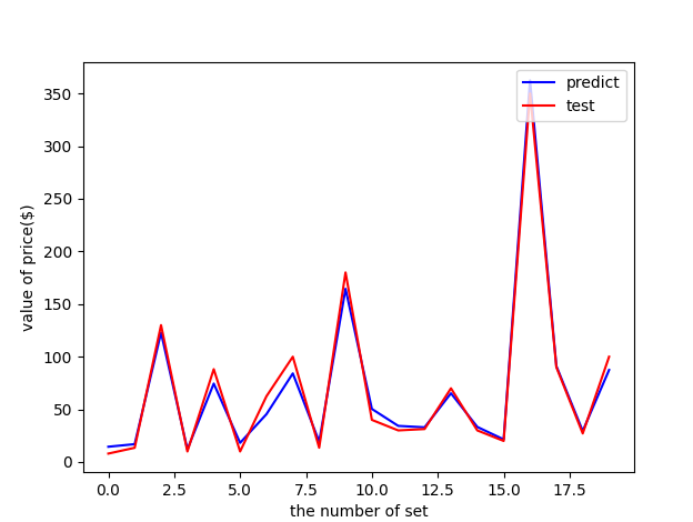
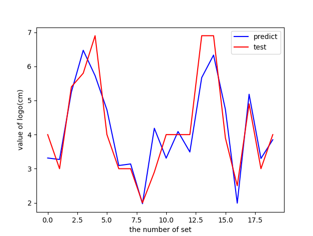 Red is the test data and blue is the prediction data. When the R side goes to 0.8, it looks ok.
Try to drop the number and age of people. The R side goes to 0.86, which is almost the same.
0.8647729279218498
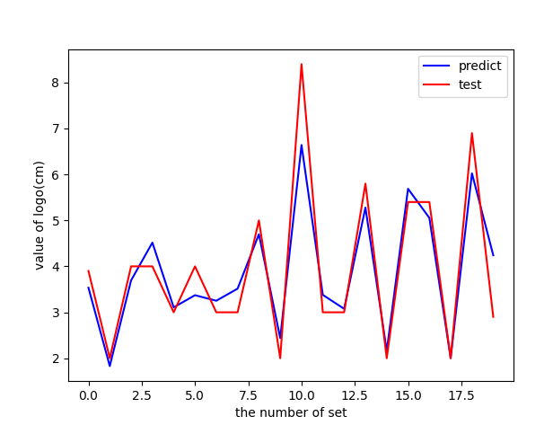
Although it still hasn't reached 0.9, it also indicates that the correlation is a little strong and the logo size can be basically predicted. It makes up for the limitations of the previous author.
Postscript - forecast price
It seems a little overqualified to predict the size of trademarks. Since there are so many dimensional data, it's better to predict the price.
Take back the previous heat map and add the year here
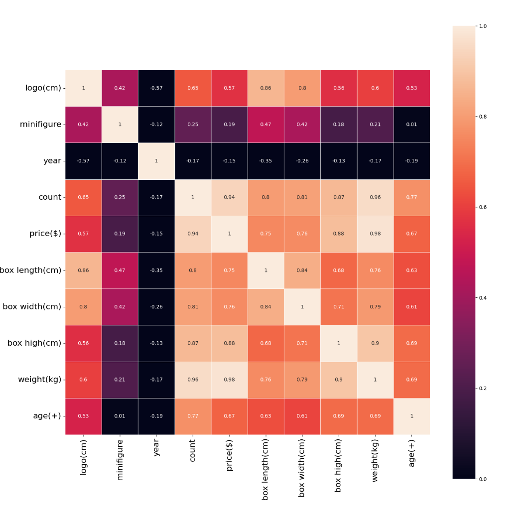
Based on the above thermal diagram:
1. In the line of price, I thought that the year would be related to the price, but I didn't expect that the year and the price showed a weak negative correlation (- 0.15), that is, it became cheaper and cheaper... I think this may be caused by insufficient data. Ignore it.

2. In addition, the minifigure is the least relevant, only 0.19 That is, the more people, the more expensive they may not be. In fact, people still account for a lot of weight in the eyes of players. People are the soul of a Lego suit!

3. The most relevant are the number of parts (count) and weight (weight), which are 0.94 and 0.98 respectively. This is easy to understand. The more parts, the heavier the weight and the more expensive the price.

To some extent, Lego still has a conscience. LEGO can fully grasp the psychology of players. The more people, the more expensive they sell. From the data, Lego's pricing is based on the cost of parts.
Then I remove the year, logo, minifigure and age. Come to the conclusion that R2 has...!
0.9866196081280411
 The R2 value of 0.98 can be said to be very high, that is, base on its number of parts, box width, height and weight, which can basically predict the pricing of LEGO suit.
This is also generally consistent with the rumored concept of "one yuan for one part, how much for how many parts".