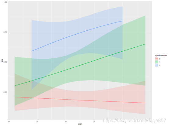
Interaction effect (p for Interaction) can be regarded as a must kill skill in SCI articles, and it will almost appear in SCI with high scores, because it can enhance the reliability of article results by dividing the population into subgroups and then making statistics. In addition, interaction can also be used for data mining. In previous articles, we have introduced how to use the R language visualization visreg package to visually analyze interactions (see the figure below),
In previous articles, we have used R language and SPSS to draw the visual analysis of logistic regression interaction effect respectively. Some fans in the background want to do a visual analysis of stata interaction effect. Now let's use stata to demonstrate the visual analysis of logistic regression interaction term (interaction), Continue to use our infertility data (official account reply: infertility can be obtained), which helps to compare the results.
Let's import the data first
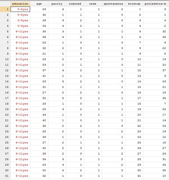
There are 8 indicators in the data. The last two are PSM matching results, which we ignore. The other six are:
Education: education level, age: age, parity, number of abortions, case: infertility, which is the outcome index, spontaneous: number of spontaneous abortions.
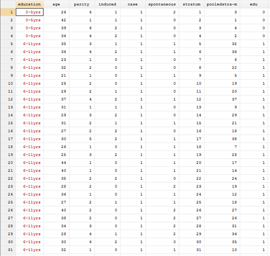
First turn the indicator of Education into a number
g edu=2
replace edu=0 if education=="0-5yrs"
replace edu=1 if education=="6-11yrs"
For the visualization of logistic regression, we must first establish a logistic regression model. Suppose we want to know whether age and spontaneous interact, and the model can be operated by interface or code, i will directly code it. Here we need to explain that the # sign in stata represents interaction (different from R, R is * sign), and a c. in front of age represents that it is a continuous variable, Spontaneous is preceded by i. to represent that this is a classification variable
logistic case age i.edu parity i.induced i.spontaneous c.age#i.spontaneous
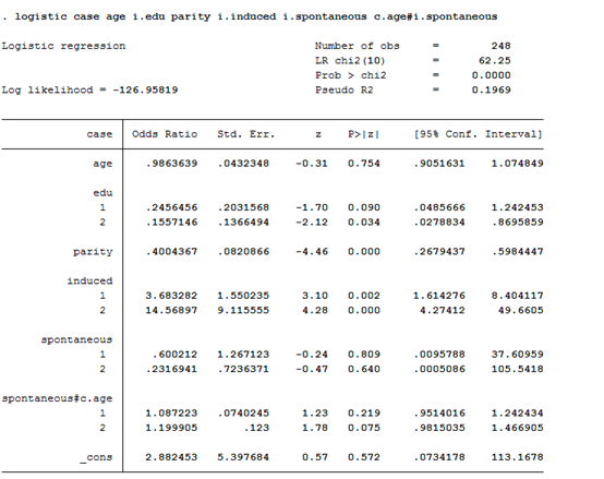
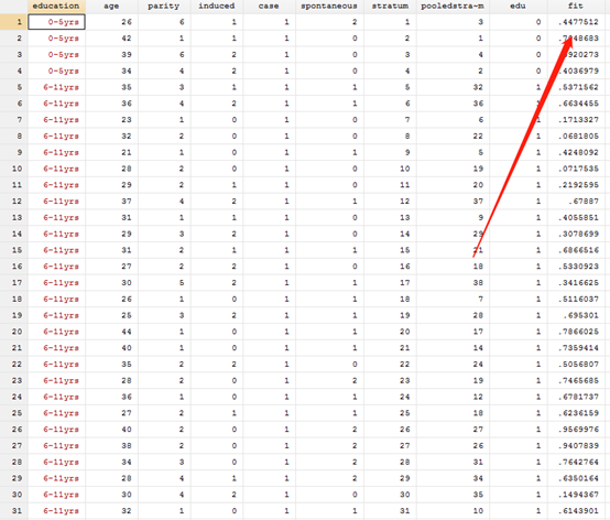
After calculating the result, we generate its probability
predict fit
After generating the probability, you can draw the graph. It mainly uses the twoway function to draw the graph. Next, we will slowly and deeply apply this function to draw the graph from simple to complex, so as to deepen the understanding of this function.
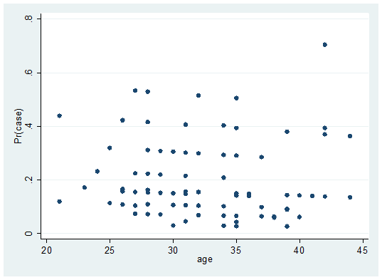
Let's make a simple point graph first. The main body of this function is twoway. Adding scatter means drawing a point graph. If adding line means drawing a line graph, connected means the connection graph of scattered points and lines. In the following code, fit and age are our variables. if spontaneous0 represents conditional judgment, which means to draw the scatter of the relationship between fit and age of spontaneous0
twoway scatter fit age if spontaneous==0, sort
twoway scatter fit age if spontaneous0, sort and twoway (scatter fit age if spontaneous0, sort) have the same code, which is equal to enclosed in parentheses.
twoway (scatter fit age if spontaneous==0, sort)

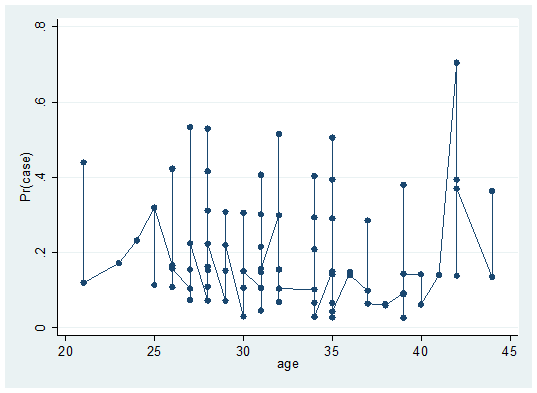
Let's replace the scatter in the above code with connected, which is the dotted line connection diagram
twoway (connected fit age if spontaneous==0, sort)
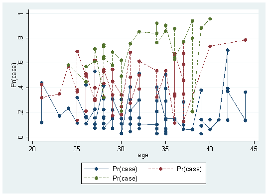
We have made the connection diagram of spontaneous0. Similarly, we can make the connection diagram of spontaneous1 and spontaneous1 = = 2 with a little modification, and draw three lines at the same time
twoway (connected fit age if spontaneous==0, sort) (connected fit age if spontaneous==1, sort lp(-)) (connected fit age if spontaneous==2, sort lp(-))
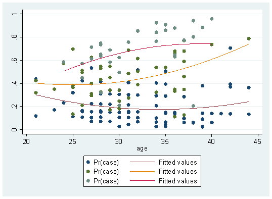
This graph is a scatter connection graph, which seems a little ugly. Let's change it and add a sentence (qfit fit age if scattered = = n) after each line graph to fit the lines according to the scatter points
twoway (scatter fit age if spontaneous==0, sort) (qfit fit age if spontaneous==0 )(scatter fit age if spontaneous==1, sort lp(-))(qfit fit age if spontaneous==1 ) (scatter fit age if spontaneous==2, sort lp(-)) (qfit fit age if spontaneous==2 )
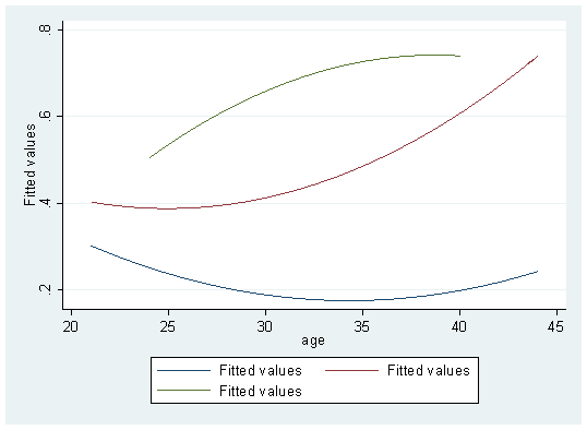
Hey, it seems to look better. At least there's a trend. If you don't want to scatter
twoway (qfit fit age if spontaneous==0 )(qfit fit age if spontaneous==1 ) (qfit fit age if spontaneous==2 )
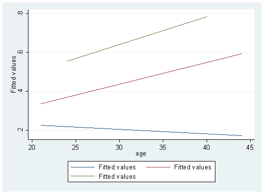
If you don't want a curve, you can change it to a straight line
twoway (lfit fit age if spontaneous==0 )(lfit fit age if spontaneous==1 ) (lfit fit age if spontaneous==2 )
Finally, add the legend
twoway (lfit fit age if spontaneous==0 )(lfit fit age if spontaneous==1 ) (lfit fit age if spontaneous==2 ),legend(lab(1 "spontaneous==0 ") lab(2 "spontaneous==1 ") lab(3 "spontaneous==3 "))

You can also change the legend location
twoway (lfit fit age if spontaneous==0 )(lfit fit age if spontaneous==1 ) (lfit fit age if spontaneous==2 ),legend(lab(1 "spontaneous==0 ") lab(2 "spontaneous==1 ") lab(3 "spontaneous==3 ") ring(0) pos(1))
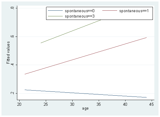
This is basically done. You can also add a title and modify the names of X-axis and Y-axis. I won't demonstrate them one by one. Twoway has many powerful functions, which we will demonstrate one by one in future articles. In addition, the interactive visualization method of COX regression is also similar. Those who are interested can try it by themselves.