1. Preface
In the past, when watching the live broadcast of wechat video, I often clicked the like button in the lower right corner. It's quite a sense of atmosphere to watch its number slowly change from one digit to five digits. Especially when you press it for a long time, there is a feedback of mobile phone vibration, which is very touching.
Although I was curious about how these floating praise effects were realized, I didn't study them in particular. It was not until the demand for the H5 live broadcasting room of Tencent classroom was put into a while ago, and it was necessary to realize such an effect by yourself that we began to explore.
Let's see the final effect first:
Compared with the action effect of the video number, the trajectory is much more complex. We can see that this period of praise action effect in the classroom live broadcast room is roughly divided into three stages:
1. From scratch, enlarge to normal size in the process of rising
2. Swaying left and right in the rising process, and the swaying amplitude is random
3. Fade and shrink in the process of swaying left and right
Before I started, I thought of using CSS animation to realize this kind of motion trajectory. After completion, another version was reconstructed with Canvas to optimize the performance.
Next, let's take a look at these two implementations.
2. CSS realizes the action effect of likes
2.1 trajectory analysis
Since the point like animation is on a two-dimensional plane, we can divide its motion trajectory into two segments on the # x axis # and # y axis #.
It's very simple on the # y-axis #. Our likes icon will make a vertical and uniform movement, rising from the bottom of the container to the top of the container.
The , x-axis , is swaying left and right, which is a simple harmonic motion from a mathematical point of view.
But when implemented with css, it doesn't have to be so fine. In order to simplify the calculation, we can use several key frames to concatenate this motion track, for example:
@keyframes bubble_swing {
 0% {
   middle
 }
 25% {
   Leftmost
 }
 75% {
   Rightmost
 }
 100% {
   middle
 }
}
2.2 trajectory design
According to the above analysis, we can design a same rising track and several different left and right swaying tracks.
The rising track is very simple. At the same time, we can also add the changes of transparency and size, as follows:
@keyframes bubble_y {
 0% {
   transform: scale(1);
   margin-bottom: 0;
   opacity: 0;
 }
 5% {
   transform: scale(1.5);
   opacity: 1;
 }
 80% {
   transform: scale(1);
   opacity: 1;
 }
 100% {
   margin-bottom: var(--cntHeight);
   transform: scale(0.8);
   opacity: 0;
 }
}
Where, -- cntHeight refers to the height of the container. In other words, we control the likes icon to rise from the bottom of the container to the top of the container by increasing the margin bottom.
For the track of lateral motion, in order to increase the diversity of motion tracks, we can design multiple left-right swaying tracks, such as a track of "middle - > leftmost - > Middle - > rightmost":
@keyframes bubble_swing_1 {
 0% {
   // middle
   margin-left: 0;
 }
 25% {
   // Leftmost
   margin-left: -12px;
 }
 75% {
   // Rightmost
   margin-left: 12px;
 }
 100% {
   margin-left: 0;
 }
}
Here, margin is also used to control the left and right movement of the icon. Similarly, we can also design several different tracks:
// Arbitrary trajectory
@keyframes bubble_swing_2 {
 0% {
   // middle
   margin-left: 0;
 }
 33% {
   // Leftmost
   margin-left: -12px;
 }
 100% {
   // Random location
   margin-left: 6px;
 }
}

// Simple harmonic inversion
@keyframes bubble_swing_3 {
 0% {
   // middle
   margin-left: 0;
 }
 25% {
   // Rightmost
   margin-left: 12px;
 }
 75% {
   // Leftmost
   margin-left: -12px;
 }
 100% {
   margin-left: 0;
 }
}
Next, we combine the trajectories (@ keyframes) of # x-axis # and # y-axis # and set a random animation time, for example:
@for$i from 1 through 3 {
  @for$j from 1 through 2 {
   .bl_#{$i}_#{$j} {
     animation: bubble_y calc(1.5s + $j * 0.5s) linear 1 forwards,
       bubble_swing_#{$i} calc(1.5s + $j * 0.5s) linear 1 forwards;
   }
 }
}
Here, 3 * 2 = 6 different trajectories are generated. For this kind of repeated selectors, using the circular syntax in SCSS can write a lot less code.
2.3 randomly selected pictures (sprite picture)
Each time we click like, different icons will appear, so a series of selectors are designed here to give different icons and let them present different pictures. First, we need to prepare a sprite chart, keep the size of all icons consistent, and then also use the circular syntax of SCSS:
@for$i from 0 through 7 {
 .b#{$i} {
   background: url('../../images/like_sprites.png') calc(#{$i} * -24px) 0;
 }
}
Like the 8 selectors generated above, we can randomly assign a selector to the icon when the program is executed.
2.4 generate a like Icon
The CSS part is almost complete. Now let's look at how JS is executed. We need to have a container div to load the likes to be generated. And a button to bind click events:
const cacheRef = useRef<LikeCache>({
   bubbleCnt: null,
   likeIcon: null,
   bubbleIndex: 0,
   timer: null,
});

useEffect(() => {
   cacheRef.current.bubbleCnt = document.getElementById('like-bubble-cnt');
   cacheRef.current.likeIcon = document.getElementById('like-icon');
}, []);
In the click event, a new div element is generated and className is set for it. Then append it to the container, and finally destroy the likes icon element after a period of time. As follows:
/**
* Add a bubble
*/
const addBubble = () => {
const { bubbleCnt } = cacheRef.current;

 cacheRef.current.bubbleIndex %= maxBubble;
 const d = document.createElement('div');

 // Picture class b0 - b7
 // Random animation class bl_ 1_ 1 - bl_ 3_ two
 const swing = Math.floor(Math.random() * 3) + 1;
 const speed = Math.floor(Math.random() * 2) + 1;
 d.className = `like-bubble b${cacheRef.current.bubbleIndex} bl_${swing}_${speed}`;

 bubbleCnt?.appendChild(d);
 cacheRef.current.bubbleIndex++;

 // Destroy elements after animation
 setTimeout(() => {
   bubbleCnt?.removeChild(d);
 }, 2600);
};
At this point, we have almost achieved it. However, we can also add some animation to the clicked icon to make it pop up after being pressed:
/**
* Click "like"
*/
const onClick = () => {
const { timer, likeIcon } = cacheRef.current;
if (!likeIcon) {
   return;
 }

 if (timer) {
   clearTimeout(timer);
   cacheRef.current.timer = null;
 }
 likeIcon.classList.remove('bounce-click');
 // Delete and re add the class. You need to delay the addition
 setTimeout(() => {
   likeIcon.classList.add('bounce-click');
 }, 0);
 cacheRef.current.timer = window.setTimeout(() => {
   likeIcon.classList.remove('bounce-click');
   clearTimeout(timer!);
   cacheRef.current.timer = null;
 }, 300);

 addBubble();
};
2.5 final effect
Finally, let's see the effect!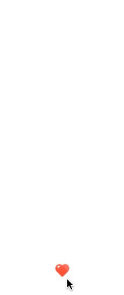
That's all for today. In the next issue, I'll share with you how canvas can achieve the action effect of praise
❤️ Welcome to pay attention to me. You are the driving force for me to continue sorting and sharing ❤️
❤️ The official account: don't do me at the front end. ❤️
❤️ Follow + like Collection + comment + share ❤️, Leave fragrance in your hand, thank you 🙏 Everybody.