1, echarts line chart (line chart)
Line chart is also one of the most commonly used charts in our data visualization charts. It is a chart that connects various data point marks with line. It can not only represent the number, but also reflect the development and change situation and change trend of the same thing at different times.
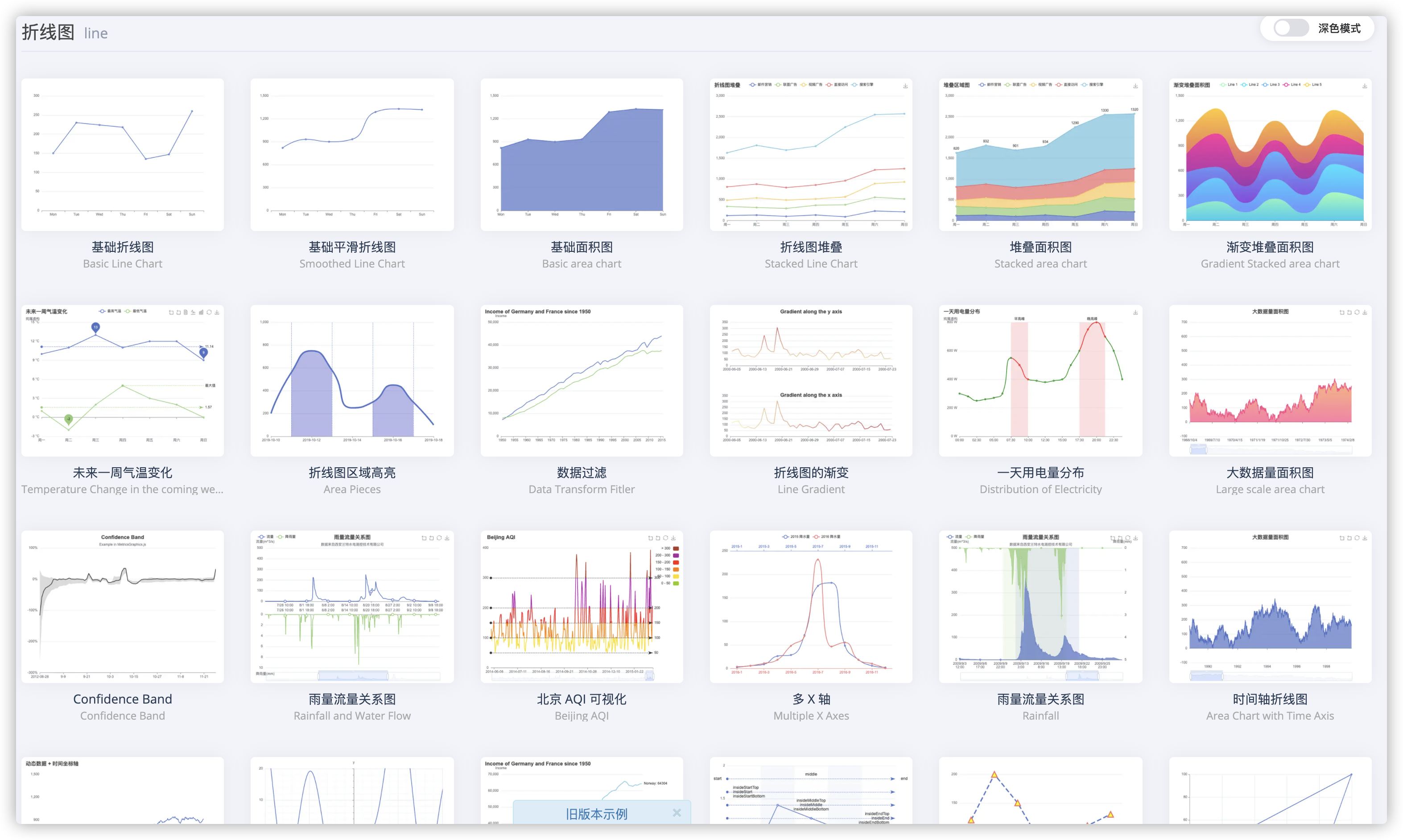
Looking at these colorful broken line diagrams of the official website examples, I believe that in daily development, as long as a little configuration and adjustment, 90% of the needs can be met.
2, Download, installation and use of echarts
In the last article, we mainly learned how to quickly set some properties of Echarts. The introduction method we used in the demonstration is to introduce all resources at one time.
As such:
import * as echarts from 'echarts';

// Initialize the ecarts instance based on the prepared dom
var myChart = echarts.init(document.getElementById('main'));
// Draw a chart
myChart.setOption({
    title: {
        text: 'ECharts Getting started example'
    },
    tooltip: {},
    xAxis: {
        data: ['shirt', 'cardigan', 'Chiffon shirt', 'trousers', 'high-heeled shoes', 'Socks']
    },
    yAxis: {},
    series: [{
        name: 'sales volume',
        type: 'bar',
        data: [5, 20, 36, 10, 10, 20]
    }]
});
In fact, the above introduction method is not recommended in the development of the project!!!
The reason is that the above code will introduce all charts and components in ECharts, and we can't use many attributes, which will cause waste and occupation of resources.
But if you don't want to introduce all the components, ECharts provides an on-demand interface to package the necessary components.
In the following articles, we will use the interface introduced on demand to develop.
It's starting now.
3, Download and on-demand introduction of echarts
The next step is to develop this example.
Download and install dependencies first:
1. Run command:
npm install echarts --save
//or
yarn add echarts
2. Bring in projects on demand (authors use Vue projects)
Note here that 4 X version and 5 The introduction of version x is very different
-
Introduction method of version 4.x
//Import basic template
import echarts from "echarts/lib/echarts";//Introduce ring graph
import "echarts/lib/chart/bar";
//Introduce prompt box component, title component and toolbox component.
import "echarts/lib/component/tooltip";
import "echarts/lib/component/title";
import "echarts/lib/component/legend"; -
Introduction method of version 5.x
Our project uses the latest version 5 x.
3. Test it
If your code runs like mine, it is correct.
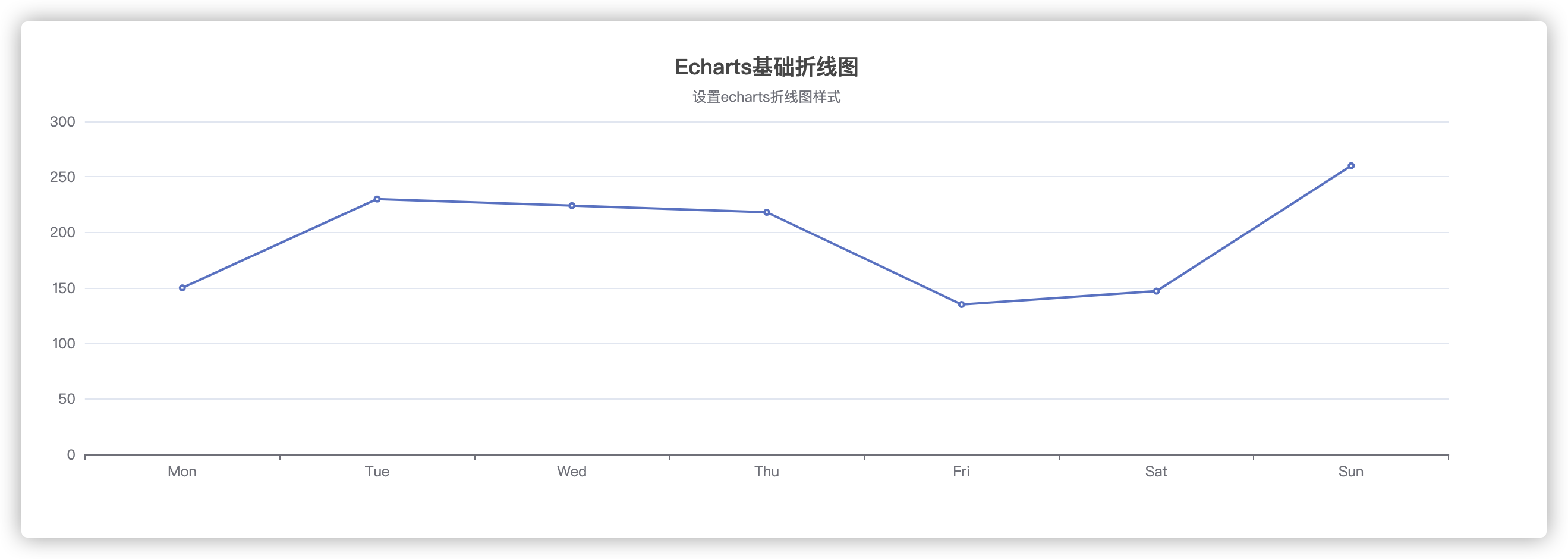
4, Requirements development example of echarts
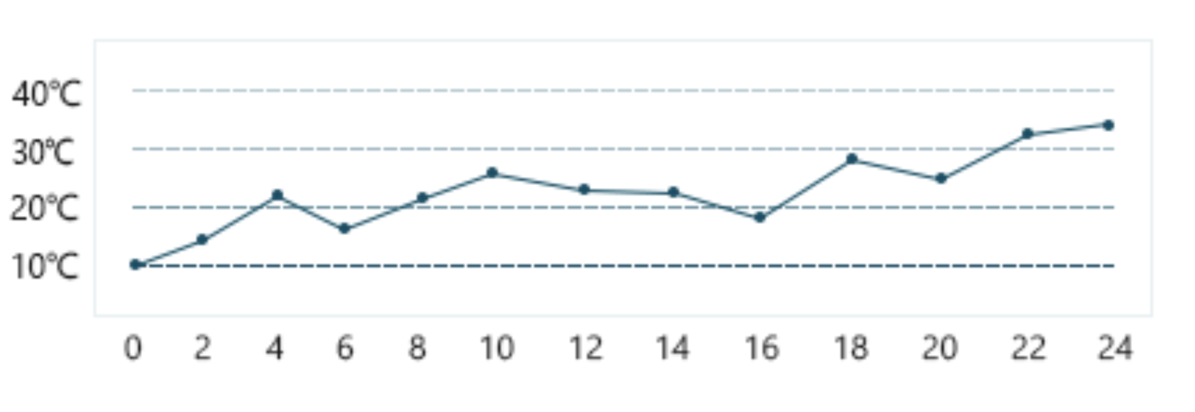
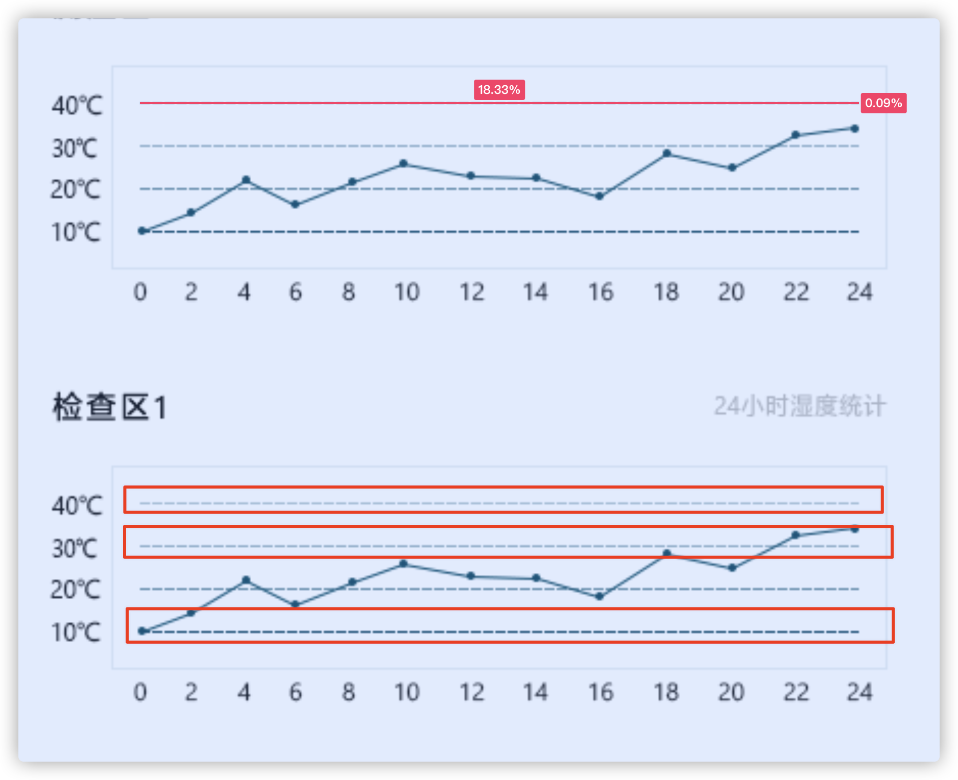
This picture is the basic line chart style of the official website. All we need to do is configure this chart to the style we need.
This picture is an example of a requirement
The similarity of configuration restoration is not 100%, but it should also be 85%.
Opening and drying:
- Configure the grid first
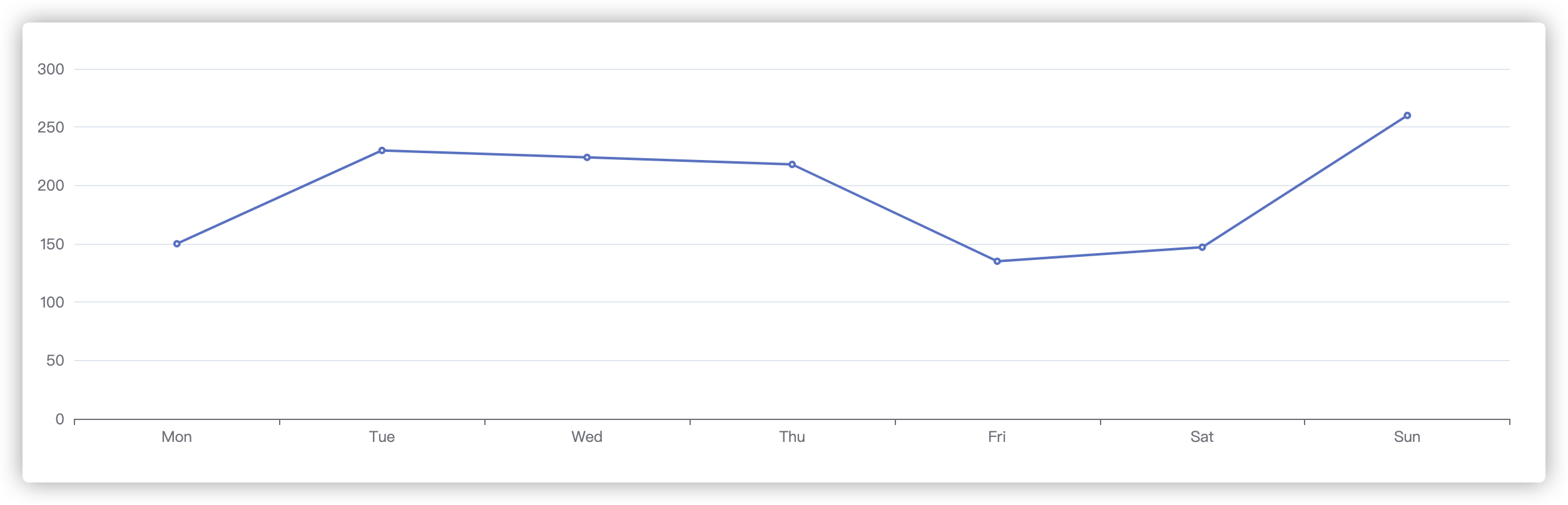
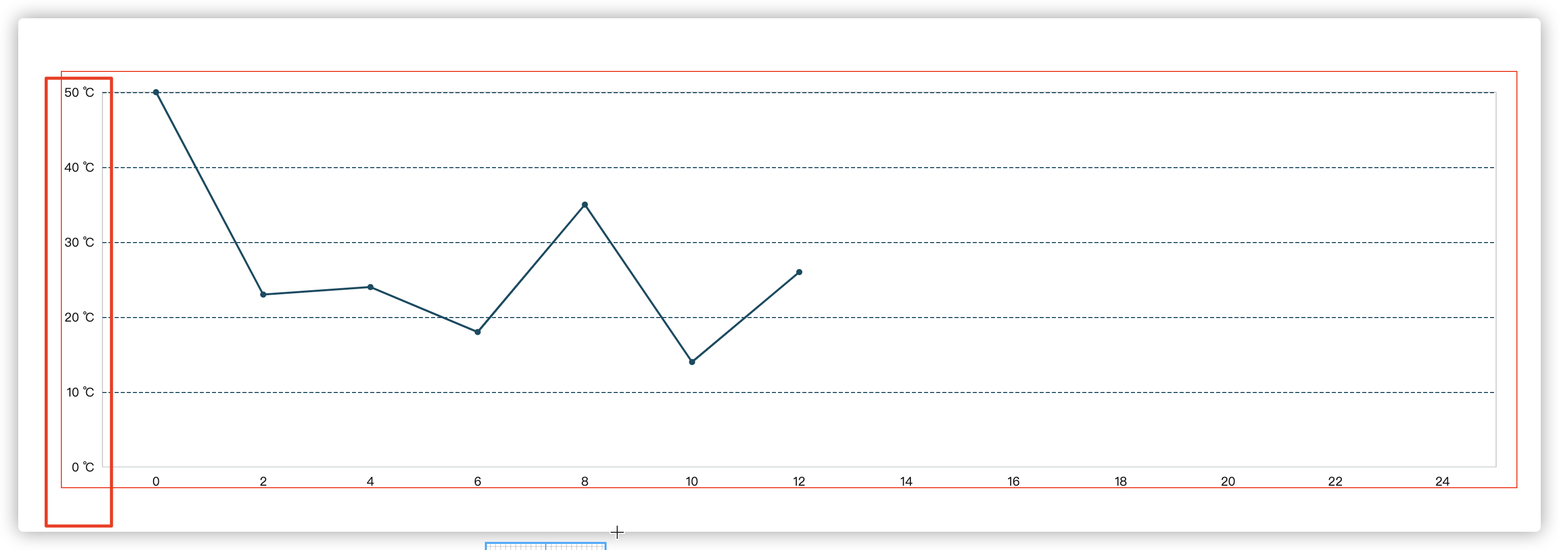
Find the configuration of grid attribute in the documents on the official website. First, we configure the rendering area. Because the default rendering area does not account for a large proportion, and a large part of it is blank, we need to adjust the rendering area.
In order to see the rendering area more intuitively, we set the border of the container div to red.
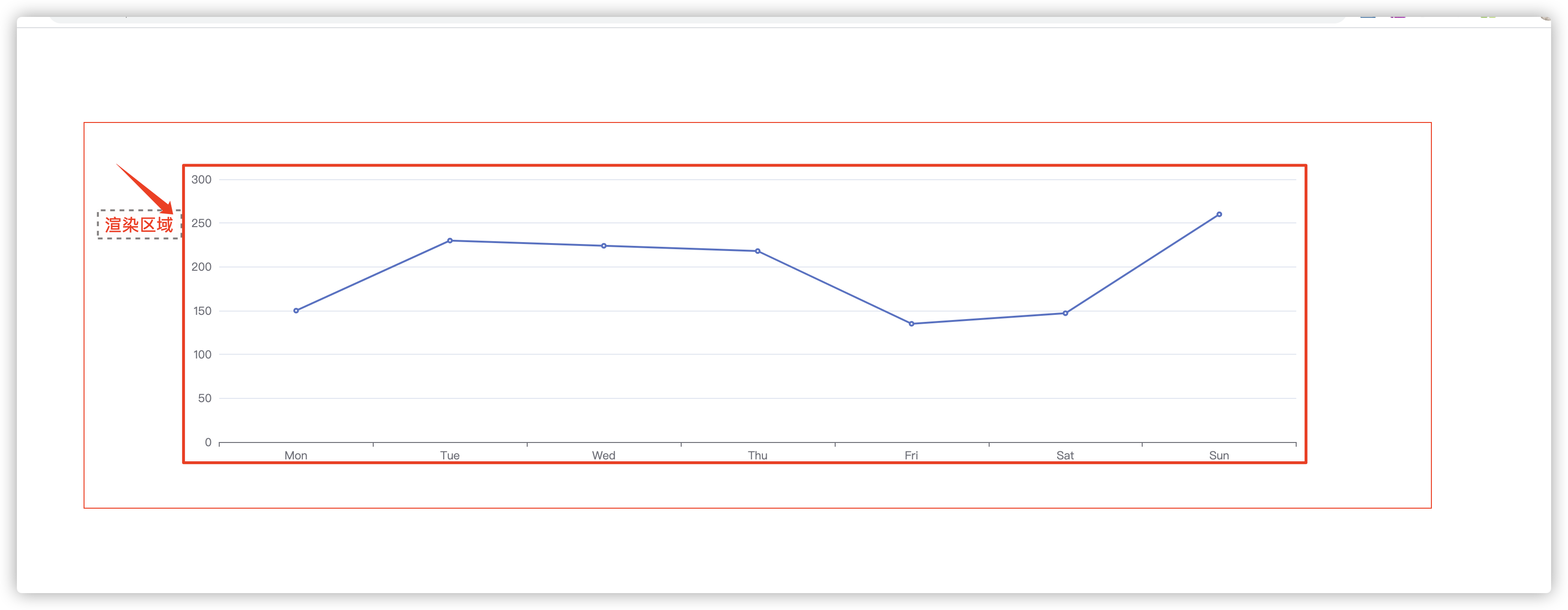
Set the rendering area to 25 at the bottom, 20 at the top, 40 on the left and 20 on the right. The default unit is px. Some small partners may not understand the distance. The official website explains the distance between the grid component and the container. If you want to set the title, the white space on the top should be larger, otherwise the title will occupy the rendering area of the chart.
grid: {
    show: true,
    bottom: 20,
    top: 20,
    left: 40,
    right: 20
}
After setting the above properties, it looks like there is a larger "screen share".
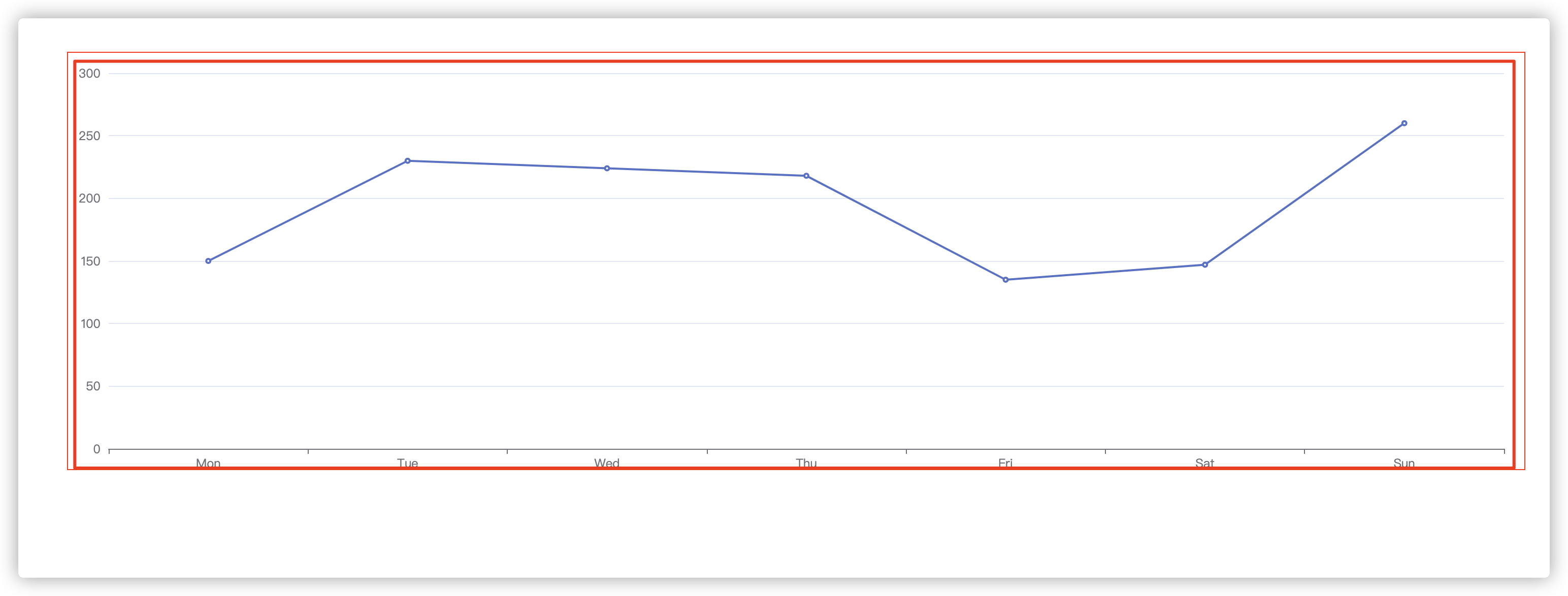
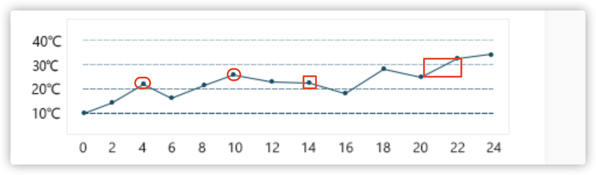
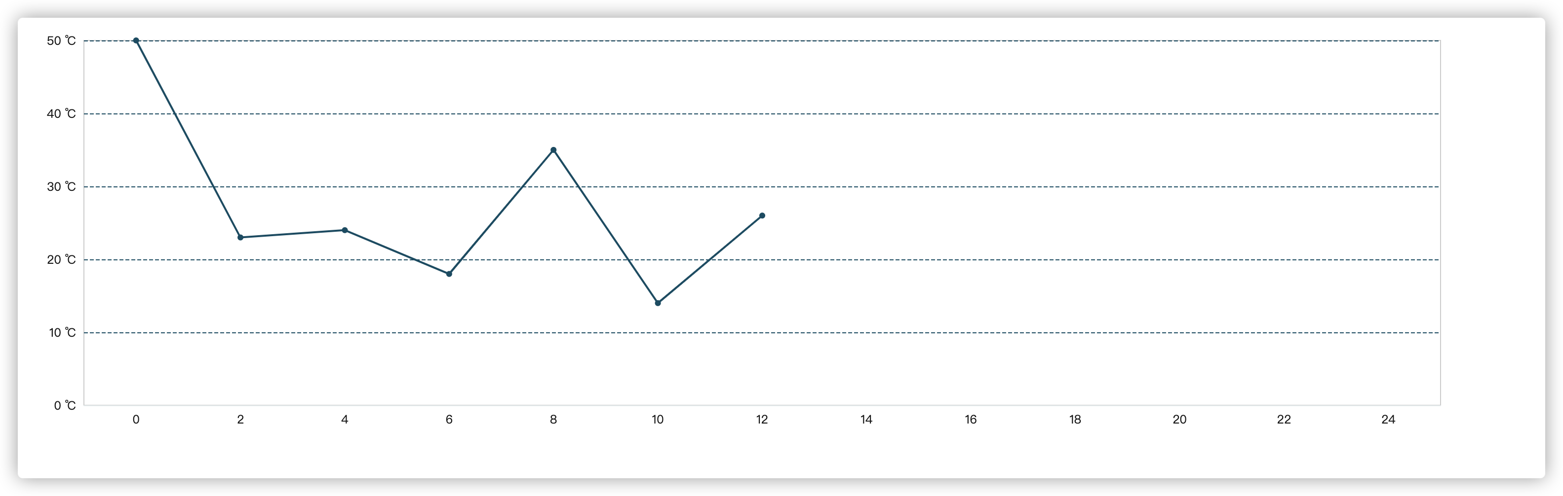
- x axis
Next, set the x axis. Let's first observe that the x axis has no scale line, the color is "color: '#151515'", the data is 24 hours, and every 2 hours is an interval.
let hs = function() {
     let arr = [];
     for (let index = 0; index <= 24; index++) {
         (index % 2 == 0) && arr.push(index);
     }
     return arr;
 };

xAxis: {
    type: 'category',
    axisTick: { //Scale setting
        show: false
    },
    axisLabel: { //Coordinate text
        color: '#151515'
    },
    axisLine:{
        lineStyle:{//Sample color of axis
            color: '#E8EFF1'
        }
    },
    data: hs()
}
The effect of setting the above attributes is as follows, which is one step closer to the target.
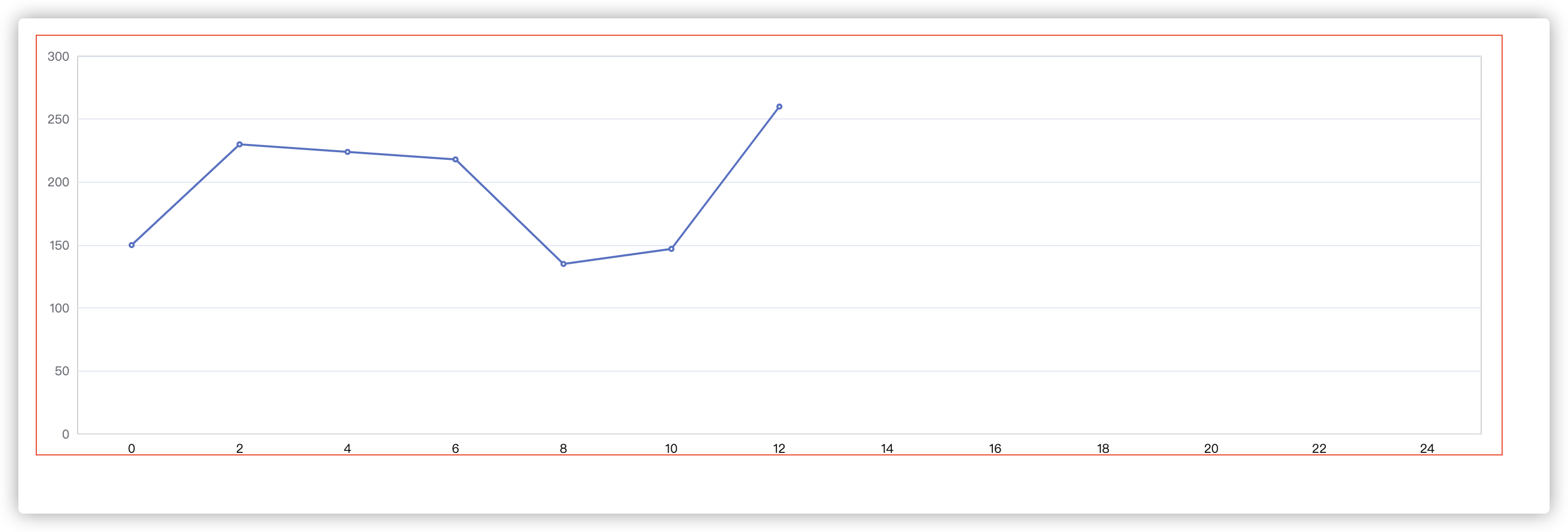
- y axis
Next, set the axis of the Y-axis and observe that the data of the y-axis needs to be formatted because the unit of "Celsius" needs to be displayed. In addition, the dotted line framed in the figure below belongs to the separation line of the y-axis in the grid, so it also needs to be set in the splitLine in the yAxis attribute. Due to the poor vision after magnification, the color of the separation line is' #004C63 ', which is not the gradient seen...
Set the following properties:
yAxis: {
    type: 'value',
    splitNumber: 4,
    axisLabel: { //Coordinate text
        color: '#151515',
        formatter: function (value) {
            return `${value} ℃`;
        }
    },
    splitLine: {
        lineStyle: {  //y-axis separation line style settings
            color: '#004C63 ', / / color
            type: 'dashed', //Dotted line
        }
    }
}
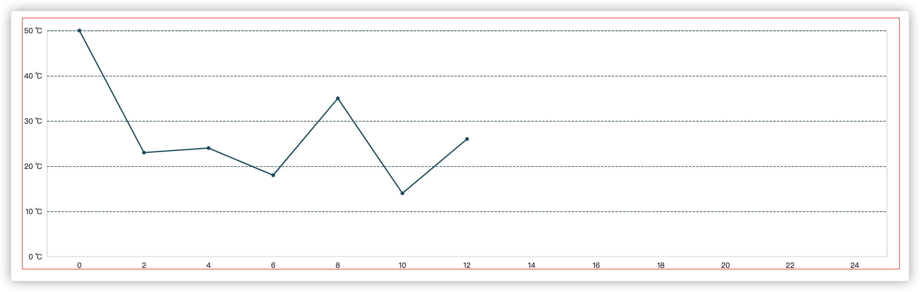
4. Style of polyline
Finally, let's set the style of the polyline and observe the characteristics of the polyline, including: the color of the polyline is "#004C63" and the solid inflection point.
General chart style attribute settings are set in "series", as follows:
series: [{
    data: [50, 23, 24, 18, 35, 14, 26],
    type: 'line',
    lineStyle: {    //Polyline style
        color: '#004C63'
    },
    itemStyle:{ //The inflection point color set here
        color: '#004C63'
    },
    symbol: "circle",  //Marked figure (inflection point)
    symbolSize: 6,  //size
}]
Most of the settings have been completed here. In fact, our restoration degree does not look so high. Because of the reason of this design drawing, some places are distorted after zooming in. There may be some missing places, so it looks a little different.
Complete code and style.
<template>
    <div id="charts-container" class="charts-container" />
</template>
<script>
// Introduce the core module of ecarts, which provides the necessary interface for the use of ecarts.
import * as echarts from 'echarts/core';
// The line Chart is introduced, and the suffix of the Chart is Chart
import { LineChart } from 'echarts/charts';
// The introduction prompt box, title, rectangular coordinate system Component and Component suffix are all Component
import { TitleComponent, GridComponent } from 'echarts/components';
// When introducing the Canvas renderer, note that the introduction of Canvas renderer or SVGRenderer is a necessary step
import { CanvasRenderer } from 'echarts/renderers';
echarts.use([CanvasRenderer, LineChart, TitleComponent, GridComponent]);
export default {
    name: "LineCharts",
    data() {
        return {

        };
    },
    mounted() {
        this.init();
    },
    methods: {
        /**
         * Initialize charts
         */
        init() {

            let hs = function() {
                let arr = [];
                for (let index = 0; index <= 24; index++) {
                    (index % 2 == 0) && arr.push(index);
                }
                return arr;
            };

            // Initialize the ecarts instance based on the prepared dom
            let myChart = echarts.init(document.getElementById('charts-container'));
            var option = {
                grid: {
                    show: true,
                    bottom: 20,
                    top: 20,
                    left: 40,
                    right: 20
                },
                xAxis: {
                    type: 'category',
                    axisTick: { //Scale setting
                        show: false
                    },
                    axisLabel: { //Coordinate text
                        color: '#151515'
                    },
                    axisLine:{
                        lineStyle:{//Sample color of axis
                            color: '#E8EFF1'
                        }
                    },
                    data: hs()
                },
                yAxis: {
                    type: 'value',
                    splitNumber: 4,
                    axisLabel: { //Coordinate text
                        color: '#151515',
                        formatter: function (value) {
                            return `${value} ℃`;
                        }
                    },
                    splitLine: {
                        lineStyle: {  //y-axis separation line style settings
                            color: '#004C63 ', / / color
                            type: 'dashed', //Dotted line
                        }
                    }
                },
                series: [{
                    data: [50, 23, 24, 18, 35, 14, 26],
                    type: 'line',
                    lineStyle: {    //Polyline style
                        color: '#004C63'
                    },
                    itemStyle:{ //The inflection point color set here
                        color: '#004C63'
                    },
                    symbol: "circle",  //Marked figure (inflection point)
                    symbolSize: 6,  //size
                }]
            };
            myChart.setOption(option);
        }
    }
};
</script>

<style lang="scss" scoped>
.charts-container {
    width: 80%;
    margin: 100px auto;
    height: 410px;
    // border: 1px solid #f00;
}
</style>
5, Summary of this paper
In fact, when I wrote here, I also found some shortcomings in the restored style, such as the style between the coordinate value of the y axis and the line. After writing the example, I found that it was omitted when I didn't pay attention. Please forgive me.
In fact, it is not difficult to see from the above section that most of the properties of the commonly used line chart settings are available, and the properties of shorthand in the previous article can be completed quickly.
As a series of articles of Echart, the main purpose of this series is to make friends who learn Echart get started quickly and will be updated continuously.
If you have any questions, please leave a message or @ blogger. Thank you for your support o( ̄)  ̄) O~
Thank you for reading. If this article or project is helpful to you, please give it a key three times if you can!
GitHub has an open source project. If you need a small partner, you can easily star it!
GitHub: https://github.com/langyuxiansheng